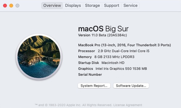
Undeterred by my experience two weeks ago, I took the plunge again yesterday and committed myself to beating macOS Big Sur into submission.
Why? Why not wait until it’s officially released? To be honest, boredom more than anything else. And I always love a challenge, especially when it comes to misbehaving software.
I traced the flickering screen problem back to cDock, and more specifically it’s “helper,” a handy little program that I’ve been using for years to change the Apple Boring dock to something a little more interesting—including previous OS versions. Once I uninstalled it, the system booted normally and the flashing screen disappeared.
Then I was faced with a couple other things not working. Bartender 3 told me it was incompatible with Big Sur, but still offered the option to load on startup. (Okay, whatever.) So I uninstalled 3 and upgraded to Bartender 4 (beta). Nag screen gone.
Then there was Avast. None of the shields would load, so I just uninstalled it and left that for another day.
I did some searching regarding the cDock issue and saw that a new version had been released that was “compatible with macOS Big Sur.” Upgraded and installed.
Big mistake. Sure, the flashing screen was gone, but when logging in the entire screen would go black for anywhere from 30 seconds to two minutes.
Uninstalled.
Everything else seemed to work normally. Yeah, most of the new icons are still butt-fugly, but I know if I really want to go to the trouble, I can harvest the icons from my Catalina backup and substitute them.* I’m not at that point yet and frankly may never be; I’m sure I will just learn to live with the iOSification happening here. Resistance is Futile.
And on the subject of the UI, it seems like the current design team can’t decide if they want everything to remain “flat” as it’s been since macOS Sierra or return to the skeuomorphism of the Scott Forstall years, so overall it’s a hot mess. I know Jony Ive was completely burnt out by the time he left Apple, but at least things under his design leadership were consistent. (Sometimes consistently bad, but at least consistent.)
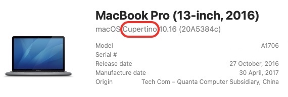
One interesting “oopsie” I stumbled upon when starting up Sensei (a great little app, by the way) is that apparently Big Sur wasn’t the first name assigned to this new OS. It appears it was originally…

Yup. Cupertino.
Were they going to use a flyover photo of the spaceship for the default wallpaper? [Shudder.]
I forwarded this tidbit to Apple. Let’s see if it’s fixed by the time the final product ships.
It’s taking me a bit to adjust to the new dialog boxes and whatnot. It hasn’t brought me to an operational standstill, but I find myself actively searching for some of the most basic of functions that used to almost be a part of muscle memory. They seem to have adopted the Microsoft mantra of moving stuff around because they can.
But you know, other than the few aforementioned glitches, everything seems to be working okay; a definite improvement over the state this beta was in a few months ago. Should you upgrade? It’s really up to you. There are a few new features (graphic and otherwise) that I do like. I haven’t noticed anything in particular that’s missing, so that’s always a positive. Some things seem faster, some things seem slower. In other words, another day with Apple ending in Y.
*Turns out I can’t substitute the icons either by directly replacing them in the application or by dragging and dropping, probably because these apps are on the locked down system partition.
