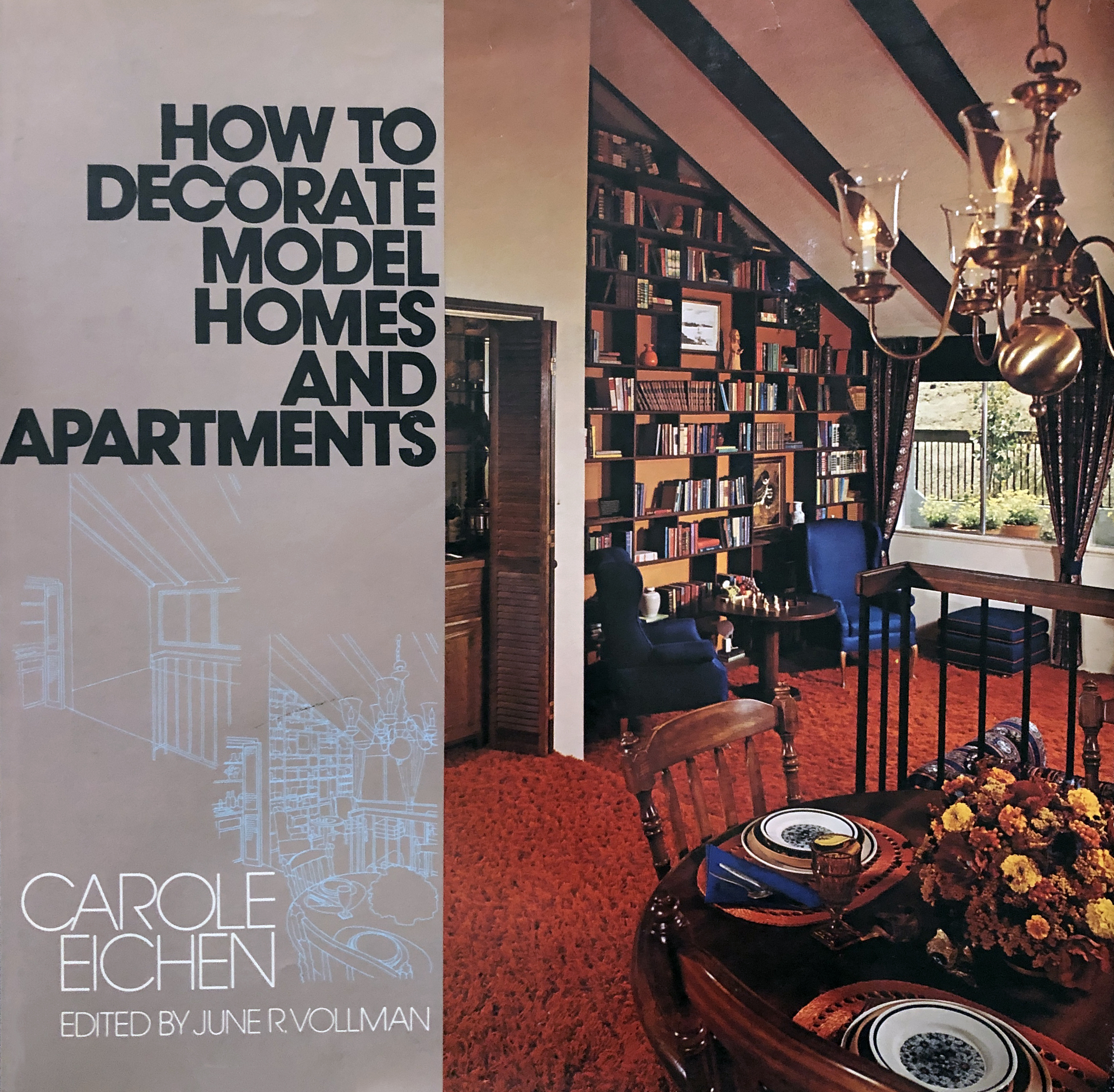

My Dad knew Ms. Eichen. When he brought this book home in the early 70s I remember pouring over the pages in rapt attention. This was the future, damn it! My future! This was the aesthetic I entered my architectural career with.
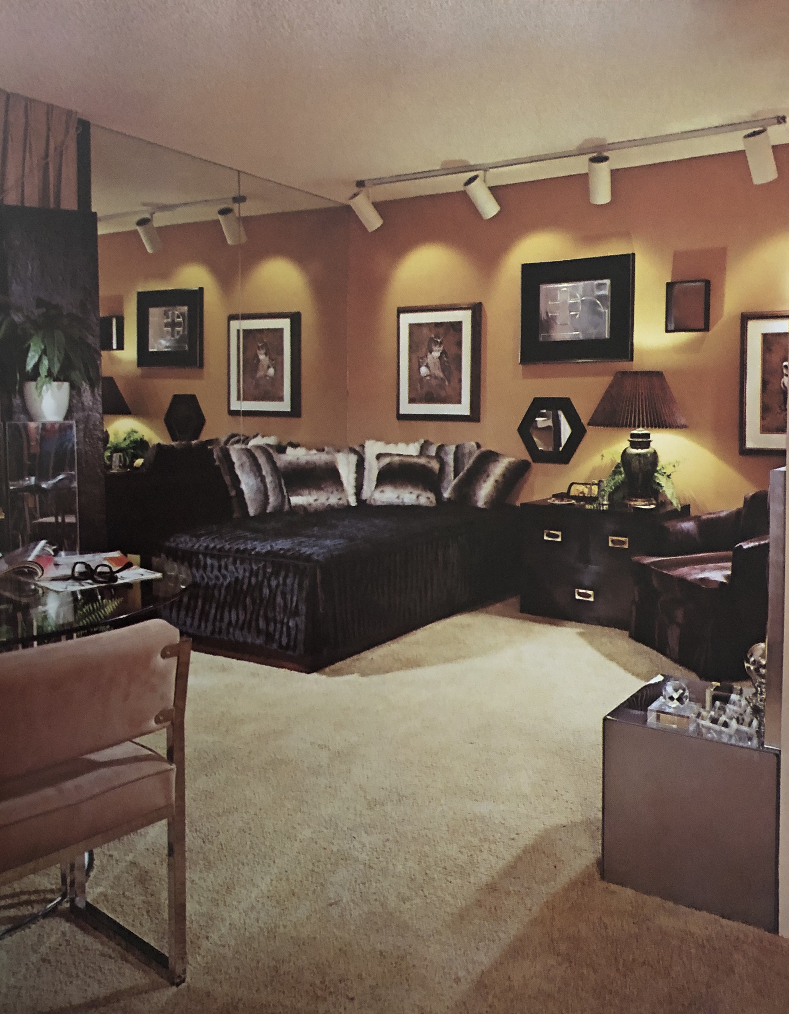
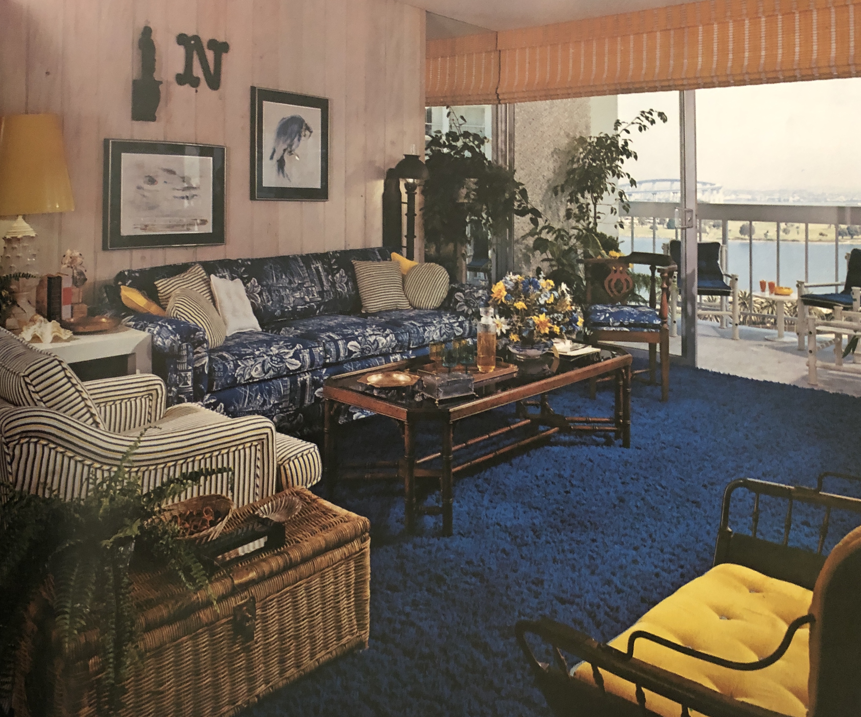
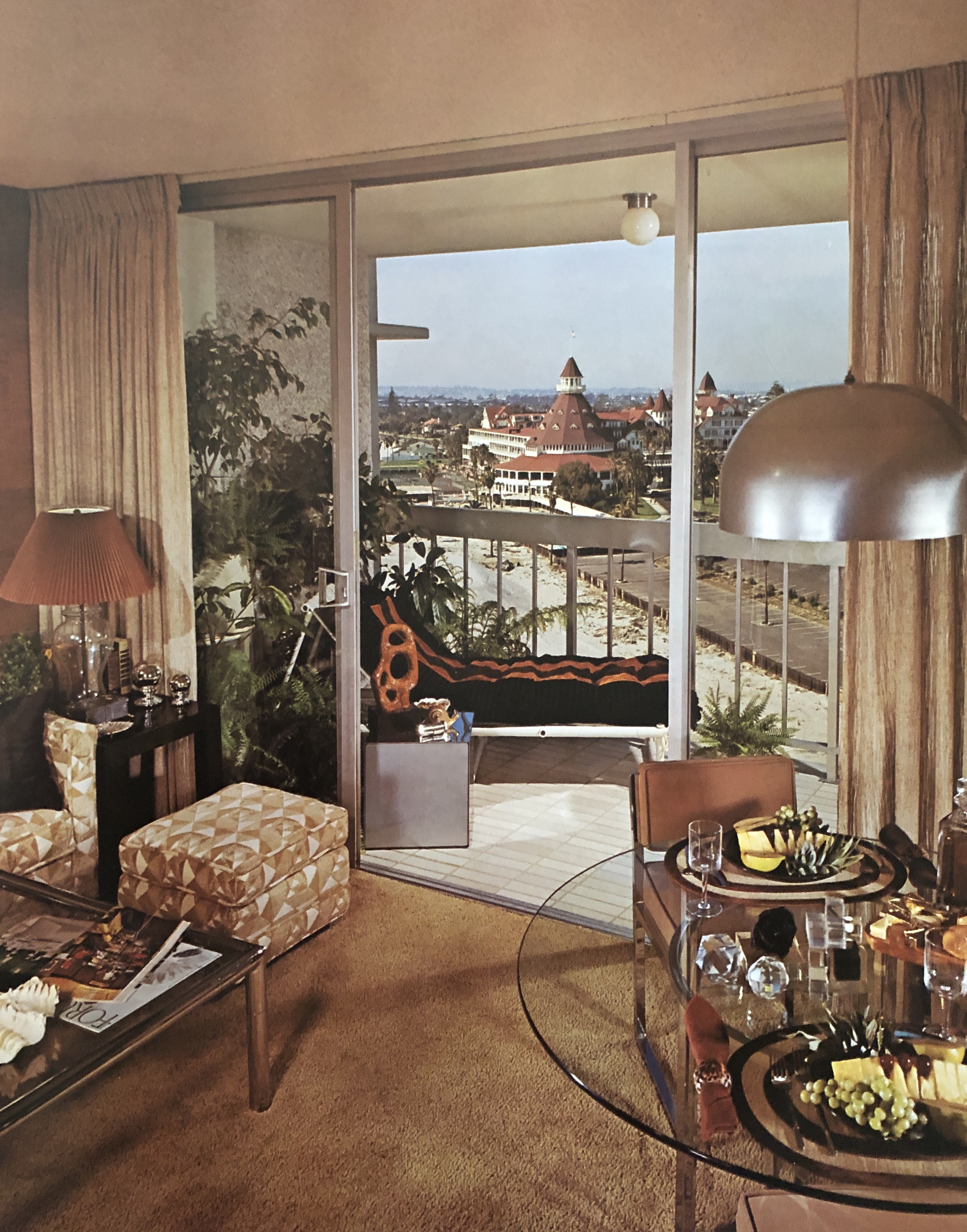
It’s funny how styles change. What at first seems beautiful and fresh and new looks so antiquated only a few decades later. The photos above are from the 70s, but even the big trends of the 90s (glass block, neon, Zolotone paint) now look hopelessly dated. That’s why I have to laugh when I watch the current crop of home improvement shows where kitchens are all white (or grey, or, most recently blue) shaker cabinets with stainless steel appliances, granite or quartz countertops and tiled backsplashes. Hardwood floors are a requirement throughout a house, and don’t even think about designing anything other than an open concept living area.
This too shall pass. By the time 2060 rolls around, all these “modern” accoutrements are going to look as dated as the photographs above. People will walk into these homes and say, “Granite!? That’s so twenty-teens! It’s gotta go!” In fact, I wouldn’t be a bit surprised if the photos above are the look in 2060 since everything old is new again.
Stainless Steel… how I hate it. Give me Harvest Gold and Avocado Green… just kidding. Though I do like the shot of the Del Coronado.