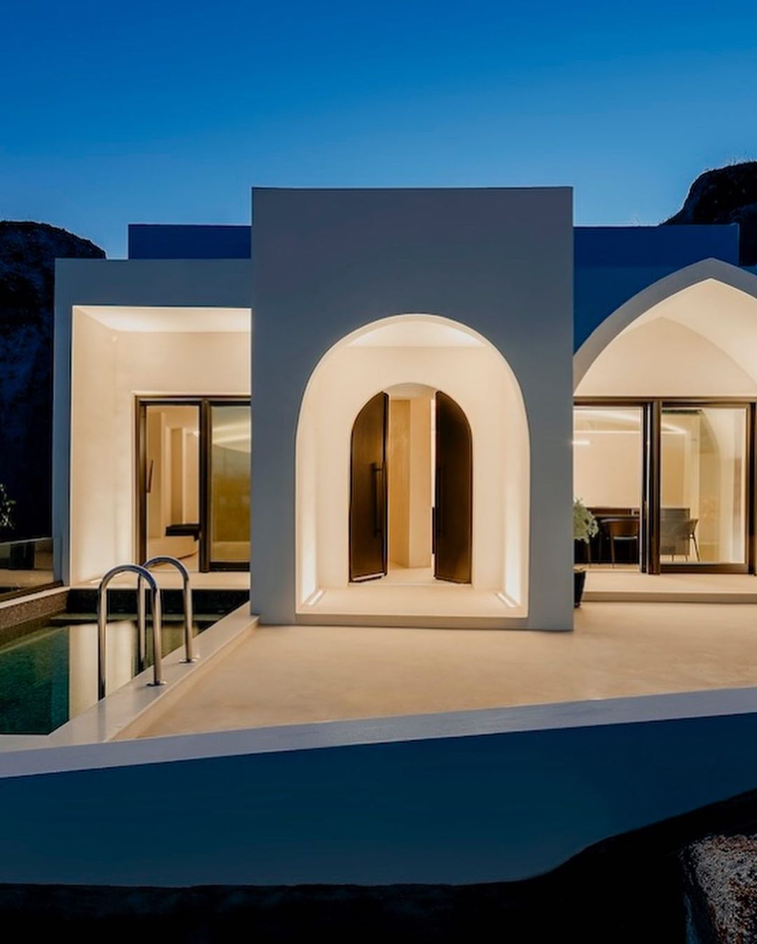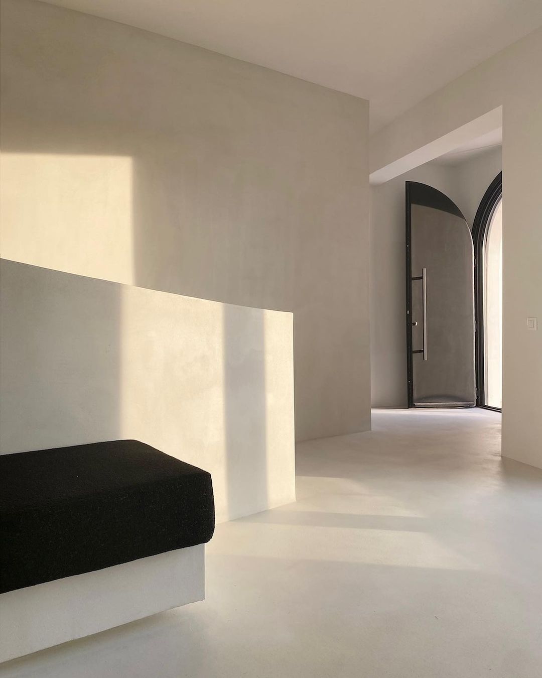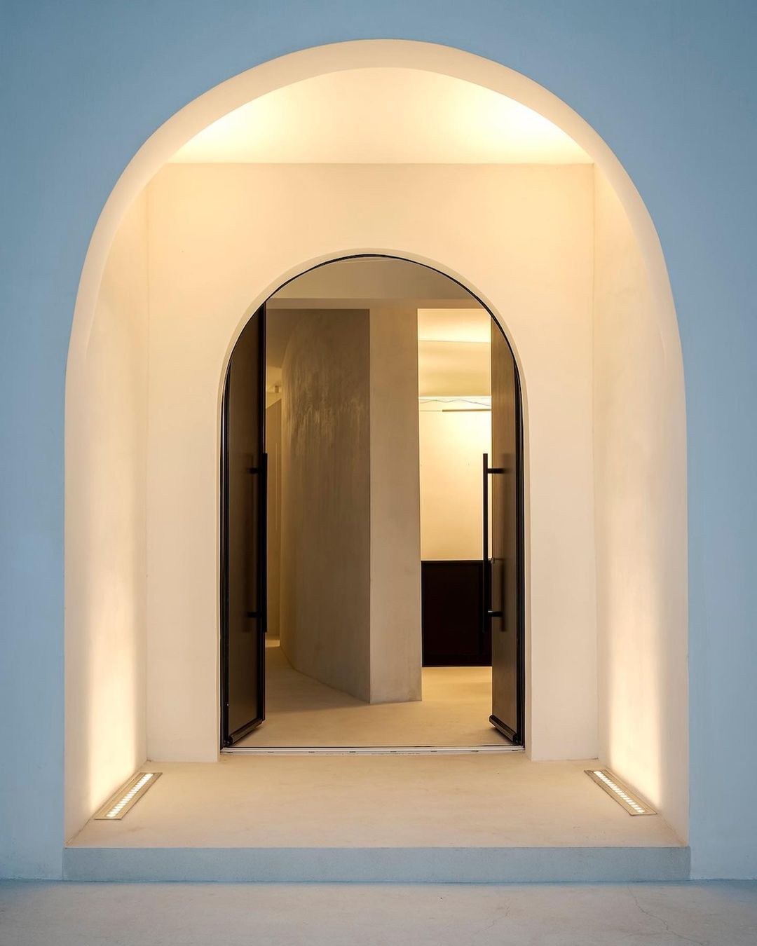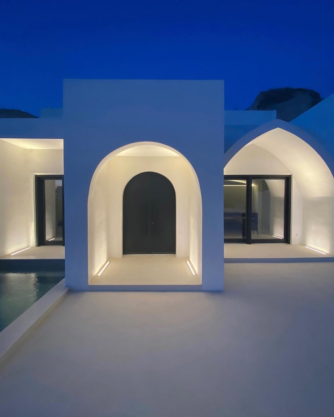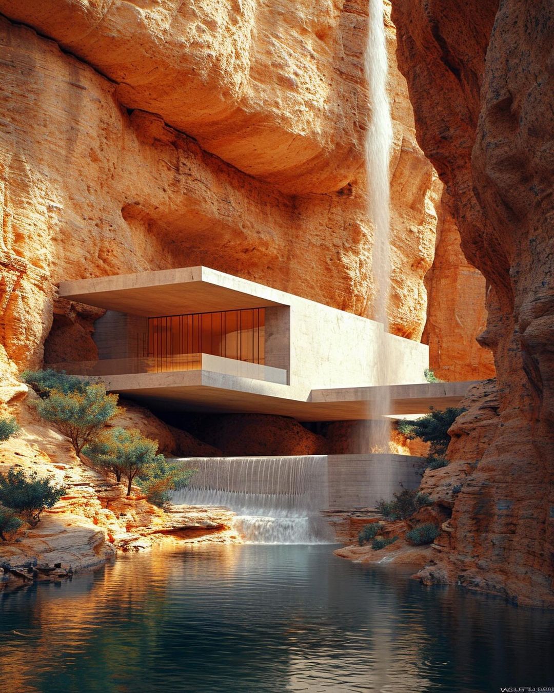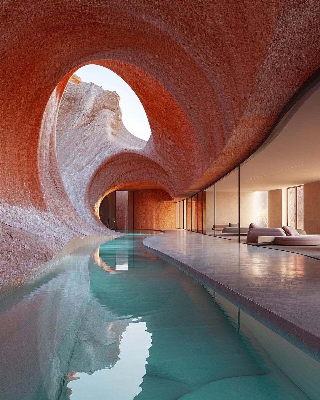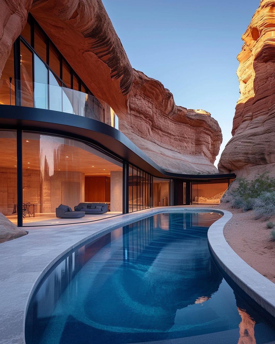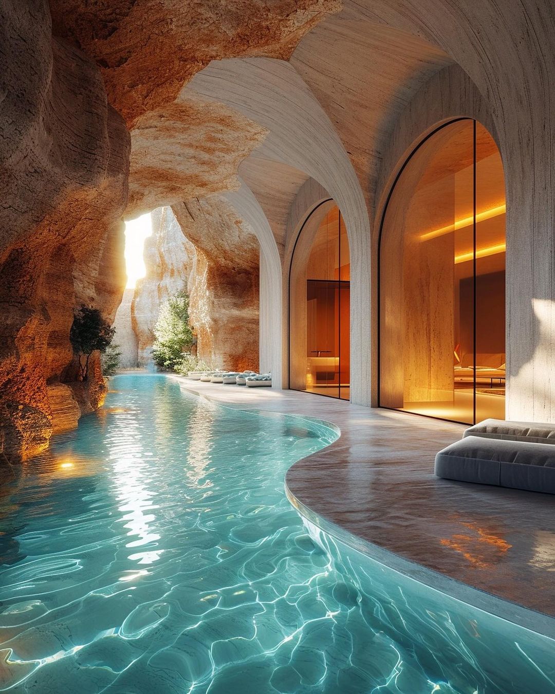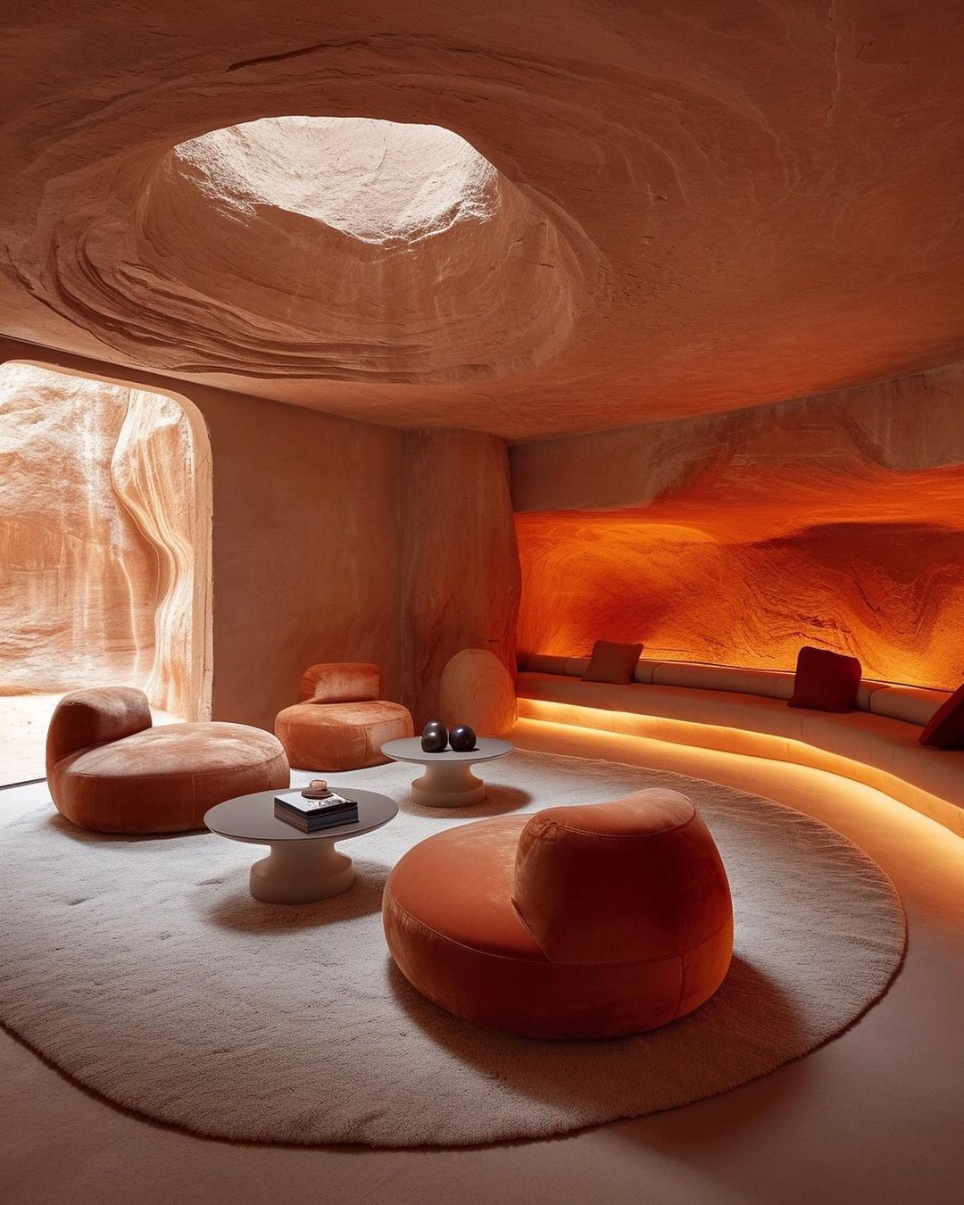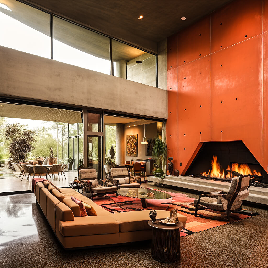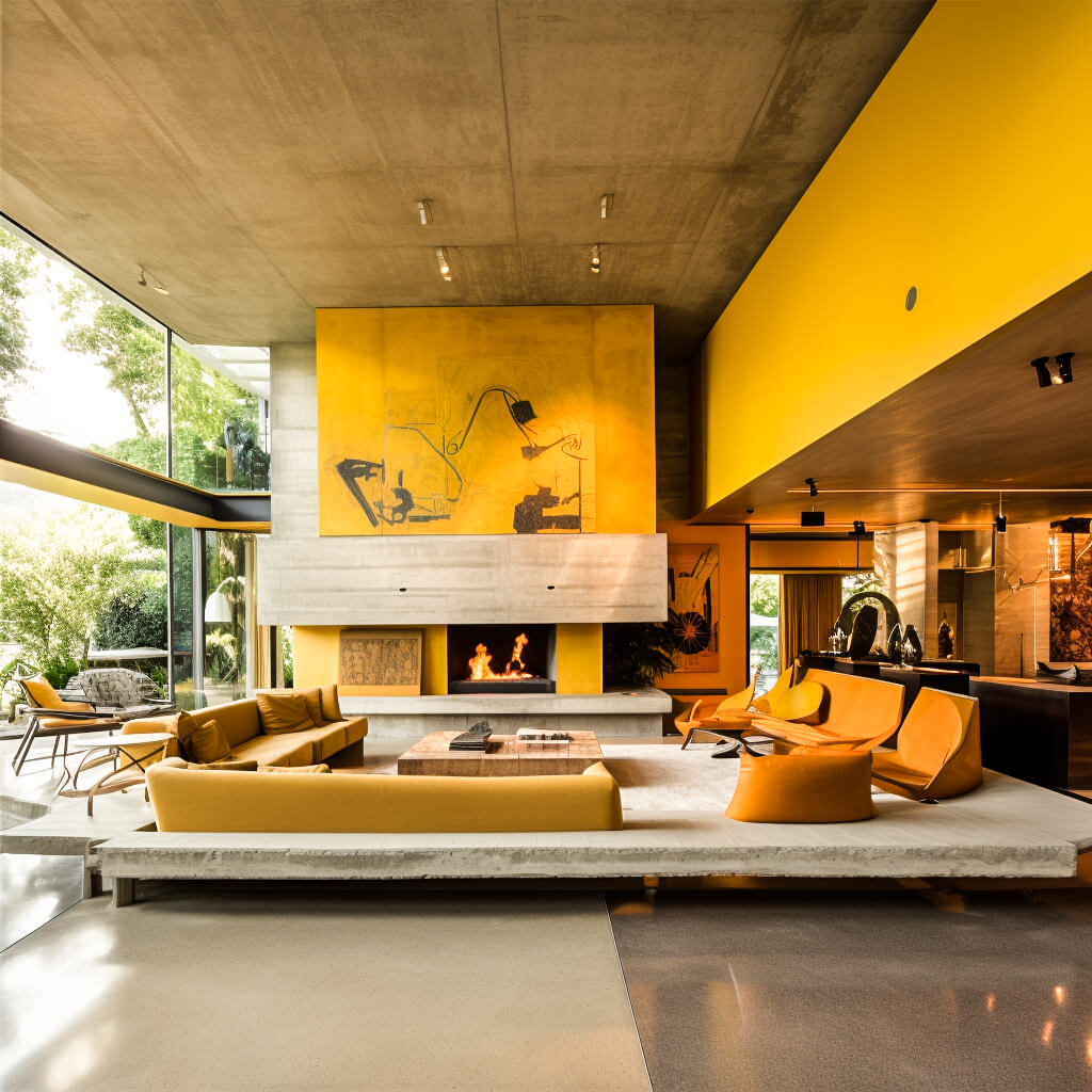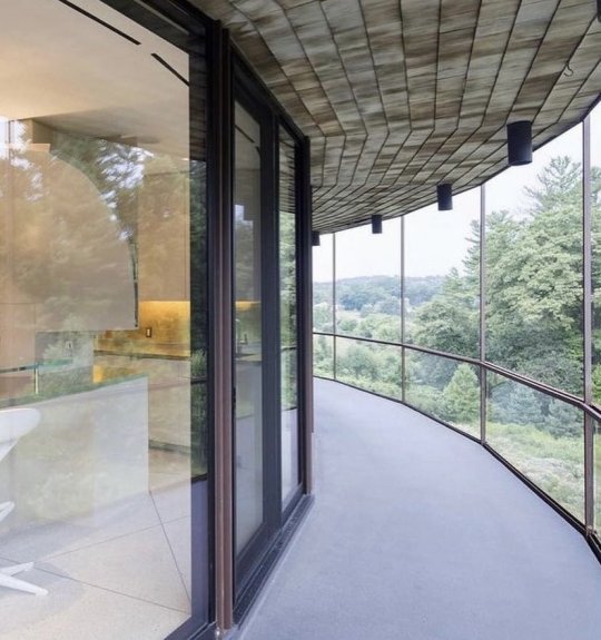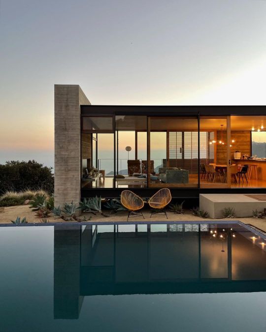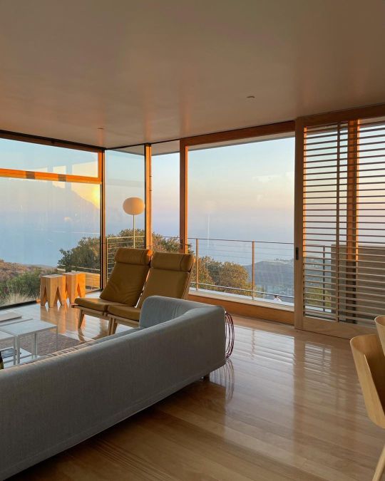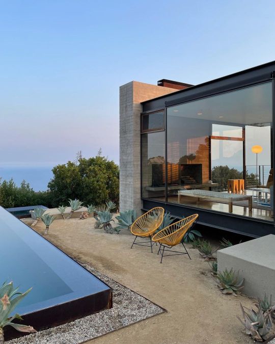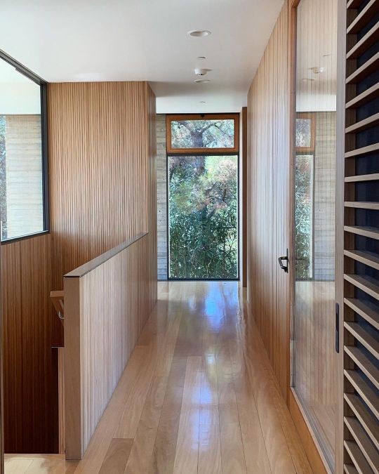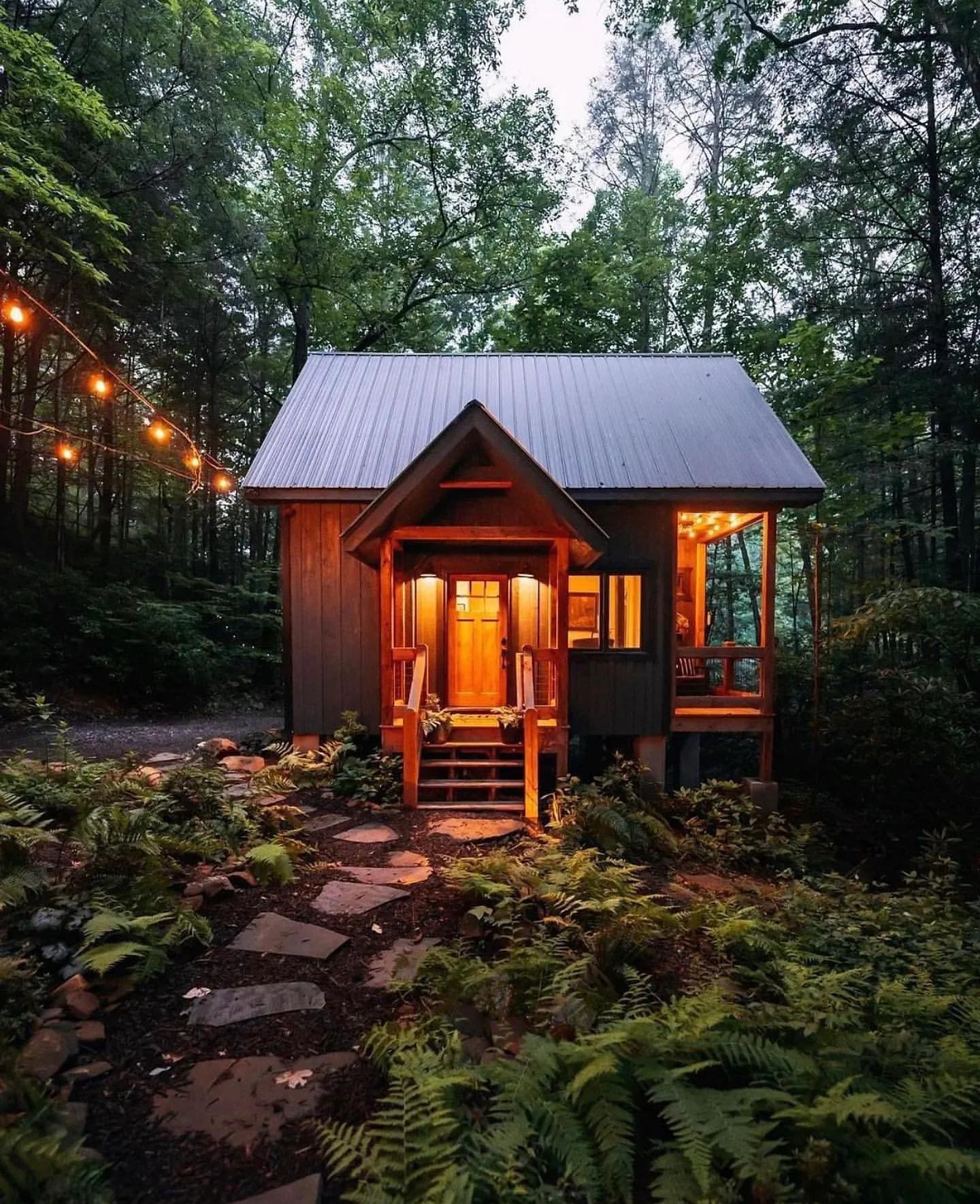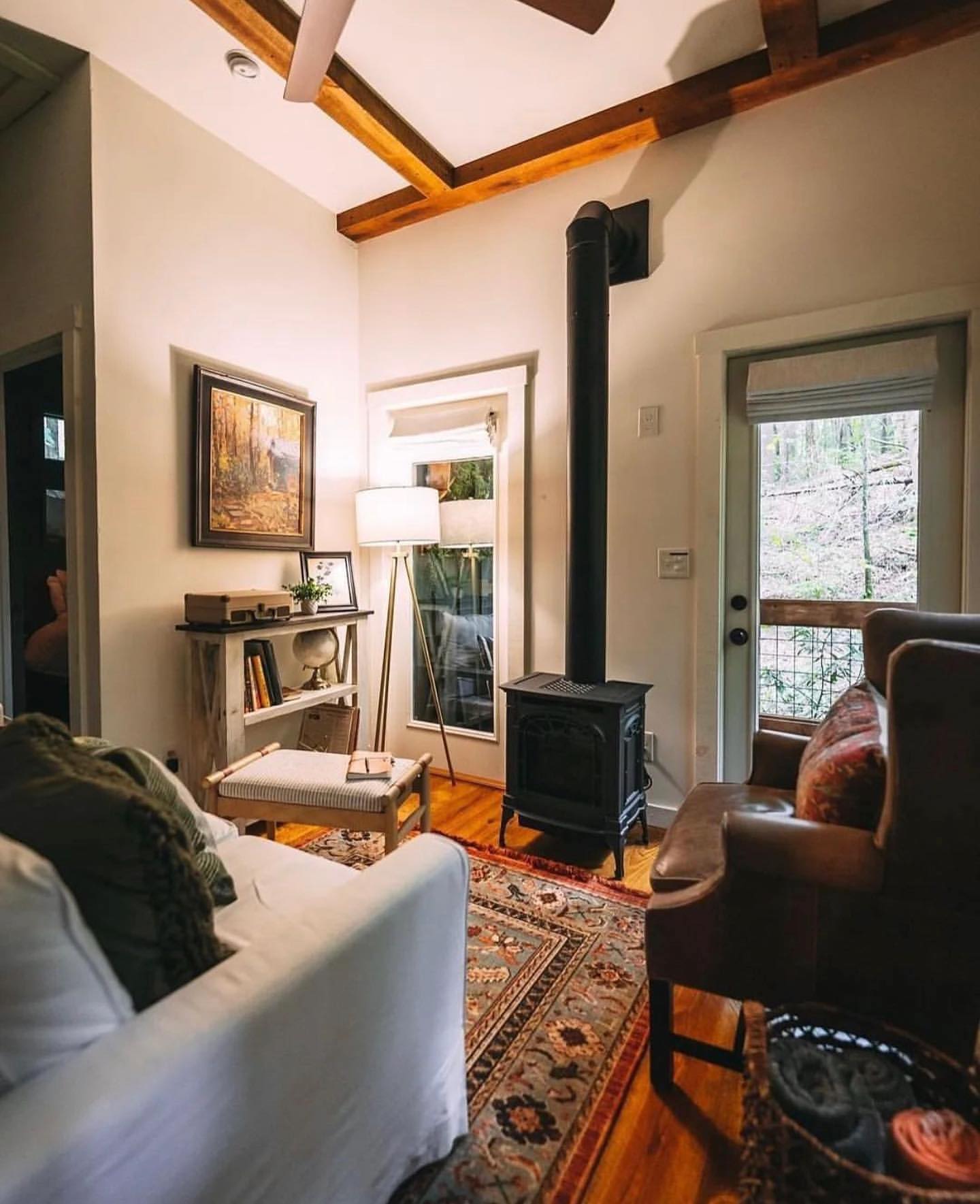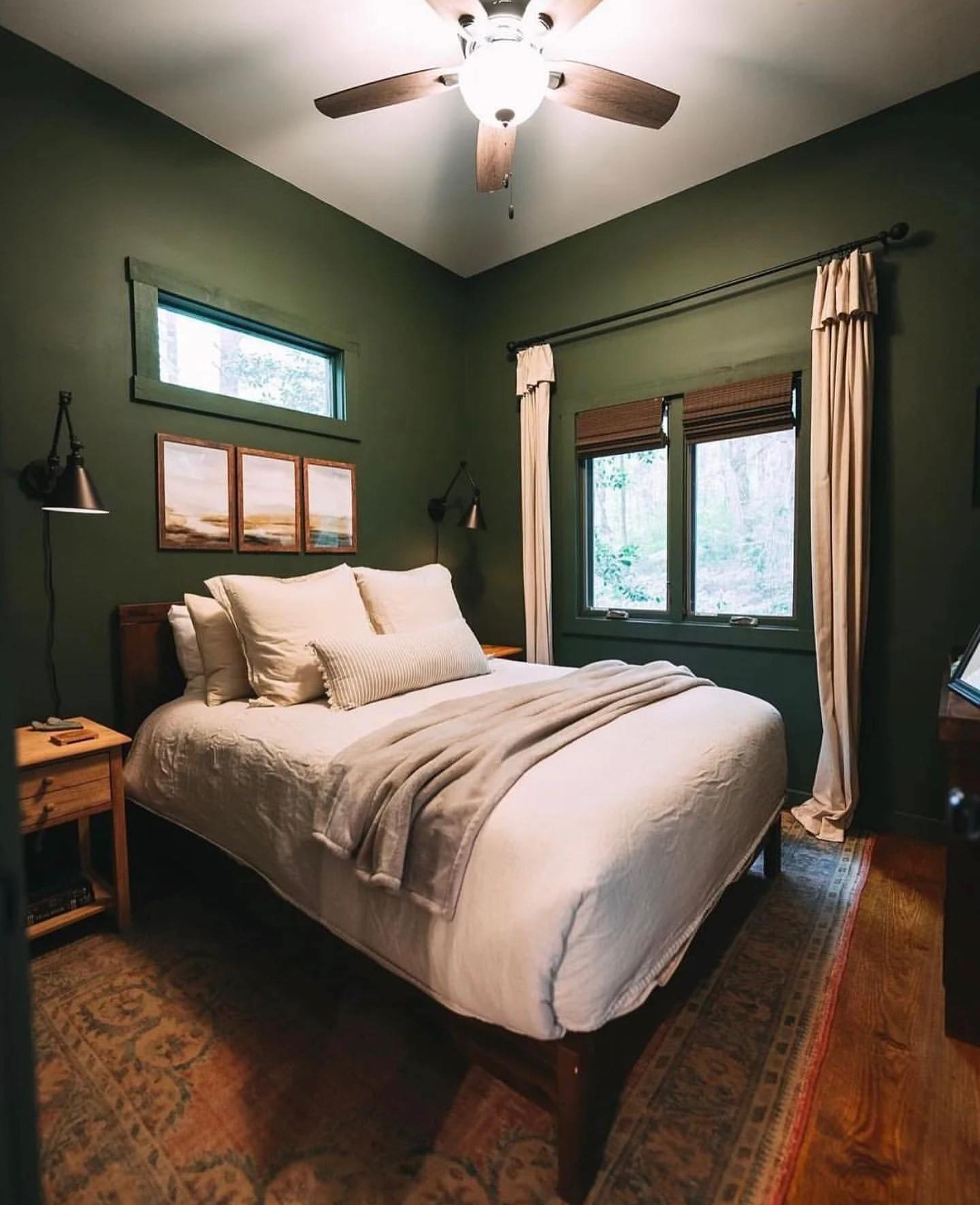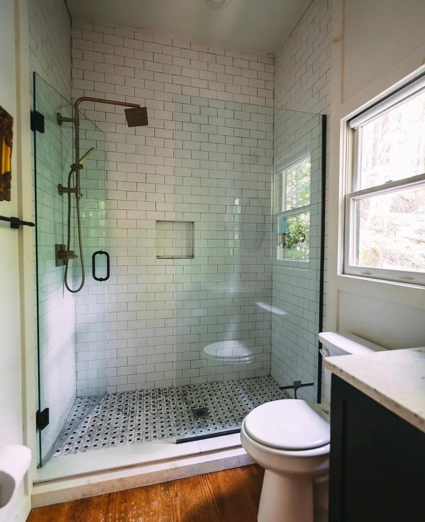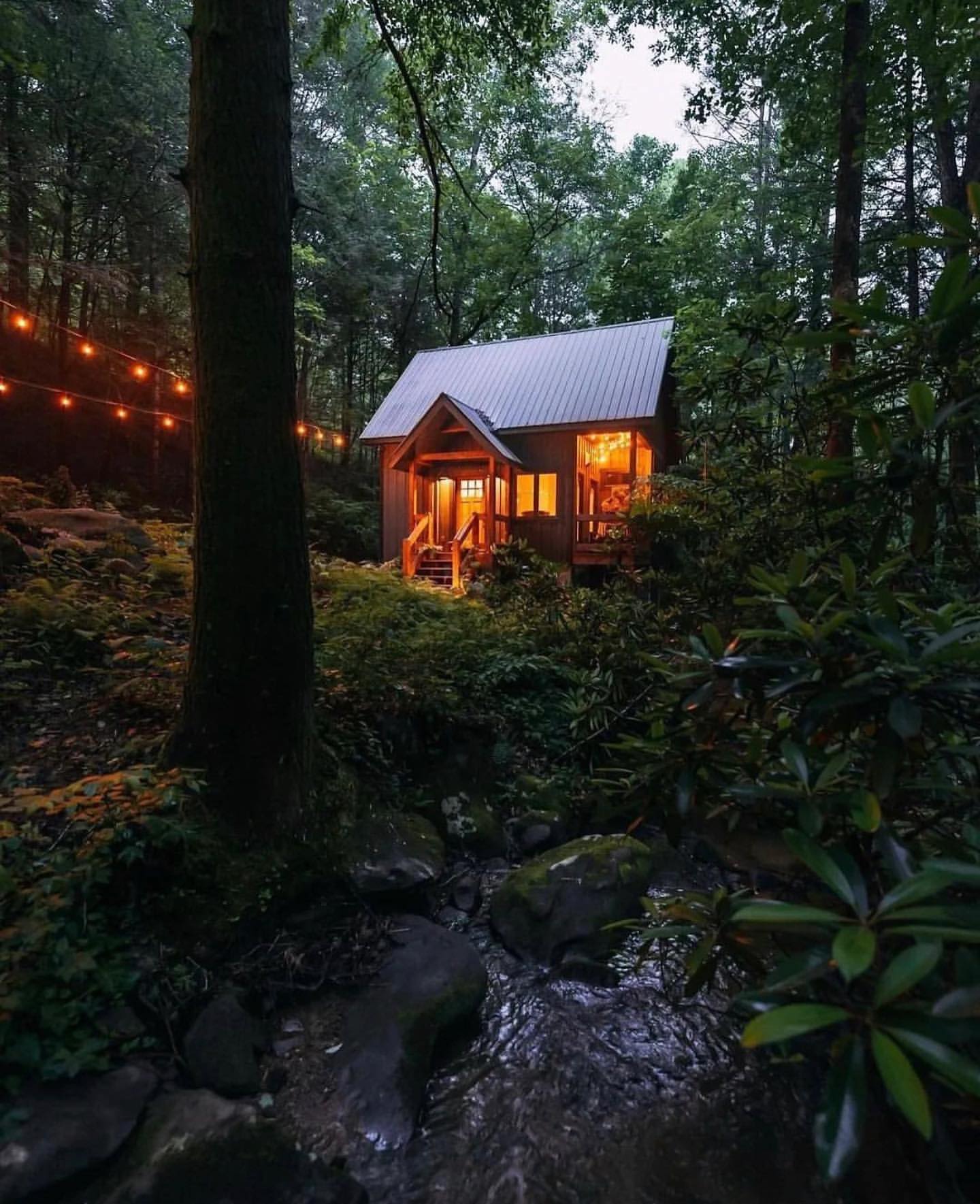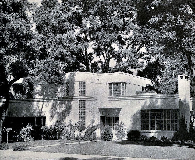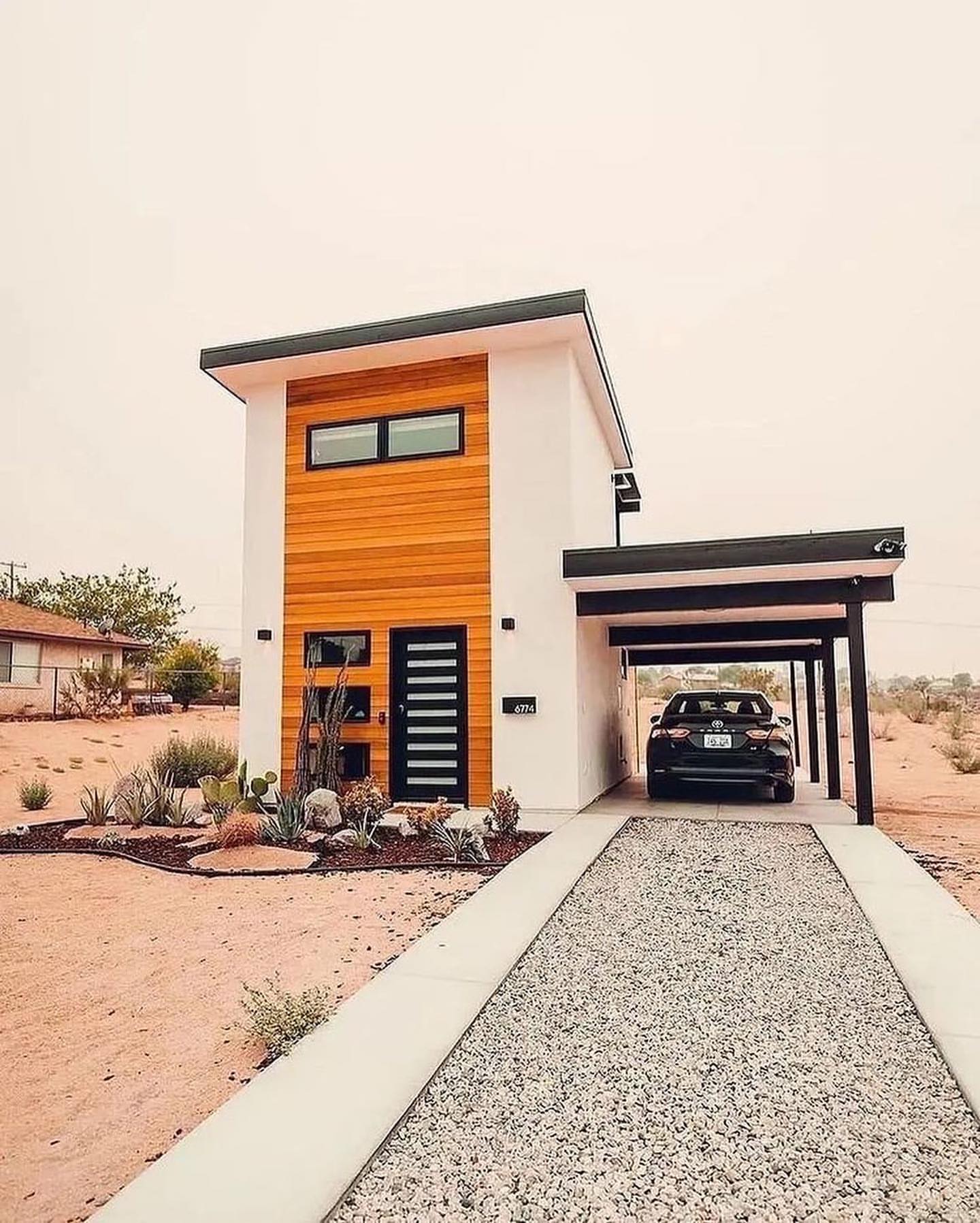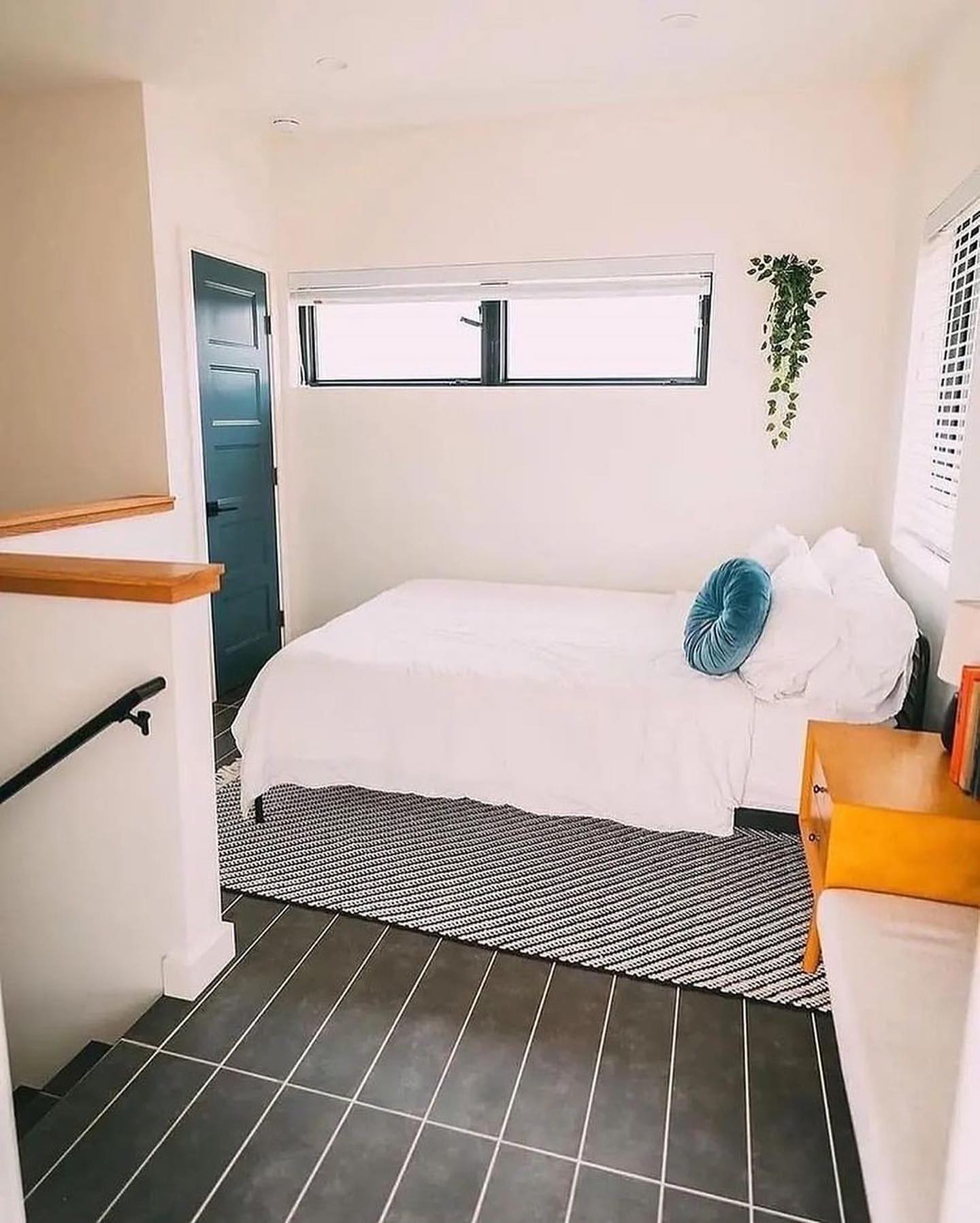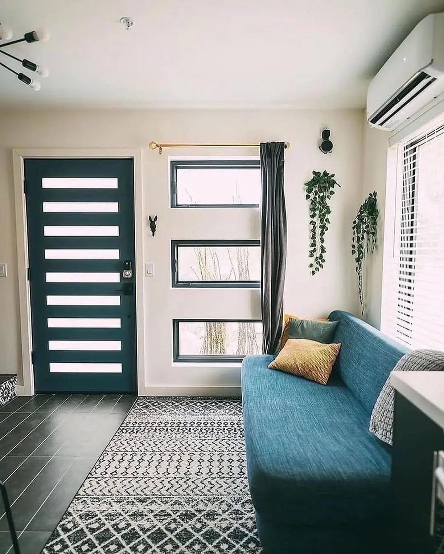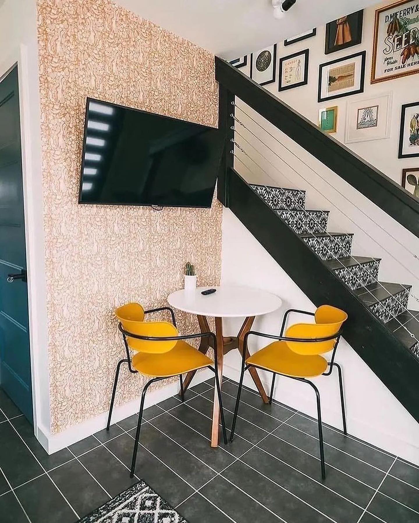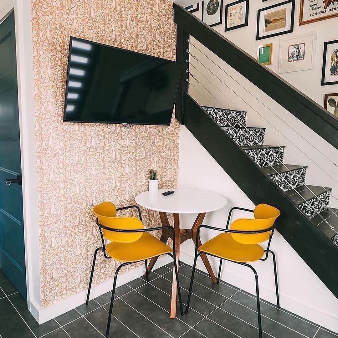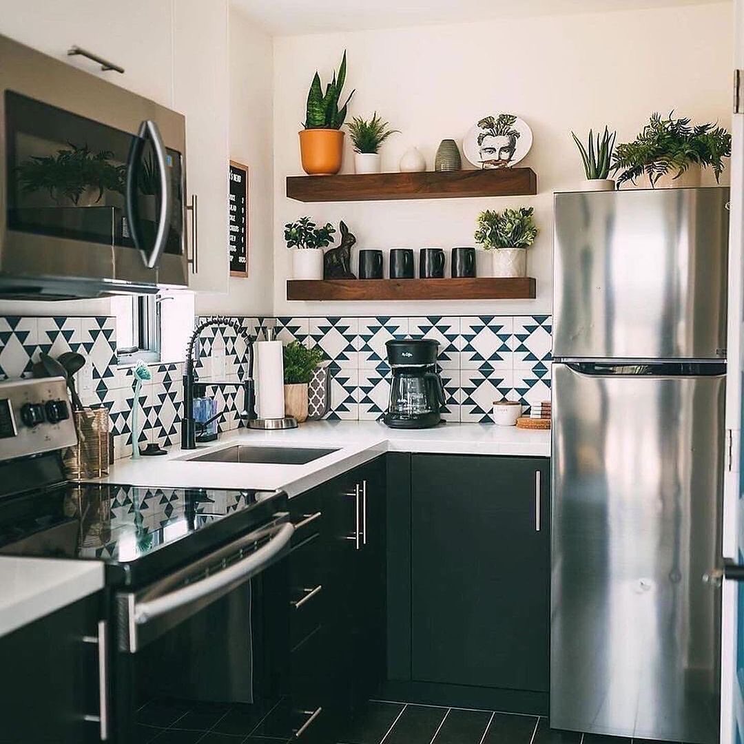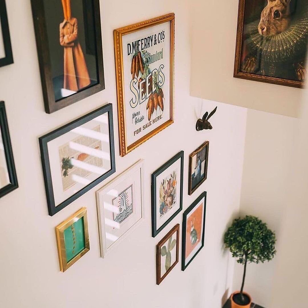
This speaks my language.
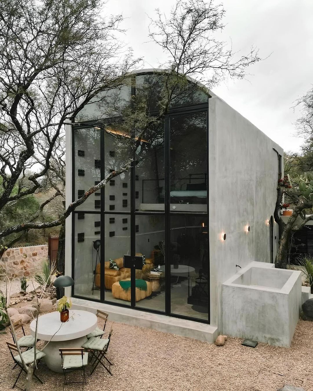
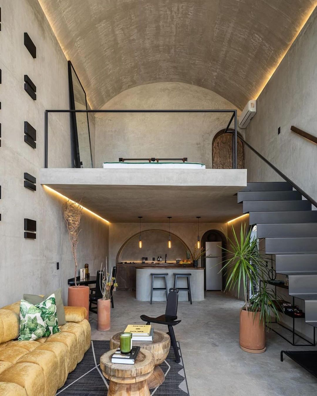
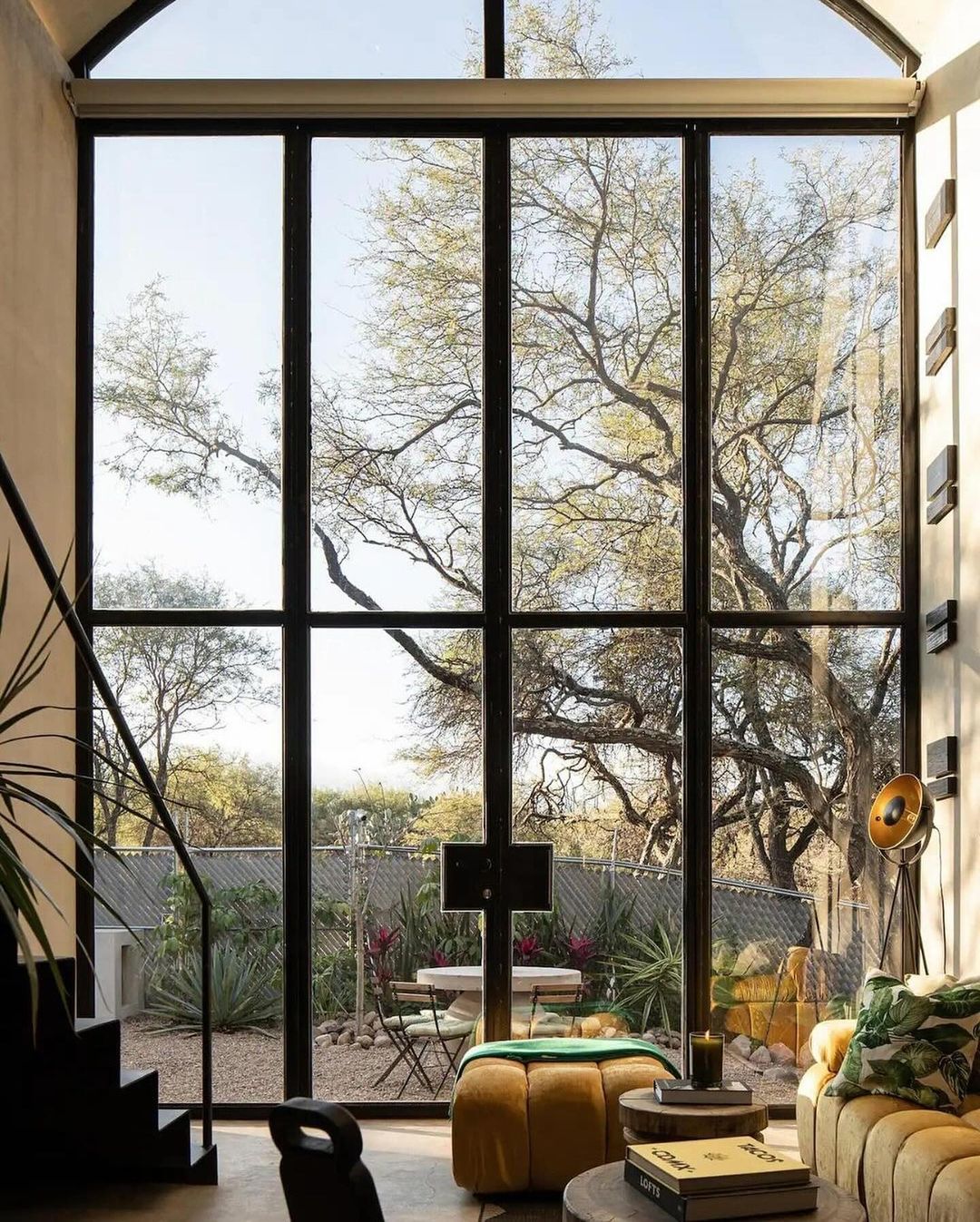
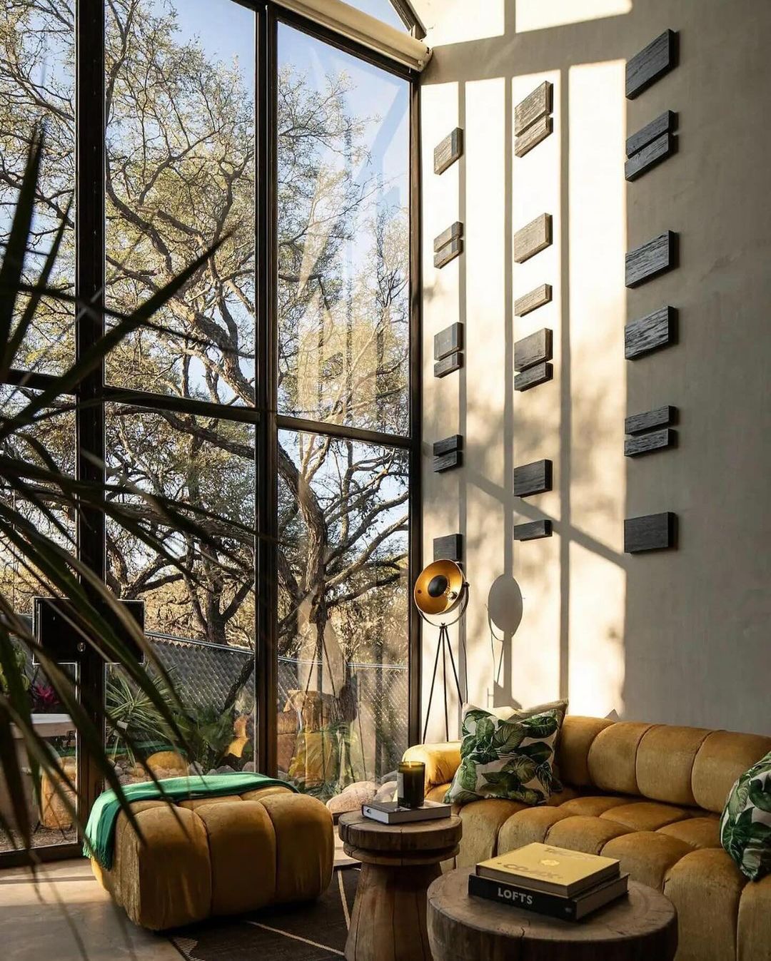
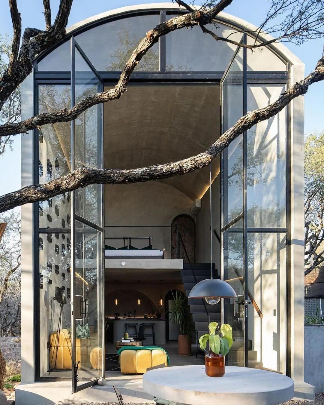
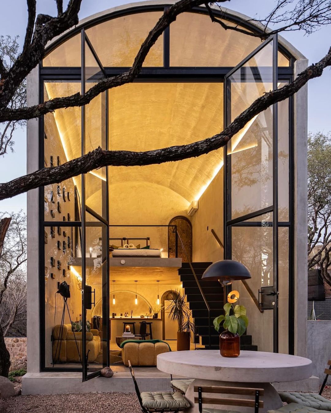
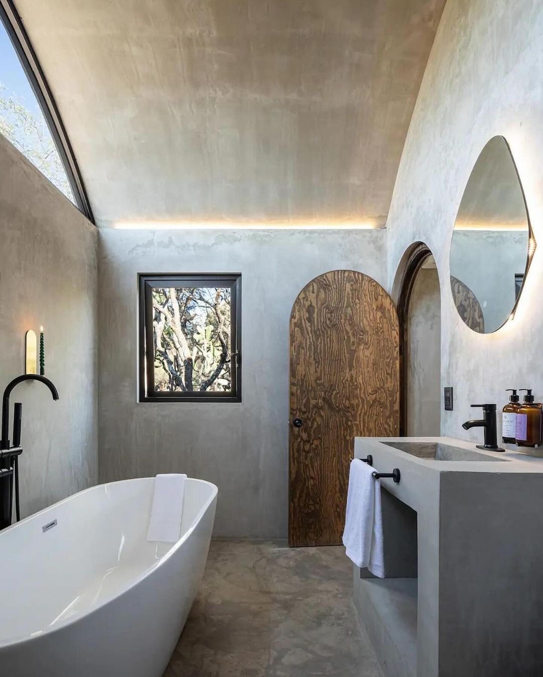
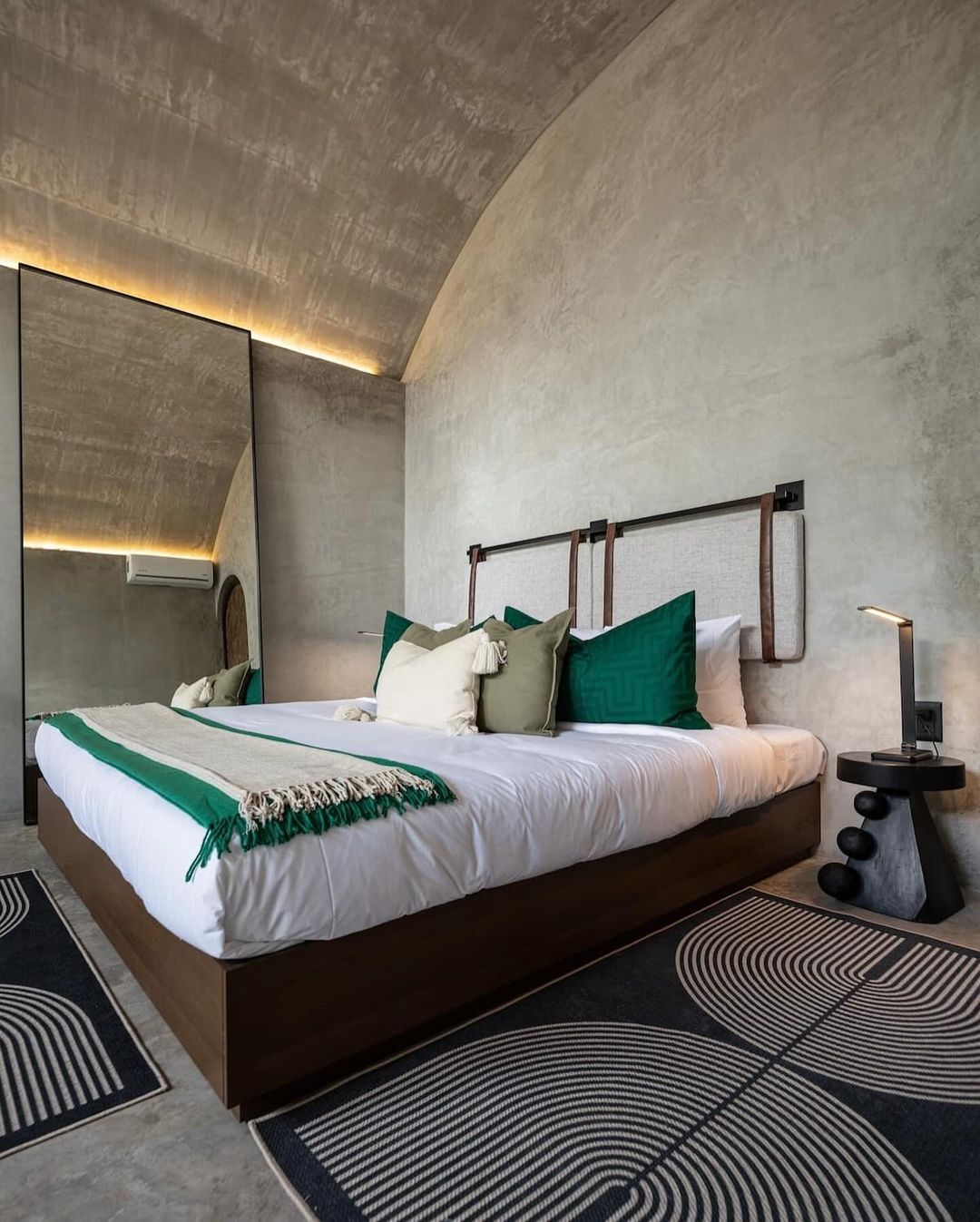
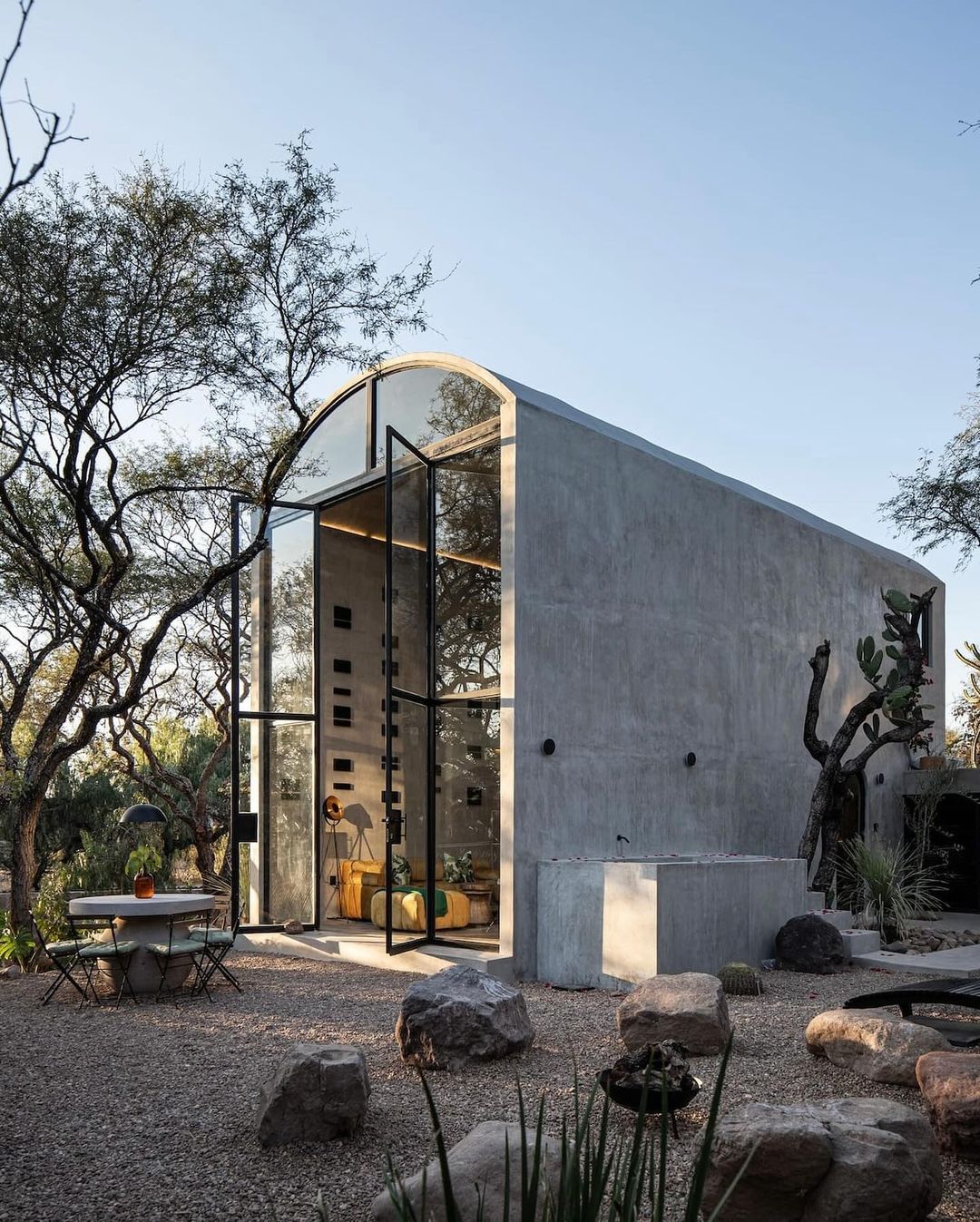
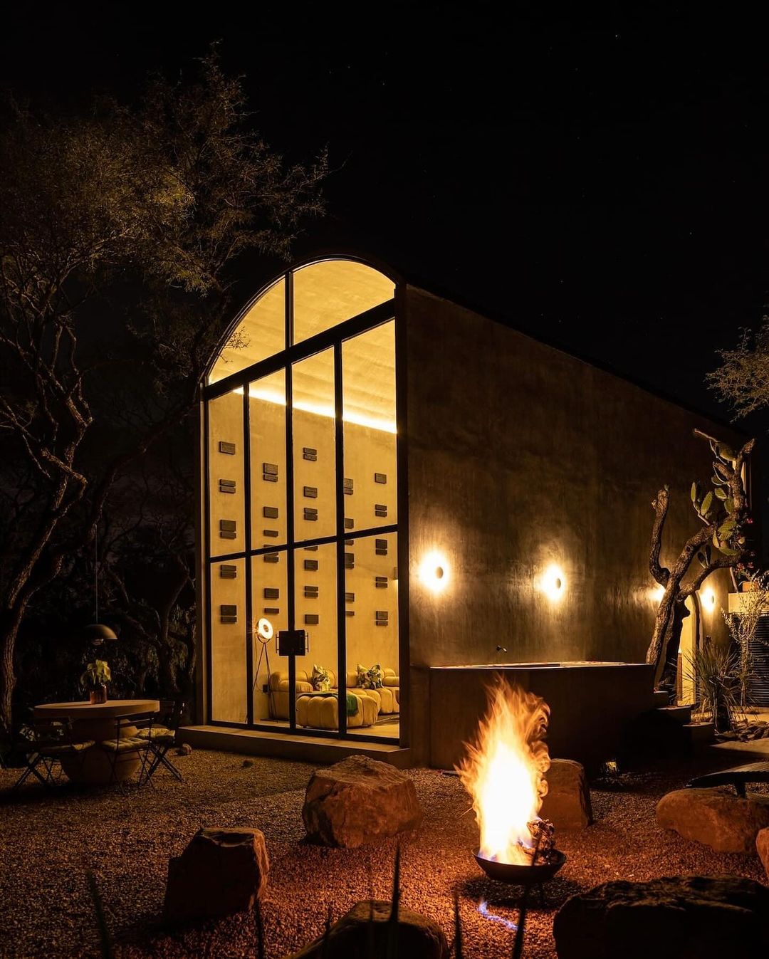
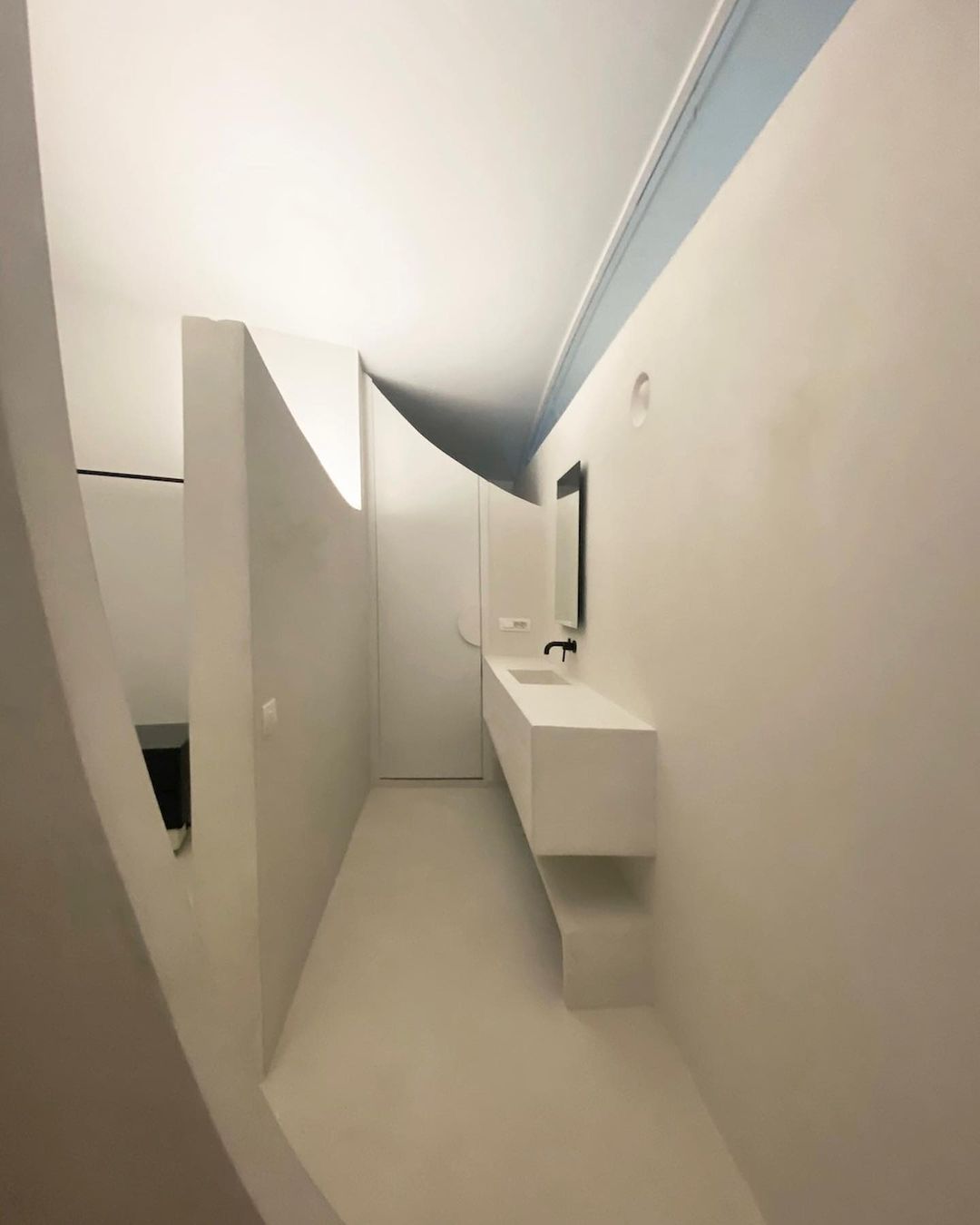
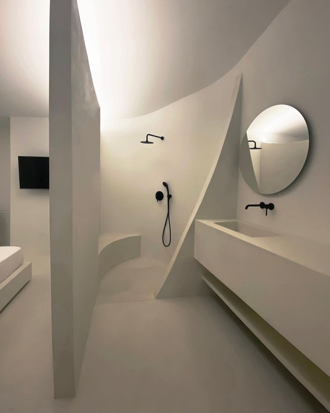
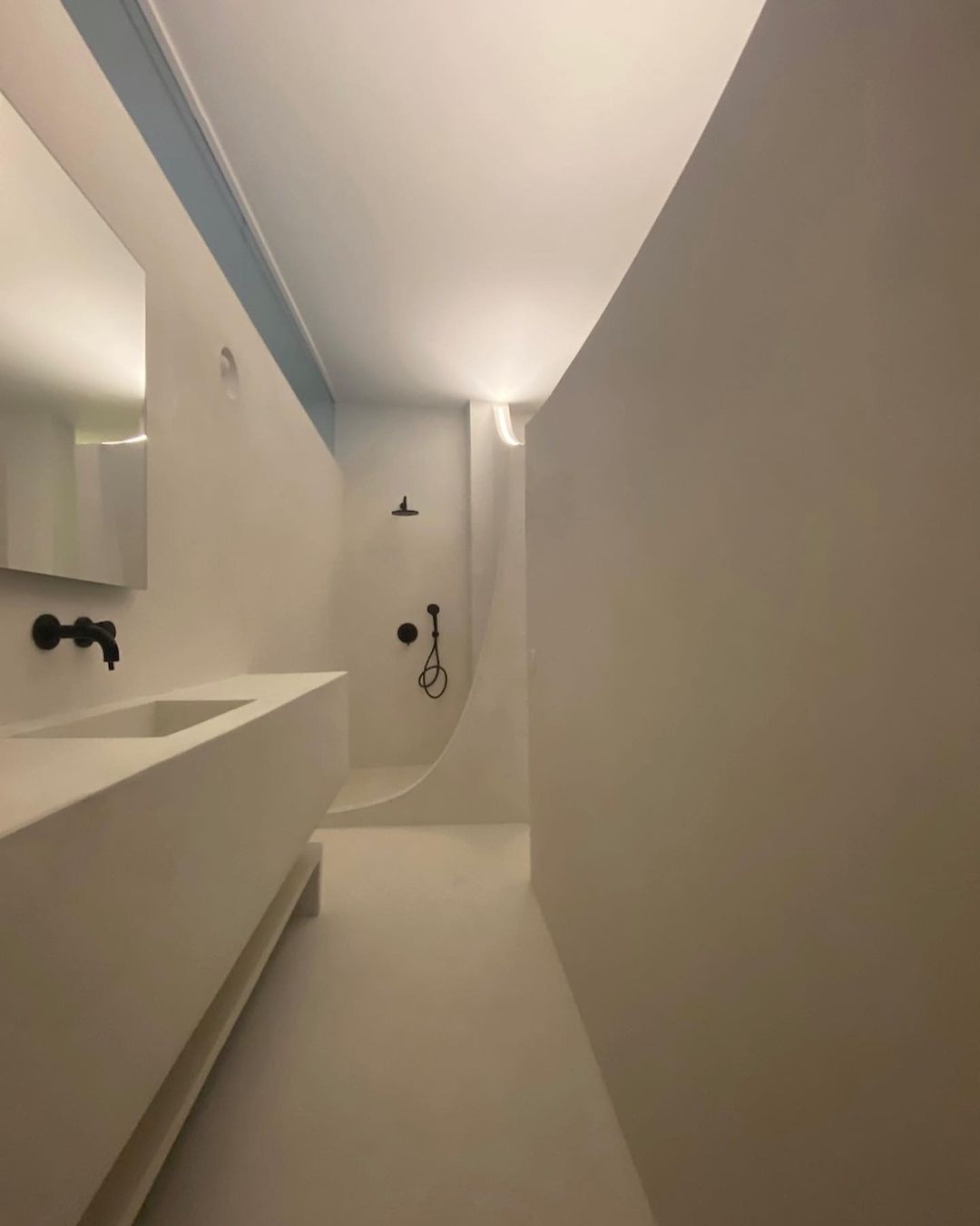
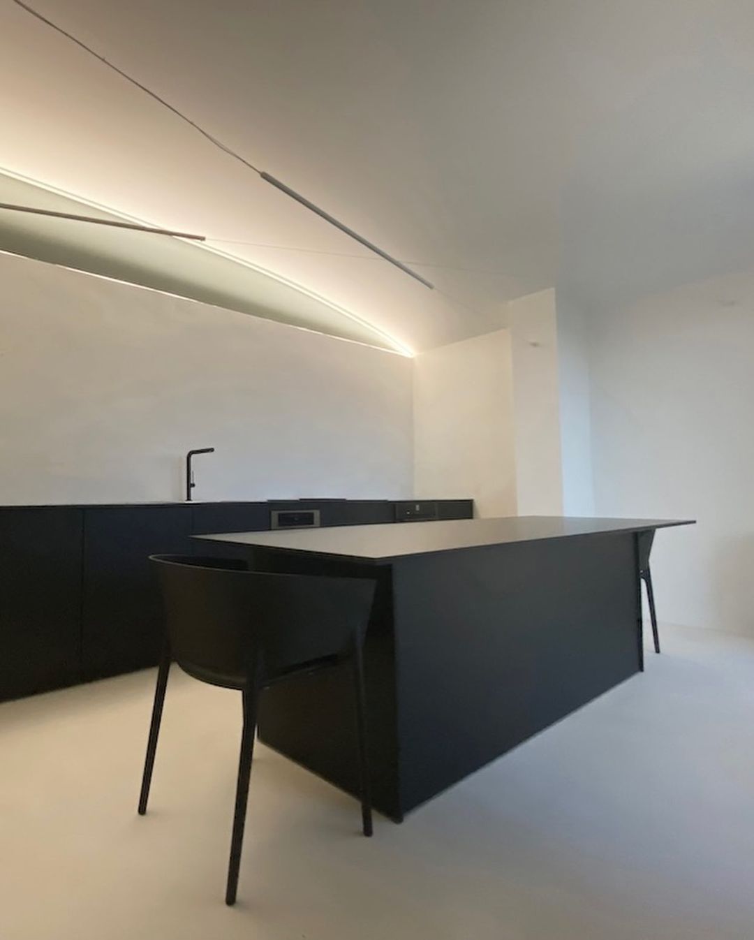
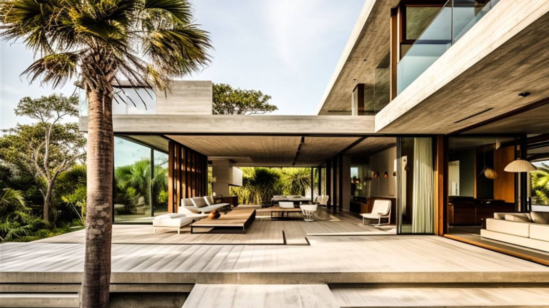
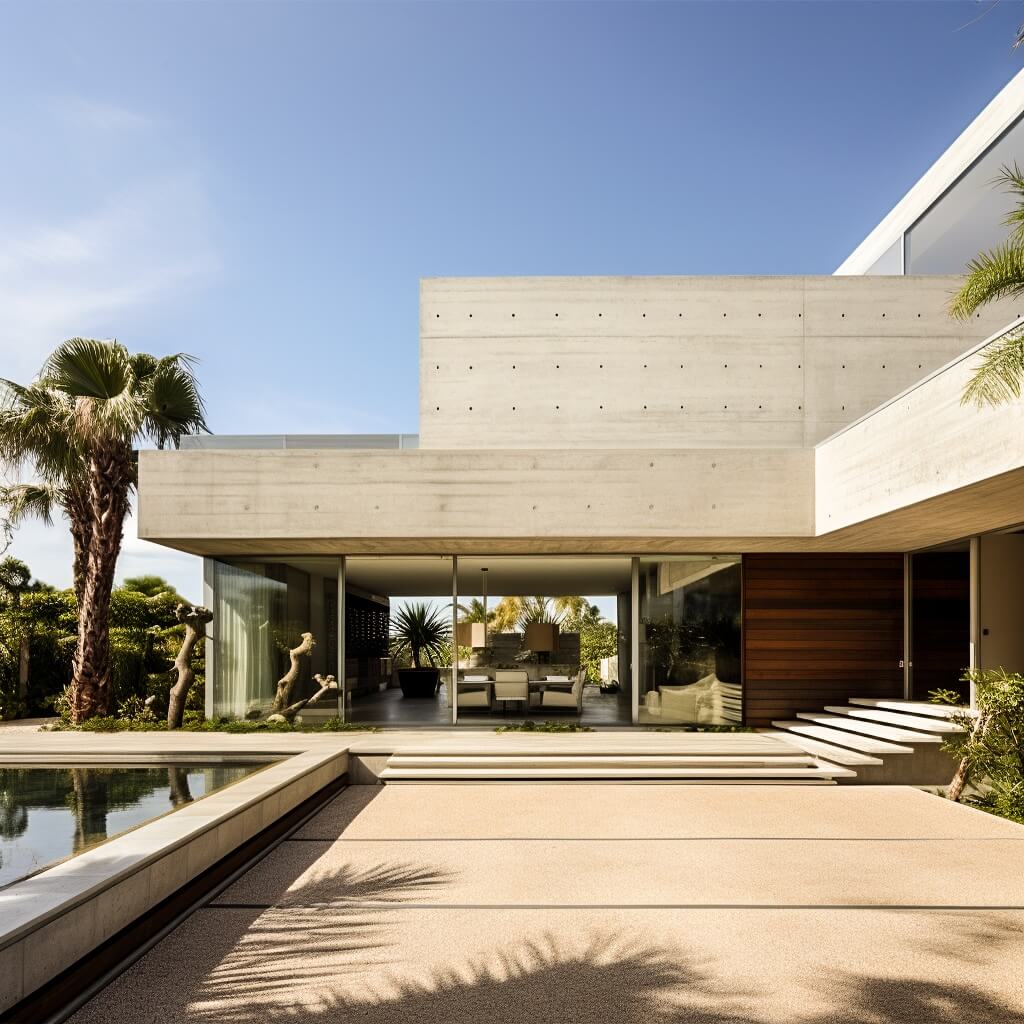
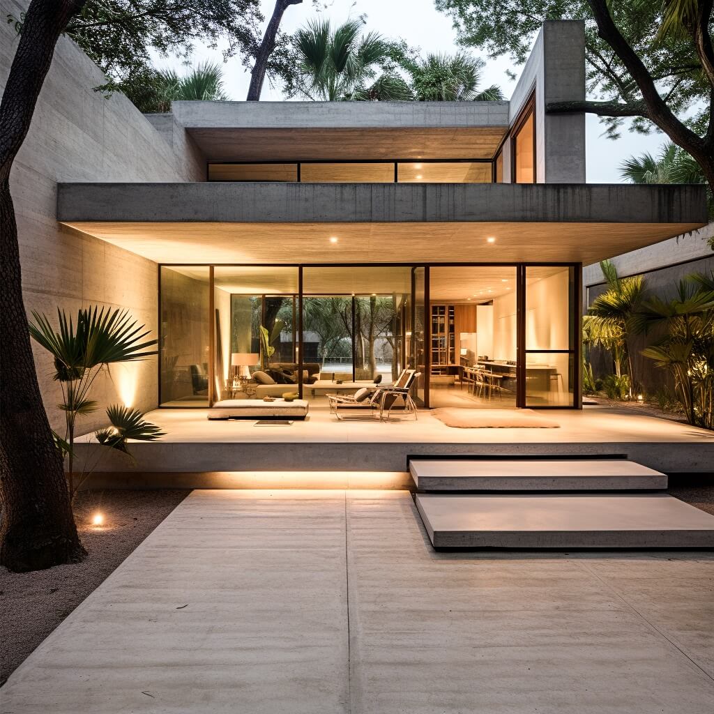
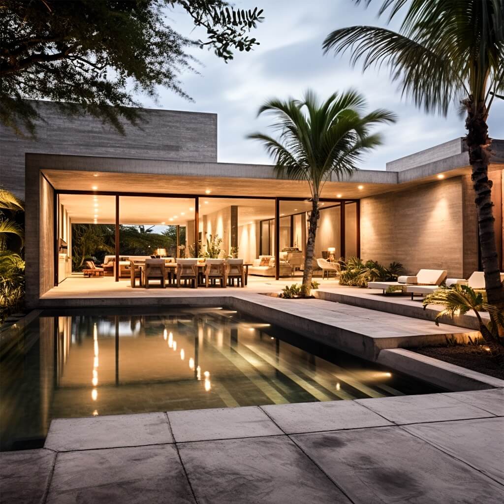
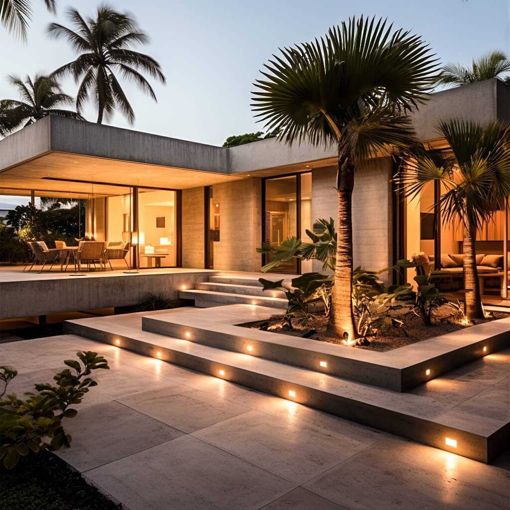
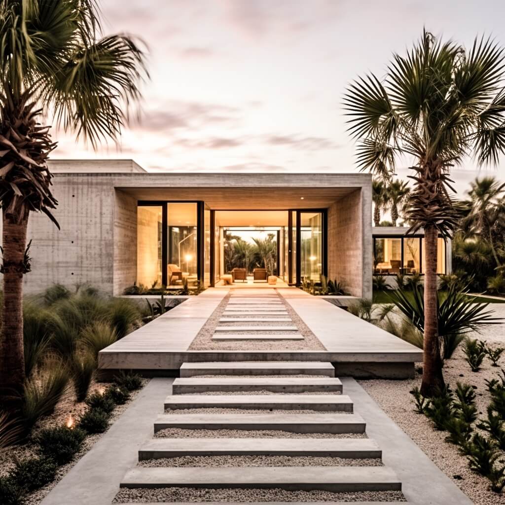
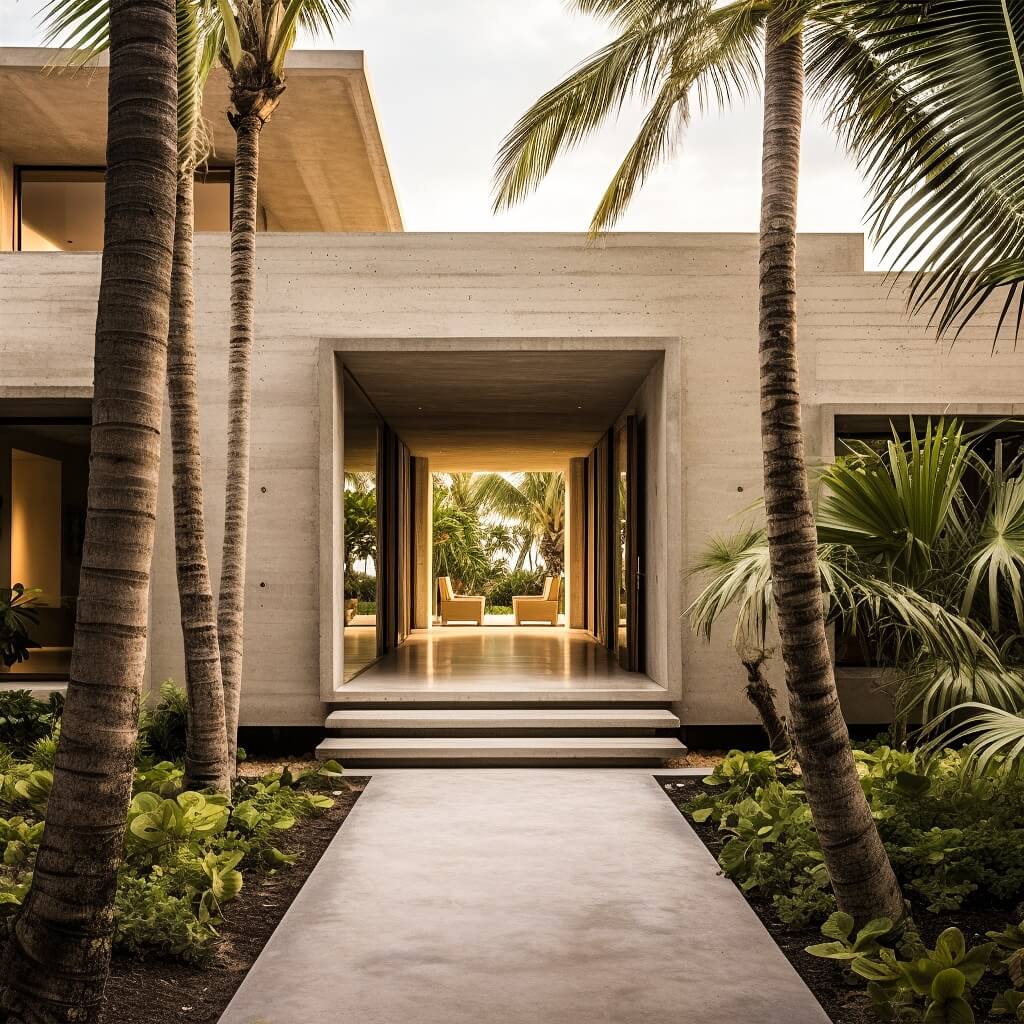
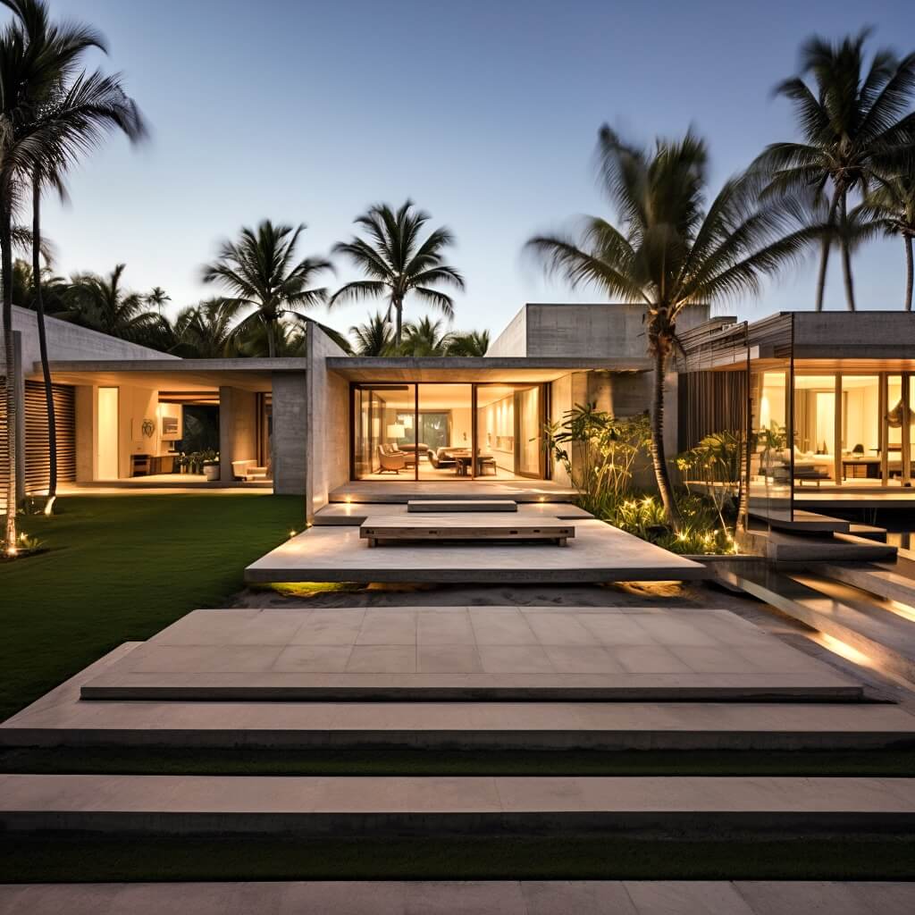
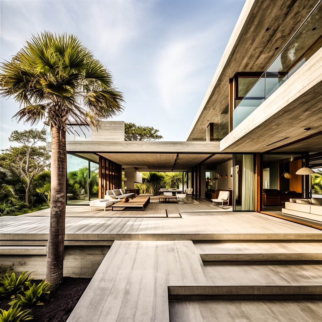
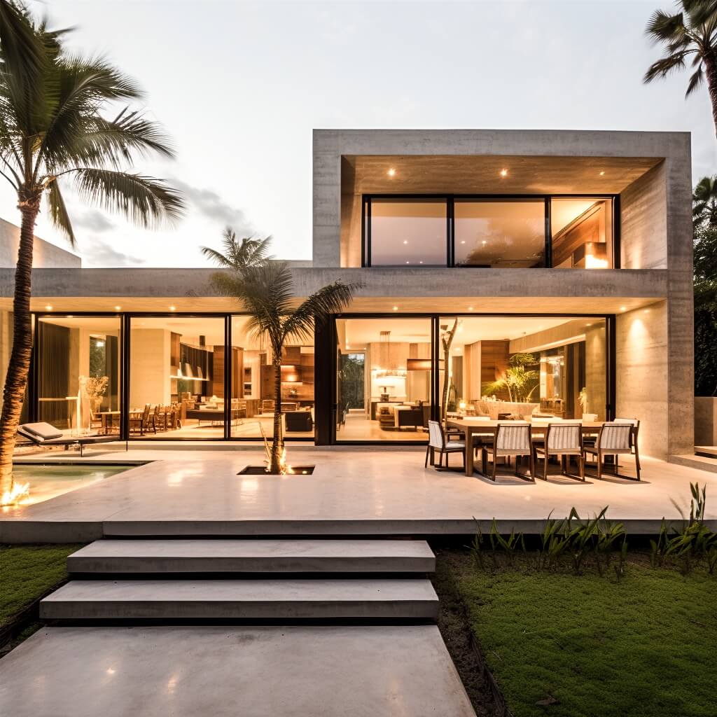
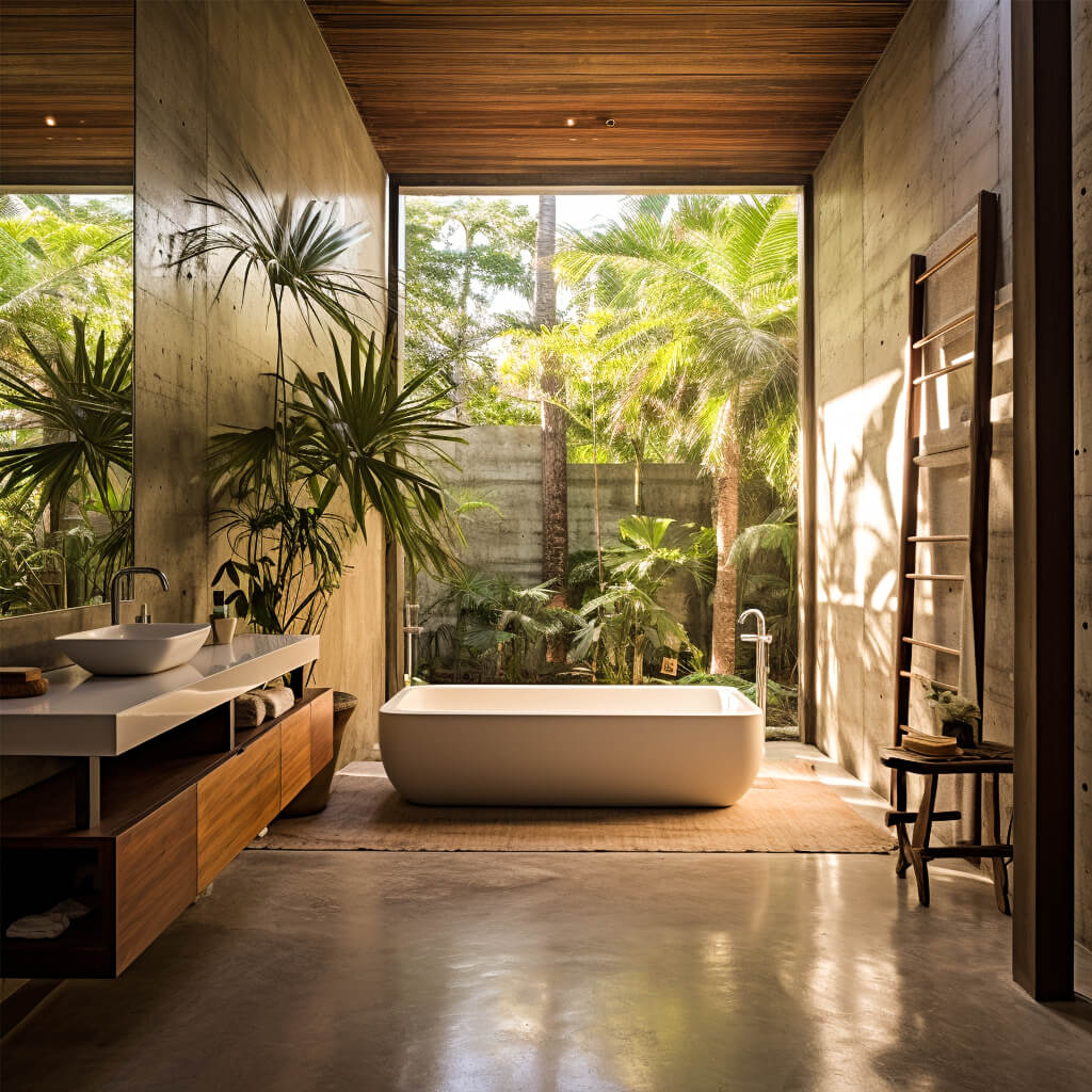
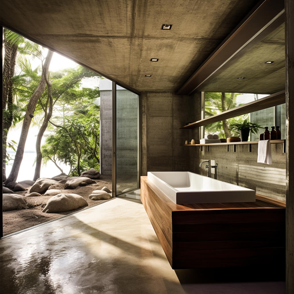
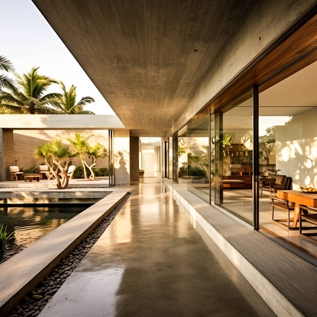
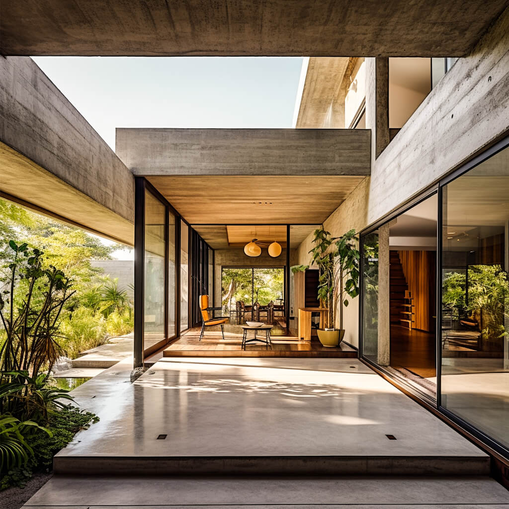
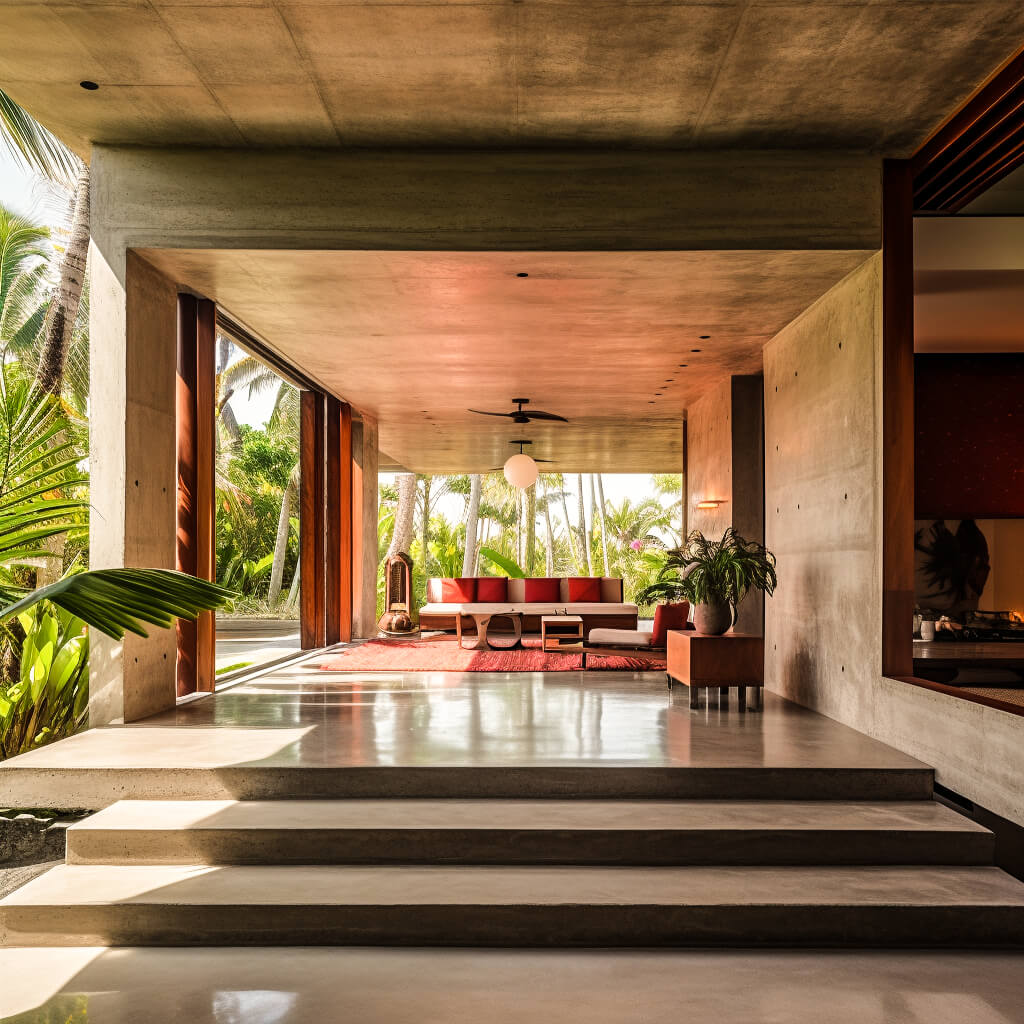
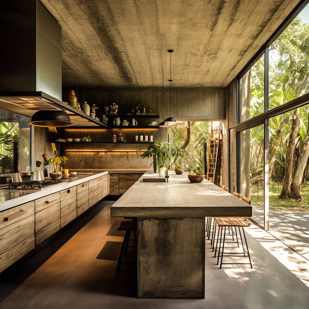
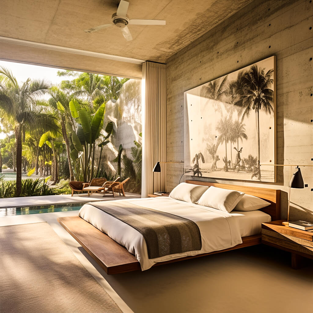
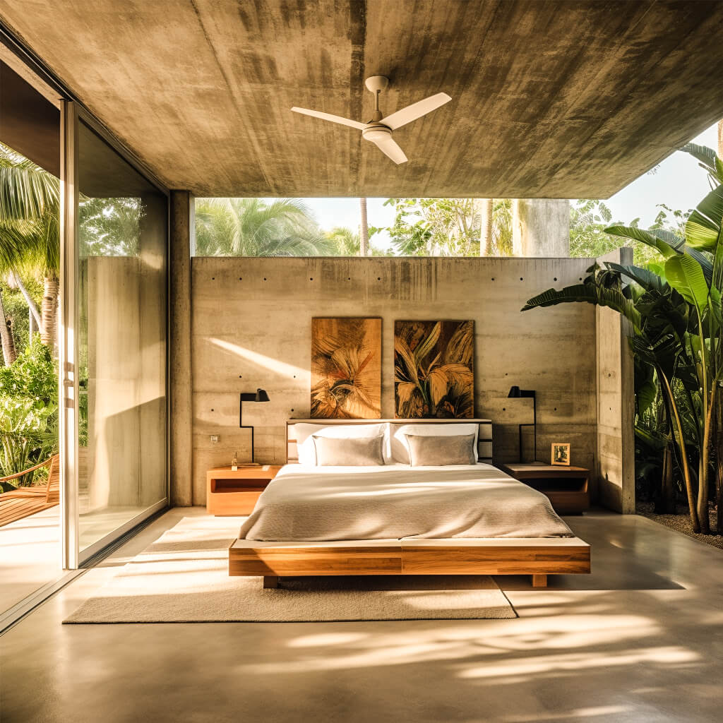
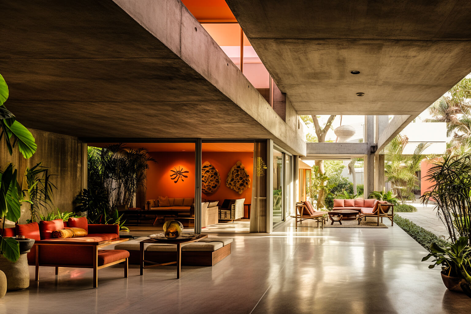
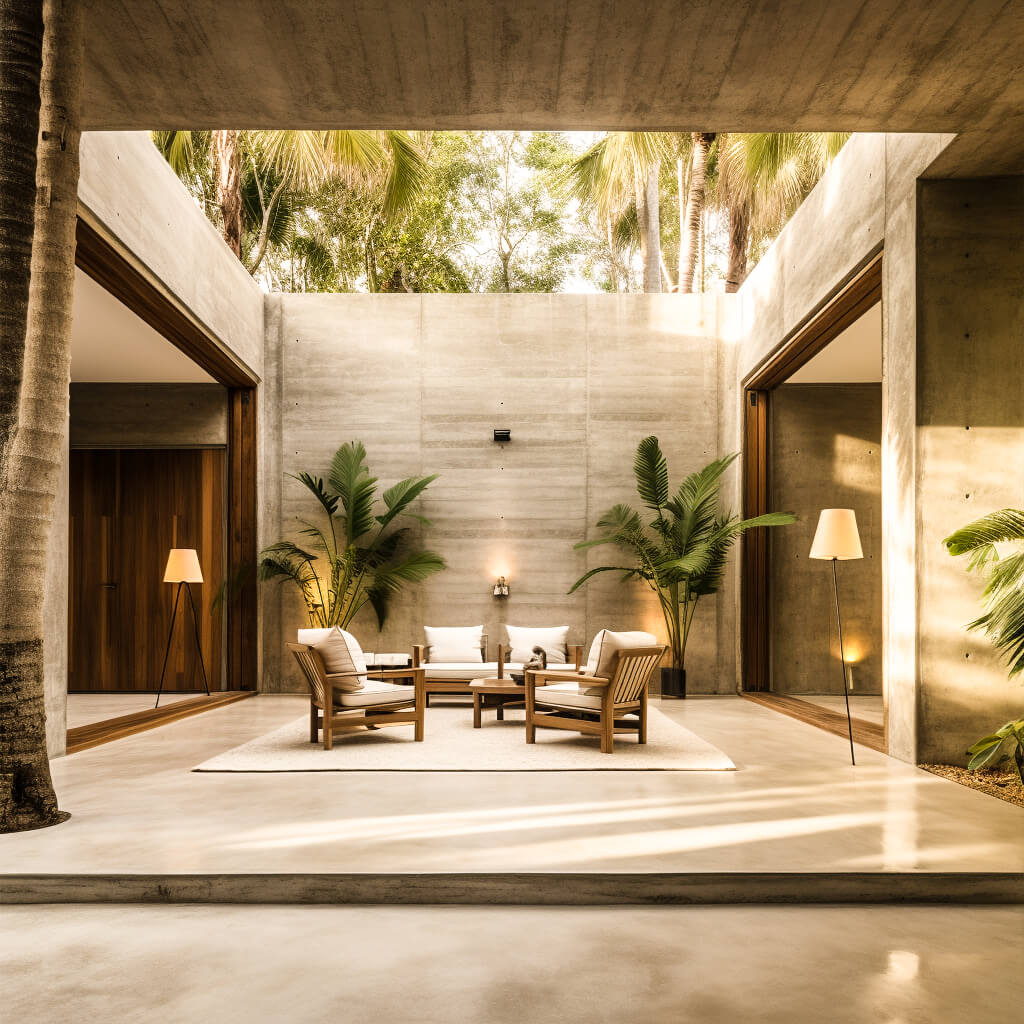
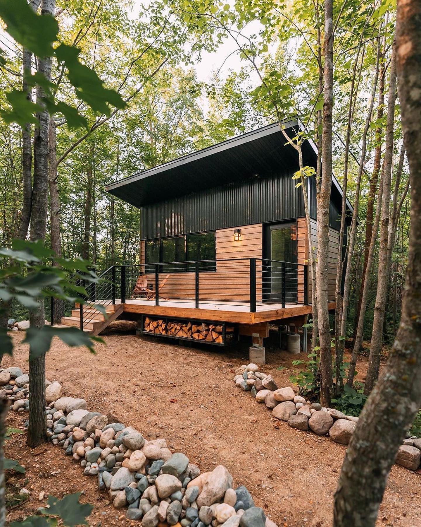
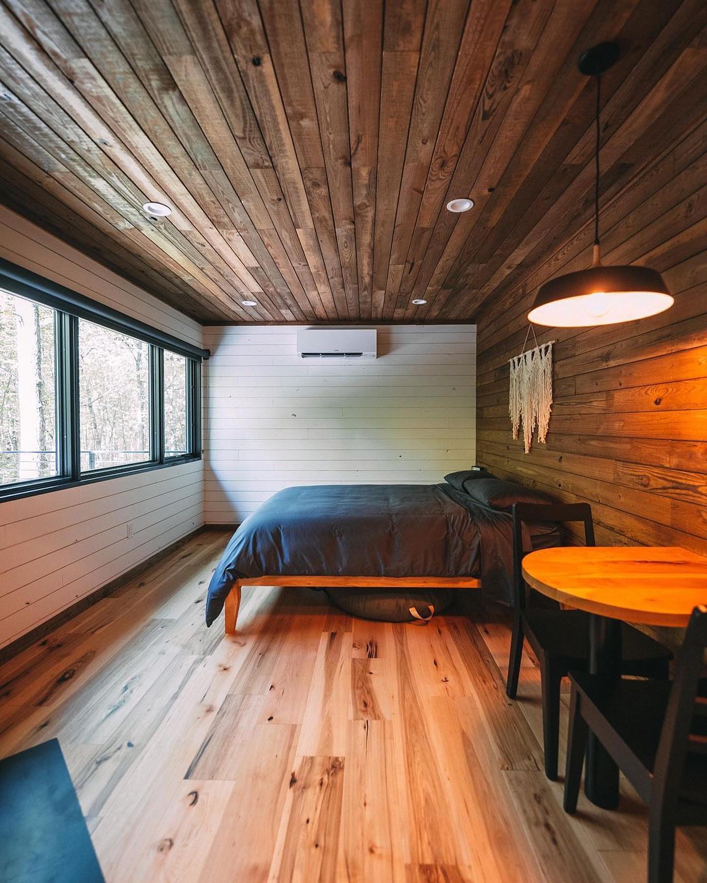
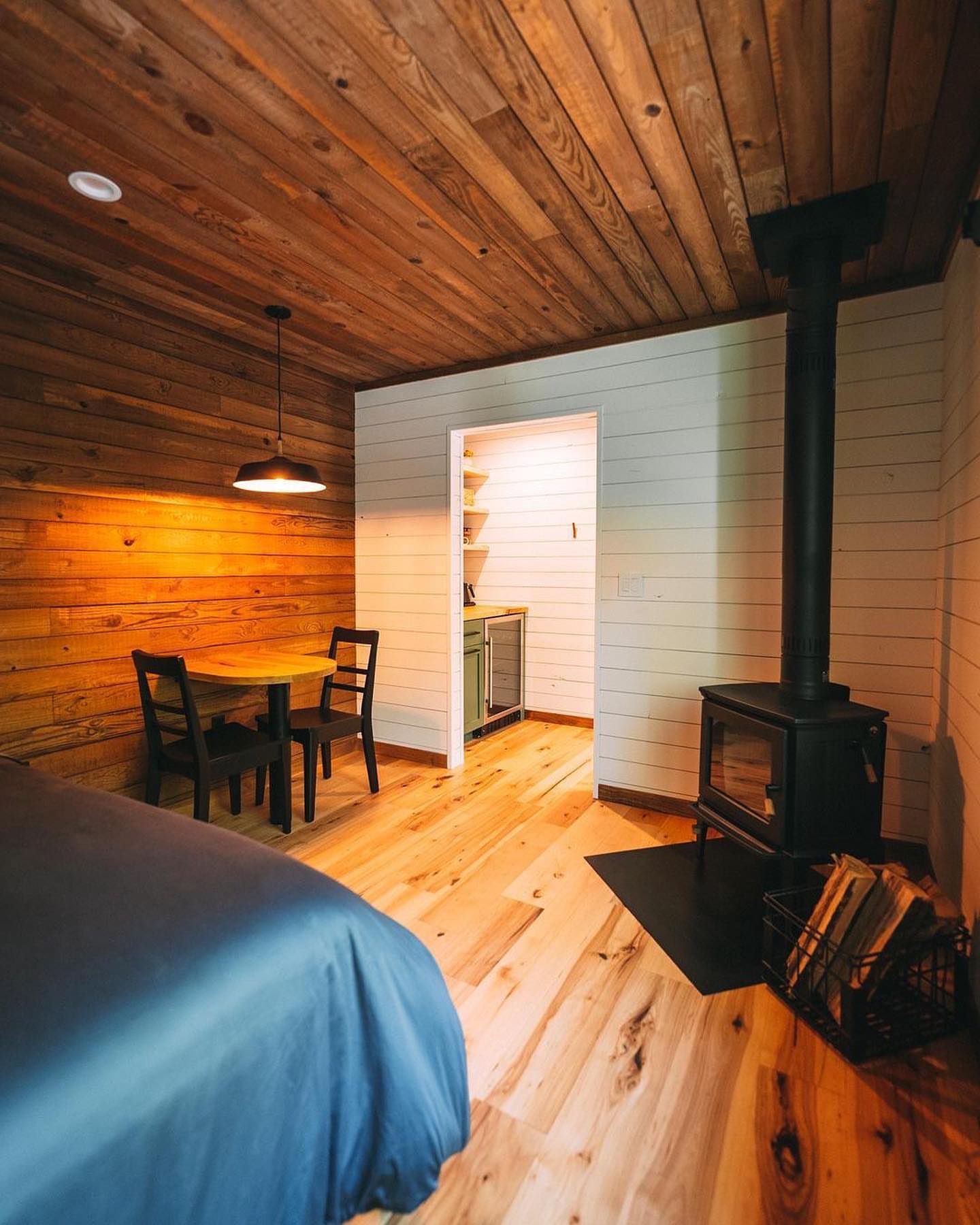
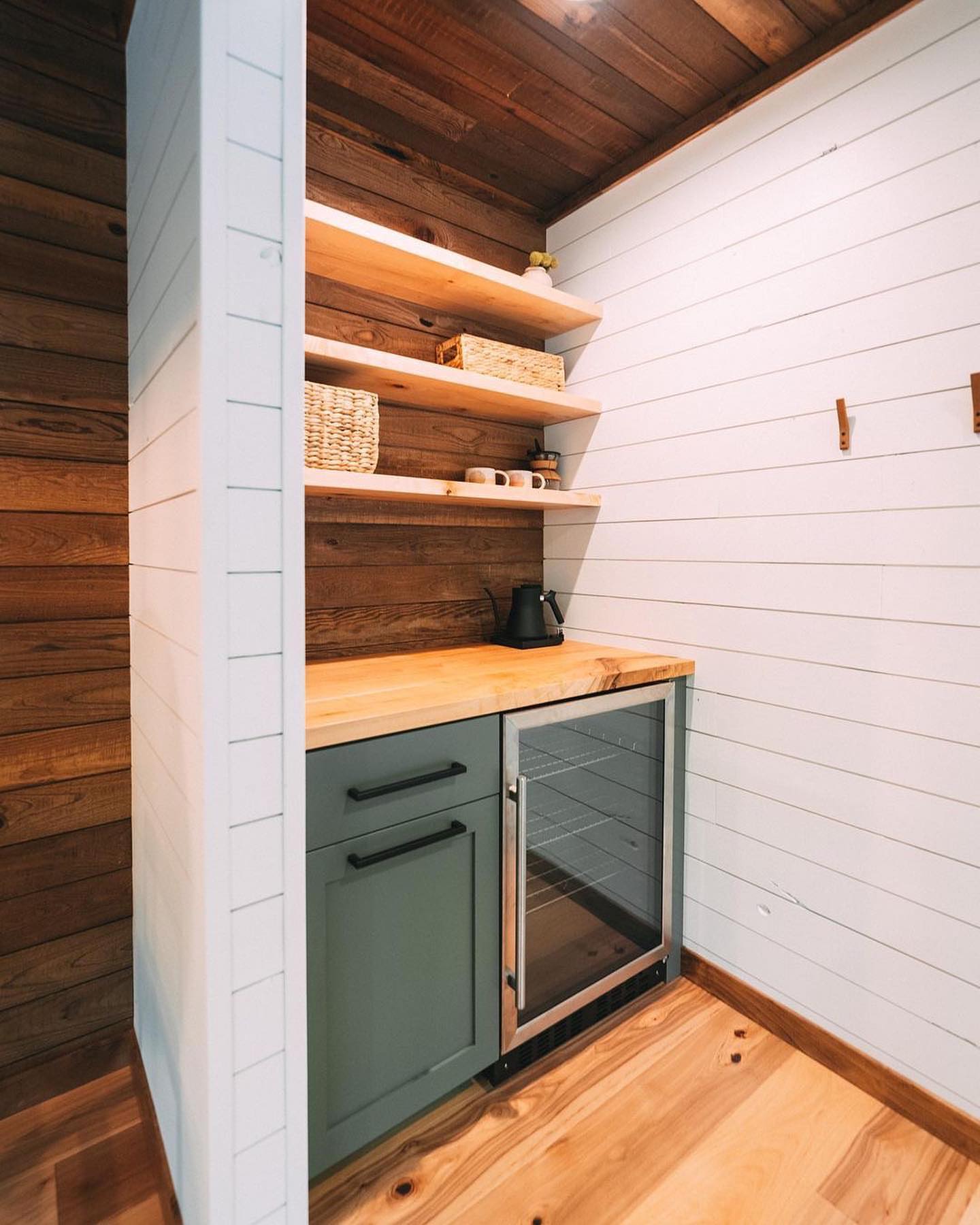
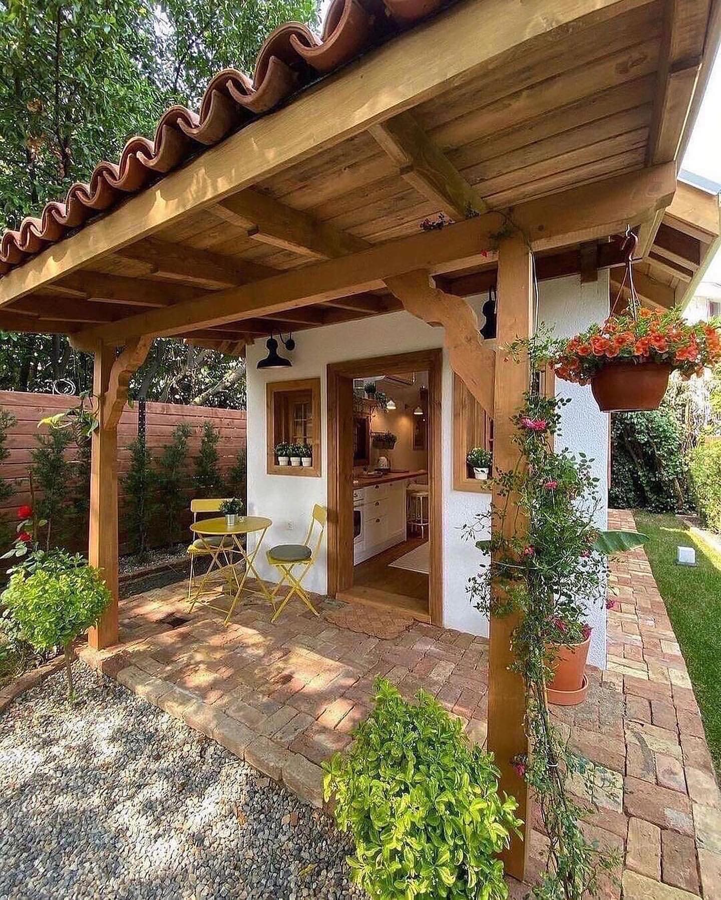
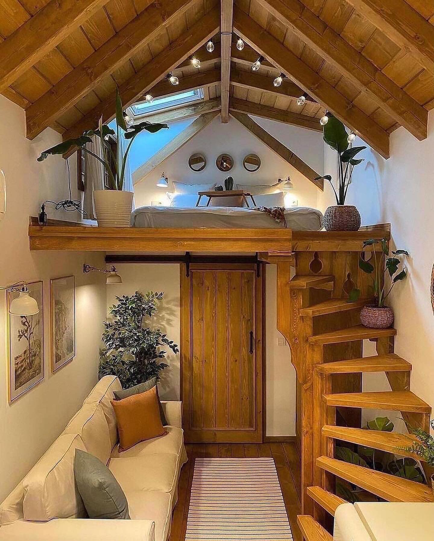
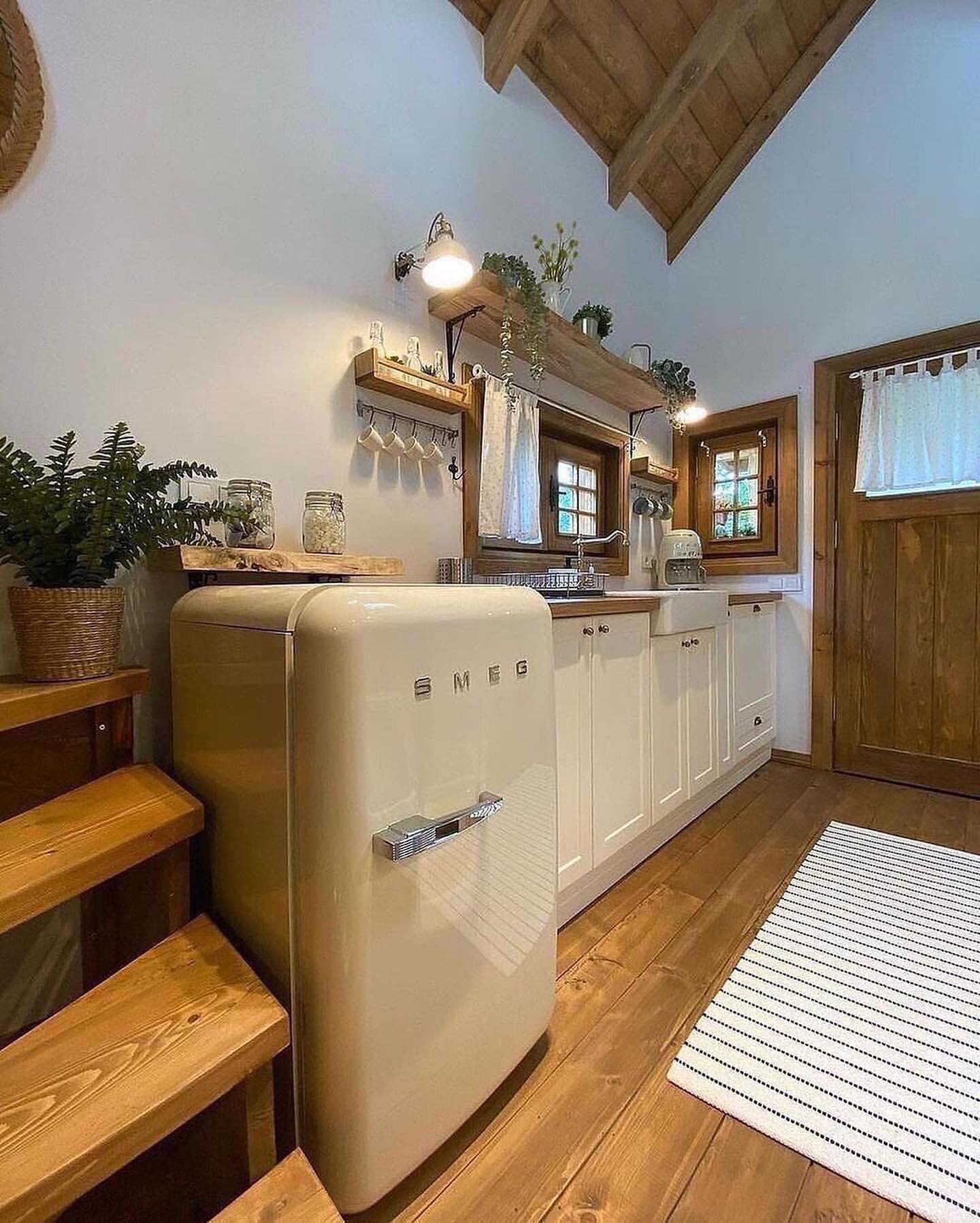
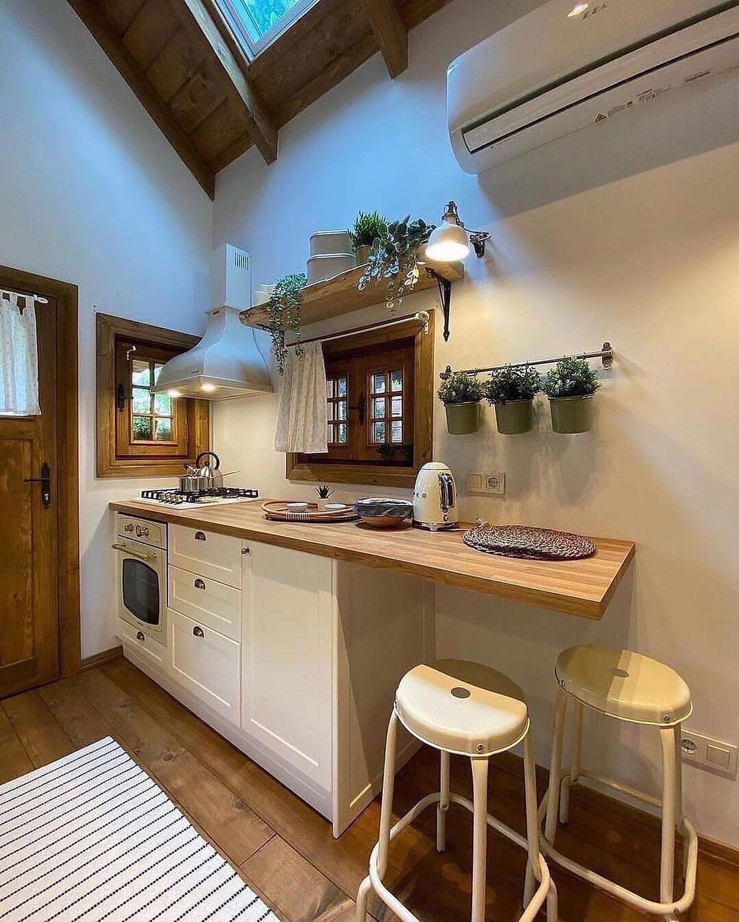
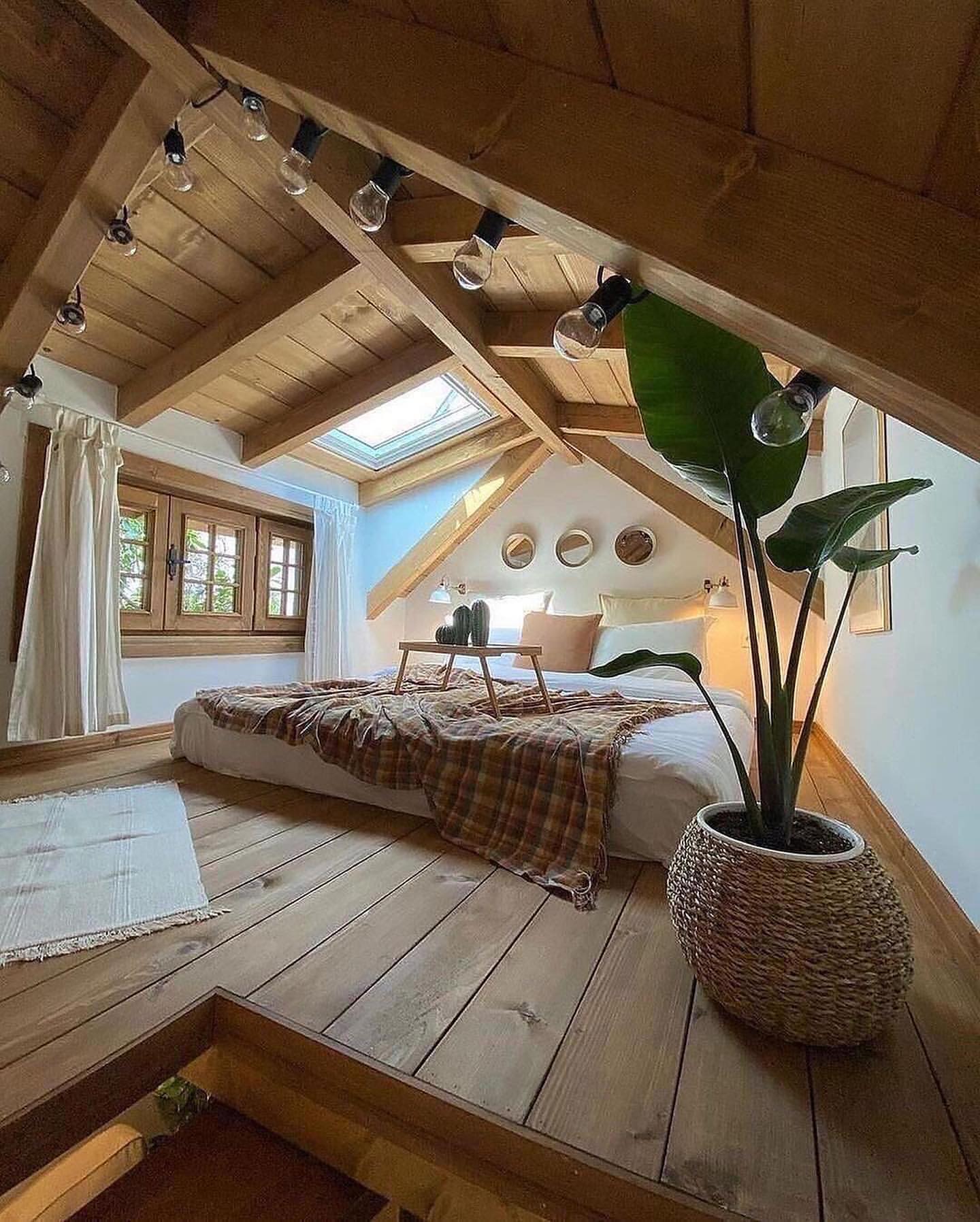
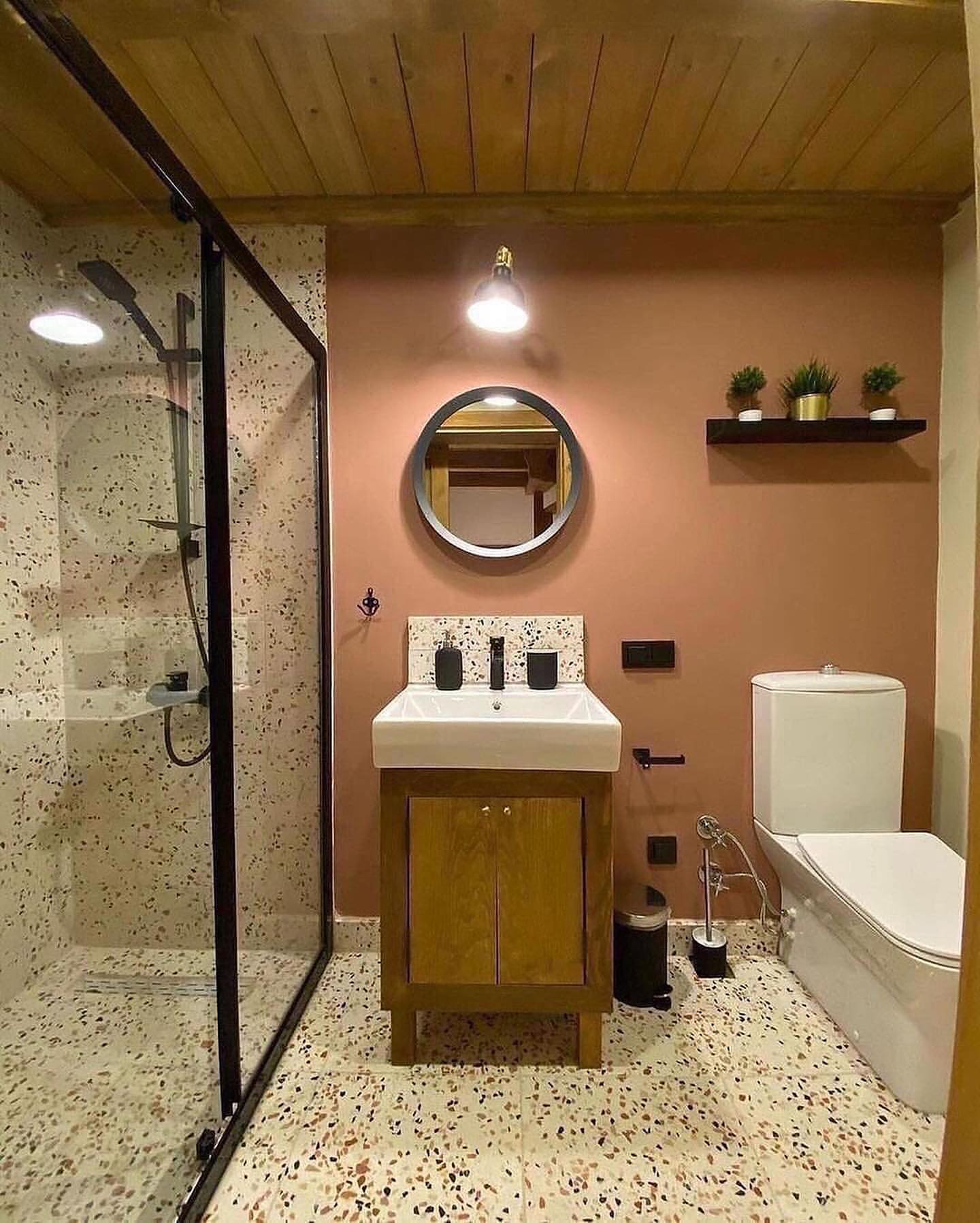
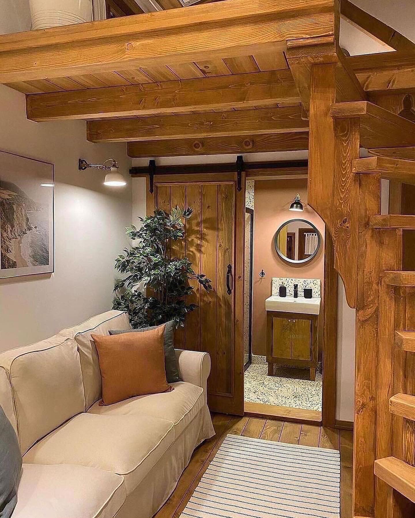
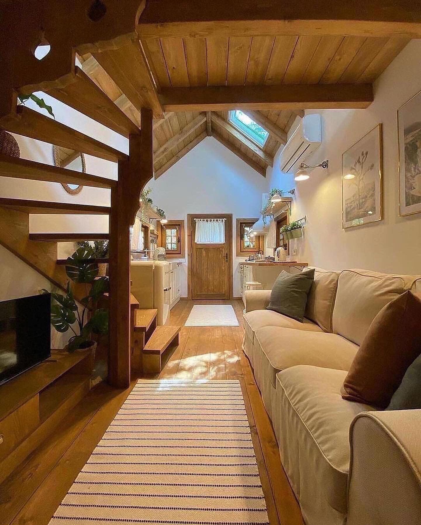
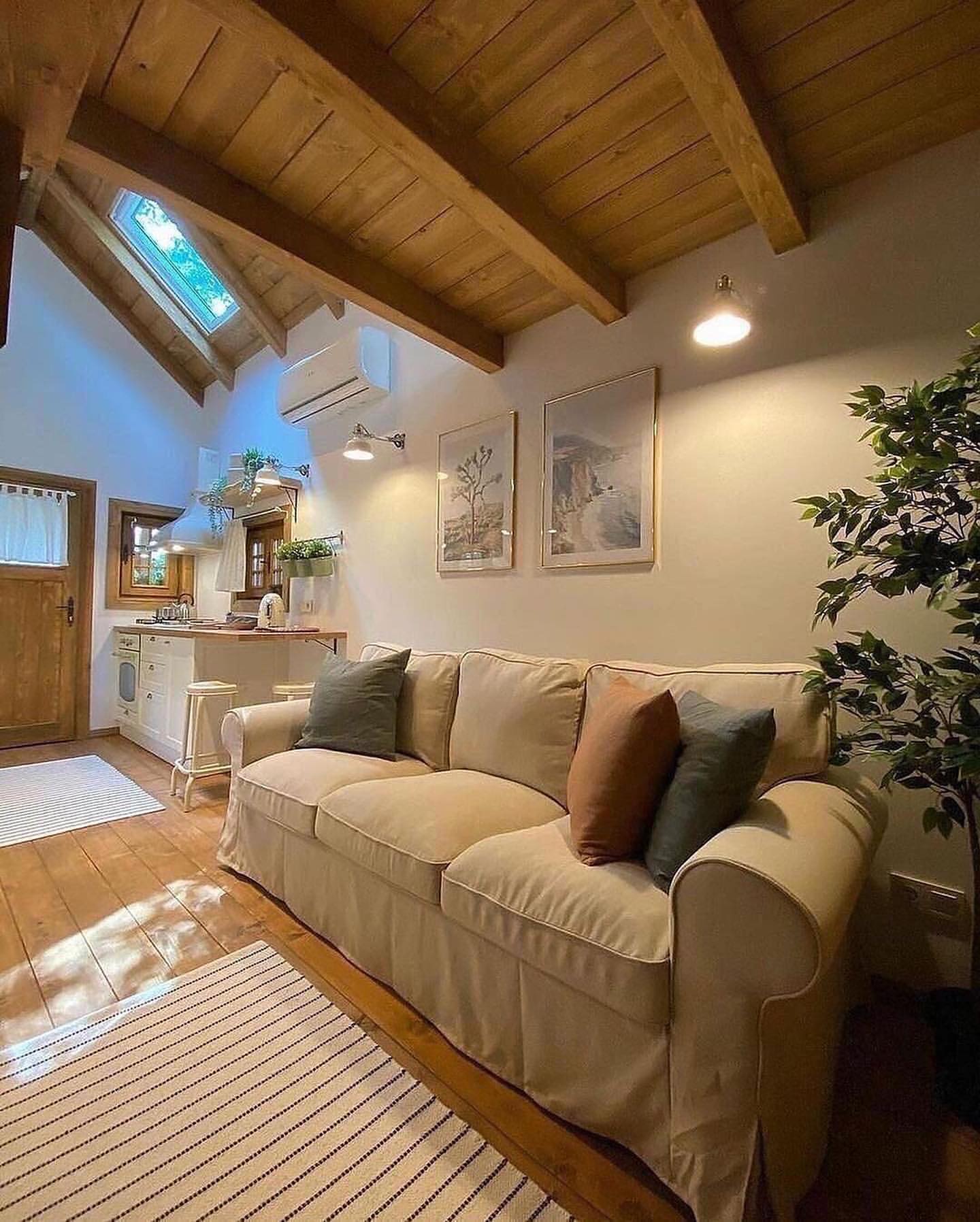
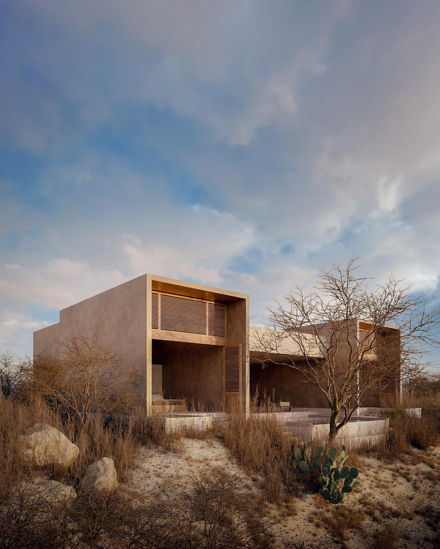
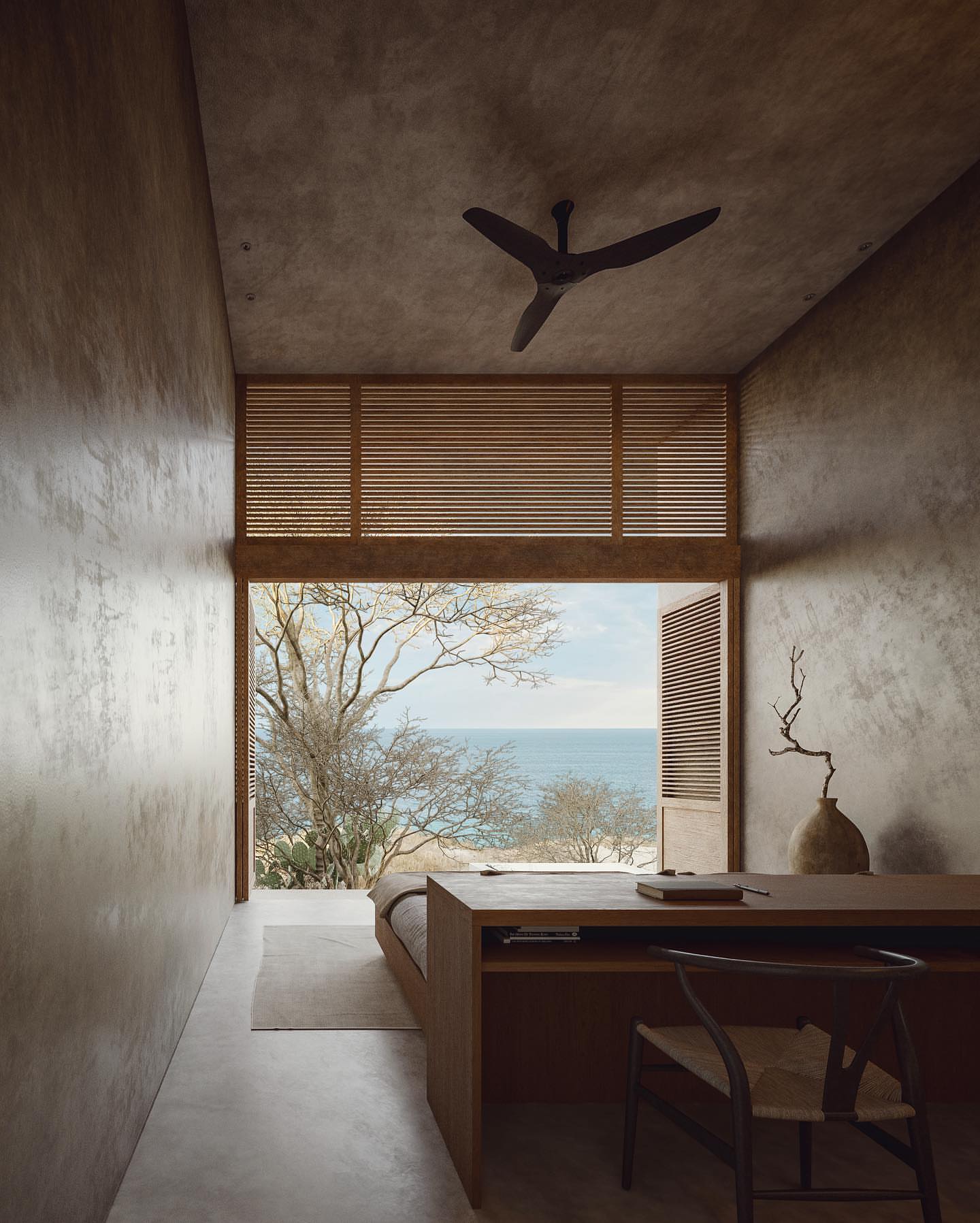
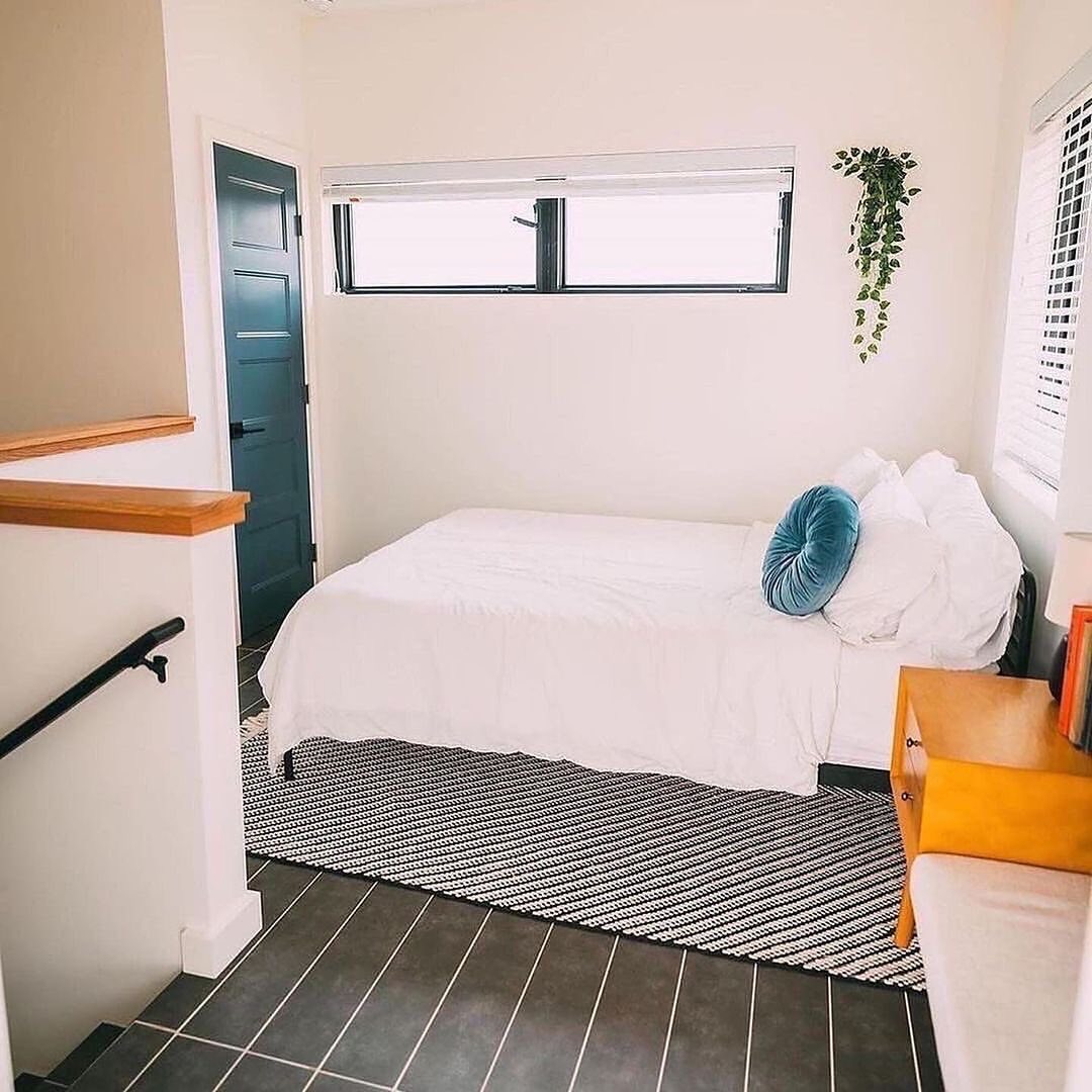
Located in San Miguel Allende, Mexico, Casa Dom by @tmasm.arquitectos, blends design, architecture, and nature, with double-height windows framing the serene surroundings. Its loft-style layout fosters simplicity and tranquility, while a well-equipped kitchen and comfortable living spaces offer relaxation. Upstairs, a king bedroom with an attached bathroom awaits. Outside, enjoy a wood and charcoal grill, fire pit, and hammock under mesquite and cactus trees. Unwind in the outdoor soaking tub, surrounded by a Buddhist Stupa promoting peace. At night, transform the front windows into a cinematic space with remote-controlled blinds.