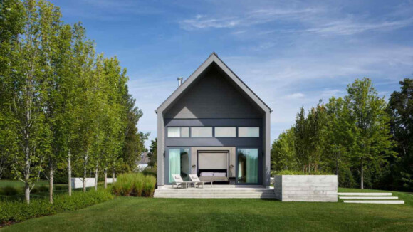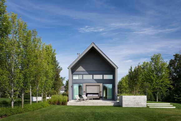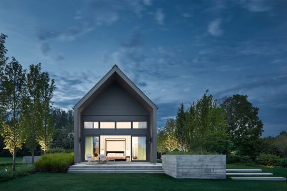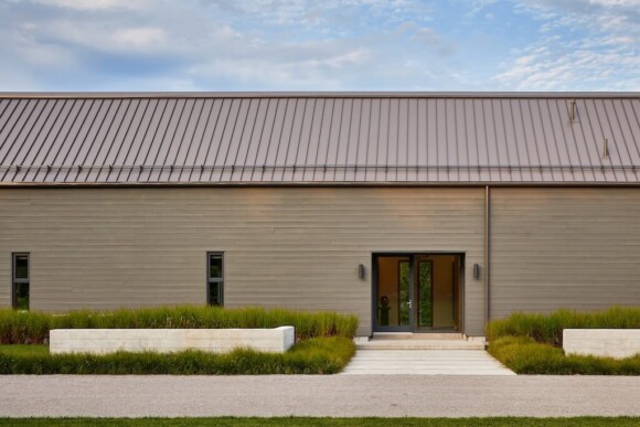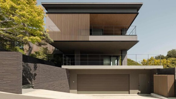
Linework Architecture: This project is a substantial remodel and addition to an unassuming 1940s single-family ranch in Northeast Seattlewith a focus on sustainability, durability, indoor-outdoor living, and generational flexibility.
Designed during the COVID quarantine, the family realized they needed to rethink how their home should function in the “new normal” and beyond. The owners wanted a house that would serve them now and into the future, no matter the shape of their family, requiring us to rethink how the traditional house is programmed and laid out.
PROBLEM SOLVING
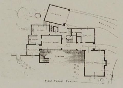
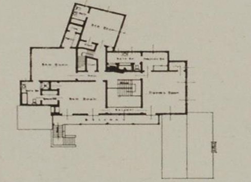
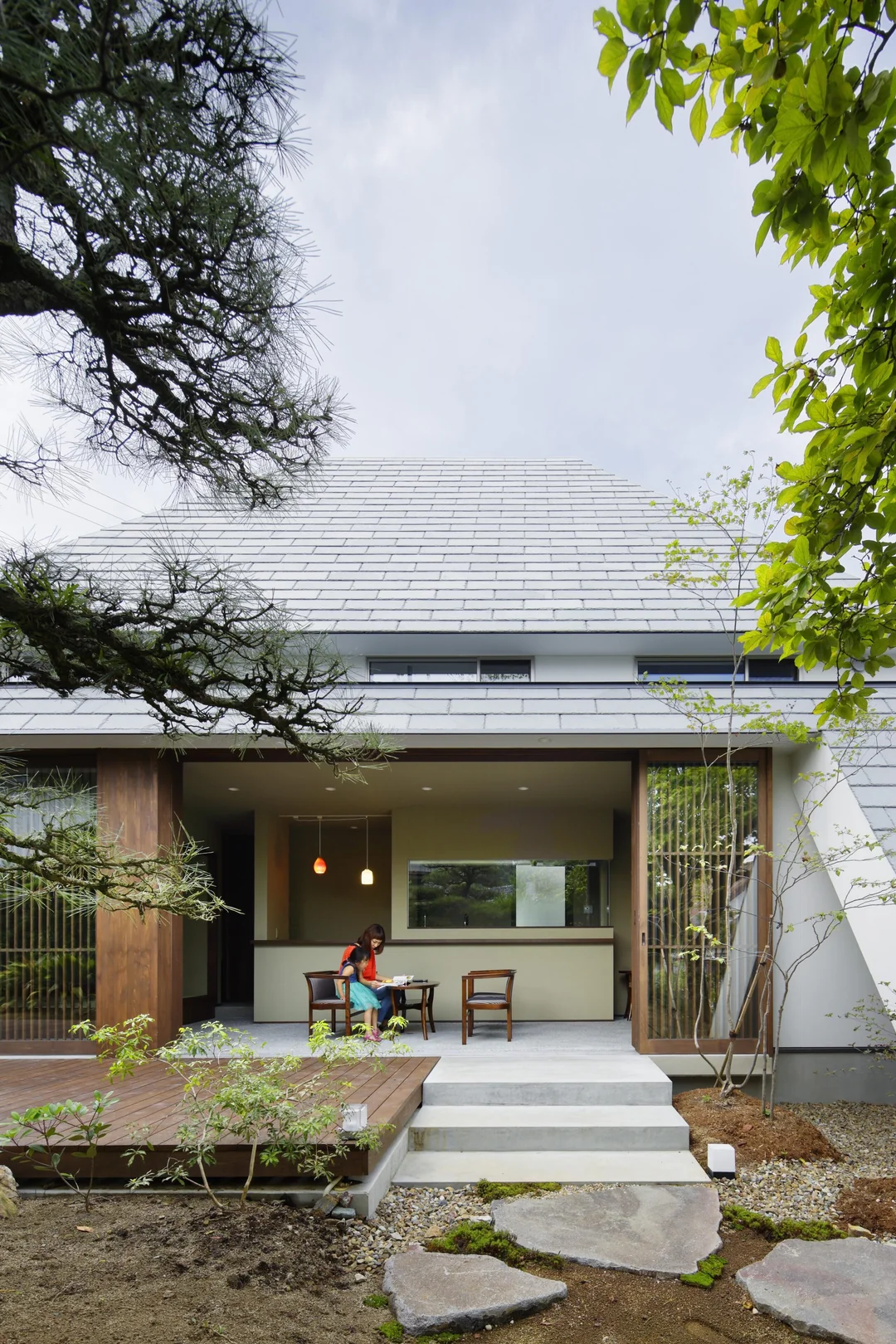
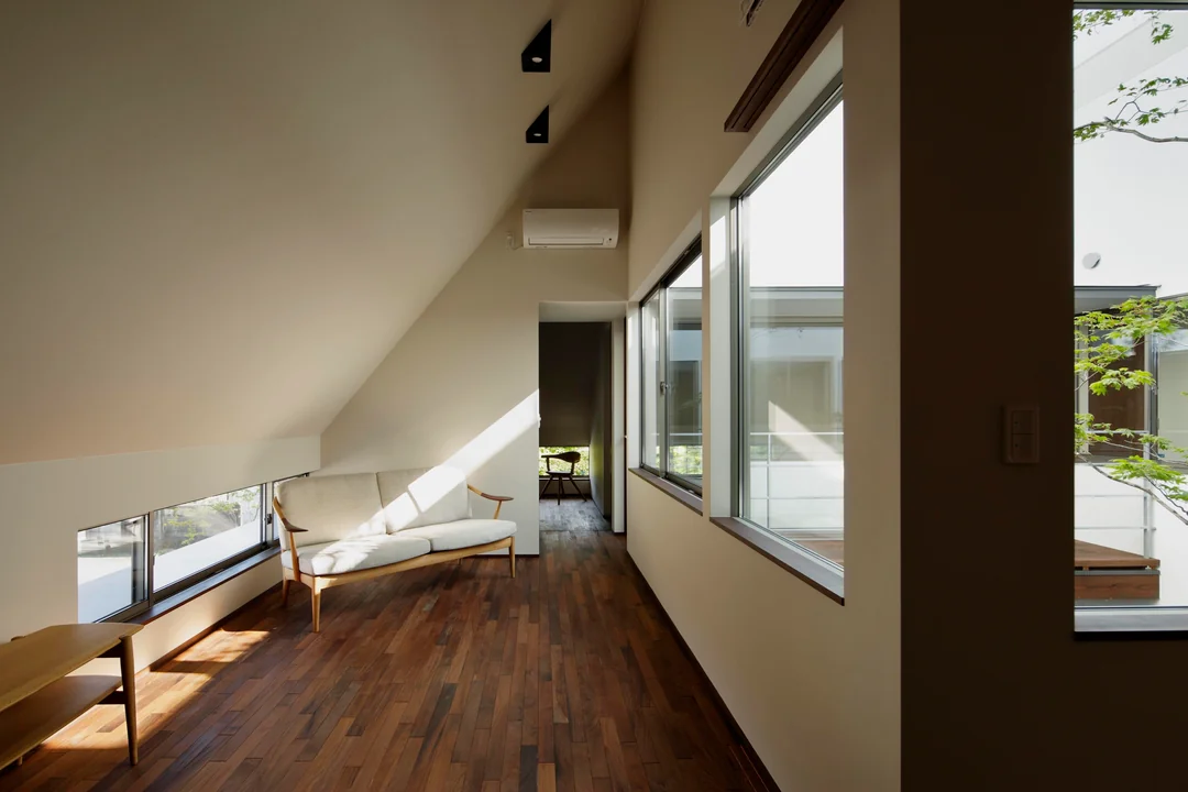
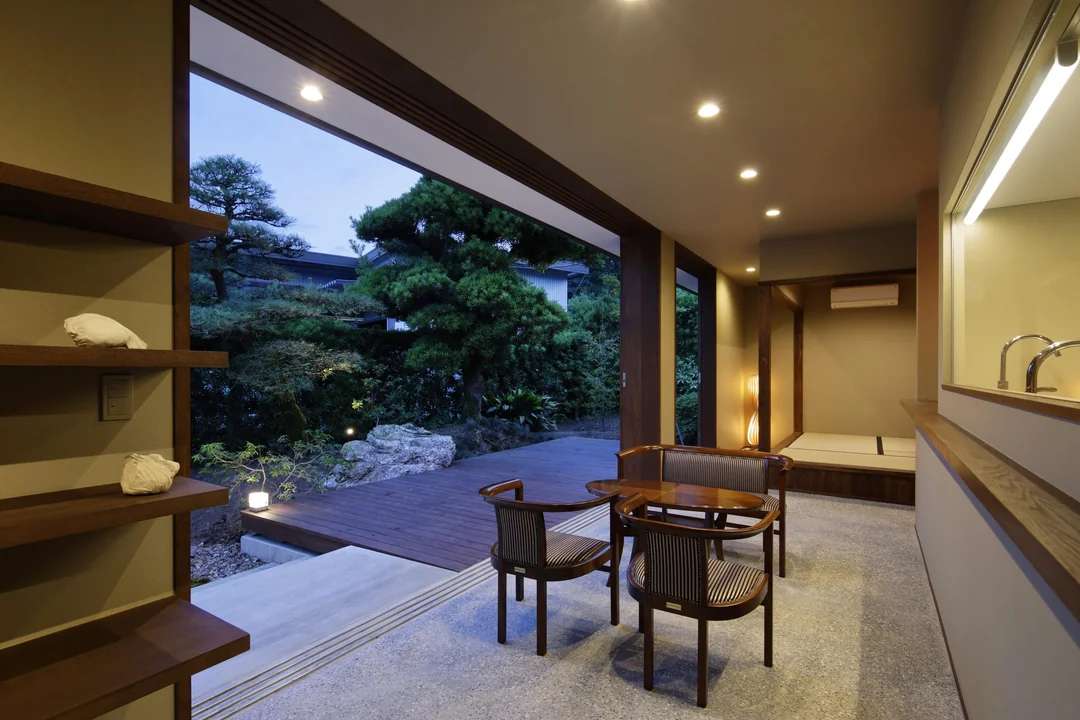
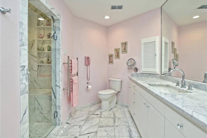
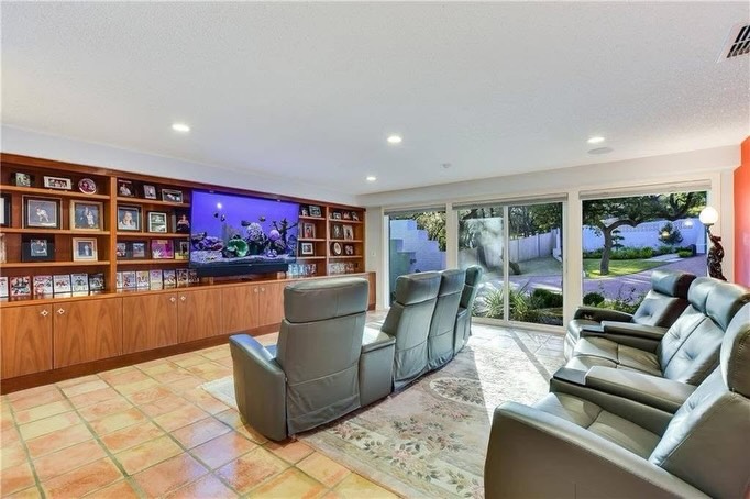
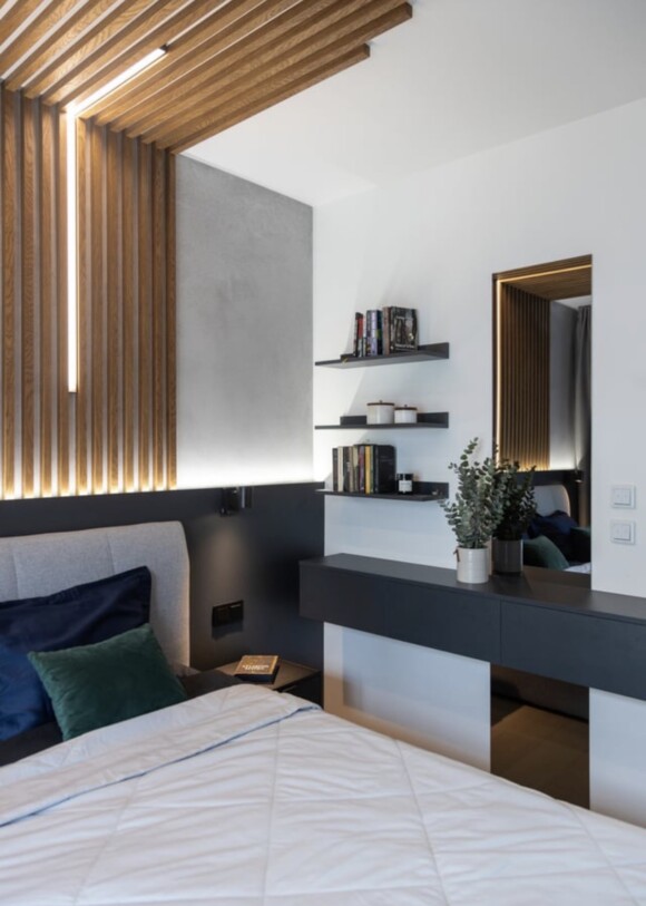
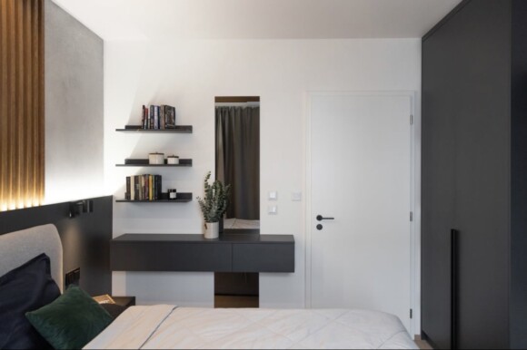
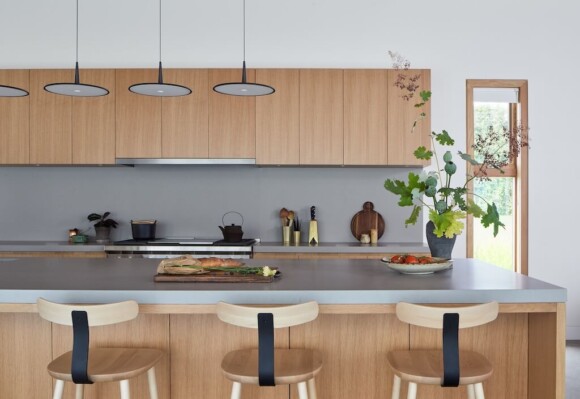
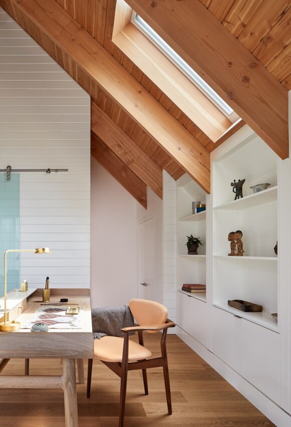
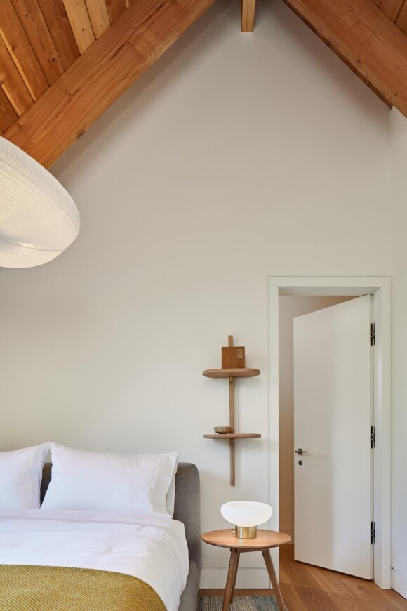
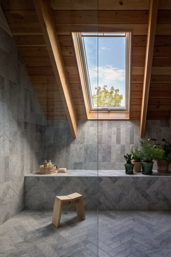
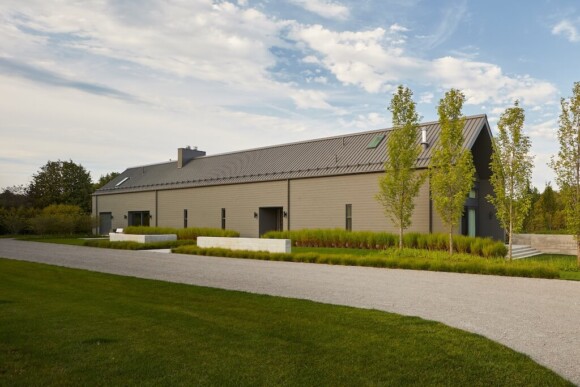
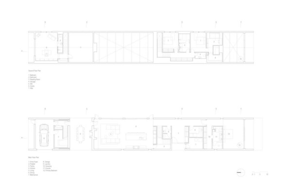
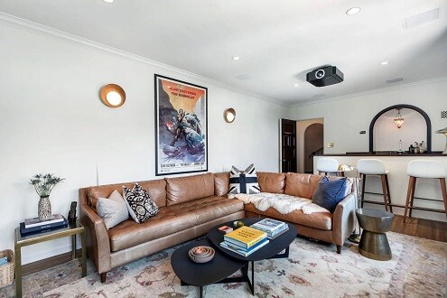
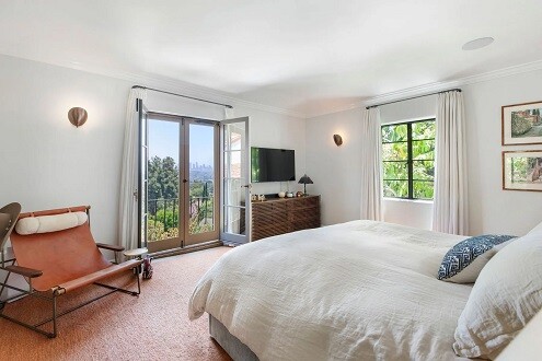
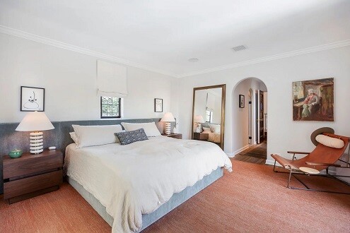
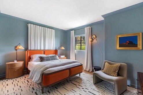
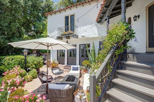
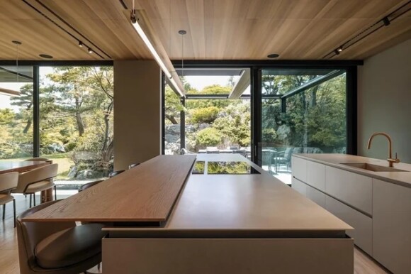
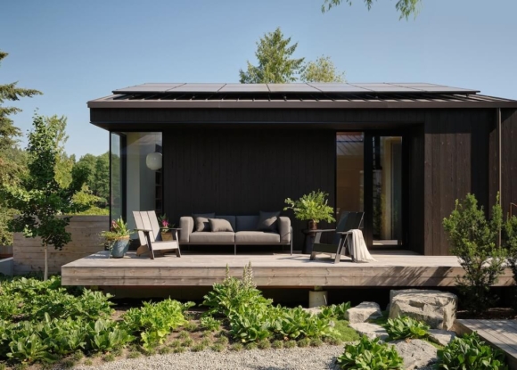
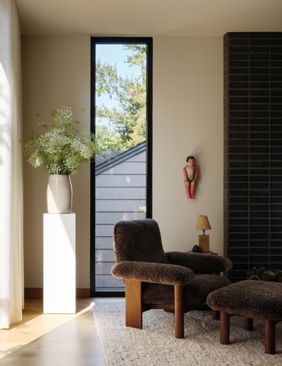
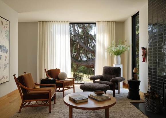
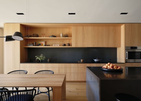
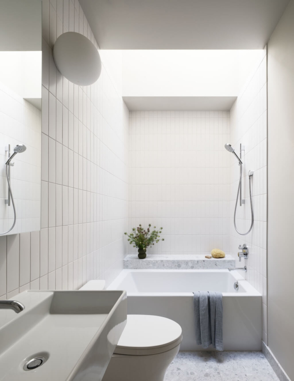
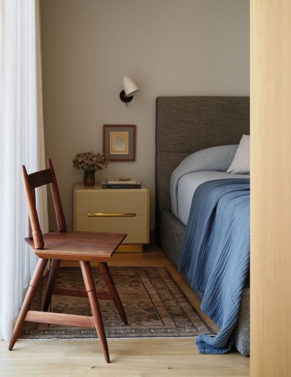
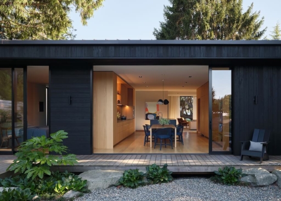
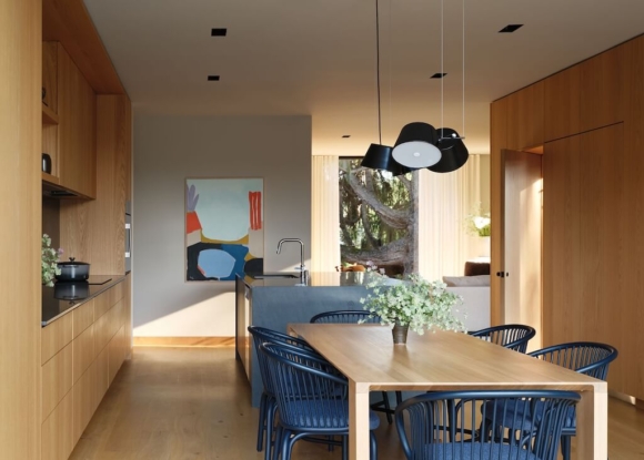
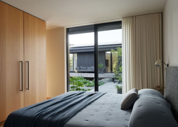
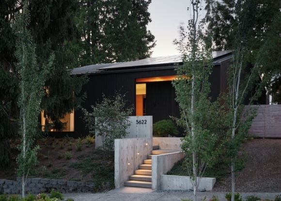
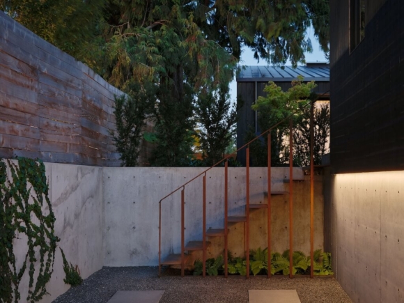
The main house was built on the existing foundation and extended to include a larger kitchen and primary bed and bath. A new garage/DADU was introduced at the rear (northern) lot line and is currently used as a family room above and a flexible work-space below, but could be re-programmed to meet the family’s needs as they change over time.
The new one house/two structure design serves up a multitude of readings. While it currently functions as one for a nuclear family, either structure can be self-sufficient as a rental but also have enough separation to finely balance independence and togetherness for an aging parent or the owner’s handicapped brother.
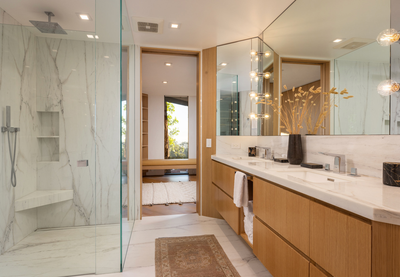
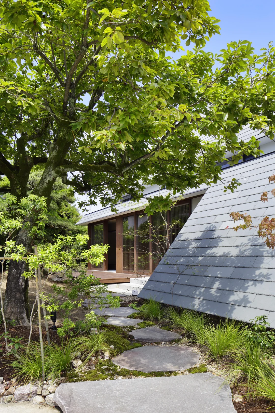
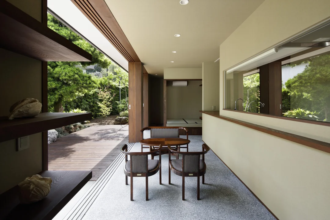
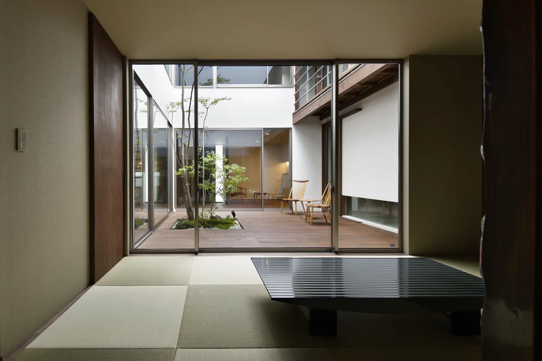
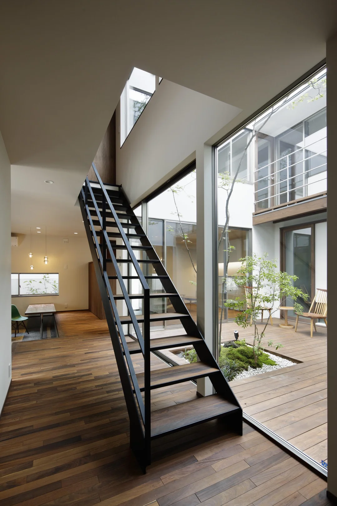
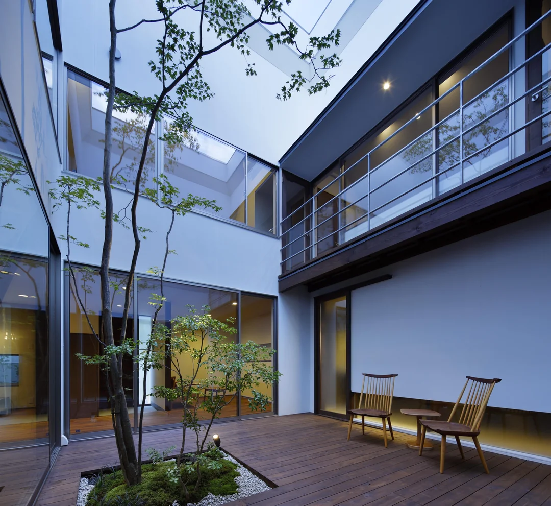
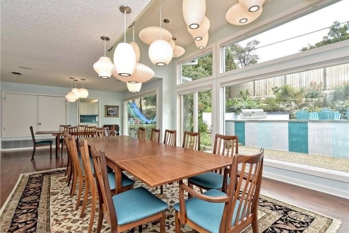
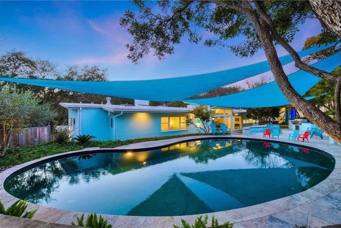
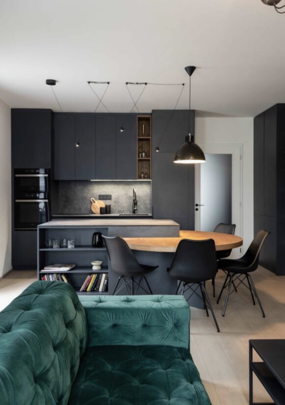
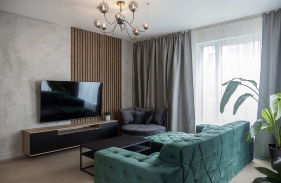
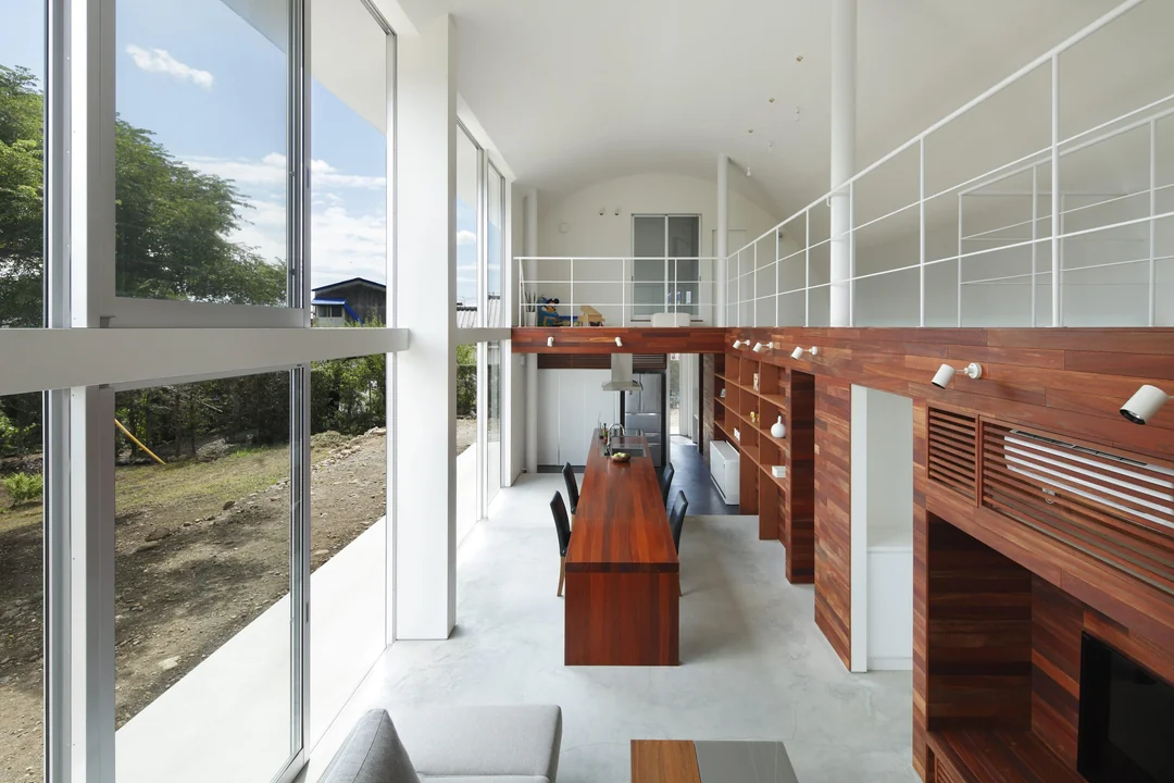
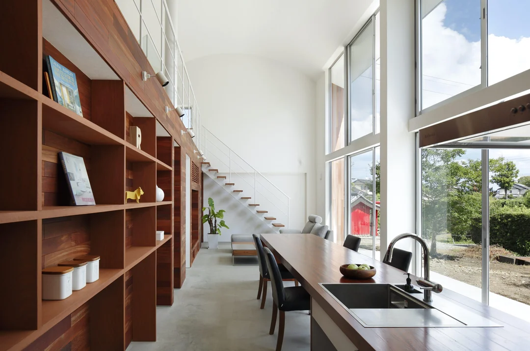
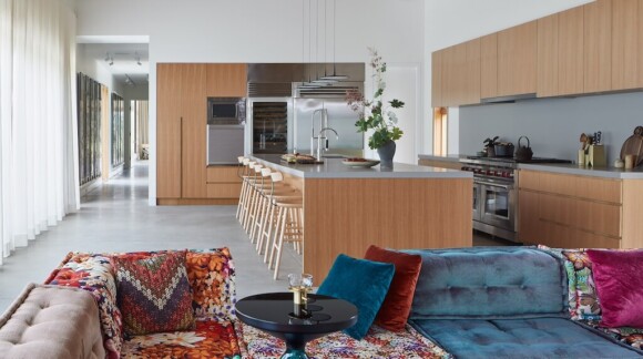
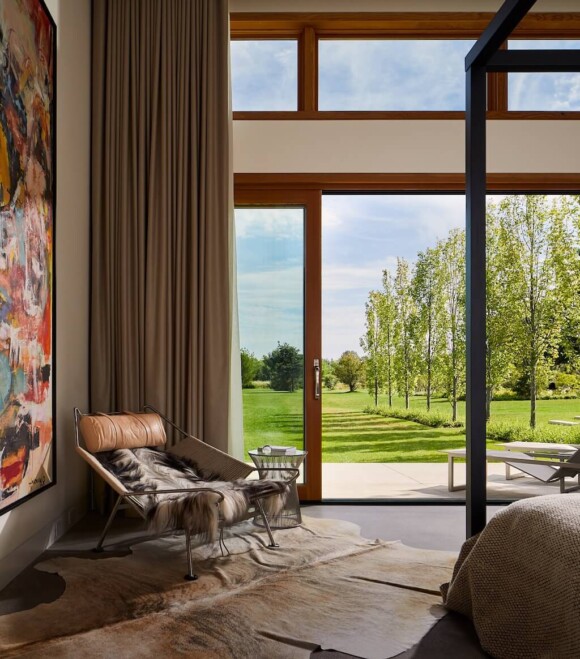
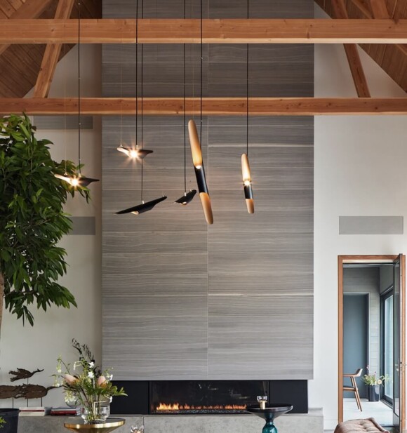
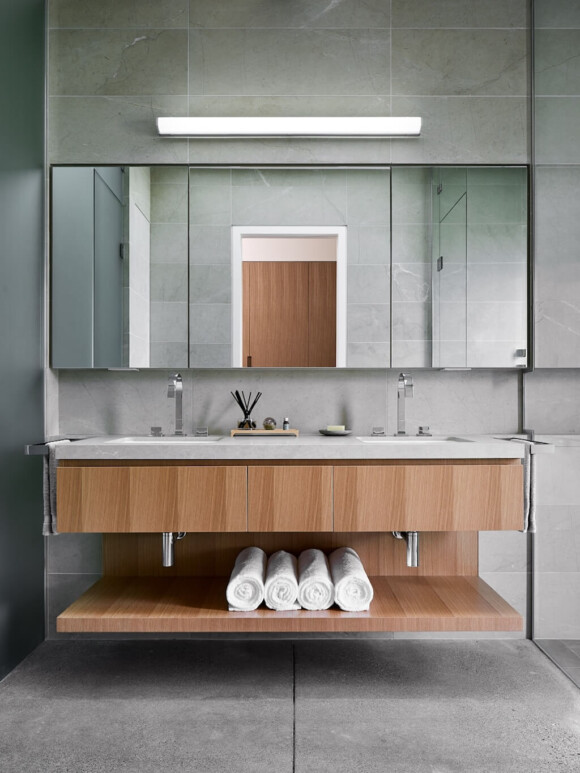
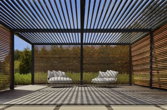
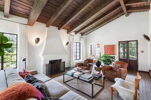
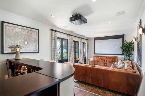
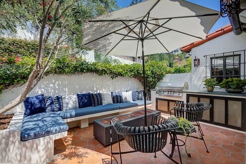
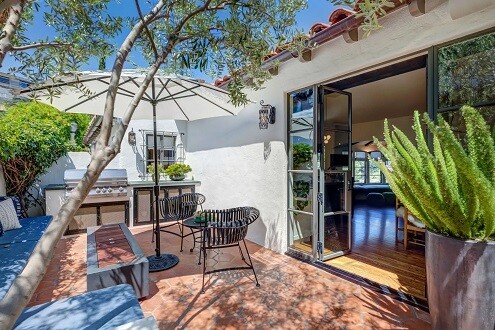
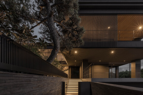
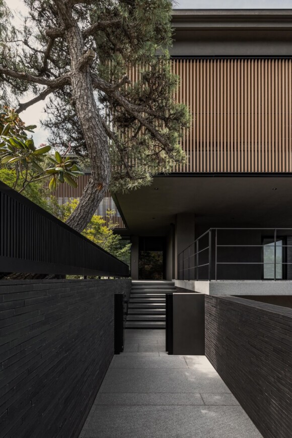
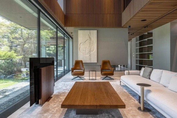
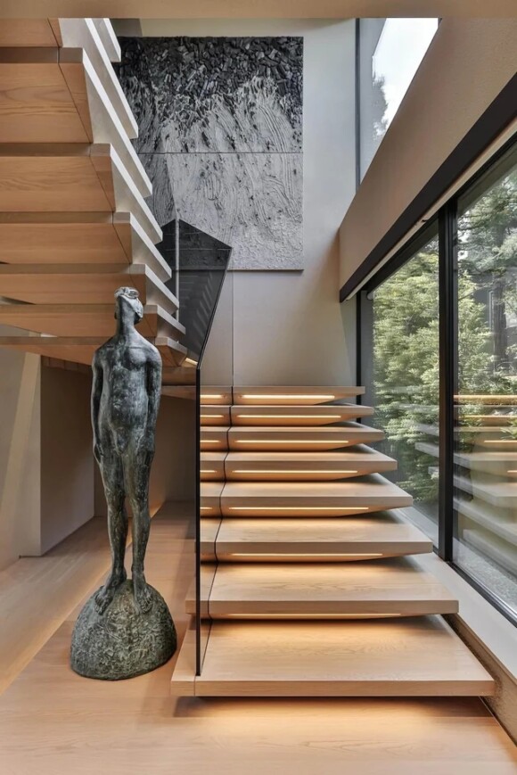
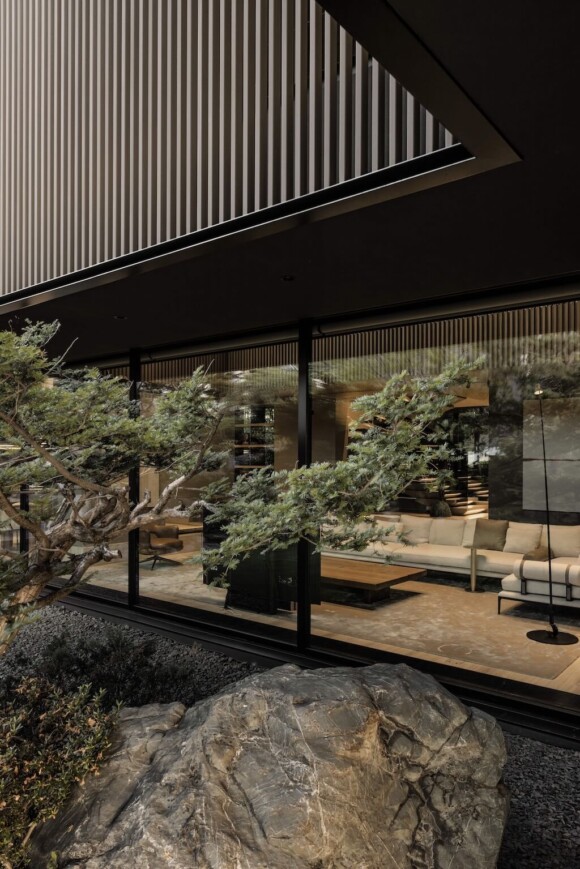
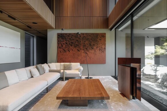
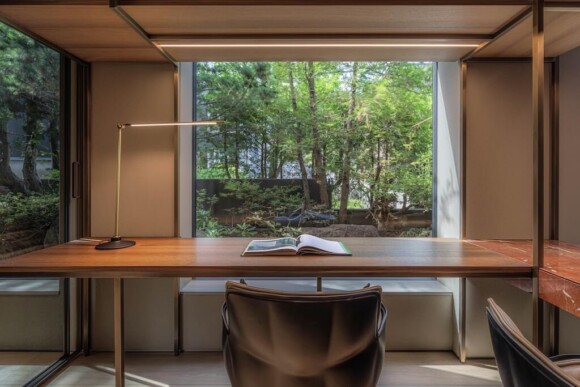
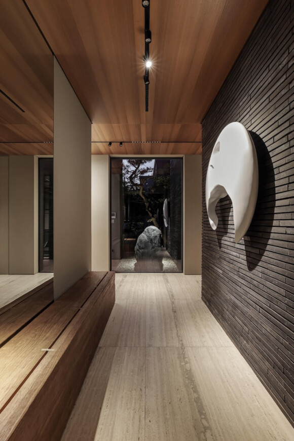
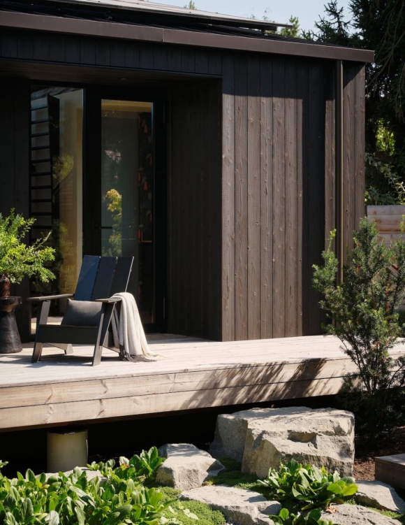
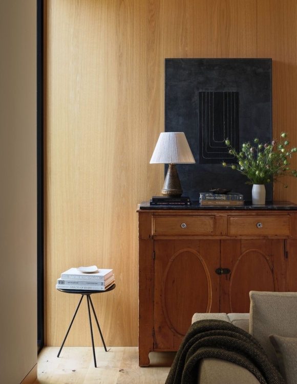
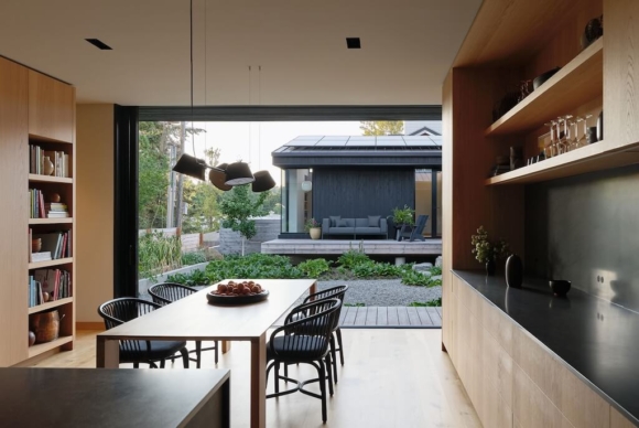
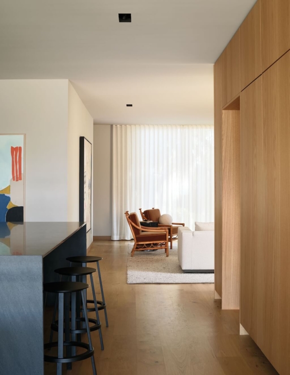
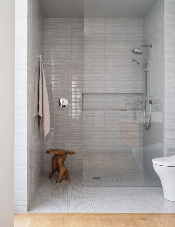
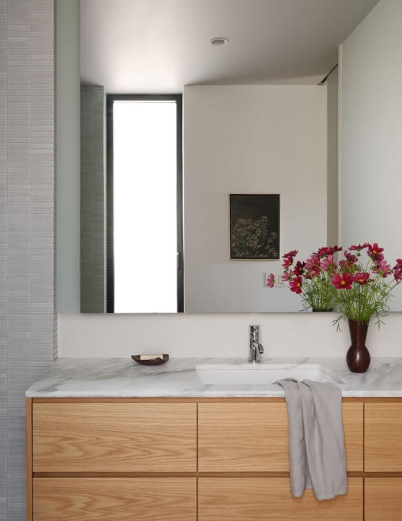
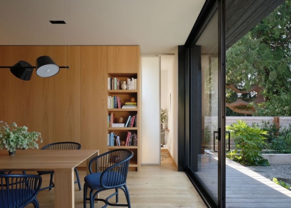
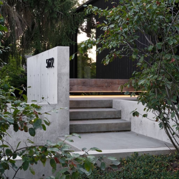
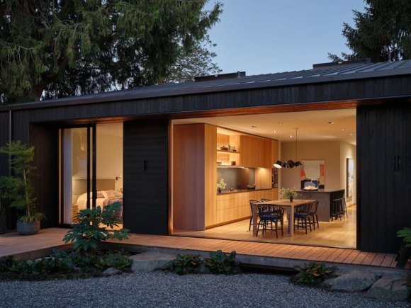
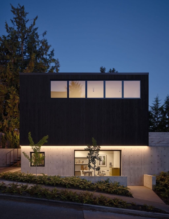
The 2,250-square-foot house is uniquely situated on a through-lot. While the original house and its neighbors had historically neglected the northern side, it became a defining opportunity to reconnect with the street and form a central garden court by placing the DADU at the rear of the property. Large sliding glass pocket doors open to the central garden court expanding the perceived interior volume and provide a seamless indoor-outdoor experience.
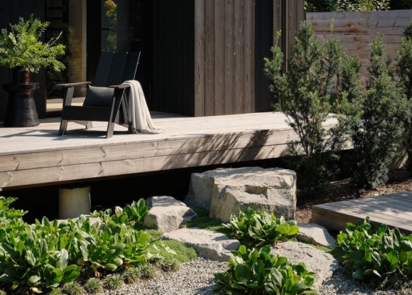
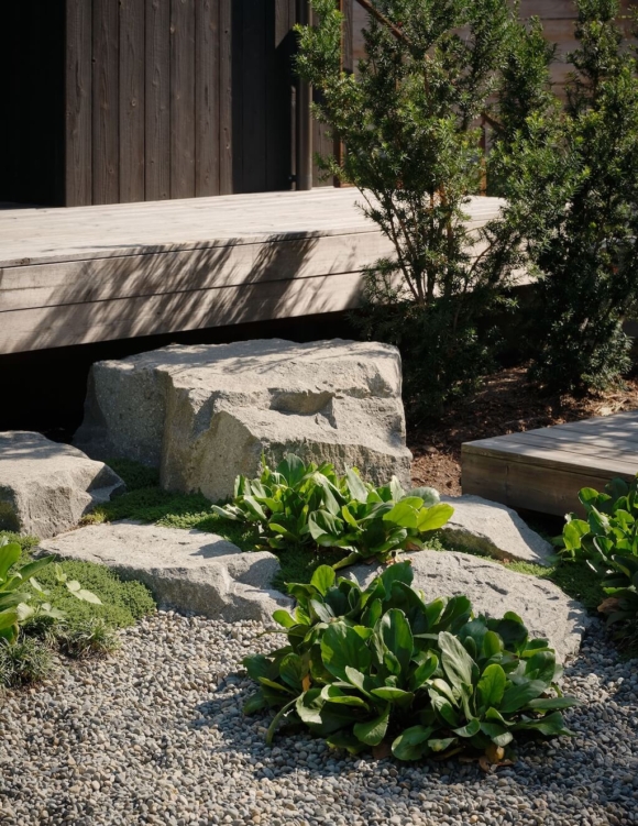
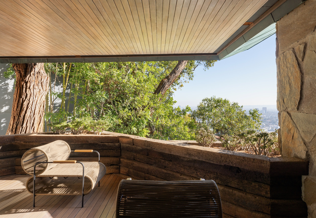
The flow and sequence of space was influenced by the owner’s experience living in a Japanese temple complex, where spaces relate and connect to each other through a common courtyard and garden. The functions were intentionally distributed between the two buildings, pushing the occupants outside and connecting them with nature.
The owners were not interested in formal certification but sought to make the house as sustainable as the budget allowed. The house was converted to 100% electrical with a 15kW solar array, and both buildings are conditioned and heat water by heat pump. The main house is ventilated with an HRV. The exterior envelope is clad in exterior insulation, thermally treated wood requiring no recoating, and the windows are U-0.23. On a holistic level, the home is built small—the house is only 1600 square feet, and the DADU adds another 650 square feet. Together, these moves reduce the net energy use to a verified 3,800 kWh per year, or a 73% reduction from the national average.
Efficiency isn’t all or nothing. By building small, building durably, and integrating sustainability features where possible, the result is a design that dramatically reduces the building’s lifetime carbon cost. Most clients do not have the appetite nor the budget for PHI certification or Living Building Challenge, yet there are still opportunities to make a huge difference when
these measures are applied incrementally and across a portfolio of work.

[source]
1 comments