
A little over a year ago when I first started playing around with ChatGPT, I thew several of my sketches and paintings into it with the simple instruction, “Make photorealistic.” I was amazed at the results, even though a few images took dozens of iterations and never reallly did come out the way I intended (ahem, The Hitchhiker) At the time ChatCPT very much had a mind of its own and decided how my work should look, not how I wanted it to look.
Well, several generations later things have gotten better. It leaves things pretty much as they were in the original but—as I instructed—makes them more photorealistic.
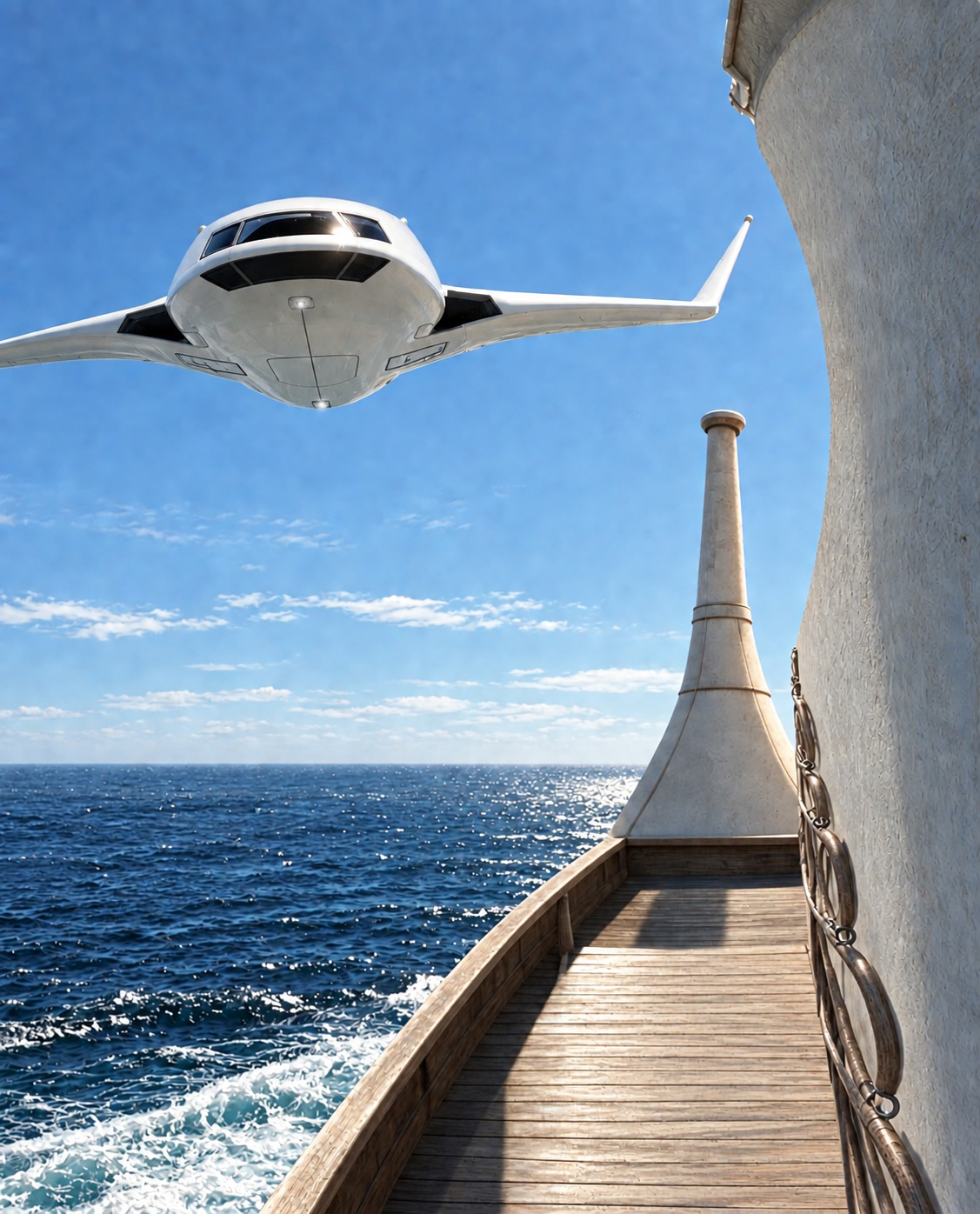
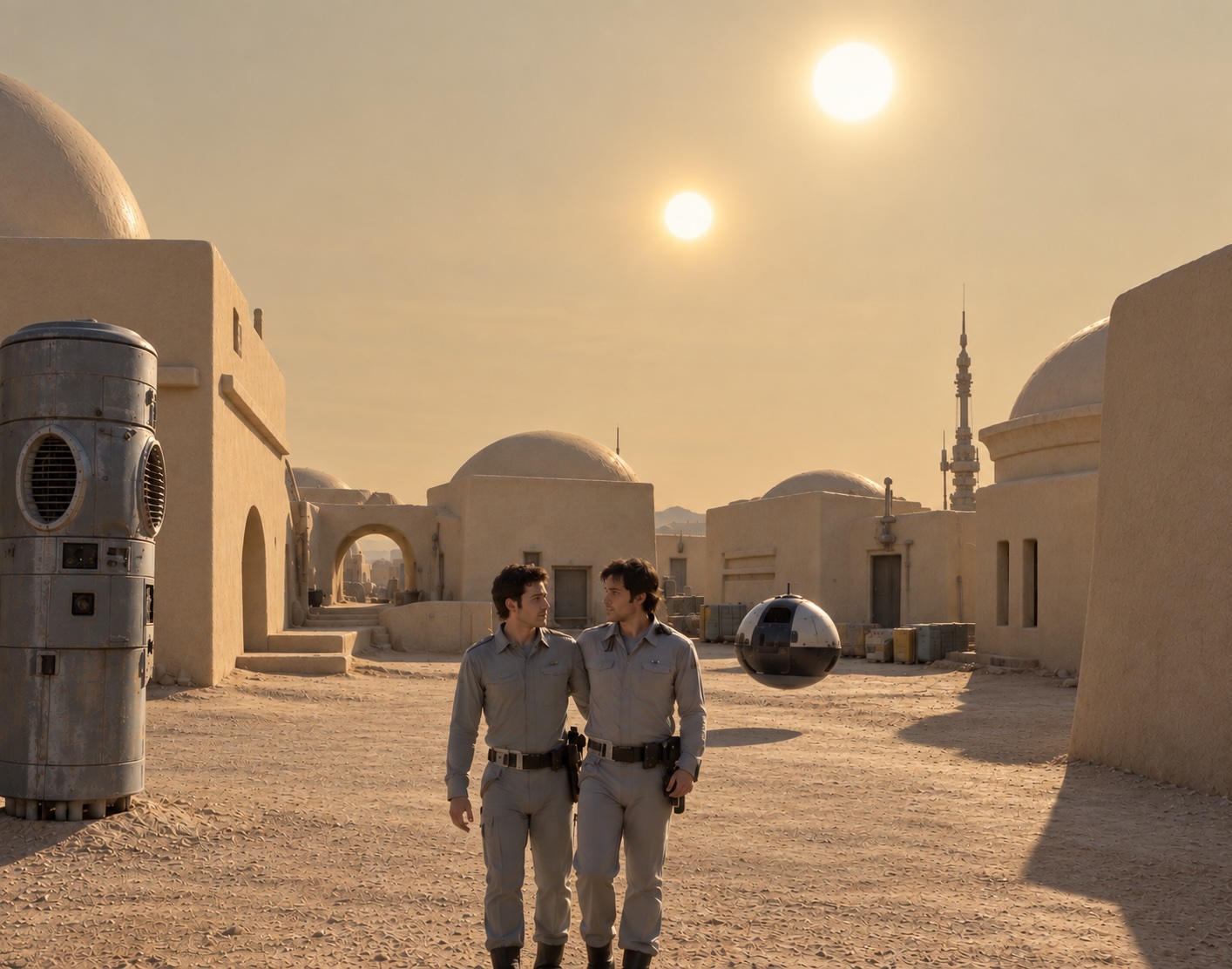
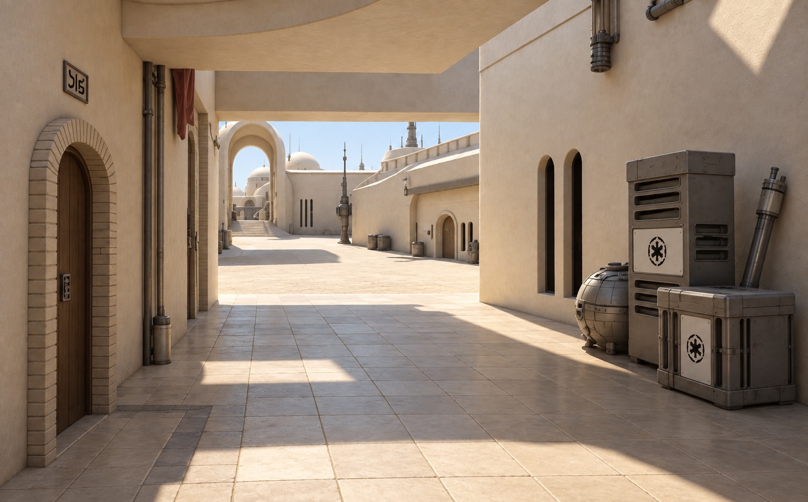
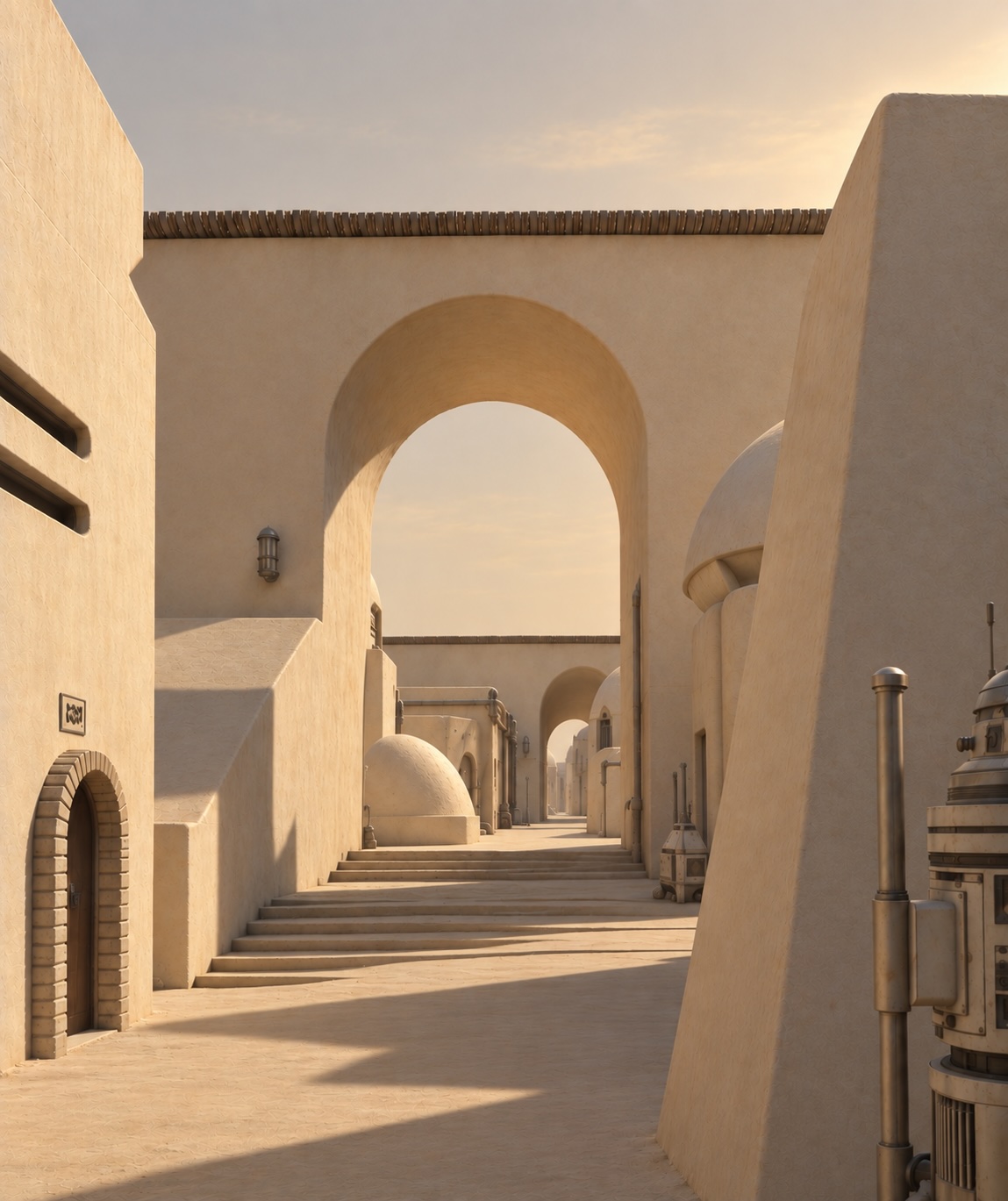
With some images, however it remained painfully stubborn. Granted it did an excellent job of turning a basic line drawing into the image below, but for the life of me I couldn’t get it to position the light source to the left and over the viewer’s shoulder as it was in the original sketch. I gave up after a dozen iterations with increasingly more specific instructions. I will no doubt revisit all this in another year or so after the models have improved still more. (If we’re all even still around by that point.)
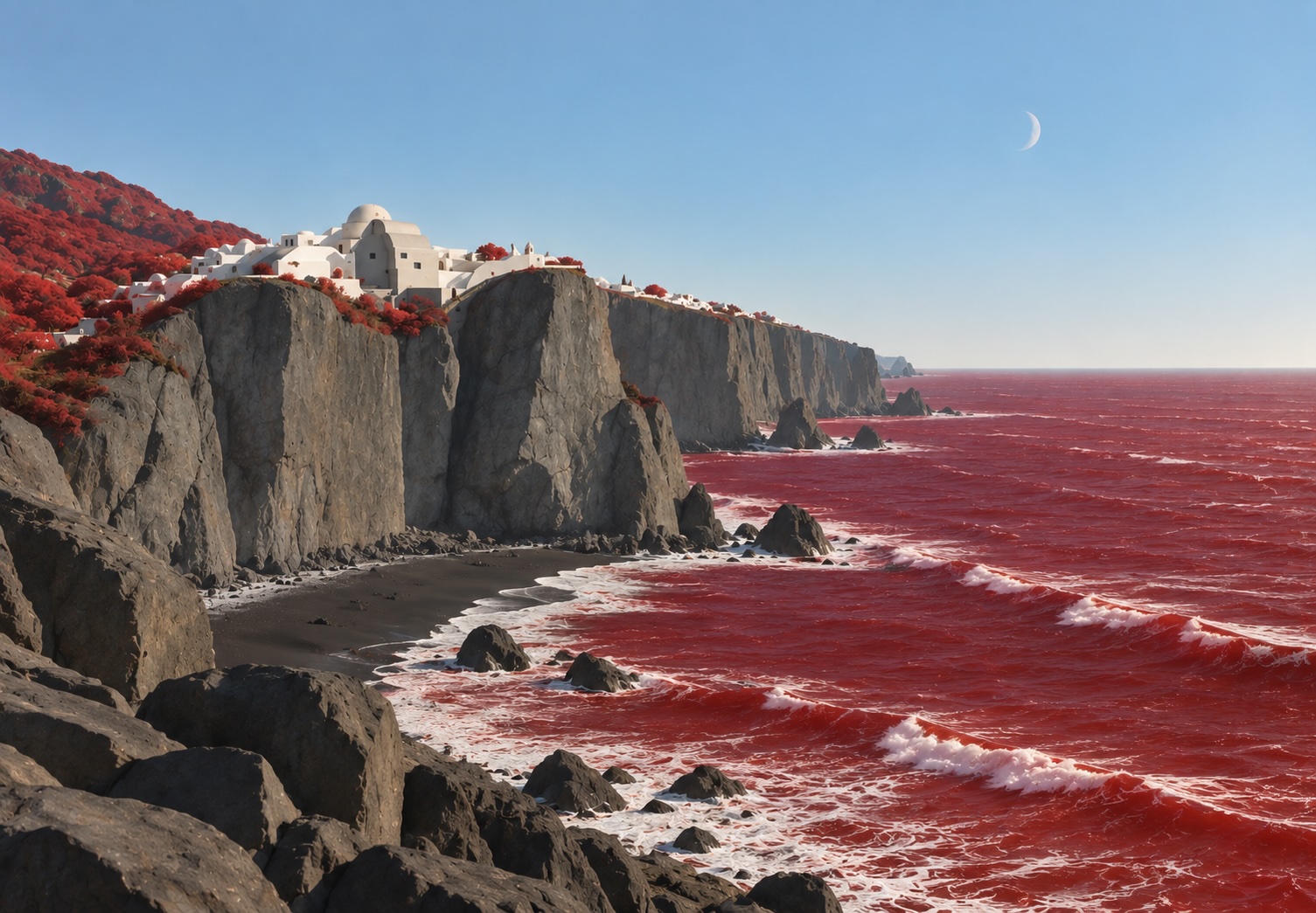
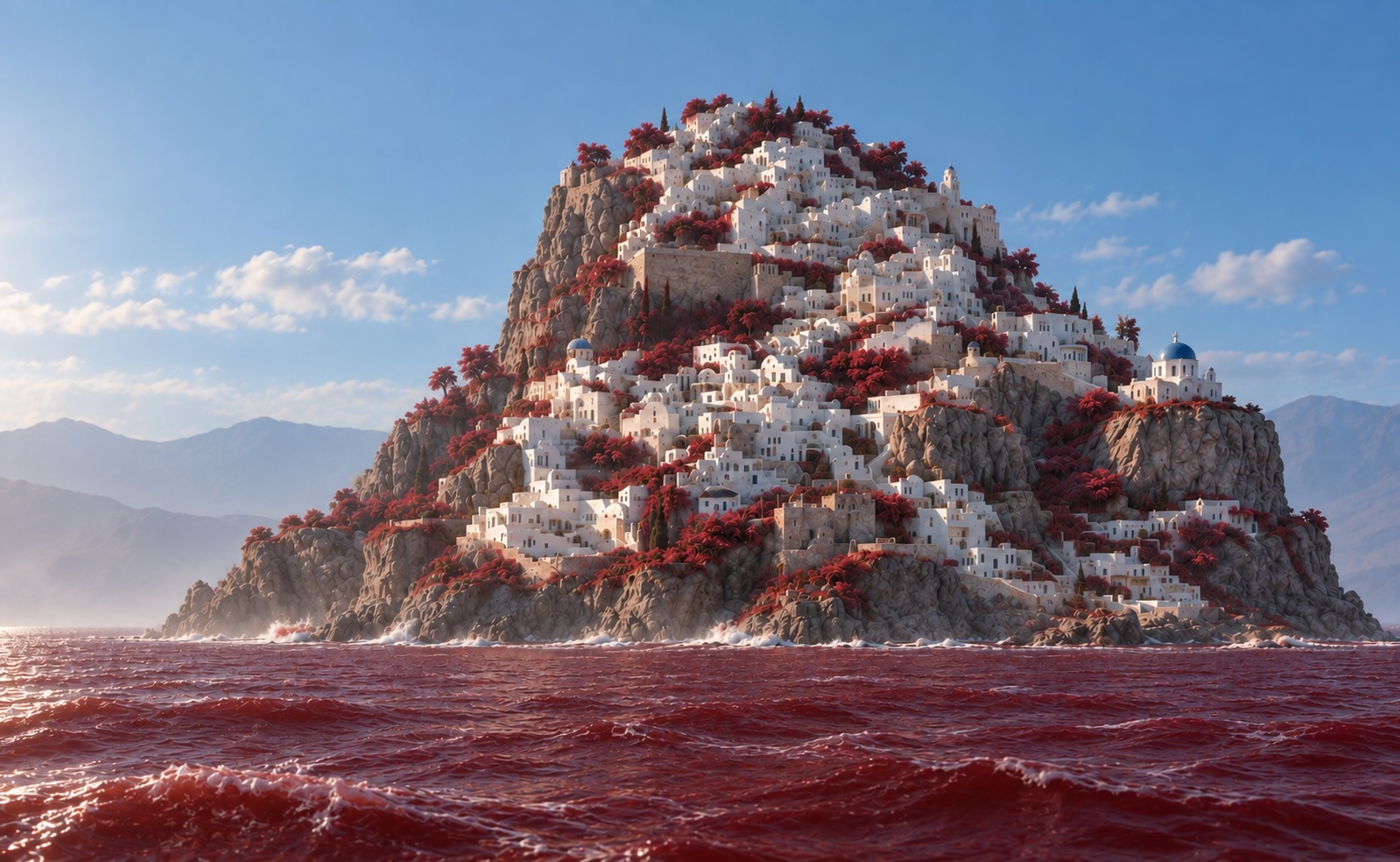
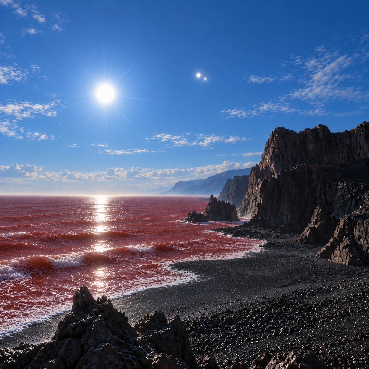
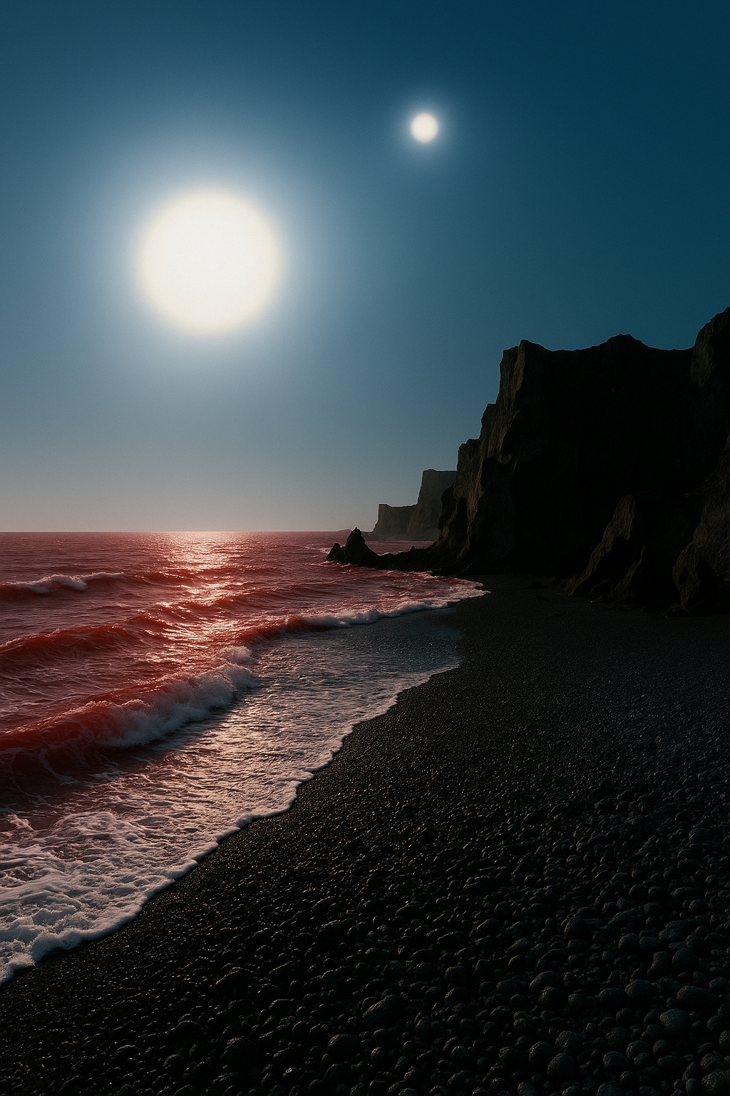
This one below was not done a year and a half ago. The original was little more than a simple pen and ink doodle. My original prompt to GPT was, Make a photorealistic, Santorini-like island rising out of a red ocean with red vegetation among the buildings. The original one it came up with looked way too CGI. So I added, Add atmospheric softening. that helped, but it still looks fake to my eye. At the same time, considering the original image I fed in, it’s fucking amazing.
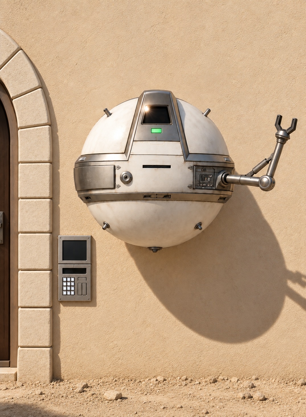
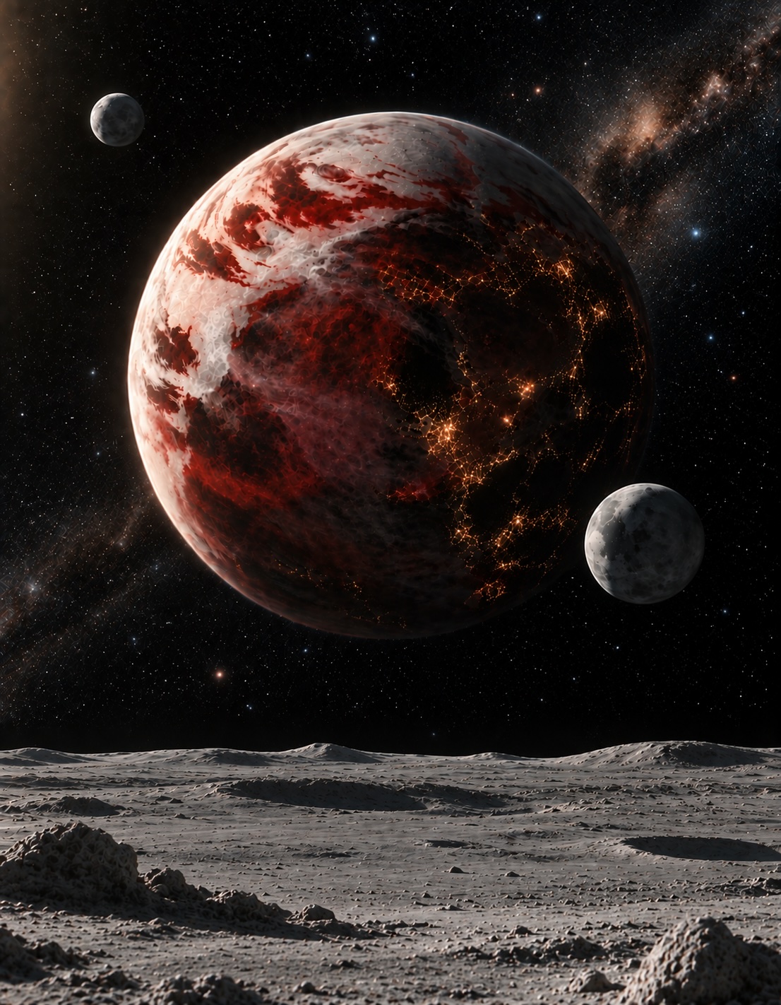
This one below still isn’t where I really want it to be. While much more realistic, I almost like the prior version more.
Prior Image:
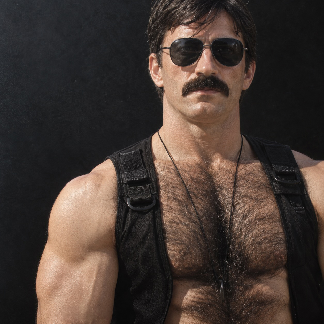
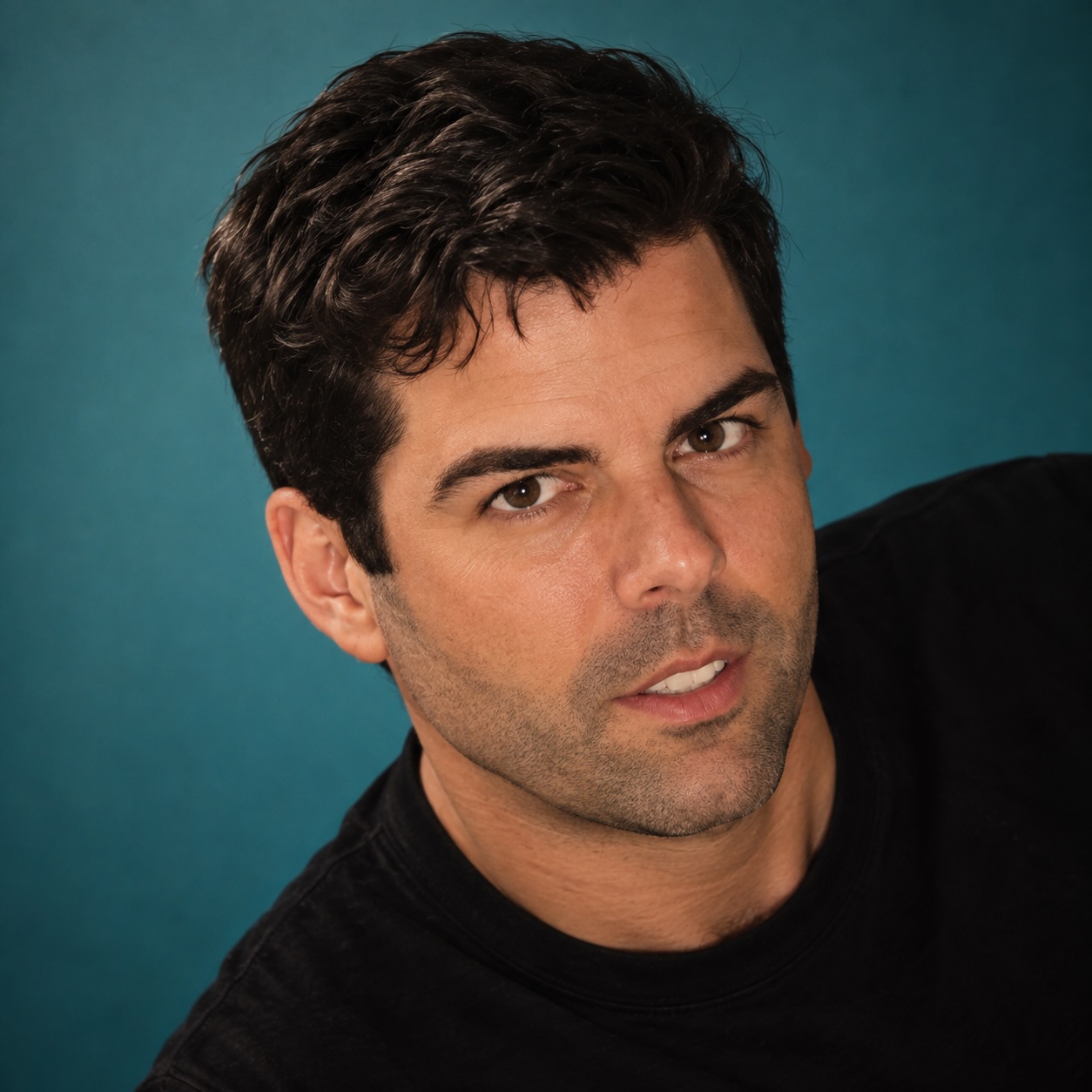
Another thing I tried this time was converting portraits I’d done back into photorealistic images to see how closely they match the photos (or at least my memory of the photos) I originally worked off of. The ultimate test I guess is to look at one of these “reverse engineered” images and say, “Yes, that’s so-and-so,” or “Who the fuck is that?”
This one is definitely Joe.
This one stil looks a little too artificial, but in comparison to the previous version, it looks so much better.
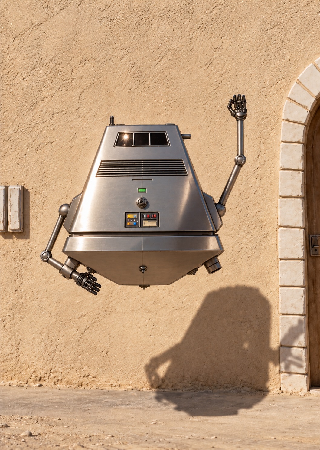
Yeah, that’s Trevor…
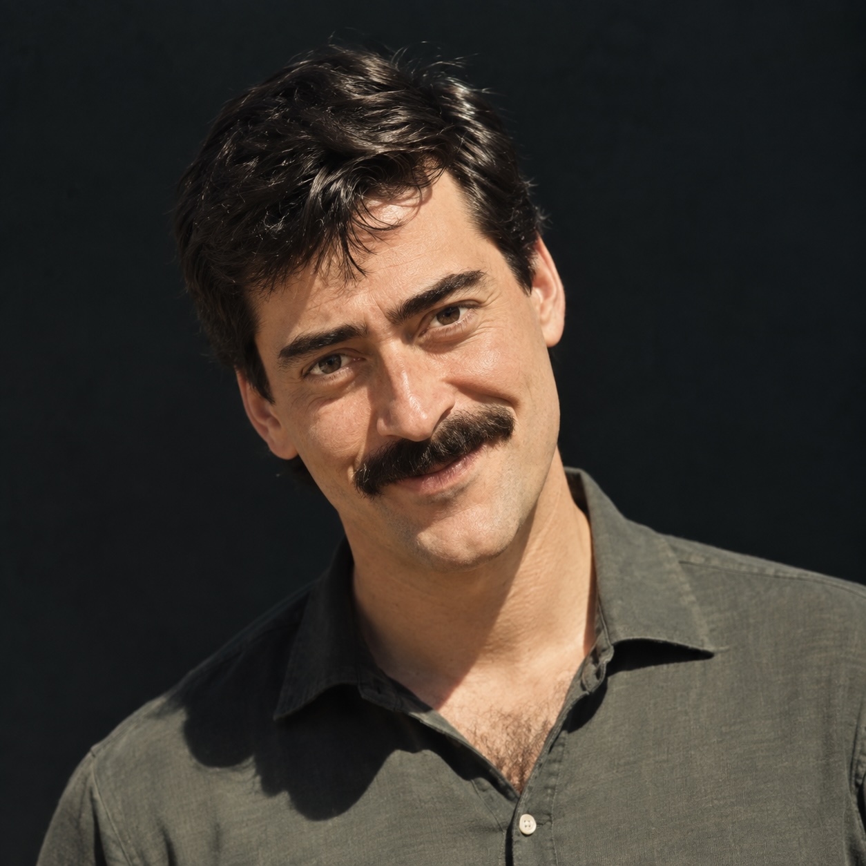
This one actually looks better than Gio…
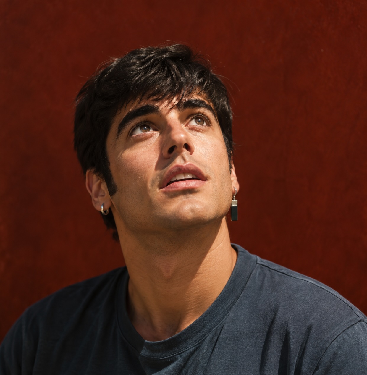
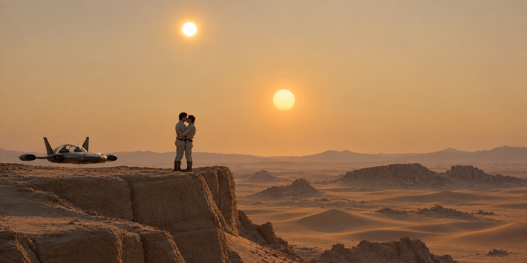
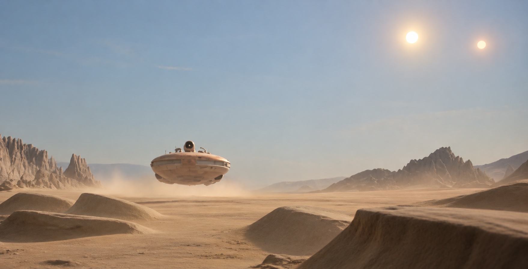
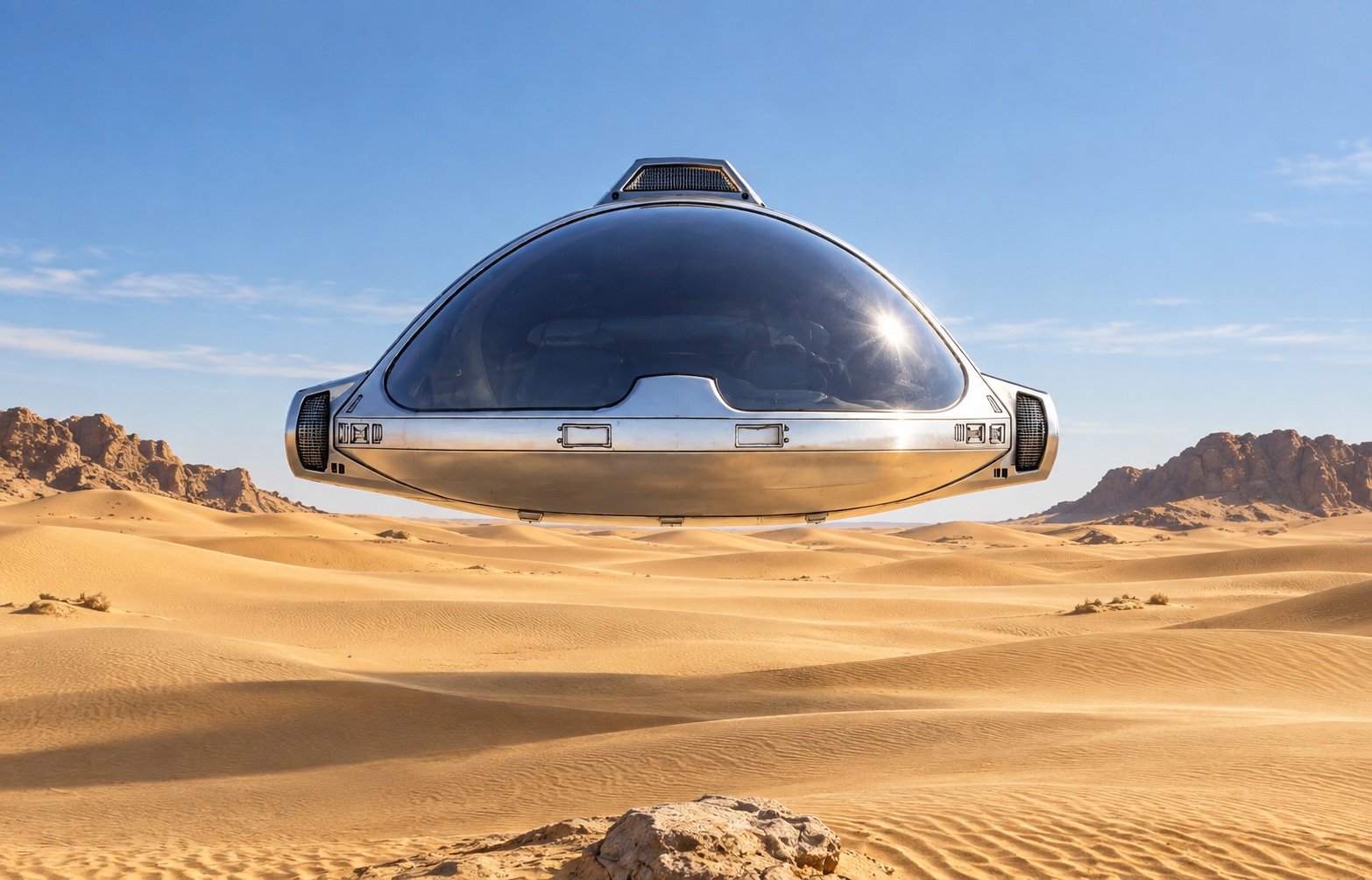
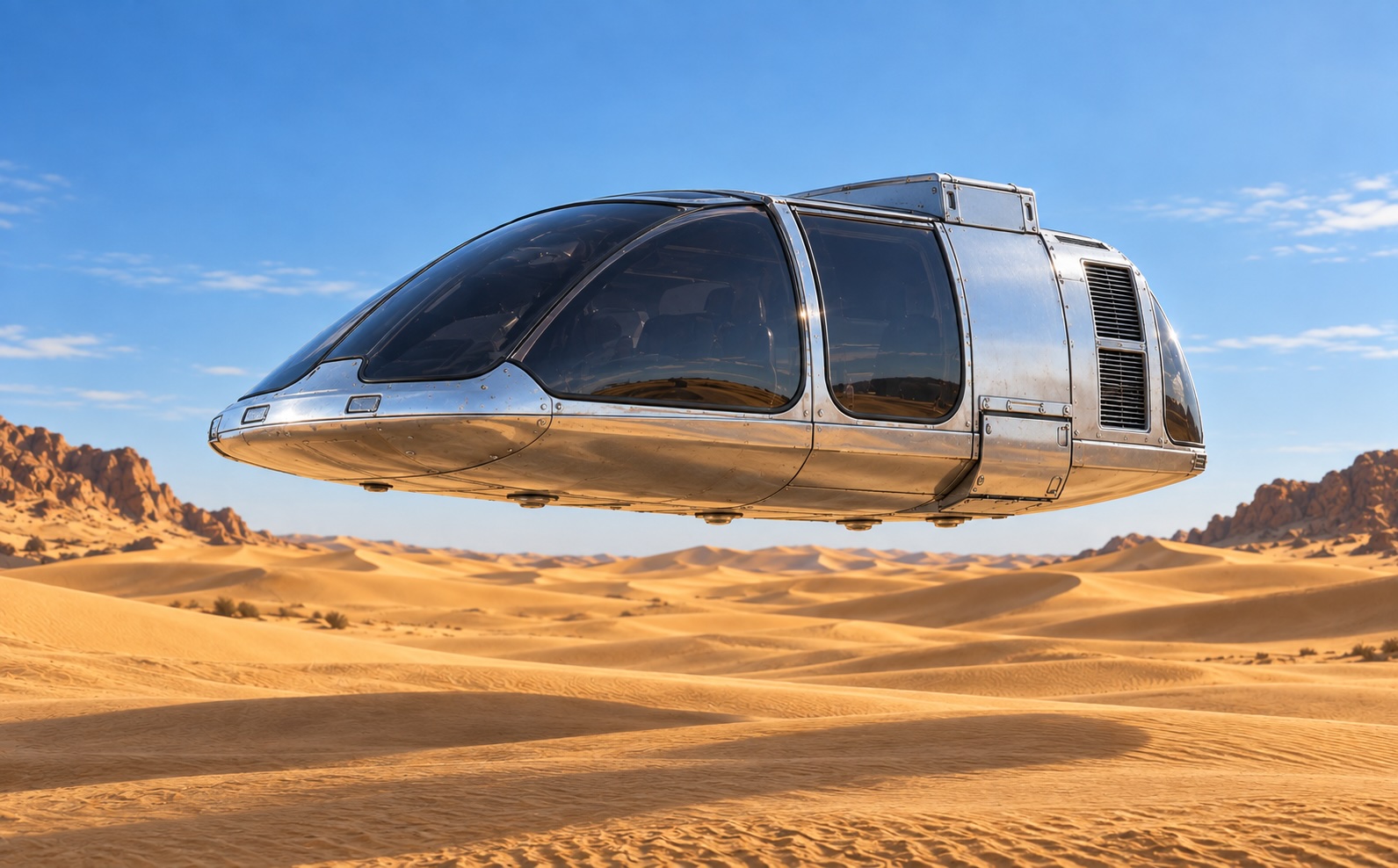
I looked at this one and went, “Wow!” The detail of the vehicle is so much better than last time.
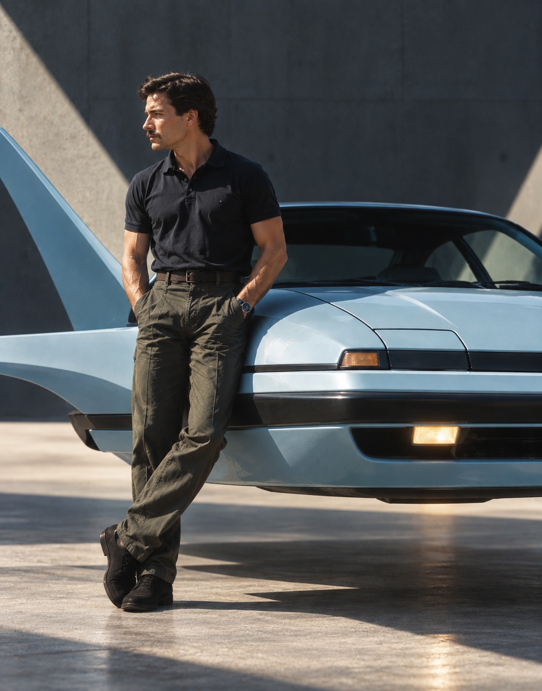
The previous version:
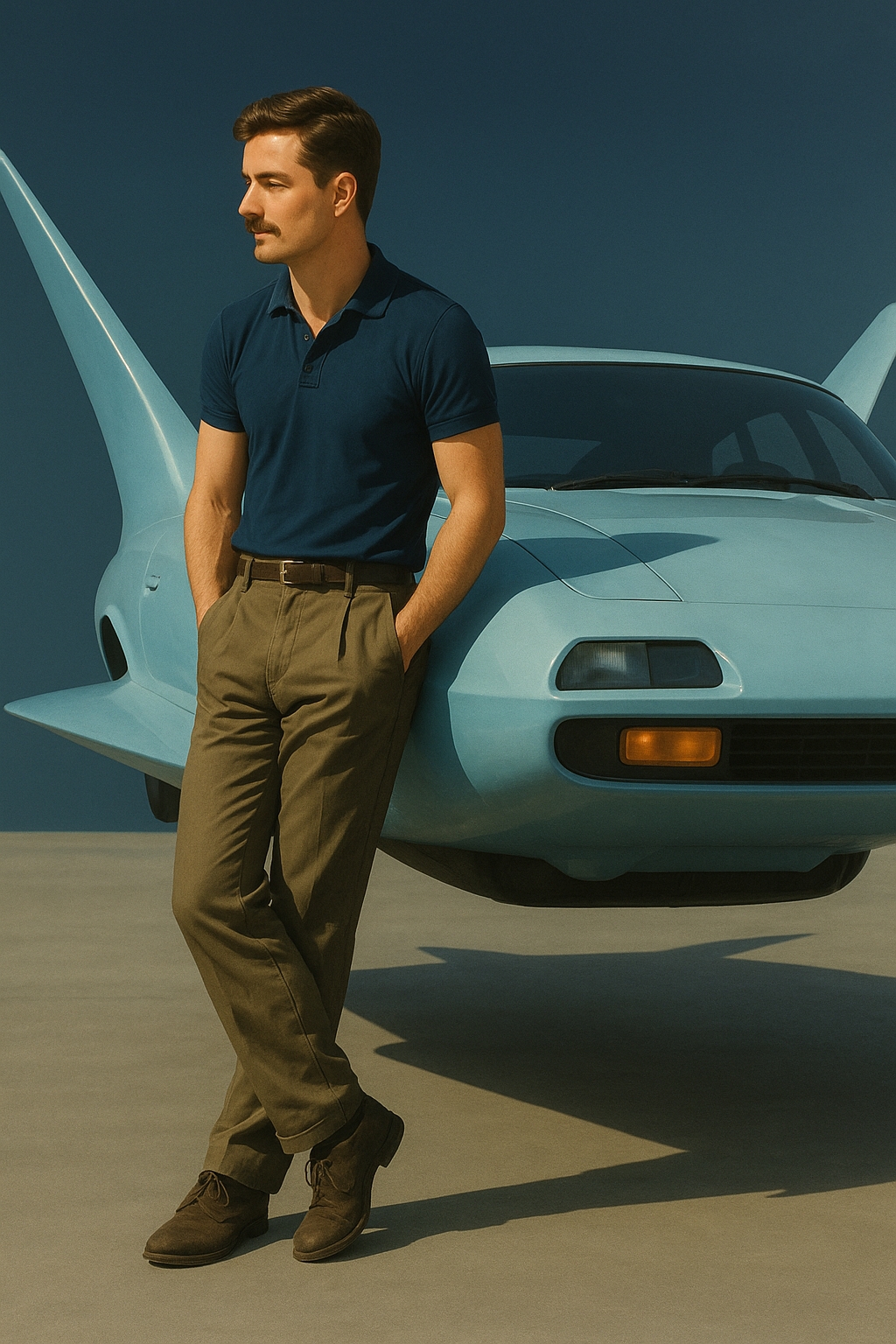
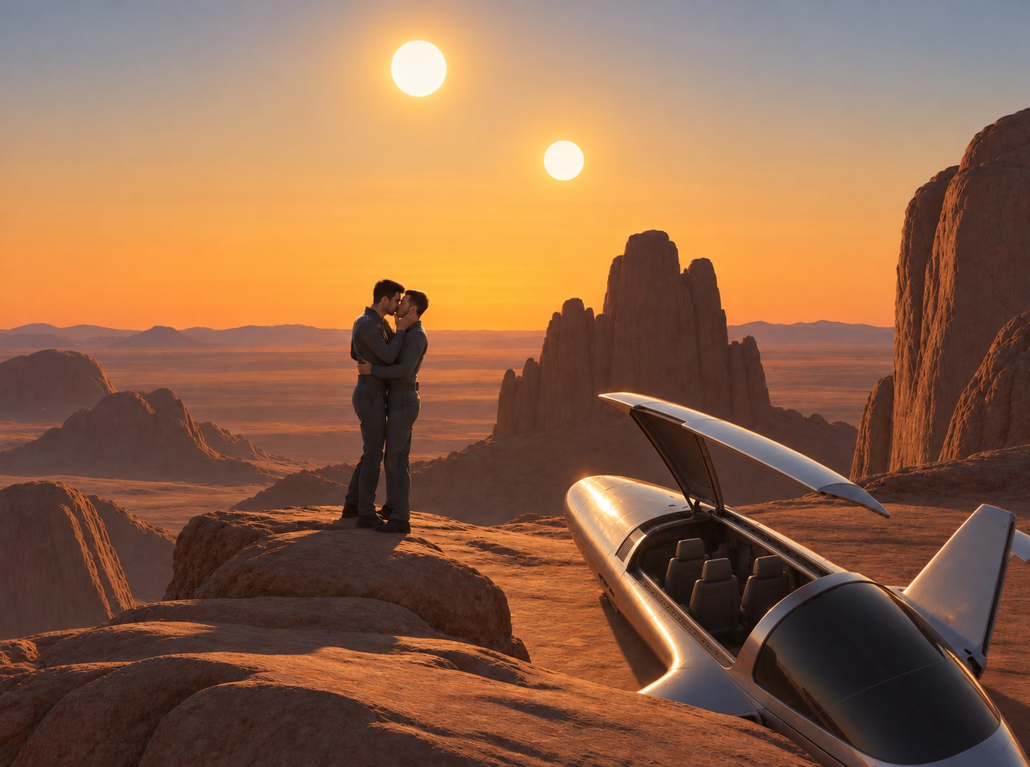
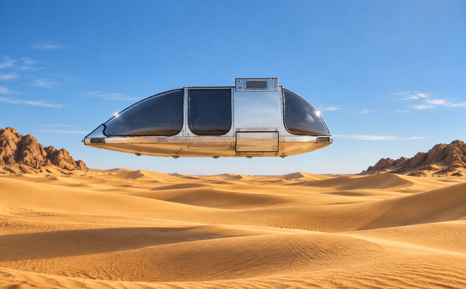
This one was a pain in the ass and after a dozen iterations, I think it’s beautiful, it still hasn’t gotten the vehicle correct. And of course I just realized why it was having so much difficulty and I’ll revisit it at a later date.
Yeah, that’s Steve…
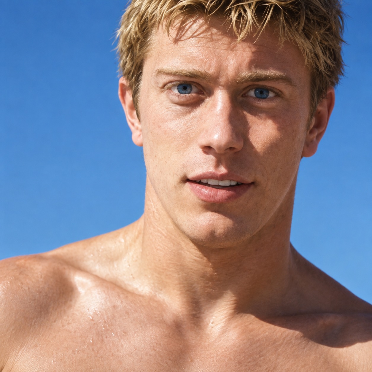
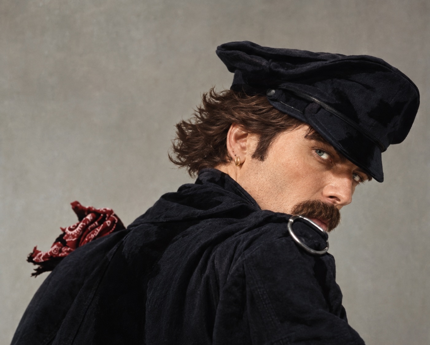
This was just some random boy from a magazine. When it generated just now I looked at it and thought, “Ugh. I prefer the old one,” but comparing them side by side, yes, this one is definitely better than the original.
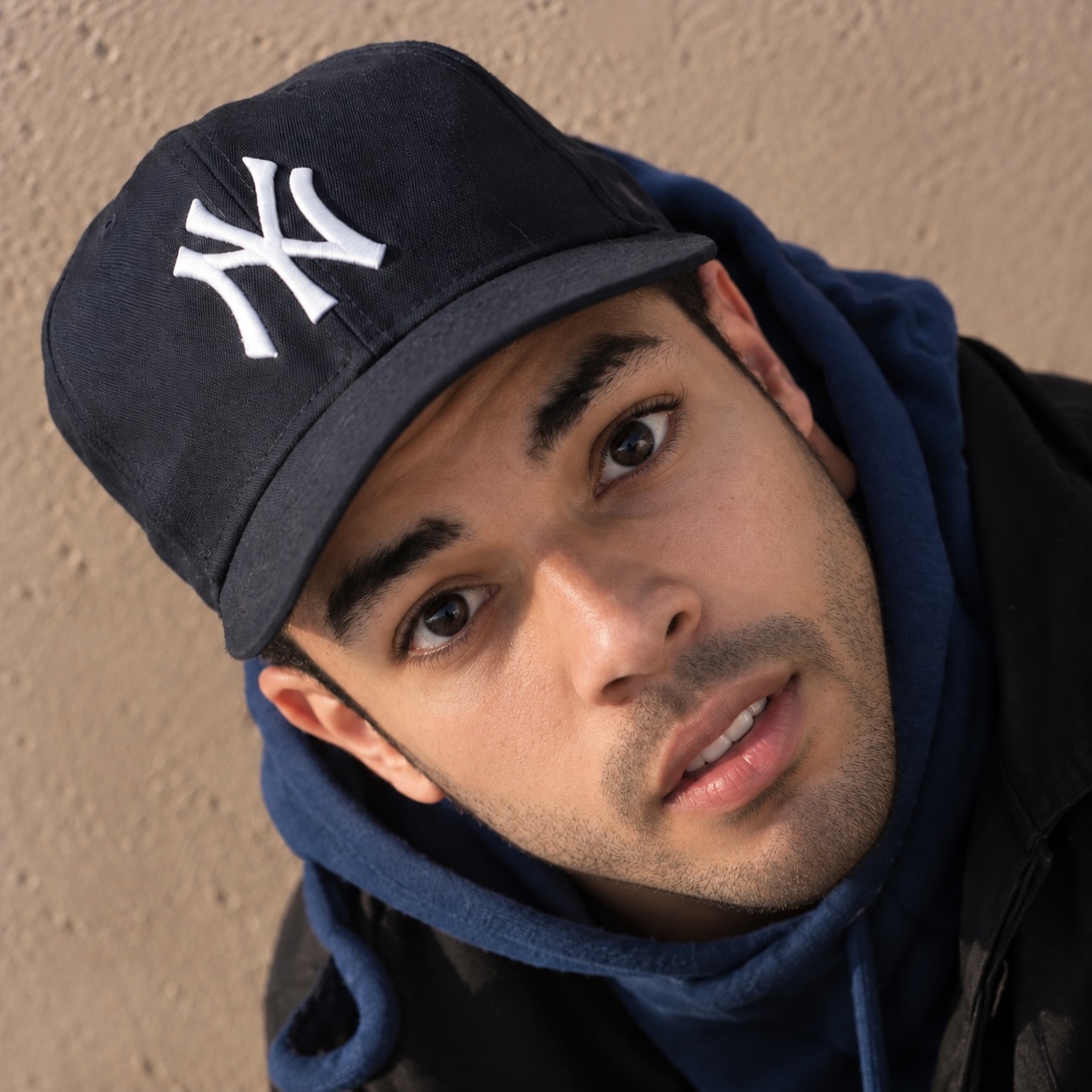
This is almost Tom. Something’s a little bit off about it.
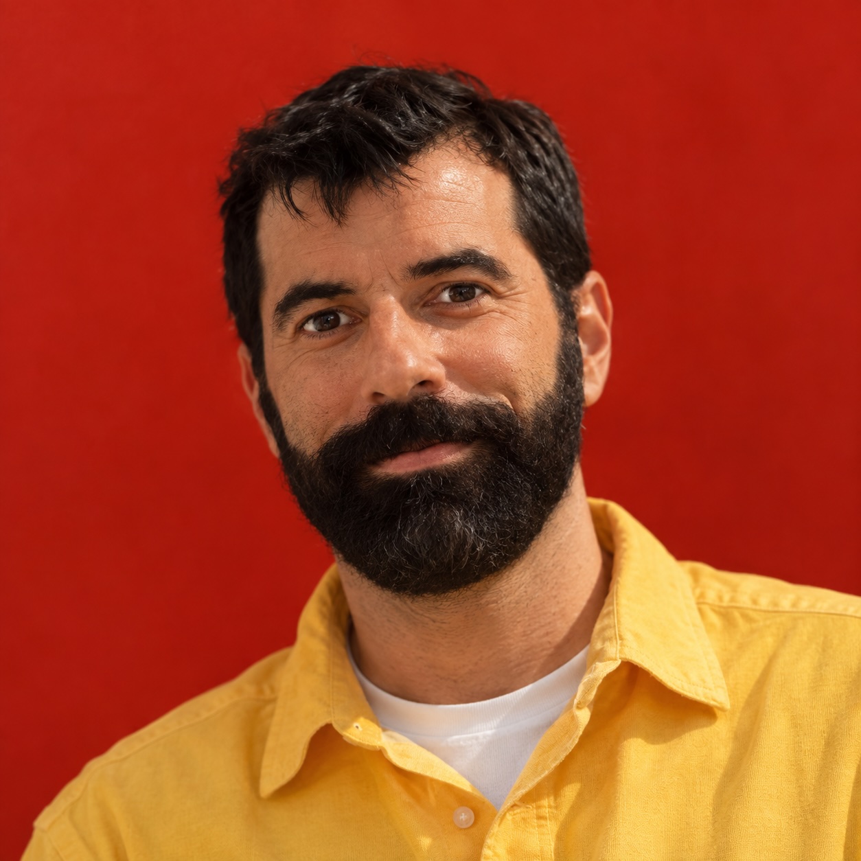
This one definitely falls under the category of “Who The Fuck Is That?” It’s definitelynot Patrick, but if you didn’t know who Patrick was, you’d never know it wasn’t a photo of a real human being.
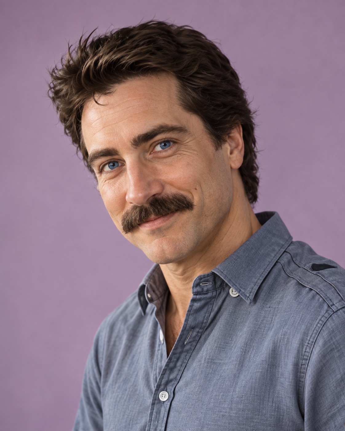
These three came out way better than the ones from a year ago. They match almost exactly my original line drawings. I will say, however, that I had ChatCPT generate the oblique view from the two views above it, and as much as I messed with the prompt, I just couldn’t get it right.
This is another one that’s almost identical to the photo I worked from. But honestly I get more Ricky Richardo than a some guy from what was it…BukBuddies?

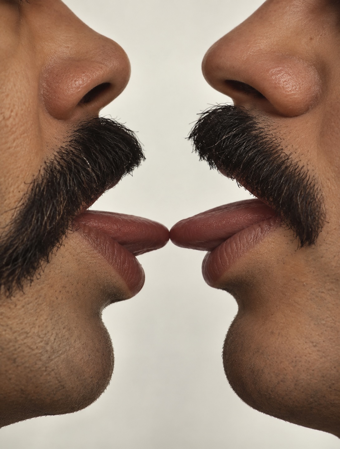
The algorithm initially balked at this one, telling me it violated their standards or some nonsense. I replied with, “Two men kissing is not a violation. Make it photorealistic.” And a little story behind the original painting: I did it shortly after I moved into my own apartment back in ’81. There was a very nosy woman who lived upstairs and always made a point of staring in my patio door as she went up the stairs. I finally decided to give her something to look at, and from that point forward her eyes were always on the stairs and not my living room.
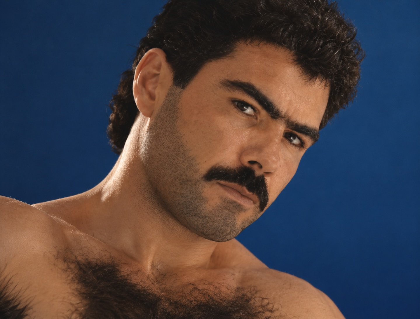
And lastly, I barely remember the original photo this came from, but it was some COLT publication that I no longer have. I think it’s a pretty accurate reverse-engineered image, but I’m not willing to bet money on it. My painting was obviously in color, but the original photo was black and white.
So, my biggest takeaway from this exercise is that yes, the AI Models are definitely improving. The portraits that I reverted back to photographs are—generally speaking—damn near impossible to fault. I mean, if you didn’t know the people, you wouldn’t realize that they weren’t real human beings in the pictures.
Also, the level of detail that the models are generating is unreal; something I didn’t actually realize until I started comparing this generation of images with the ones I made previously.
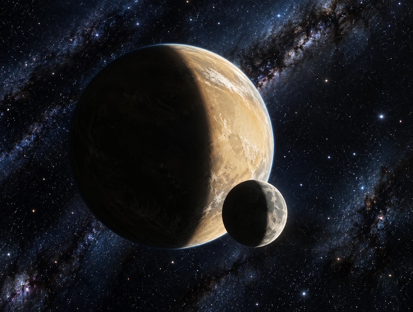
Finally, an interesting artifact of fine tuning the prompts on each generation of image is that yes, like in The Backrooms, the AI forgets more than it remembers with each new copy. Objects disappear or are subtly distorted. Things move. The suns in the image of the two guys on the cliff (the one with the vehicle that was giving me so much grief) sank lower and lower in the sky with each passing tweak. I finally had to tell the program to restore them to their original position!
2 comments
The one with double suns reminds me of the novel “Dahlgren,” Read it a couple of times over the years.
Looks like you’re keeping busy and having fun. These are remarkable.