
1 comments
Crazy Stats






My Visions Coming To Life
A little over a year ago when I first started playing around with ChatGPT, I thew several of my sketches and paintings into it with the simple instruction, “Make photorealistic.” I was amazed at the results, even though a few images took dozens of iterations and never reallly did come out the way I intended (ahem, The Hitchhiker) At the time ChatCPT very much had a mind of its own and decided how my work should look, not how I wanted it to look.
Well, several generations later things have gotten better. It leaves things pretty much as they were in the original but—as I instructed—makes them more photorealistic.



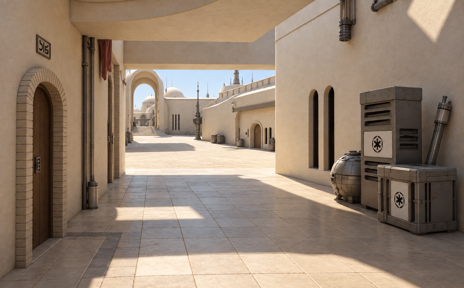

With some images, however it remained painfully stubborn. Granted it did an excellent job of turning a basic line drawing into the image below, but for the life of me I couldn’t get it to position the light source to the left and over the viewer’s shoulder as it was in the original sketch. I gave up after a dozen iterations with increasingly more specific instructions. I will no doubt revisit all this in another year or so after the models have improved still more. (If we’re all even still around by that point.)
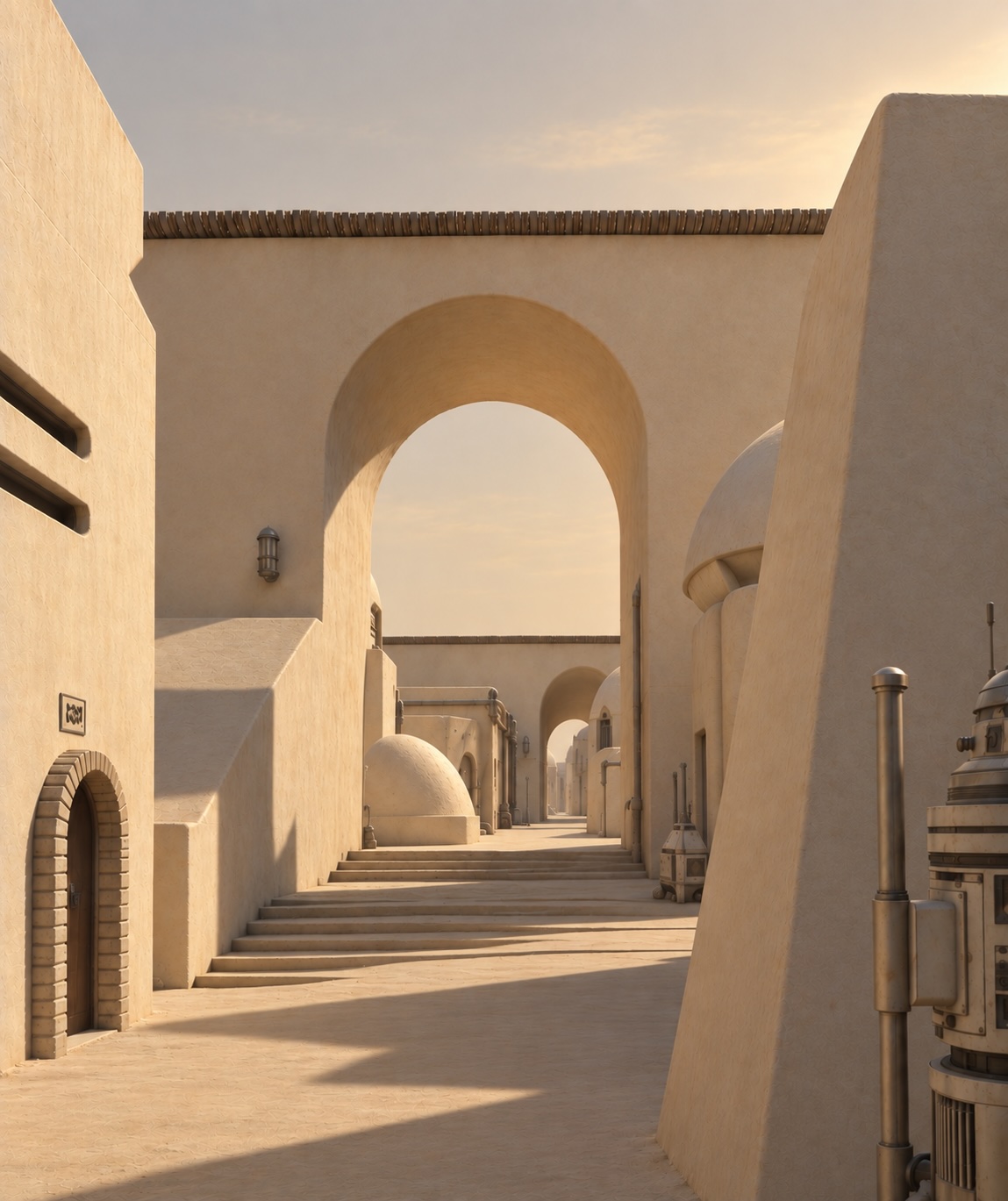
This one below was not done a year and a half ago. The original was little more than a simple pen and ink doodle. My original prompt to GPT was, Make a photorealistic, Santorini-like island rising out of a red ocean with red vegetation among the buildings. The original one it came up with looked way too CGI. So I added, Add atmospheric softening. that helped, but it still looks fake to my eye. At the same time, considering the original image I fed in, it’s fucking amazing.

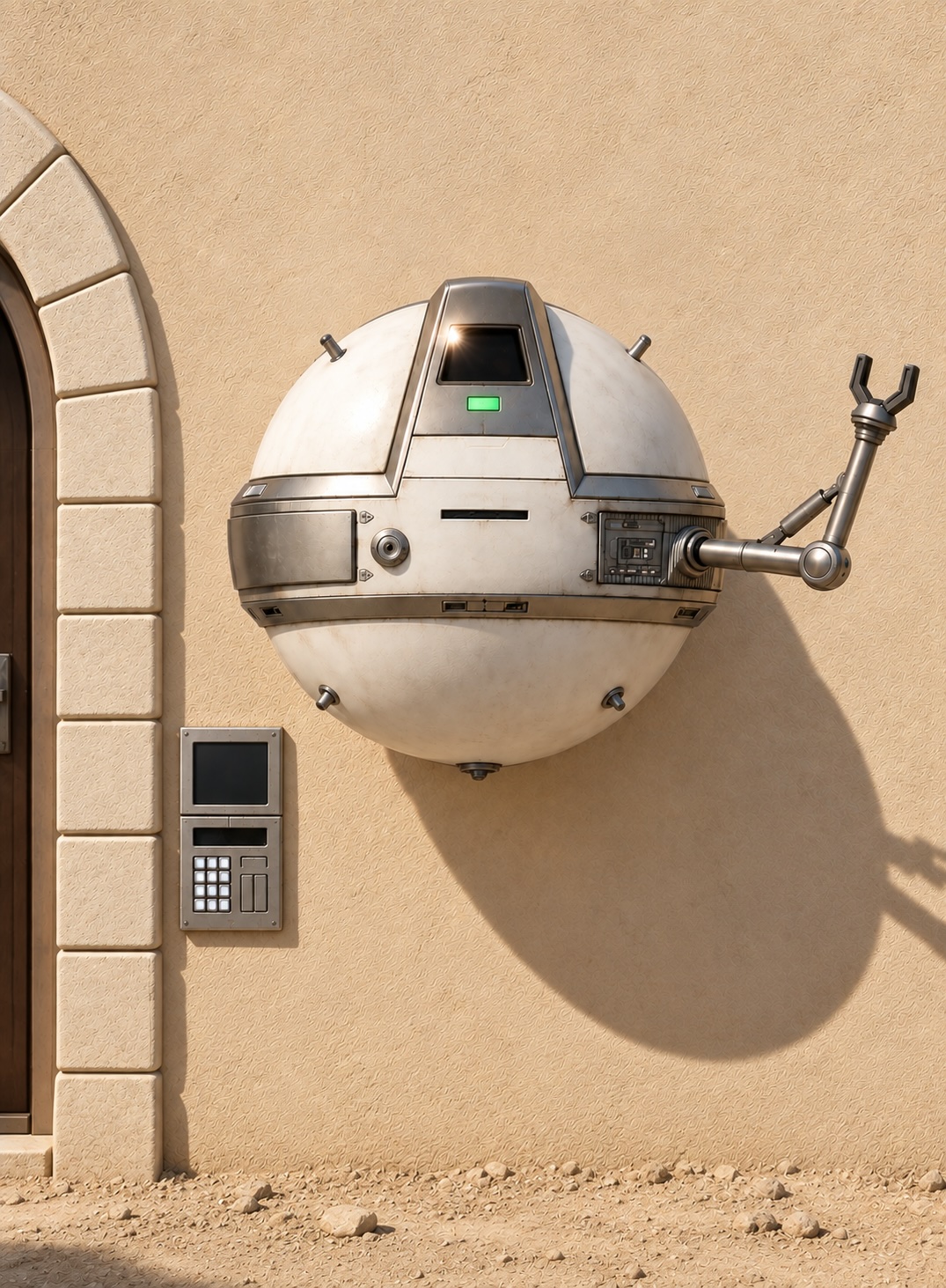


This one below still isn’t where I really want it to be. While much more realistic, I almost like the prior version more.

Prior Image:
Another thing I tried this time was converting portraits I’d done back into photorealistic images to see how closely they match the photos (or at least my memory of the photos) I originally worked off of. The ultimate test I guess is to look at one of these “reverse engineered” images and say, “Yes, that’s so-and-so,” or “Who the fuck is that?”
This one is definitely Joe.



This one stil looks a little too artificial, but in comparison to the previous version, it looks so much better.
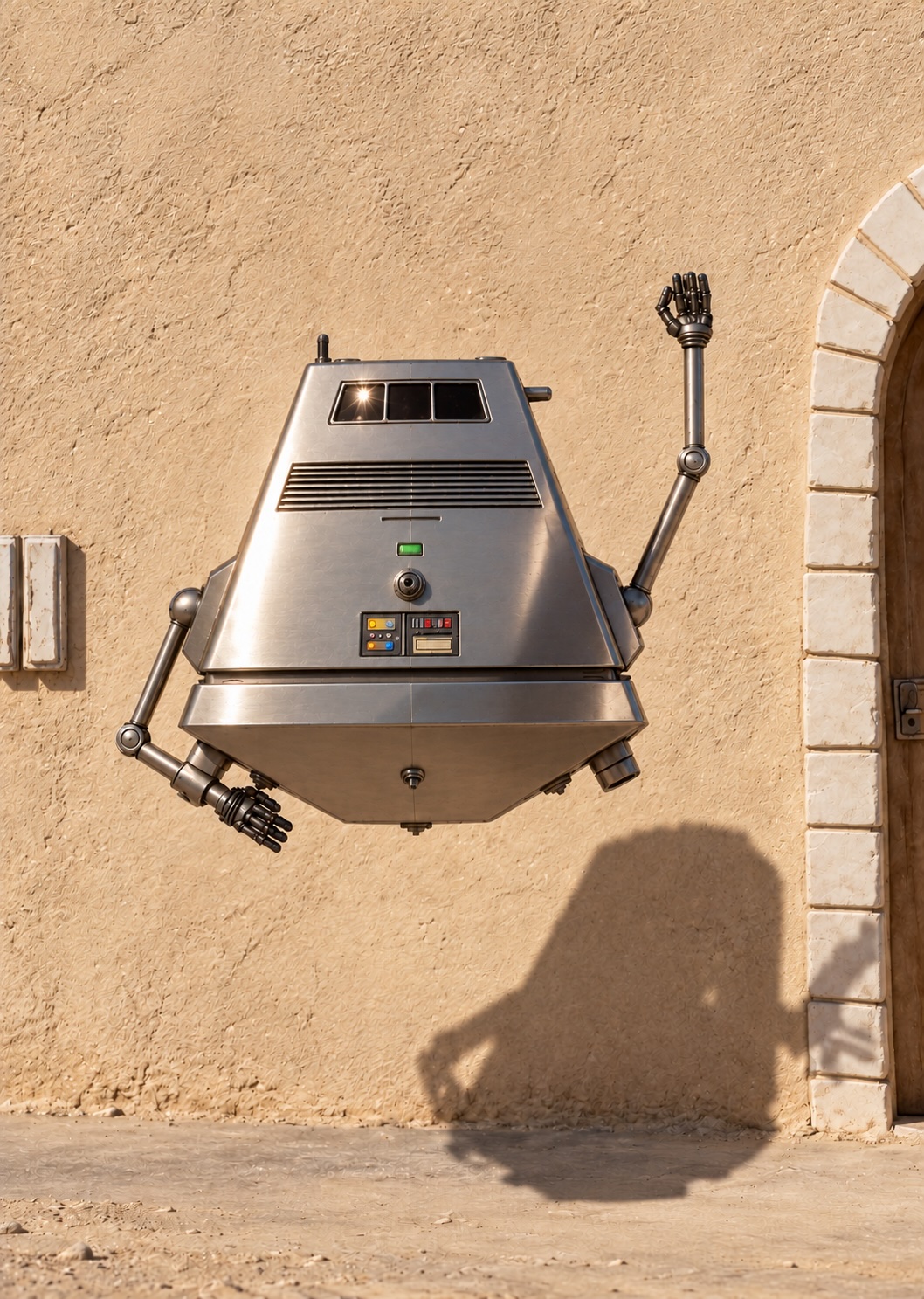
Yeah, that’s Trevor…

This one actually looks better than Gio…

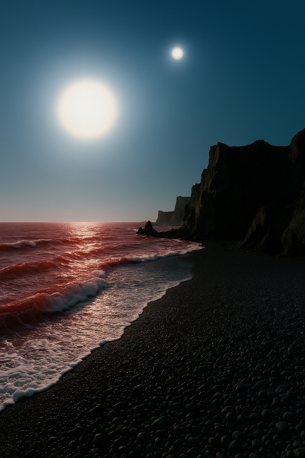
I looked at this one and went, “Wow!” The detail of the vehicle is so much better than last time.
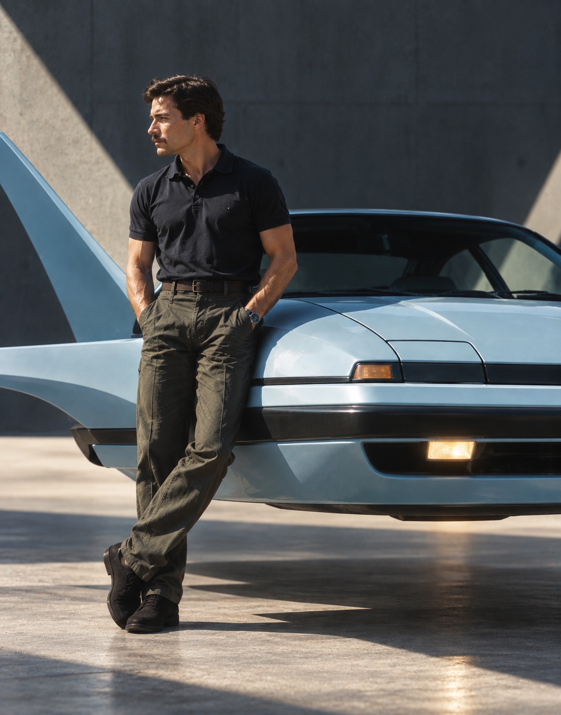
The previous version:

This one was a pain in the ass and after a dozen iterations, I think it’s beautiful, it still hasn’t gotten the vehicle correct. And of course I just realized why it was having so much difficulty and I’ll revisit it at a later date.

Yeah, that’s Steve…

This was just some random boy from a magazine. When it generated just now I looked at it and thought, “Ugh. I prefer the old one,” but comparing them side by side, yes, this one is definitely better than the original.

This is almost Tom. Something’s a little bit off about it.

This one definitely falls under the category of “Who The Fuck Is That?” It’s definitelynot Patrick, but if you didn’t know who Patrick was, you’d never know it wasn’t a photo of a real human being.

These three came out way better than the ones from a year ago. They match almost exactly my original line drawings. I will say, however, that I had ChatCPT generate the oblique view from the two views above it, and as much as I messed with the prompt, I just couldn’t get it right.



This is another one that’s almost identical to the photo I worked from. But honestly I get more Ricky Richardo than a some guy from what was it…BukBuddies?

The algorithm initially balked at this one, telling me it violated their standards or some nonsense. I replied with, “Two men kissing is not a violation. Make it photorealistic.” And a little story behind the original painting: I did it shortly after I moved into my own apartment back in ’81. There was a very nosy woman who lived upstairs and always made a point of staring in my patio door as she went up the stairs. I finally decided to give her something to look at, and from that point forward her eyes were always on the stairs and not my living room.

And lastly, I barely remember the original photo this came from, but it was some COLT publication that I no longer have. I think it’s a pretty accurate reverse-engineered image, but I’m not willing to bet money on it. My painting was obviously in color, but the original photo was black and white.

So, my biggest takeaway from this exercise is that yes, the AI Models are definitely improving. The portraits that I reverted back to photographs are—generally speaking—damn near impossible to fault. I mean, if you didn’t know the people, you wouldn’t realize that they weren’t real human beings in the pictures.
Also, the level of detail that the models are generating is unreal; something I didn’t actually realize until I started comparing this generation of images with the ones I made previously.
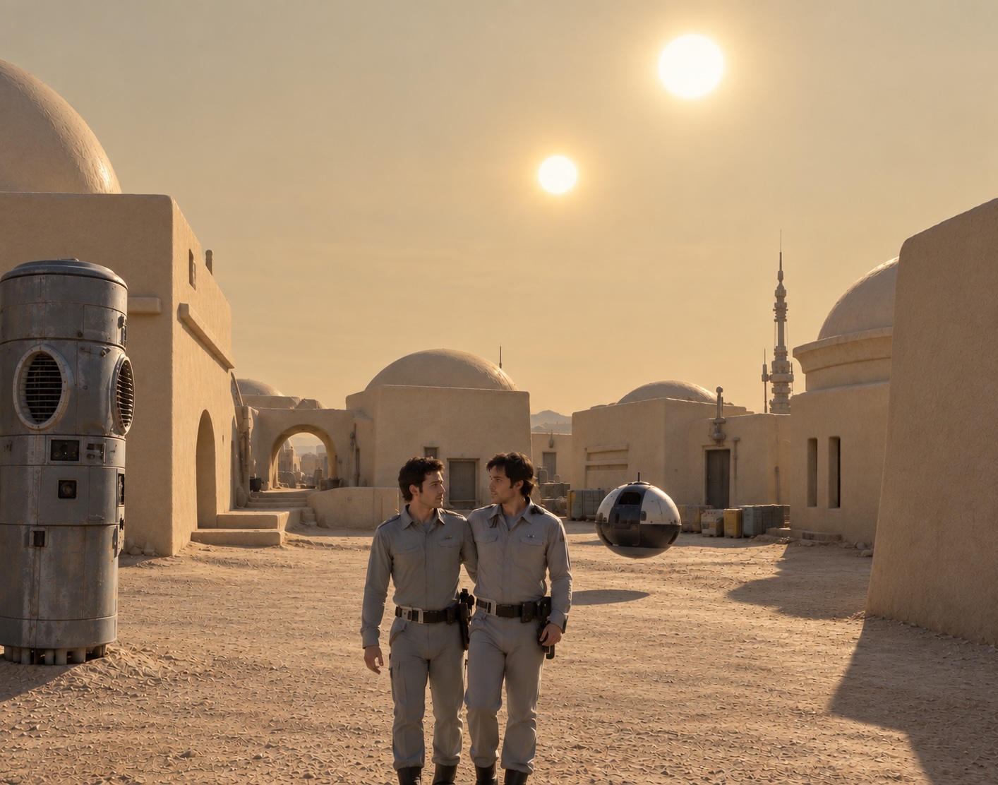
Finally, an interesting artifact of fine tuning the prompts on each generation of image is that yes, like in The Backrooms, the AI forgets more than it remembers with each new copy. Objects disappear or are subtly distorted. Things move. The suns in the image of the two guys on the cliff (the one with the vehicle that was giving me so much grief) sank lower and lower in the sky with each passing tweak. I finally had to tell the program to restore them to their original position!
2 comments
Like Most Tools, AI Can Be Used For Evil…Or For Good

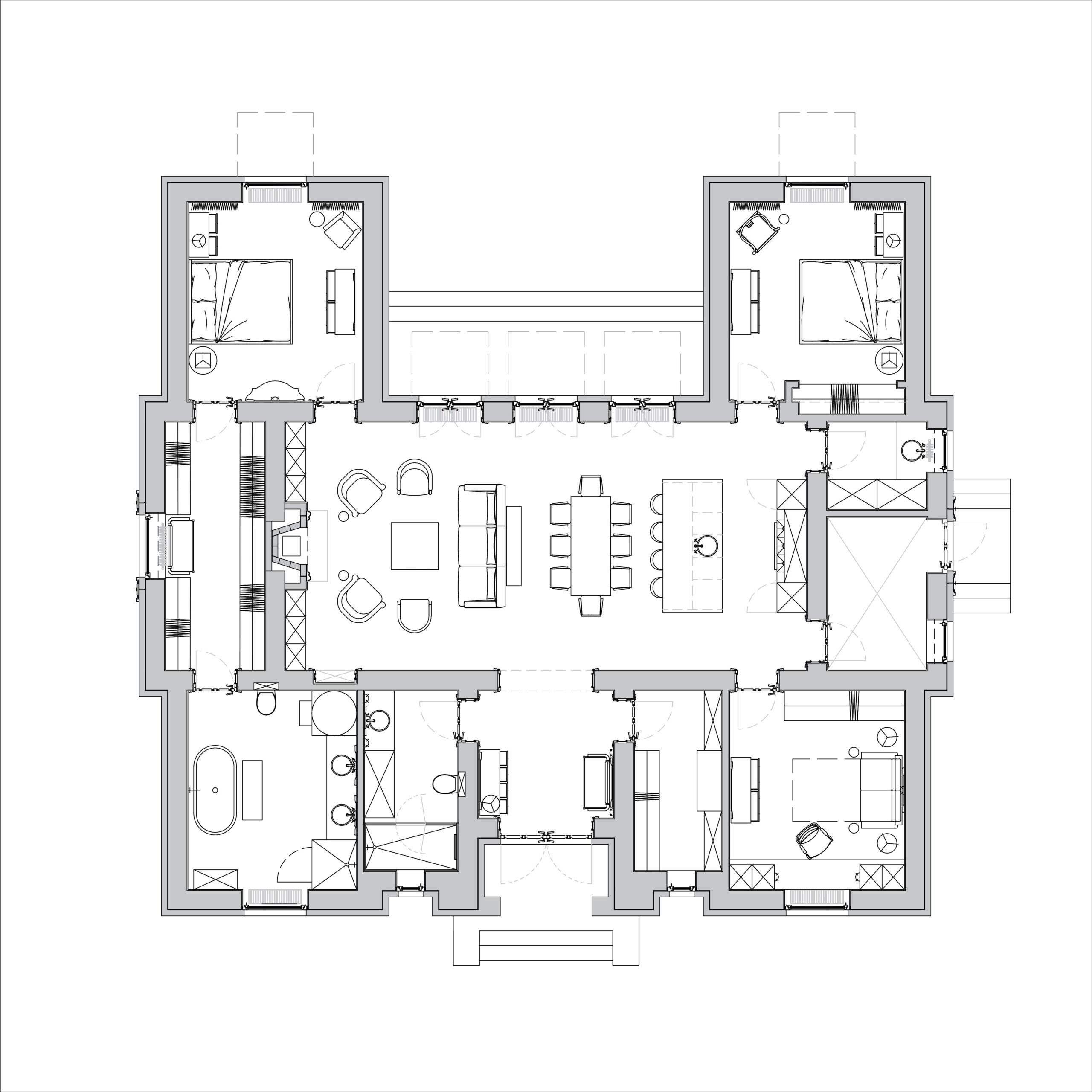
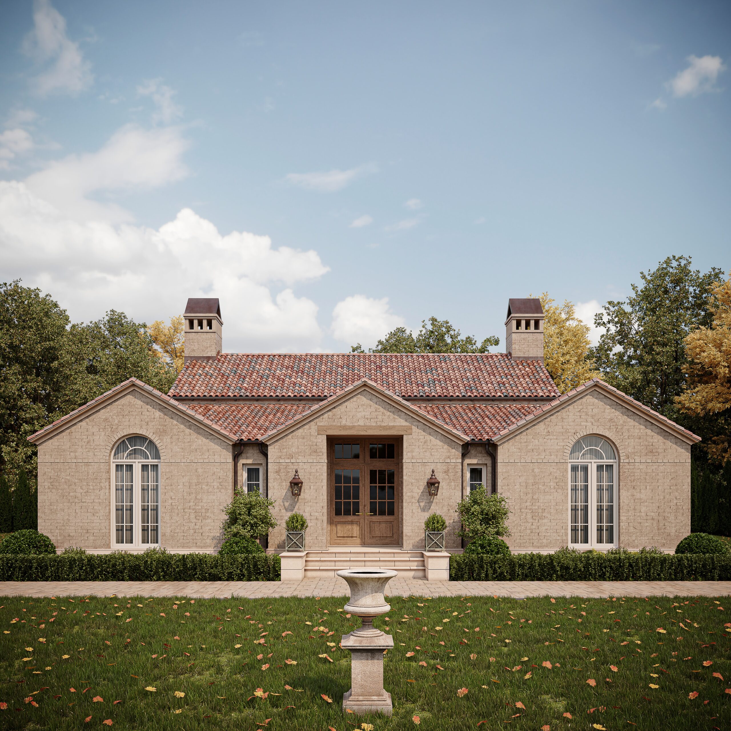
Another well thought-out thick-walled (I am assuming) Russian house.
I love how these plans don’t even feature garages. It’s refreshing to see residential architecture from a non-car-centric perspective.
I could definitely live here without making any changes.* Would you?
*The only thing I might change would be to flip the second bathroom and the closet/storage area on either side of the main entrance and open the bathroom to the main living area instead of the Foyer.
0 comments
This One Makes Sense
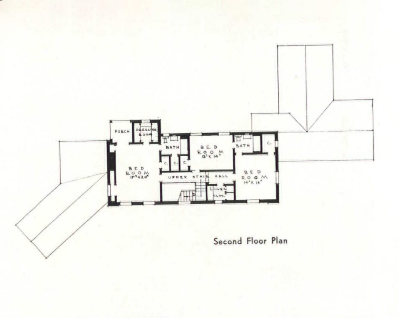
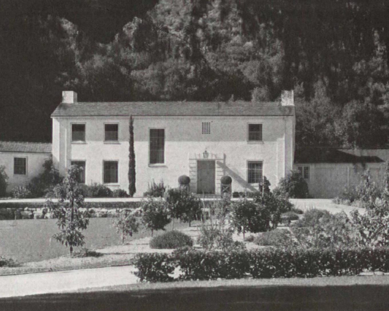
Kind of an unassuming exterior, but I like the floor plan. The livable layout makes sense. It’s on the larger side without being overly ostentatious.
1 comments
I’m Glad Someone Does

Name The Architect
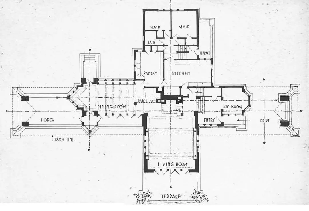
Ostentatious Doesn’t Even BEGIN To Describe This Monstrosity
Let’s see…a 4 car garage plus an addition 2 car garage, a Billiards Room, a Billards Gallery, His ‘n Hers Offices, His ‘n Hers Bathrooms, His ‘n Hers Powder Rooms, Assistant’s Office, Conservatory, a BALL ROOM, a 21′ x 44′ Entry Hall with its own BAR, Butler’s Pantry, Elevator, a Hers Closet that’s bigger than our Living Room, and not one, but two Family Rooms…
It’s like those old illusion drawings where you’re supposed to locate all the things that are fucked up.
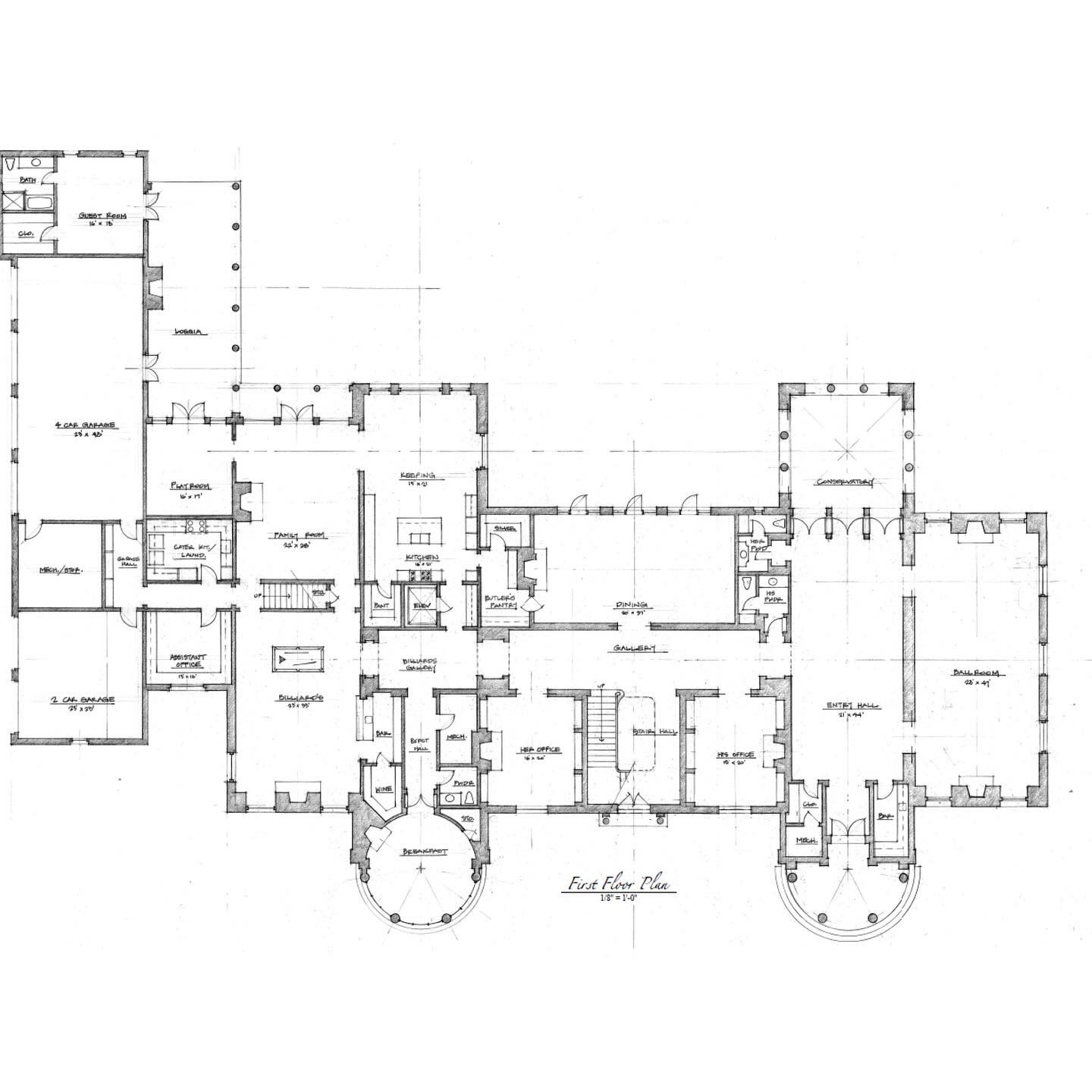
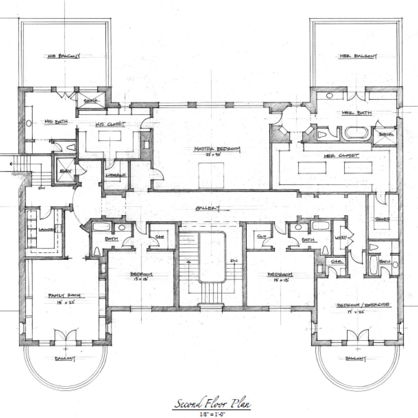
2 comments
So That’s What’s Going On…
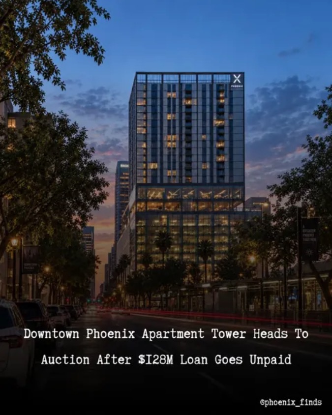
Downtown Phoenix Apartment Tower Heads To Auction After $128M Loan Goes Unpaid
X Phoenix, the 330 unit apartment community at 200 W. Monroe Street in Downtown Phoenix, is headed toward a trustee sale after its developer failed to repay a $128 million loan tied to the property.
According to Maricopa County documents, lender Mack Real Estate Group has scheduled the first phase of X Phoenix to be sold at auction on December 10 at Maricopa County Superior Court.
The property originally opened as a roughly $100 million development and marked Chicago based The X Company’s entry into the Phoenix market.
Ben and I were discussing this only a couple days ago; about how it seemed all progress had ground to a halt. To be honest, the entire concept and design of X Phoenix was odd from the beginning. Based on its description it sounded more like a high-tech dormitory for young adults (private bedrooms and baths, but shared living and kitchen facilities) than a traditional apartment building. Nevertheless it seemed to fill up quickly. Maybe I’m just old, but…no thanks!
The first phase of this building went up pretty quickly. It was directly north of City Hall so I saw it every day.
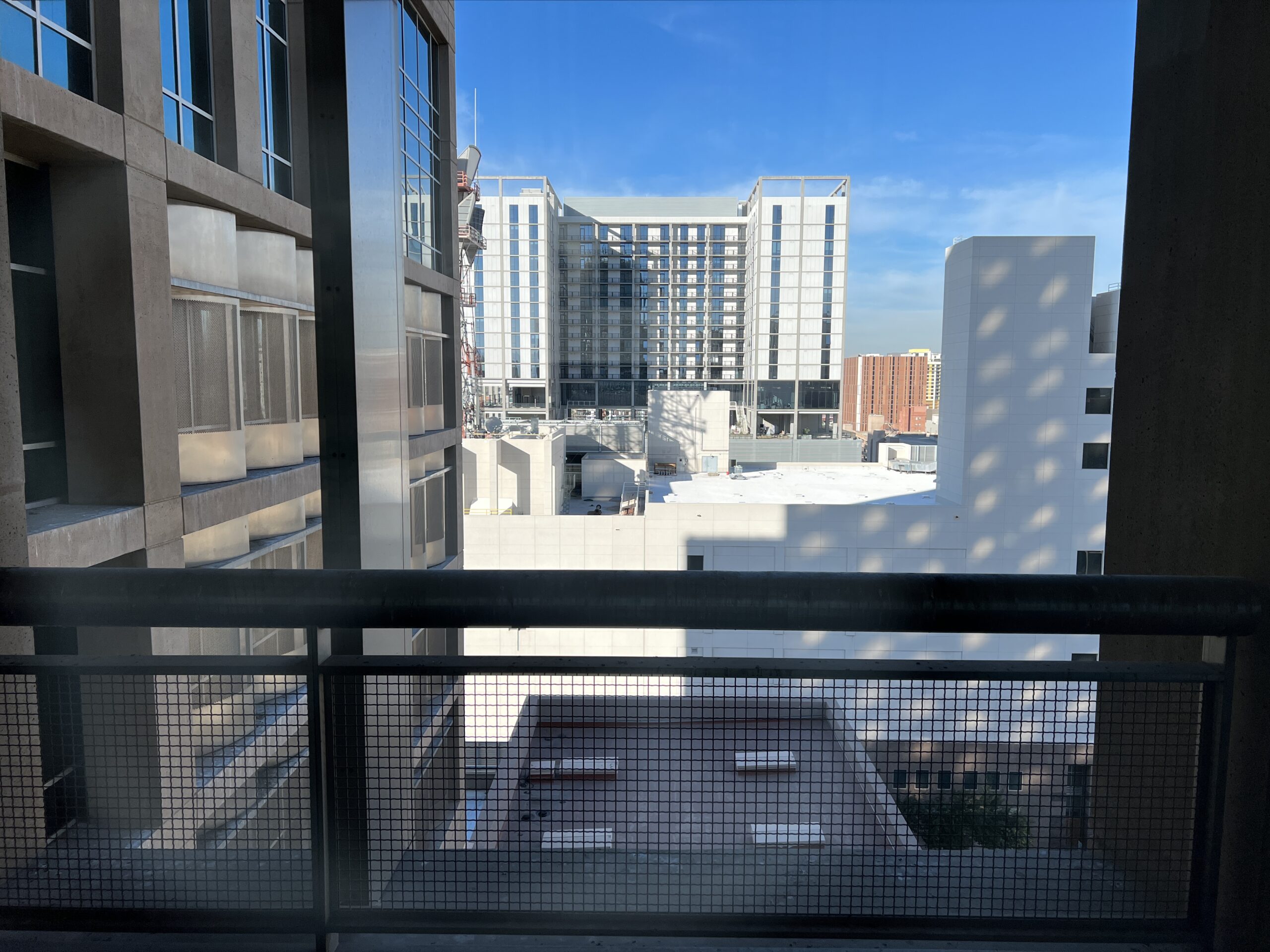
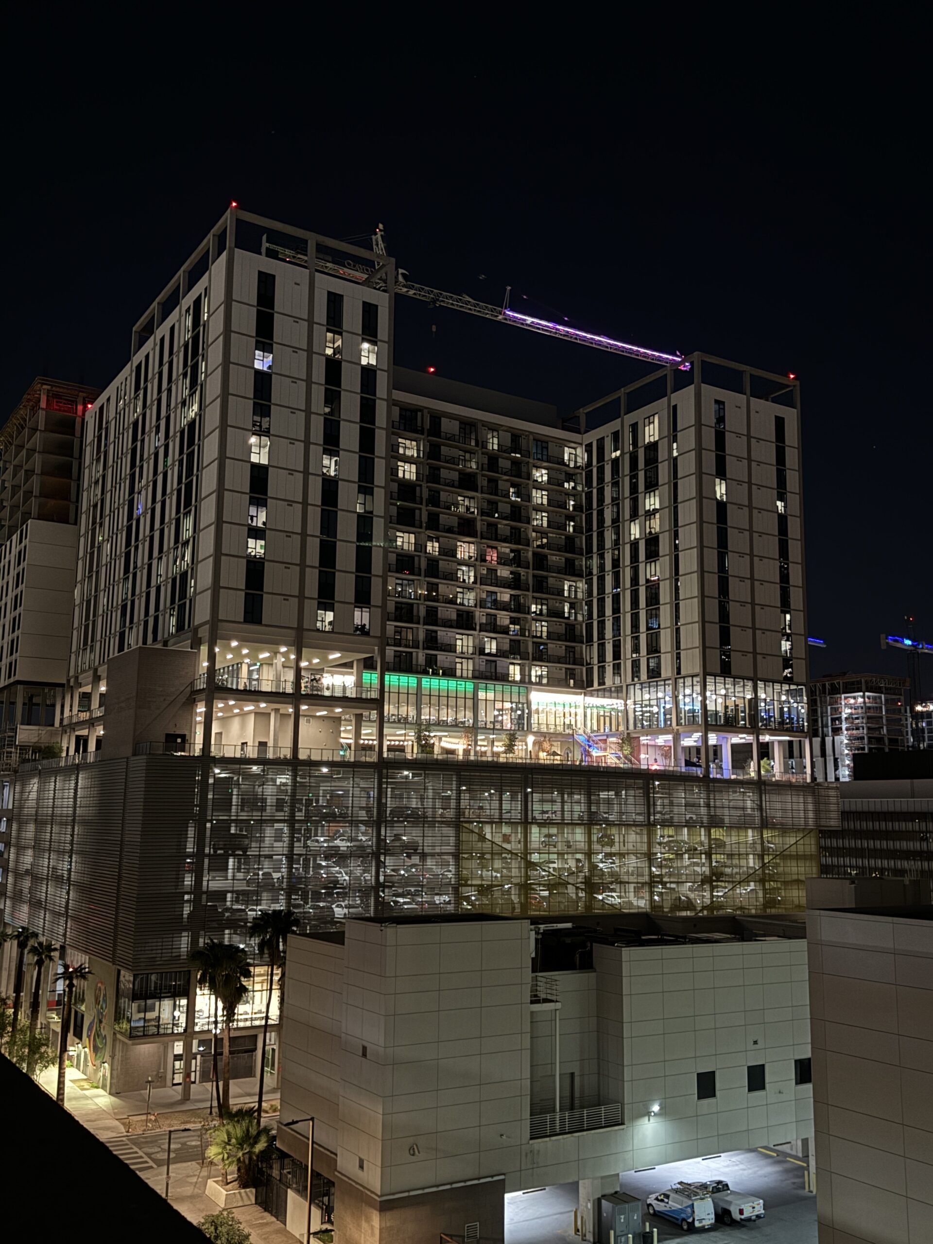
They started construction on Phase 2 in late 2023 or early 2024, and it seemed it was taking forever. When I retired from the City in January 2025, it still wasn’t finished, although it looked close enough that would probably be done by the end of the year.
Well, imagine my surprise when I was downtown a couple weeks ago and saw that it still wasn’t completed, and in fact, looked like precious little had been done since I last saw it 20 months ago. At least now I know why.
1 comments
I Could’ve Sworn I Posted This One Already
…because it’s such a funky layout with a bedroom physically separate from the rest of the house, but I looked and couldn’t find it.
2 comments
Needs Color, But I Like The Layout…
Submitted Without Comment

At Least He’s Honest…




I Guess “Post Modern” Meant Something Else In The 60s
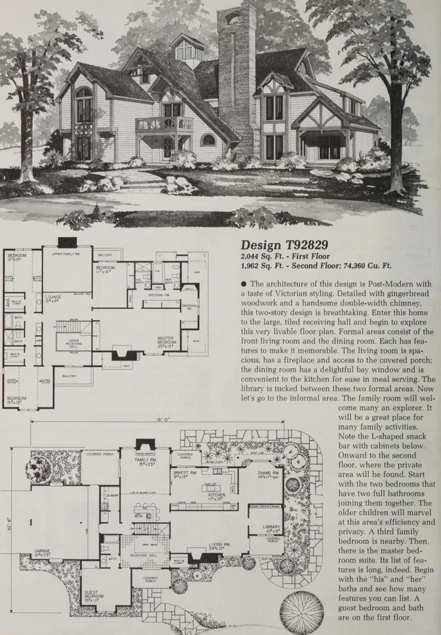
I don’t understand the bathroom arrangement on the second floor. Two of the bedrooms have their own, but also they’re also shared. And this his and hers bathrooms in the master suite?
At least there’s a guest bath on the first floor—even if it belongs to the Guest Bedroom…
1 comments
Won’t Someone Please Think Of The Billionaires?




I Like This One
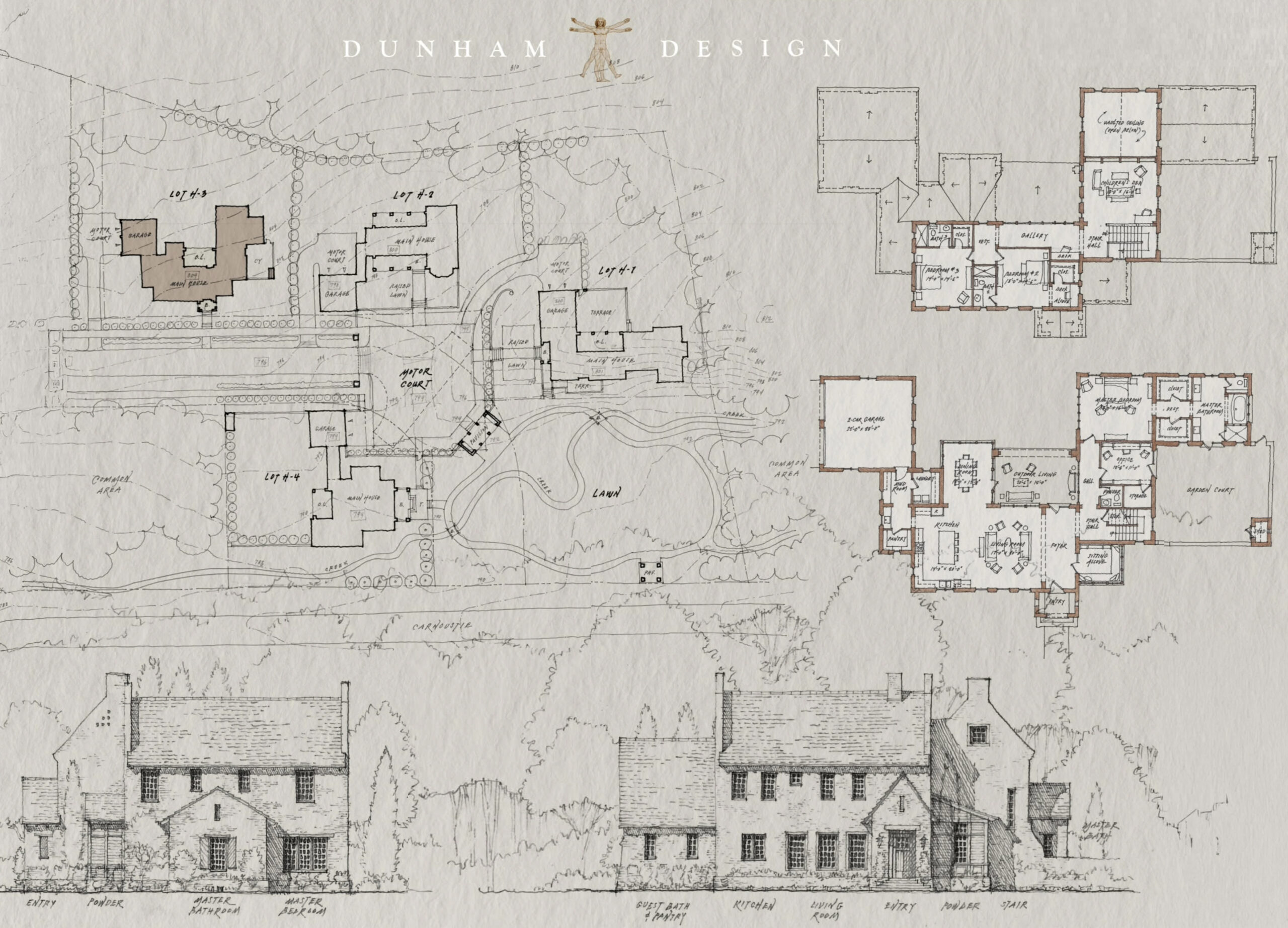
I Could Live There
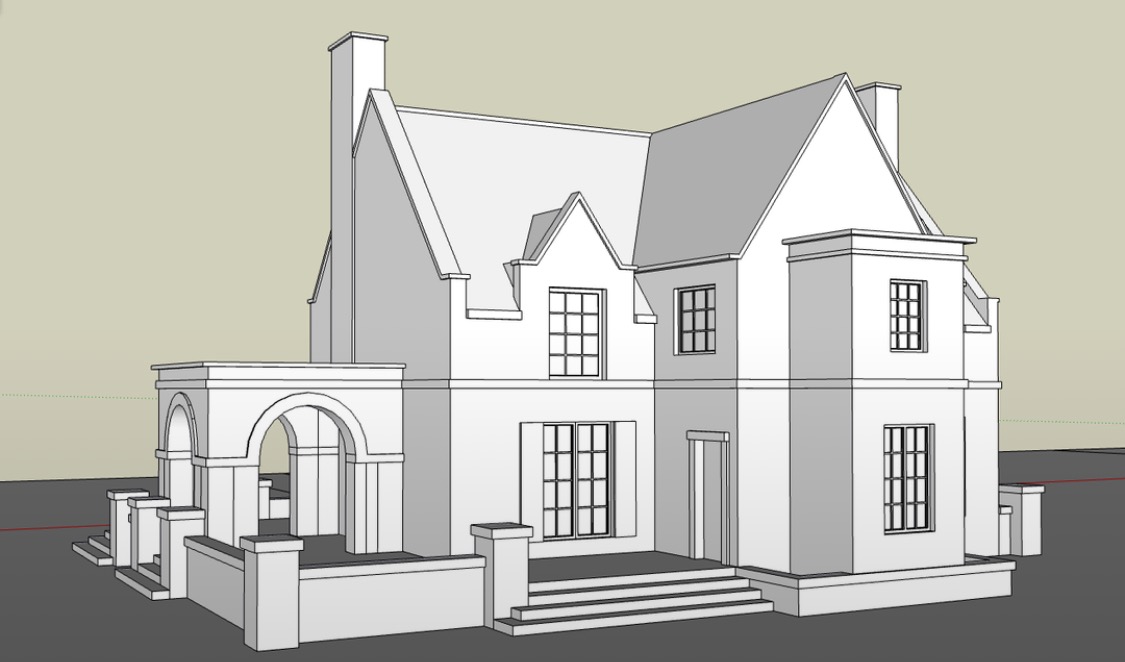
Yeah, It’s Like That For Them

I Like This One
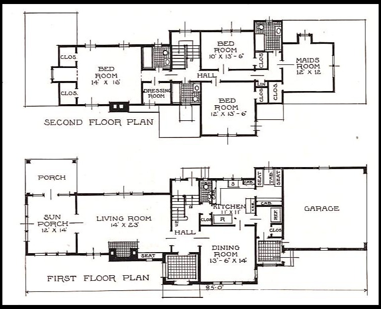
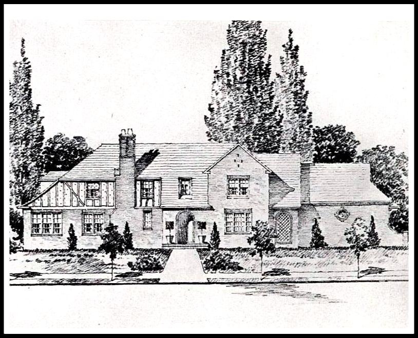
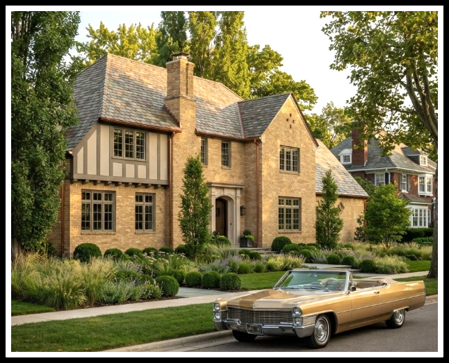
The Most Important Part Of The Morning
That’s Quite A Hallway…
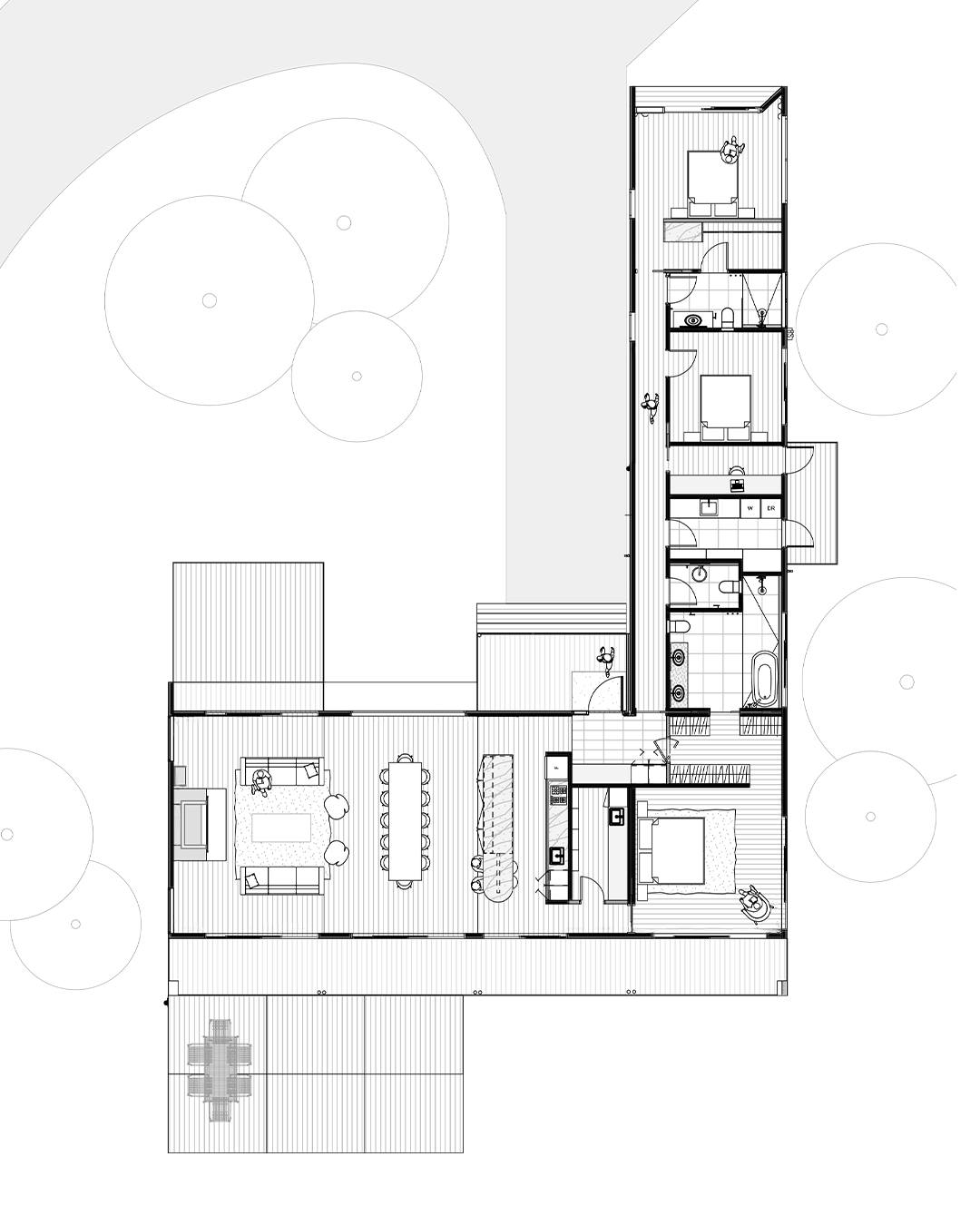
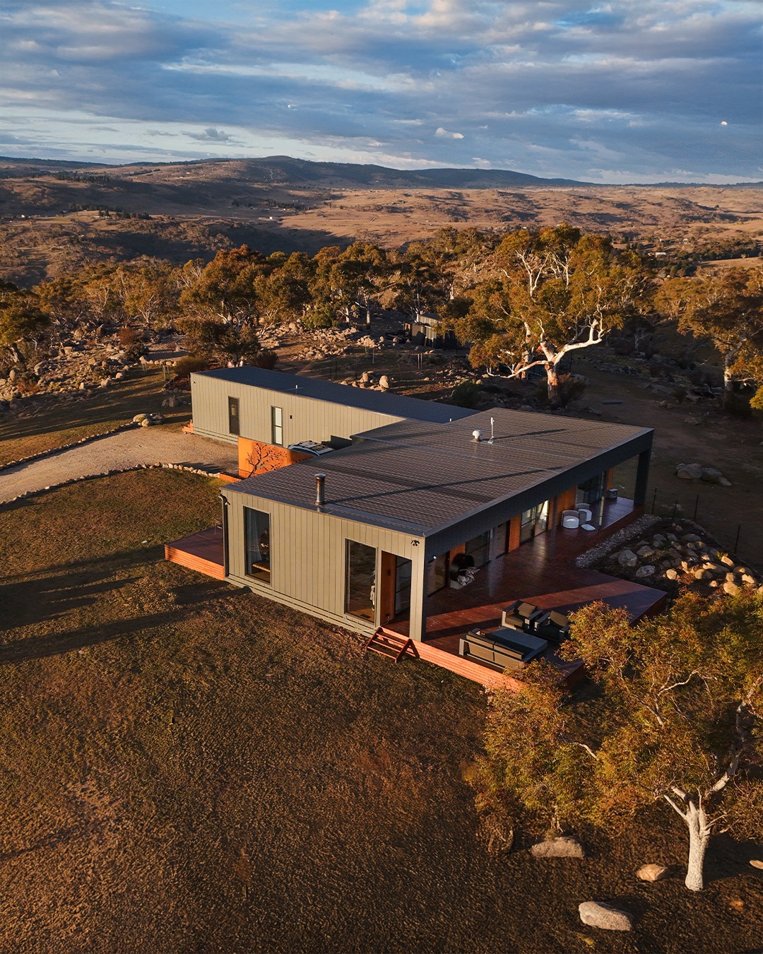
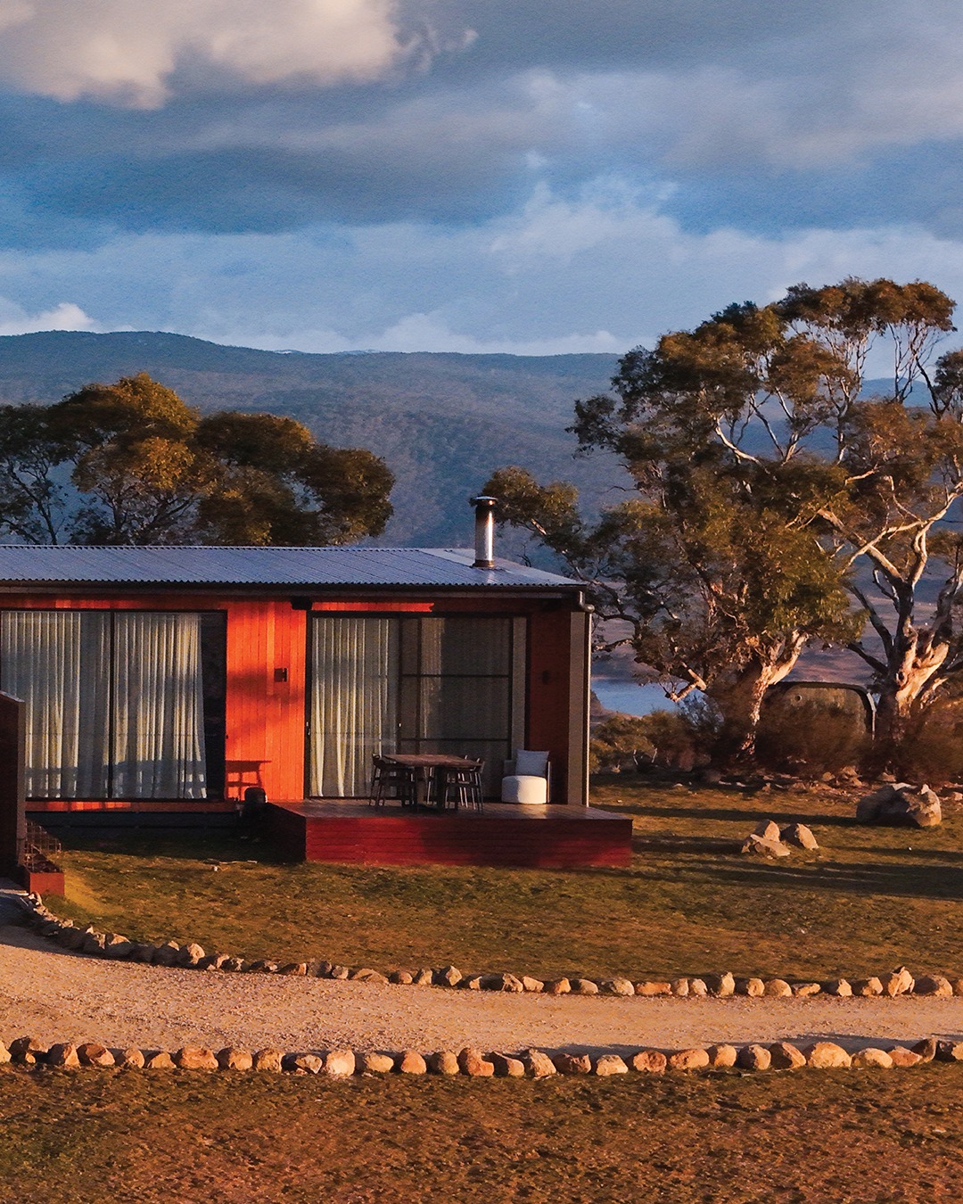
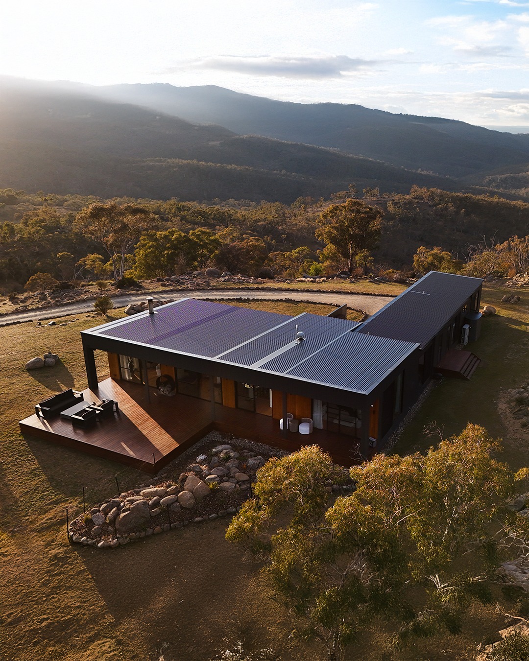
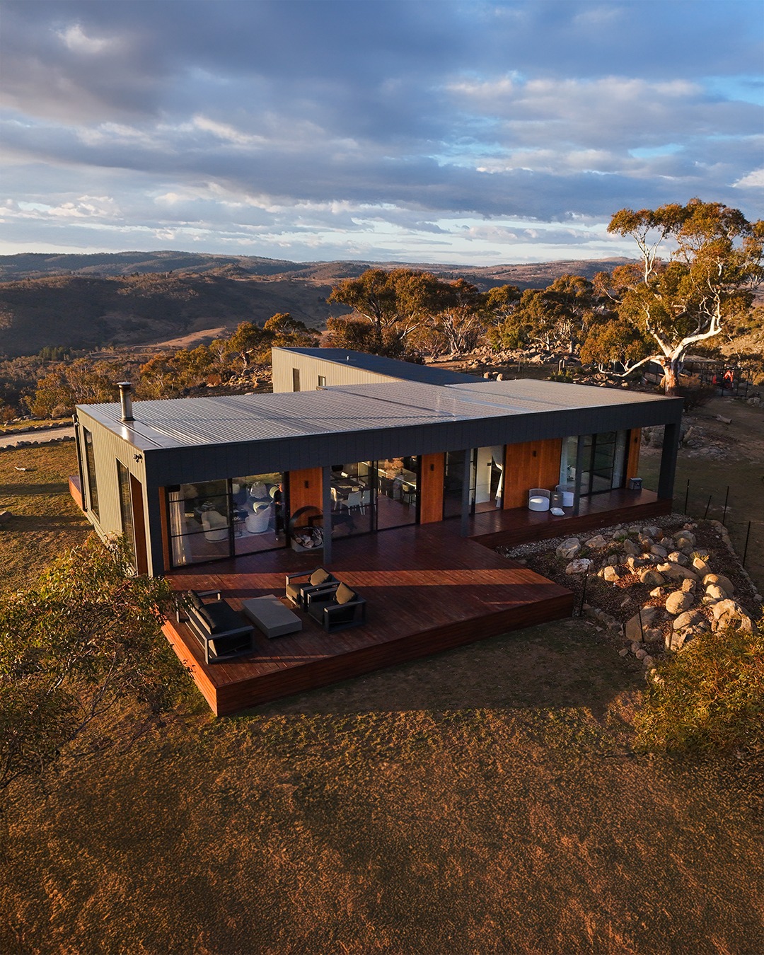
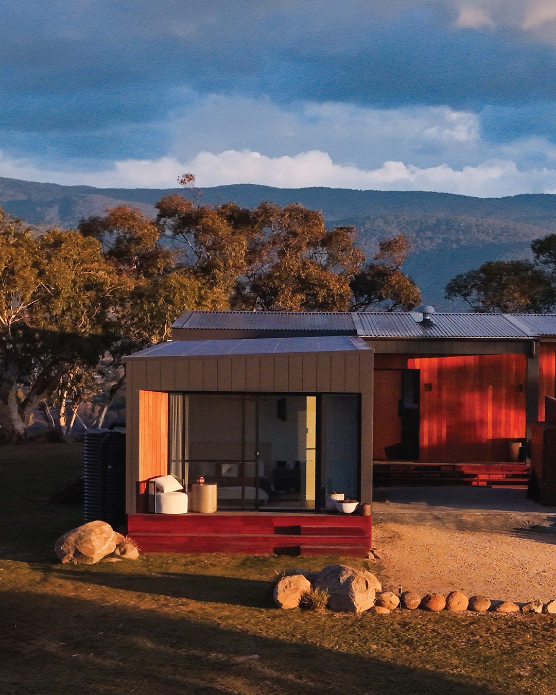
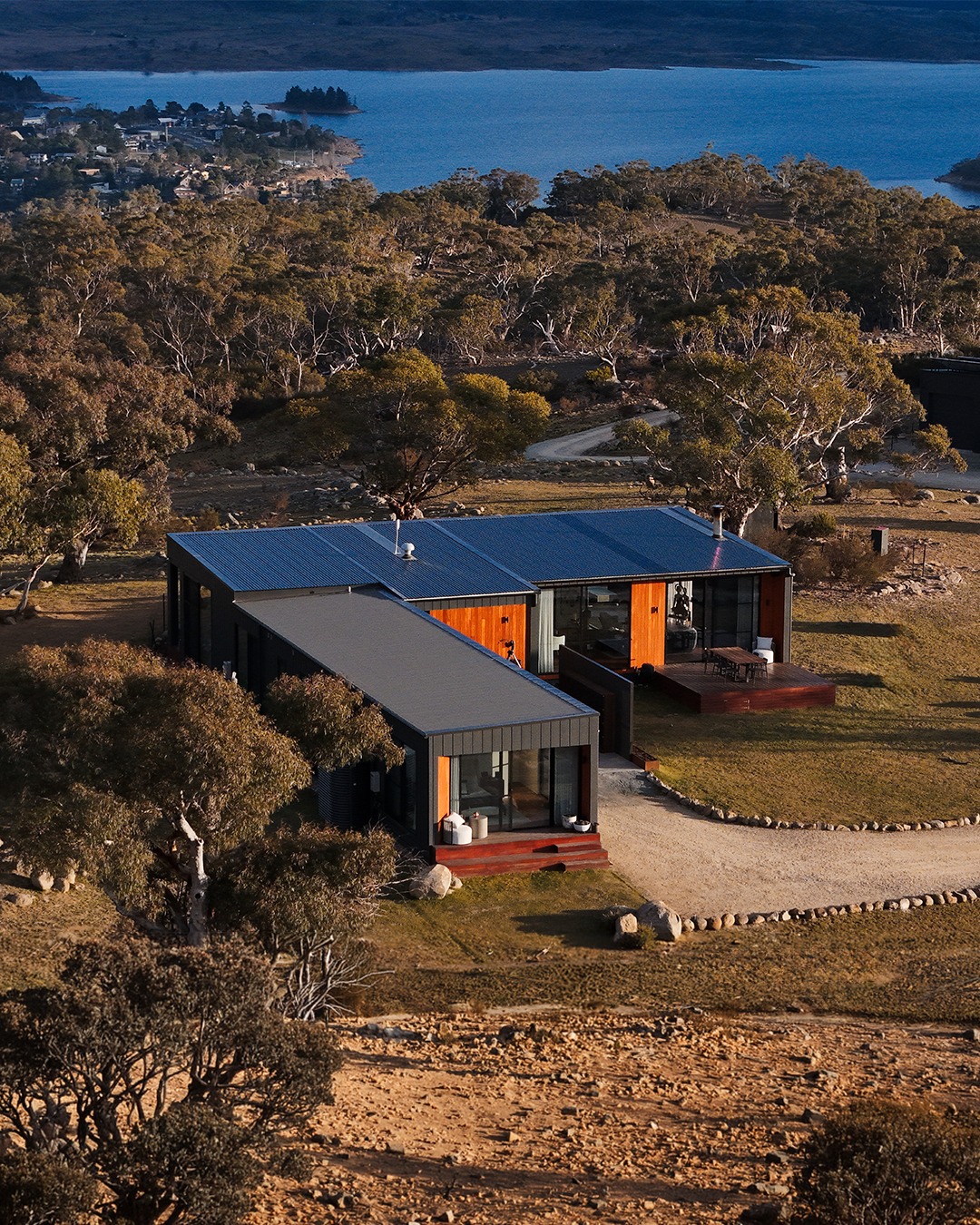
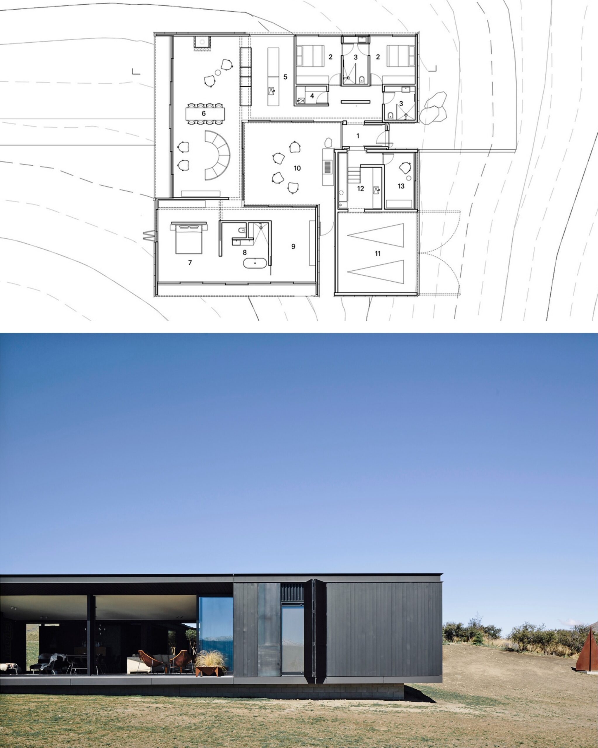
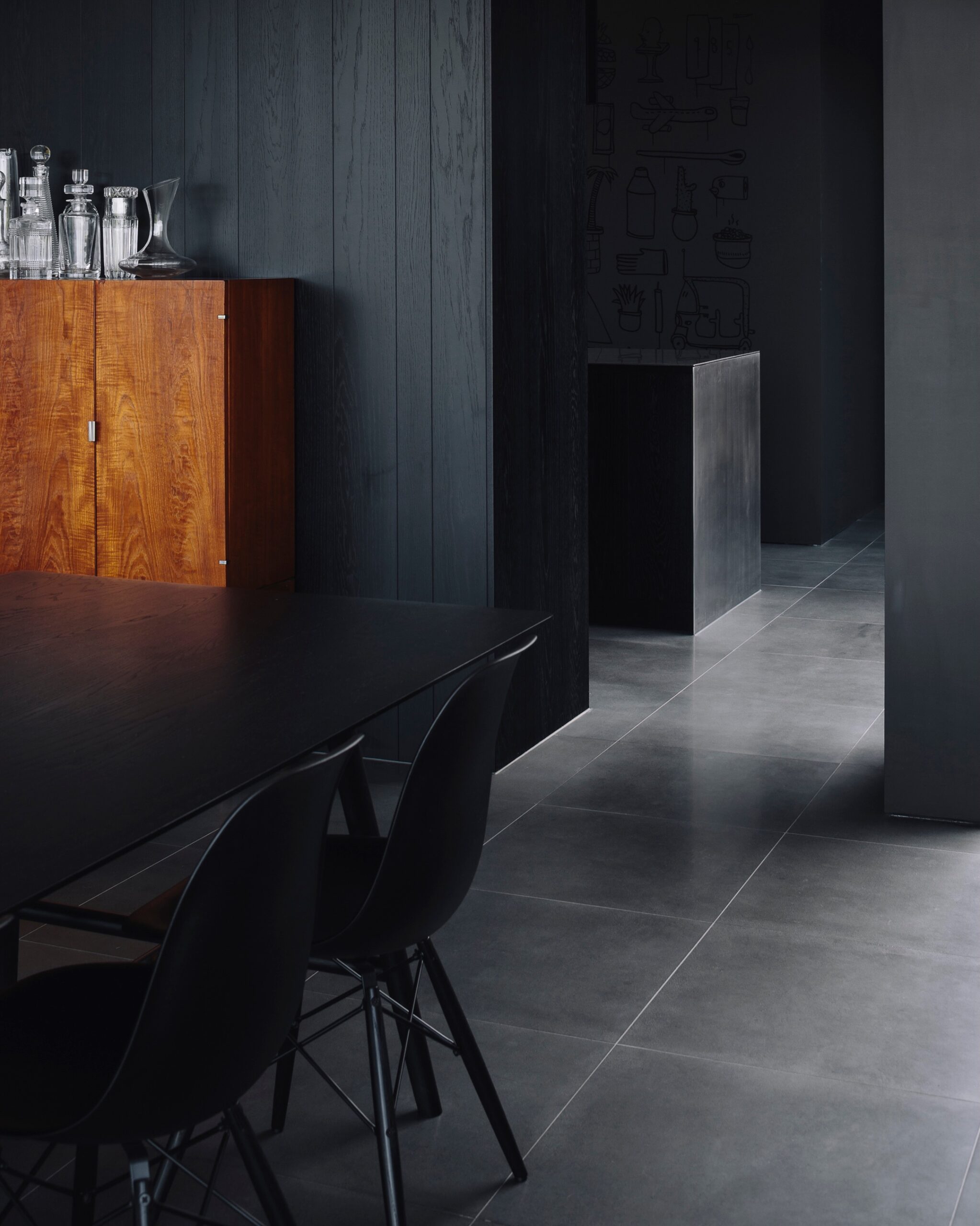
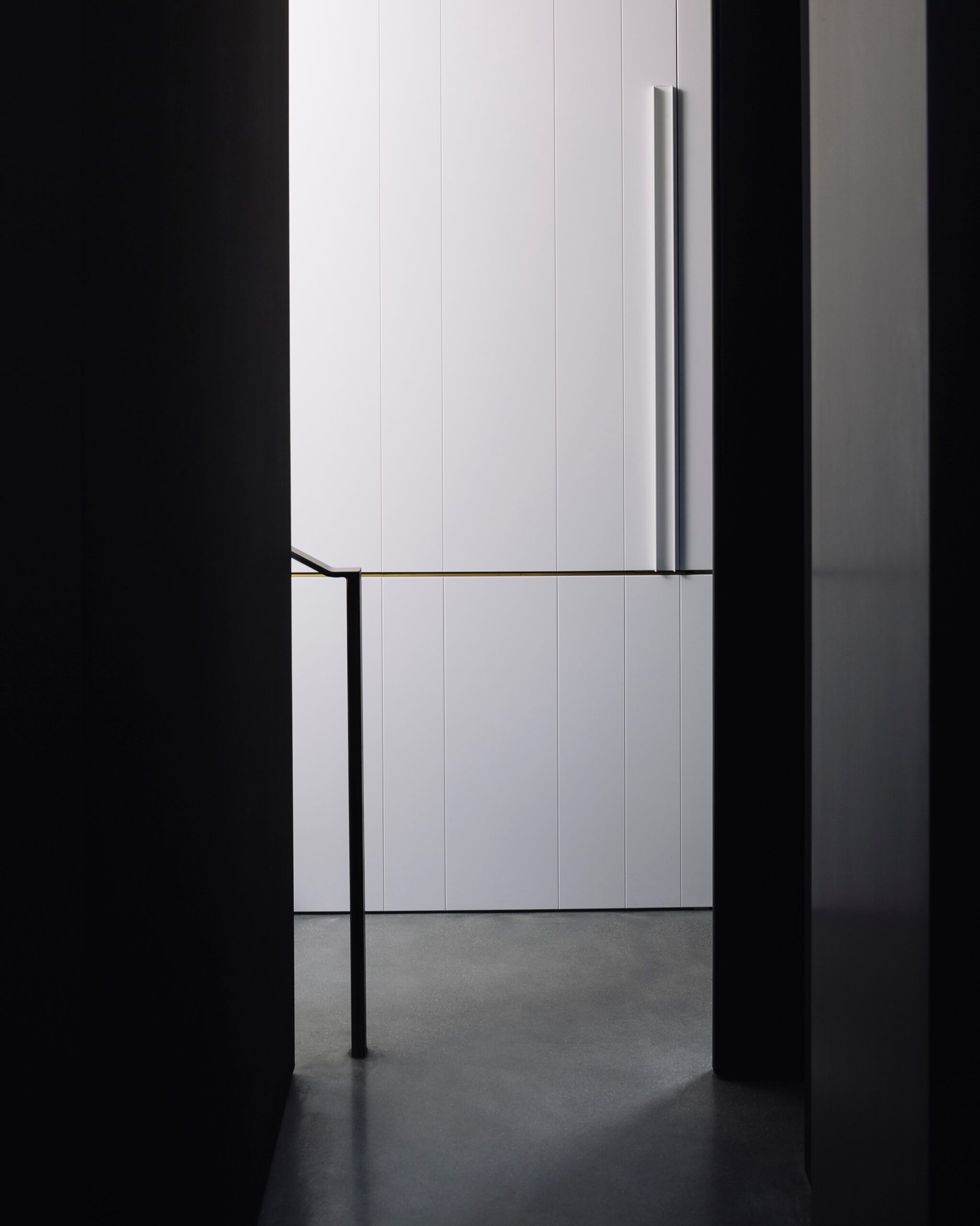
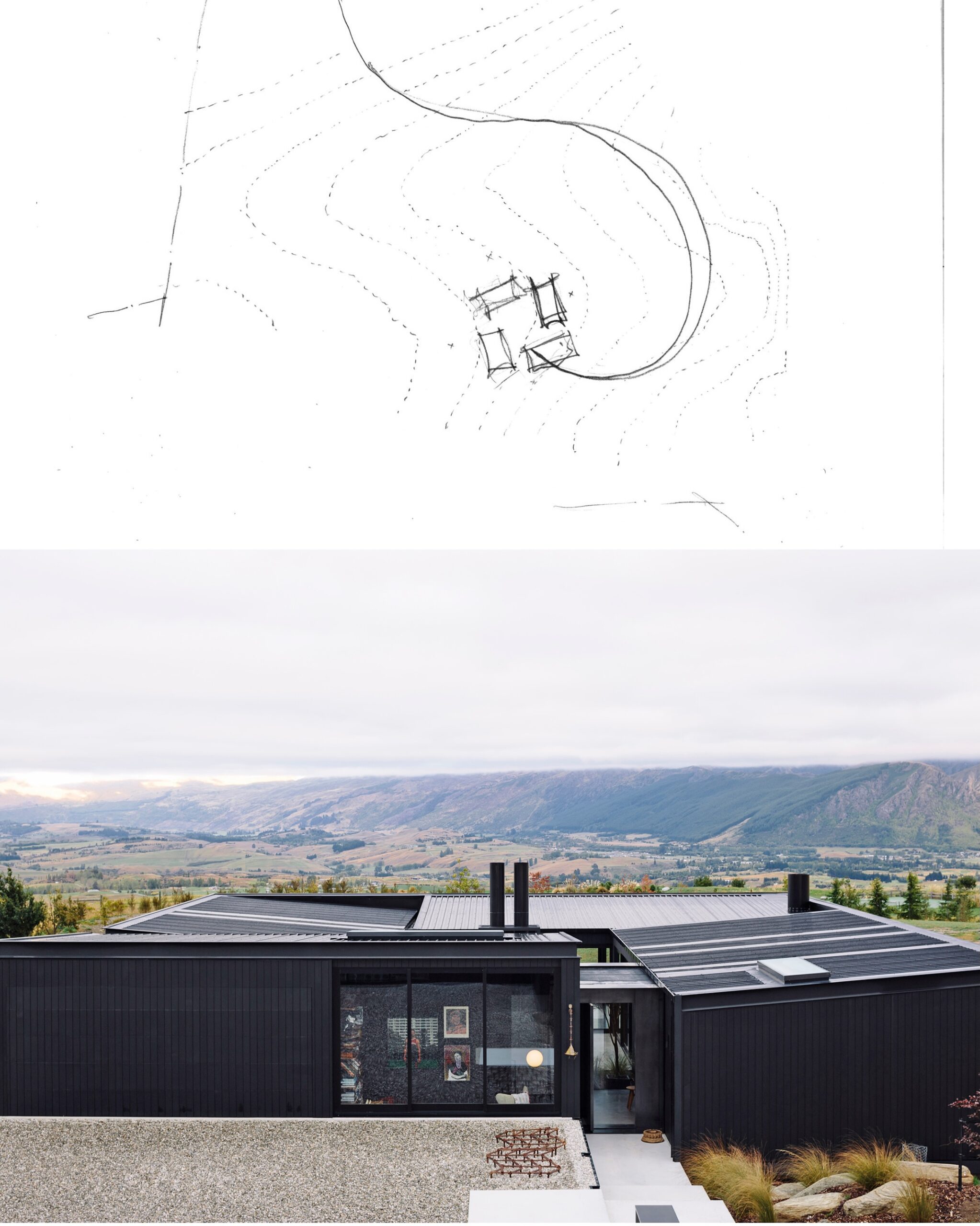
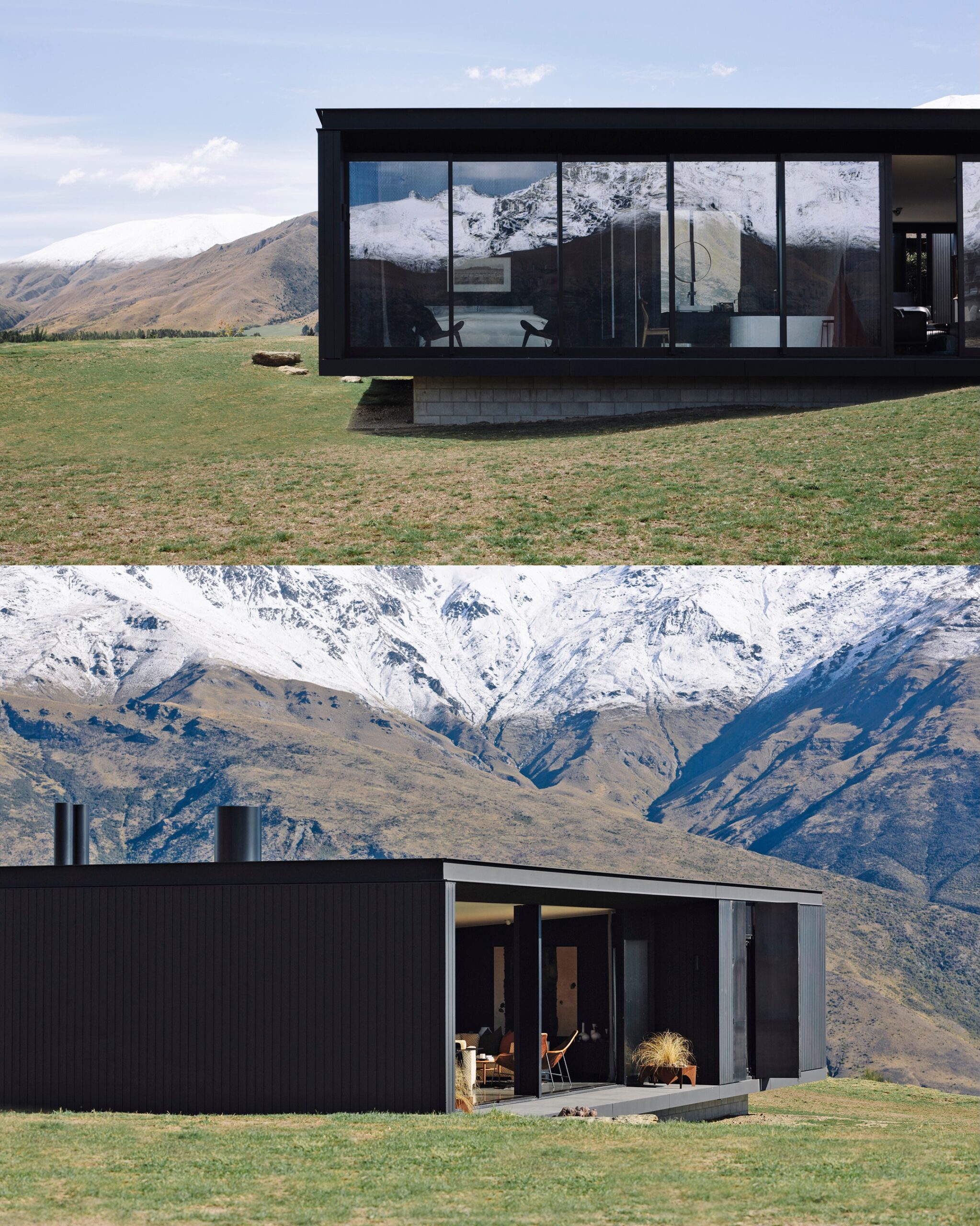
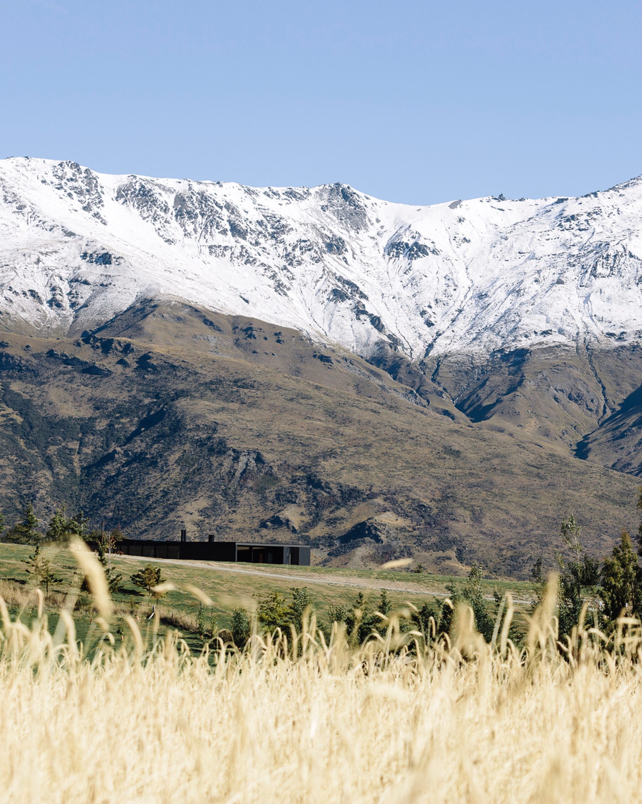
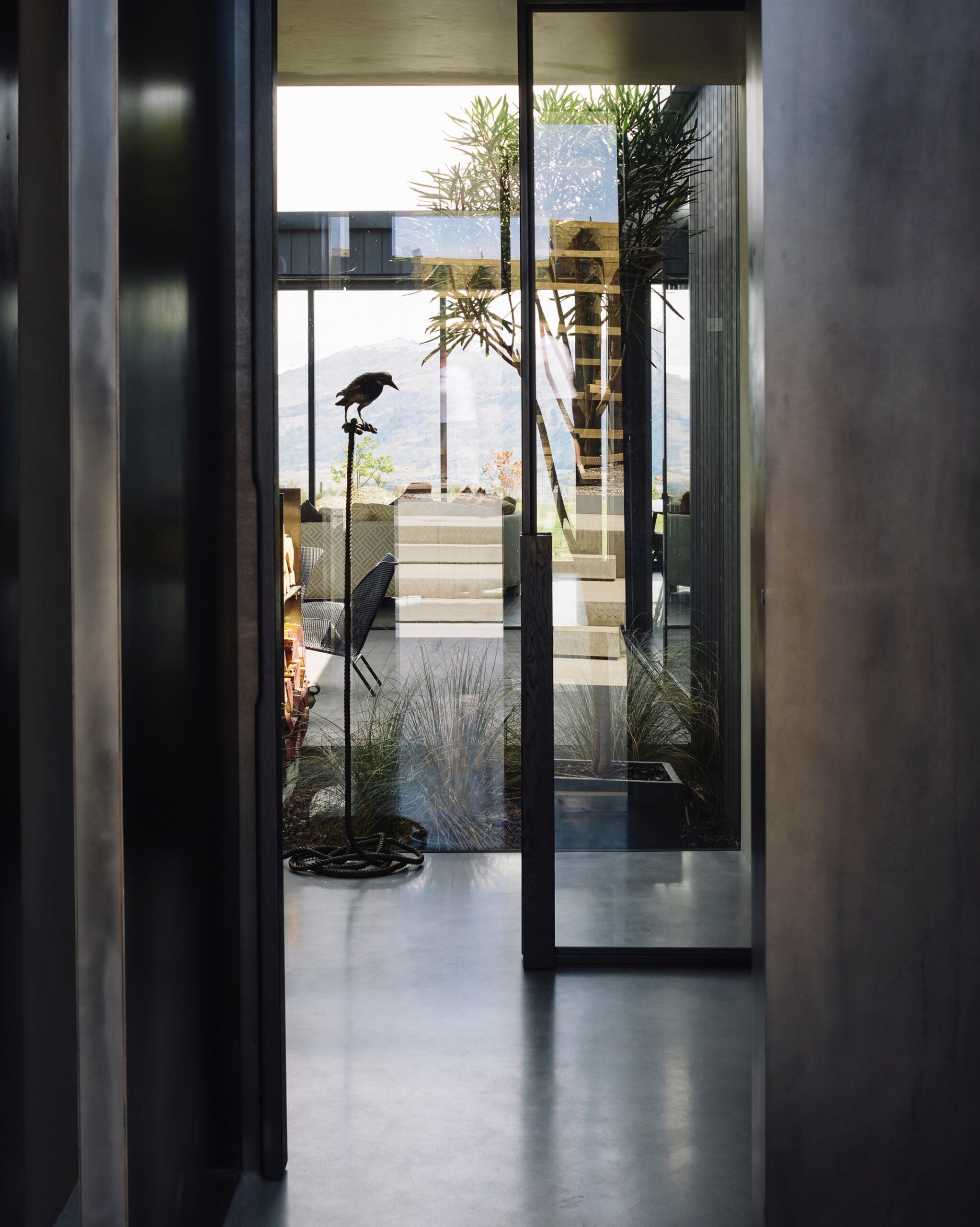
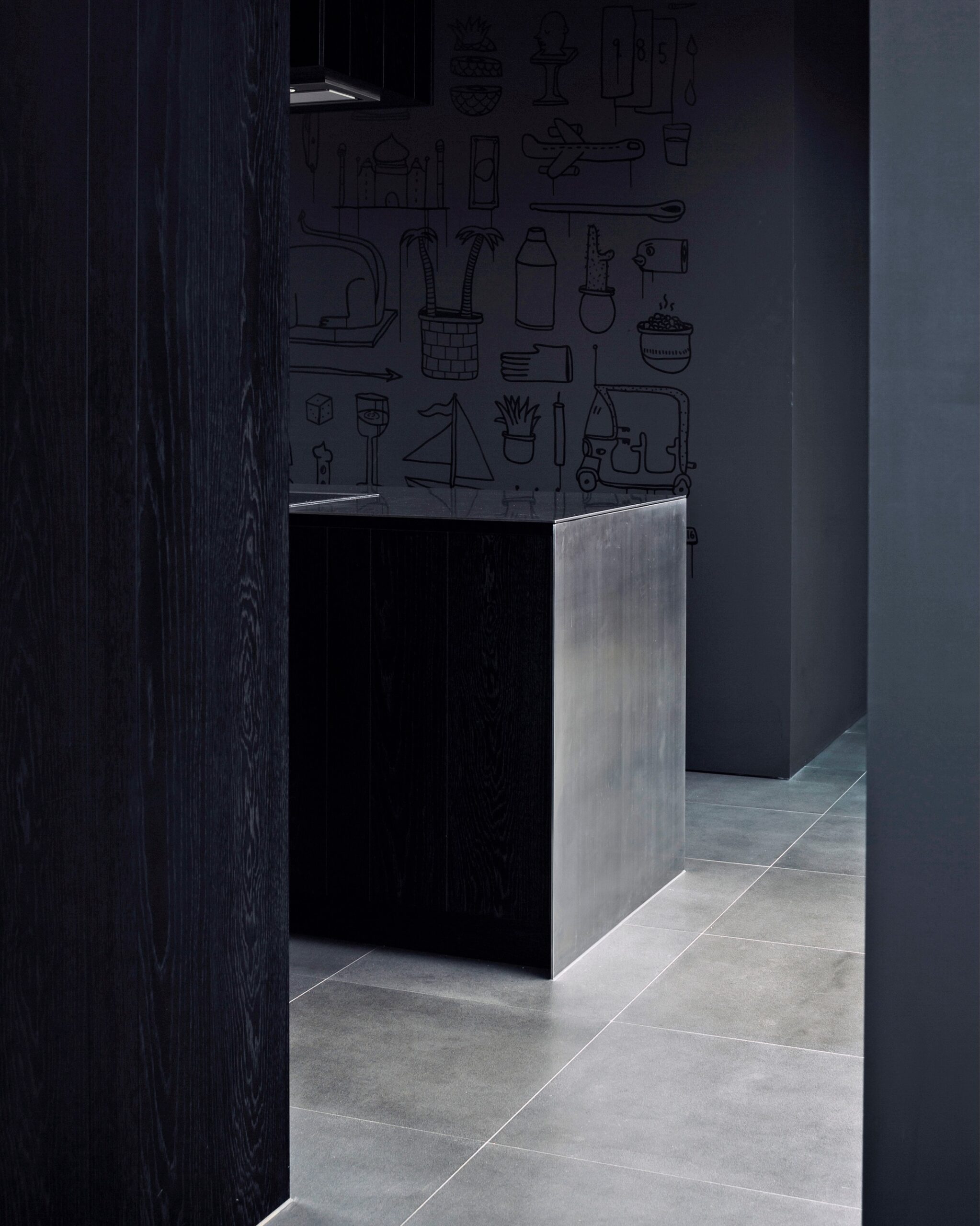
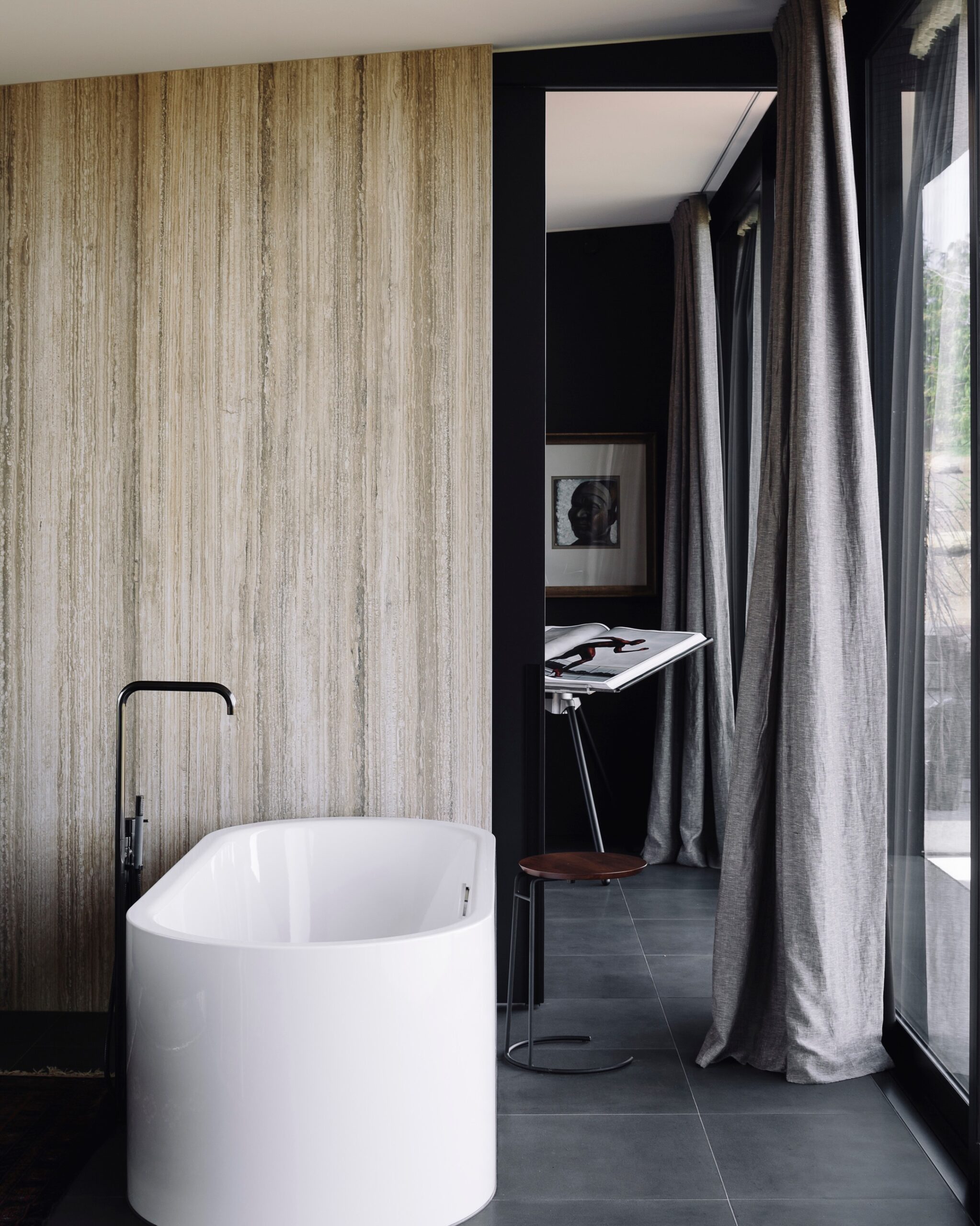
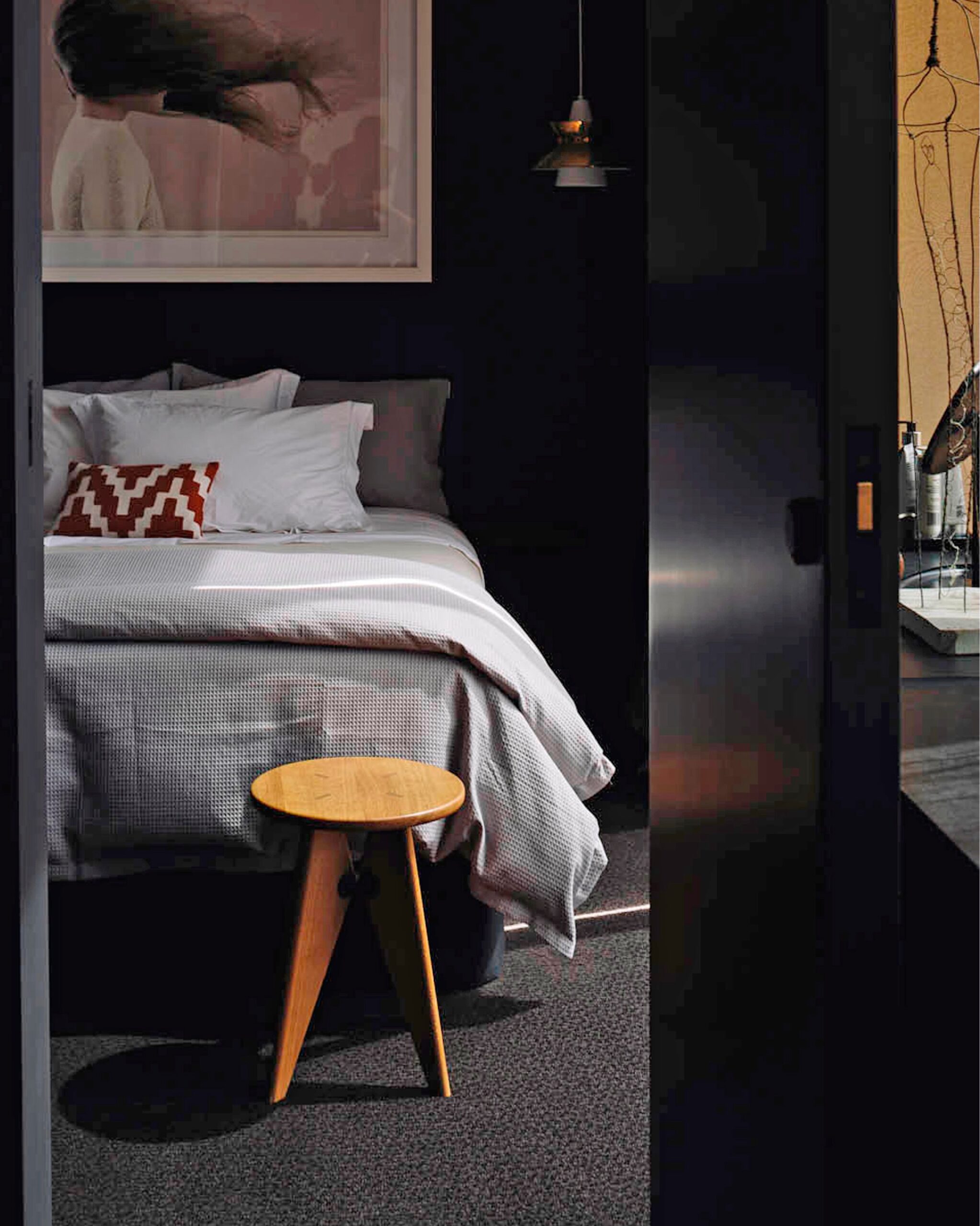
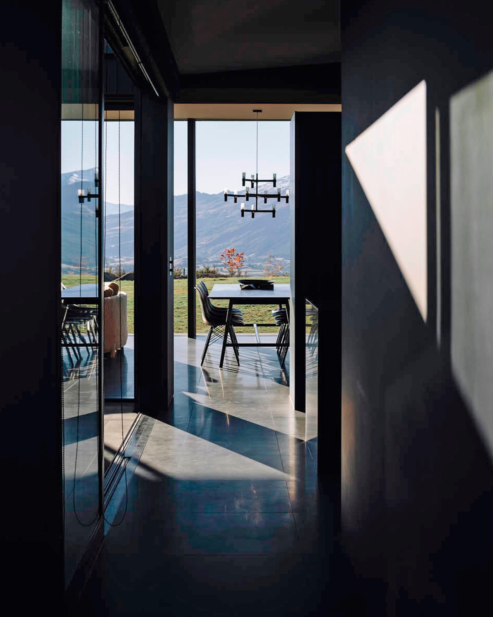
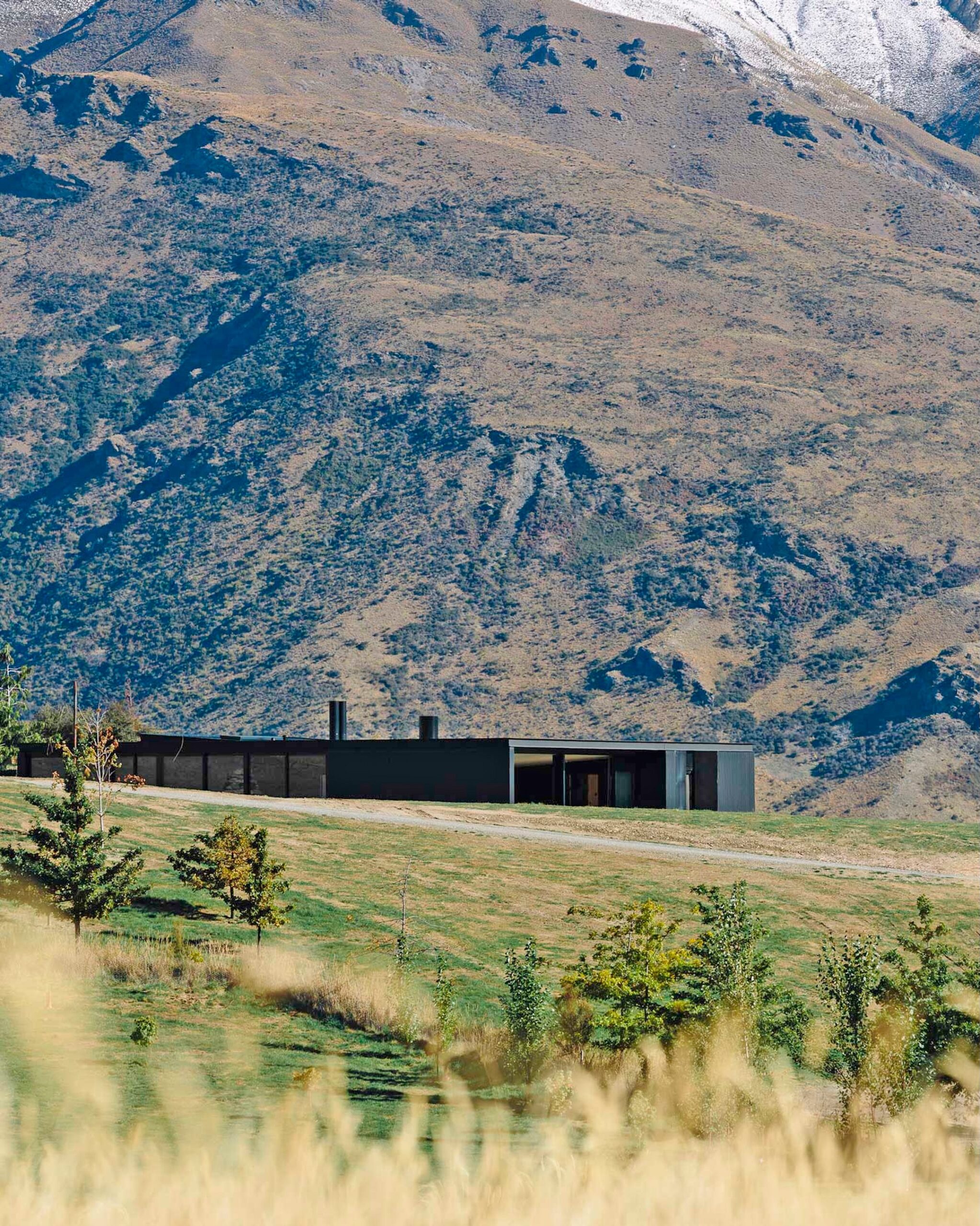
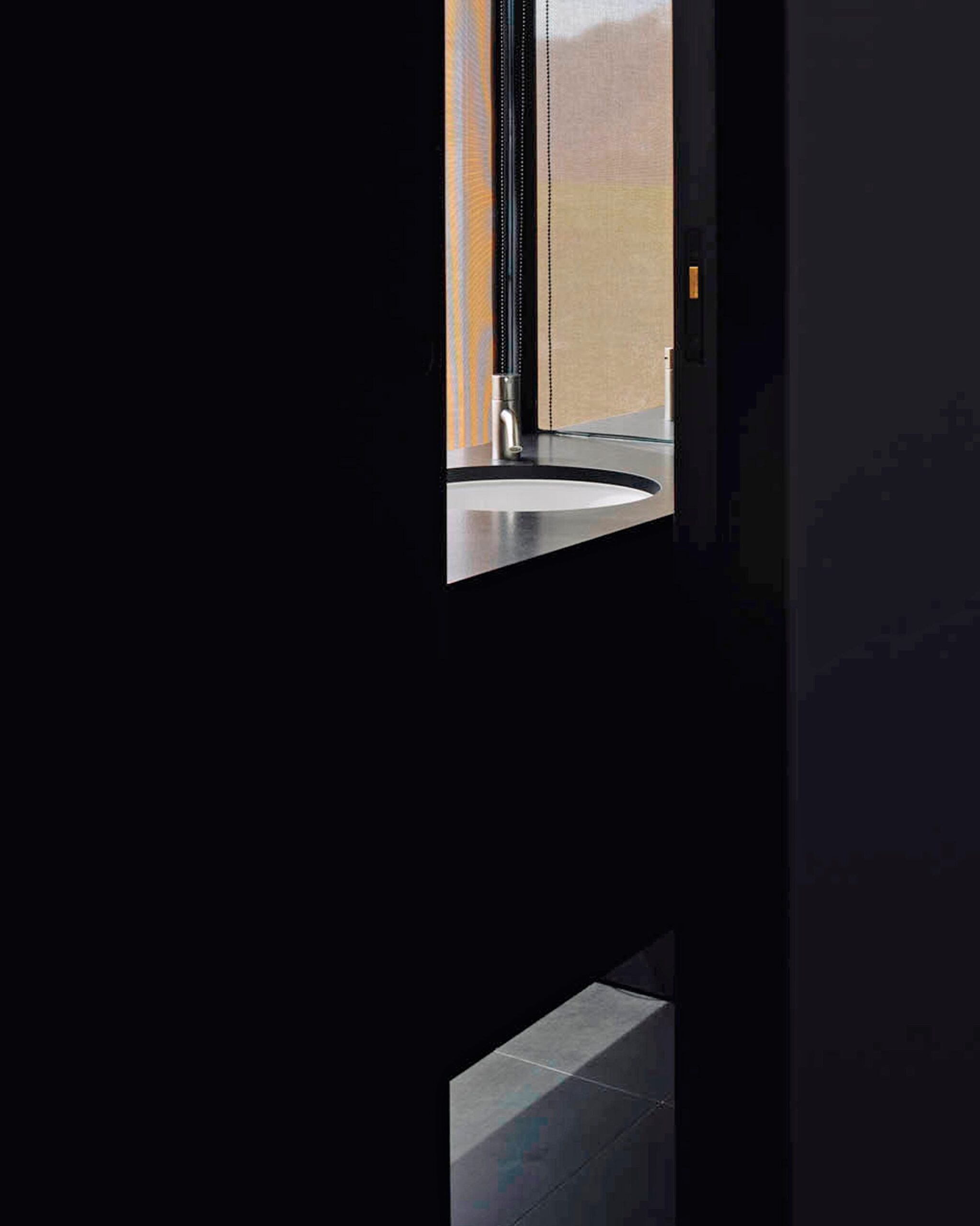
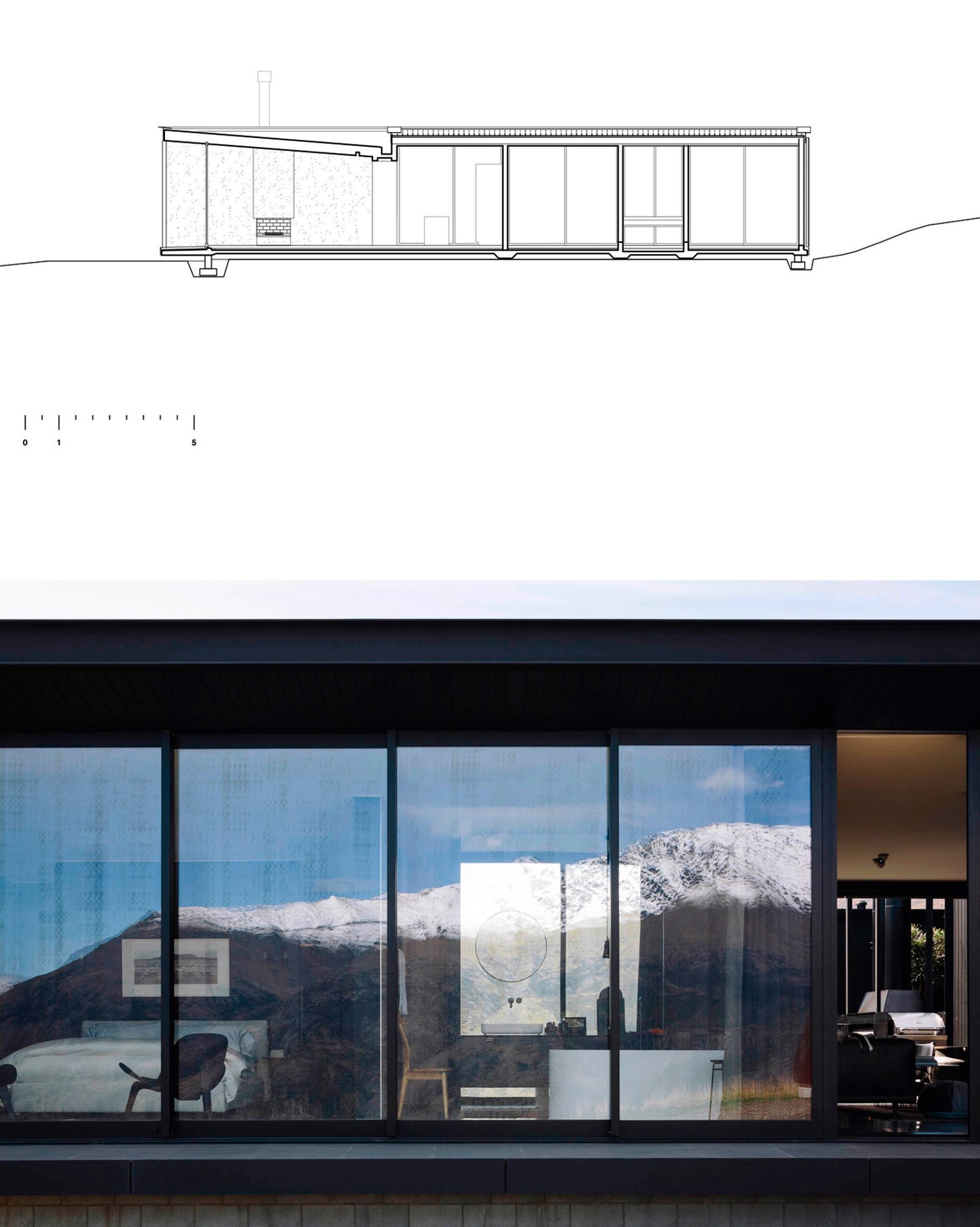
arkular_: Embrace the slow. Designed around the landscape, the Jindabyne House is a home base for getting out into nature and then retreating back in.
At 280m², the L-shaped layout balances shared living with private retreat spaces, creating a home that feels generous, calm, and easy to live in. Expansive glazing brings the outdoors in, while a fully self-sufficient, off-grid setup allows for independence without compromising comfort.
Thoughtfully designed, sustainably powered, and carefully considered, this is architecture that works with the landscape, not against it. Your site deserves a home designed for it.
1 comments
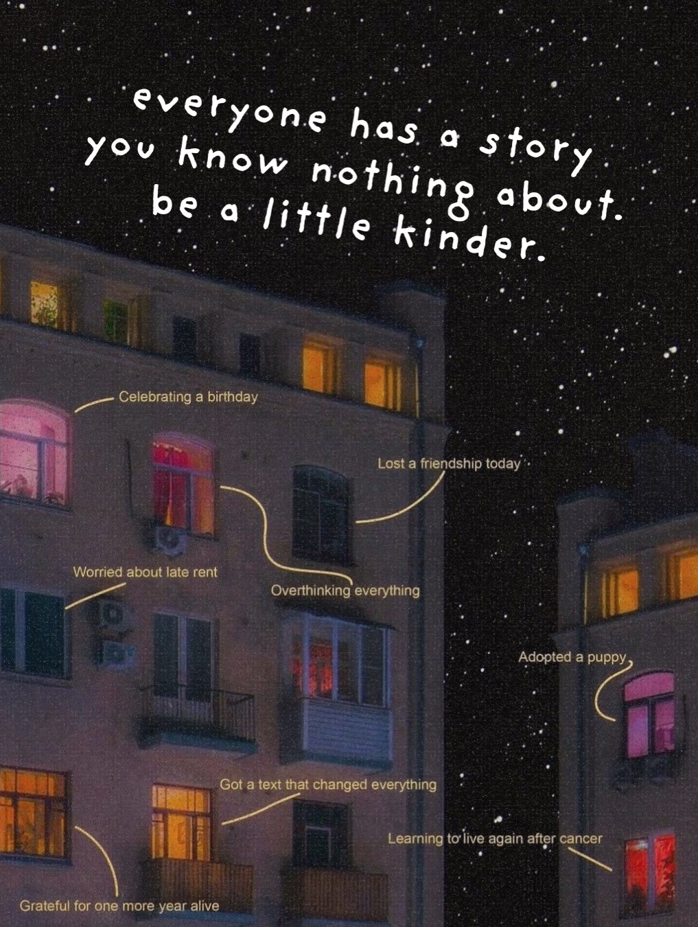
Practice Kindness

This Is Fun
Midcentury Compact
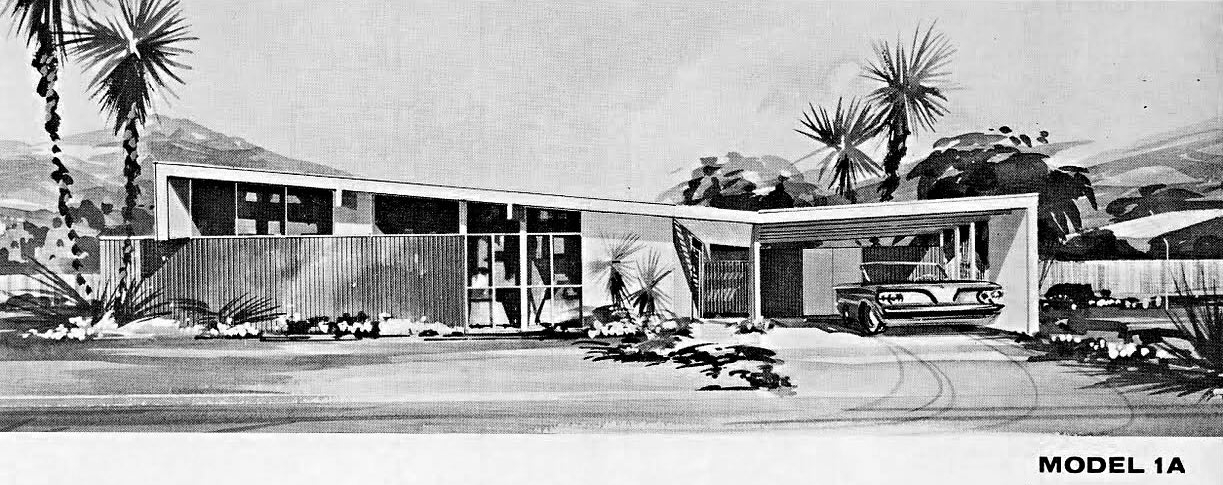
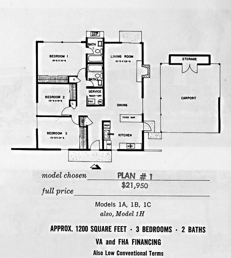
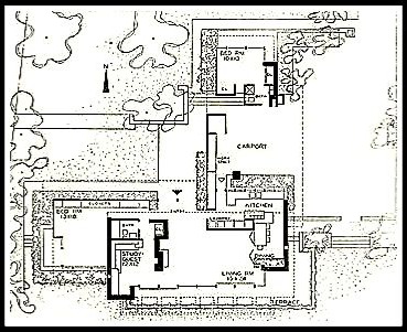
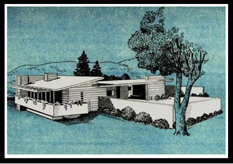
Other than the windows on the exterior rendering not matching up with the actual floor plan…
The kitchen needs work, moving the door to the carport if necessary to the other side of the “food bar” so cabinets can be run the lenth of that wall. The entry hall is also unnecessarily long and dark, but I don’t know what could be done other than putting a glass panel front door in place.
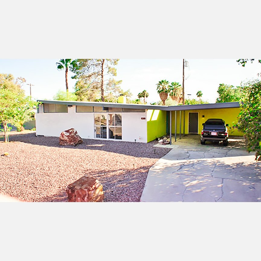
Obviously some changes have been made…
0 comments
Good Advice!
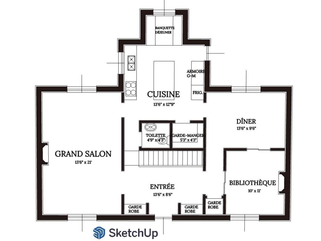
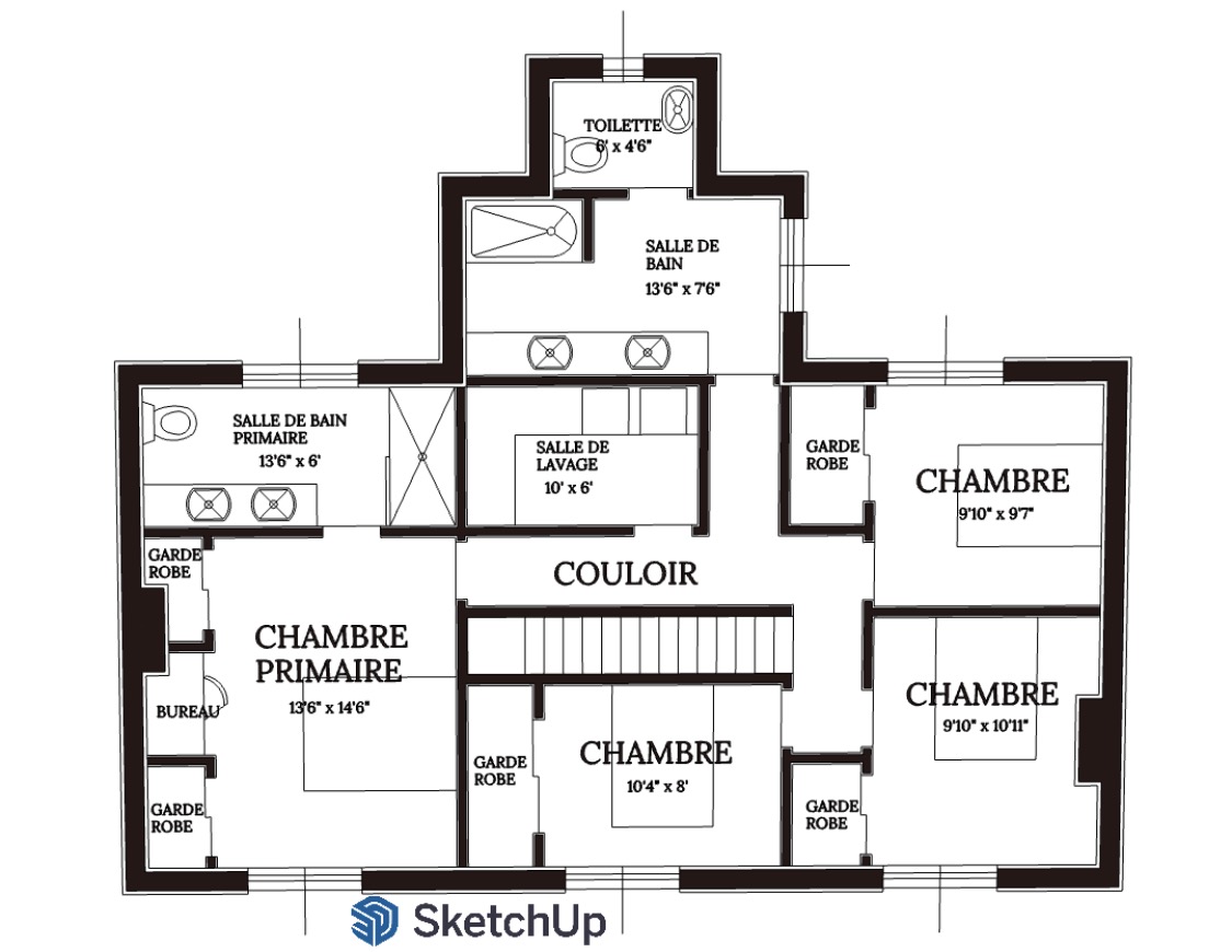
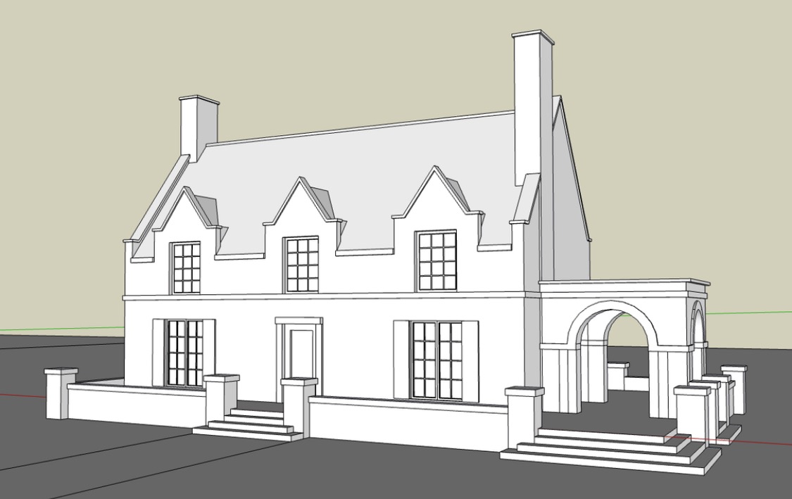
I Don’t Care For The Exterior Treatment, But I Rather Like The Floor Plan (With A Few Caveats)


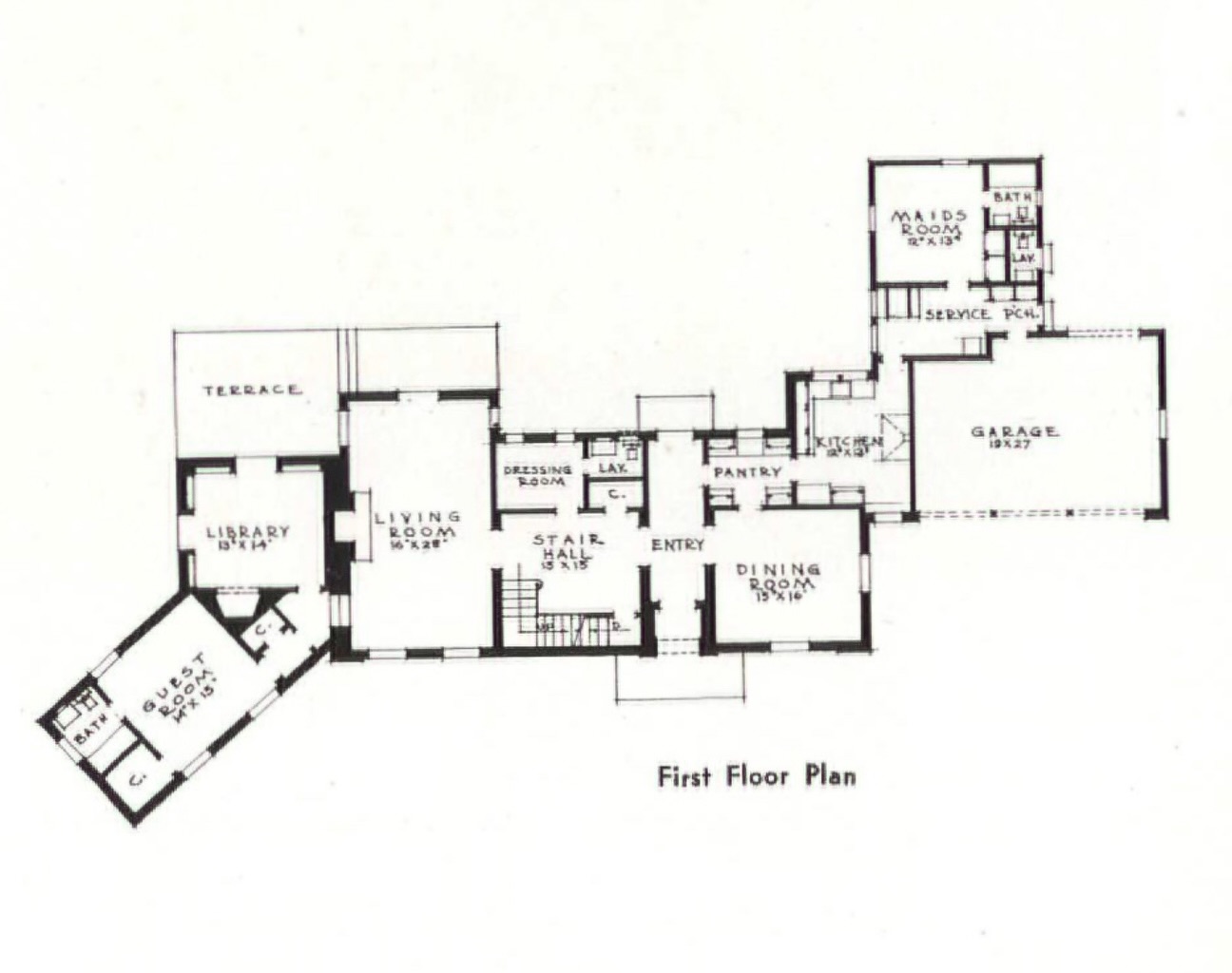
I’d turn the existing Pantry into a Breakfast Room. Some of my fondest memories of childhood revolve around eating my bowl of cereal (usually corn flakes with sugar sprinkled on top, doused with half-and-half) in the breakfast room of my grandparents’ house in western Massachusetts. The closet between the Kitchen and the Service room could easily be turned into a pantry. I also think the cubbies and the fireplace in the Library need to go. There’s no place to put a desk unless you want it floating in the middle of the room.
I’d also have to sort out that rabbit warren of spaces just to the left of the staircase on the second floor. It seems odd that you’d have to pass through the door to the Master Suite in order to access the second bathroom since there is already a dedicated bathroom in the suite.
4 comments
As Normal Size Floor Plans Go…
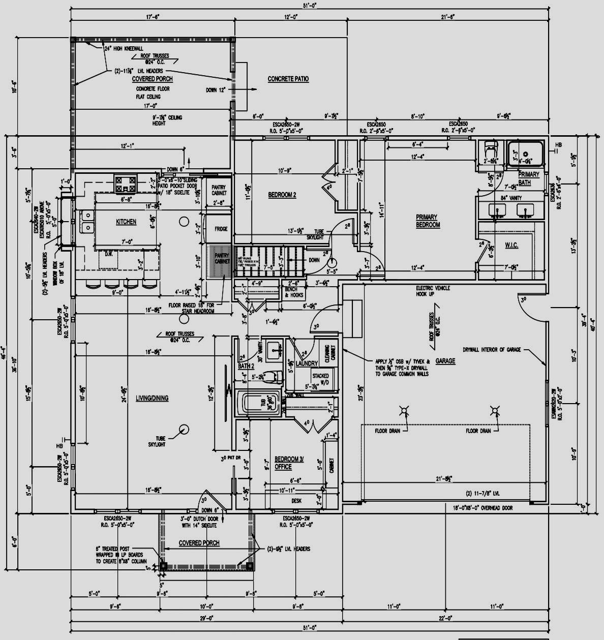
…this one ain’t bad! I think the only thing I’d change is to run the front porch across the entire front of the house, not just 10 feet at the front door.
2 comments