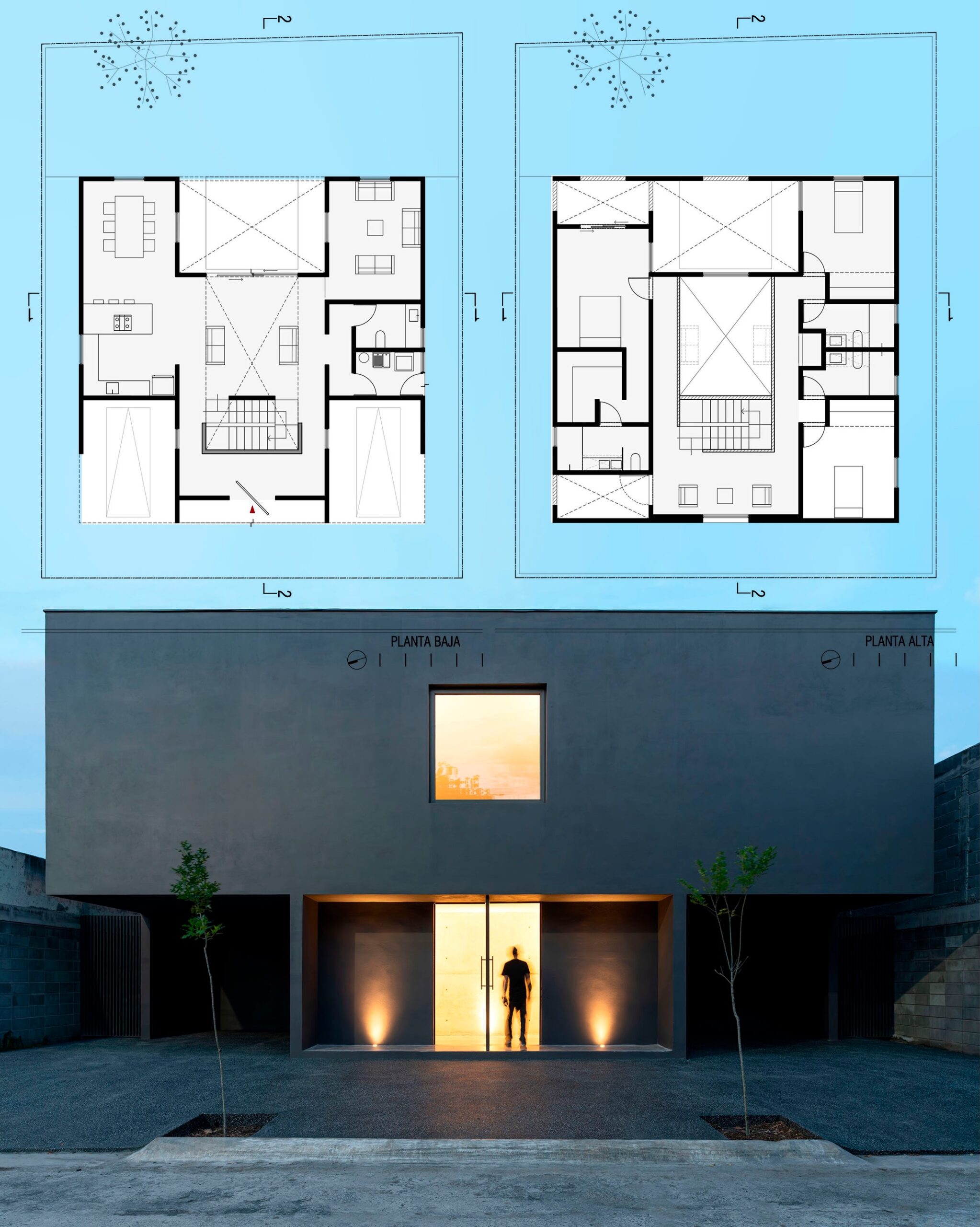
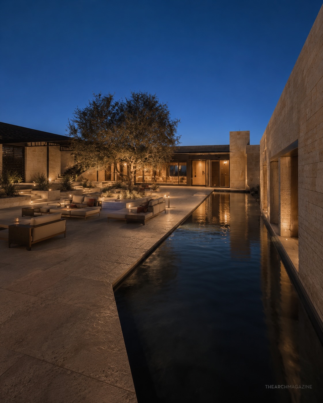
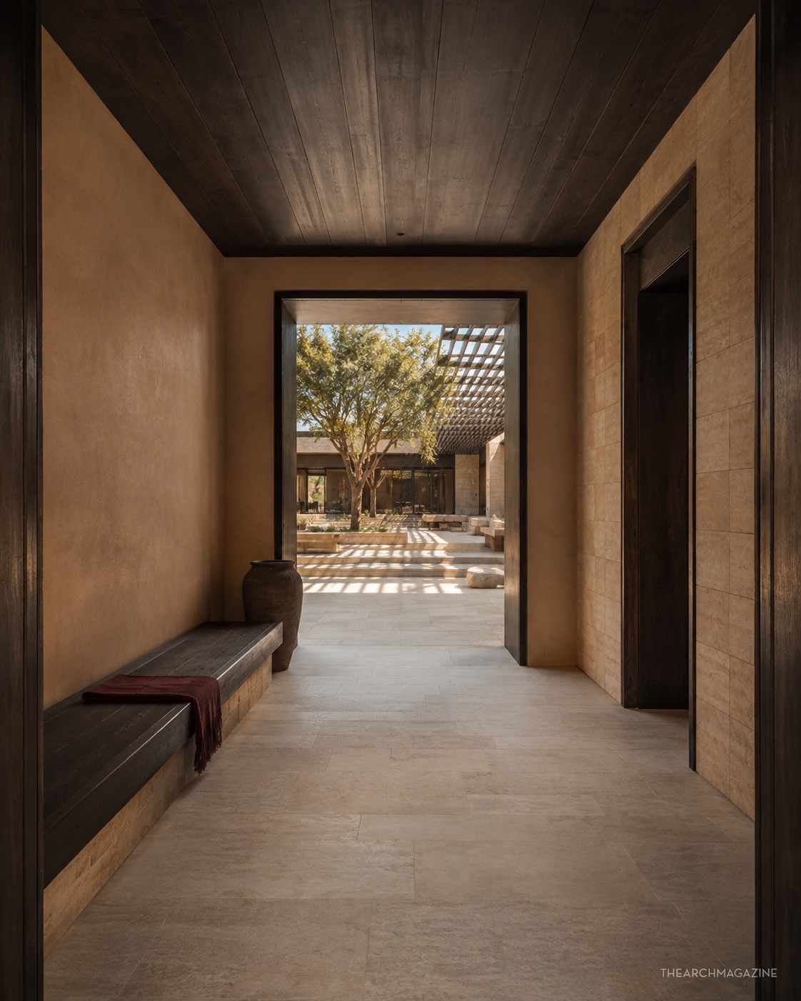
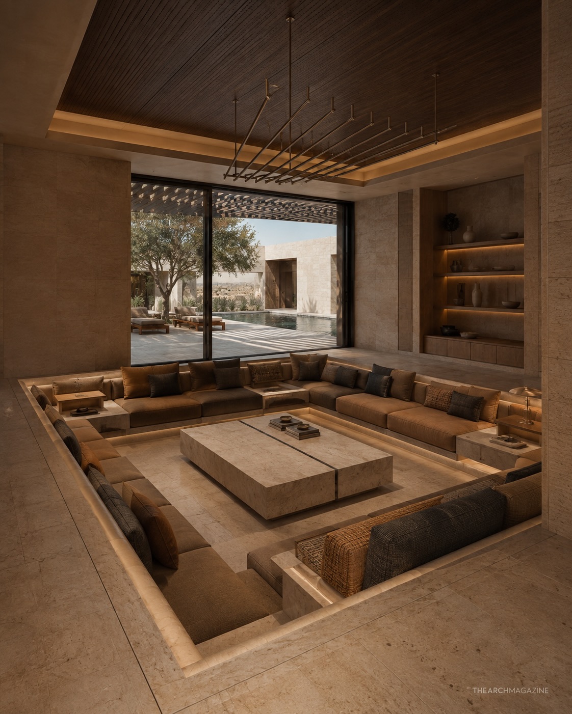
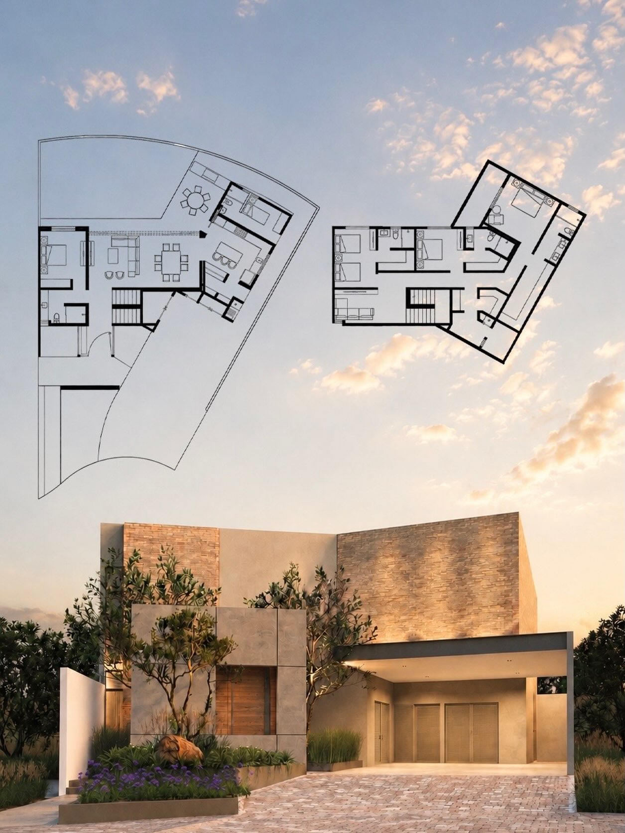
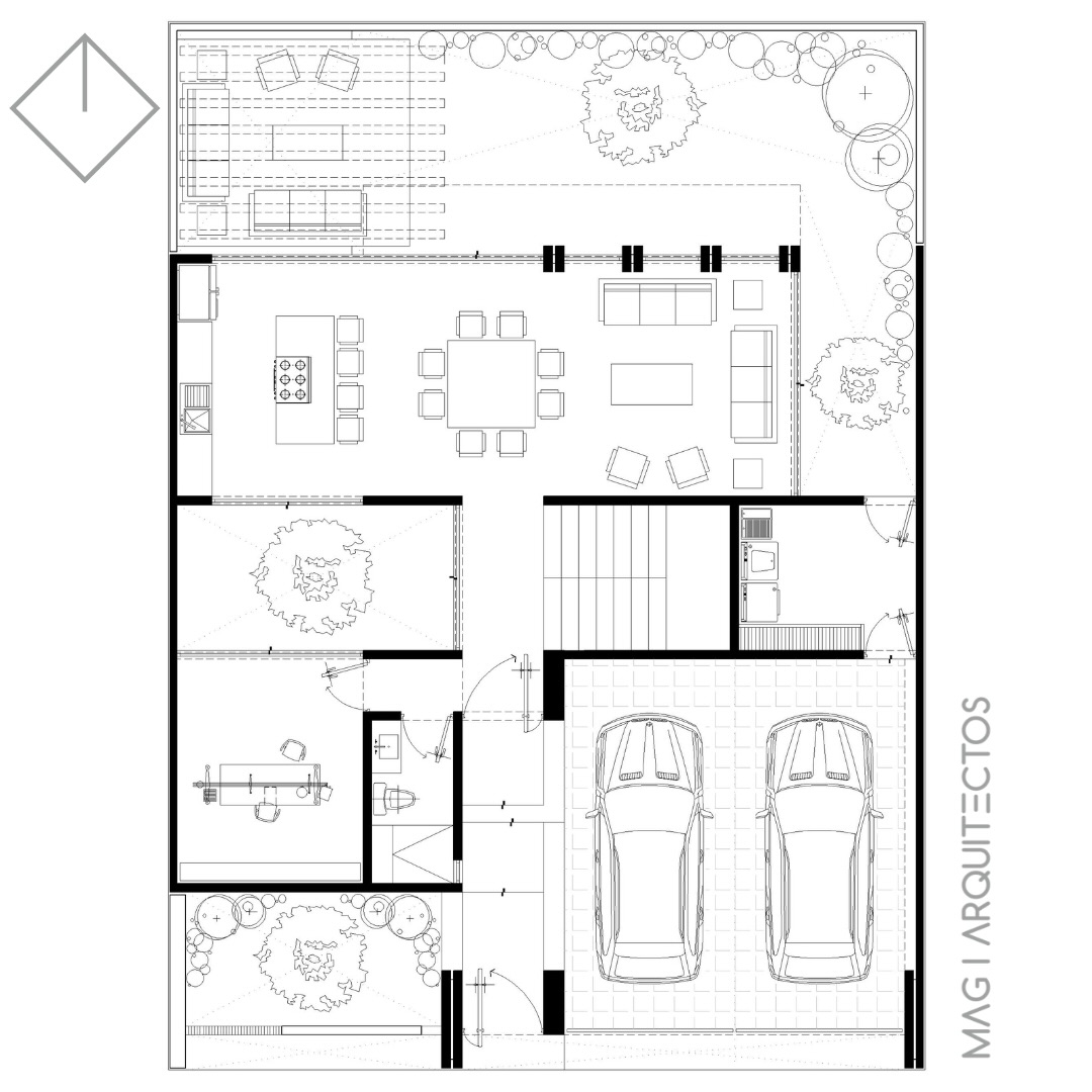
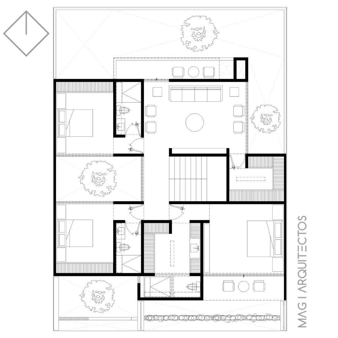
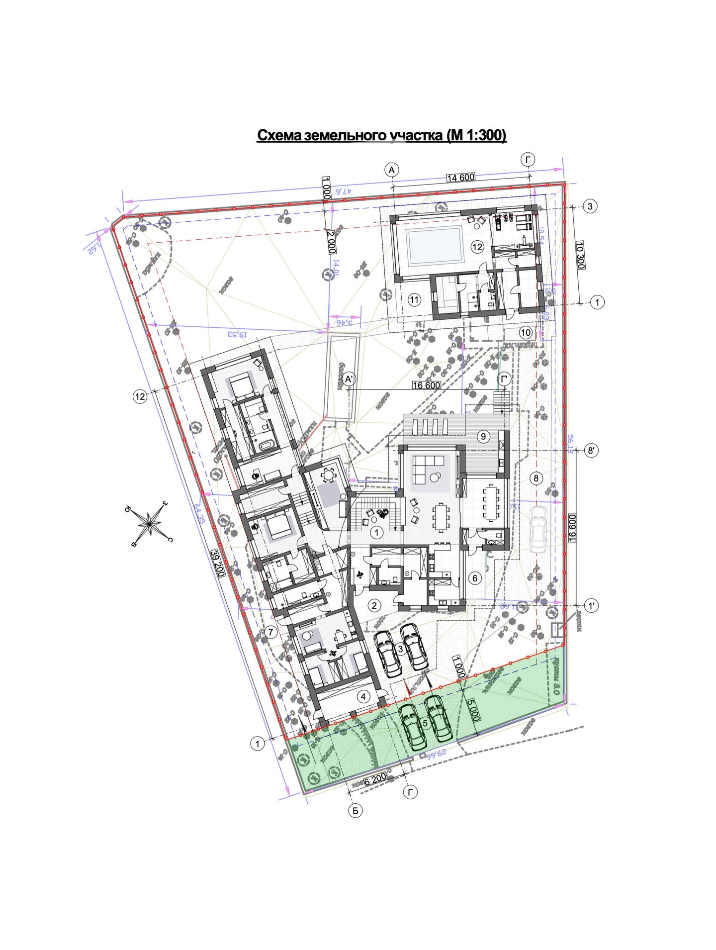
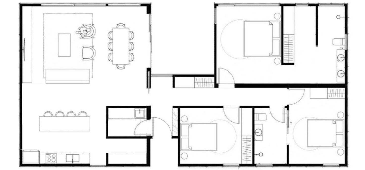
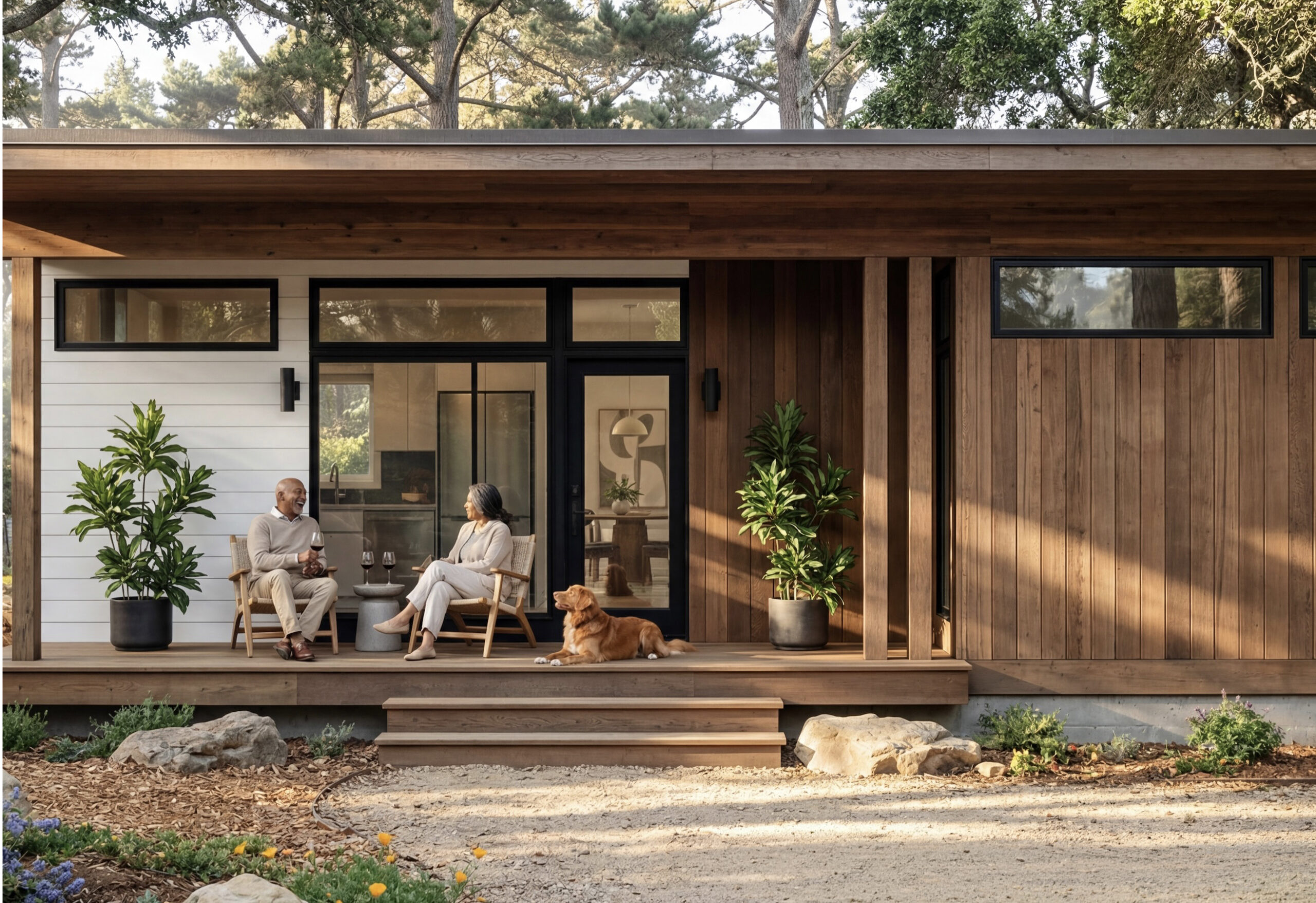
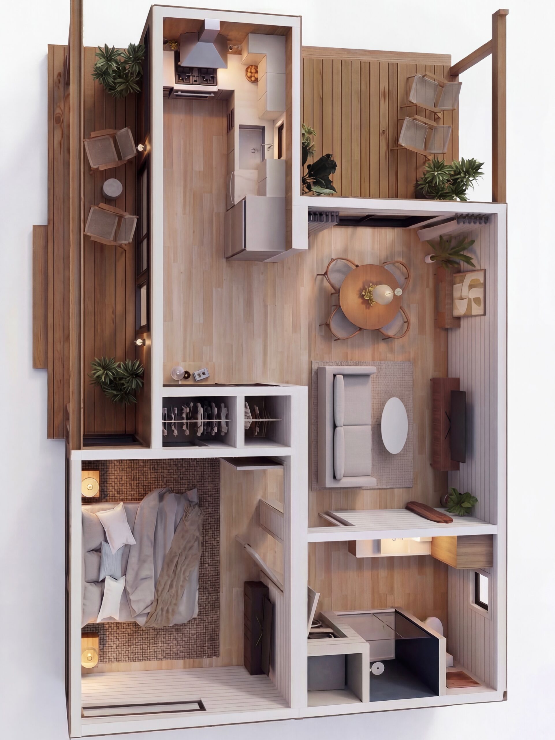
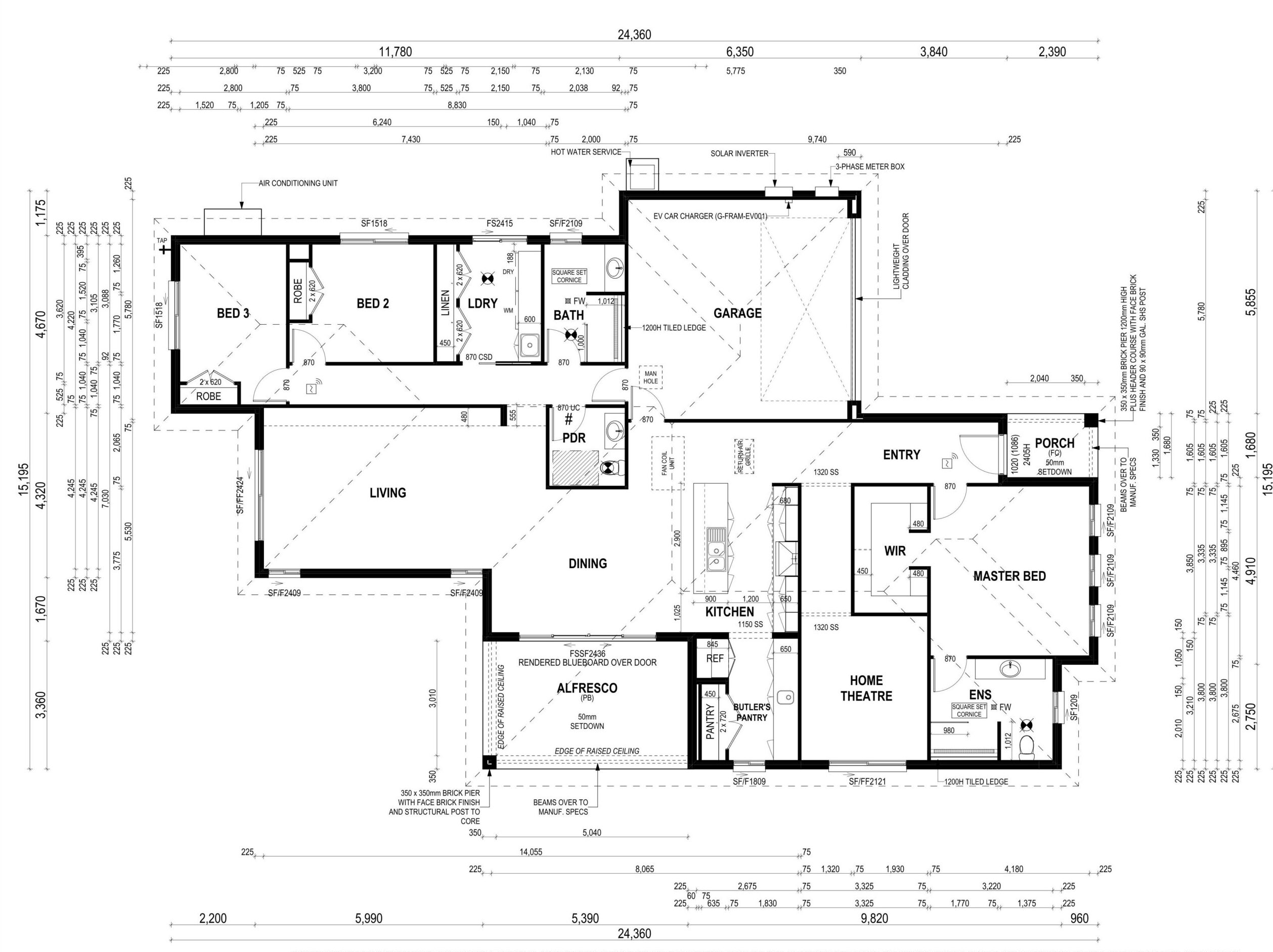
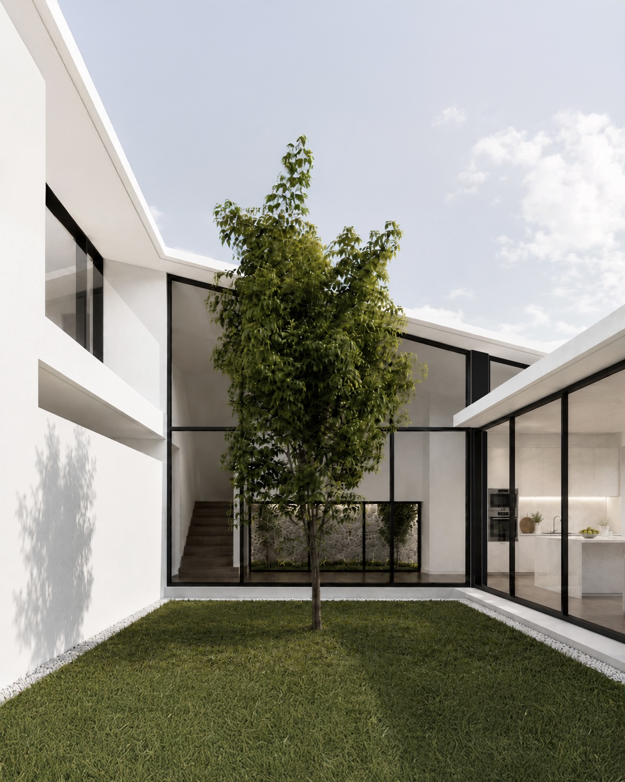
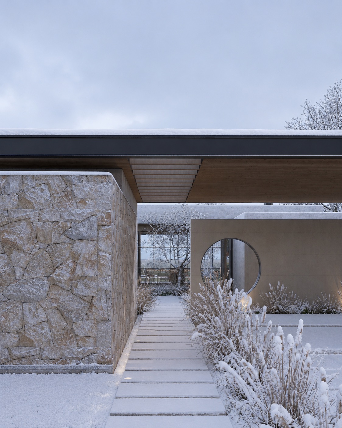
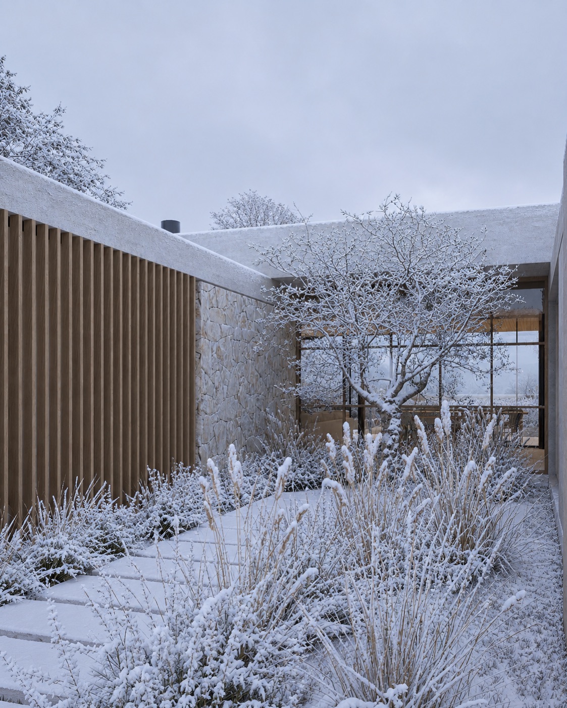
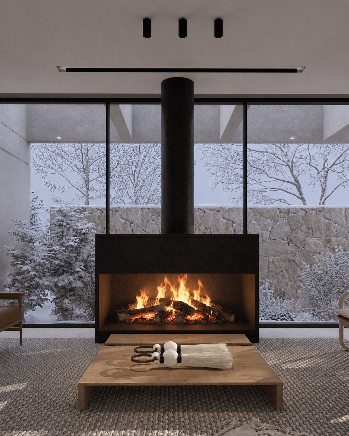
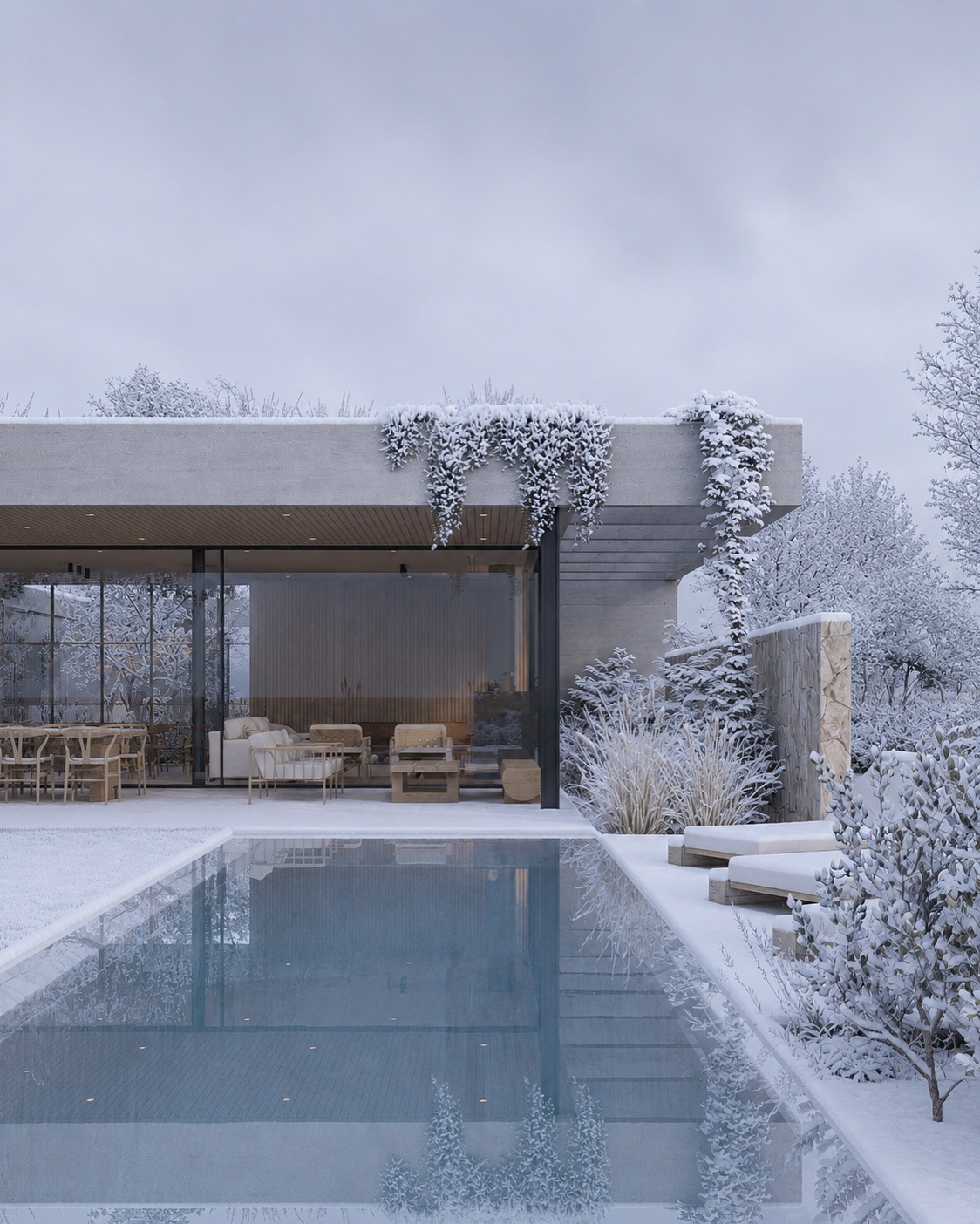
I would’ve put a huge skylight over that central area, but that’s just me…
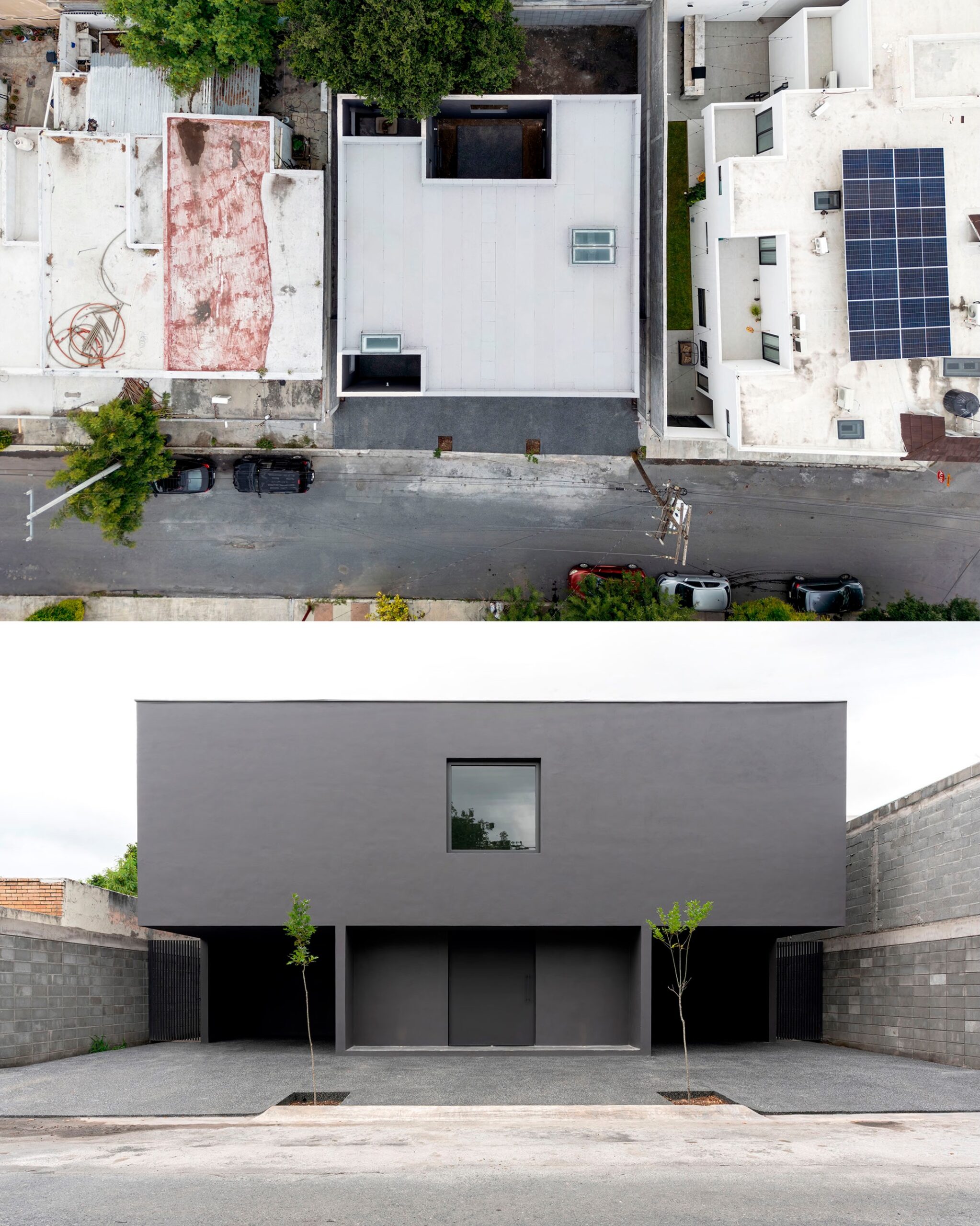
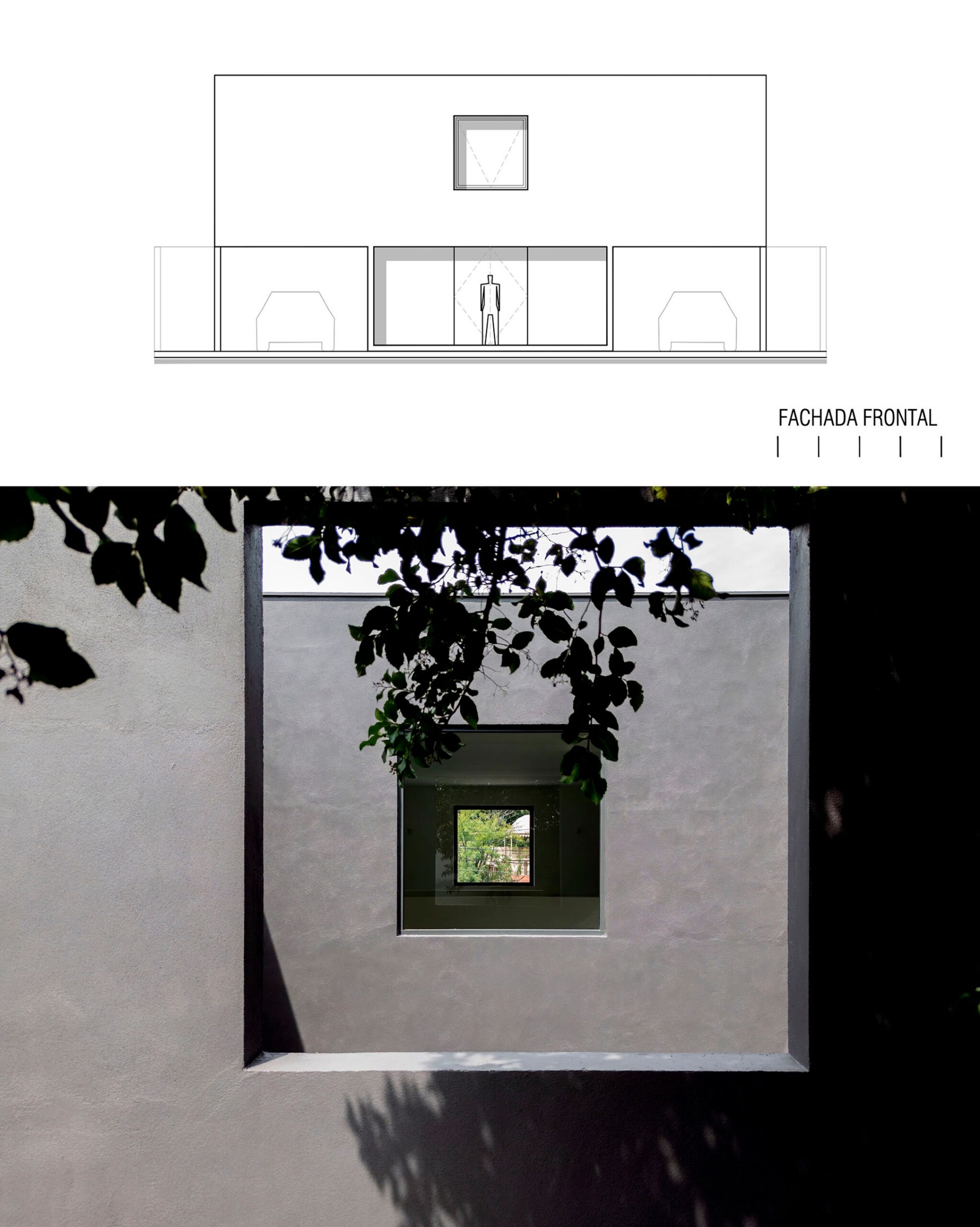
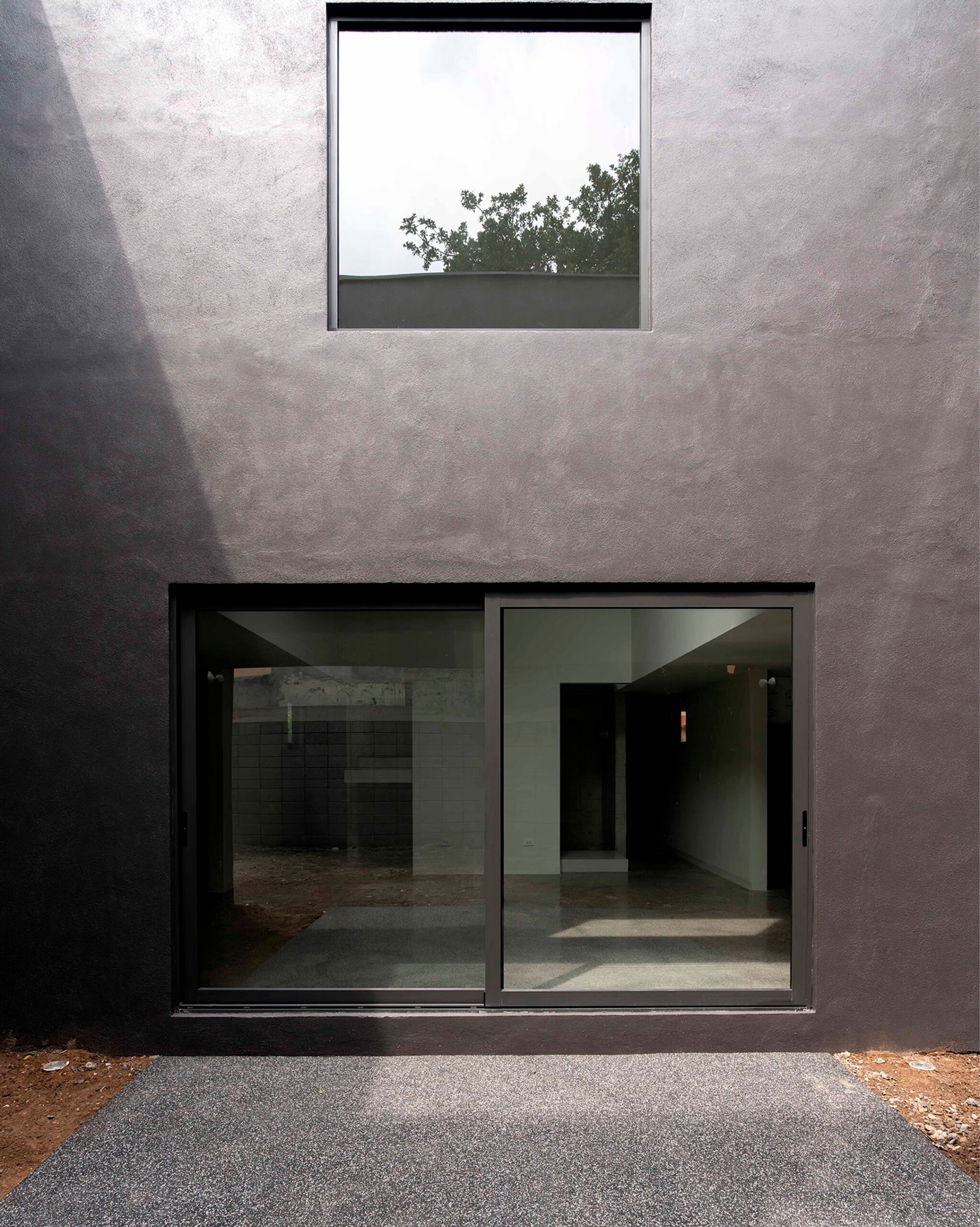
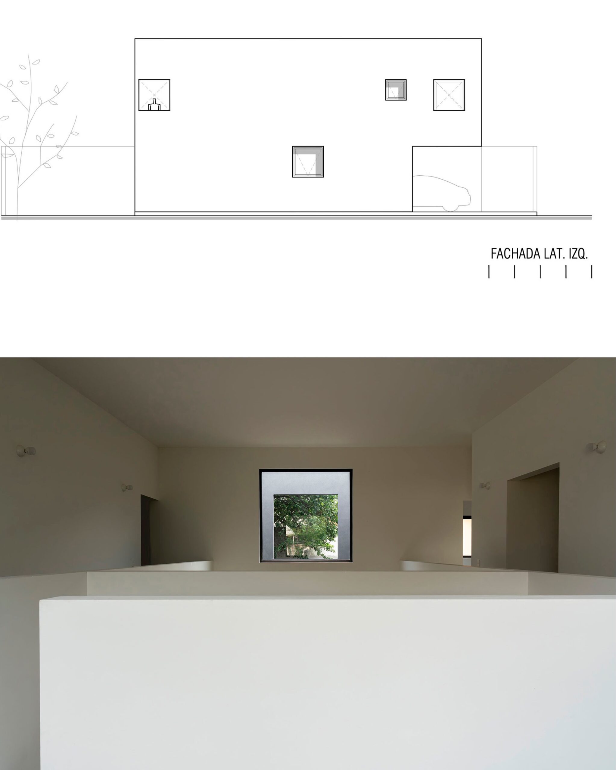
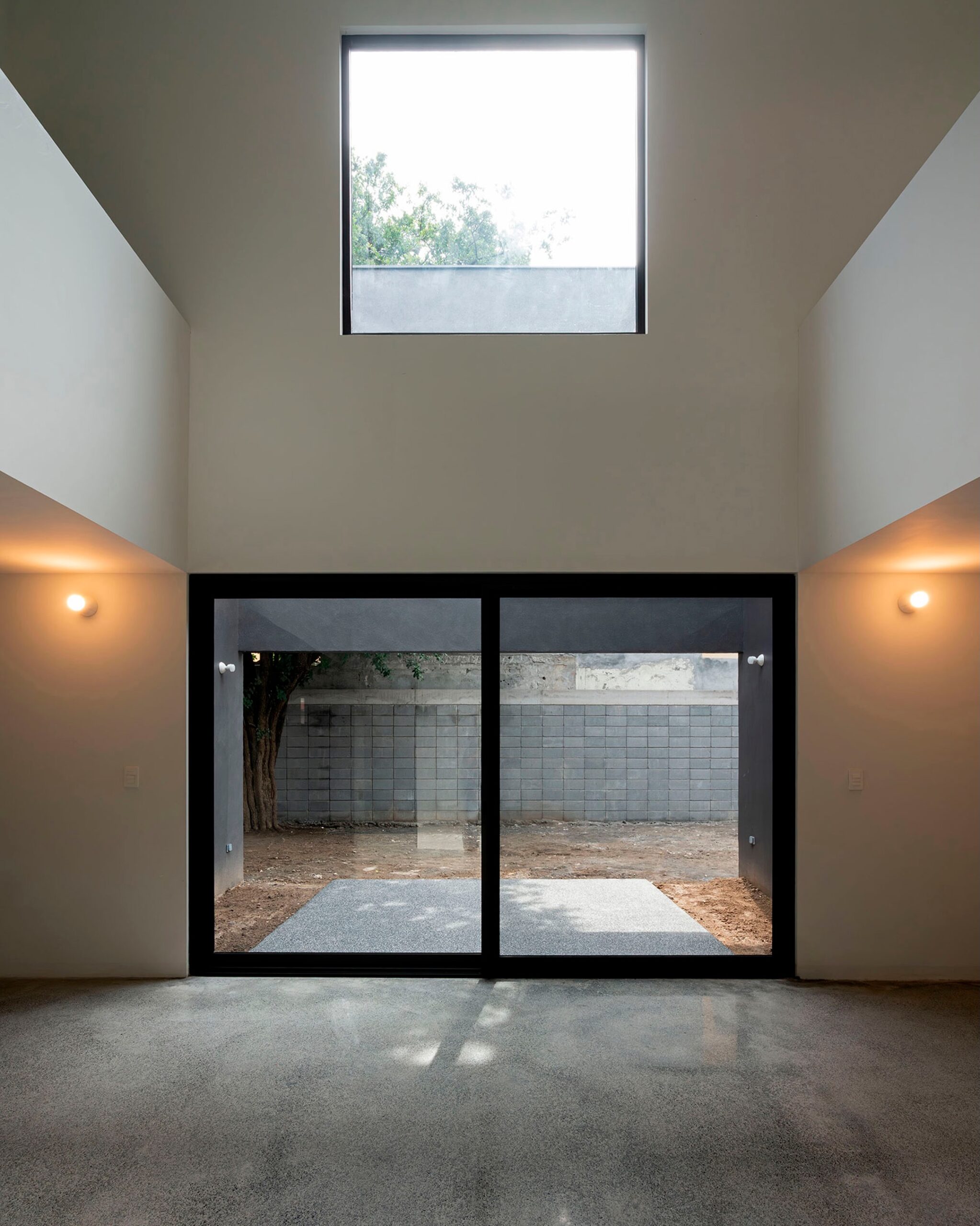
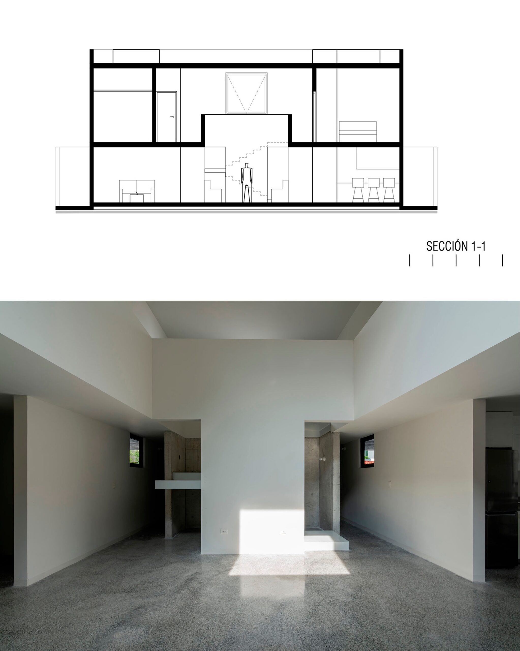
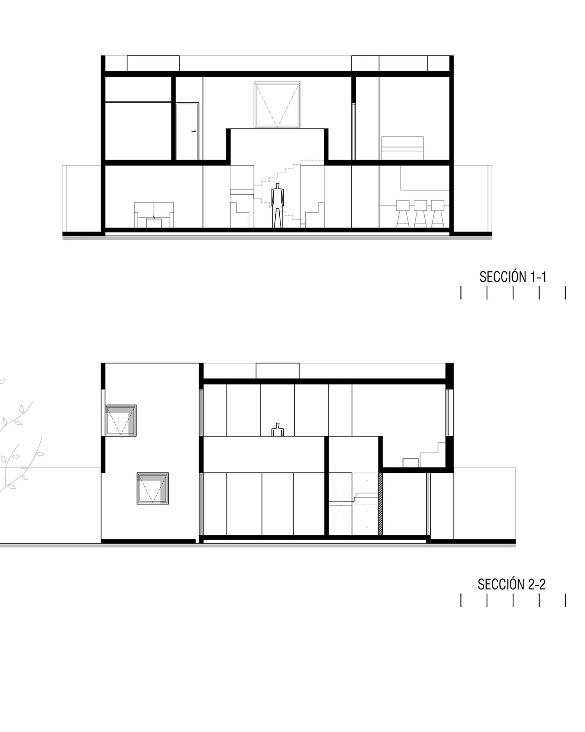
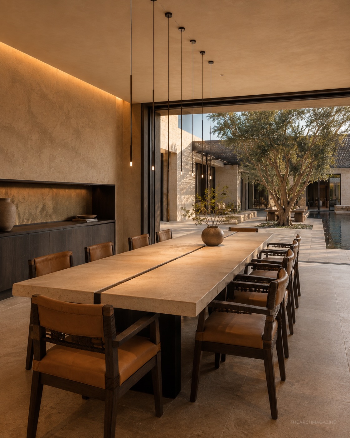
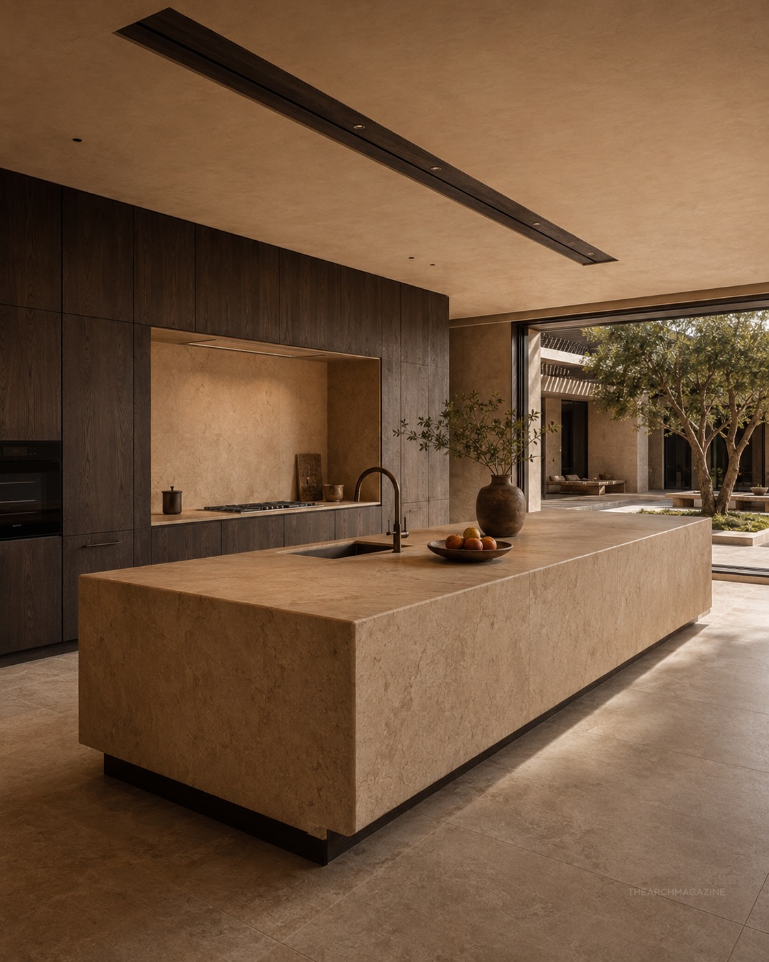
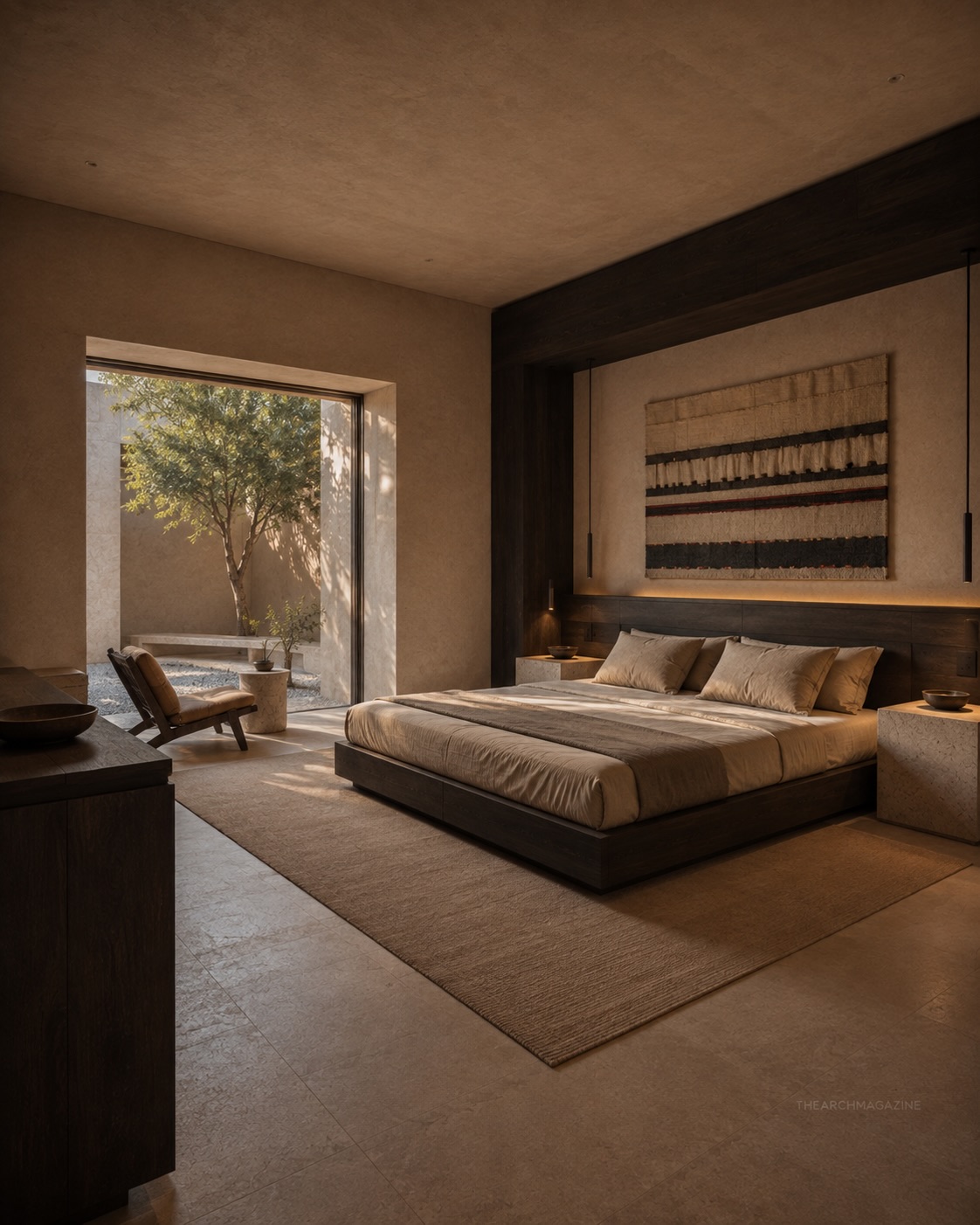
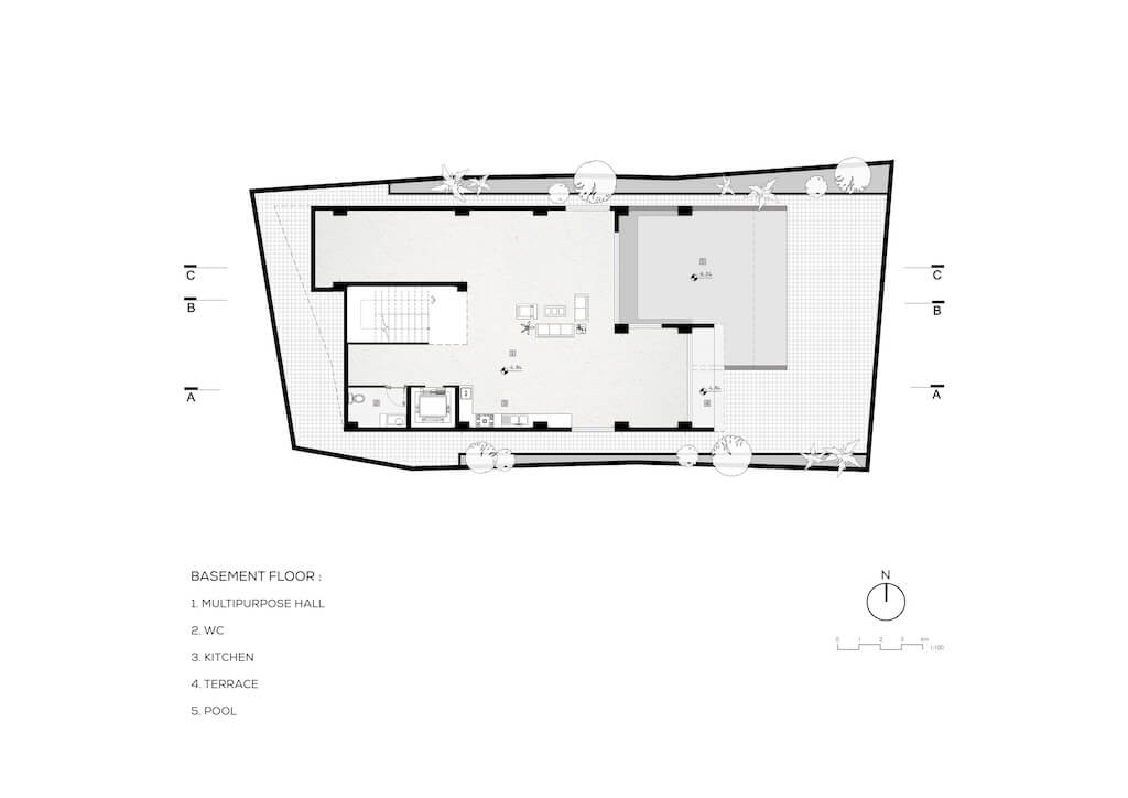
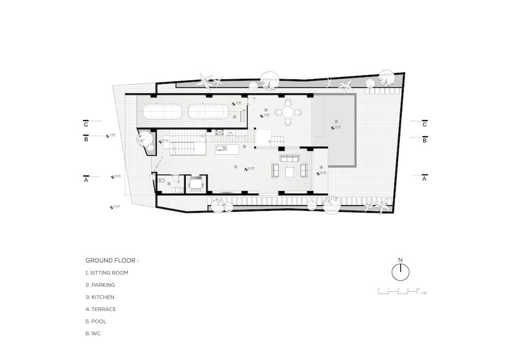
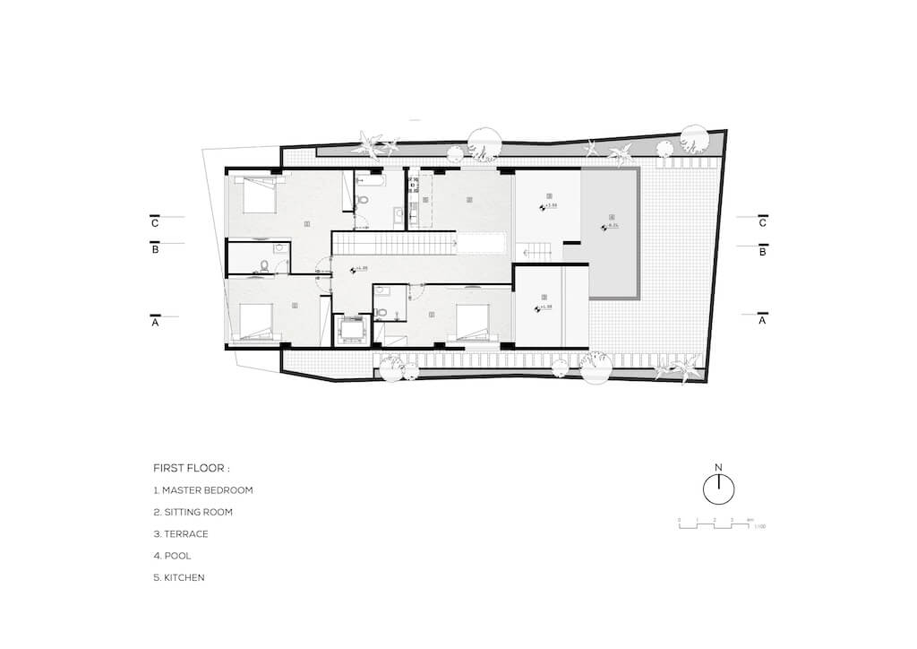
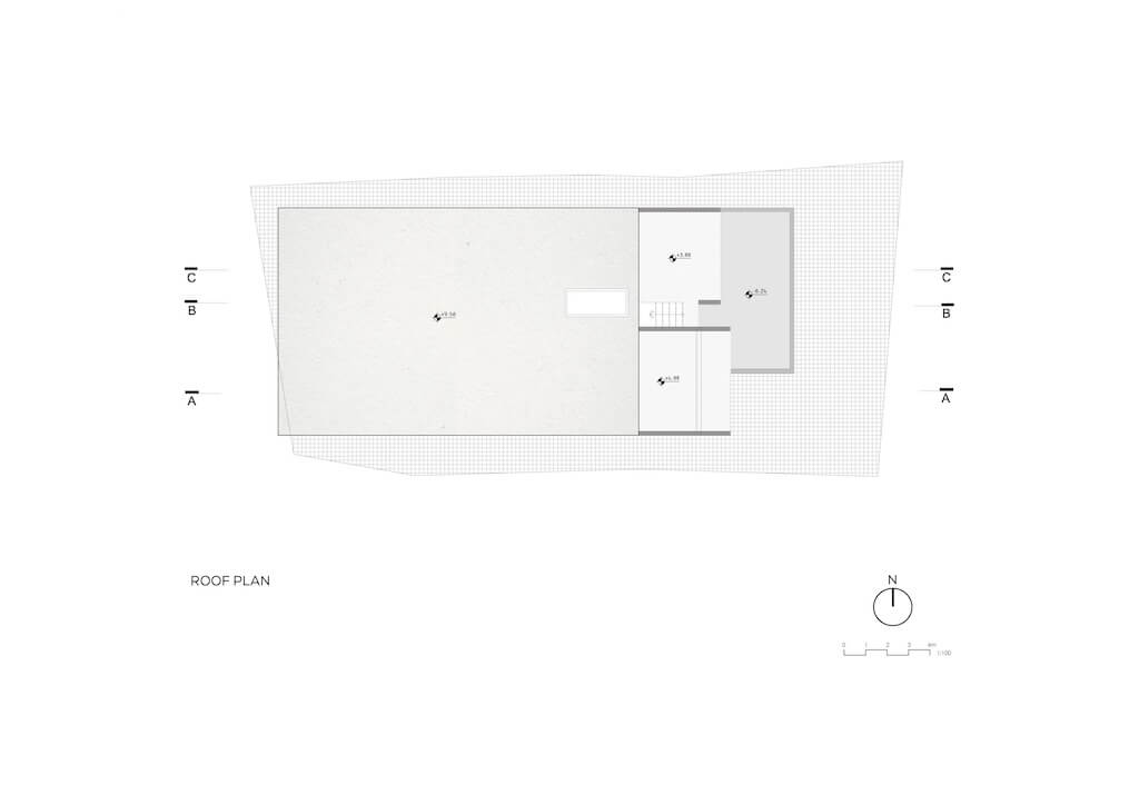
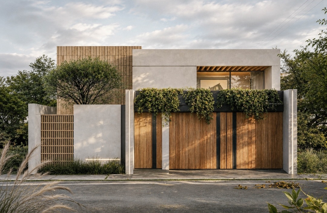
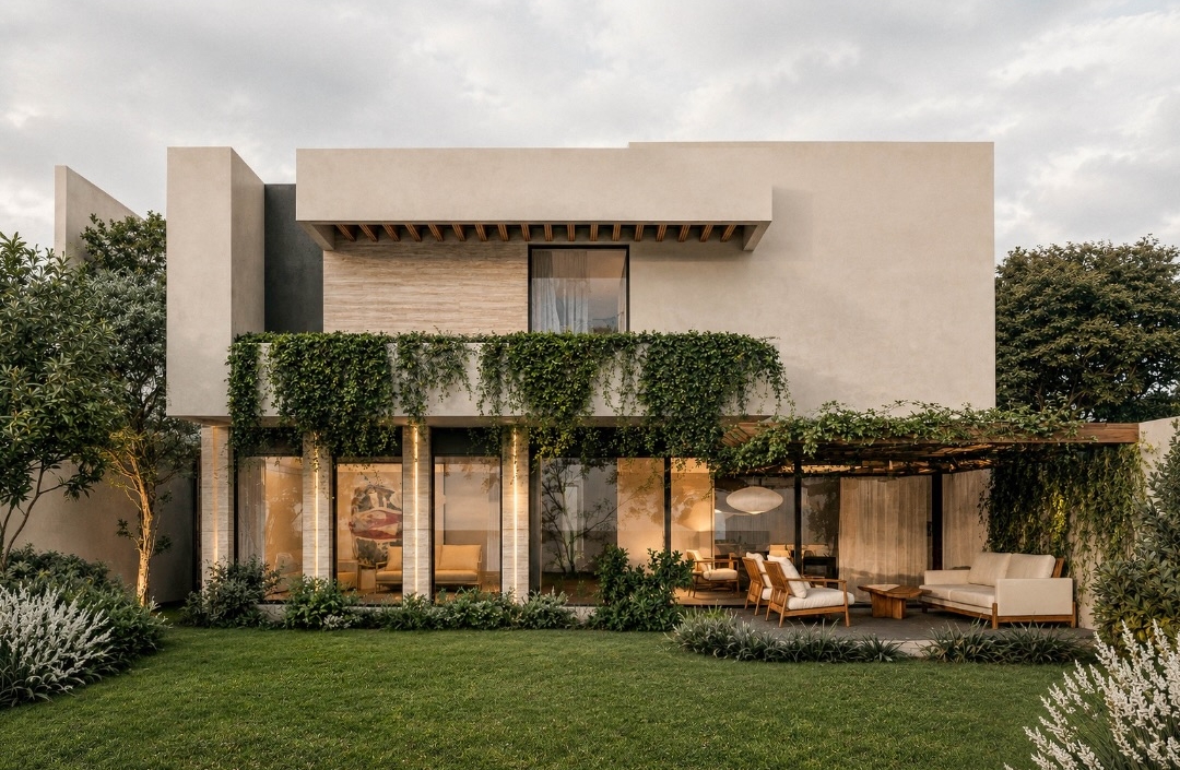
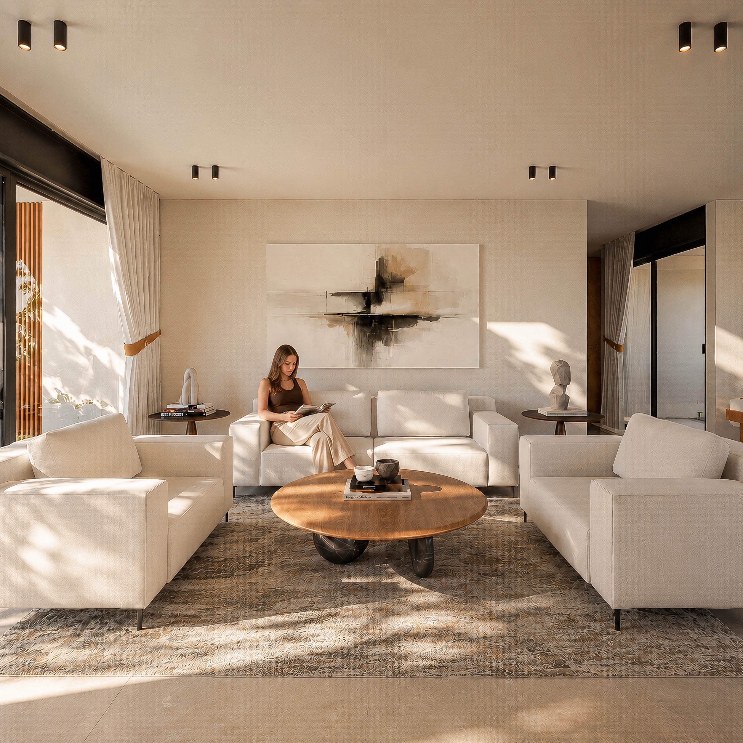
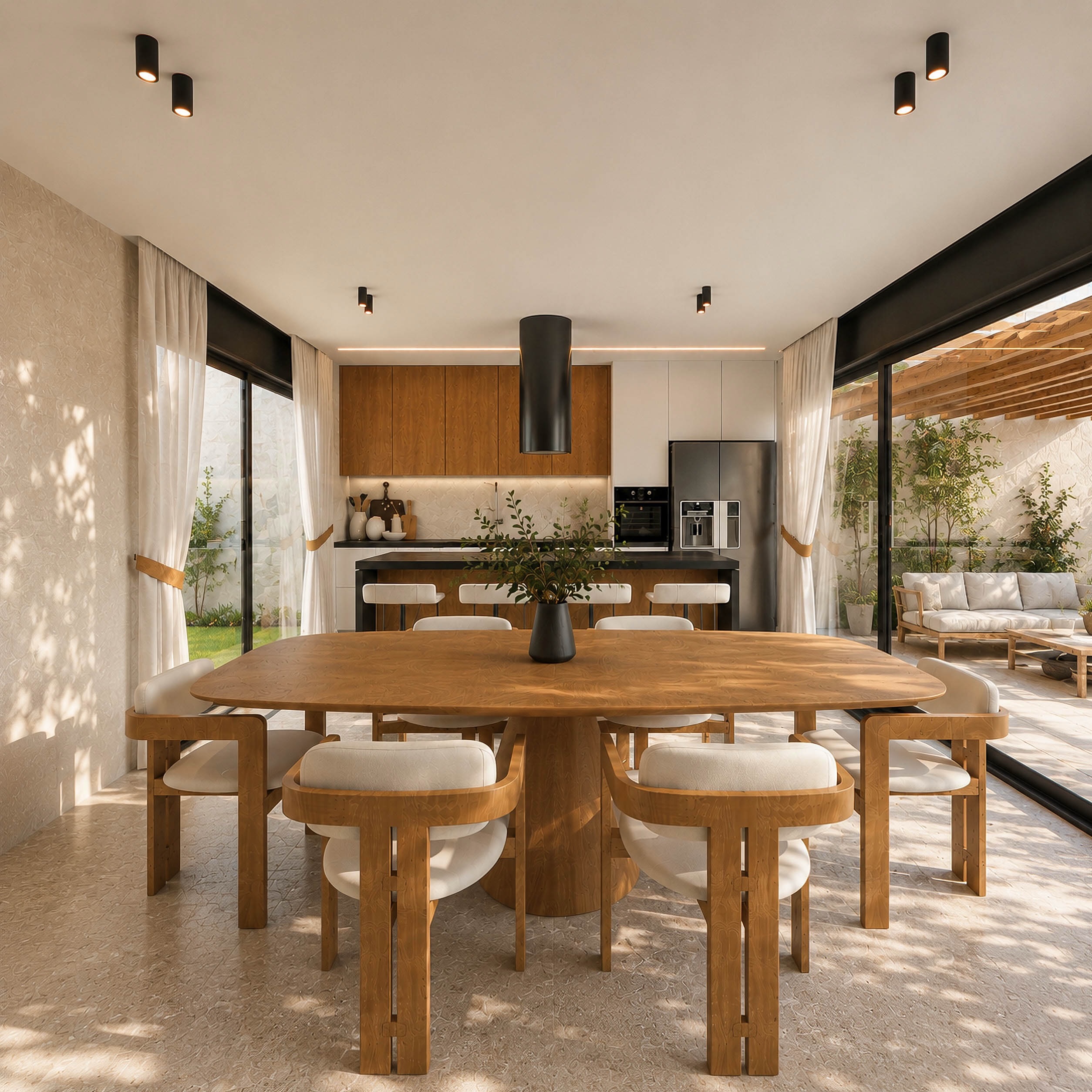
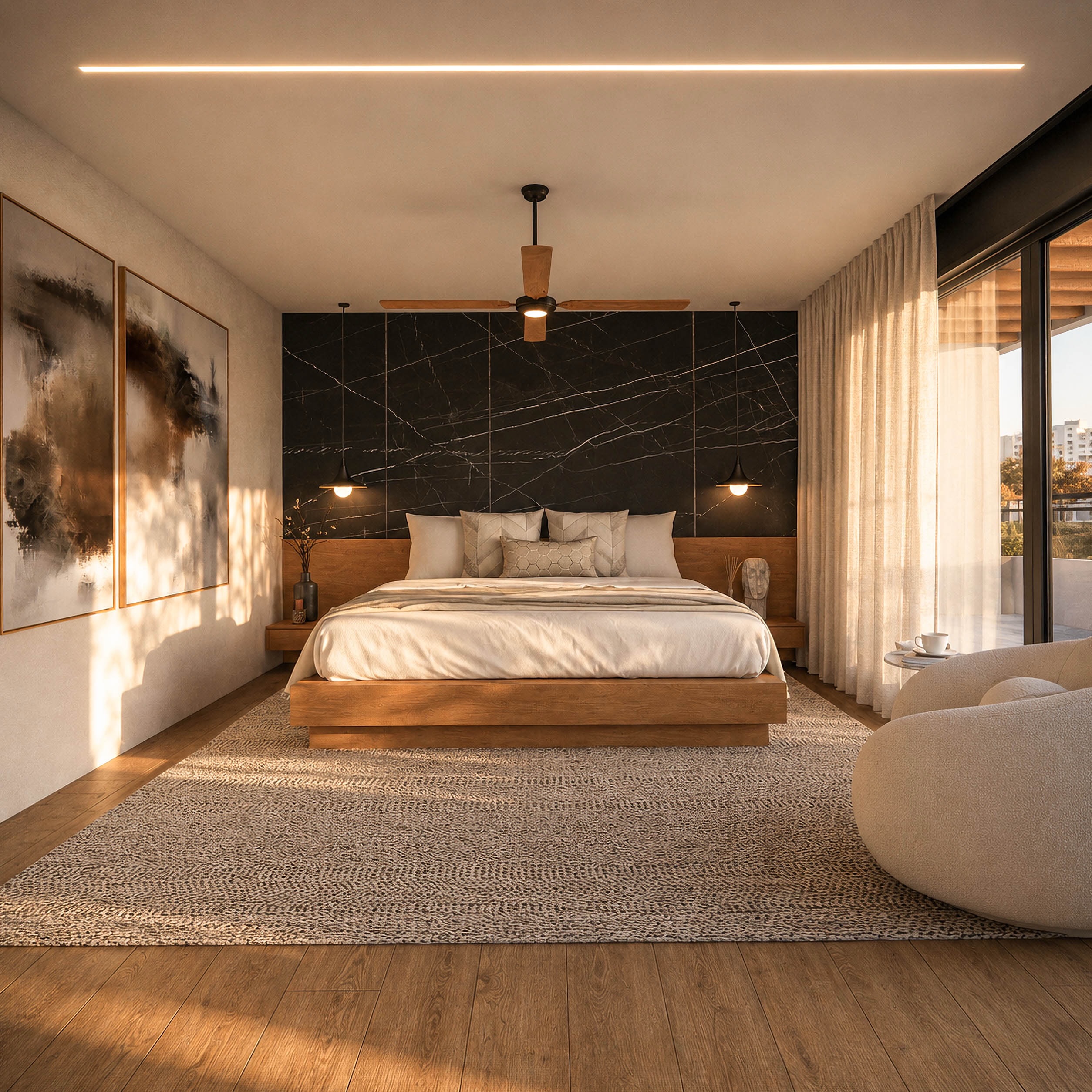
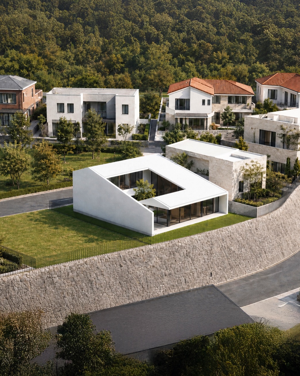
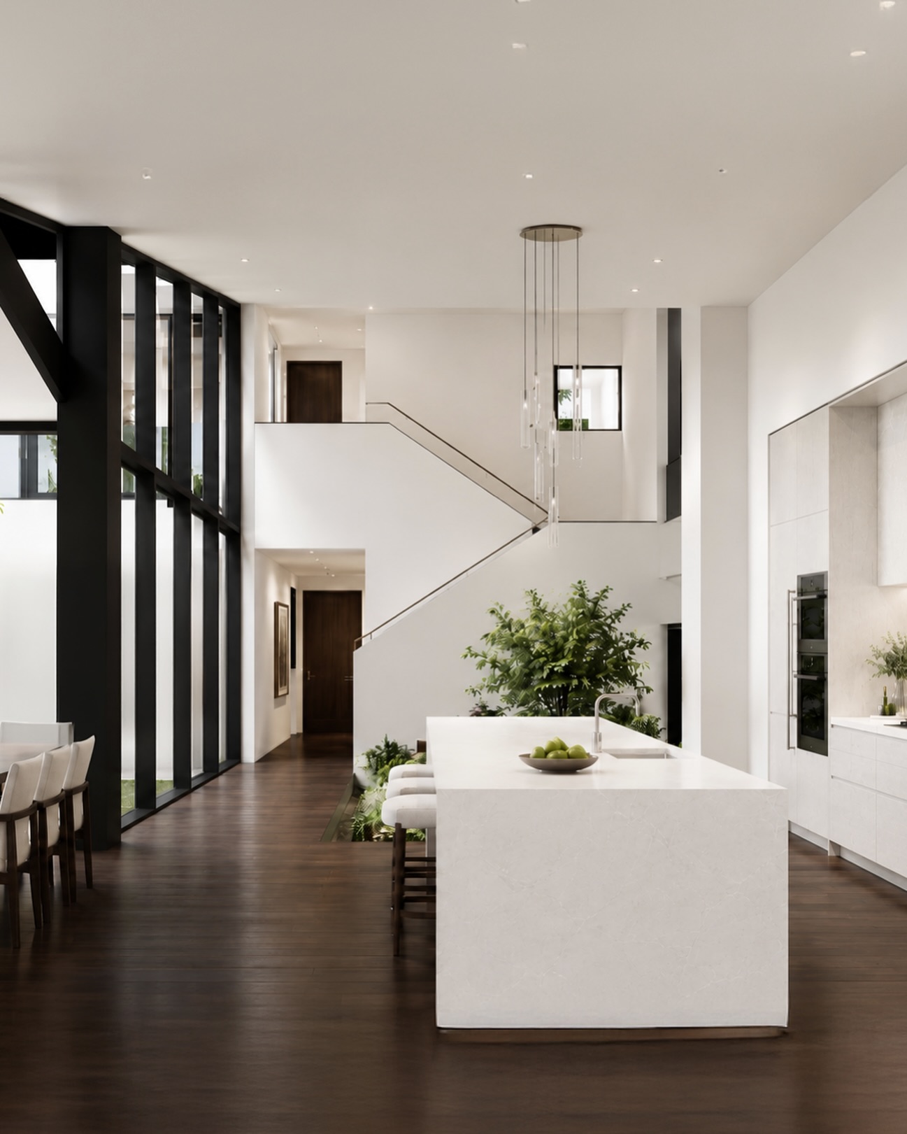
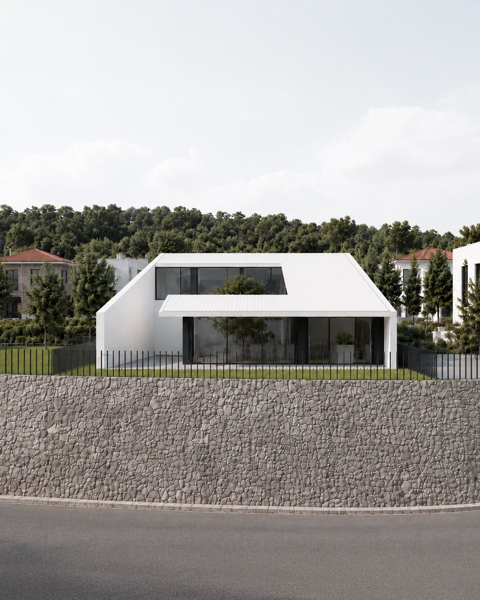
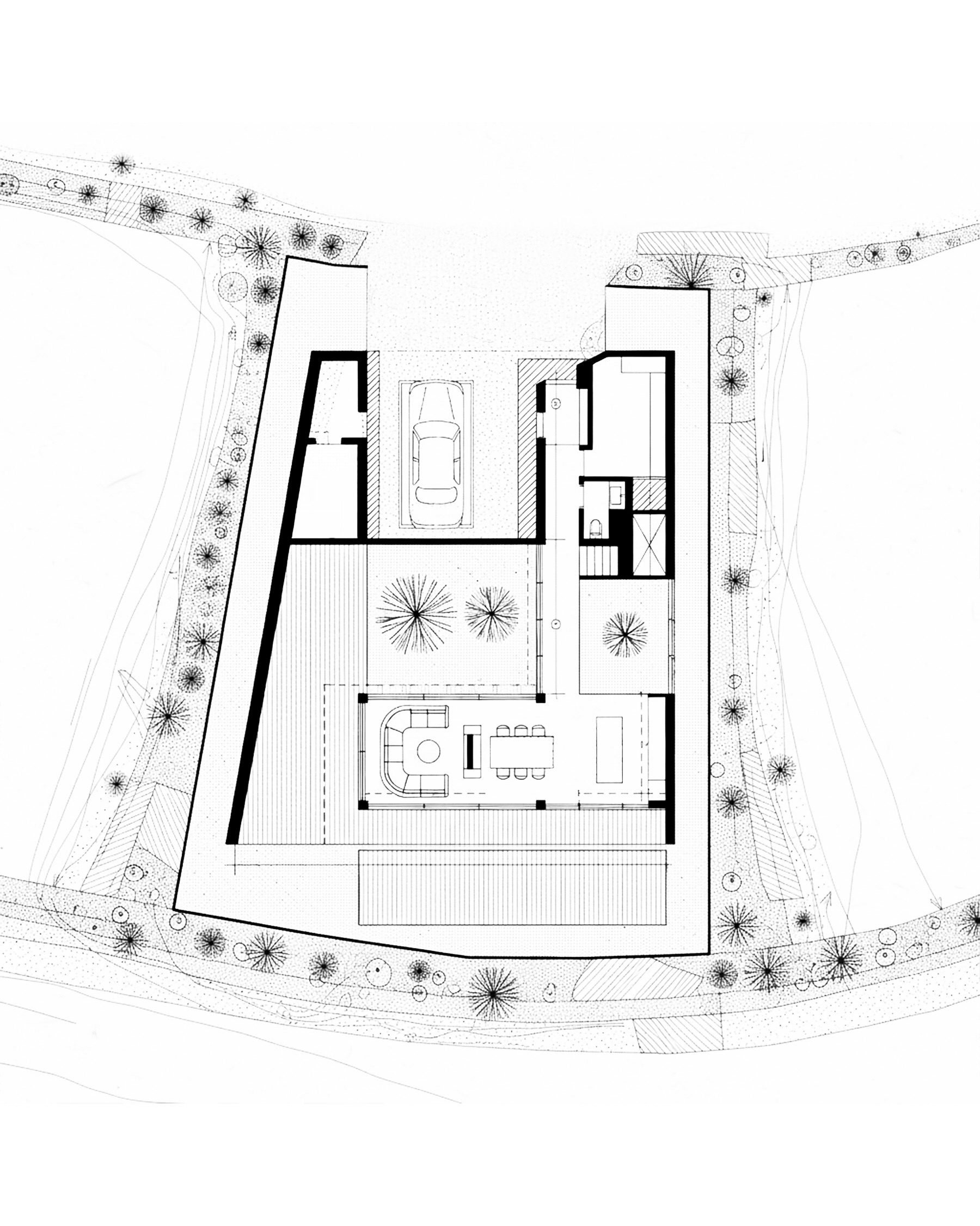
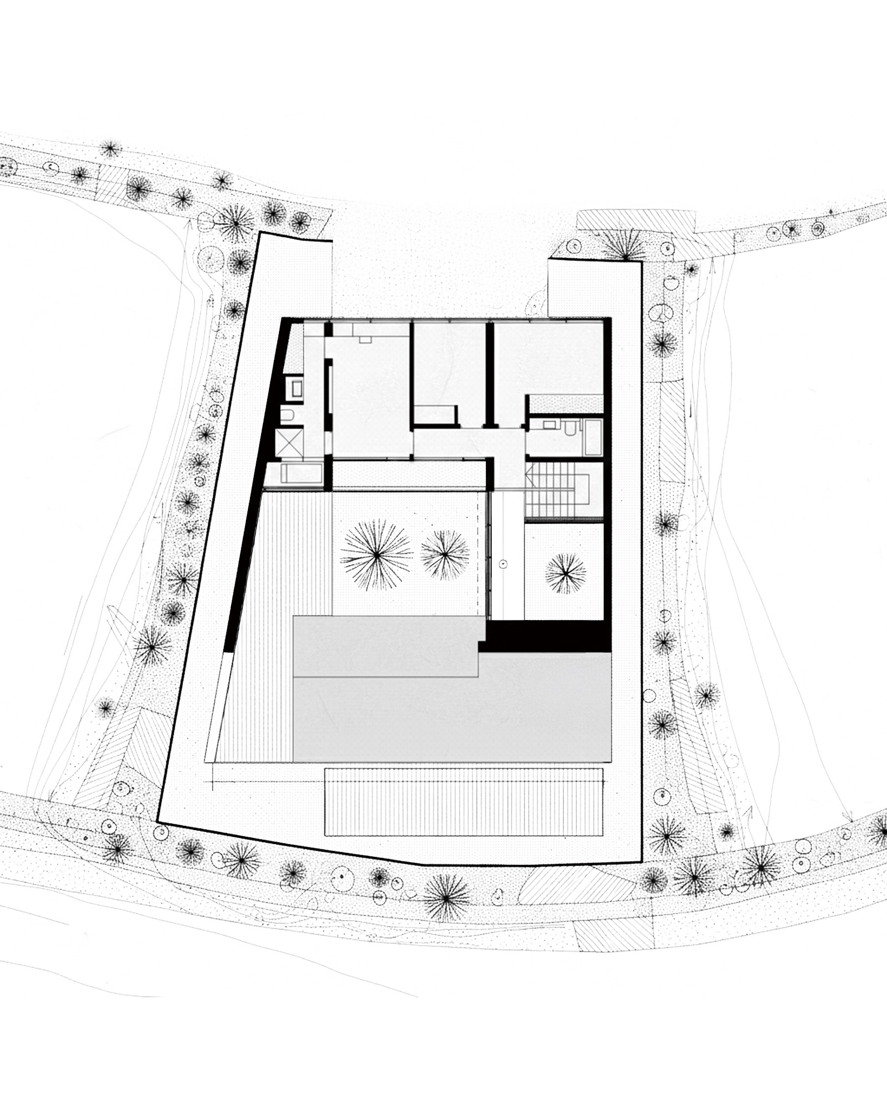
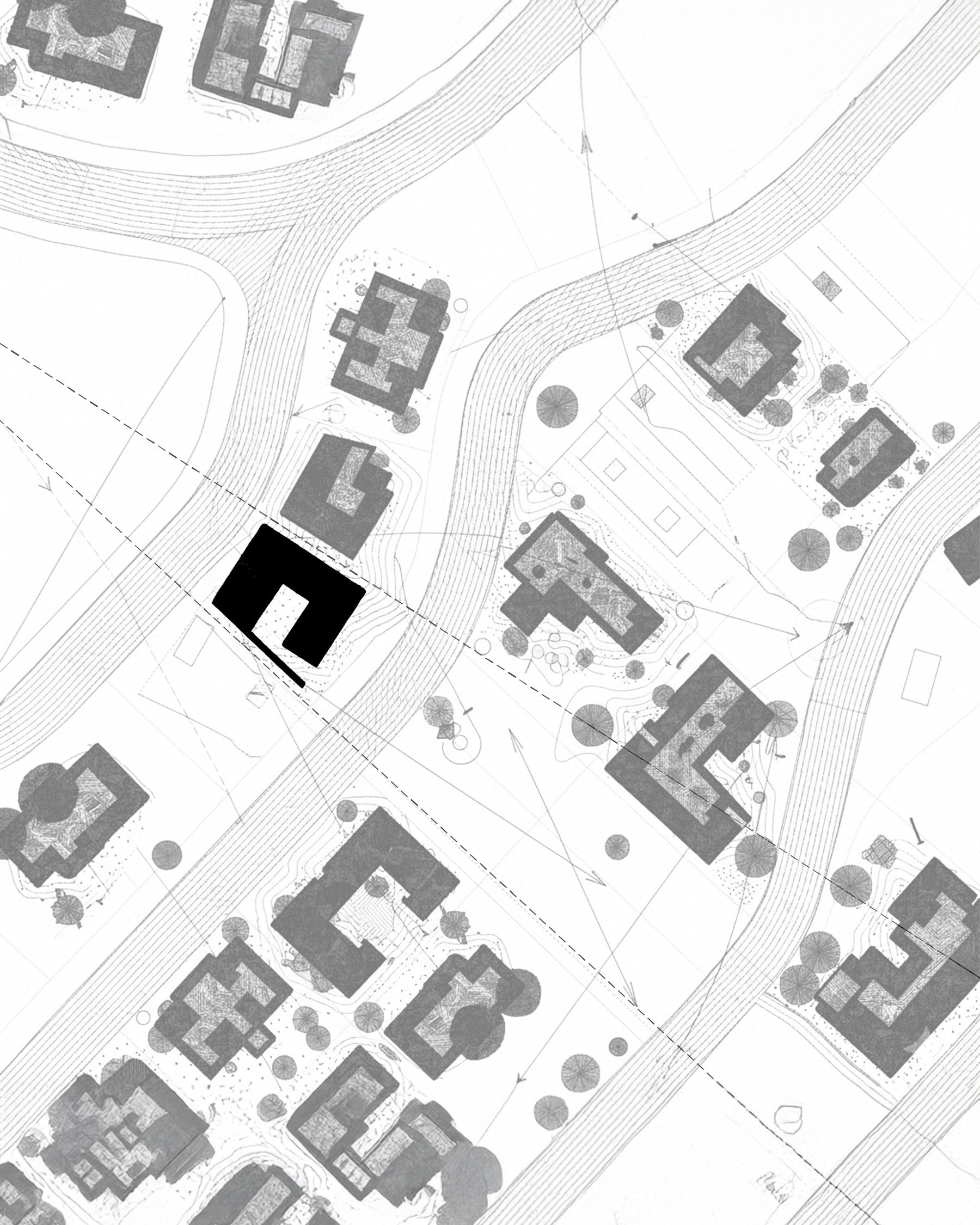
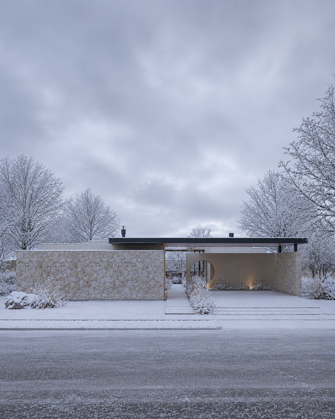
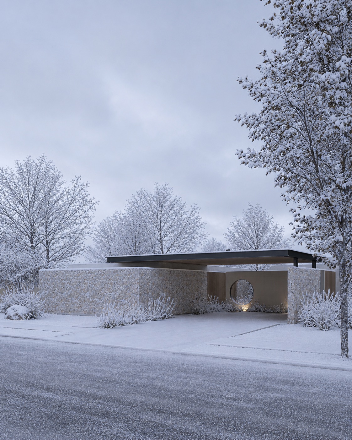
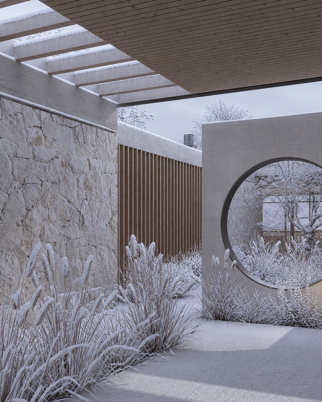
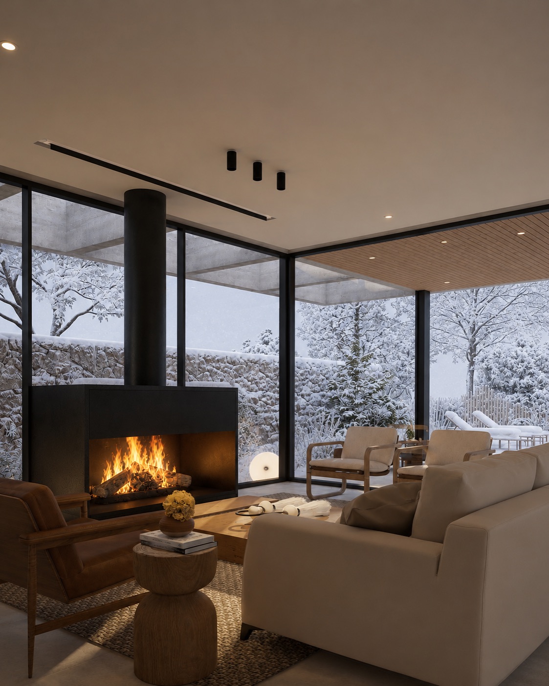
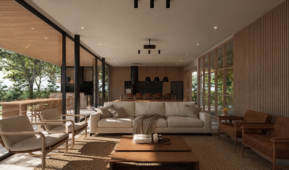
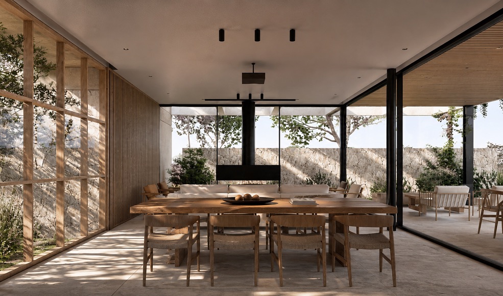
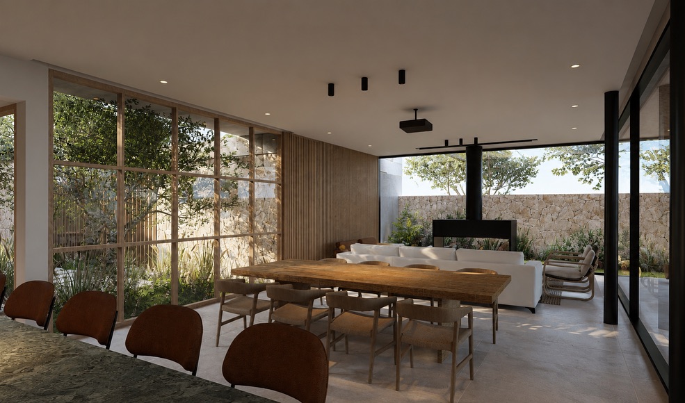
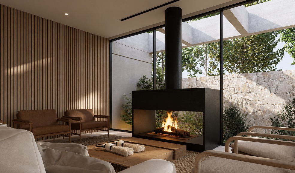
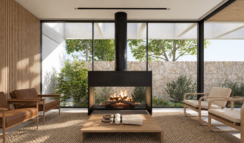
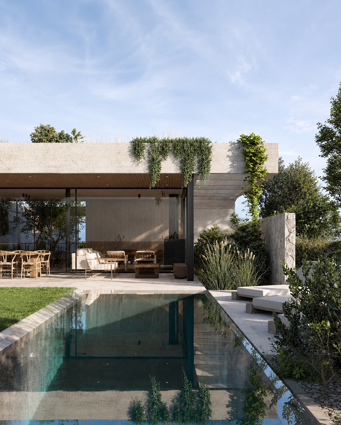
Minimalist design. 13×13 House by ARKRAFT 287 m² San Nicolás de los Garza, Nuevo León, Mexico Photograph Hector Pineda.
Casa 13×13 is a single-family home located in San Nicolás de los Garza, Nuevo León, that explores how a clear geometric organization and an introspective spatial strategy can generate a rich domestic experience within a compact scale. The house is structured around a central open-air void that functions as a courtyard, allowing natural light and ventilation, as well as establishing visual connections between the different levels. This void acts as the main spatial organizer, connecting the circulation areas, social spaces, and private areas.The architecture is defined by a restrained material palette and a precise spatial sequence that prioritizes clarity and continuity between spaces. Instead of relying on large openings to the exterior, the house is oriented inwards, using the courtyard as a controlled space for daily use and environmental connection. Casa 13×13 proposes an alternative for contemporary urban housing, demonstrating how a rigorous spatial organization can lead to a serene and consistent domestic architecture.
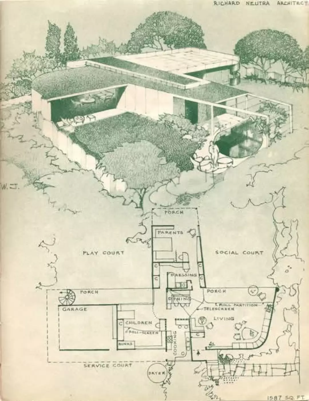
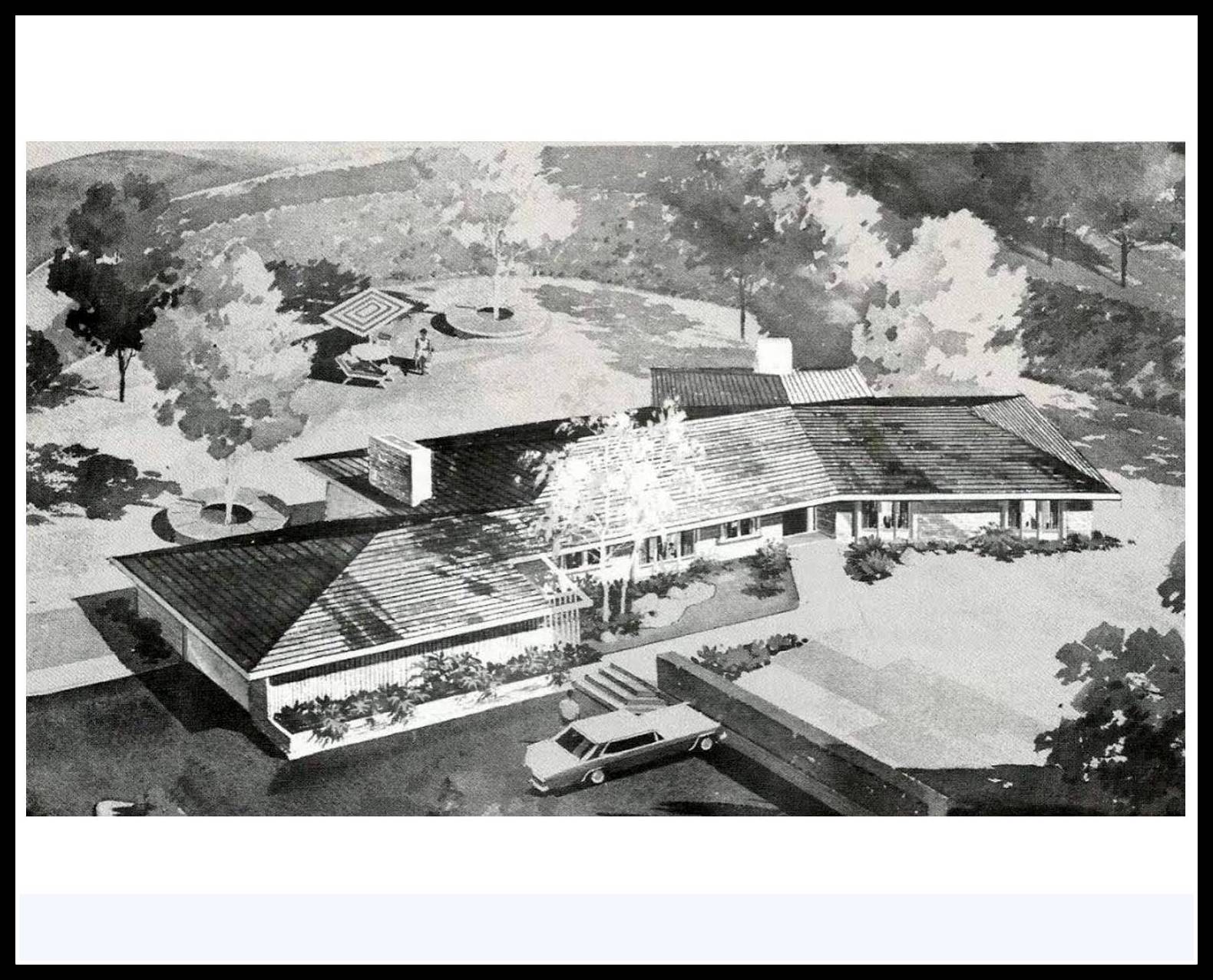
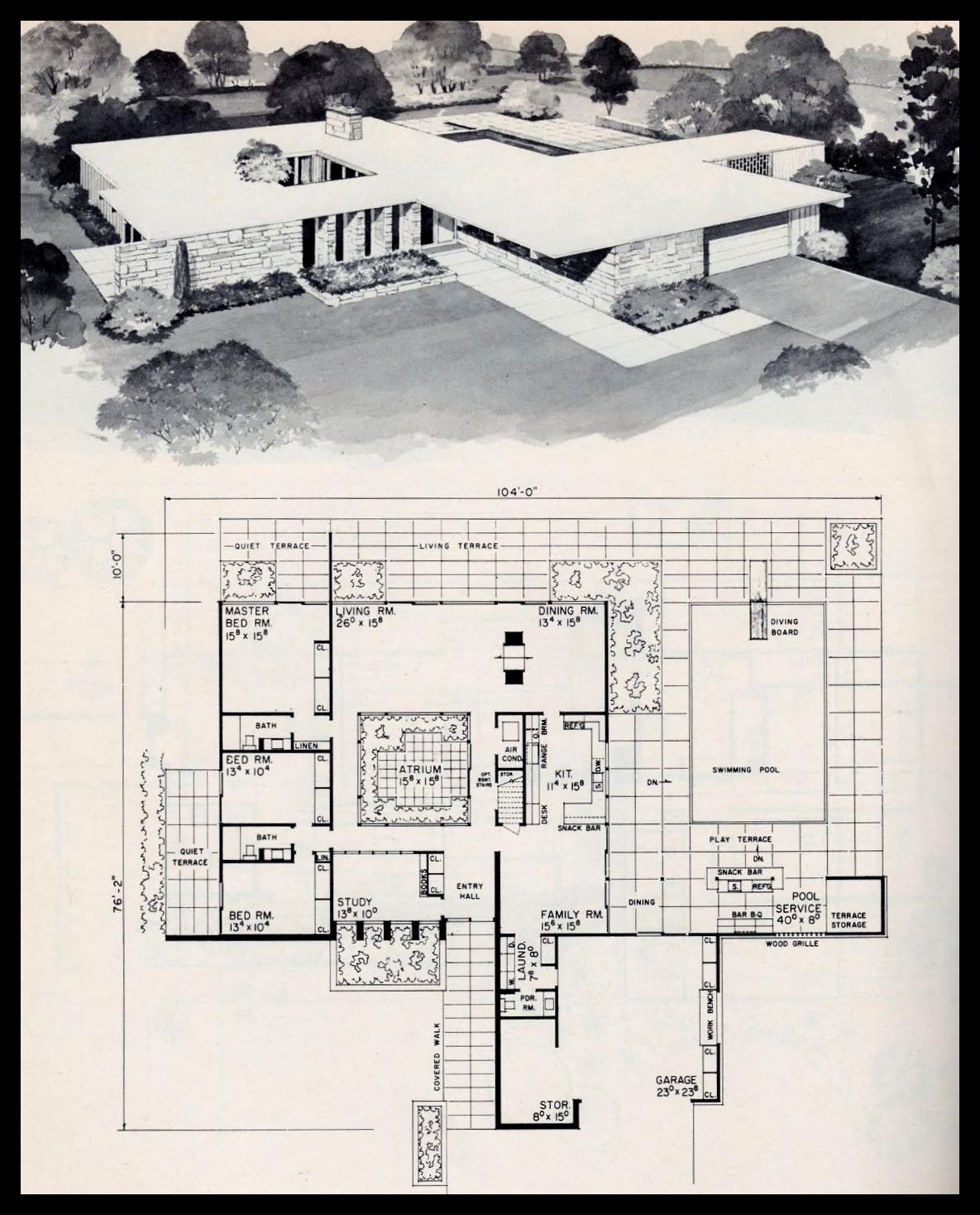
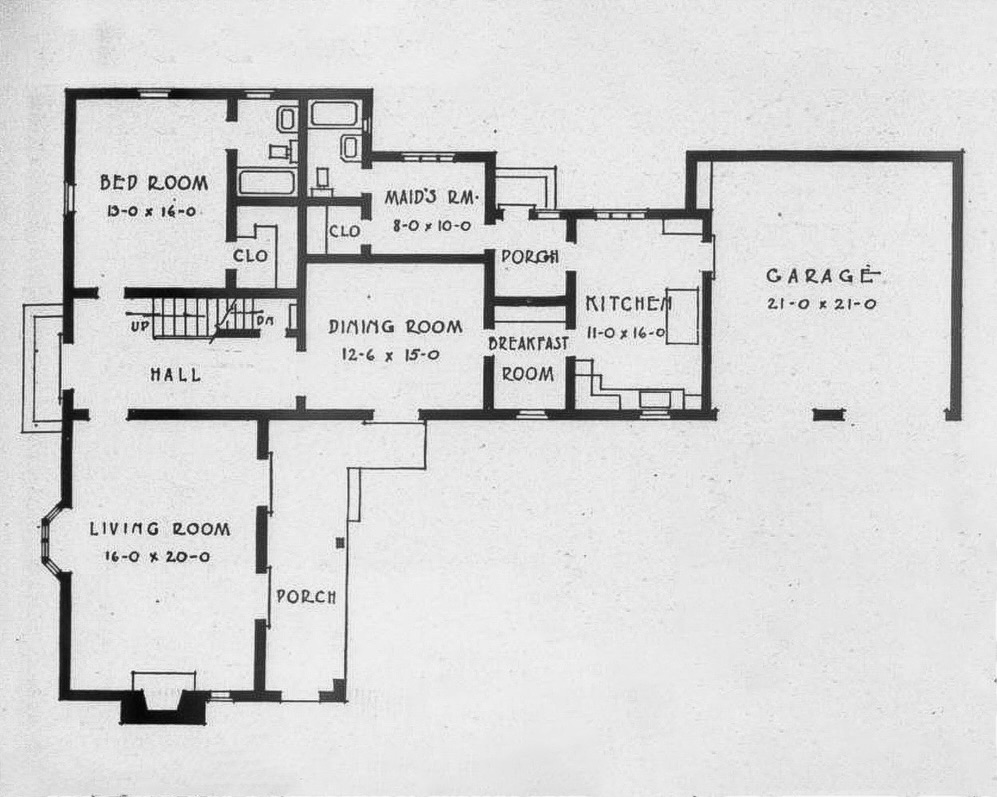
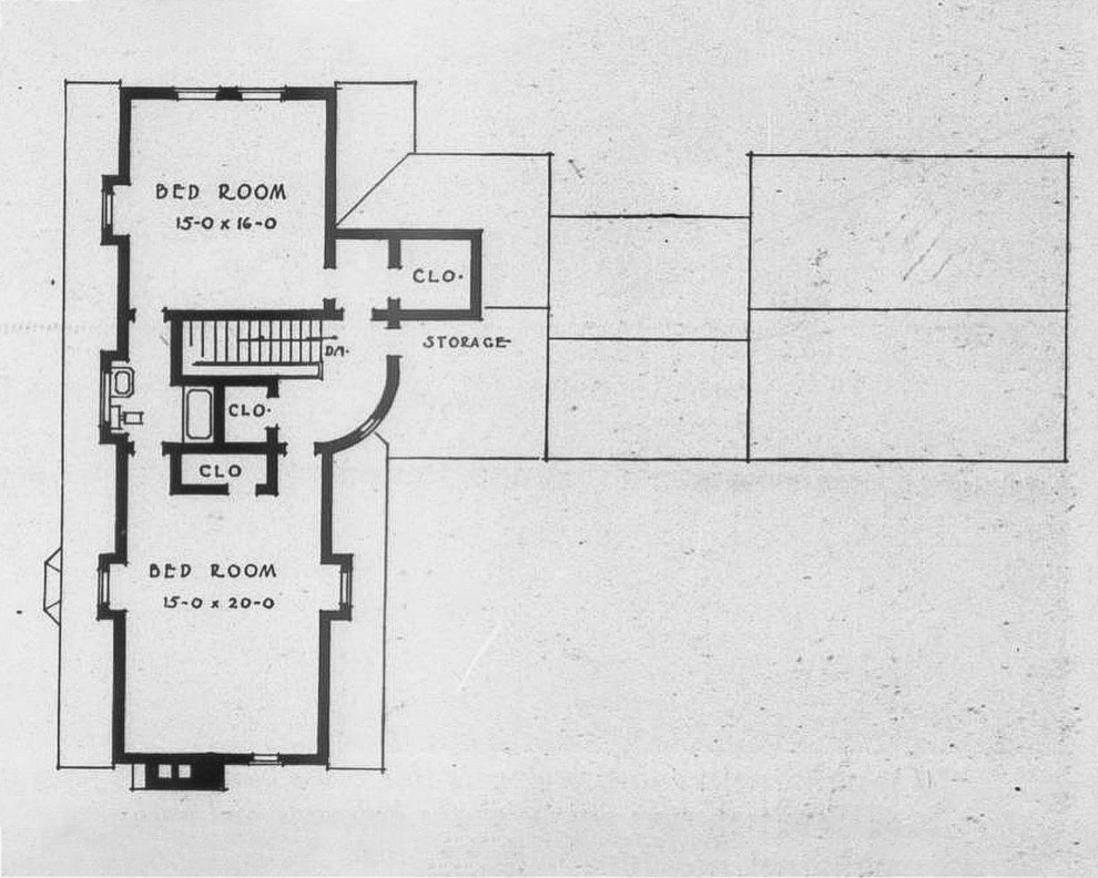
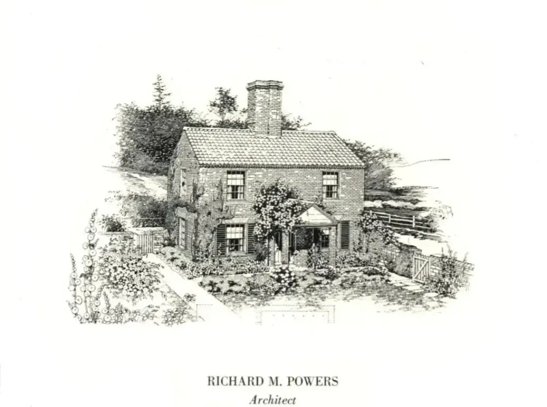
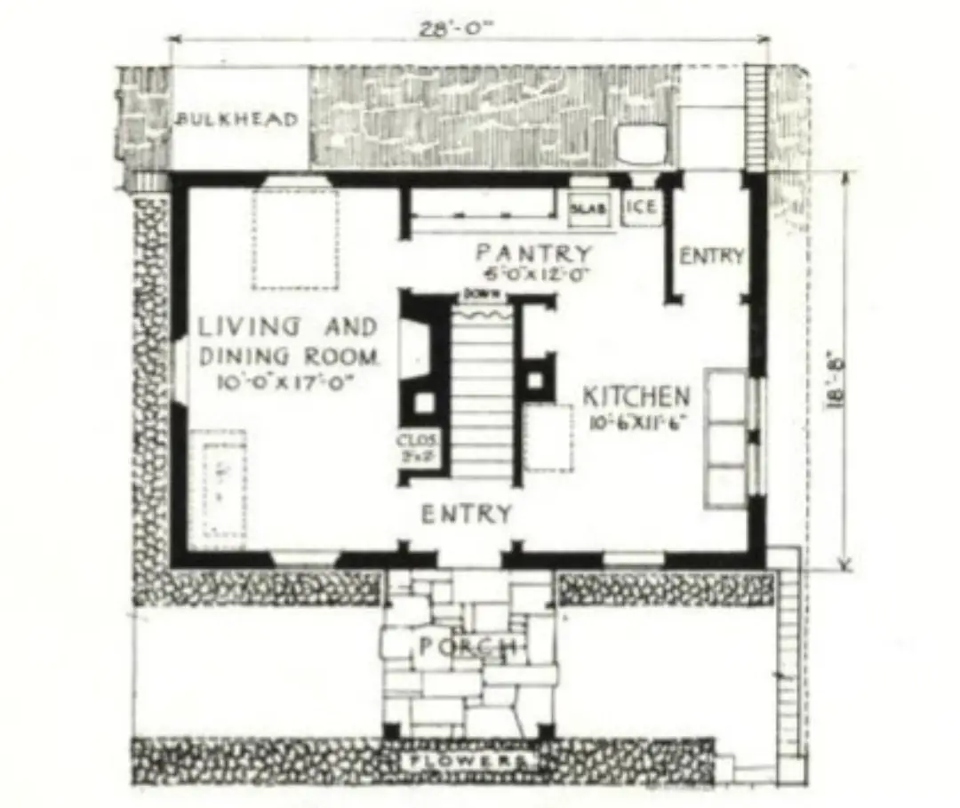
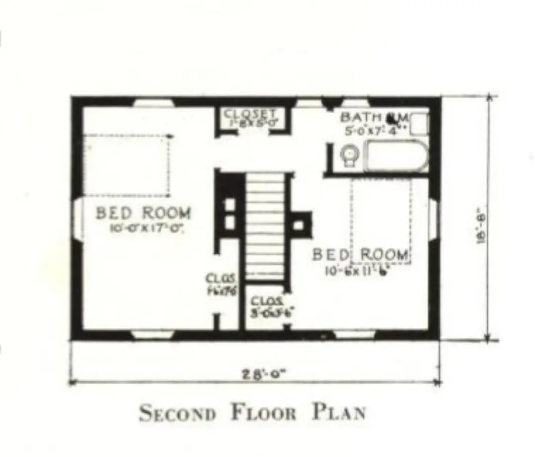
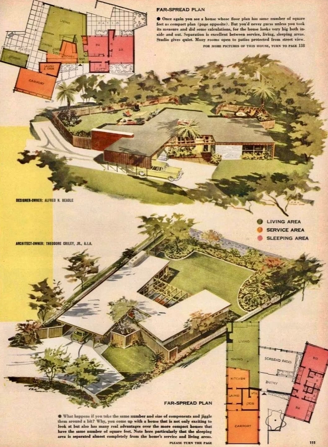
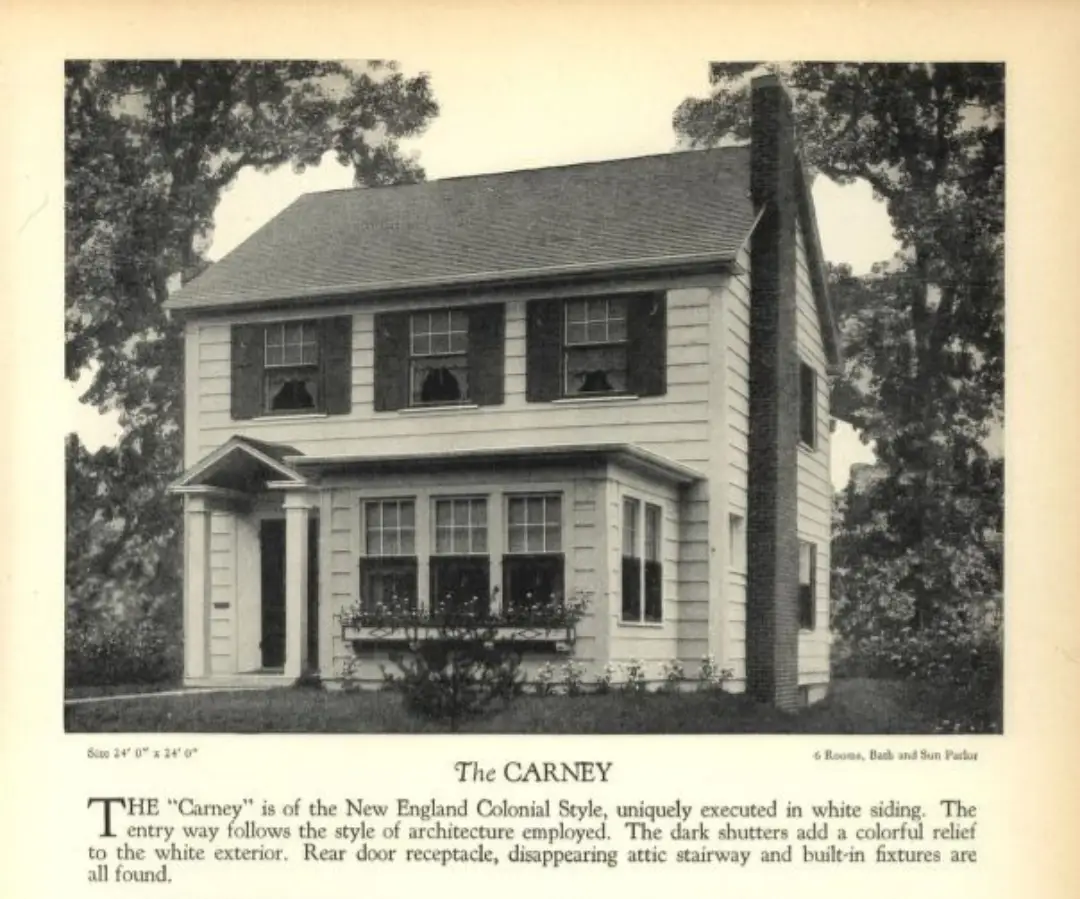
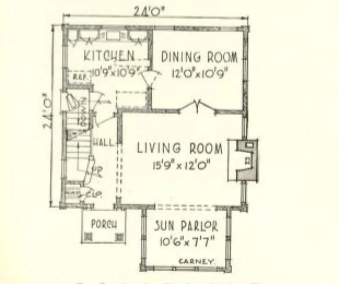
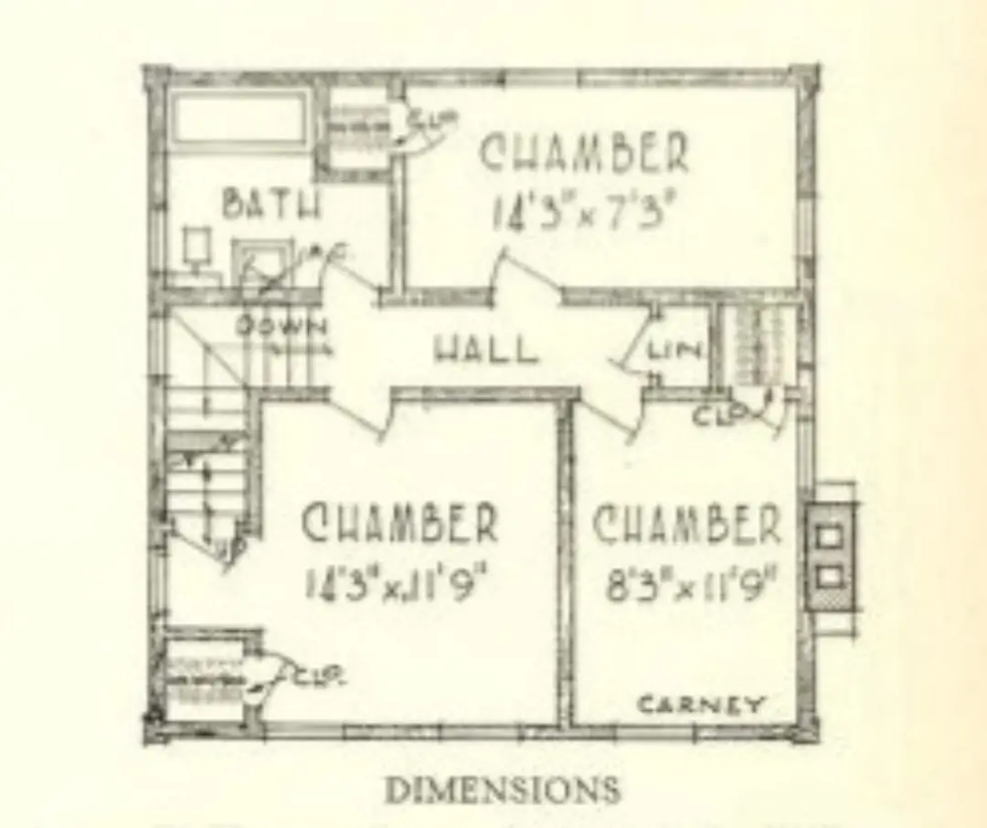
“The Neutra Home” by Richard Neutra This house plan is from this old tattered book called The Small Home of Tomorrow by Paul R. Williams AIA, from 1945
There’s a lot I like about this one. I could see living there.
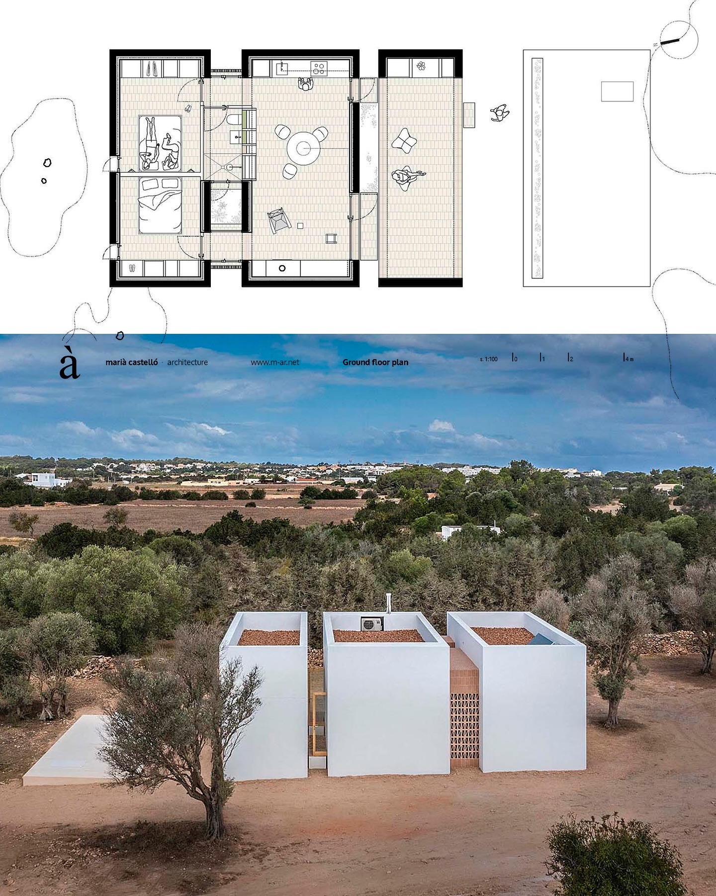
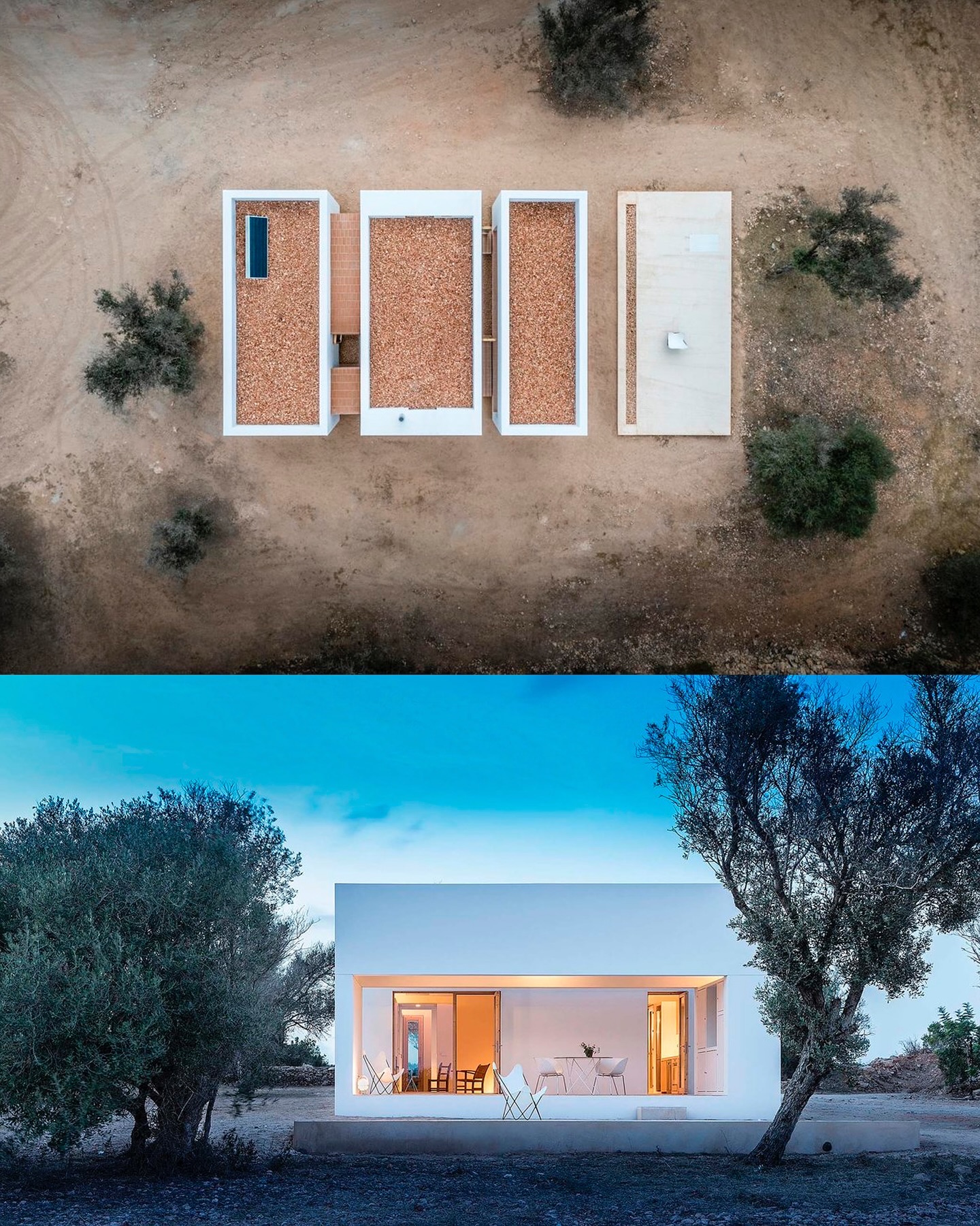
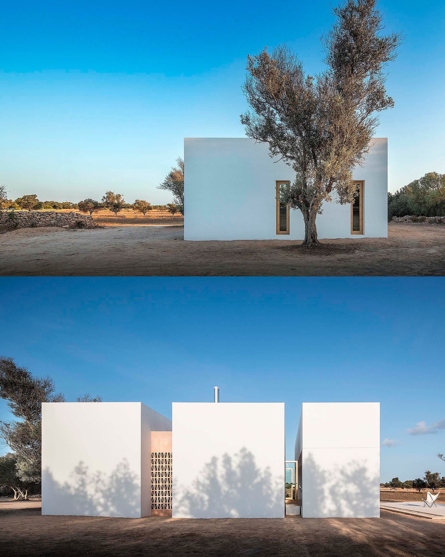
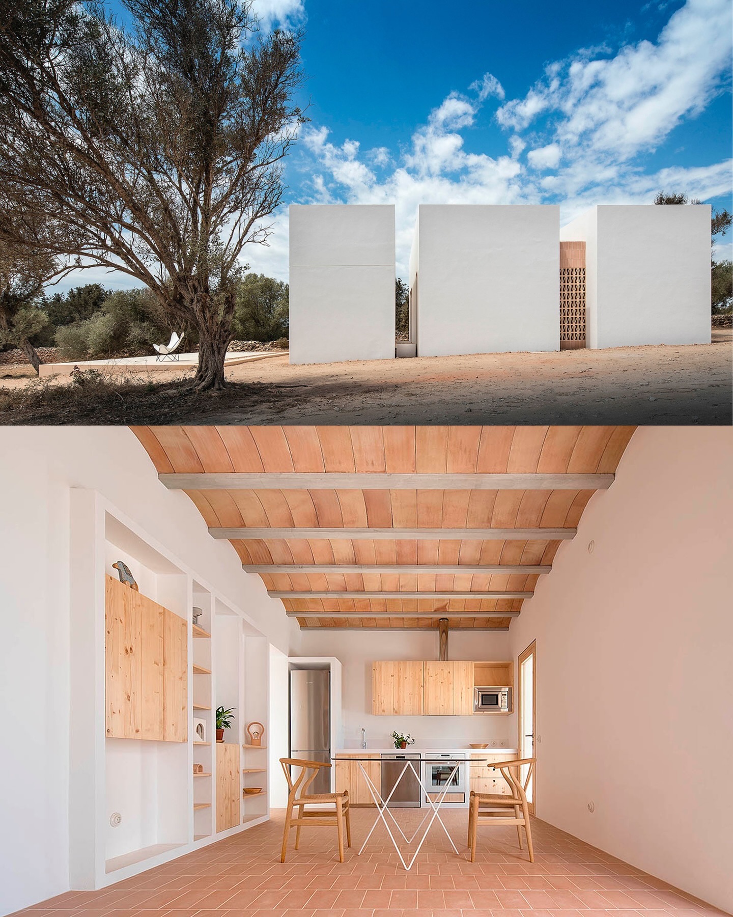
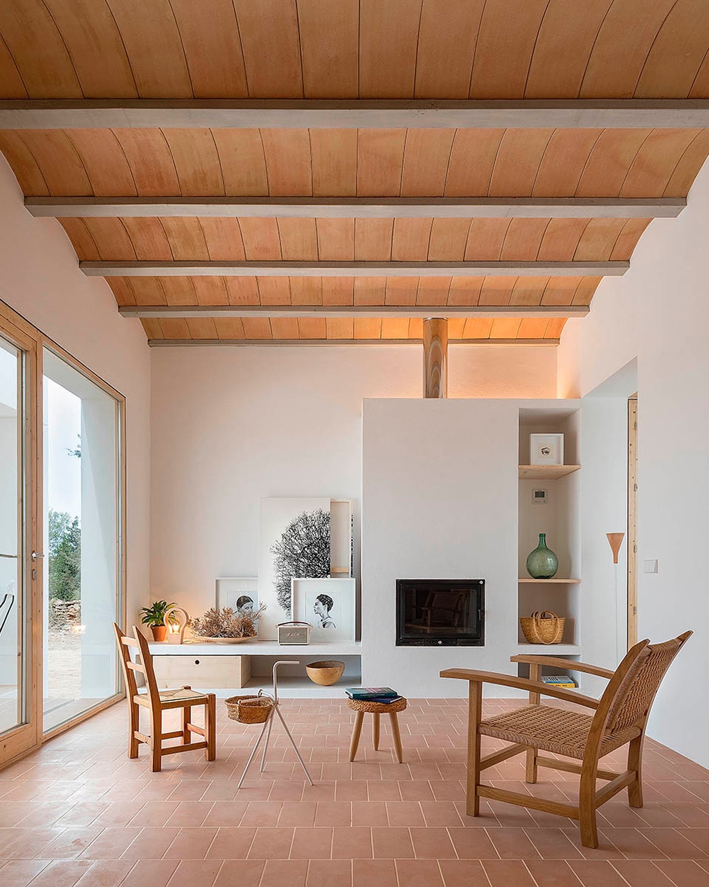
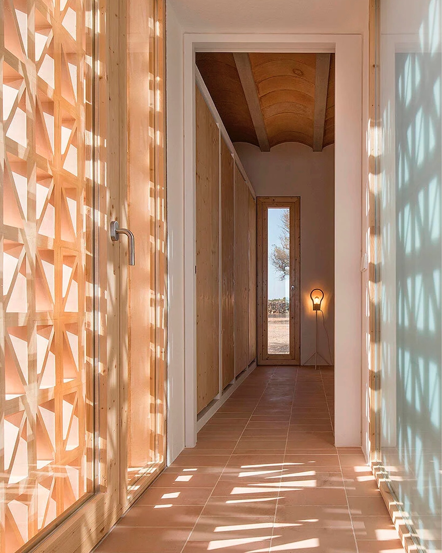
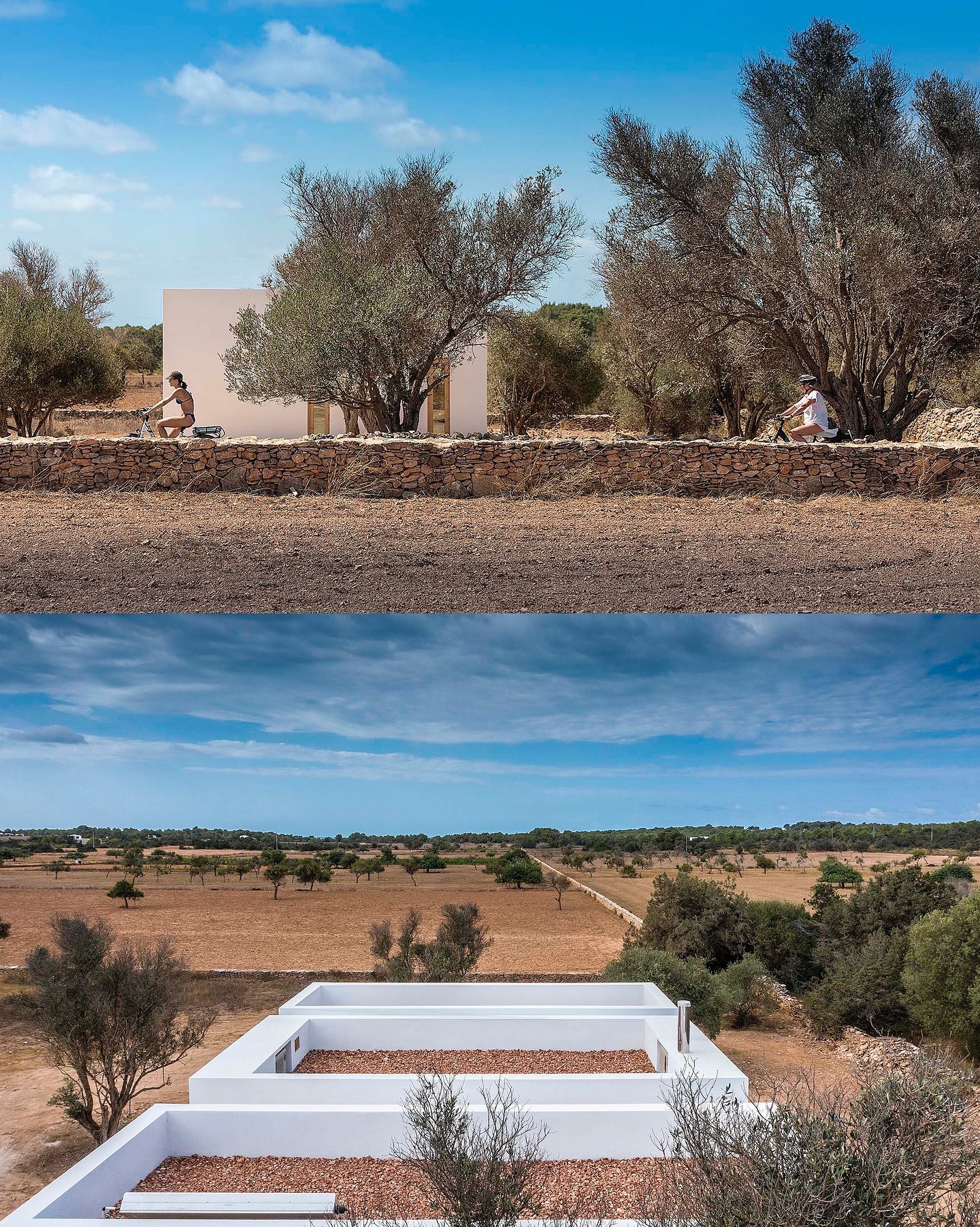
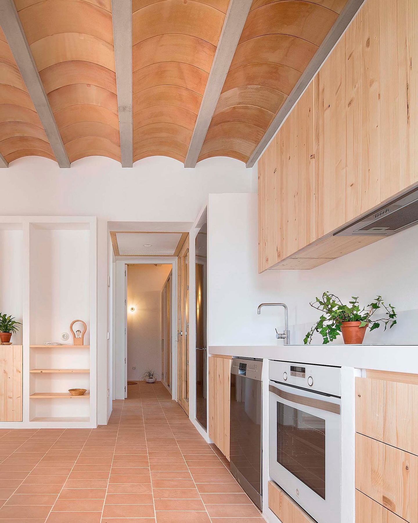
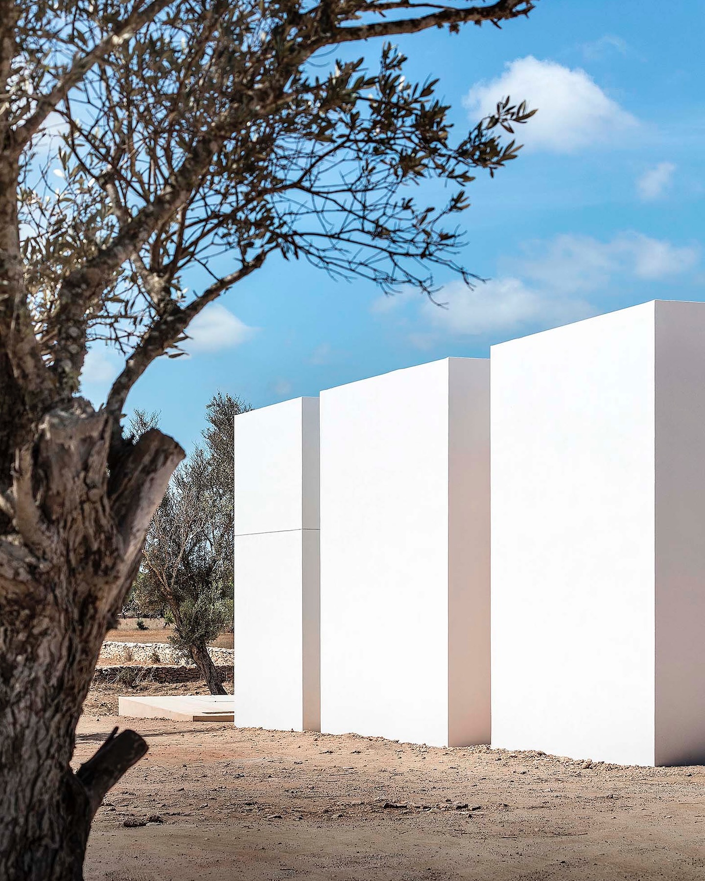
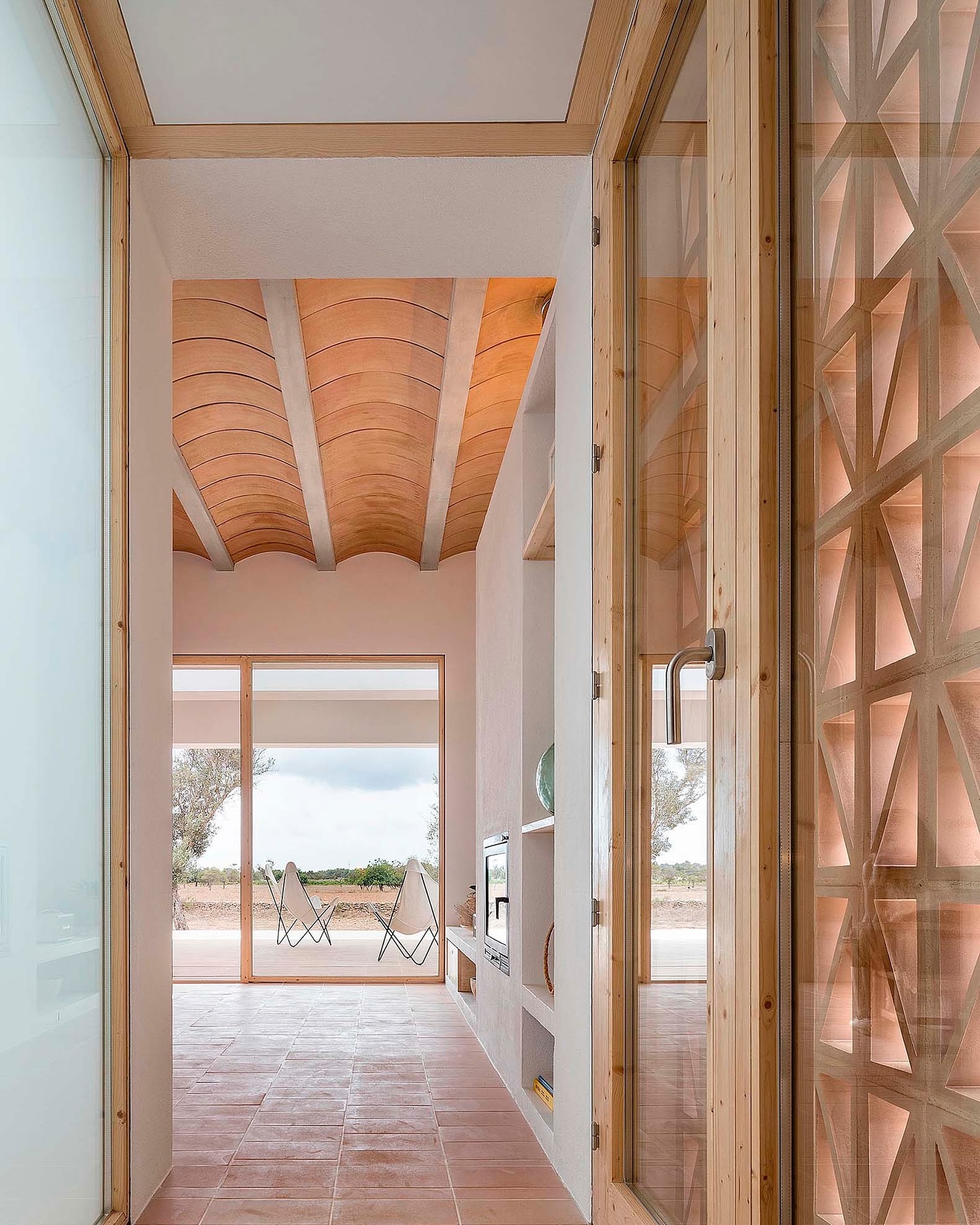
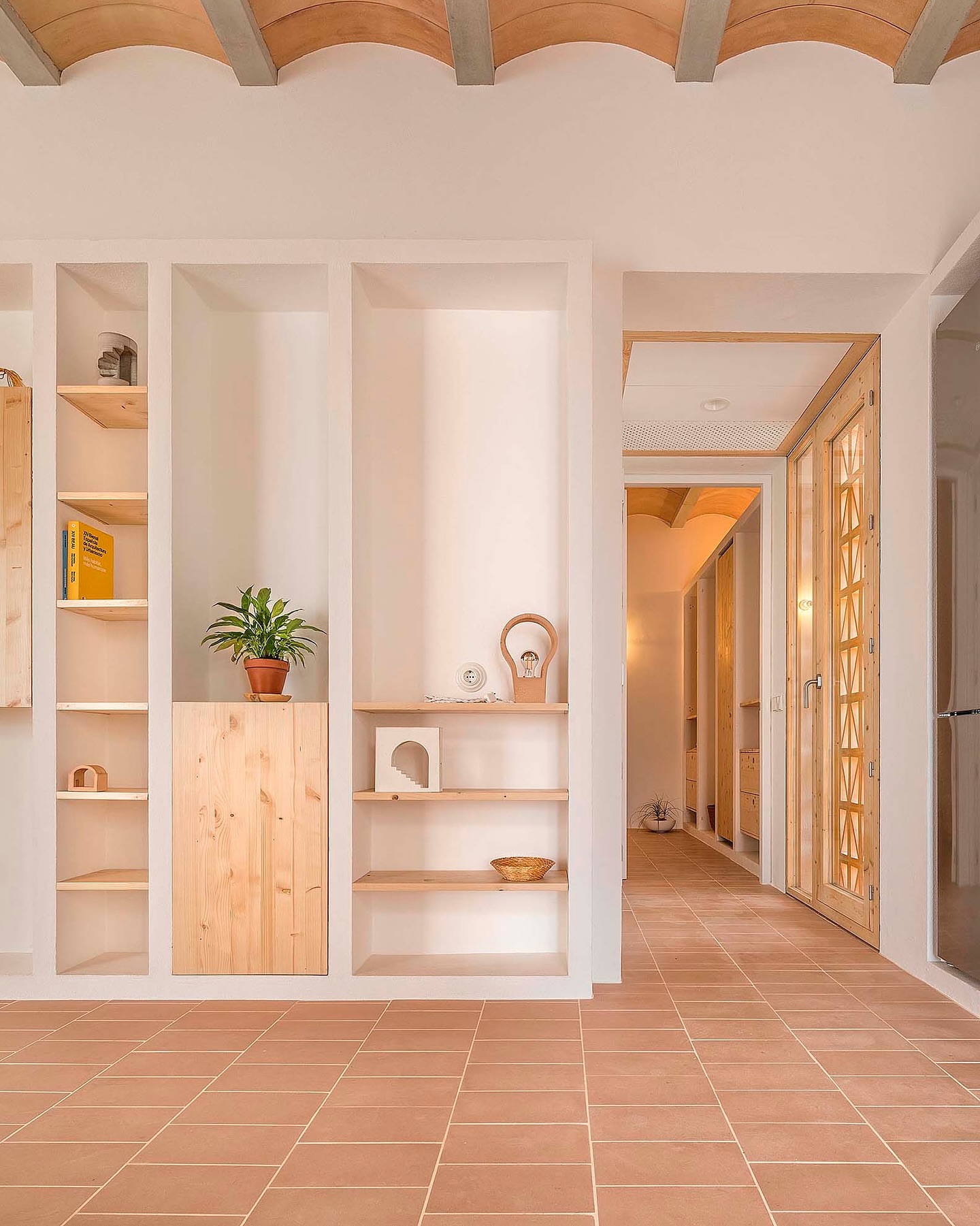
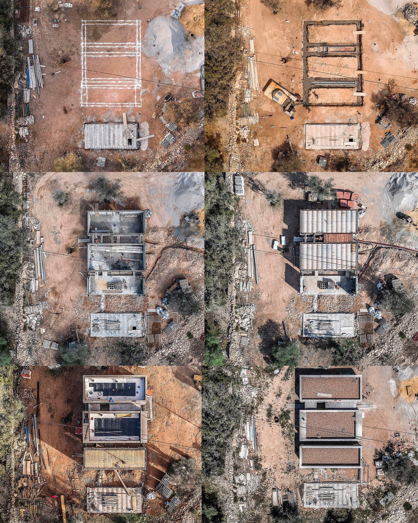
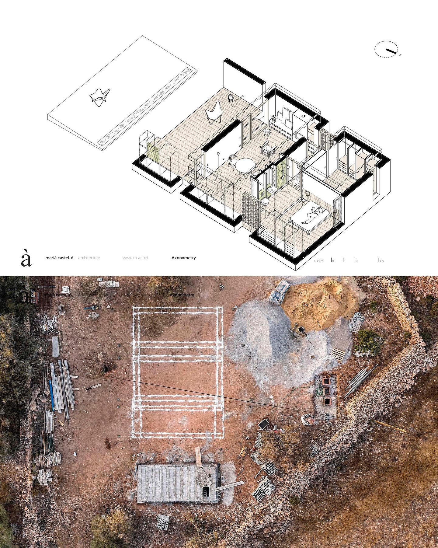
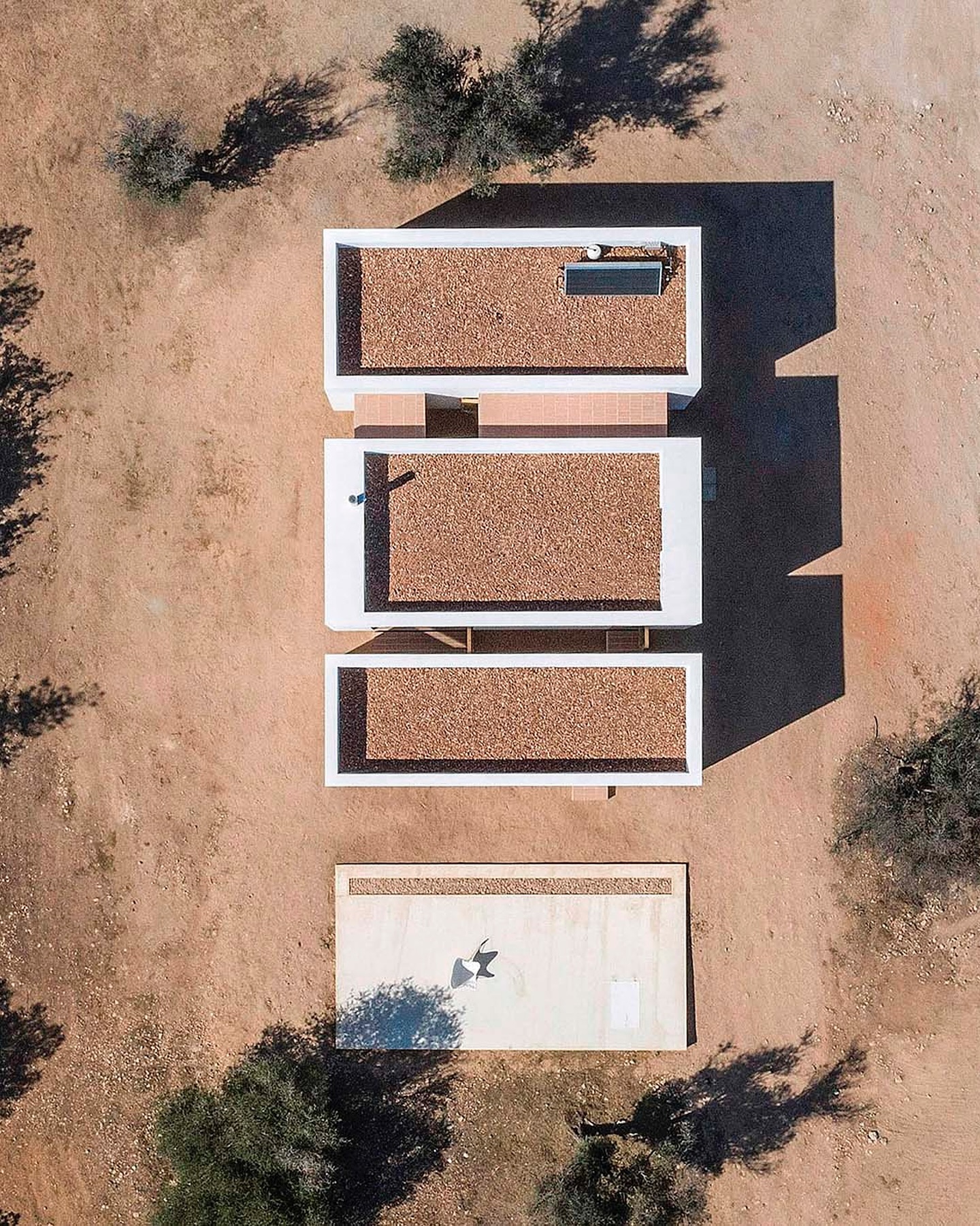
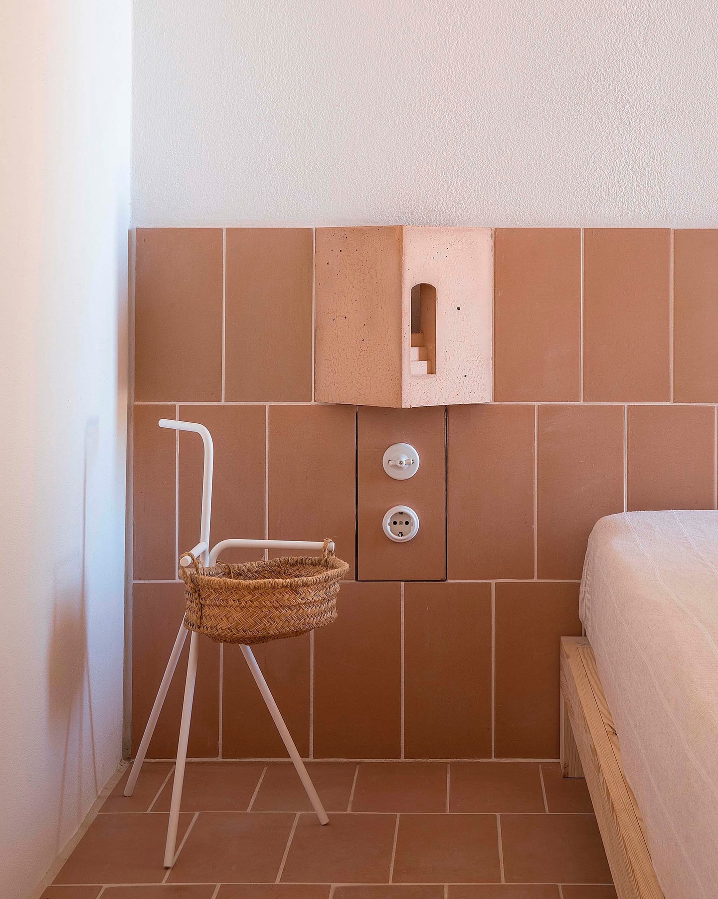
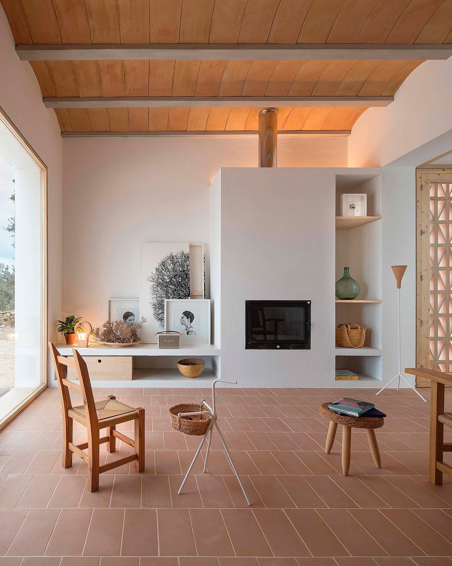
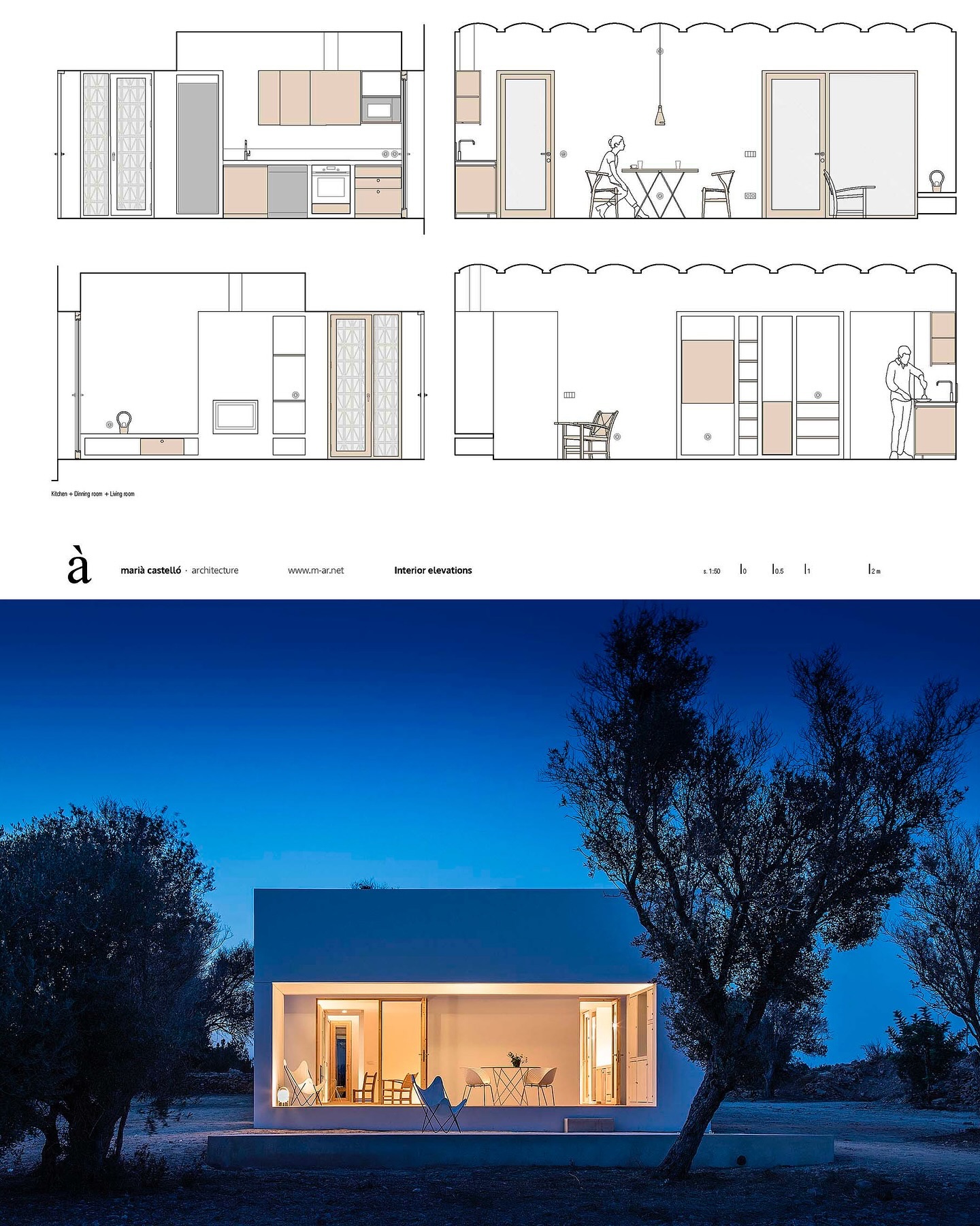
Es Pou House in Formentera by Marià Castelló Formentera Spain 94m2 The proposal is divided into three volumes, which order the program while providing it with a smaller grain and in accordance with the scale of the landscape. From south to north, the first volume houses a porch that offers solar protection, the second contains the more public program and the third two bedrooms. Among them are transverse strips that physically separate the volumes, giving them ventilation and lighting, as well as providing them with services and connections. In front of the house, there is a cistern that makes it self-sufficient in terms of water supply while offering a solarium for the coldest months of the year.
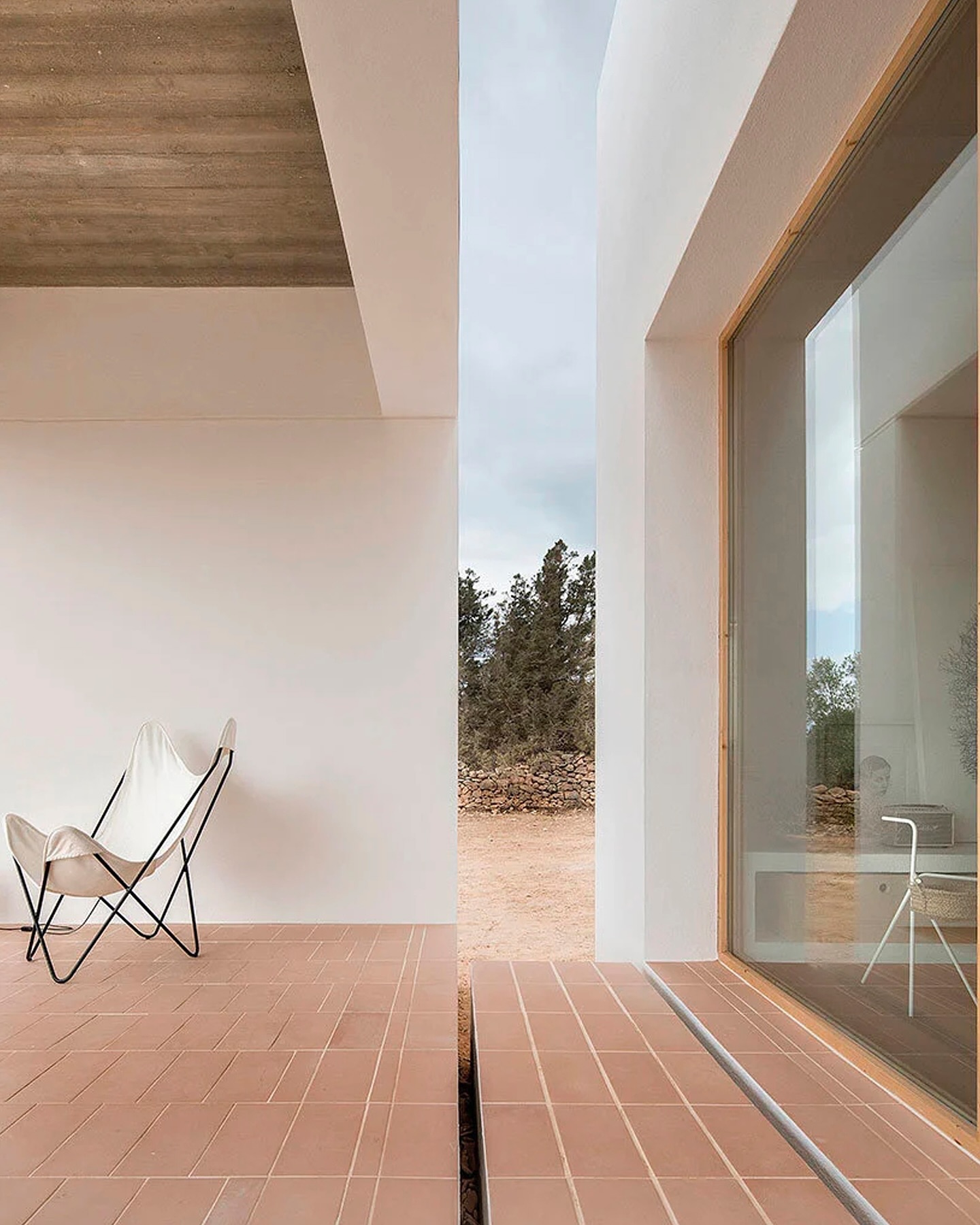
From the inside and through the porch, deep perspectives are discovered towards the flat landscape of wheat and oat fields, where the soft and warm color of the earth and the muted greens of the almond and fig trees predominate. The light, color, and material from the outside enter the interior of the house thanks to ceramics and wood, two noble materials that are combined in a subtle and timeless way.
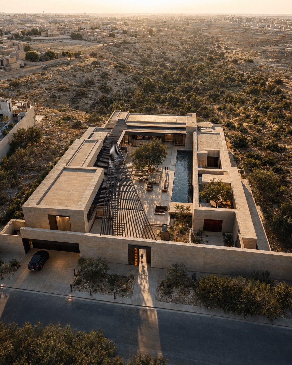
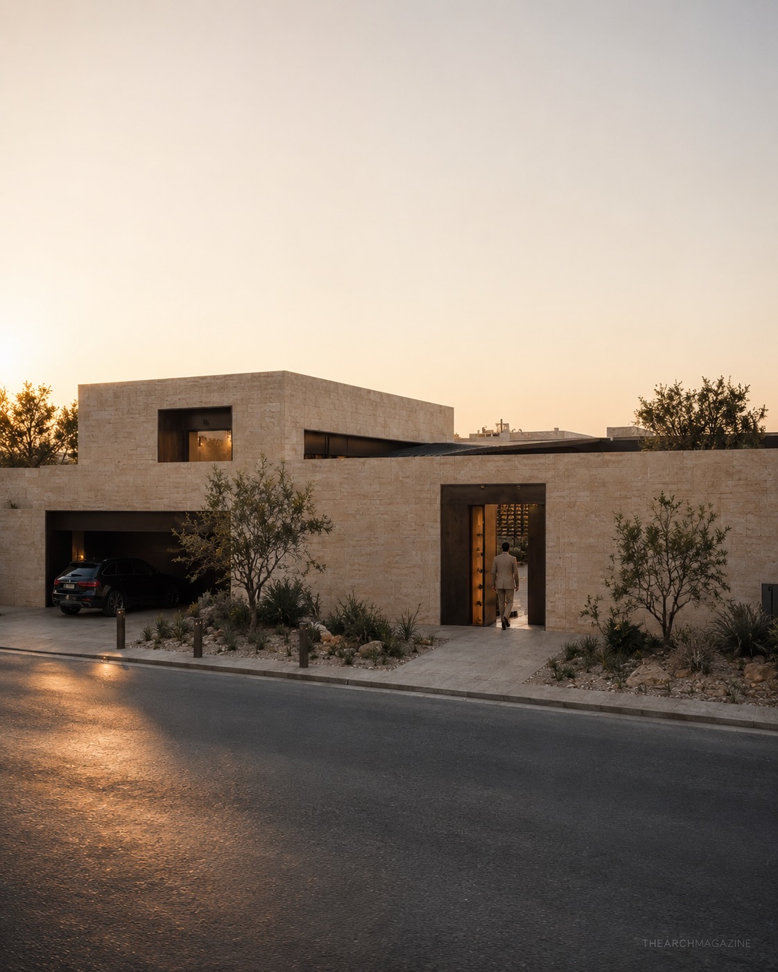
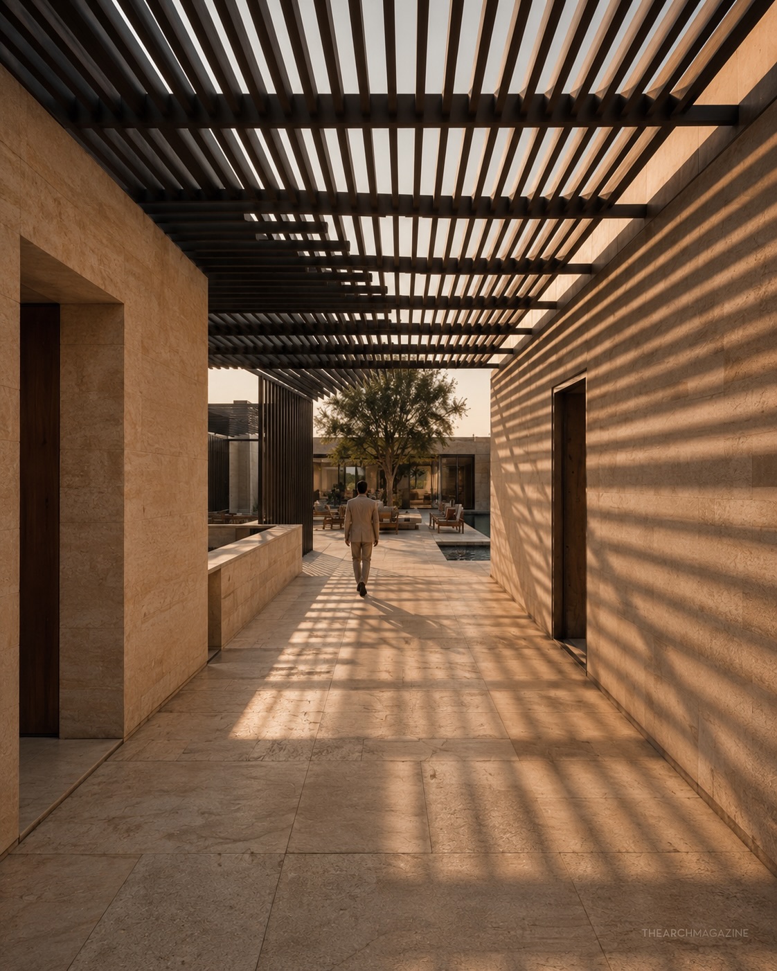
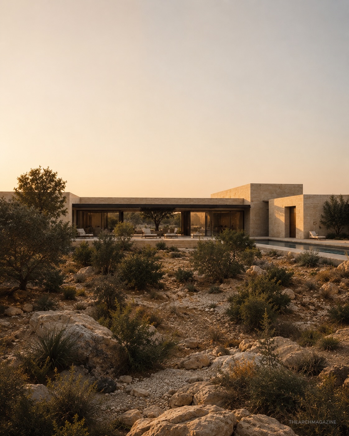
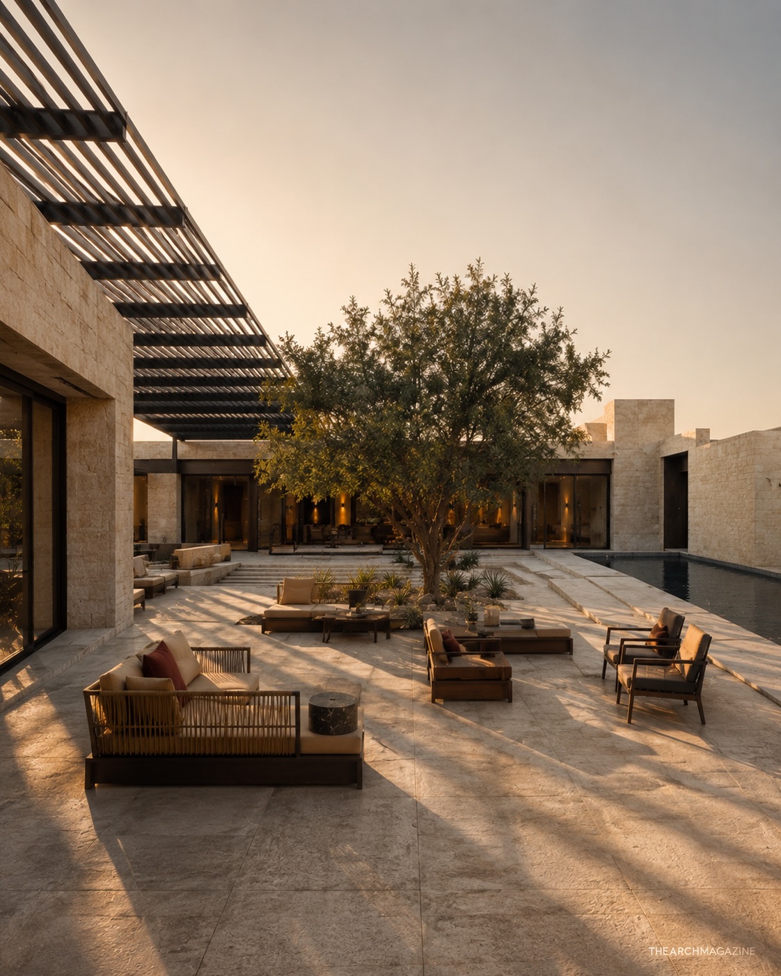
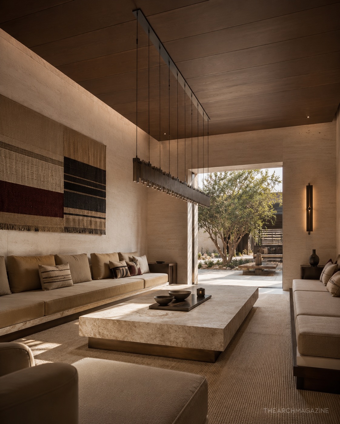
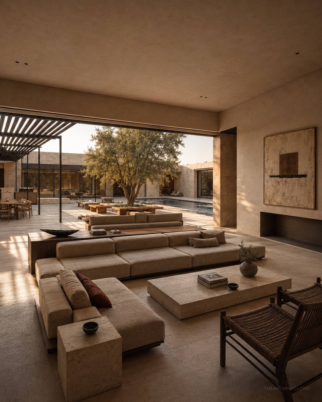
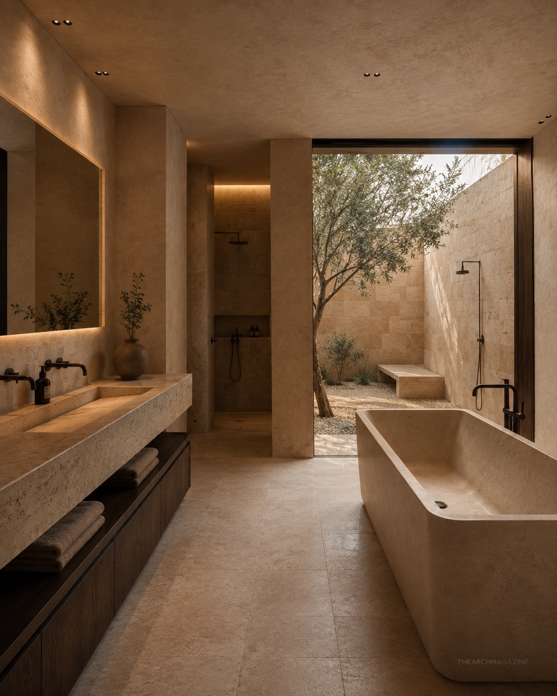
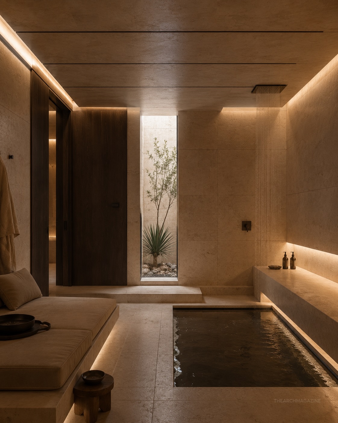
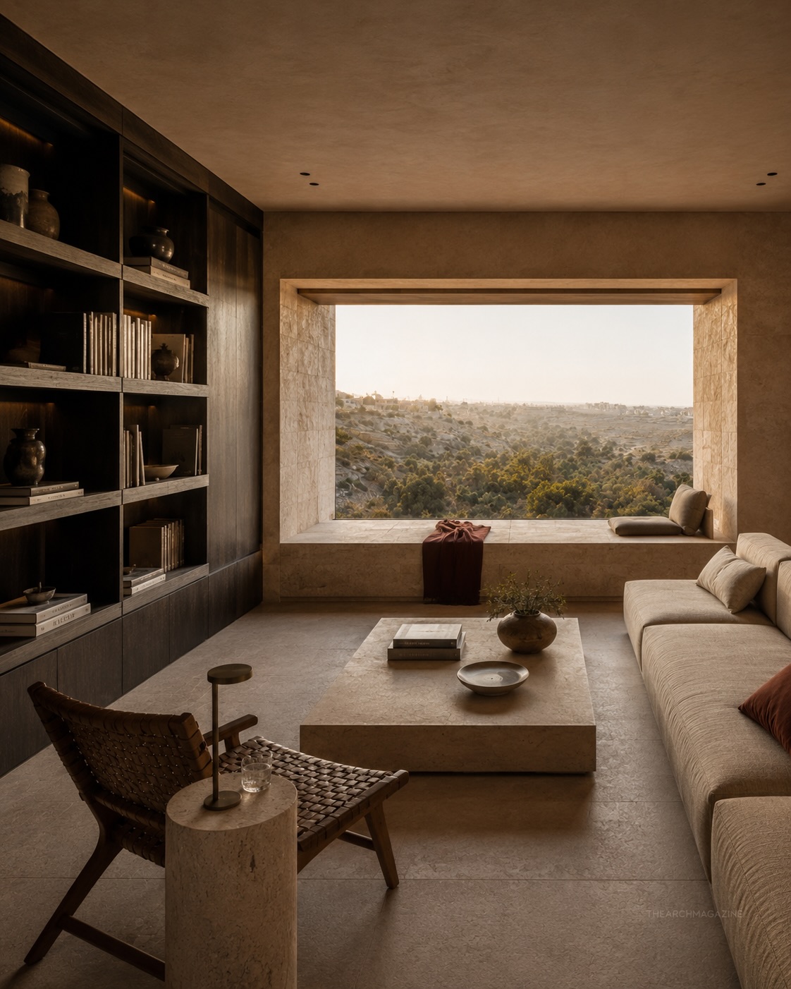
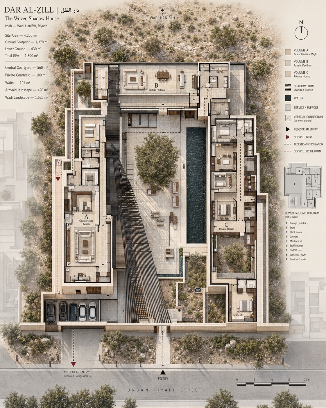
DĀR AL-ẒILL | دار الظل begins with a simple idea: what if the house didn’t wear Al-Sadu, but let the sun weave it?
Set on a 4,200 m² site in Irqah, overlooking Wadi Hanifah, Riyadh, the residence unfolds through three monolithic limestone volumes, a shaded central courtyard, a dark linear pool, and the signature Shadow Loom an oxidized-bronze canopy that translates Saudi weaving into light, rhythm and shadow.
Inside, warm Riyadh limestone, smoked timber, mineral plaster, bronze and custom furniture create a calm world of contemporary Saudi architecture, luxury interior design and modern desert living. Privacy, hospitality and landscape are carefully layered from the urban street edge toward the Wadi.
Ideator/ Designer: Jad El Mourad
[Disclaimer: Completely AI generated. Not a real residence, project, or commission.]
My 28-year old self would’ve loved this. But my 68 year old self with all those stairs?
And it needs color. I’m thinking of it as a blank canvas to be filled in with brightly colored furniture and carpets.
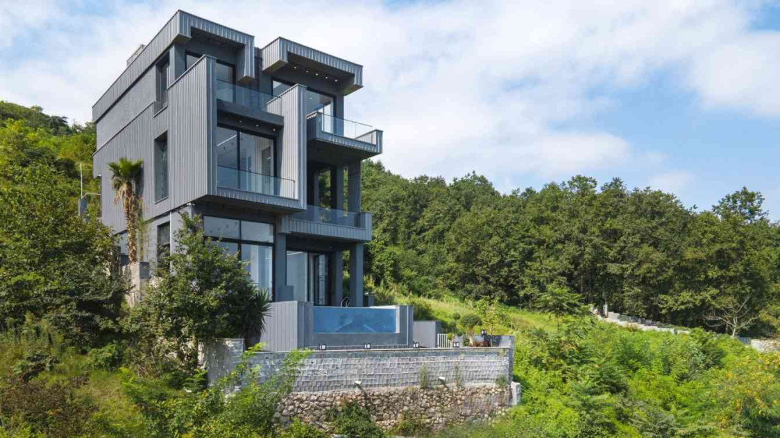
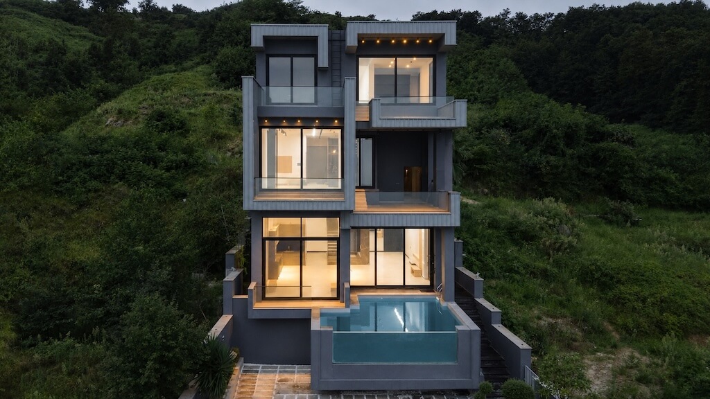
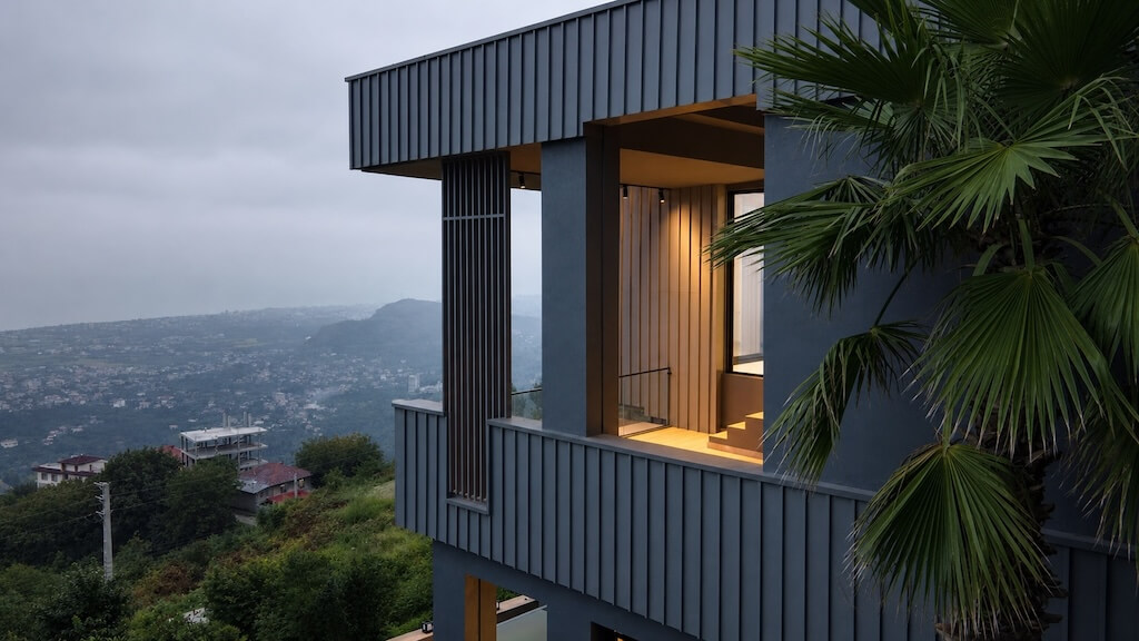
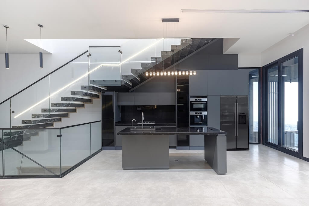
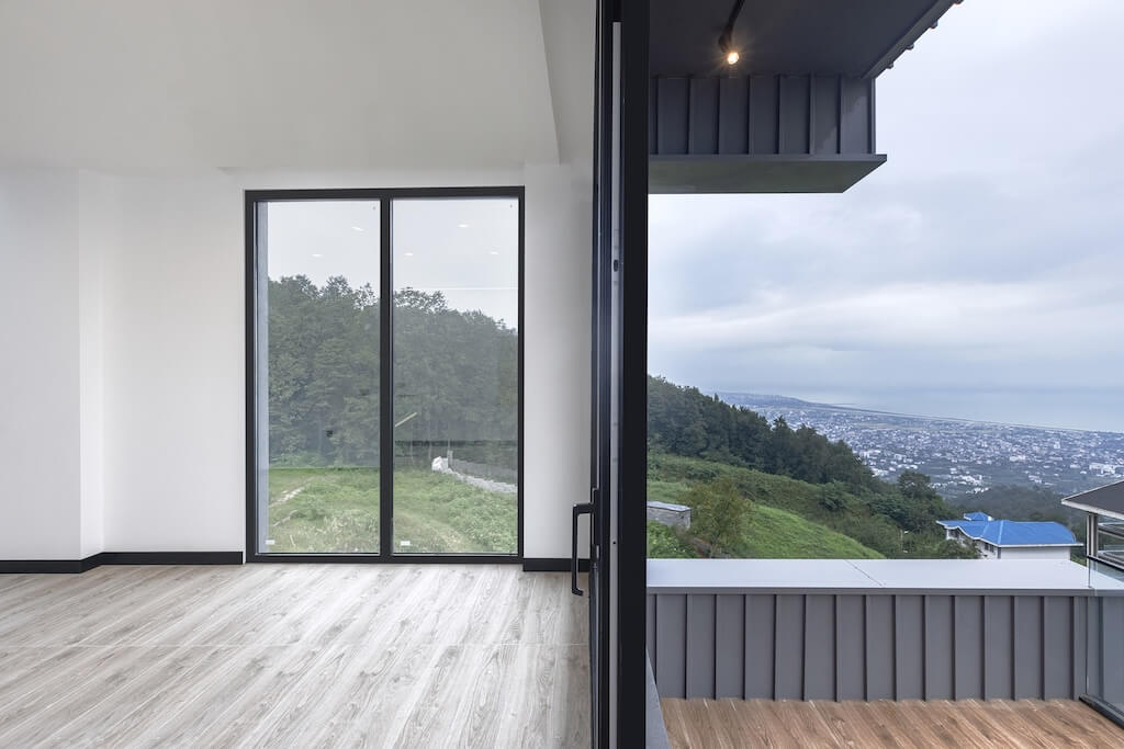
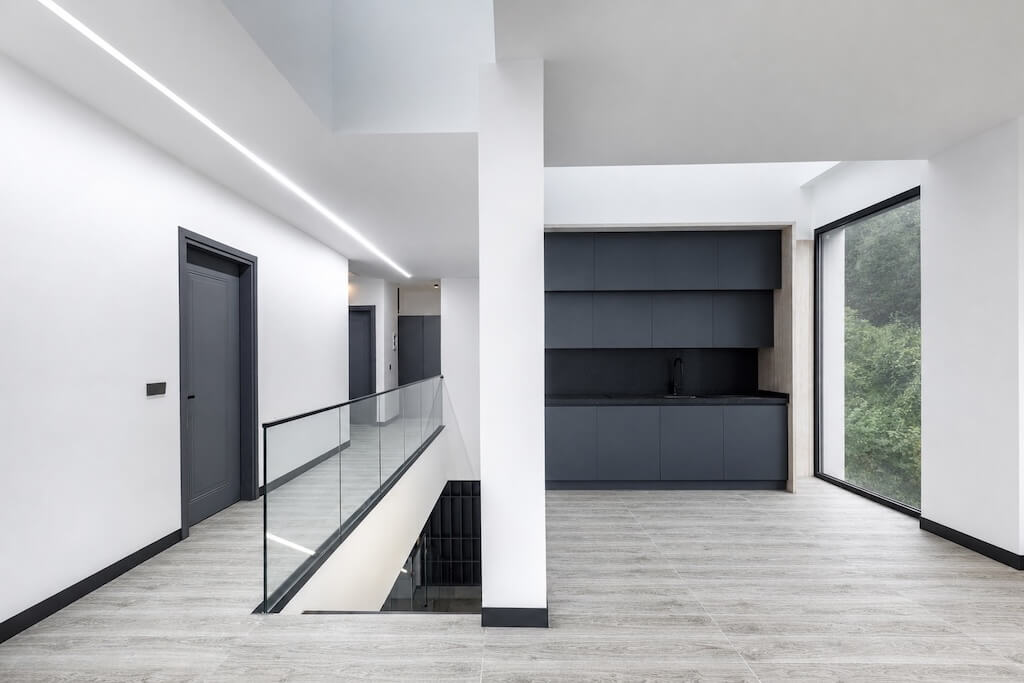
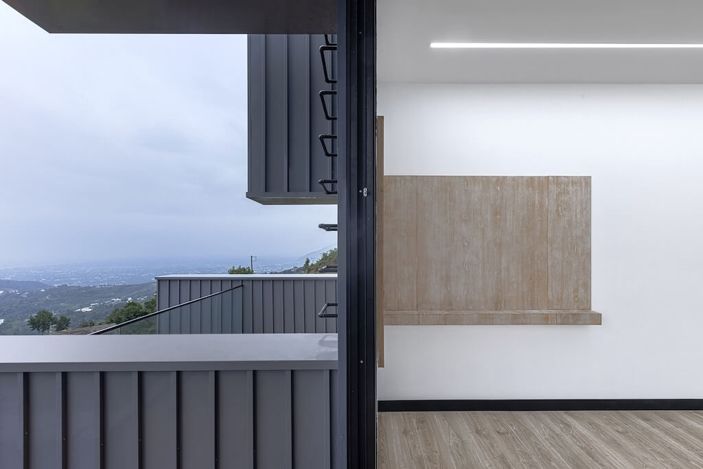
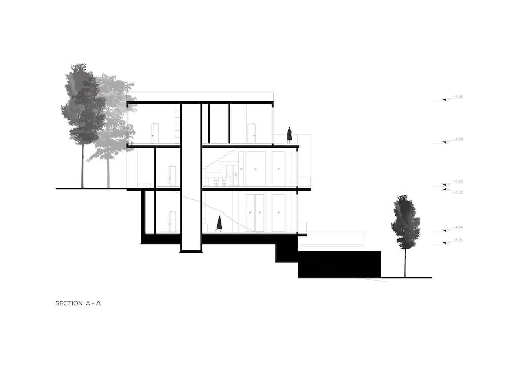
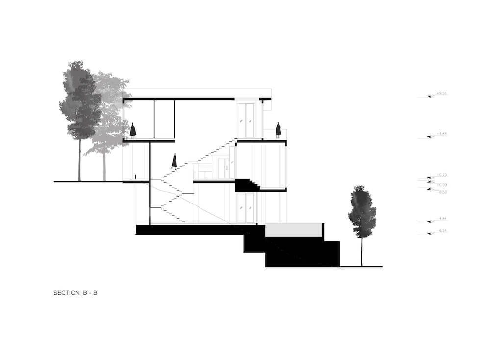
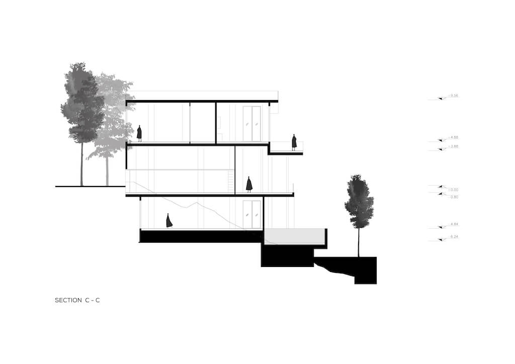
Villa Terrace: A Layered Response to a Steep Coastal Landscape
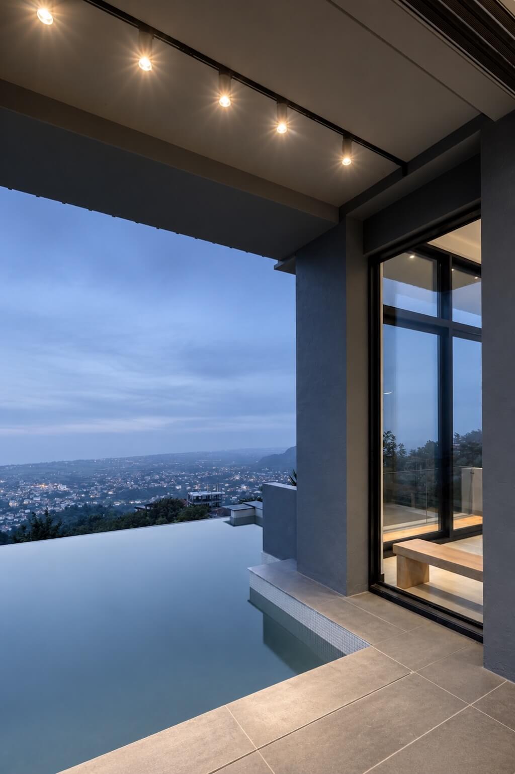
Poorkeivan Studio: Villa Terrace is designed on a steep hillside in Ramsar, northern Iran, where a thirteen-meter difference in elevation is transformed from a construction challenge into an opportunity for creating a layered living experience.
Despite the complexity of construction and the increased costs associated with the site, the client intentionally selected a higher location to benefit from wide views toward the Caspian Sea and the surrounding urban and natural landscape.
The main design challenge was how to respond to the steep topography while preserving climatic comfort and creating diverse spatial experiences. Inspired by the client’s desire to experience different framed views of the landscape, the project transforms the slope into a sequence of interconnected terraces.
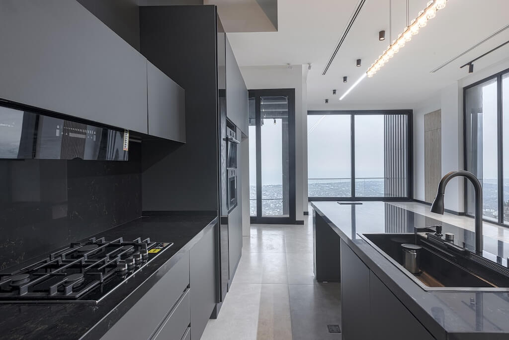
Each floor is conceived as an individual terrace, where enclosed spaces are carefully positioned according to their functions. The swimming pool, gym, breakfast area, bedrooms, and living spaces interact with these terraces, allowing every part of the villa to engage directly with the surrounding environment.
The north–south orientation of the site guides the placement of openings to maximize natural ventilation and daylight. The terraces extend toward the sea while opening toward the forest, creating a natural airflow system. Sea breezes pass across the terraces and enter the villa through a central vertical opening around the staircase, which functions as a wind channel and distributes airflow throughout the interior spaces.
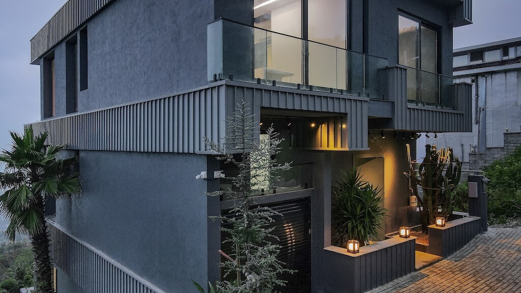
The façade design reinterprets the traditional metal roofs commonly found in northern Iranian architecture through a contemporary language. The standing seam metal cladding, finished in a grey tone, recalls the collective memory of the region while creating a modern architectural identity.
From the northern street, the building appears as a modest two-story villa; however, entering the project reveals a deeper, multi-layered spatial experience shaped by the terrain. The terraces frame different views of the surrounding landscape, gradually revealing the true scale and complexity of the villa.
By utilizing the potential of the slope, integrating passive climatic strategies, and combining concrete structure, curtain wall glazing, and a metal envelope, Villa Terrace establishes a balance between contemporary architecture, local identity, and environmental responsiveness.
Casa Mesquite was born from the search for contemporary architecture that, beyond its aesthetics, transmits warmth and a true feeling of home.
From its facades to each of its interior spaces, the project maintains the same language: clean lines, warm materials, natural textures and lighting carefully integrated to create serene, welcoming and timeless environments.
Each space was thought of as part of a set, seeking continuity between architecture, materiality and interior design. Social areas open up and connect, while private spaces find a more intimate and quiet atmosphere, always maintaining the essence of the project.
Casa Mesquite represents our way of understanding architecture: spaces that not only respond to a function, but generate sensations and build an identity of its own.
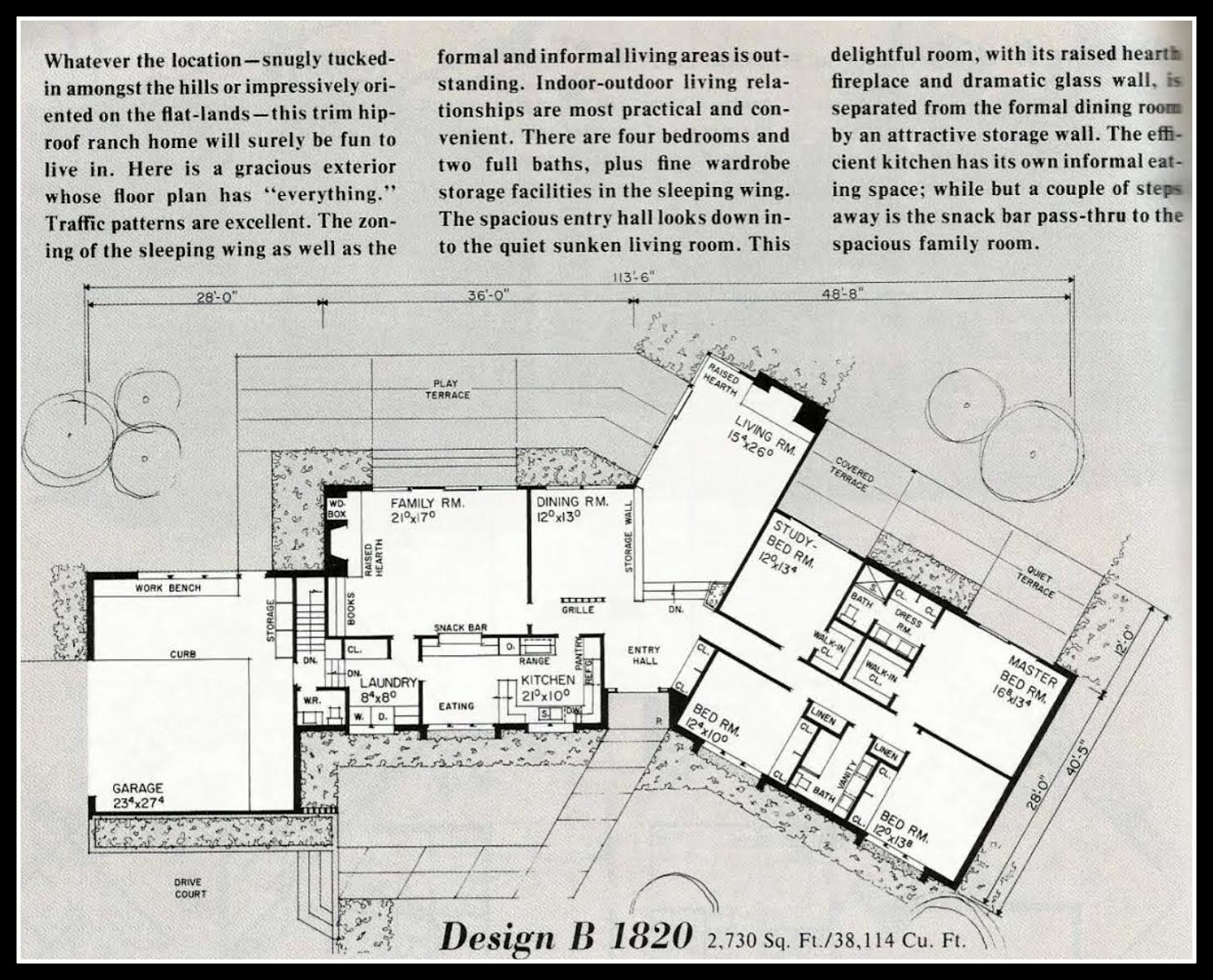
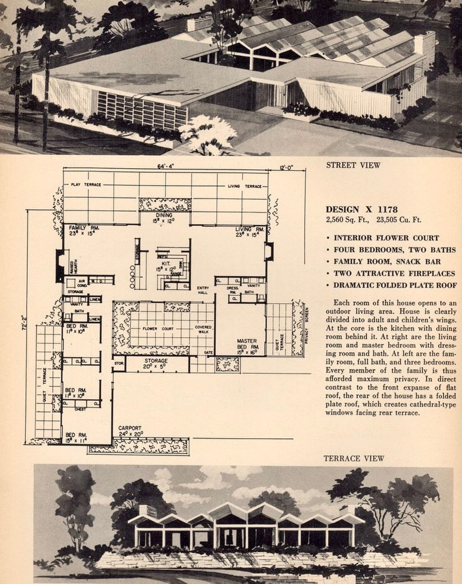
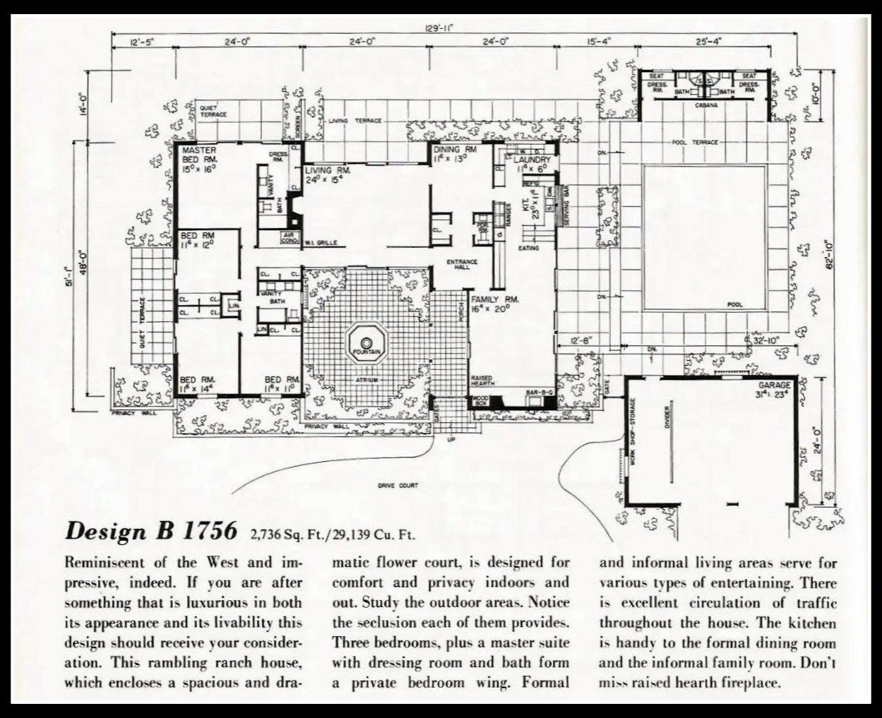
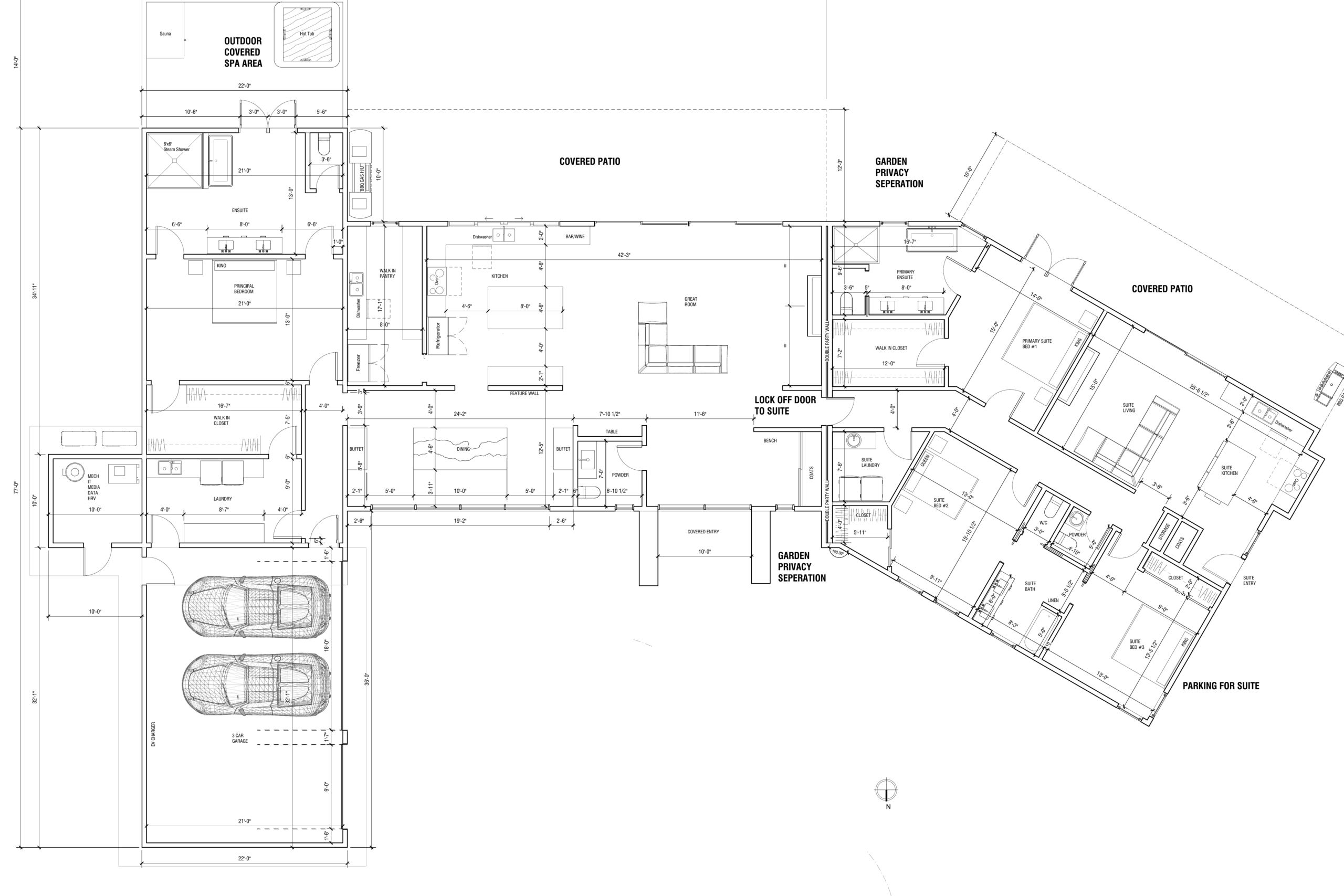
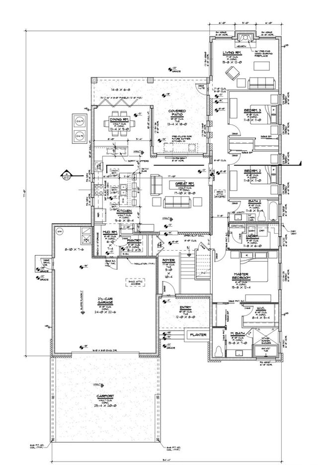
These are the kind of plans that fired my young architect’s imagination when I was in high school, although what I—or at most coupled to the man of my dreams—do with four bedrooms eluded me completely.
Now of course, four bedrooms translates into a primary suite, an office for each of us, and a guest room, duh!
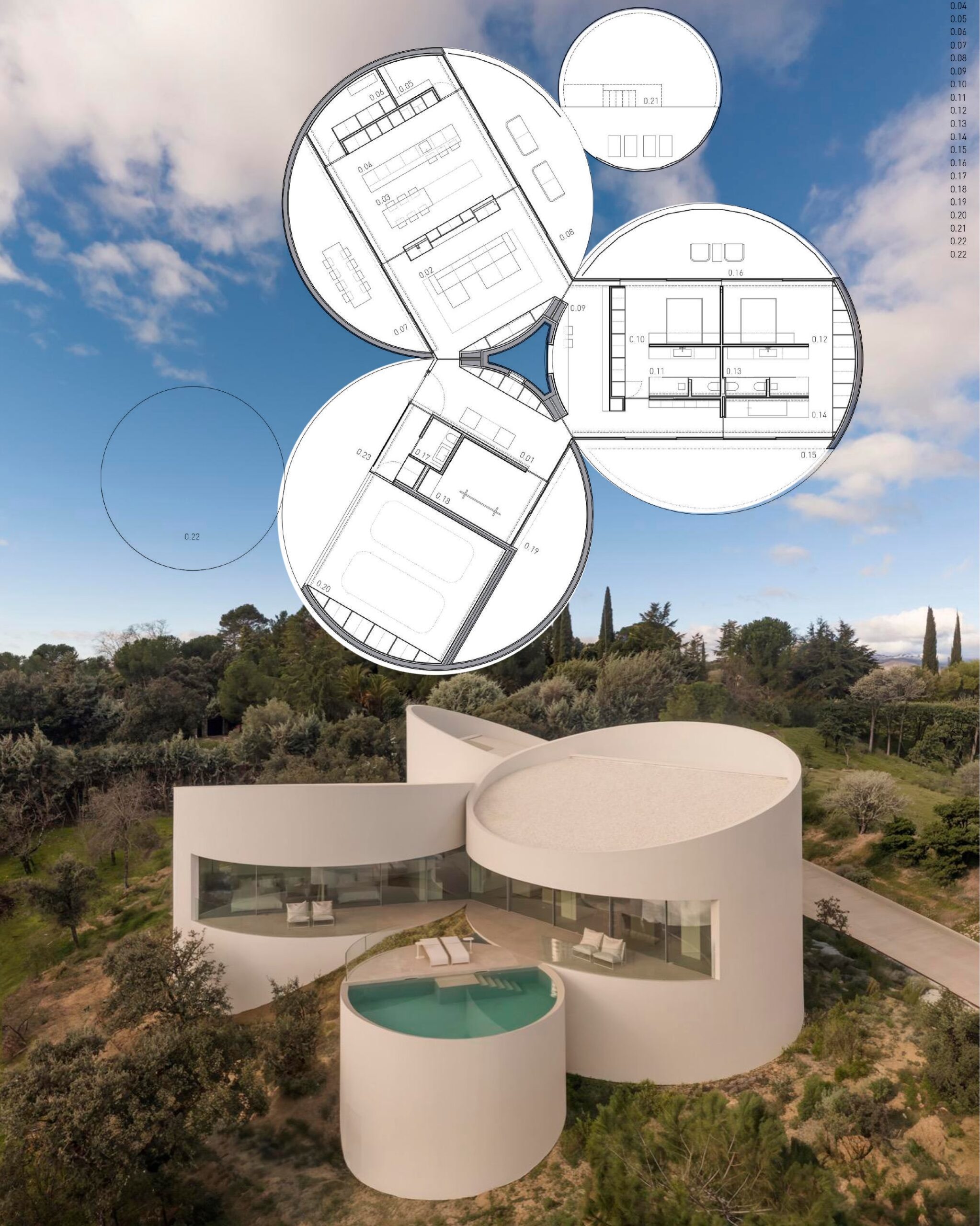
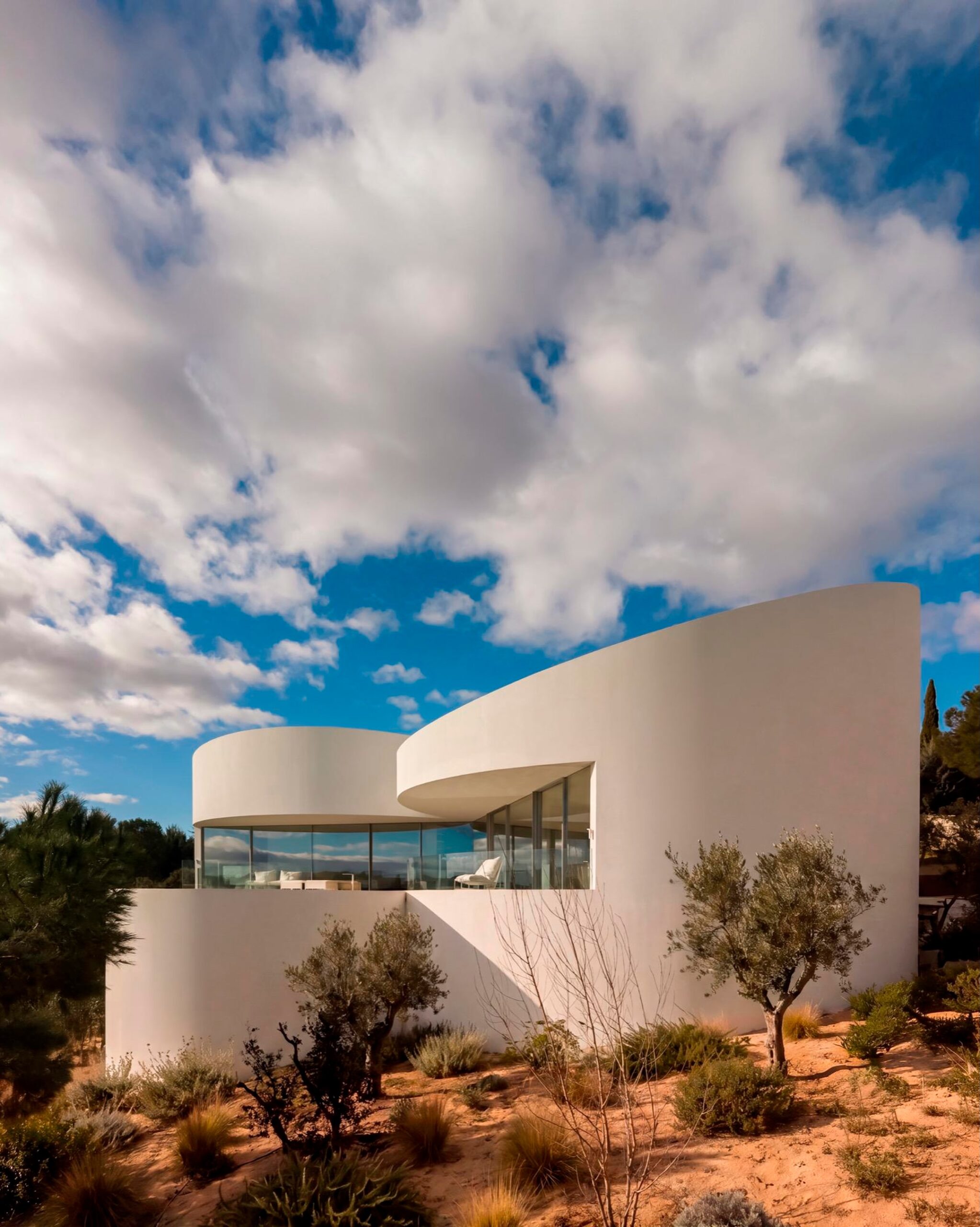
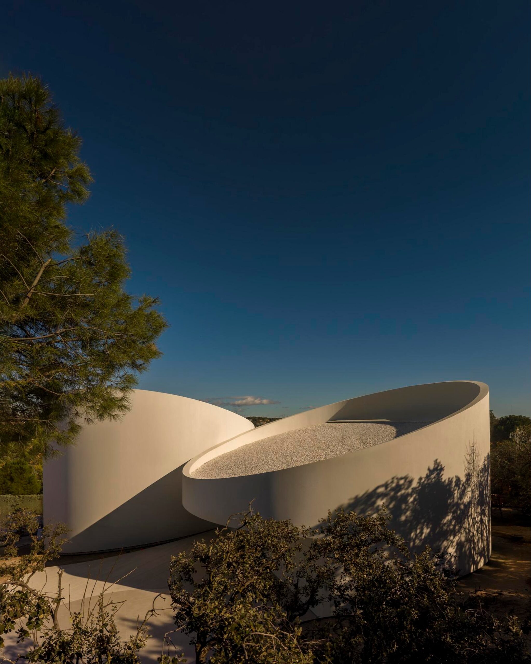
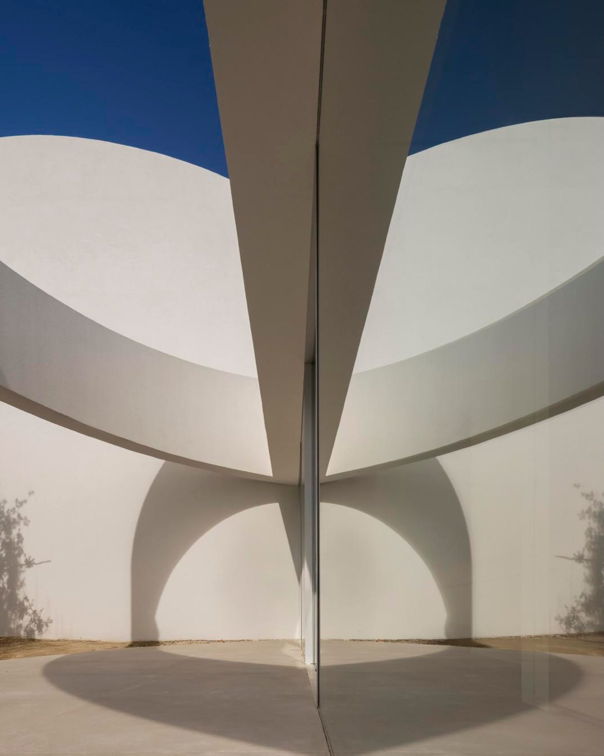
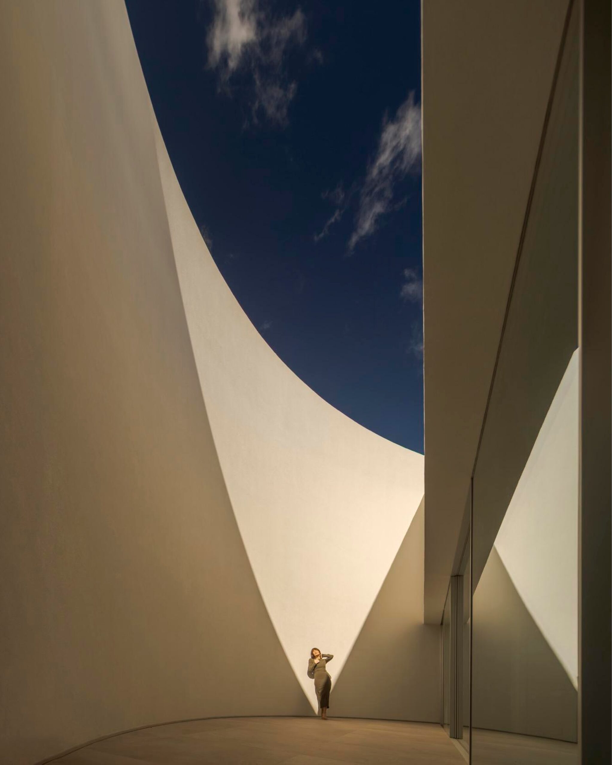
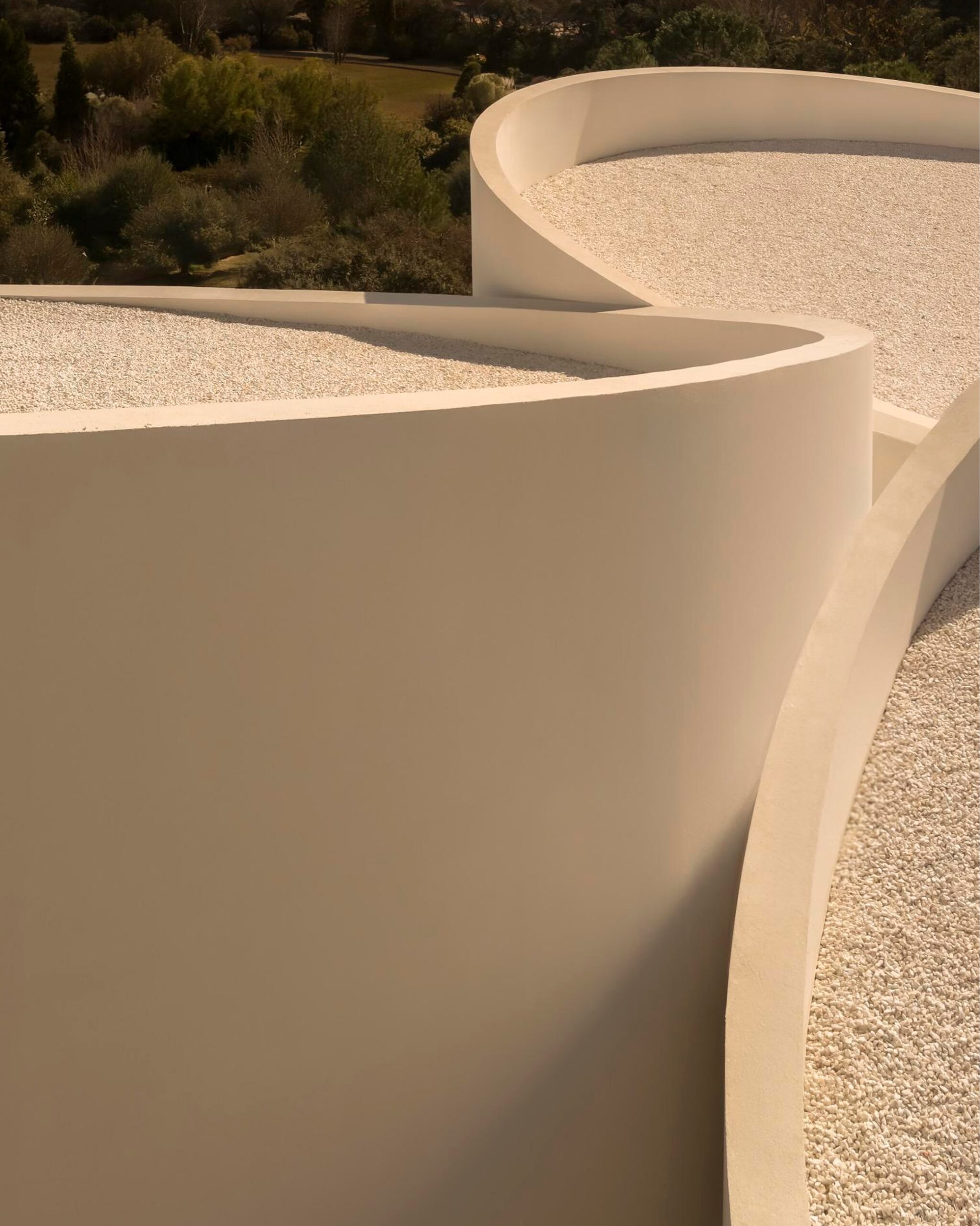
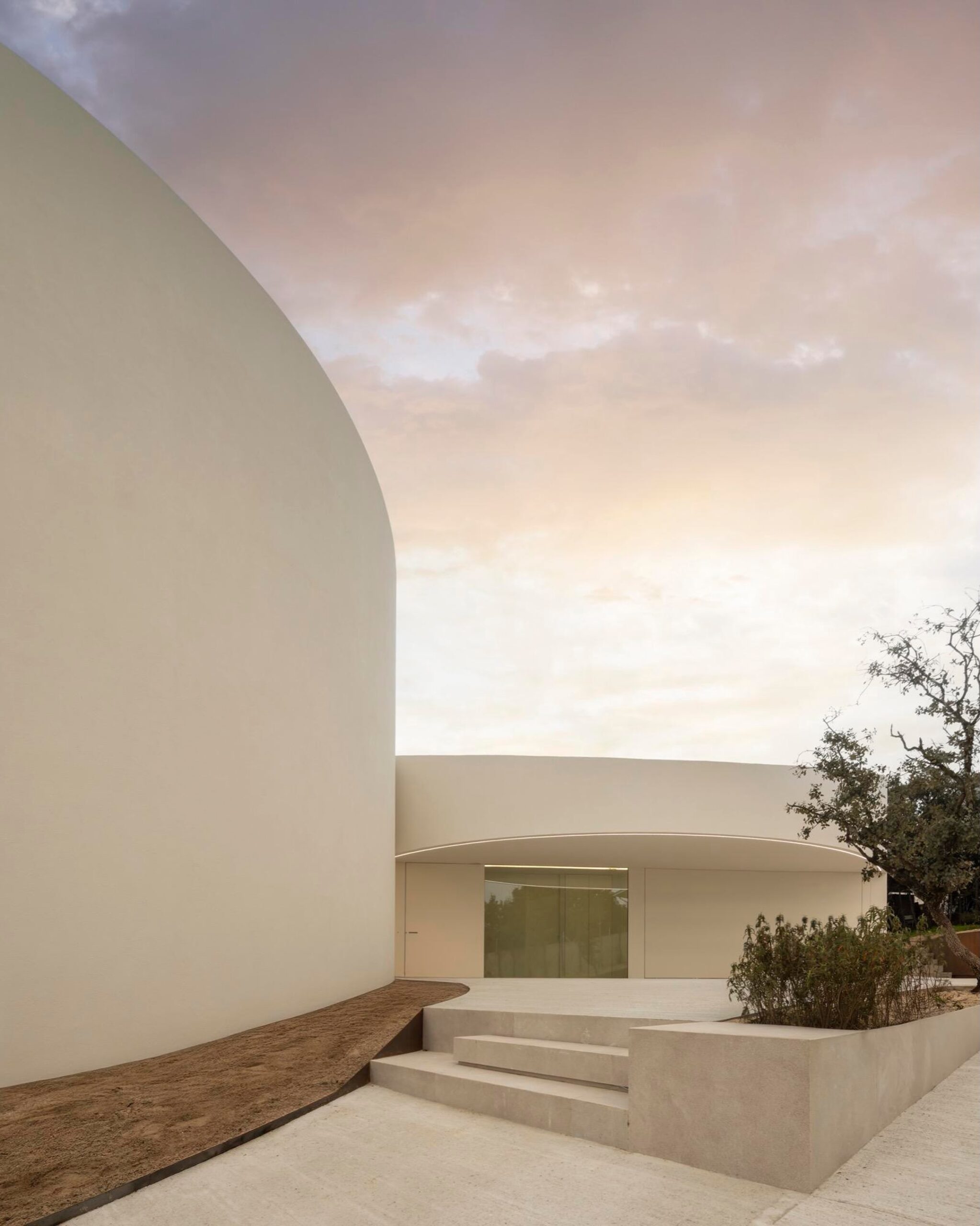
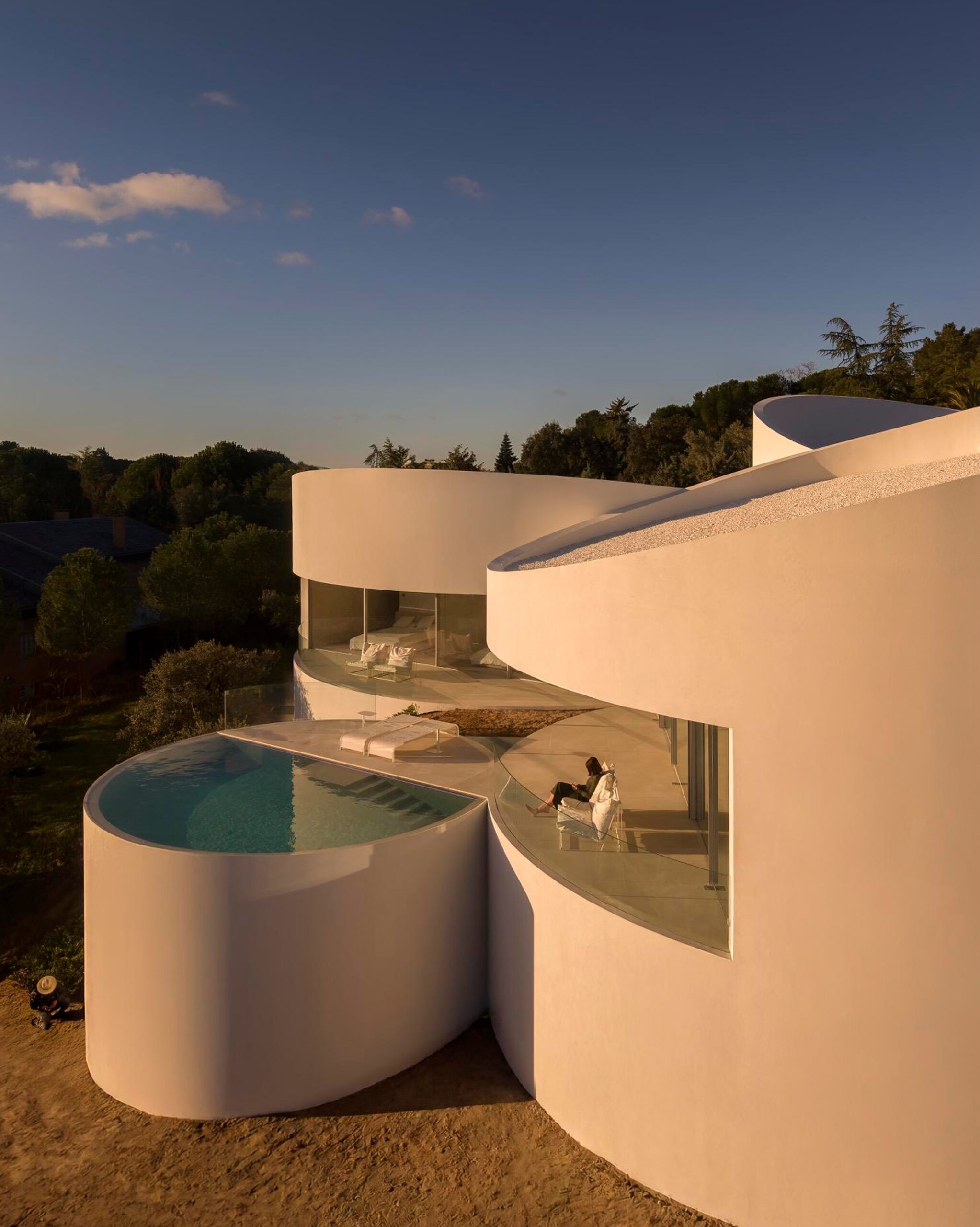
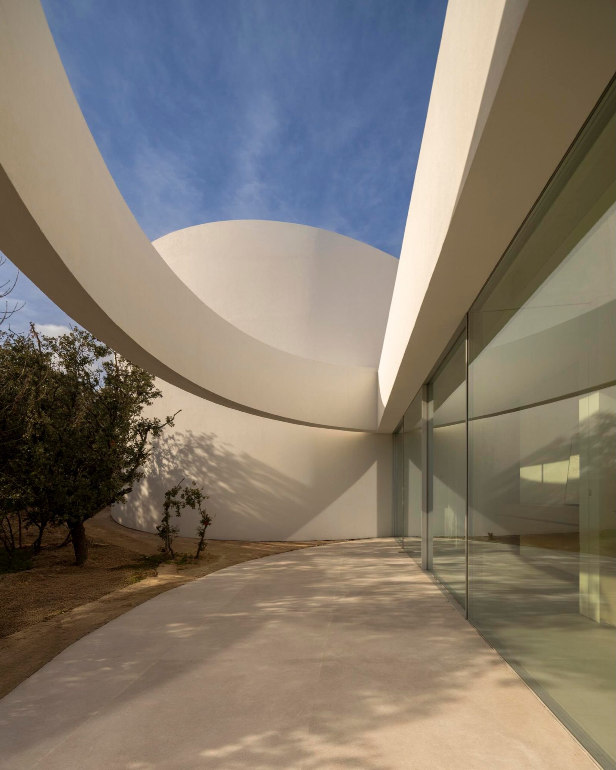
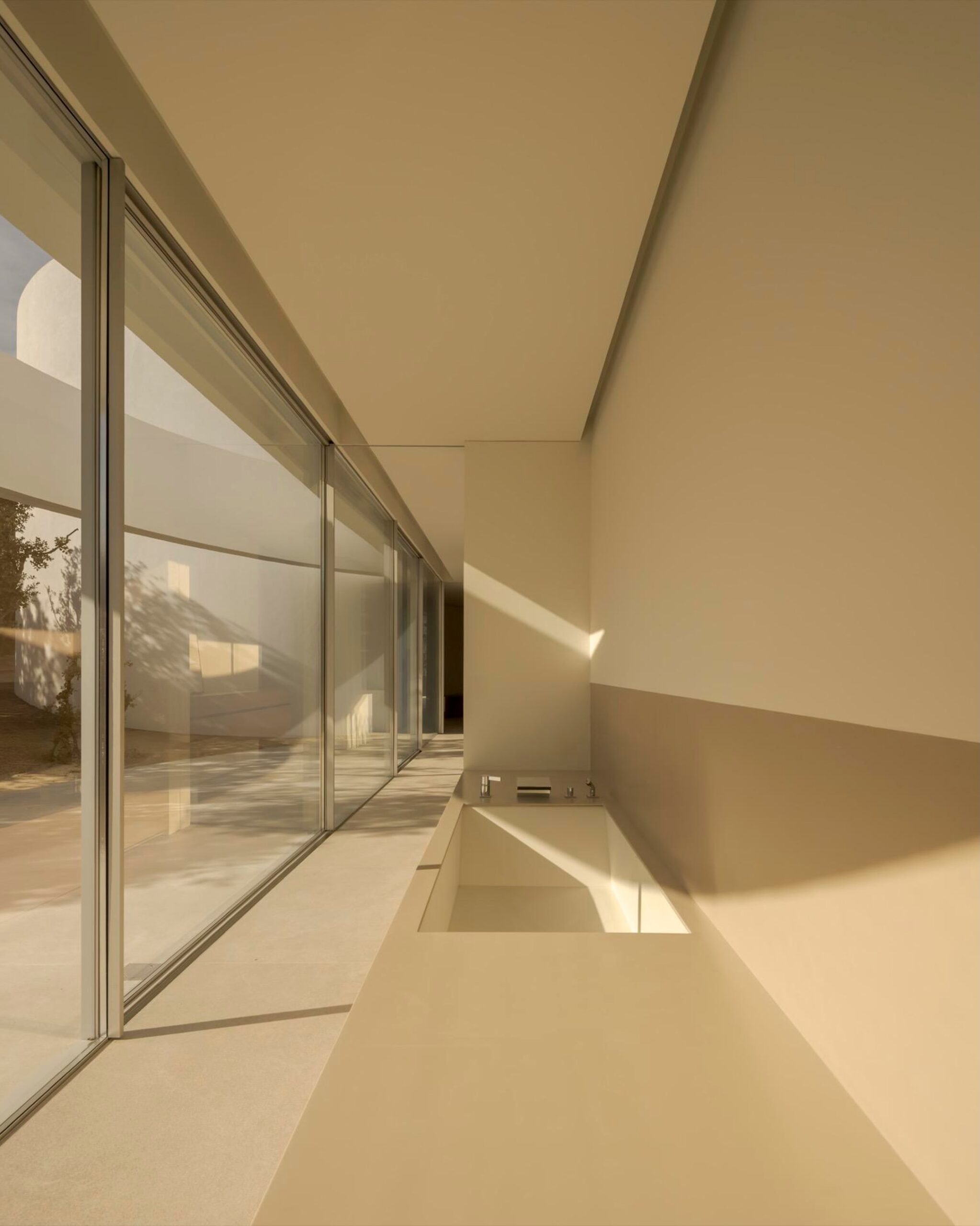
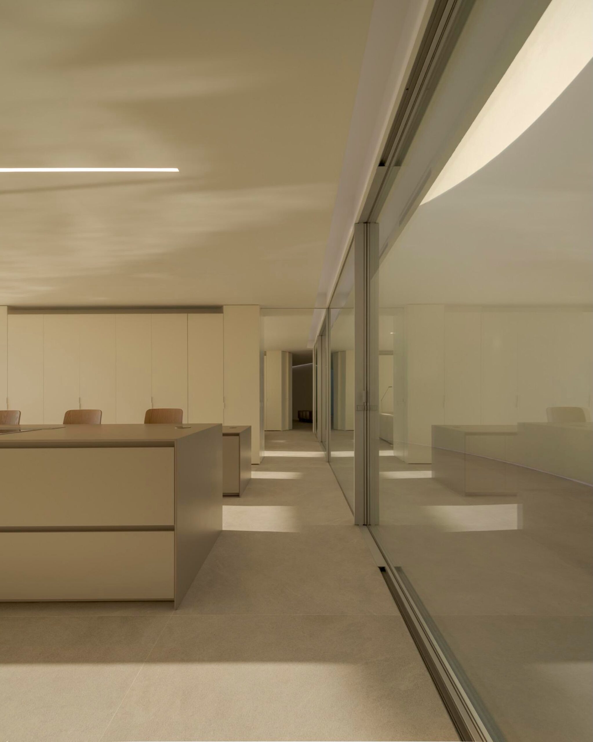
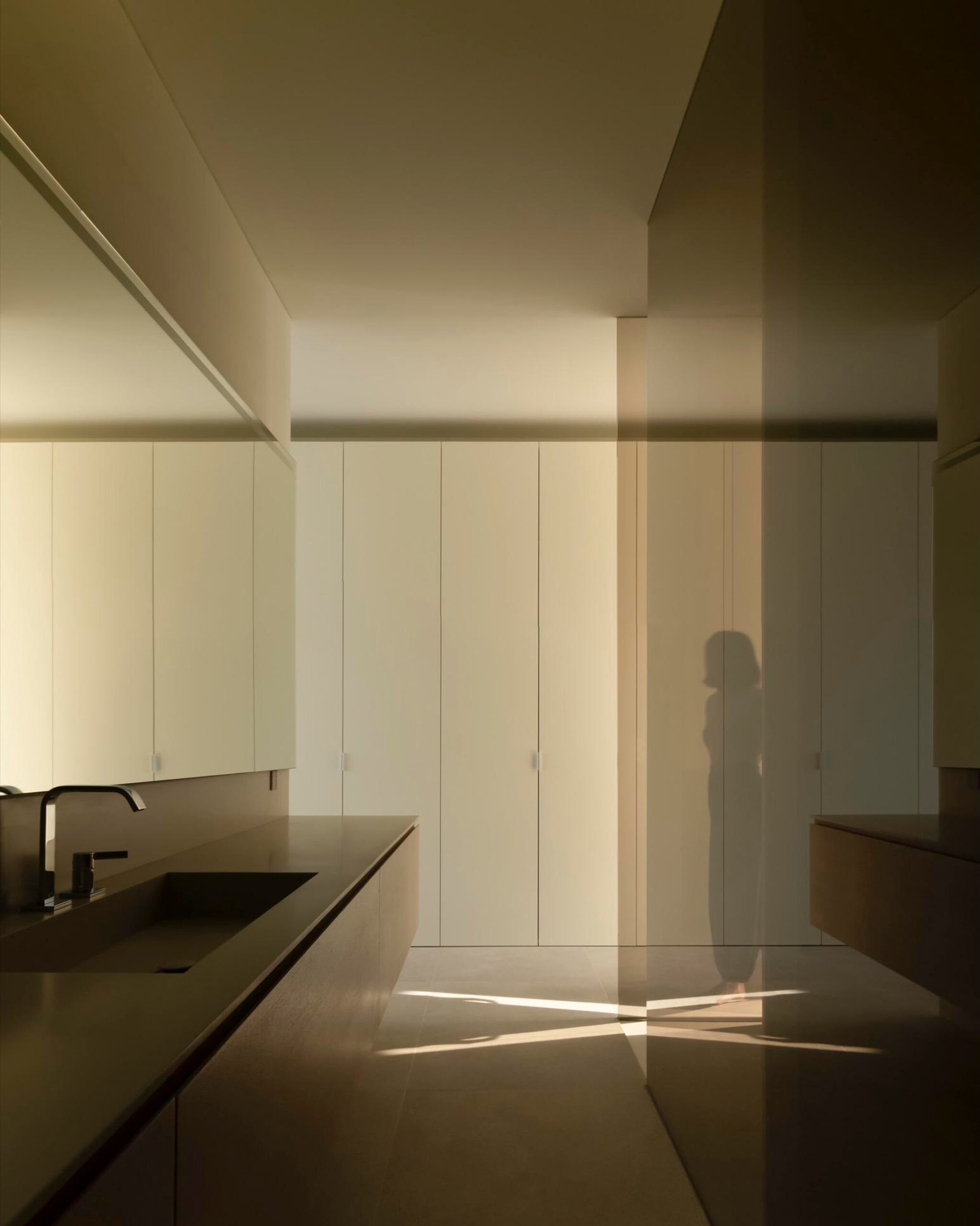
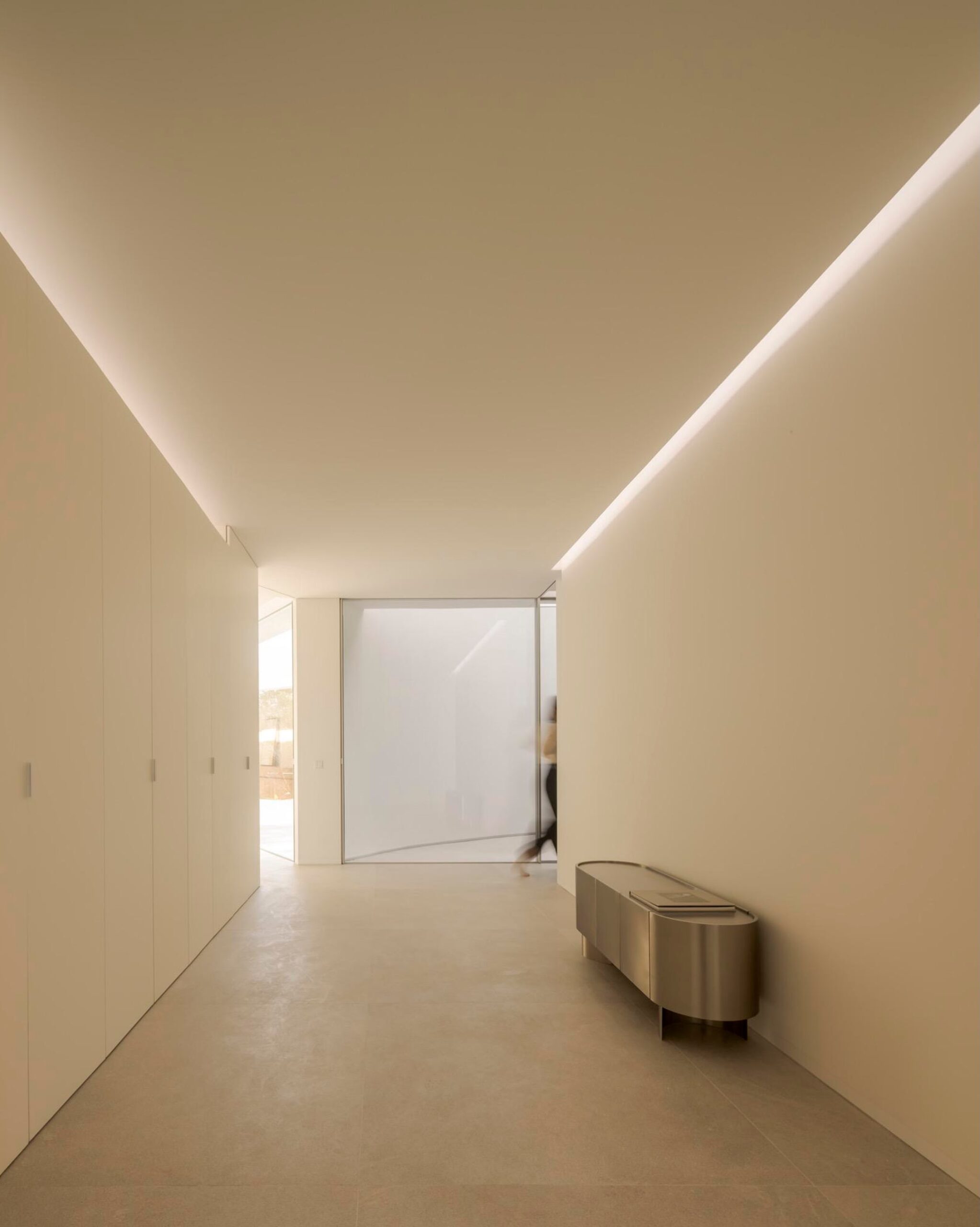
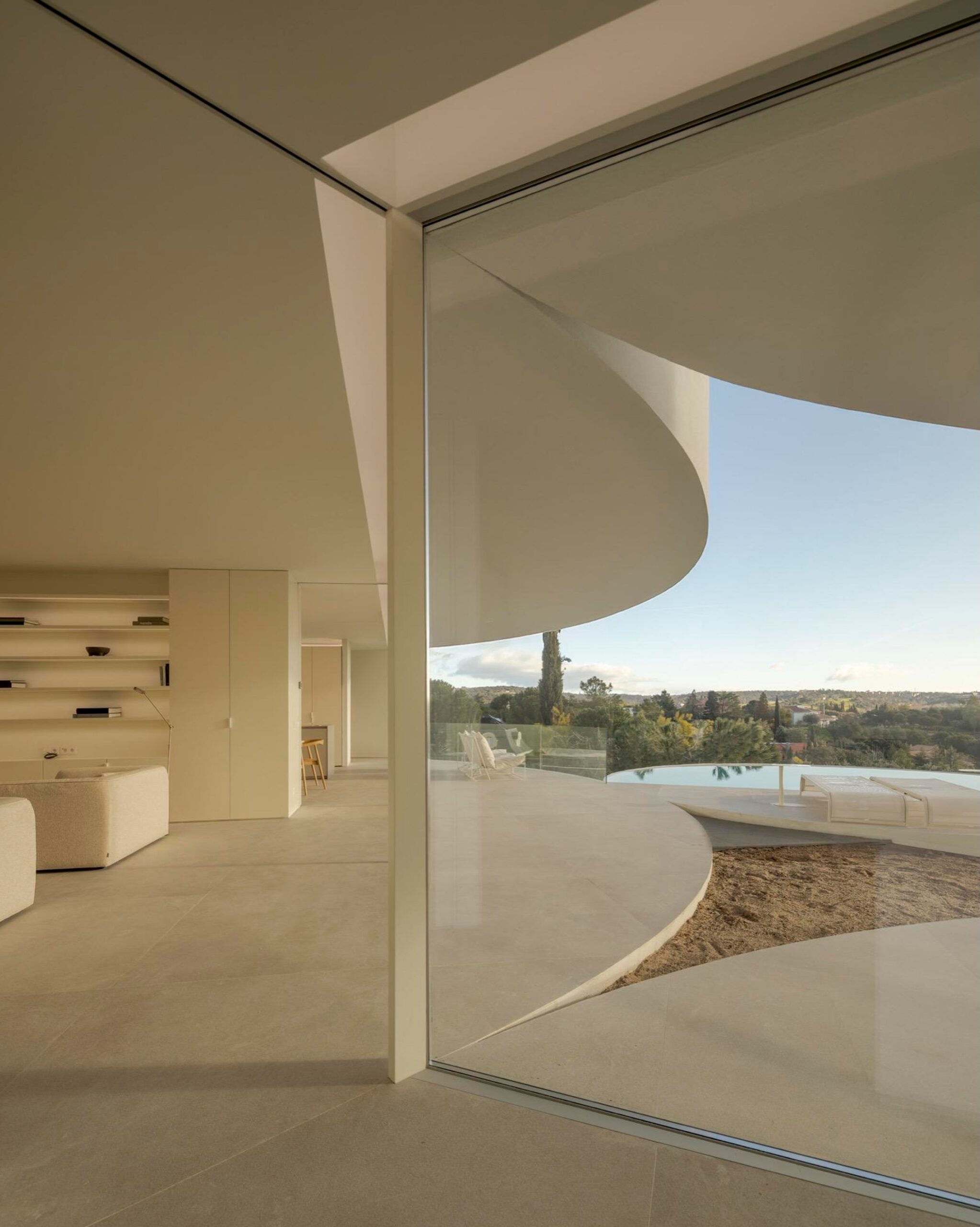
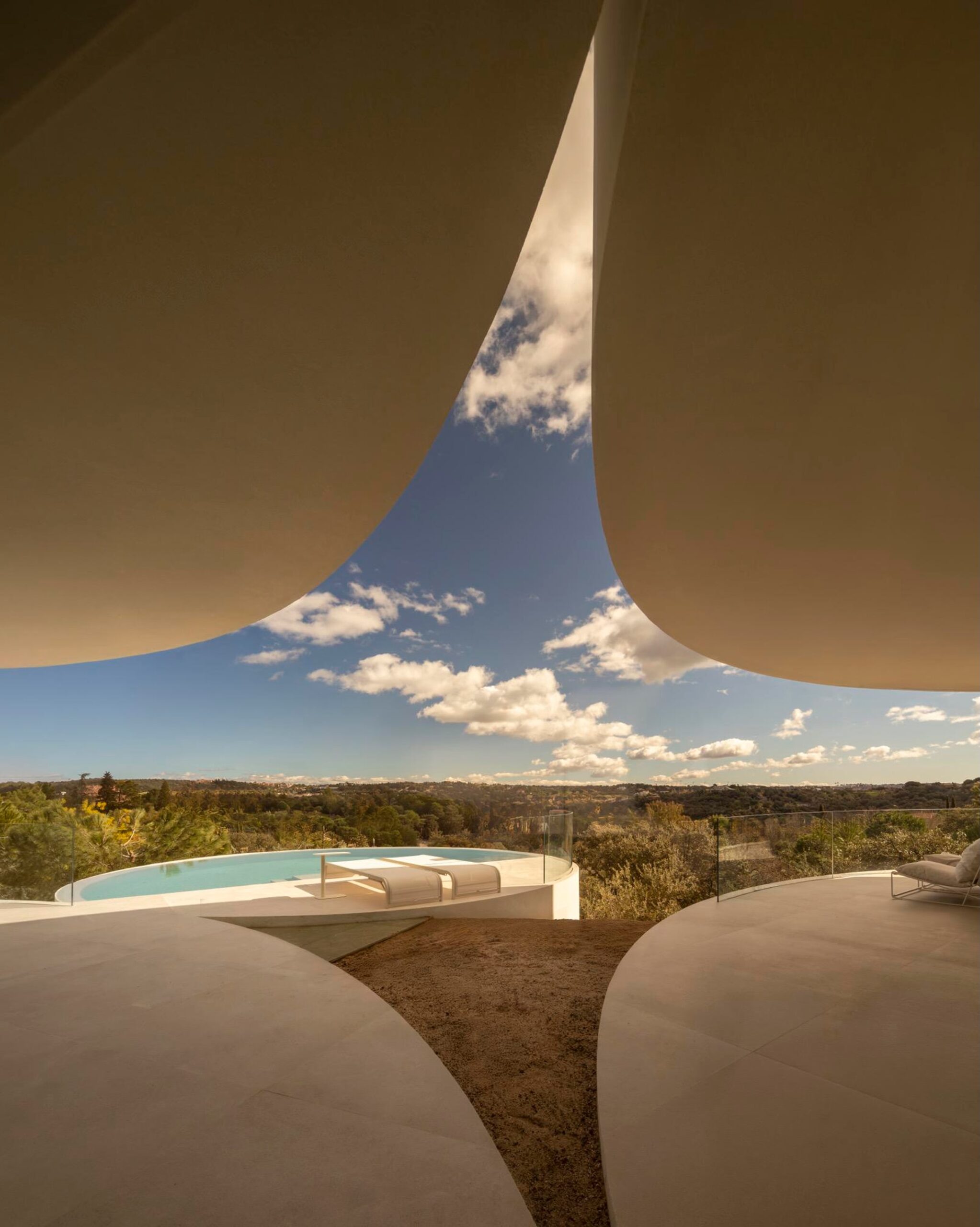
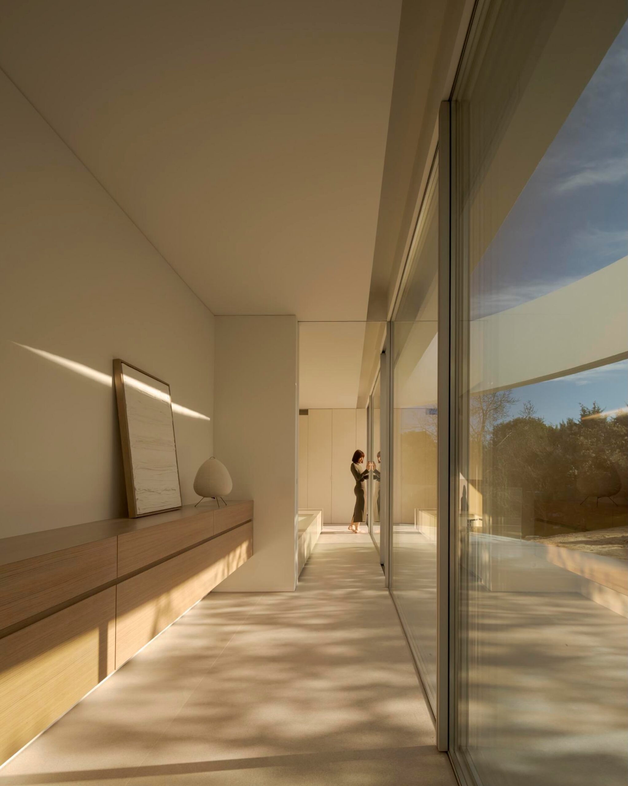
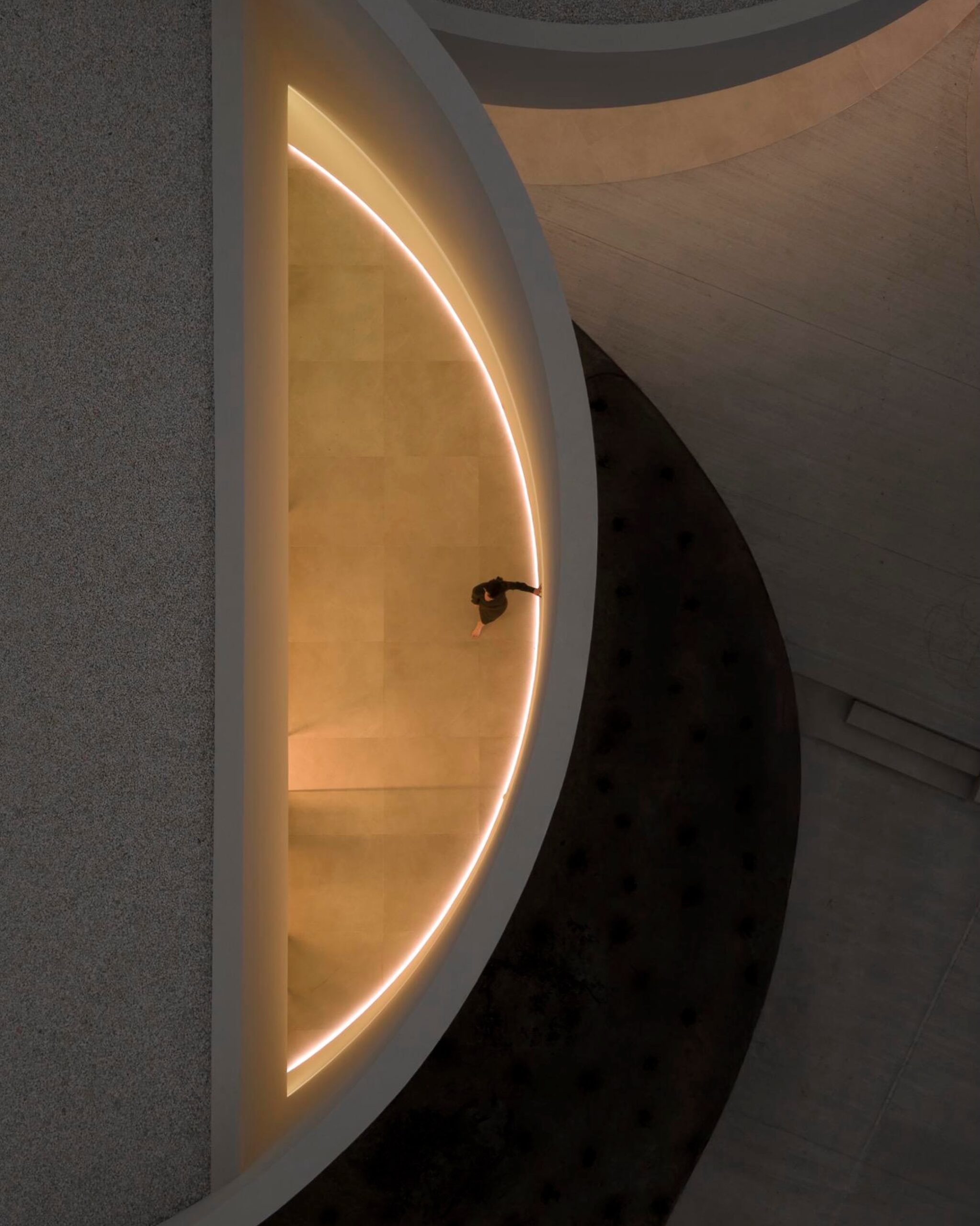
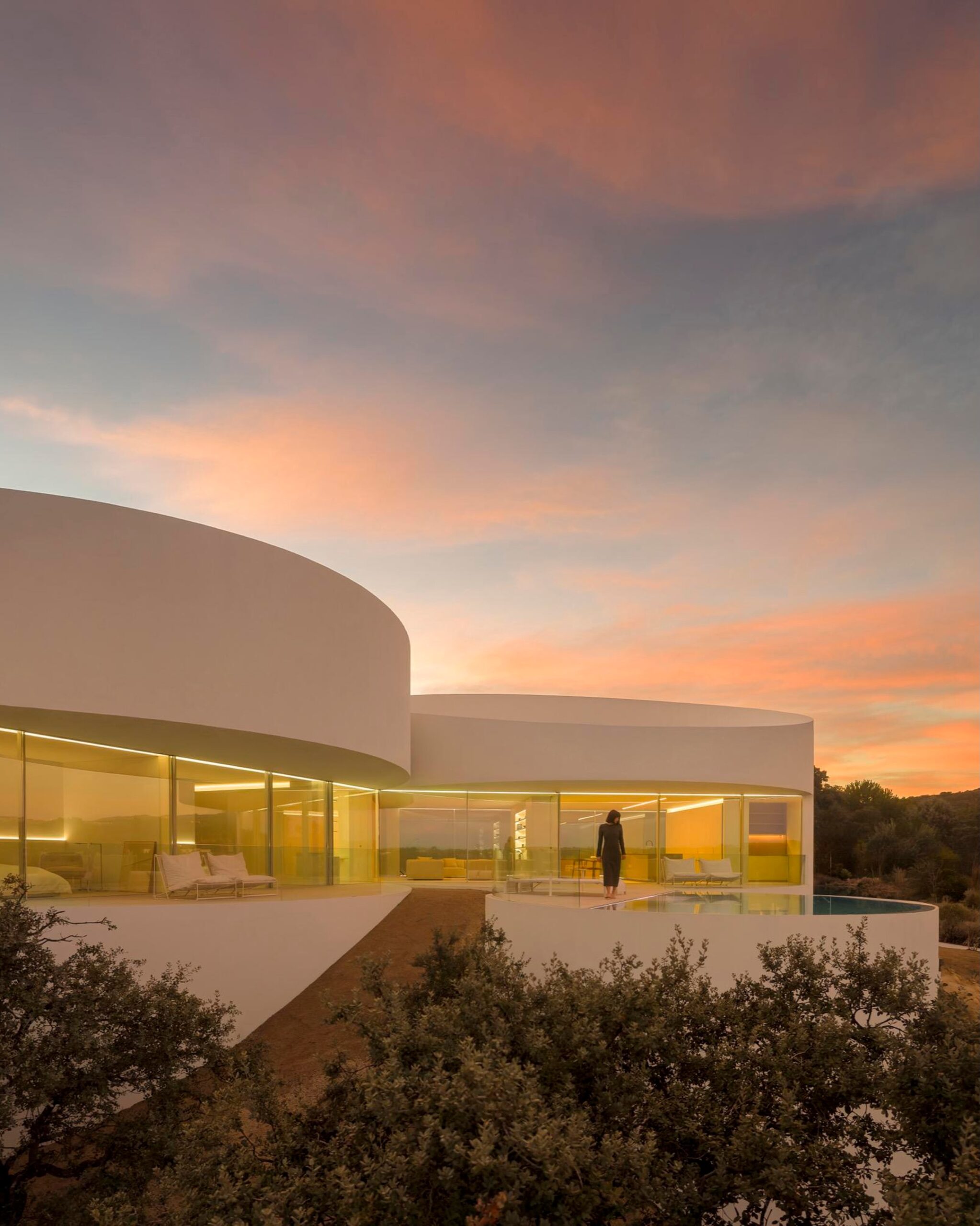
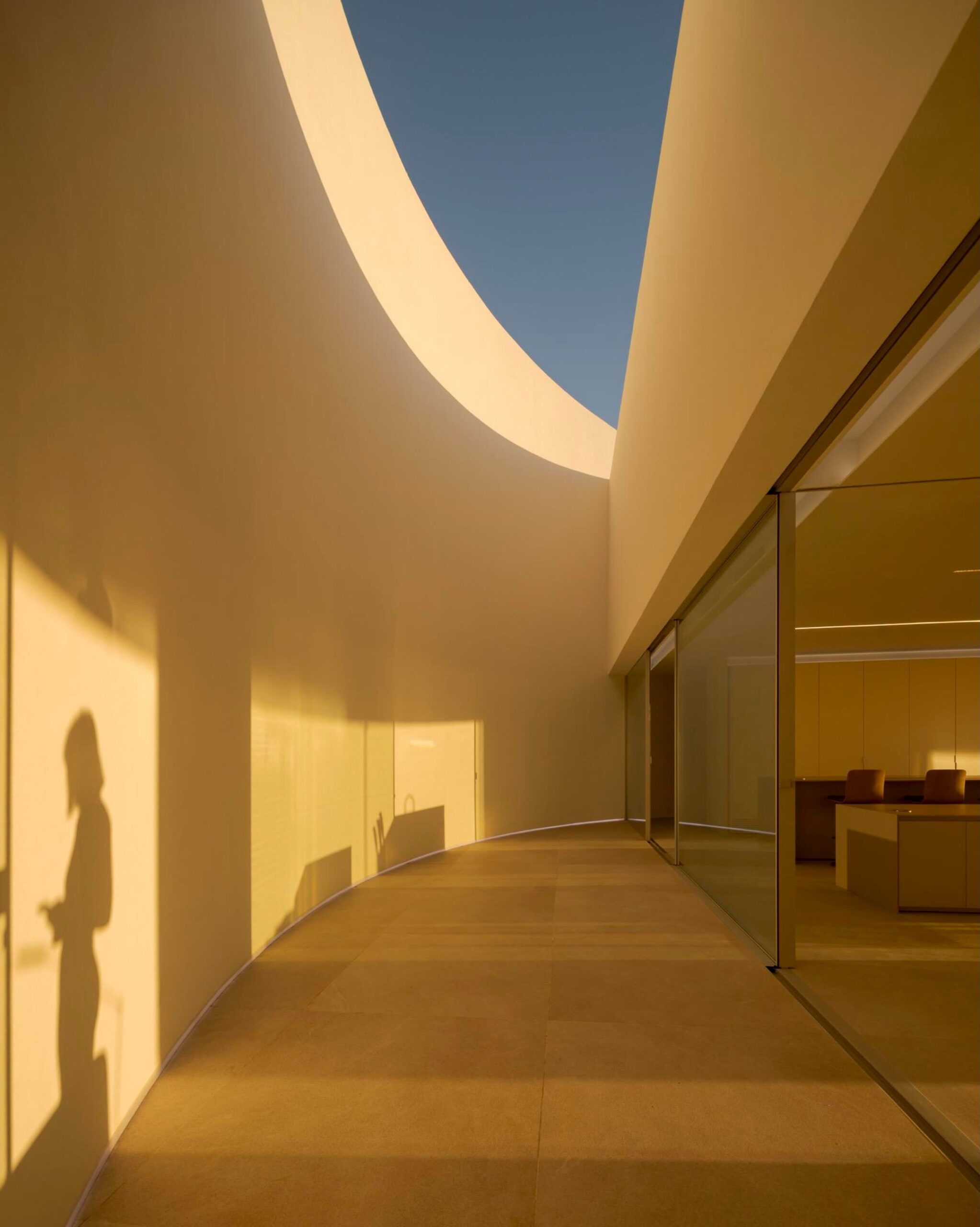
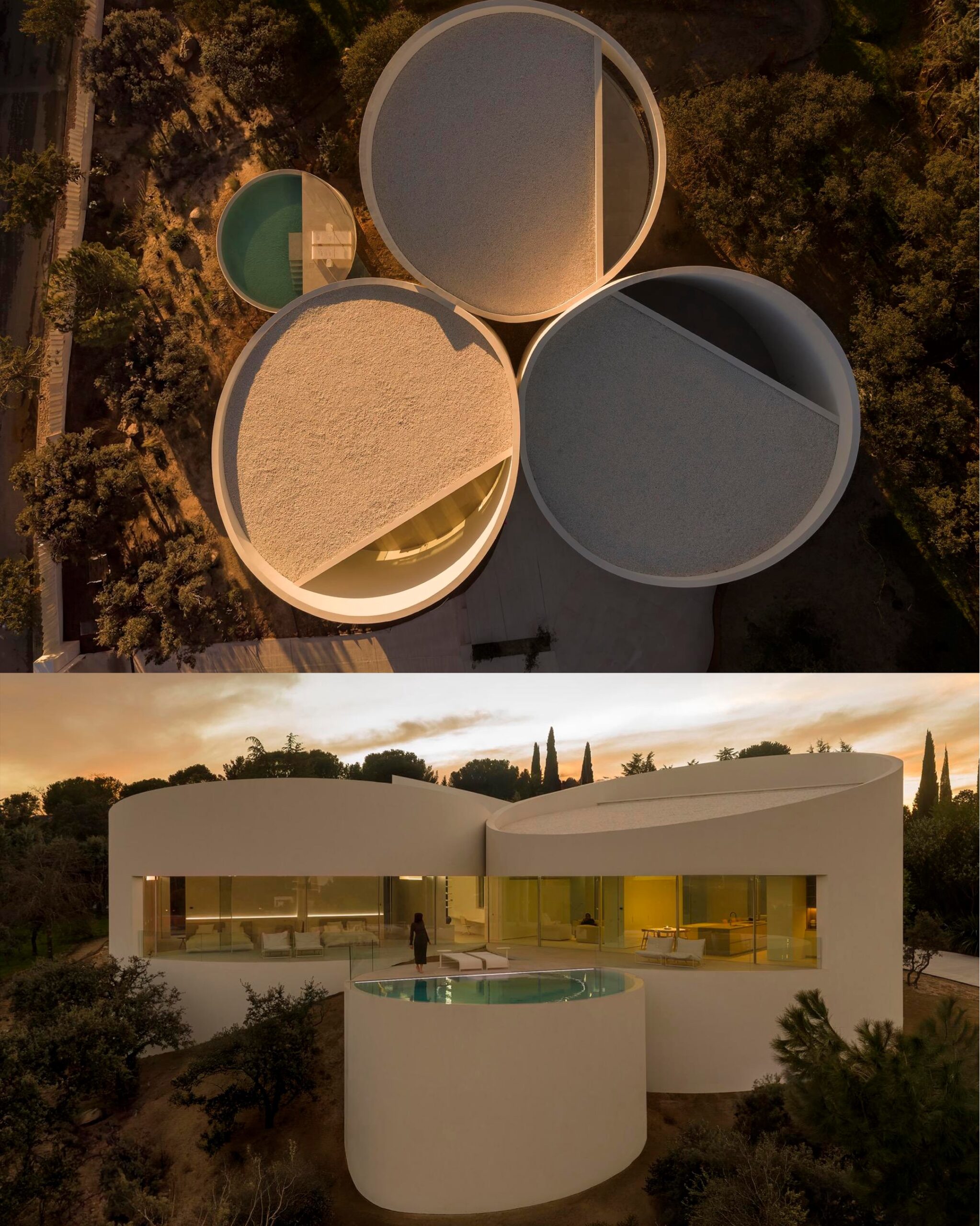
Fran Silvestre Arquitectos 🇪🇸 HOUSE IN LAS ROZAS Spain – Madrid Photos by Fernando Guerra / FG+SG
Located in Las Rozas, with open views towards the Sierra de Guadarrama, the house is composed of five cylinders that define the proposal and shape its geometry for a variety of reasons.
The cylindrical volumes organise the programme with precision, accommodating the bedrooms, the living area, the volume that integrates vehicular access with the garage and the wellness area, the volume containing the swimming pool and technical facilities, and the entrance area. The structure is clearly resolved through this geometry, which coherently defines the spatial character of each area.
The cylinders are cut obliquely for two reasons. On the one hand, to adapt naturally to the slope of the terrain; on the other, at the upper level, to respond to the need for a pitched roof—traditional in the area—and to capture light from different orientations.
The floor plan is rationally organised through orthogonal volumes arranged at 120-degree angles, which are connected to form a small yet significant inner courtyard. Due to its geometry, light transforms its surface and alters the perception of the space throughout the day.
Over time, the openings allow for panoramic views of the landscape. This configuration also enables each volume to have its own outdoor space: courtyards protected from the wind and from view in two of the volumes, and an open terrace in another. From a more intuitive perspective, perhaps the fascination with Andreu Alfaro’s “Homage to Brancusi” provides an essential point of departure for understanding the origins of this project.
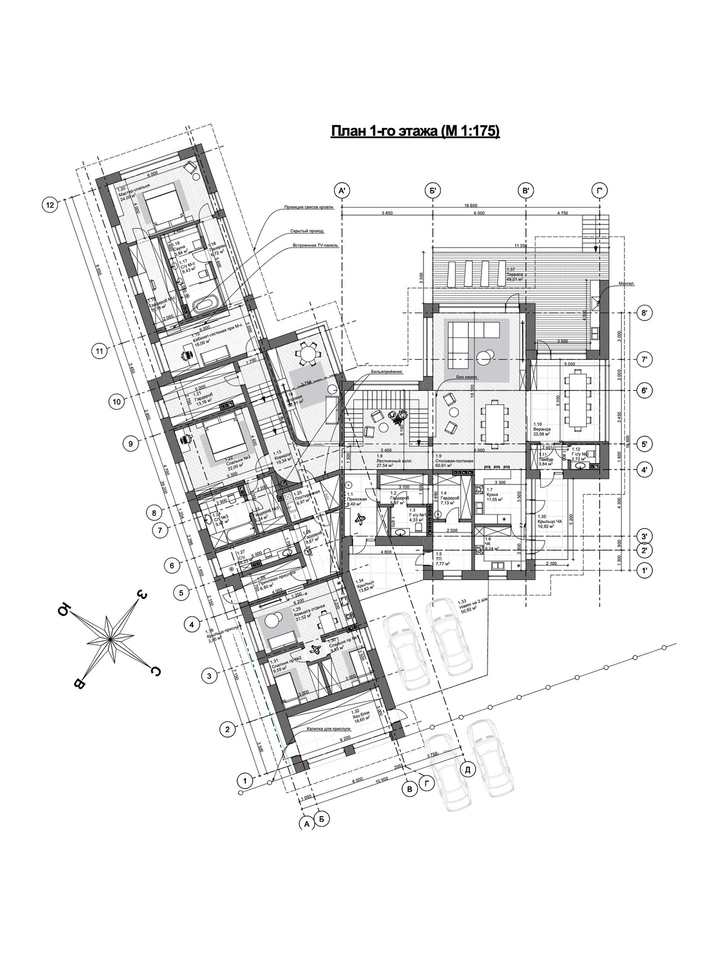
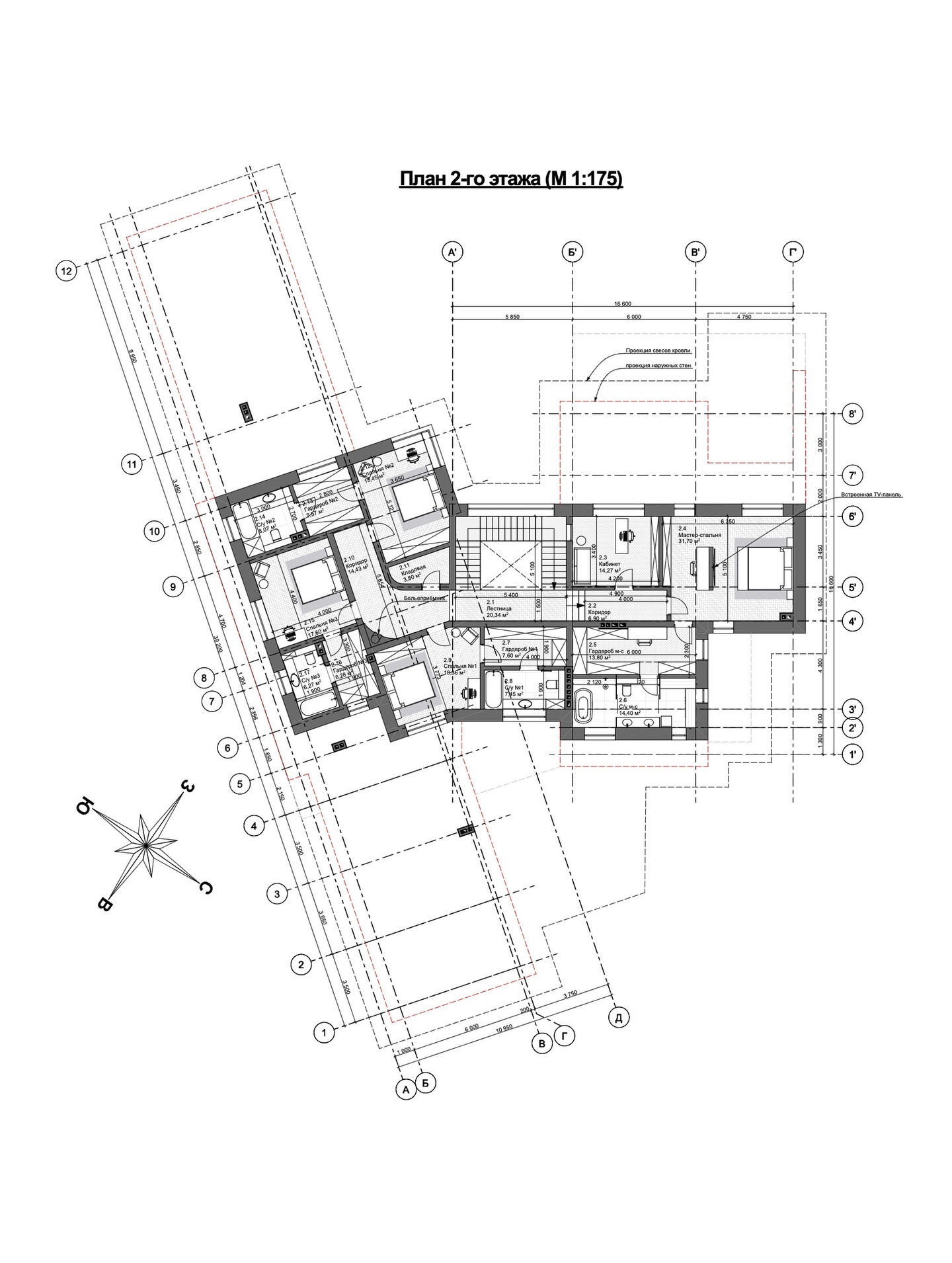
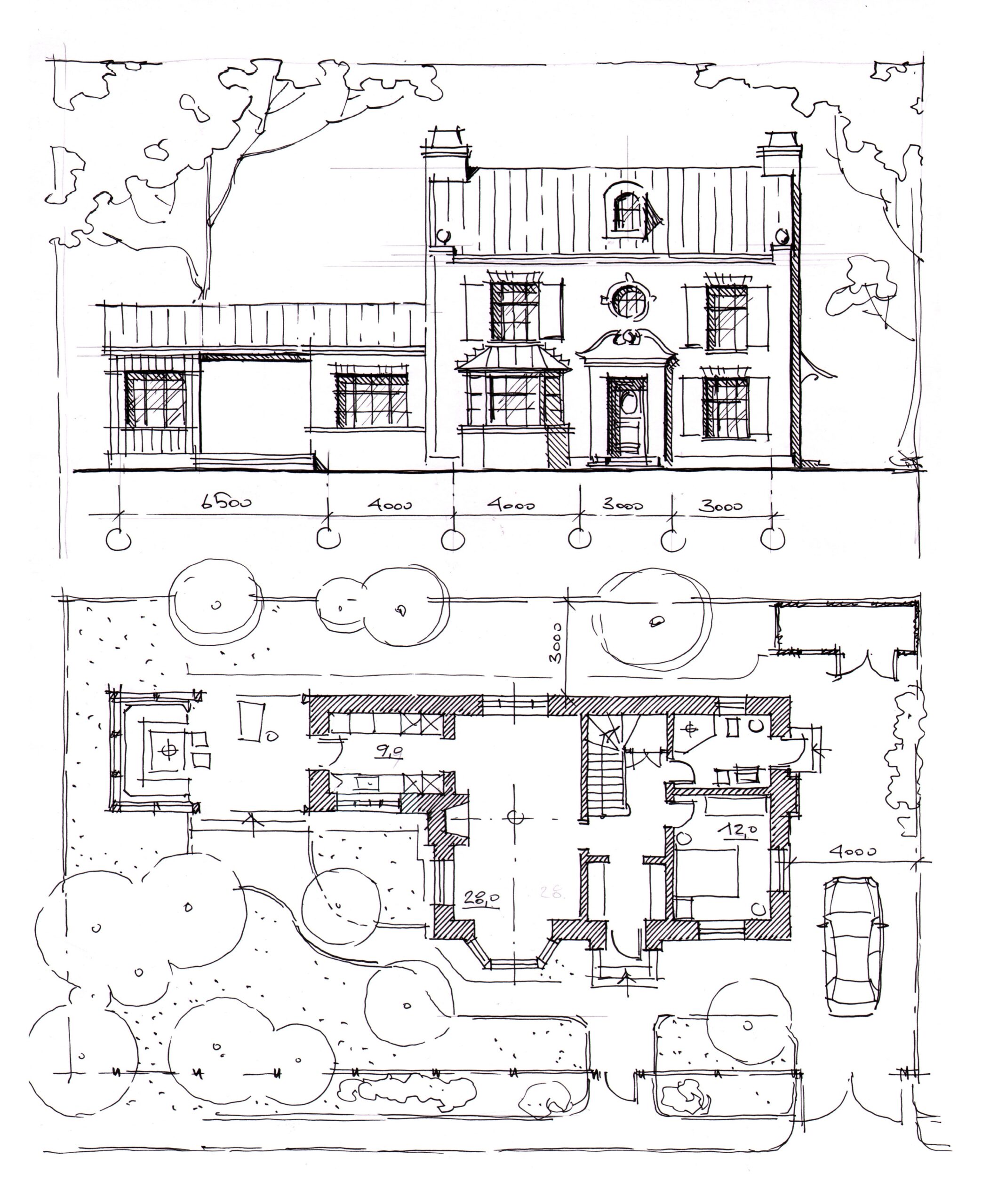
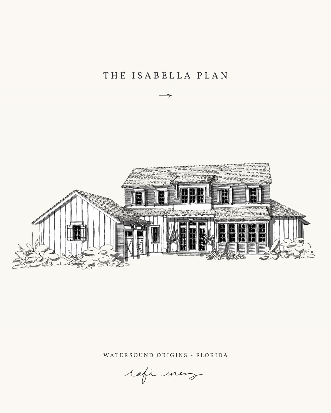
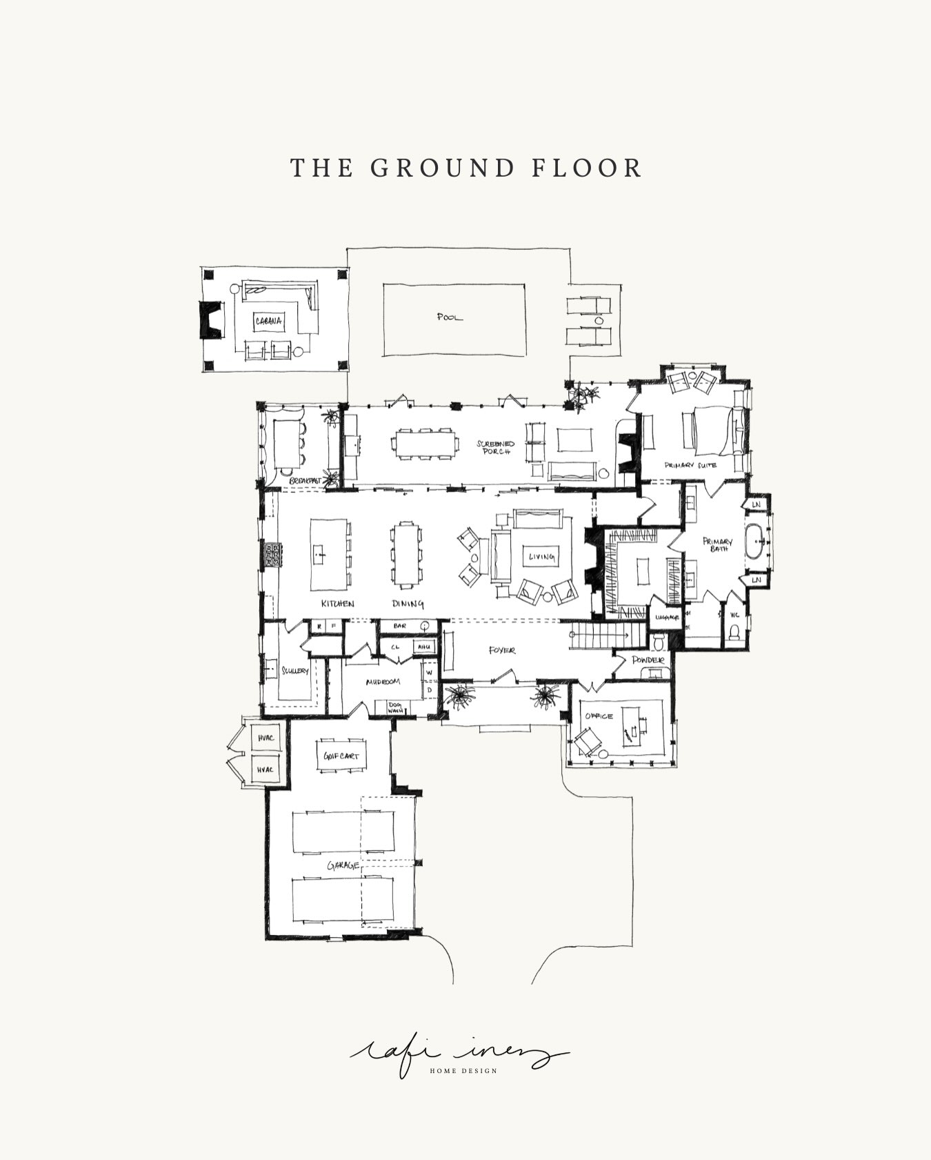
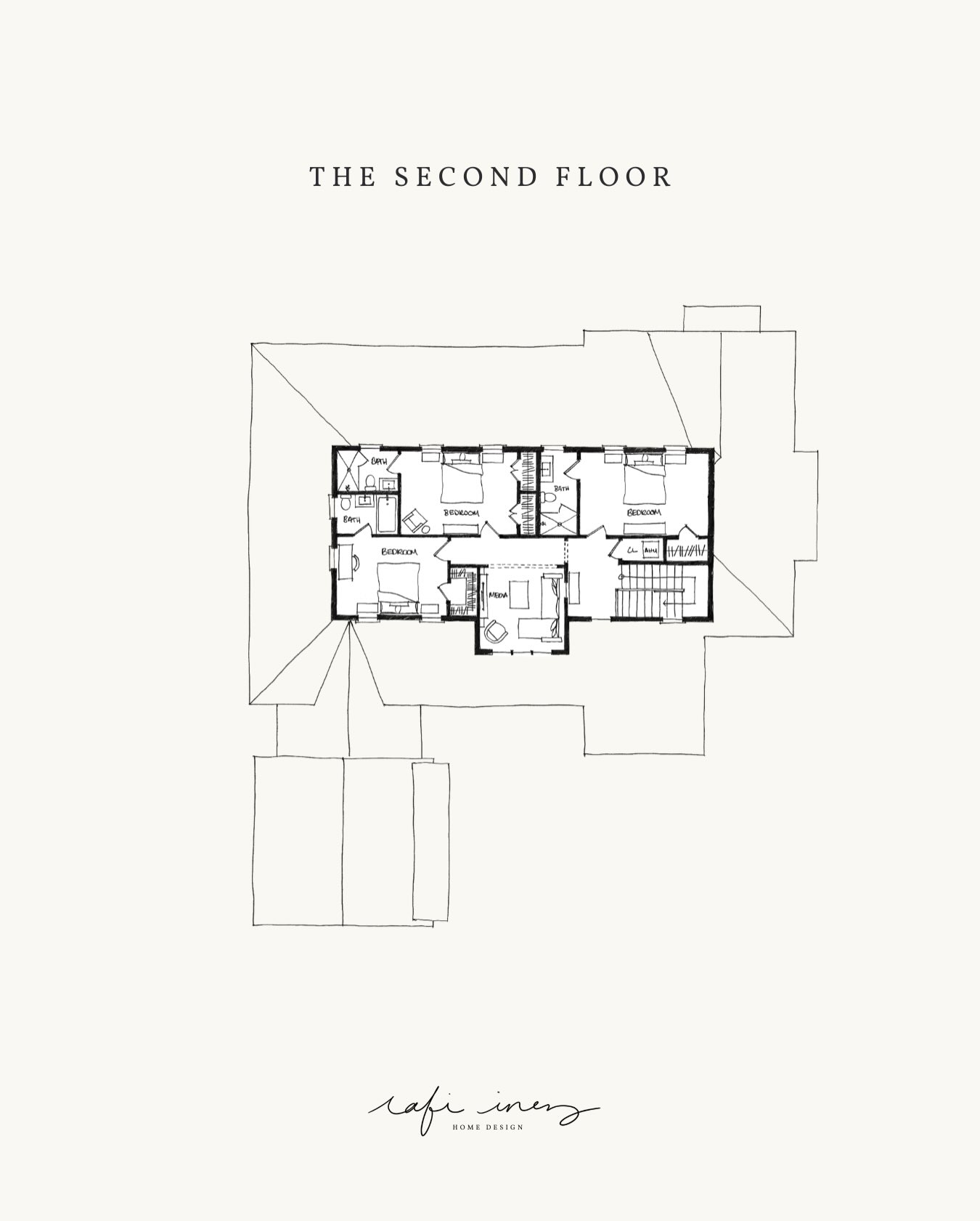
I really wish he’d posted the second floor plan, although it wouldn’t be that difficult to infer the layout.
I like this one. It seems well laid out, although I’d push the door from the downstairs hall to the living room closer to the front of the house to maximize wall space in the main living area. If there’s an indoor dining area as well (I really like the al fresco patio dining) I’d tuck that into the bay window area.
The downstairs guest bedroom would also make a great home office.
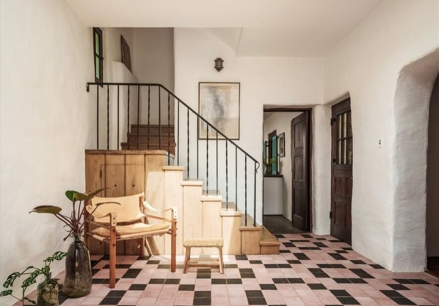
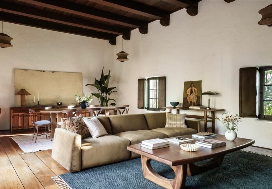
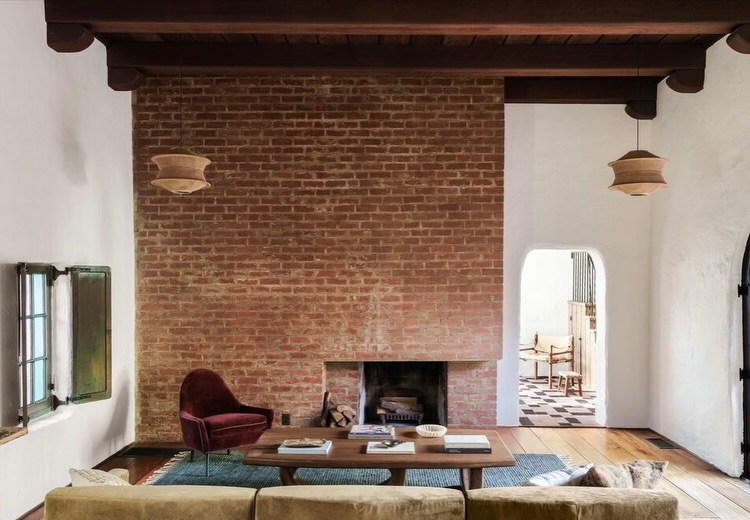
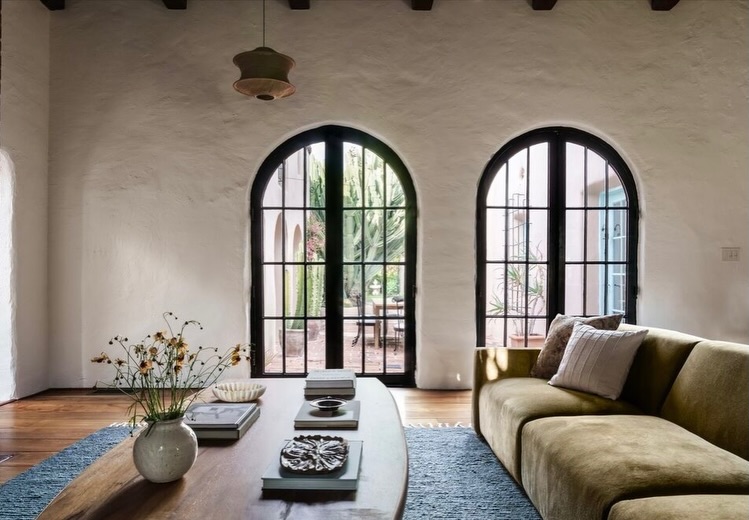
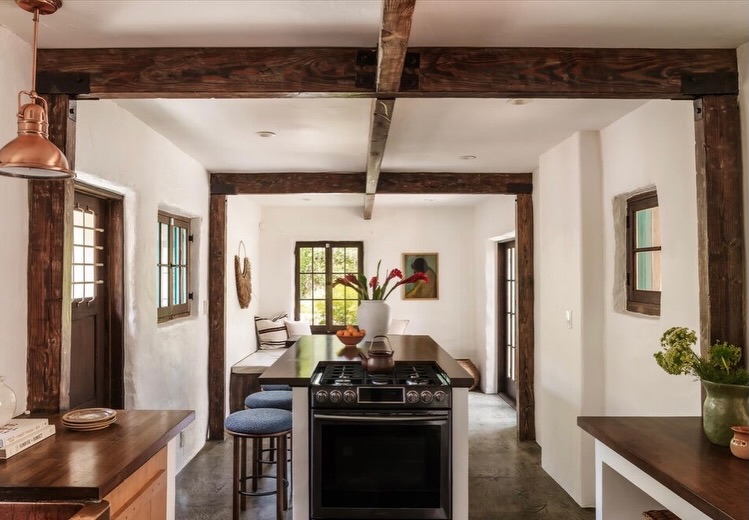
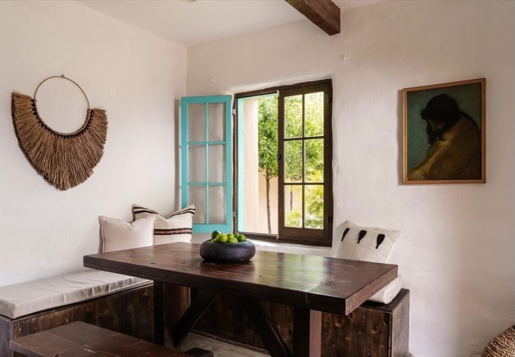
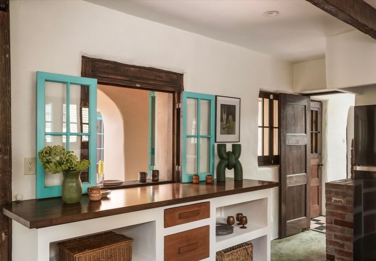
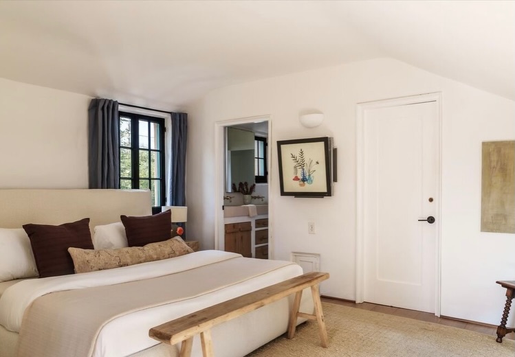
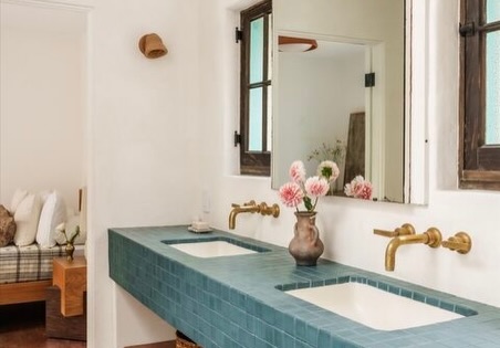
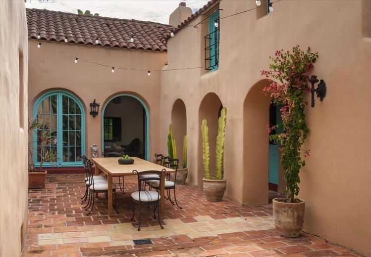
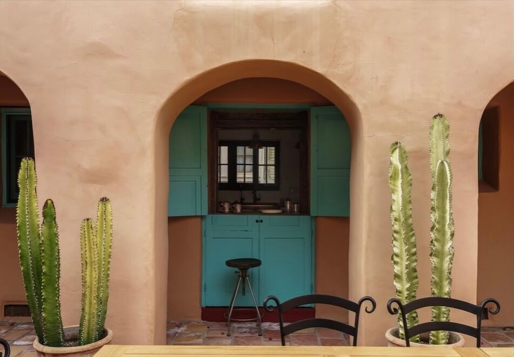
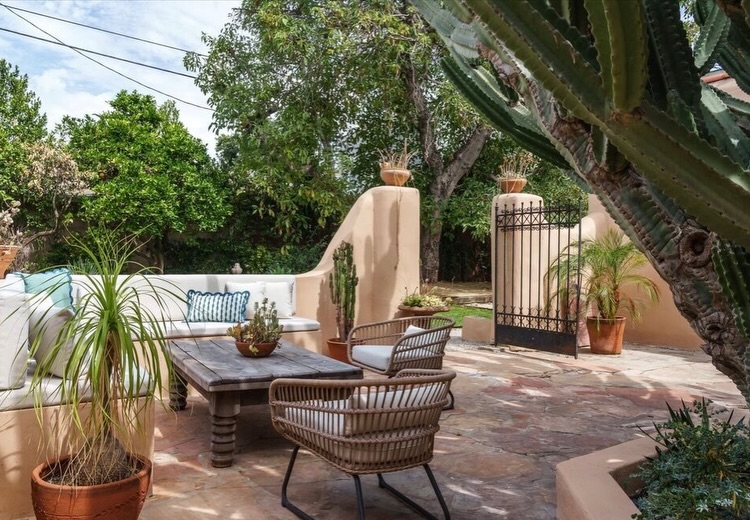
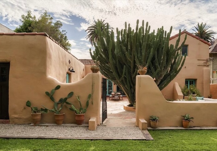
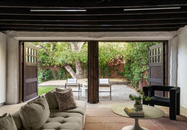
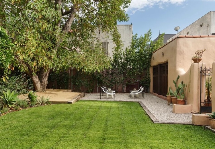
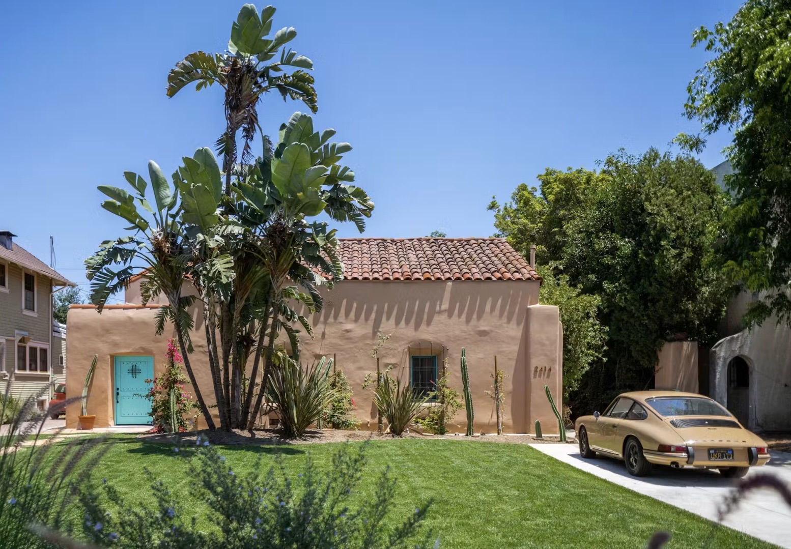
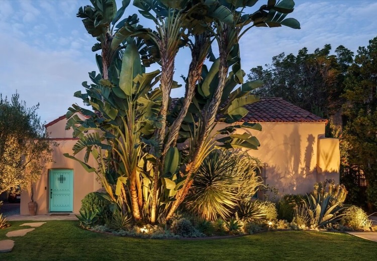
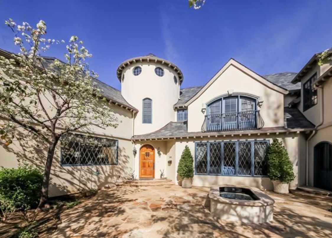
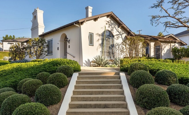
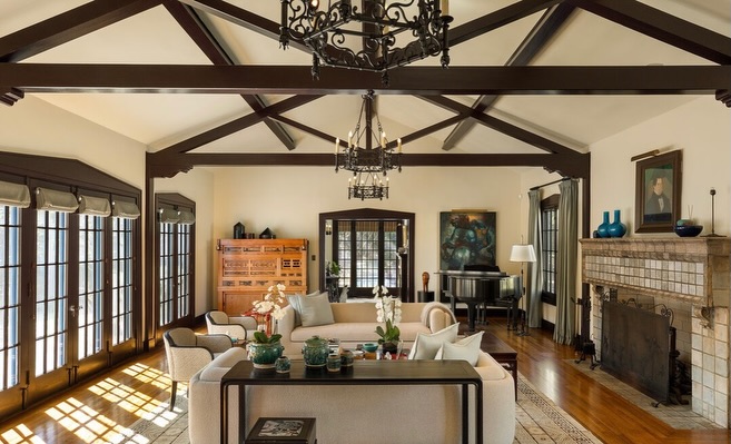
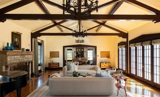
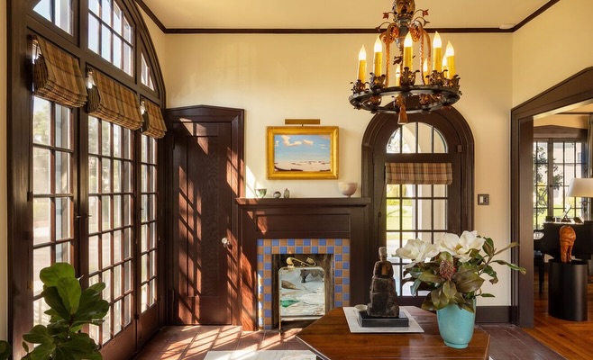
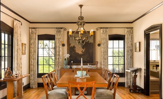
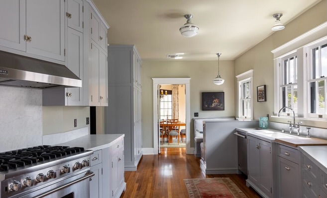
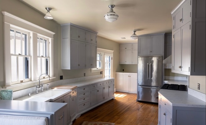
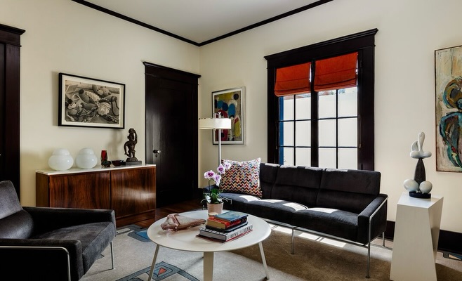
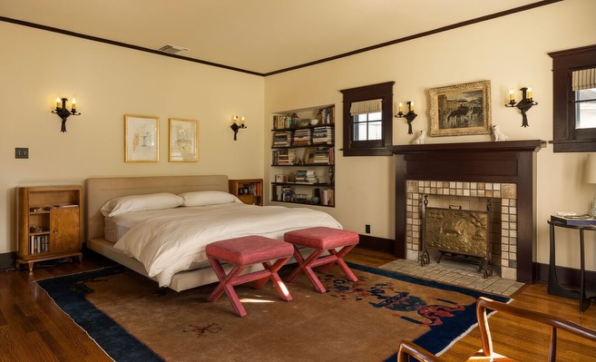
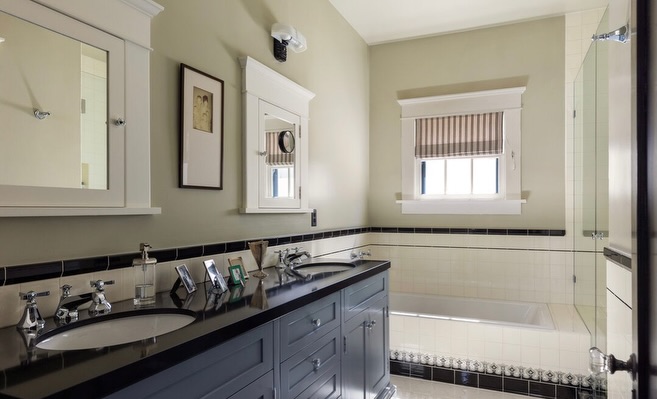
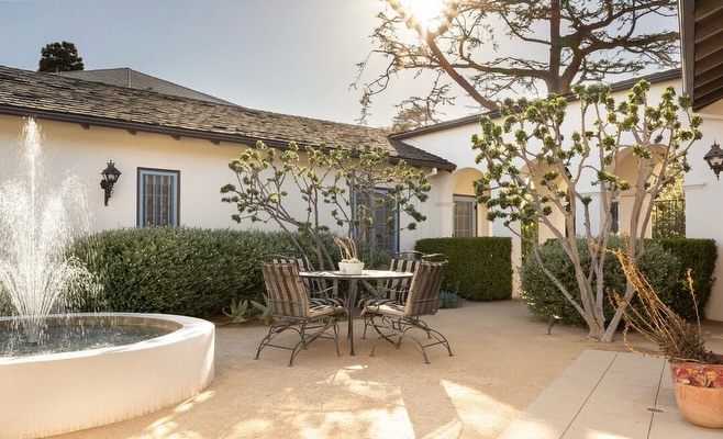
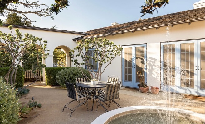
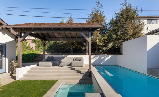
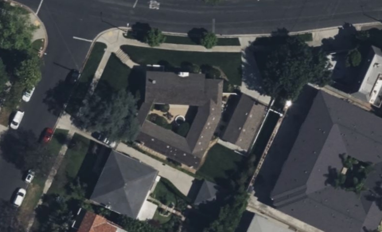
On the Market: 1922 Alice Lynch House designed by Harwood Hewitt and John Byers in West Adams Terrace HPOZ. Completed in 1922, today’s home was designed by noted LA architect Harwood Hewitt along with architect and adobe construction advocate John Byers for the poet Alice Lynch. The home was designed in the Spanish Colonial Revival style with thick exterior walls recalling the adobe construction of the Spanish Colonial period. The home’s large airy rooms have been thoughtfully restored and reimagined to create a world that celebrates the home’s history while also harmonizing it with the 21st century. I’m particularly enamored with the beamed ceiling in the living room and the expansive exterior courtyard and loggia. Located in the West Adams Terrace HPOZ, the home has been designated Los Angeles Historic-Cultural Monument No. 621, ensuring it will stand for generations of future Angelenos to enjoy. 2414 4th Avenue, a 4 bedroom, 3 bath, 2,560 square foot home located on a 9,386 square foot lot, is currently listed for $1,849,500. Source: MLS, Year book of Architecture & Allied Arts, Southern California Chapter American Institute of Architects, Los Angeles Architectural Club 1922, Dwell.
But I’d have to do something about walking through one bedroom to get to another.
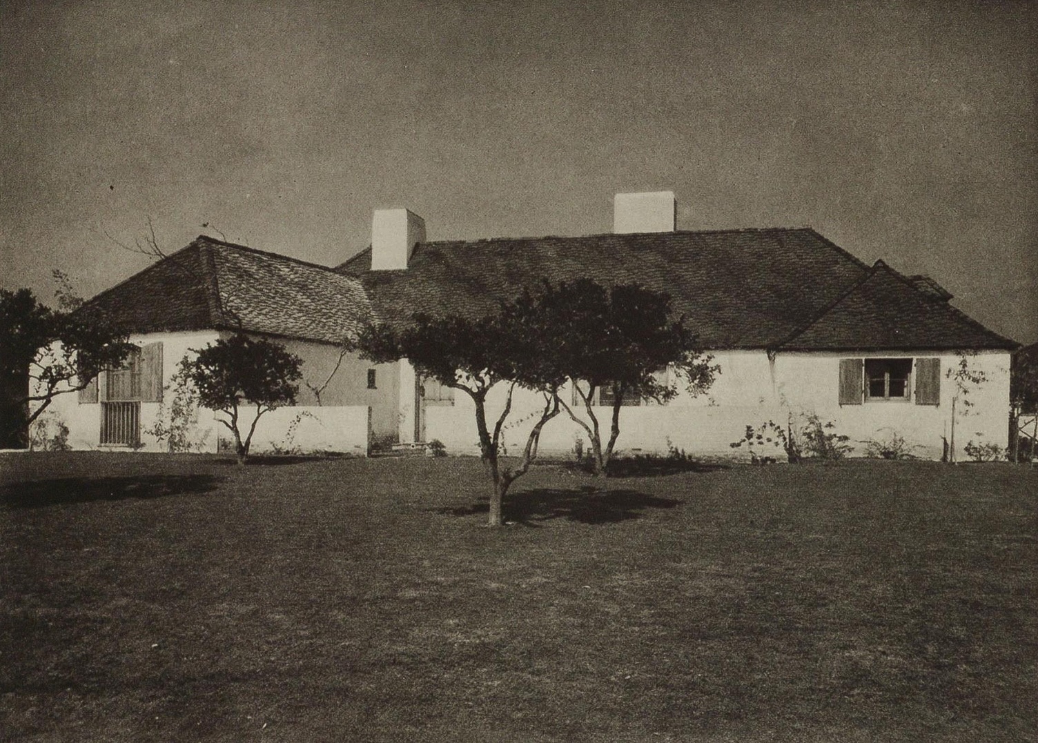
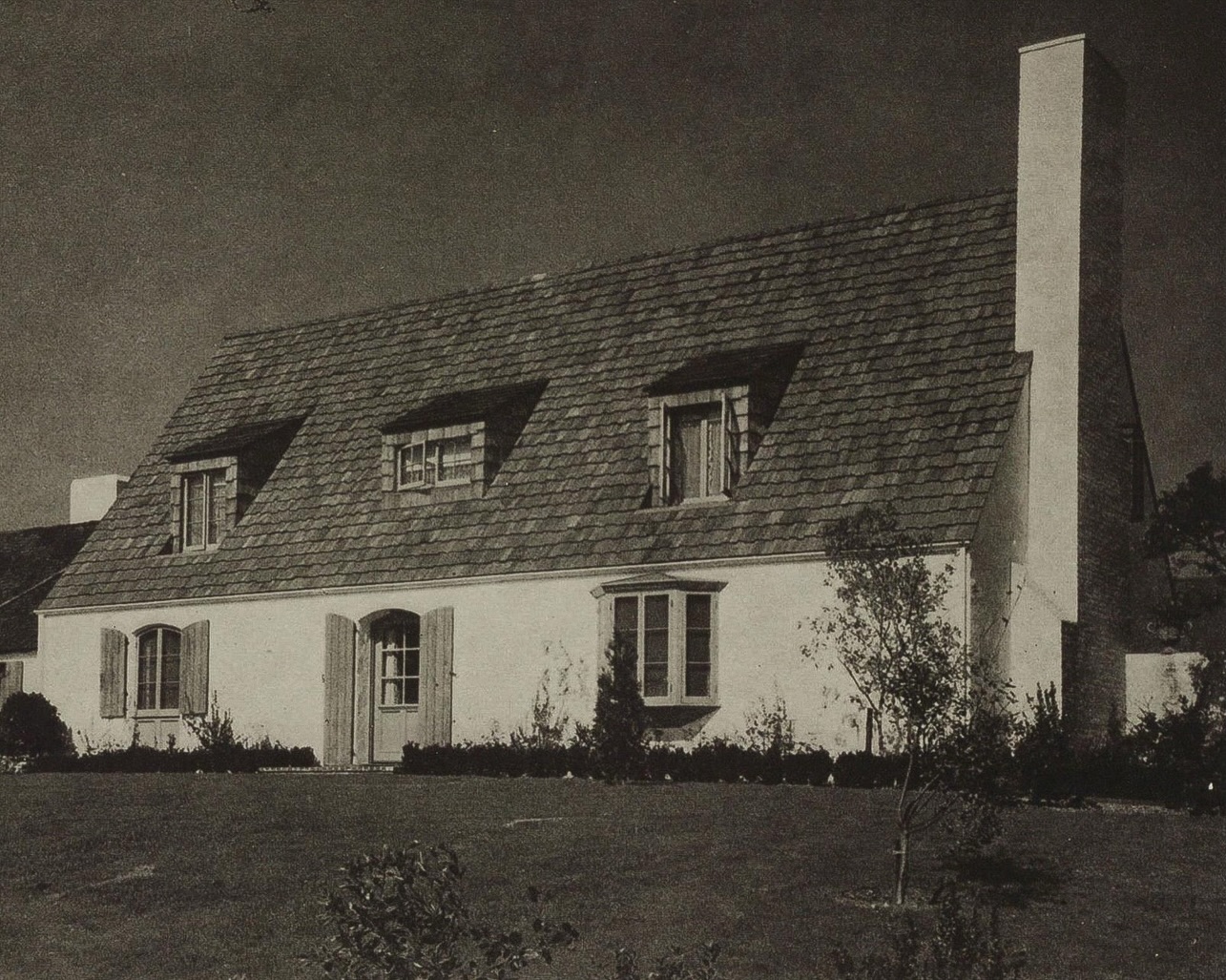
architecturaldetective – Designed for Mr. and Mrs. Robert H. Stephenson, today’s home is yet another Marston, Van Pelt & Maybury-designed French Norman Revival style home located near the intersection of San Pasqual Street and S San Marino Avenue. The home, like the other Marston, Van Pelt & Maybury-designed French Norman Revival style homes around it, were built by the firm of Thomas & Stephenson, hinting that this may have been the home one of the builders built as his the personal residence for himself and his family.
From the street, the home recalls a long and lean Norman farmhouse, with it’s small enclosed forecourt creating a charming entrance garden. Once inside, we are welcomed into a small foyer that allows us access to the home’s H-shaped floor plan, which is anchored by a central living room. From the living room, we can progress into the small study or dining room and its attached service spaces, including a pantry, kitchen laundry room, and staff bedroom suite.
The private family wing includes four bedrooms and two bathrooms with staircase access to the attic above. With its expansive single floor design, the Stephenson residence is one of my favorite Marston, Van Pelt & Maybury commissions as it begins to braid together Spanish Colonial and early Ranch style design elements with the easily malleable French Norman Revival style to create a distinctive commission that would help spread the style across the Southland.
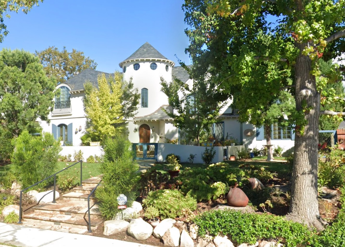
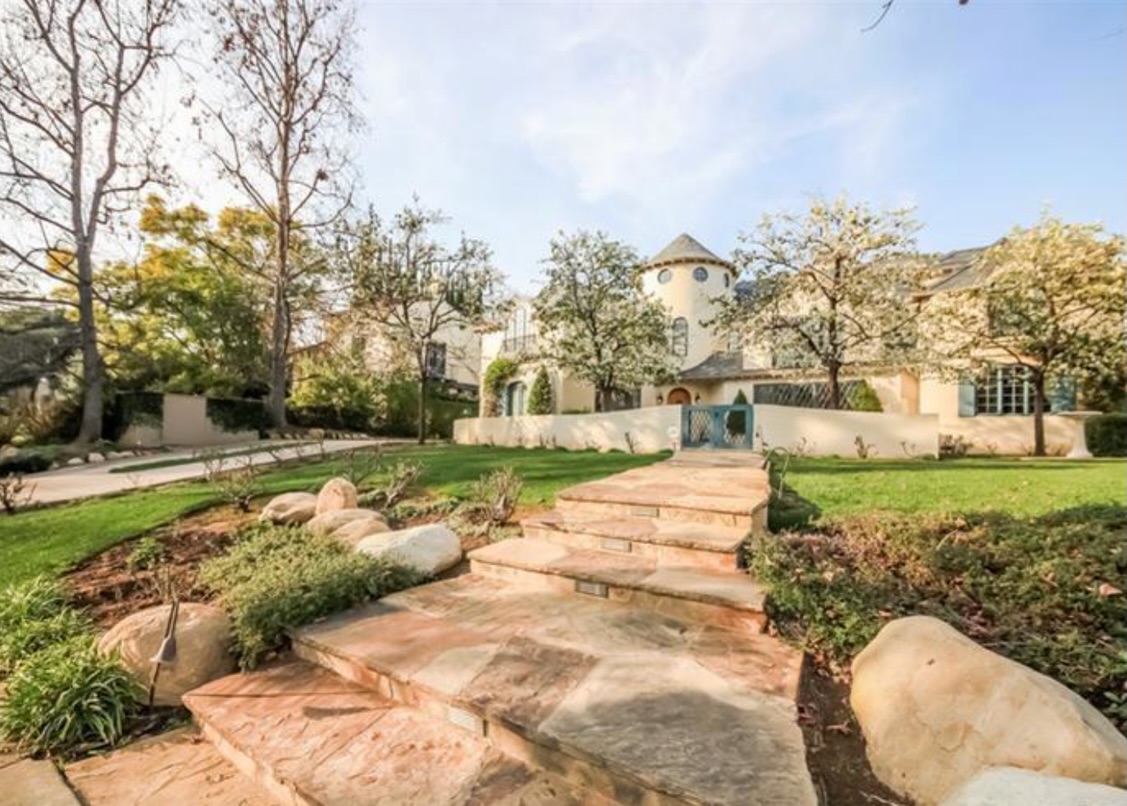
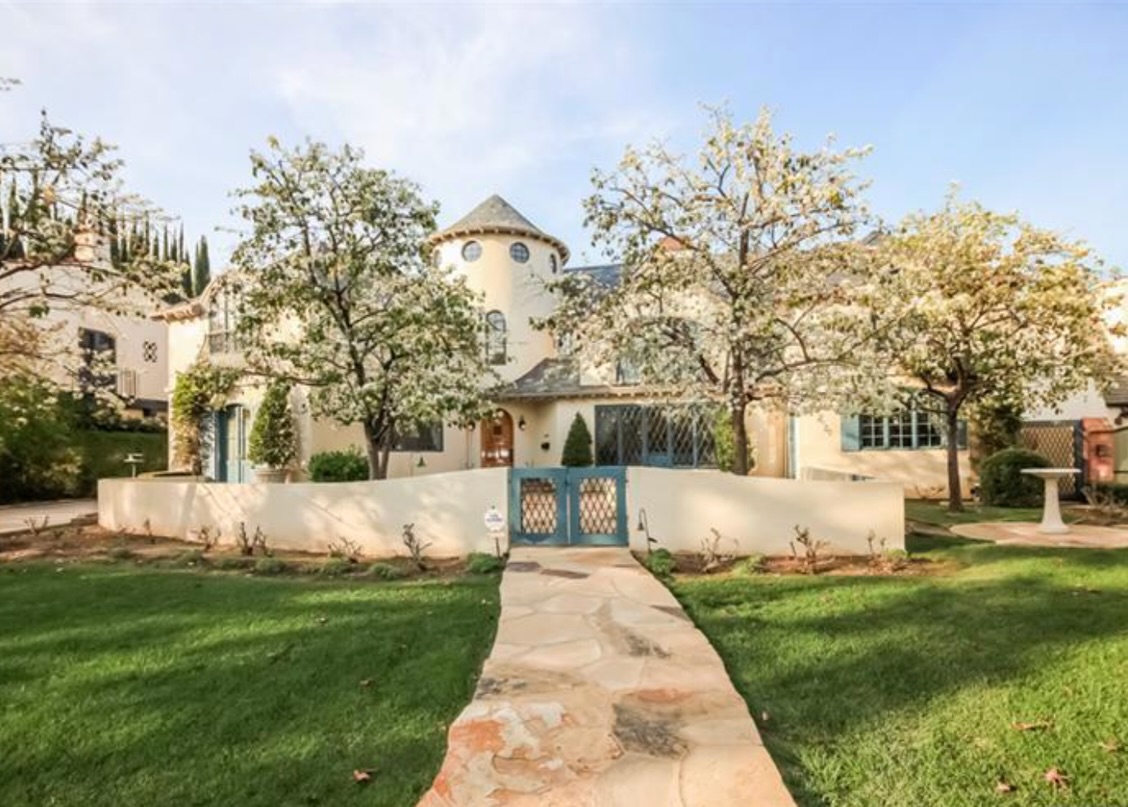
Located at 2005 San Pasqual Street, the home is extant, yet a substantial remodel in the early 2000s effectively doubled the homes square footage by adding a second story and an entry tower, obscuring Marston, Van Pelt & Maybury’s original design. The home last sold for $3,550,000 in 2015.
Project: Residence of Mr. and Mrs. Robert H. Stephenson, 1926
Architect: Marston, Van Pelt & Maybury
Location: Pasadena, California
Source: Architectural Digest, Google Maps, MLS
@architecturaldetective: On the Market: Former Sunday School, Rectory, and Art Club transformed into a Single Family Home in LA’s Windsor Village Historic District.
Constructed in 1922, today’s home has enjoyed a long and illustrious life as a staple of the Mid Wilshire neighborhood community, first serving as the Sunday school and rectory for the Wilshire United Methodist Church before being purchased by the Ruskin Art Club in 1926 to serve as their club house. While under the stewardship of the Ruskin Art Club, the residence would host arts programming for their membership and “support writers, artists, musicians, architects, and thinkers who espouse Ruskin’s values in Southern California” before selling the property in 2014.
Following the property’s sale, the club house would be reimagined as a single family home by architect Scott Lander. Originally designed by architect Frank Meline, the residence combines the Mission Revival and Spanish Colonial Revival styles, serving as an excellent example of the transition from the earlier Mission Revival to the Spanish Colonial Revival style.
The home is built around a central courtyard, with the interior spaces including a large living room, sunroom, dining room, and a thoughtfully remodeled kitchen. In addition to these public spaces, the home includes 4 bedrooms and baths and a total of three fireplaces, with two boasting Batchelder tiles.
800 S Plymouth Boulevard, a 4 bedroom, 4 bath, 3,421 square foot home located on a 15,033 square foot lot, is listed for $3,995,000.
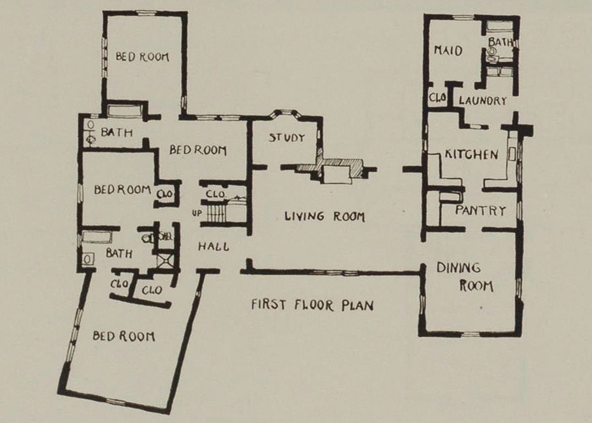
This is one plan I’ve seen where the Maid’s Room actually makes sense. Downstairs, I’d move the wall between the Maid’s Room and the Dining Room about a foot further into the Dining Room, adding a little extra space to the Maid’s Room because that 8-foot dimension is a very tight fit.. With it’s own semi-private entrance, that room could serve today as an in-home office or a bedroom for a (trusted) teenager or young adult returned home. I’d also punch a doorway between that back porch and the Dining Room and ditch the basement/stairs and tuck a half bath under the stairs.
Upstairs, there’s more than enough room for two full bathrooms, even if both aren’t en-suites. There’s no need for a single Jack-and-Jill bathroom to be shared between the two bedrooms..
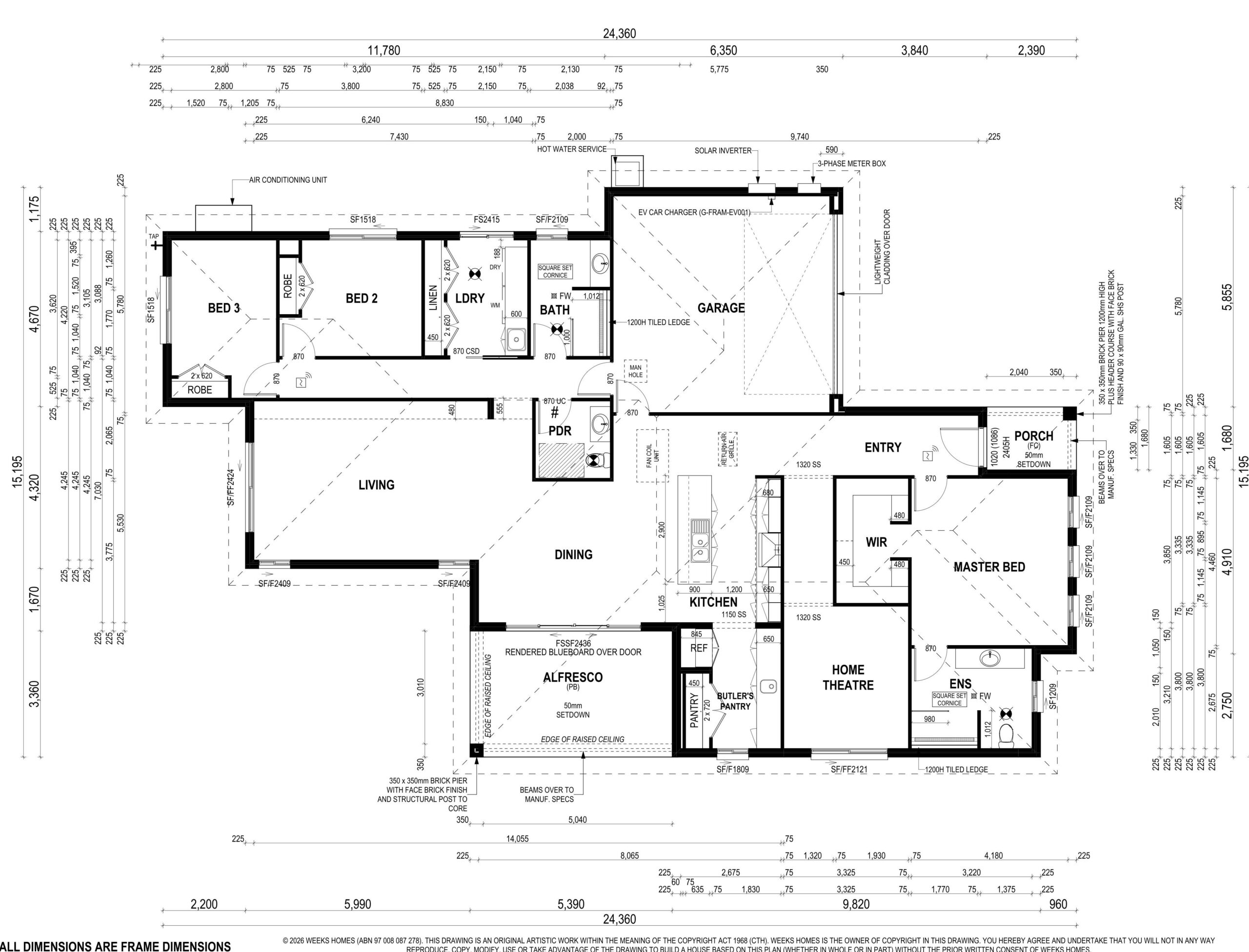
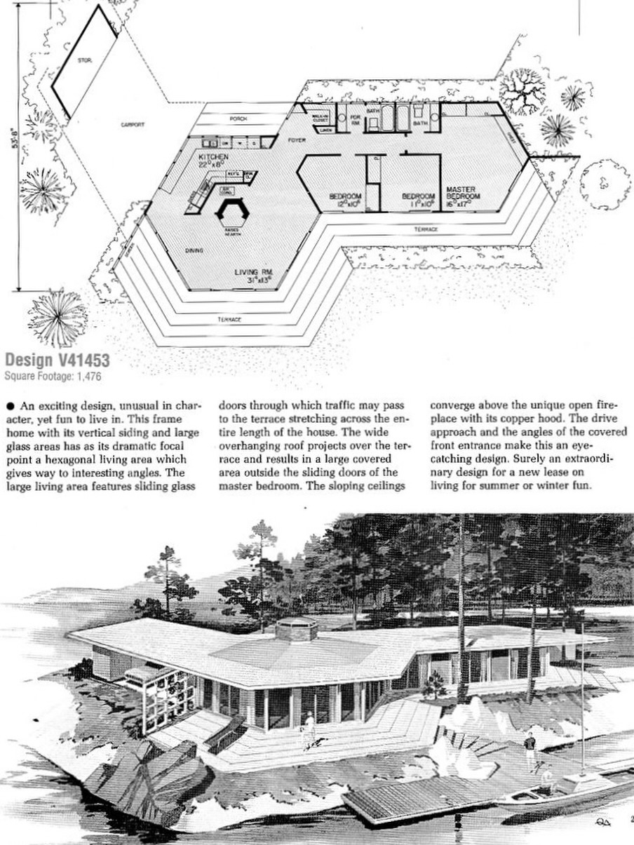
I don’t like the idea of having to take my laundry outside to get it into the wash on the top plan. I’d have put a door directly from inside the house, closed off the one to the carport, and ditched that room’s “storage” designation. I also would’ve made it a double carport with storage on the outside edge that runs the length of the carport.
I understand the design philosophy behind the lower plan, but it seems that entry hallway is a tremendous waste of space.