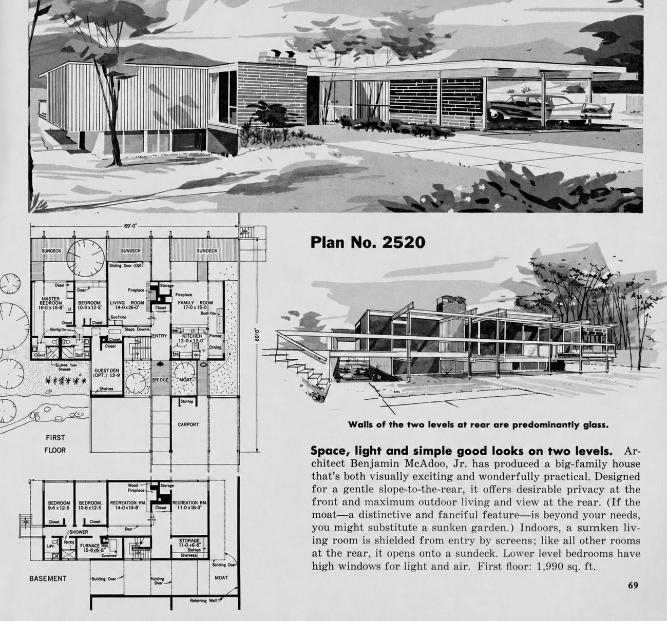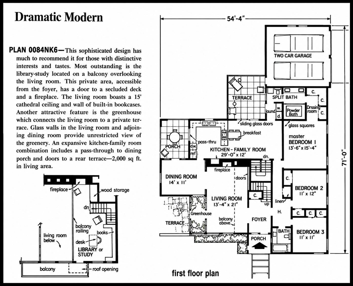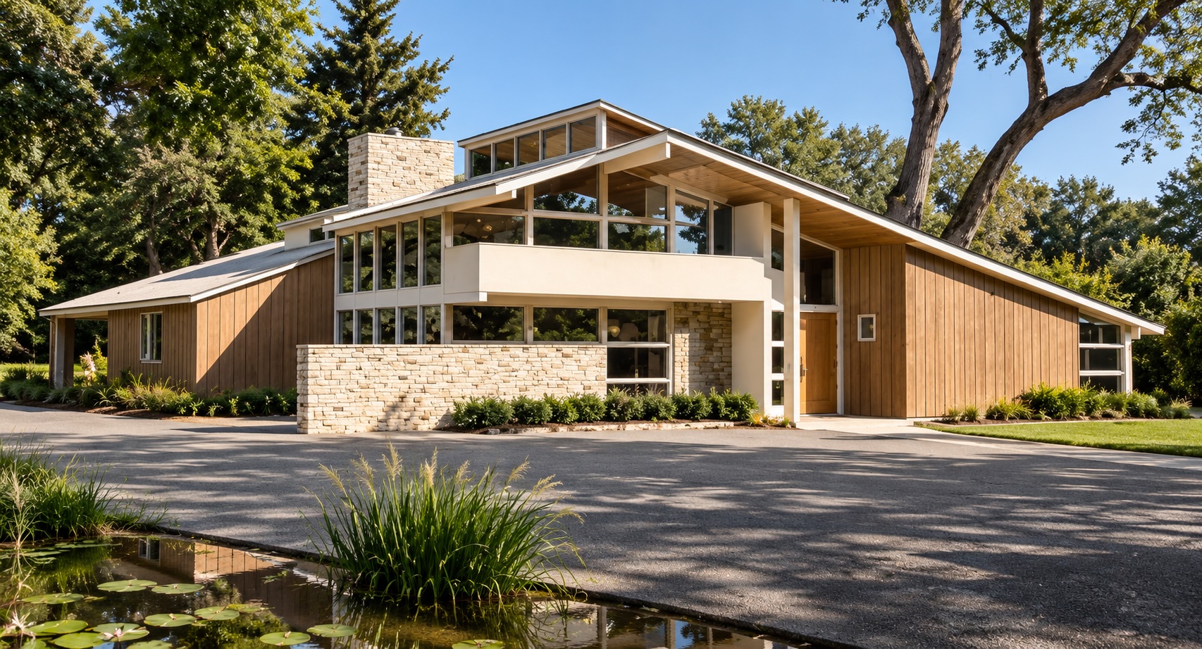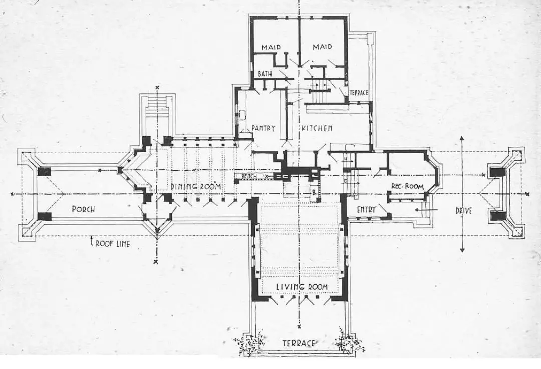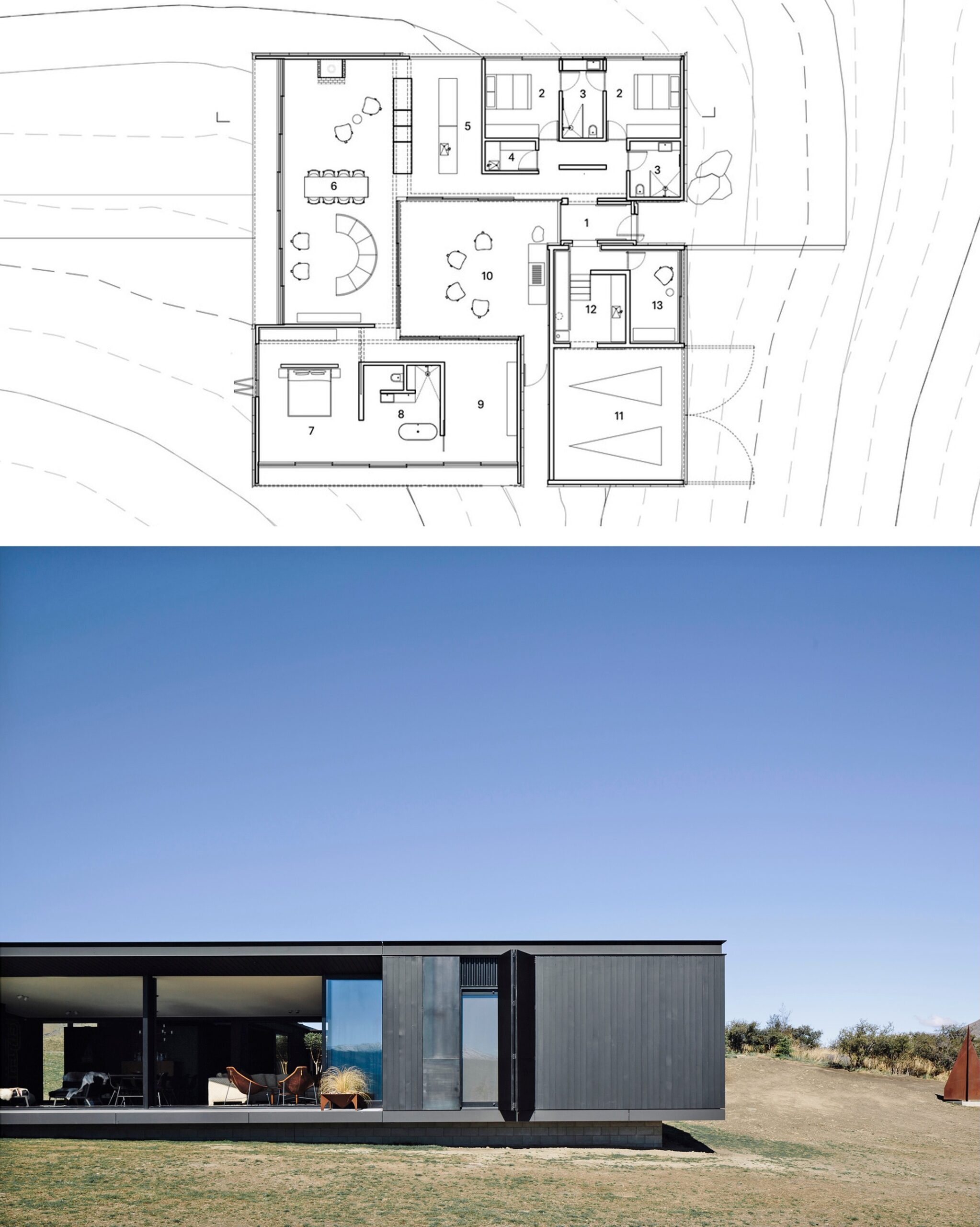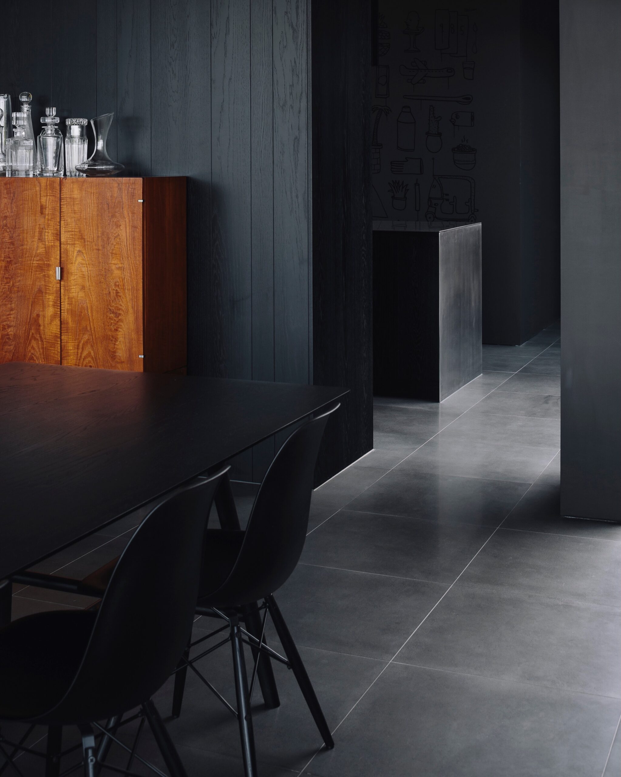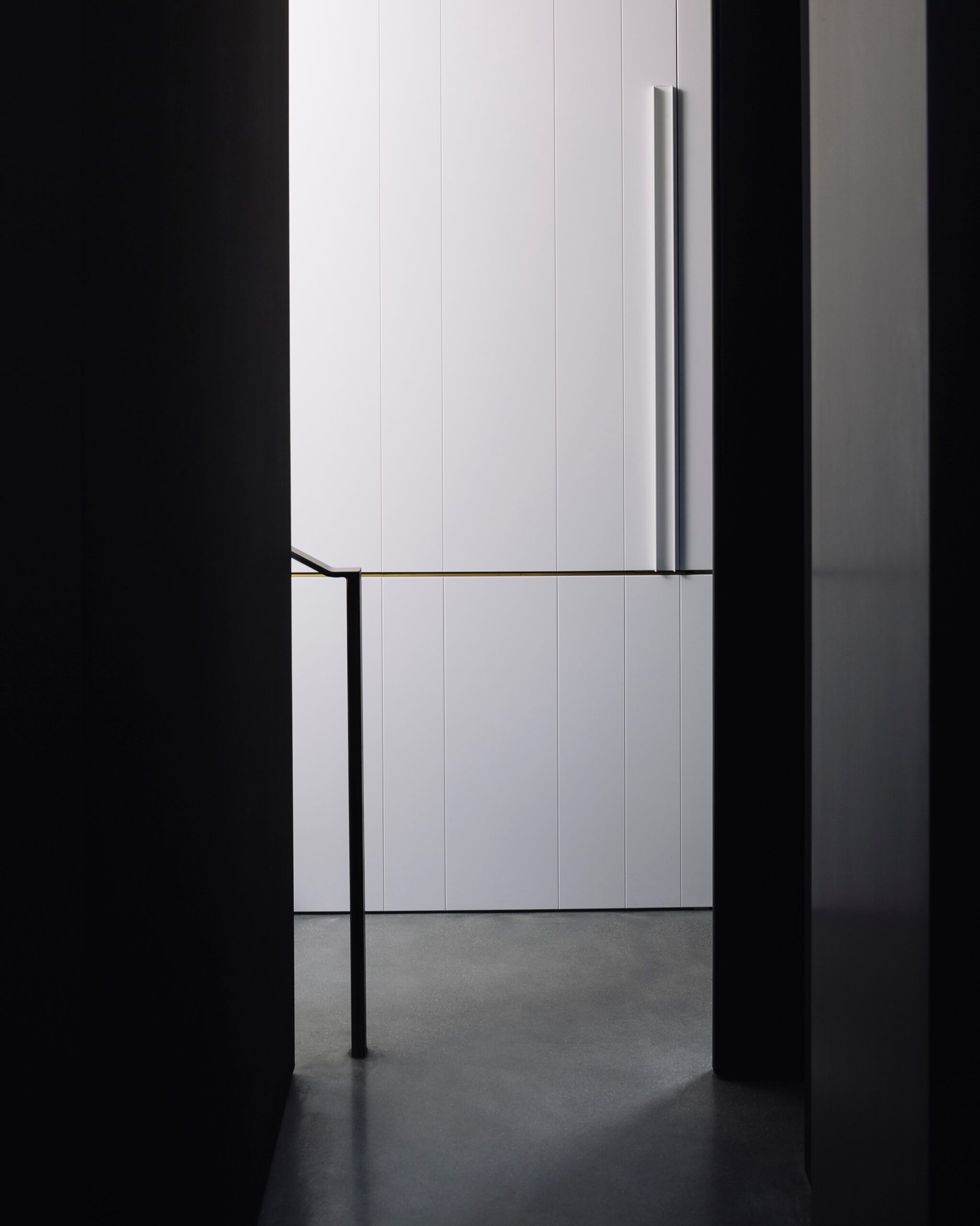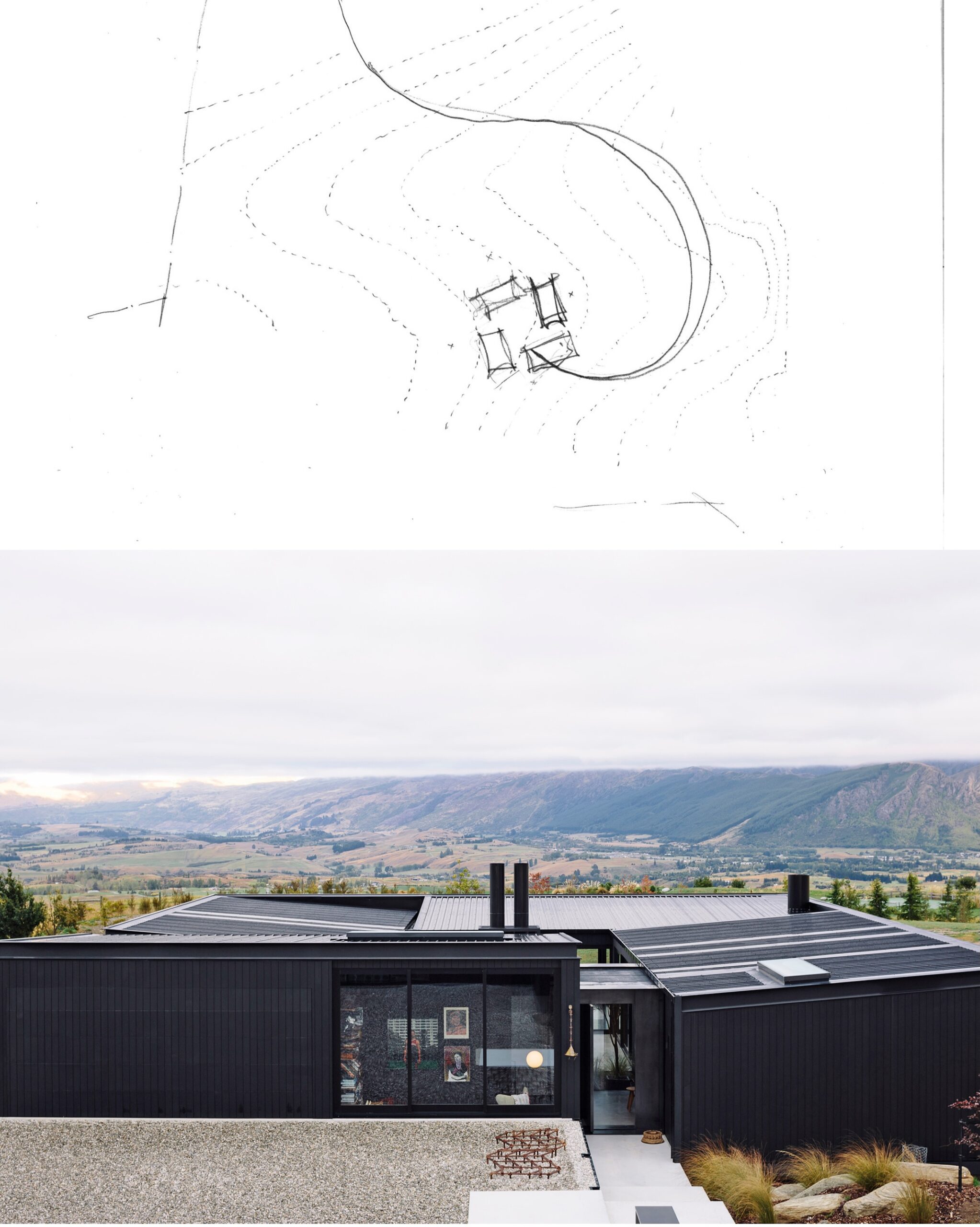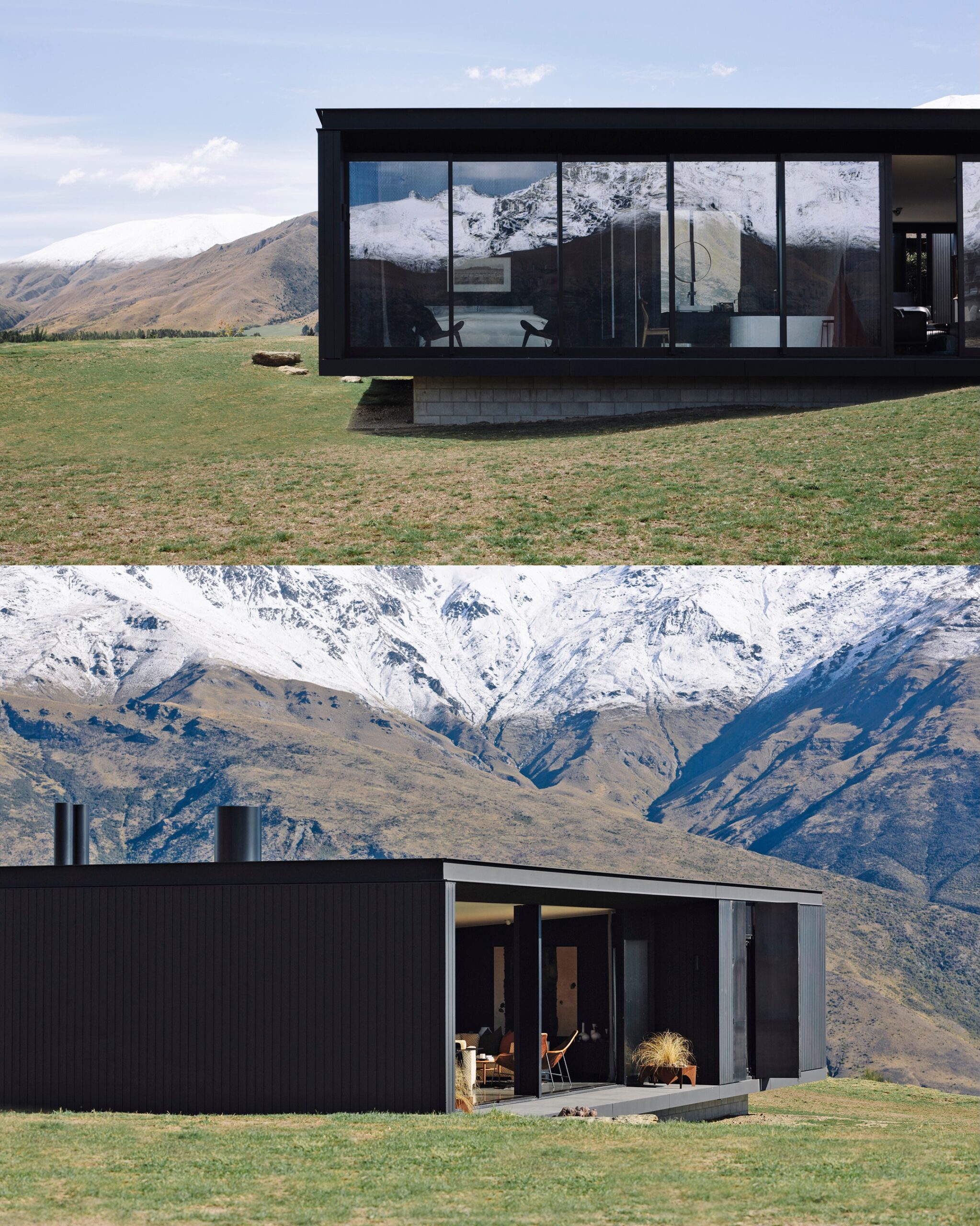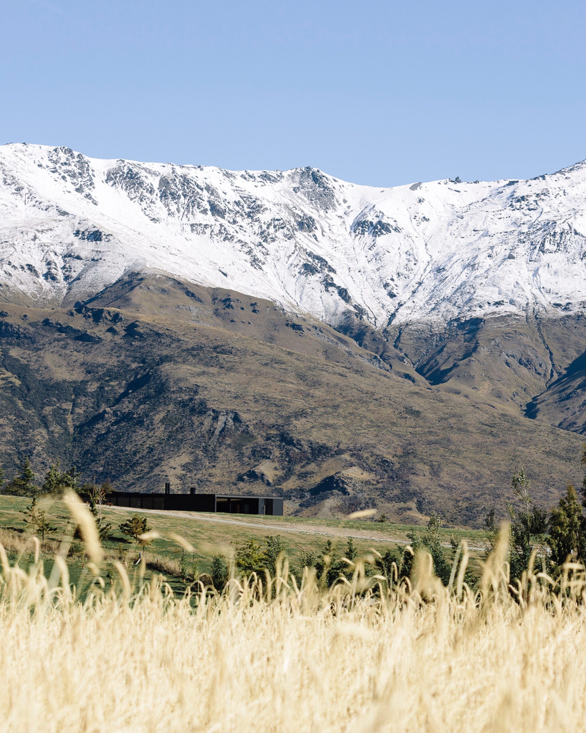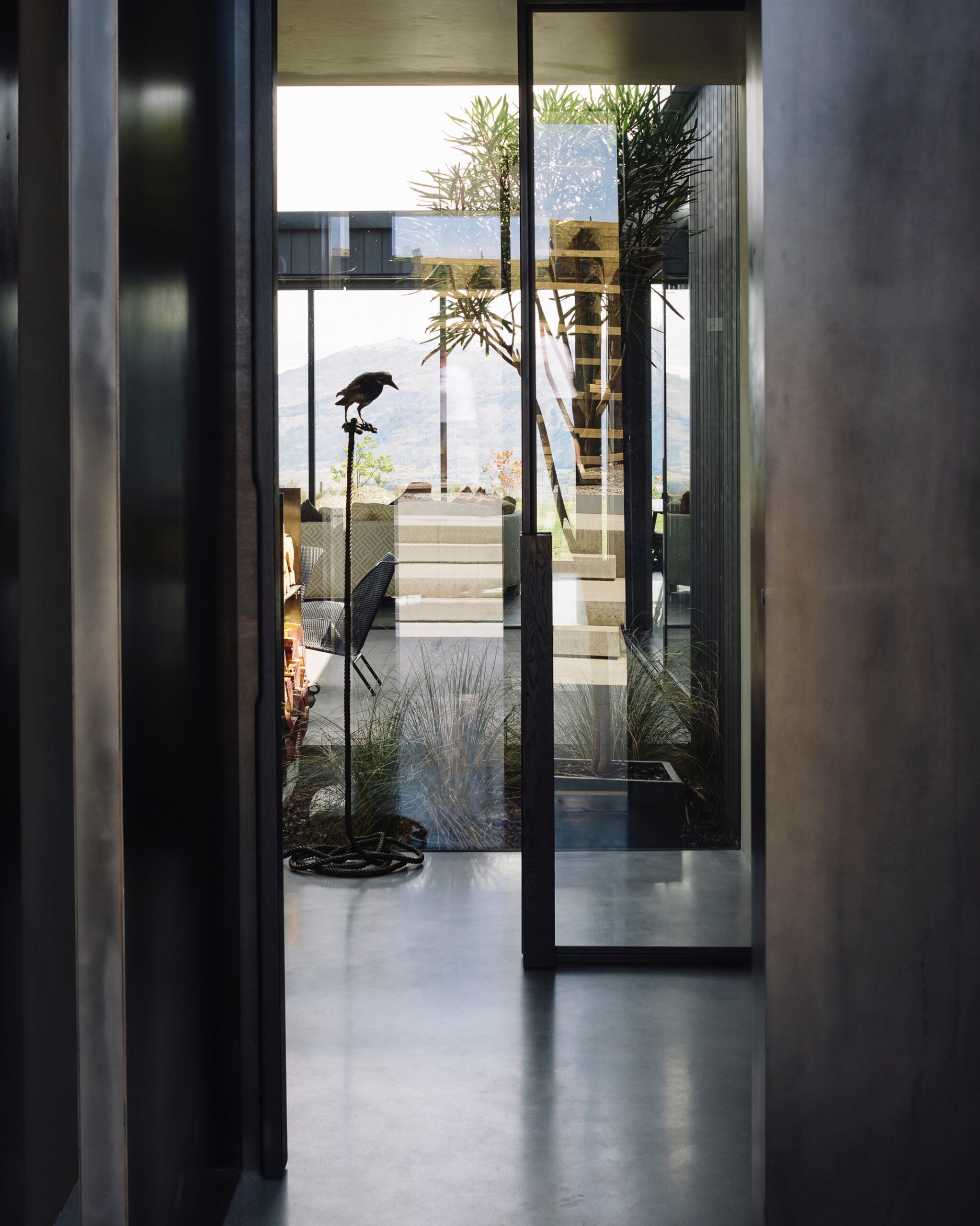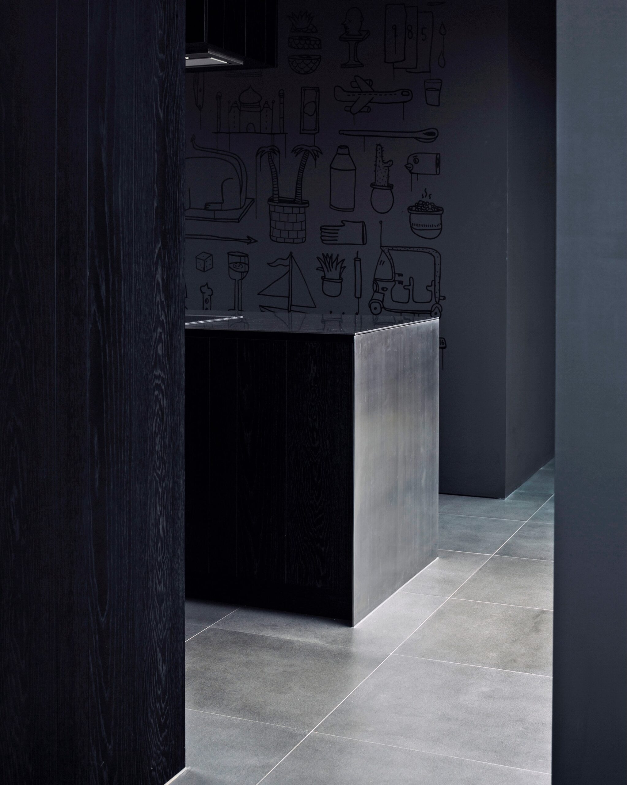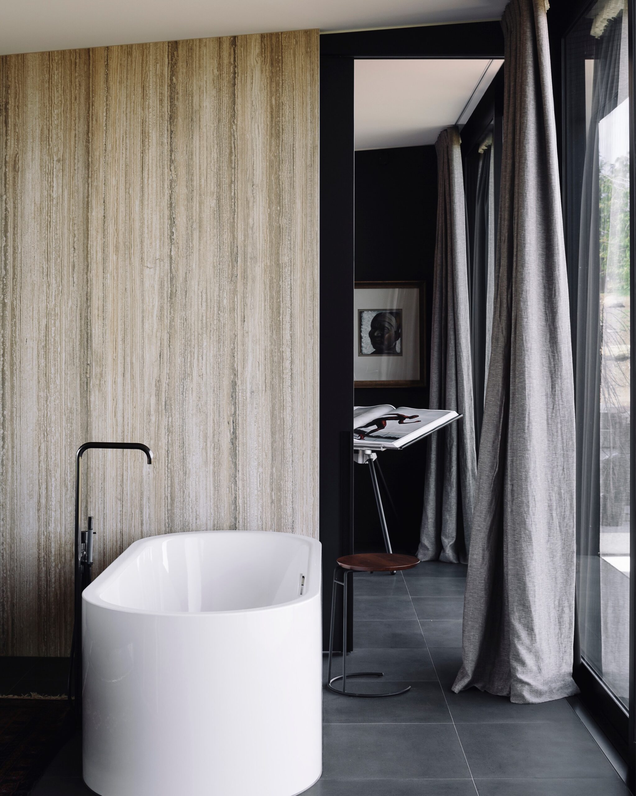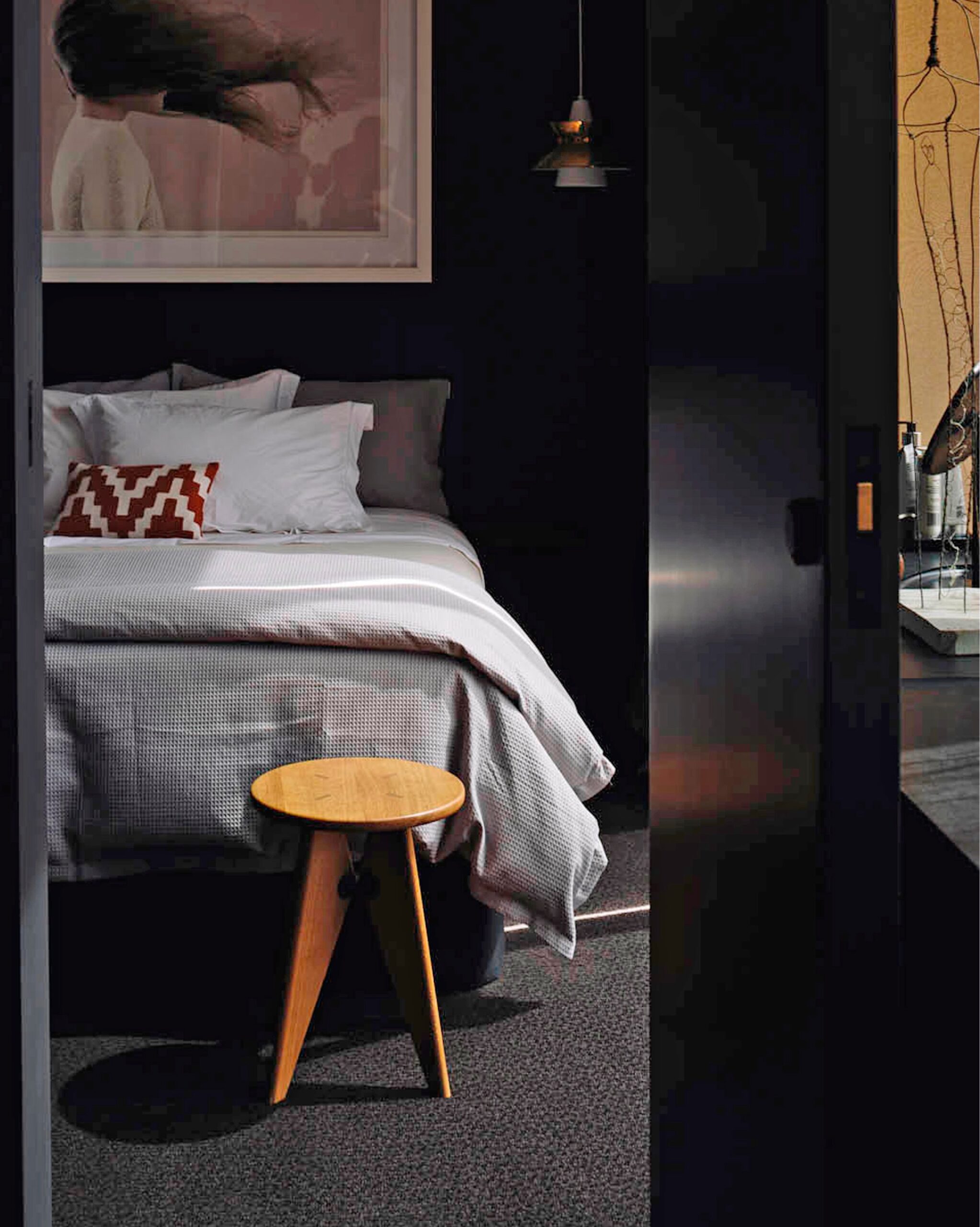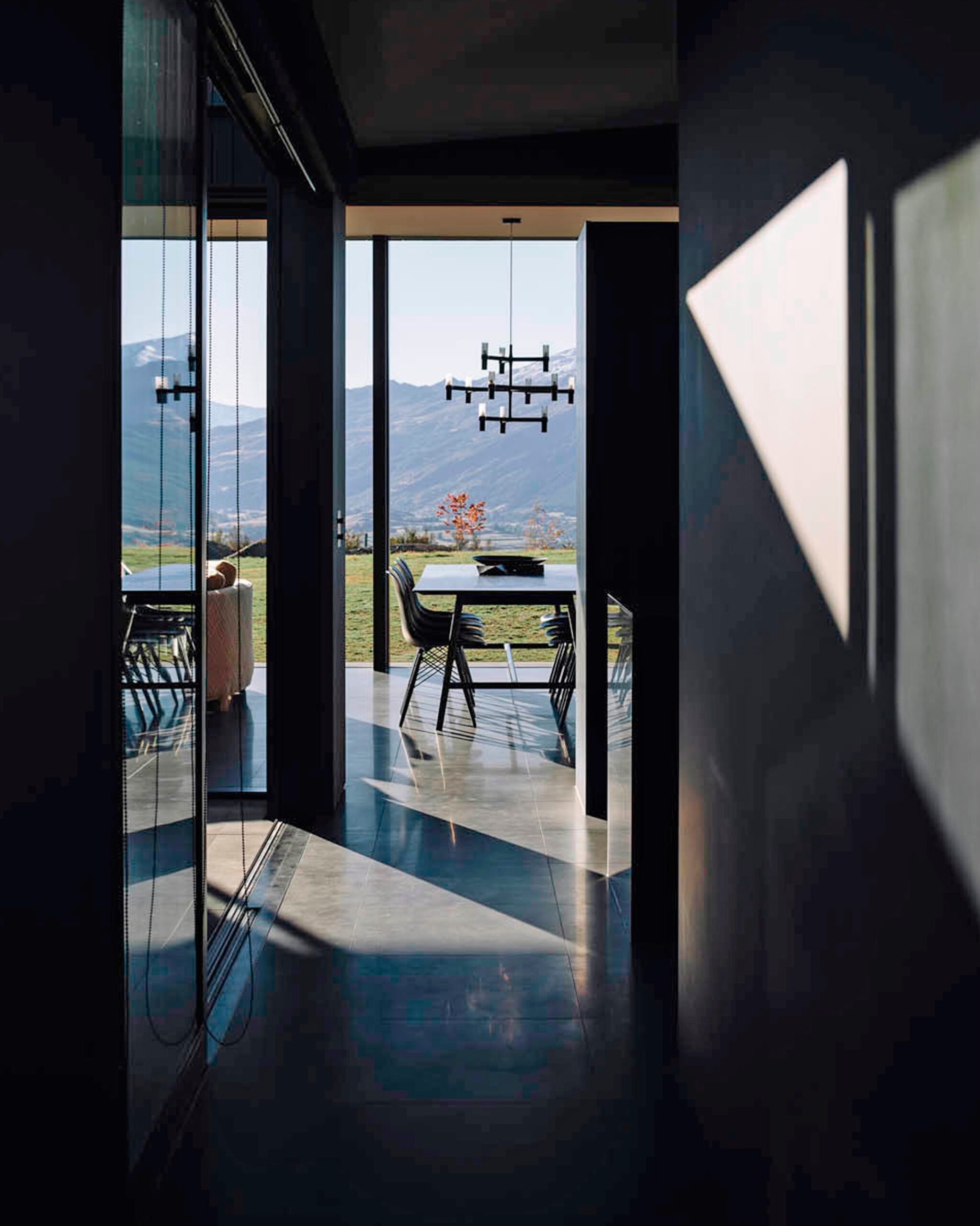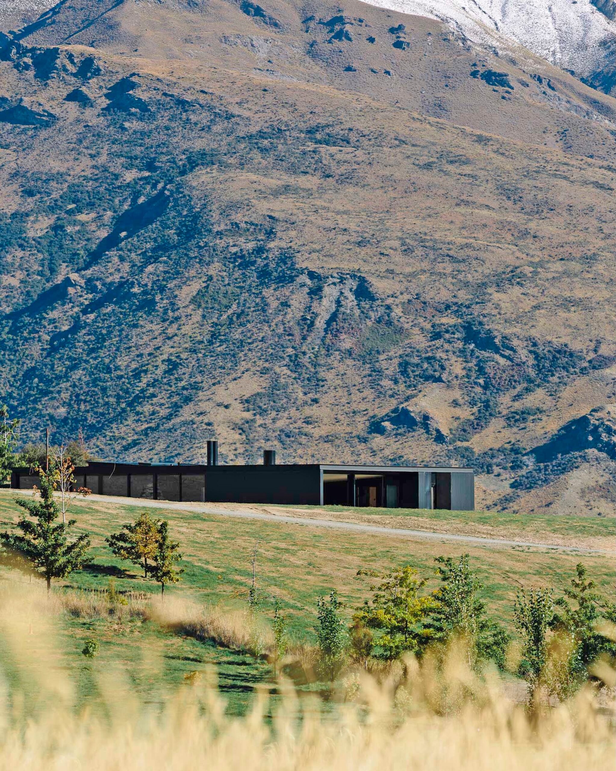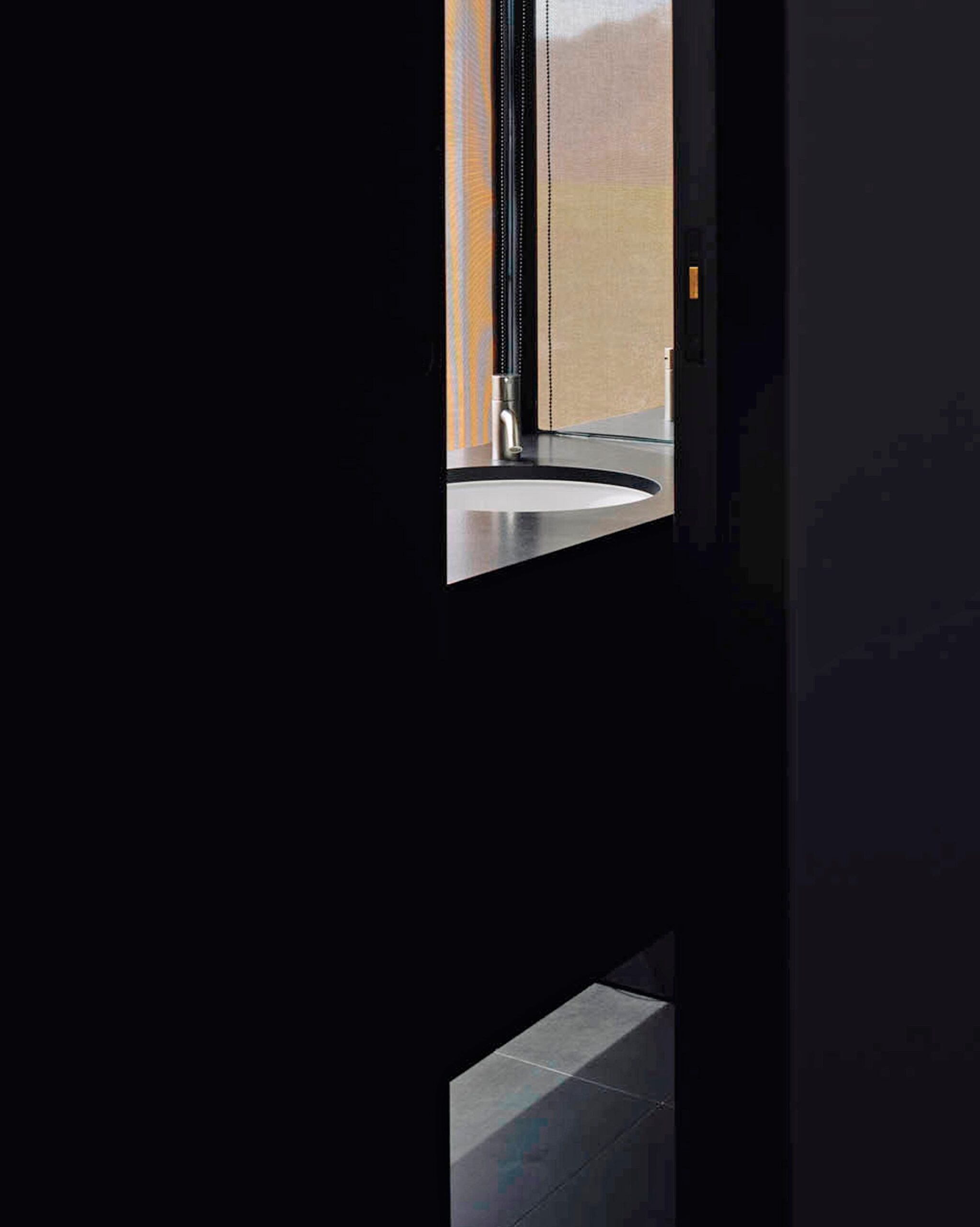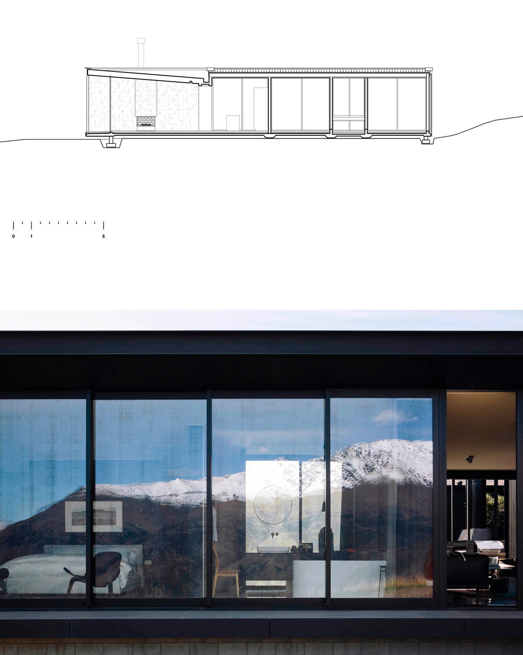
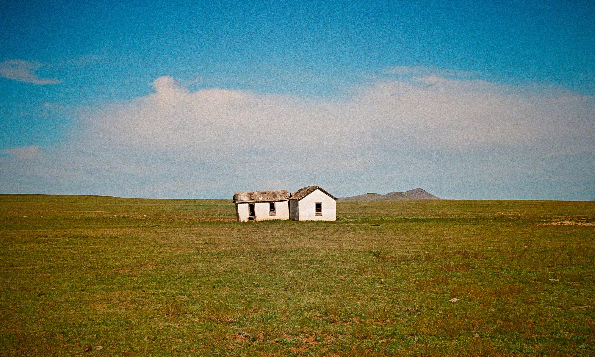
But it would make a great B&B…
0 comments
Shitposting since 2005
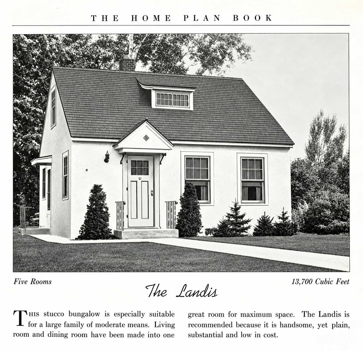
You could certainly do worse.
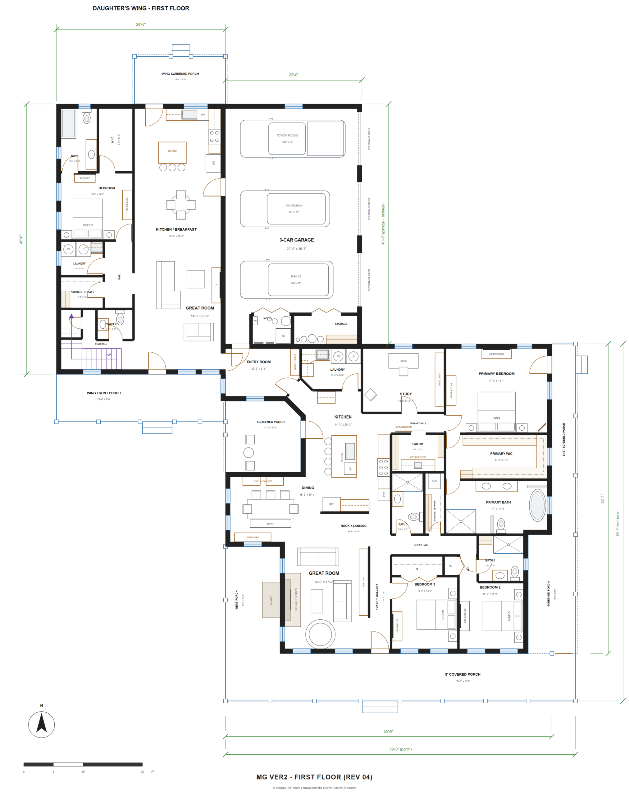
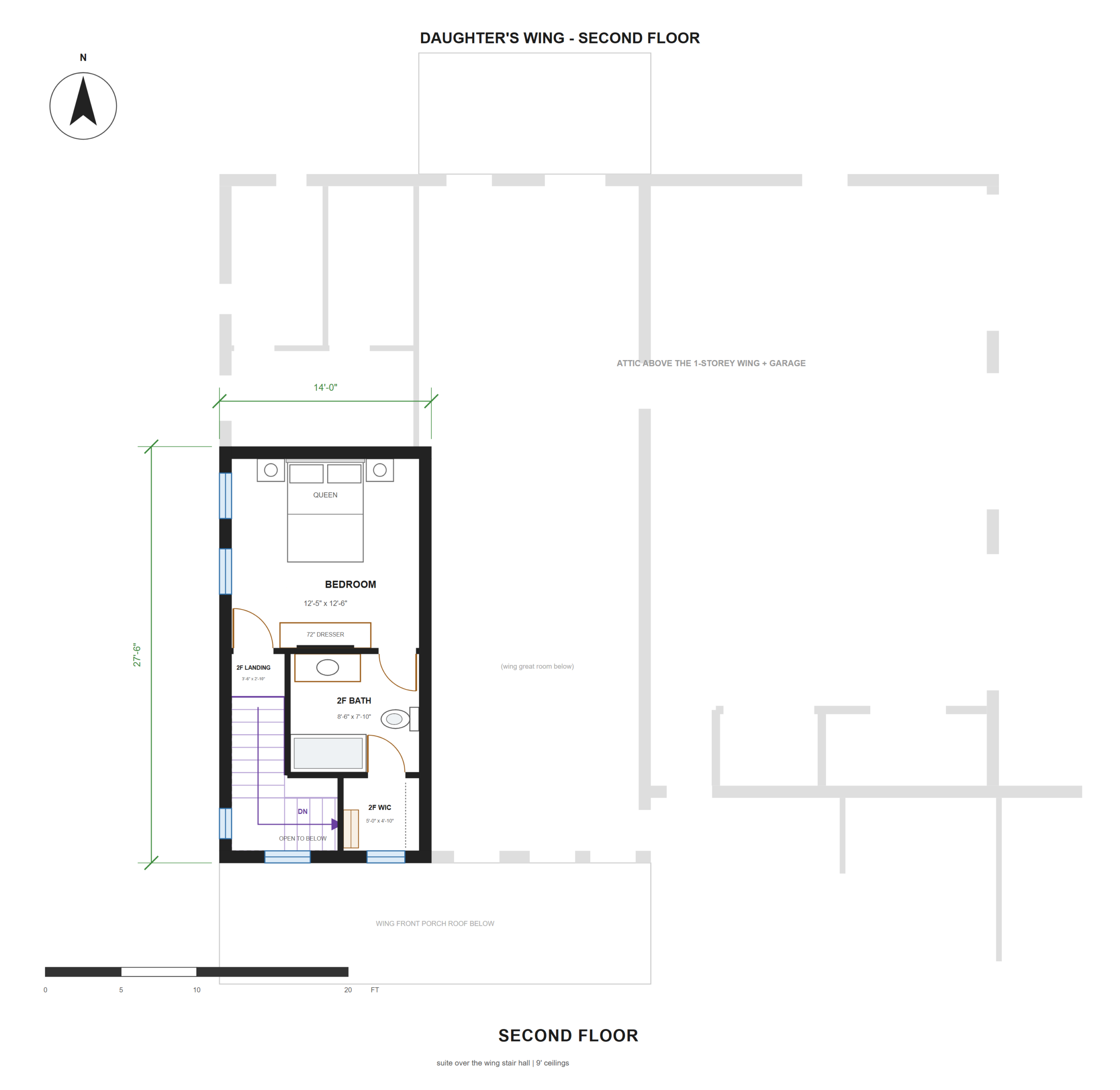
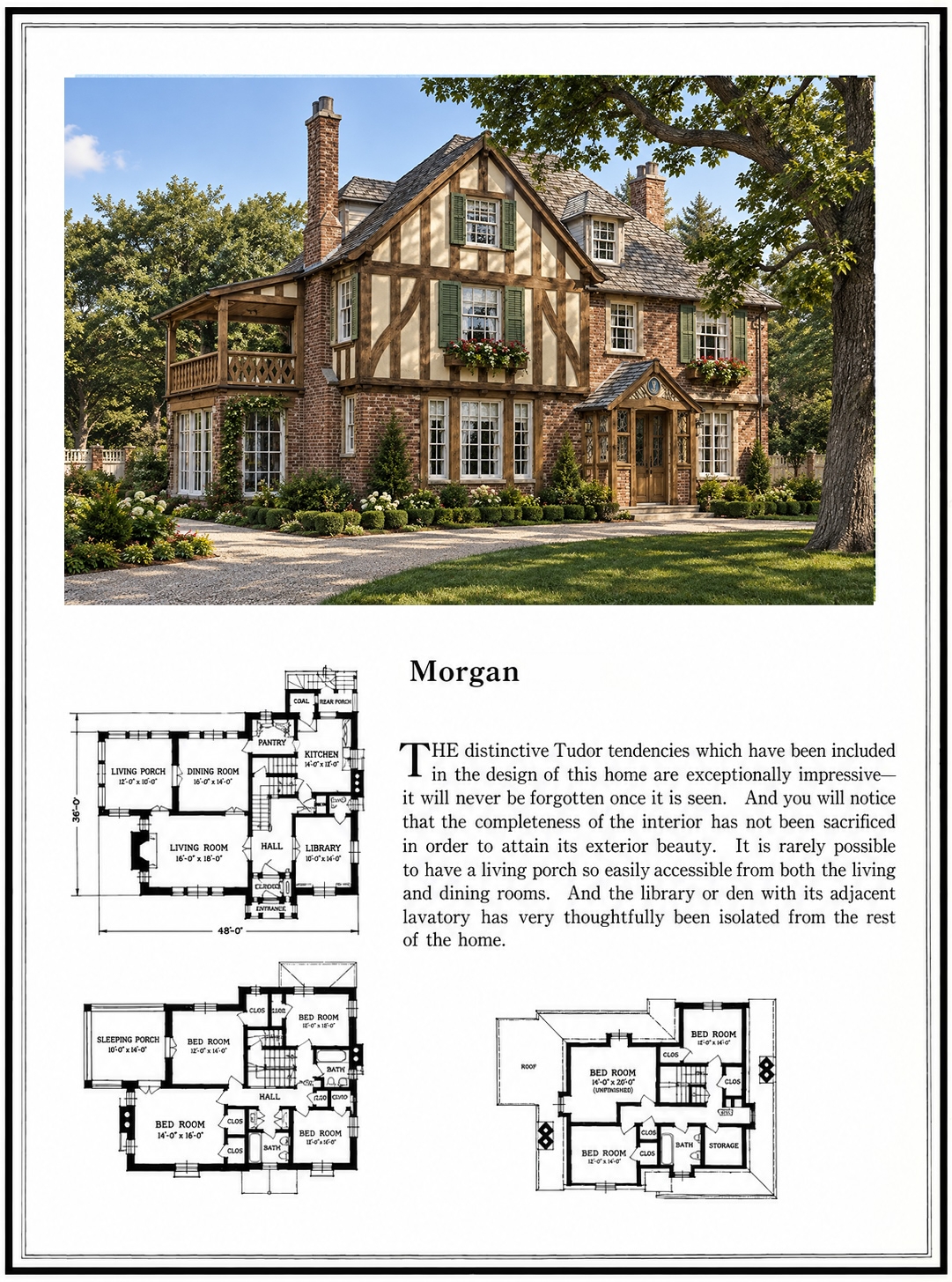
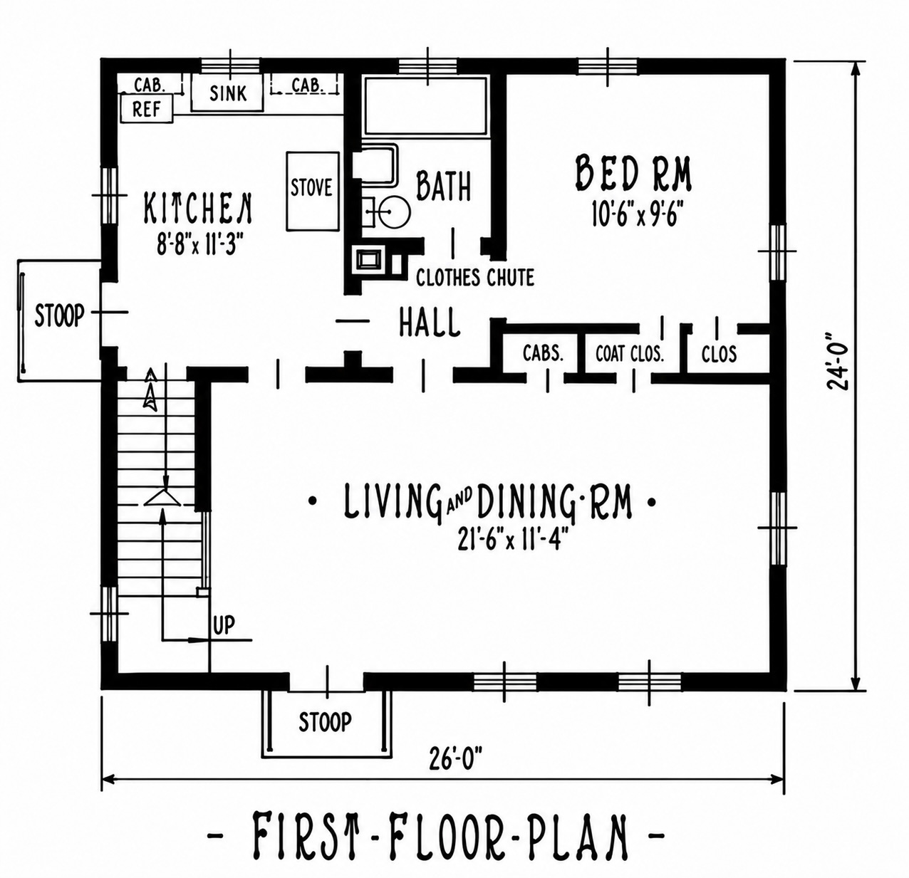
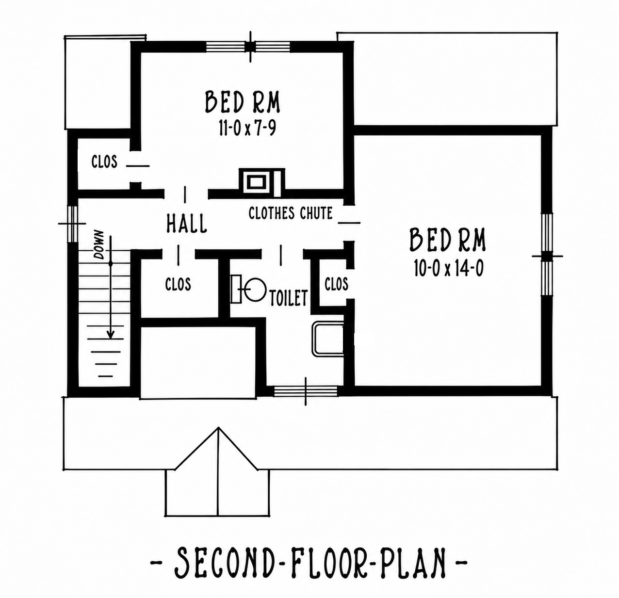
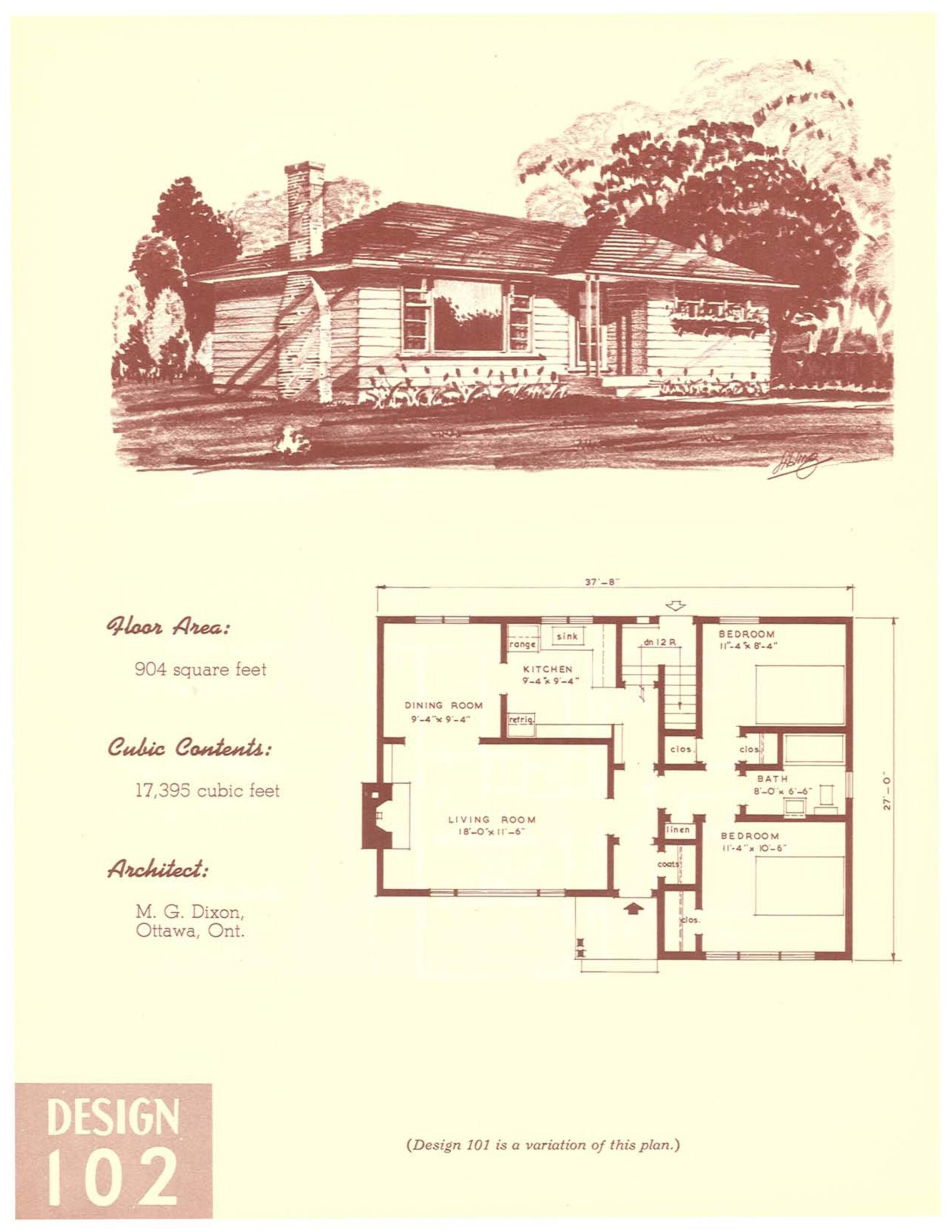
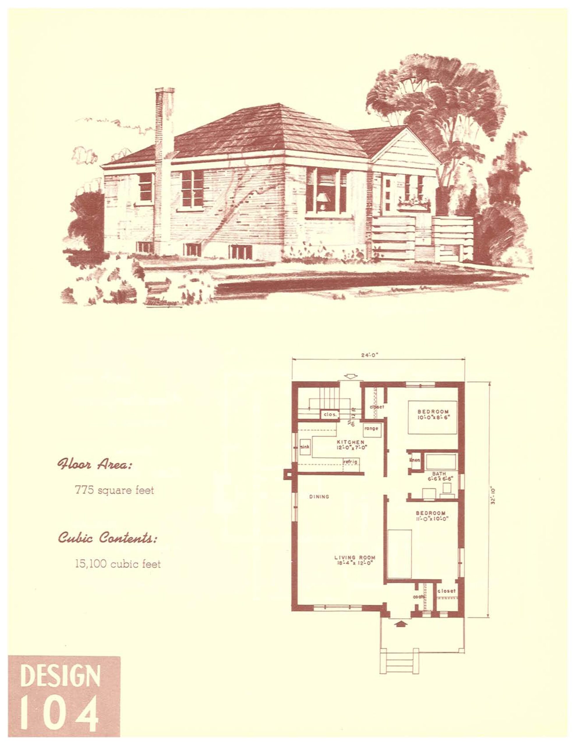
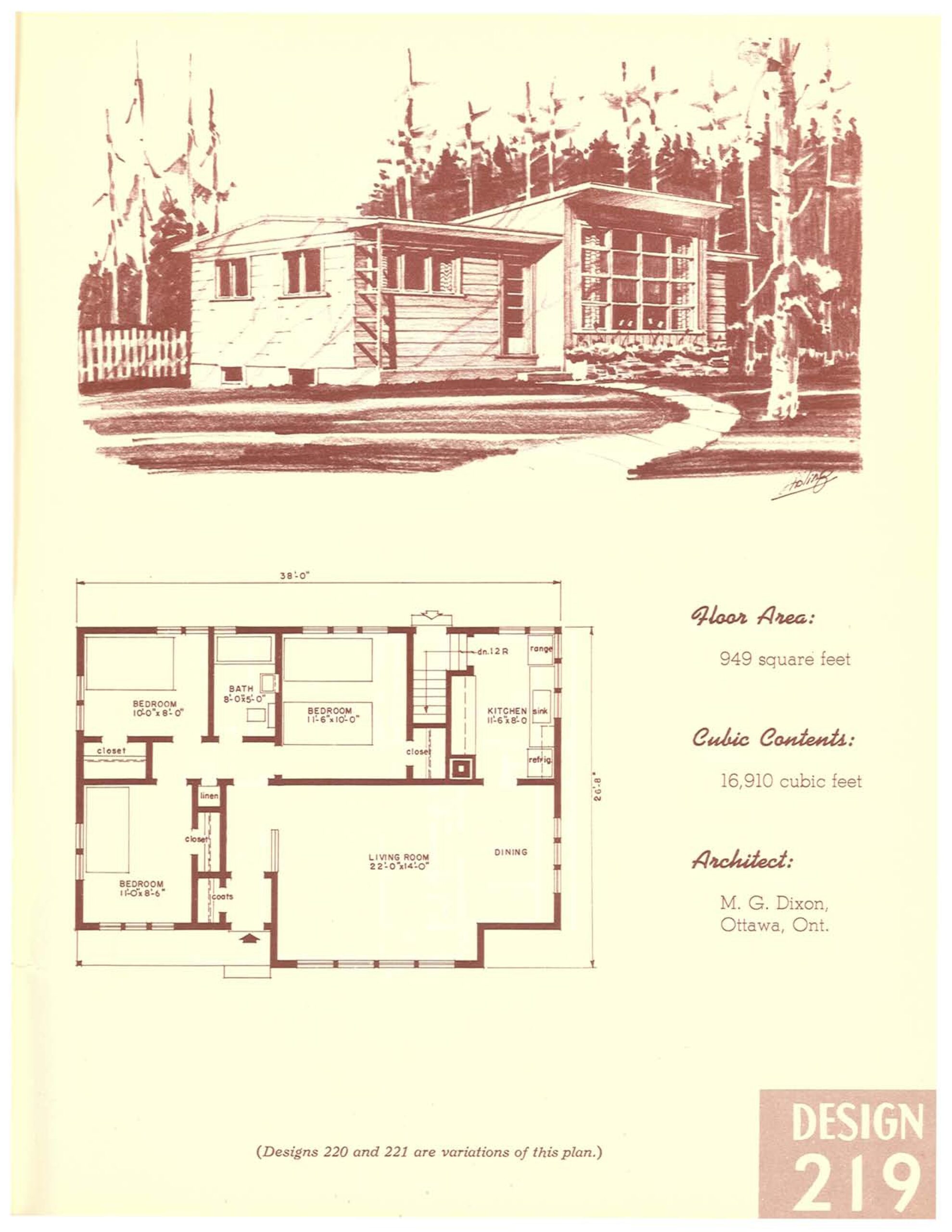
HOWEVER…even though I wasn’t going to do it again, I went ahead and made a few changes to present them visually instead of just trying to describe them.
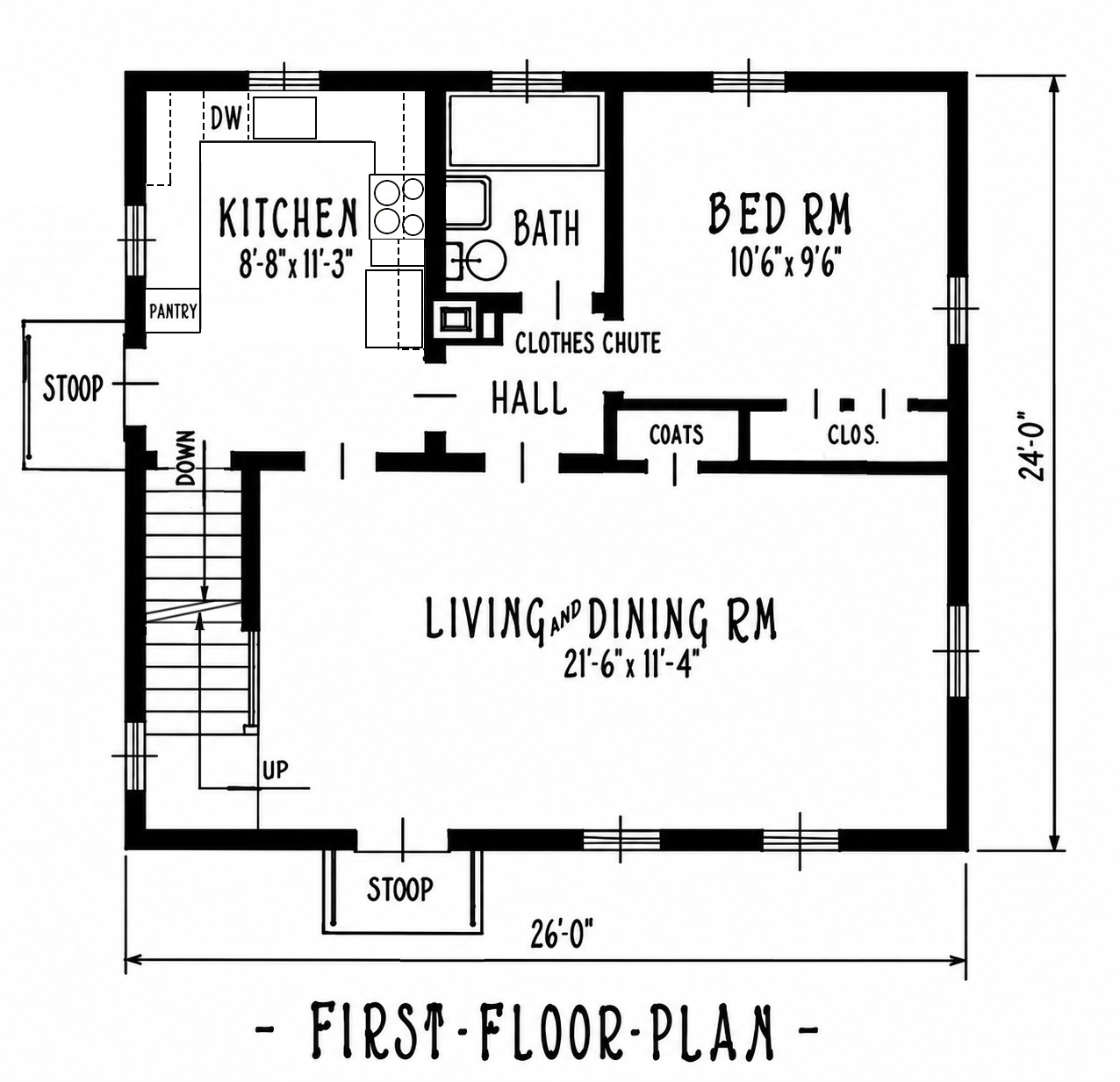
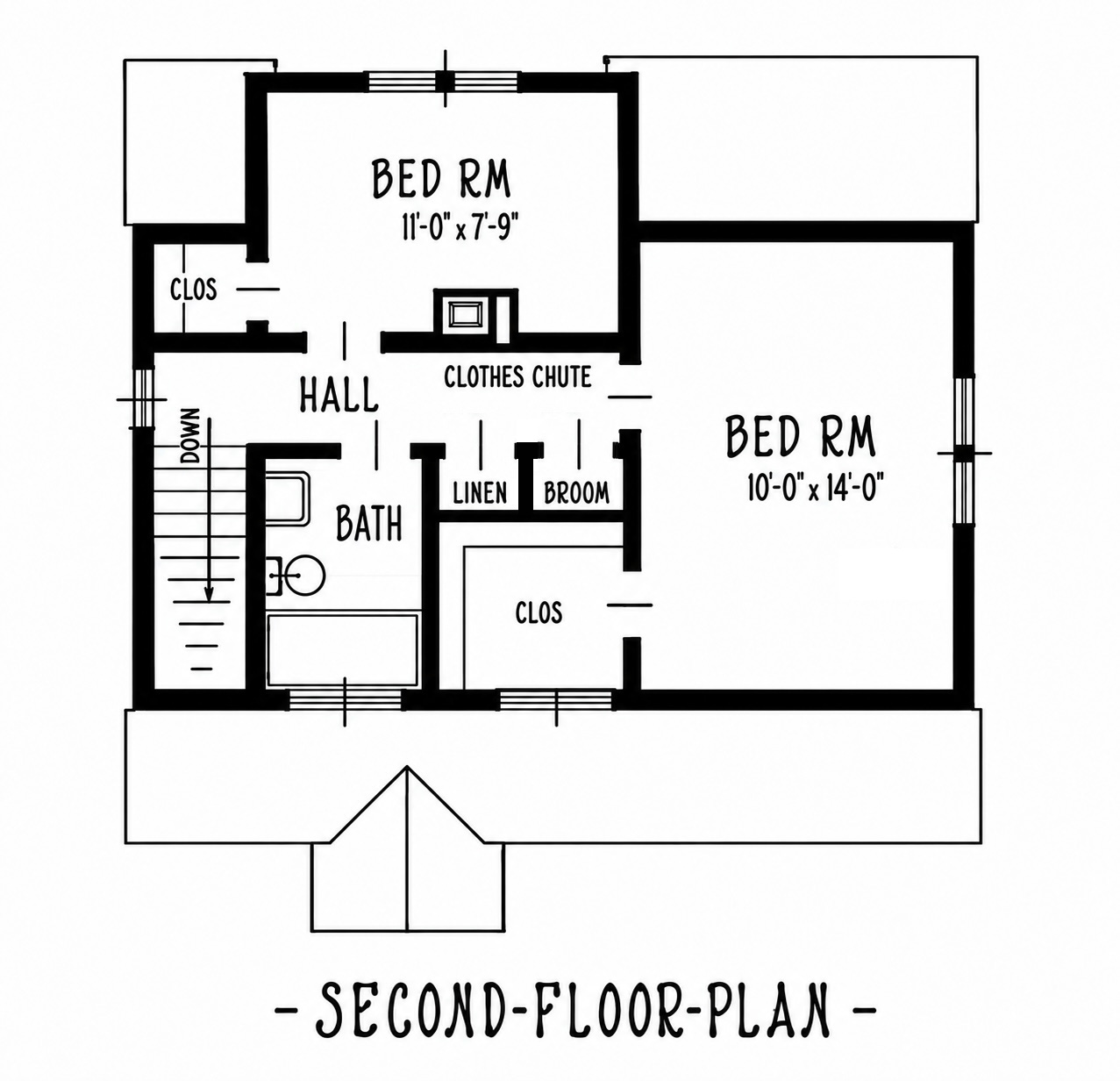
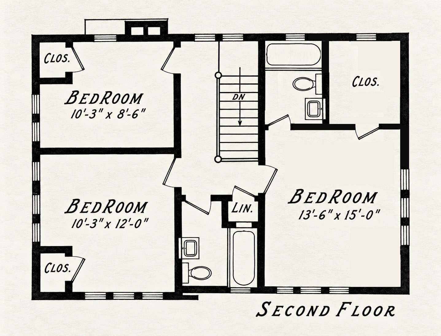
I extended the dormer window to double-wise on the second floor to accommodate full height ceilings in both the bath and new walk-in closet.
Gotta say…that was an ordeal with the tools I had available, but it felt good when I was finally finished.
3 comments
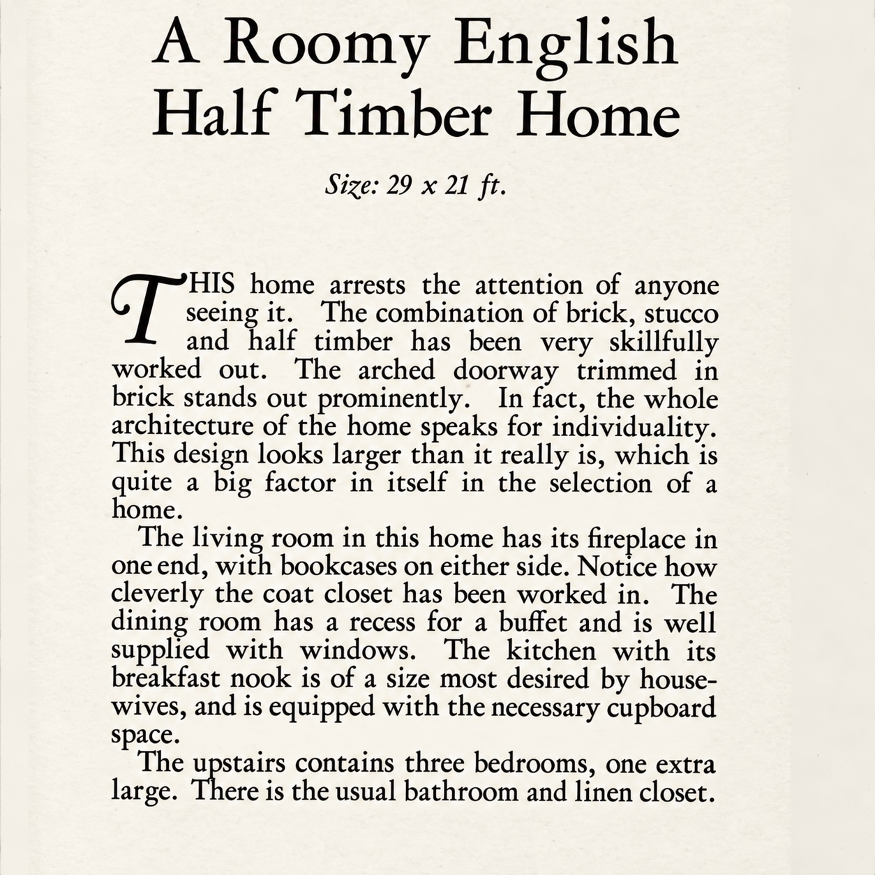
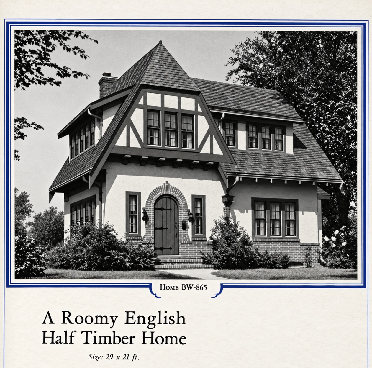
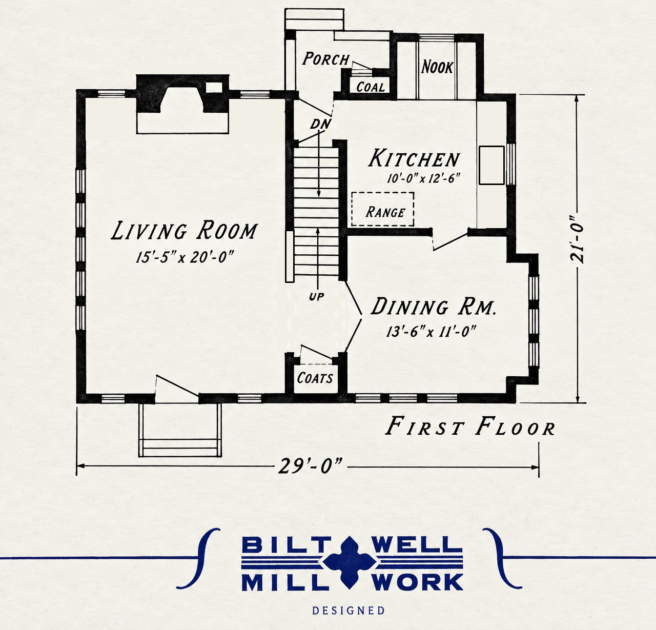
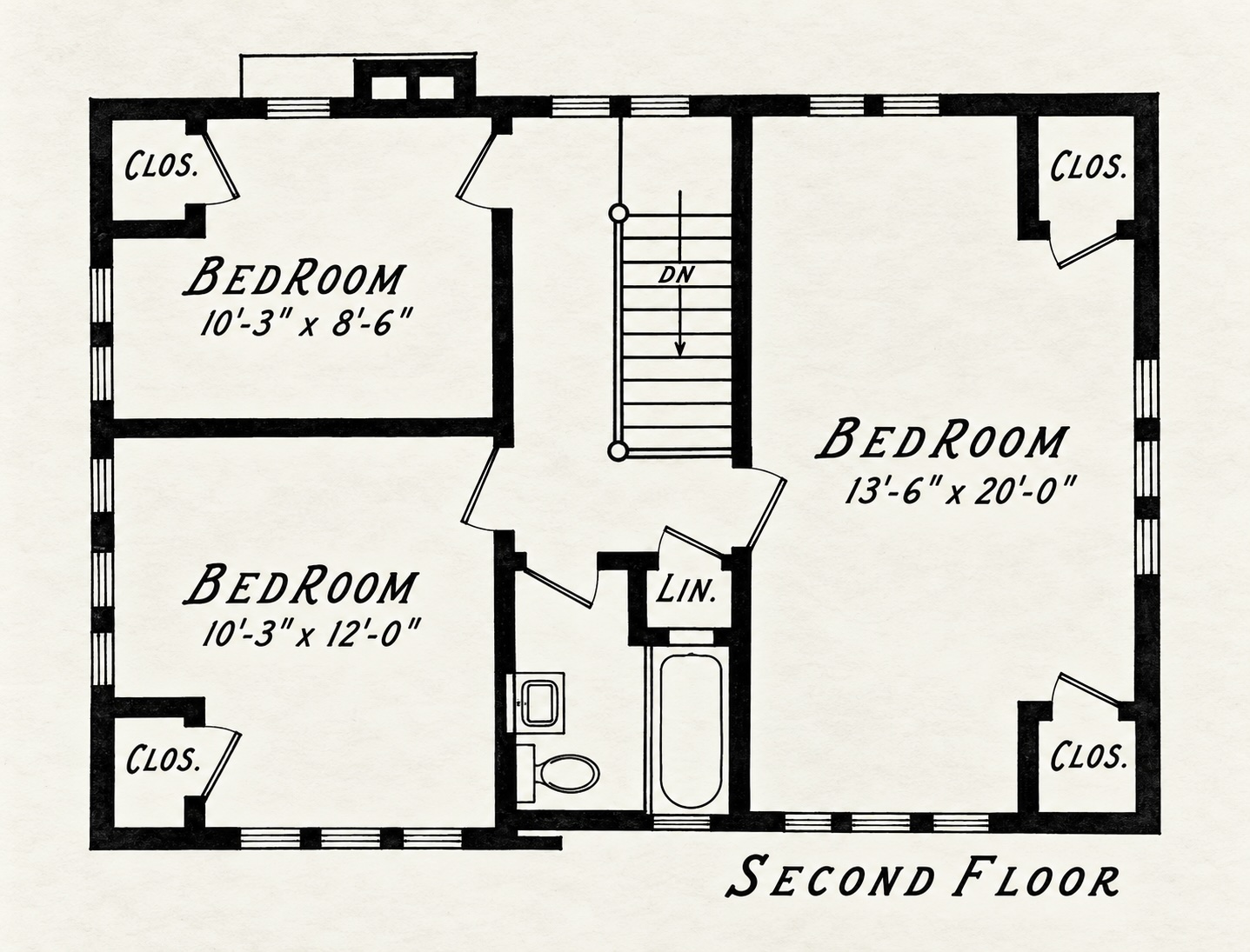
…did no one have to pee when they were downstairs?!
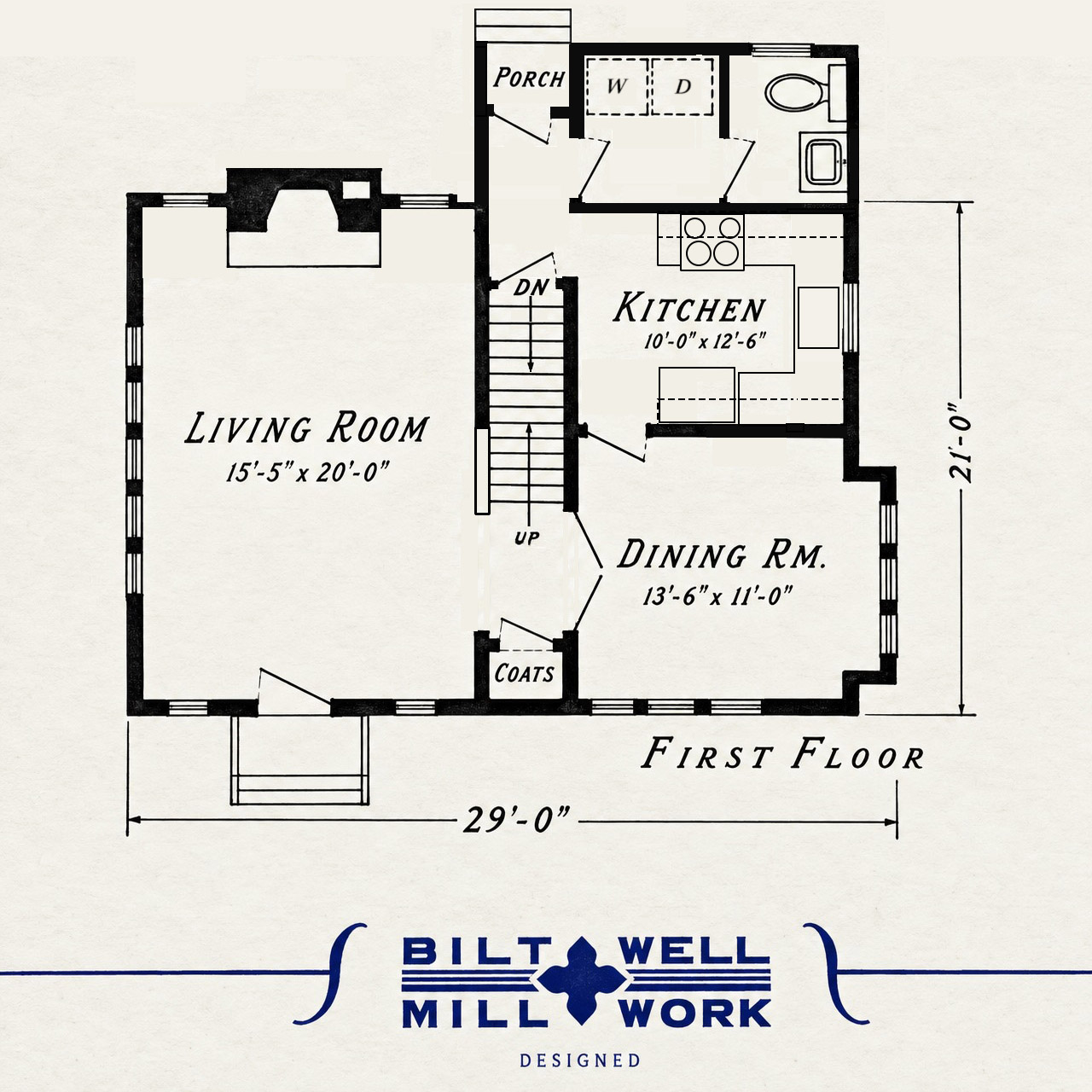
If I were using this plan to build new, I’d lose the nook and coal chute and push the porch out so the inner edge lines up with the exterior edge of the existing nook. I’d then reconfigure that area so the rear door is moved to align with that new wall and add a door to that new space from the new hall area that was created. The half bath could go into that new space. In fact—since there’s no laundry room—depending on how far out you push that rear wall, there could be room enough for a side-by-side washer/dryer and a half bath back there.
I also noticed there’s no refrigerator in the kitchen. There’s plenty of room in that space, so if you move the door to the dining room to the corner nearest the stairwell you could actually put in a u-shaped kitchen with refrigerator on one side and stove on the other.
I don’t see a whole lot that needs to be changed on the Second Floor.
~ADDENDUM~
I went ahead and drew the changes I’d suggested—plus a second floor revision left by a reader. I don’t think I’ll be making a habit of this; editing floor plans in Photoshop is a BITCH.
7 comments
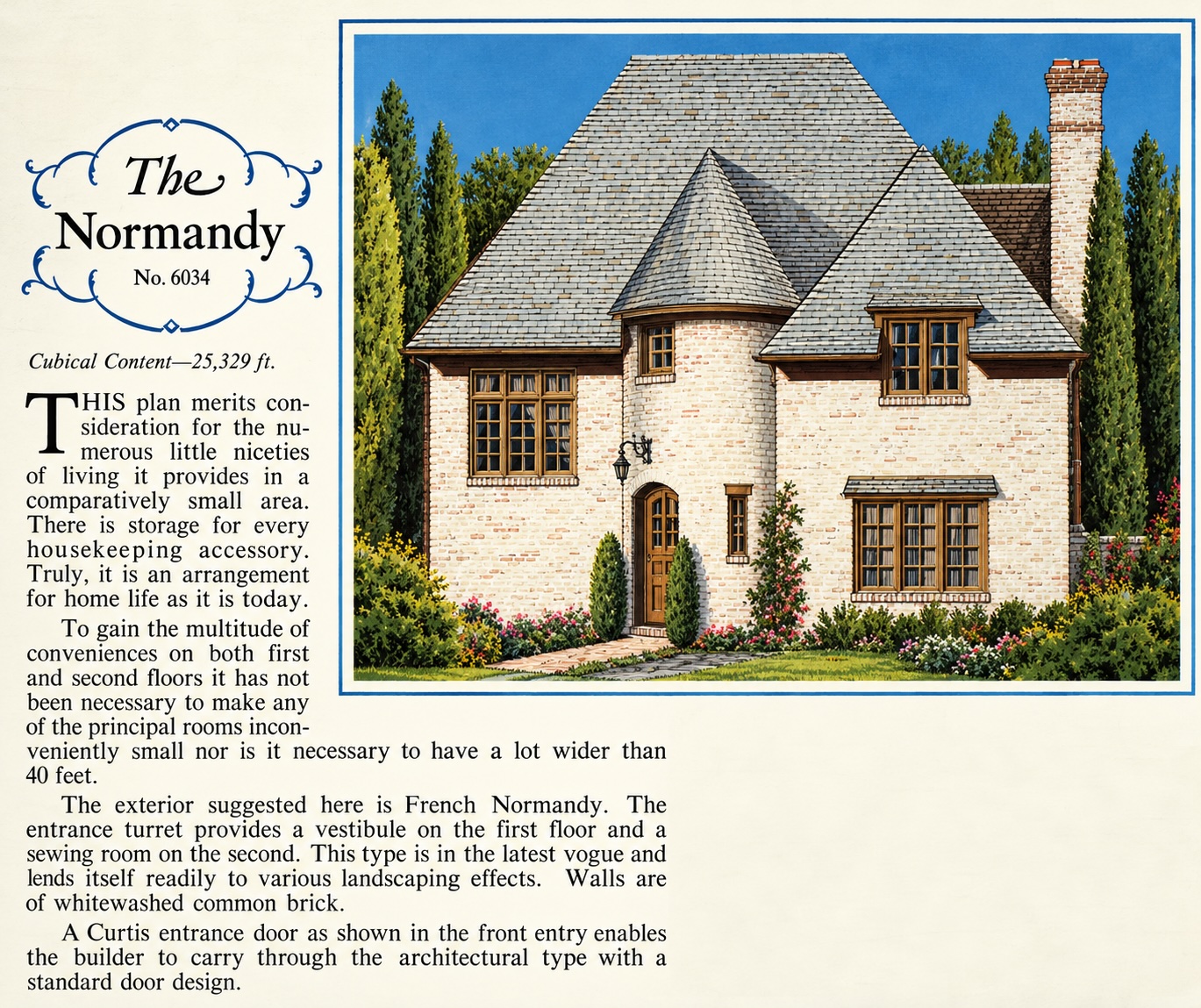
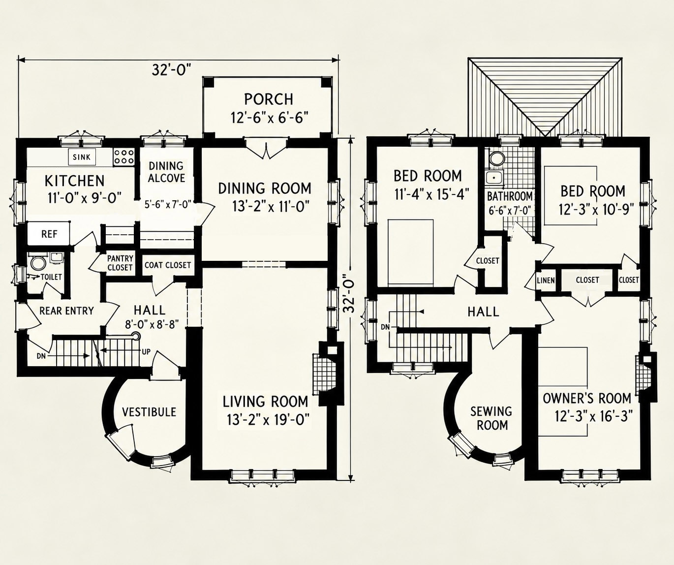
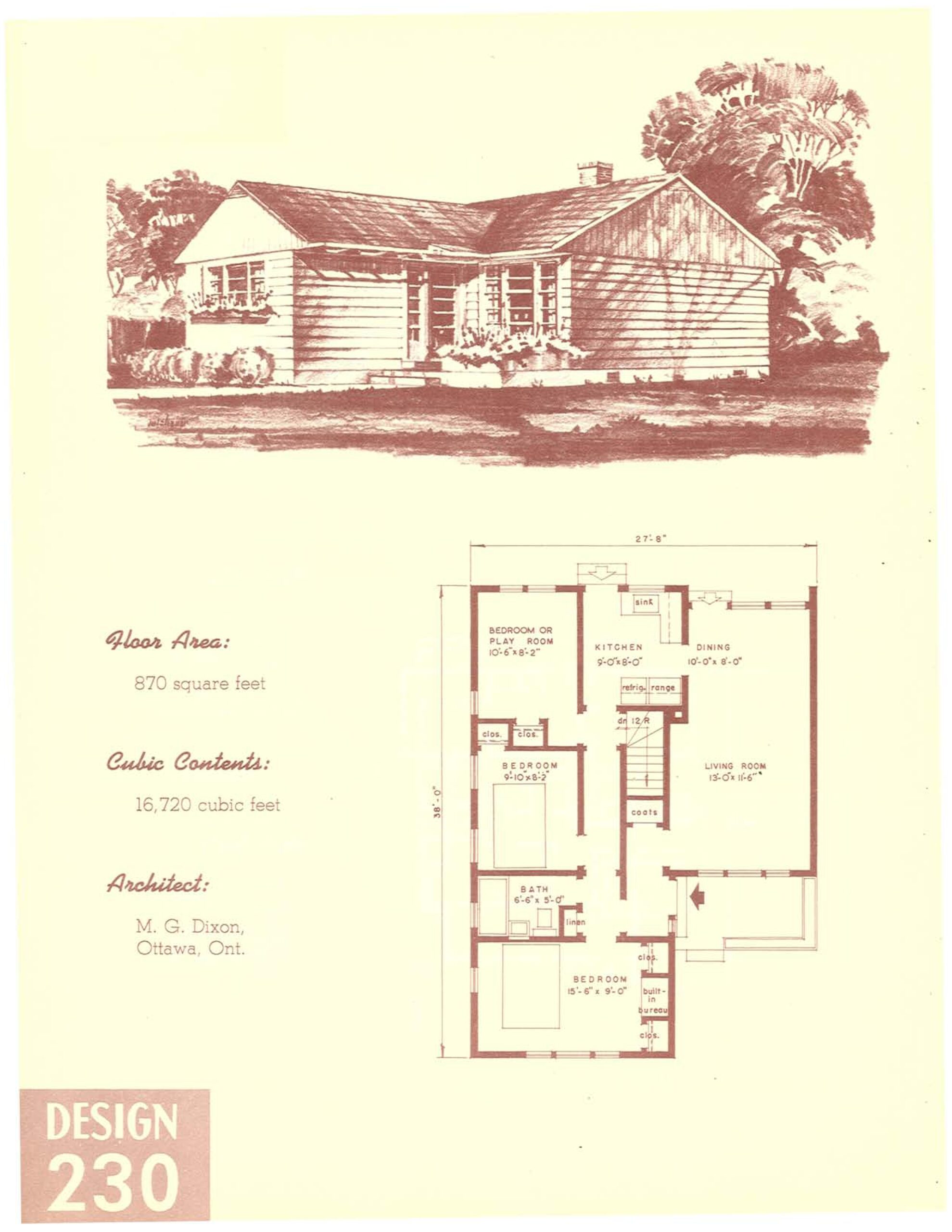
It’s cute, and it’s even got a half bath on the first floor! f
And a rear entry… 😈
Sorry, that’s the twelve-year-old in me talking.
But seriously, the only thing I’d do is ditch the dining alcove and knock out the wall between it and the kitchen. Then I’d rework the kitchen to make it all a bit more in keeping with what we expect from a 21st century kitchen.
On the second floor, that bathtub looks suspiciously small, so I’d definitely turn it 90 degrees and shove it up against the wall with the window and then relocate the sink and toilet to match the “modern” layout.
5 comments
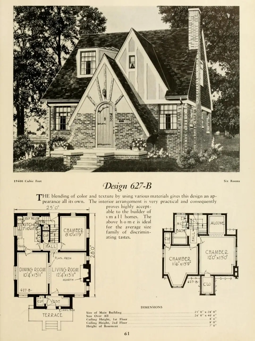
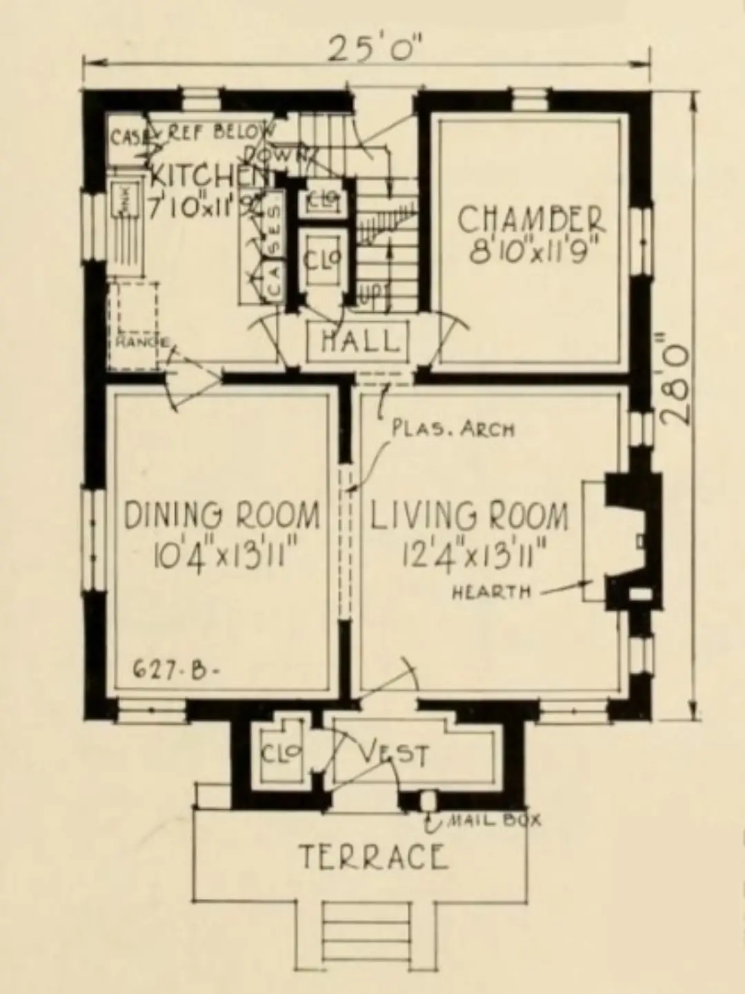
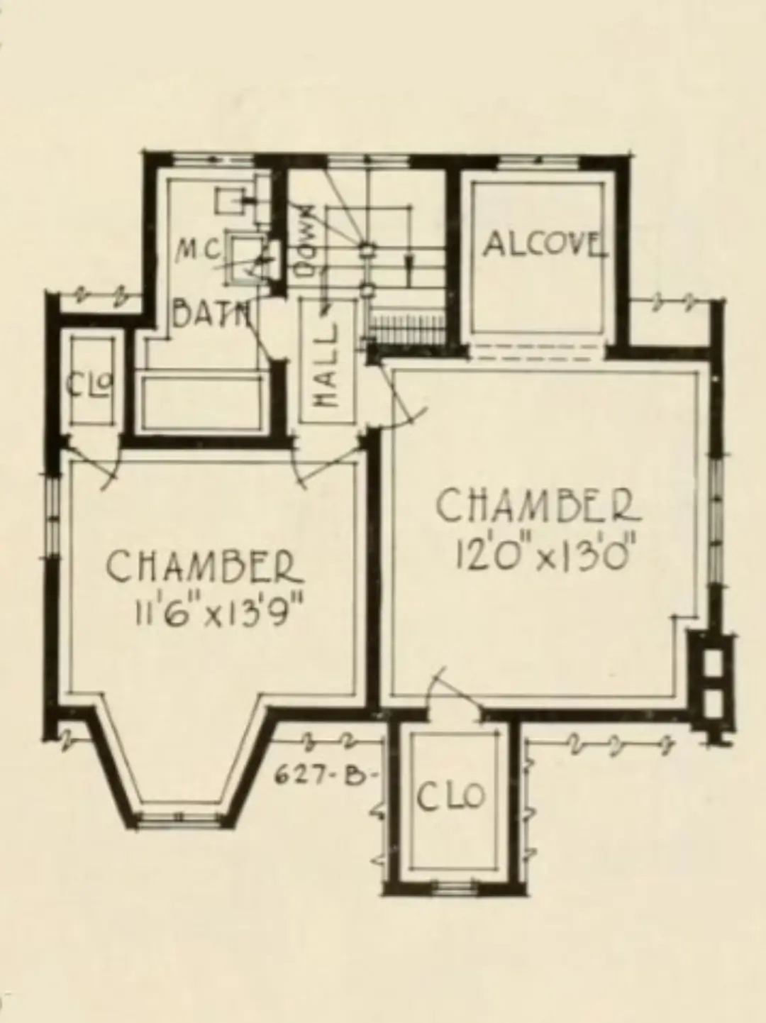
…for a small house, it ain’t bad.
The kitchen obviously needs to be brought into the 21st century, but it looks doable in the existing footprint. I’d also convert the alcove off the 2nd floor bedroom to an ensuite. It might be a little tight, but I’d make it work. Also, the third bedroom on the first floor would make an excellent office, study, or even a small media room.
0 comments
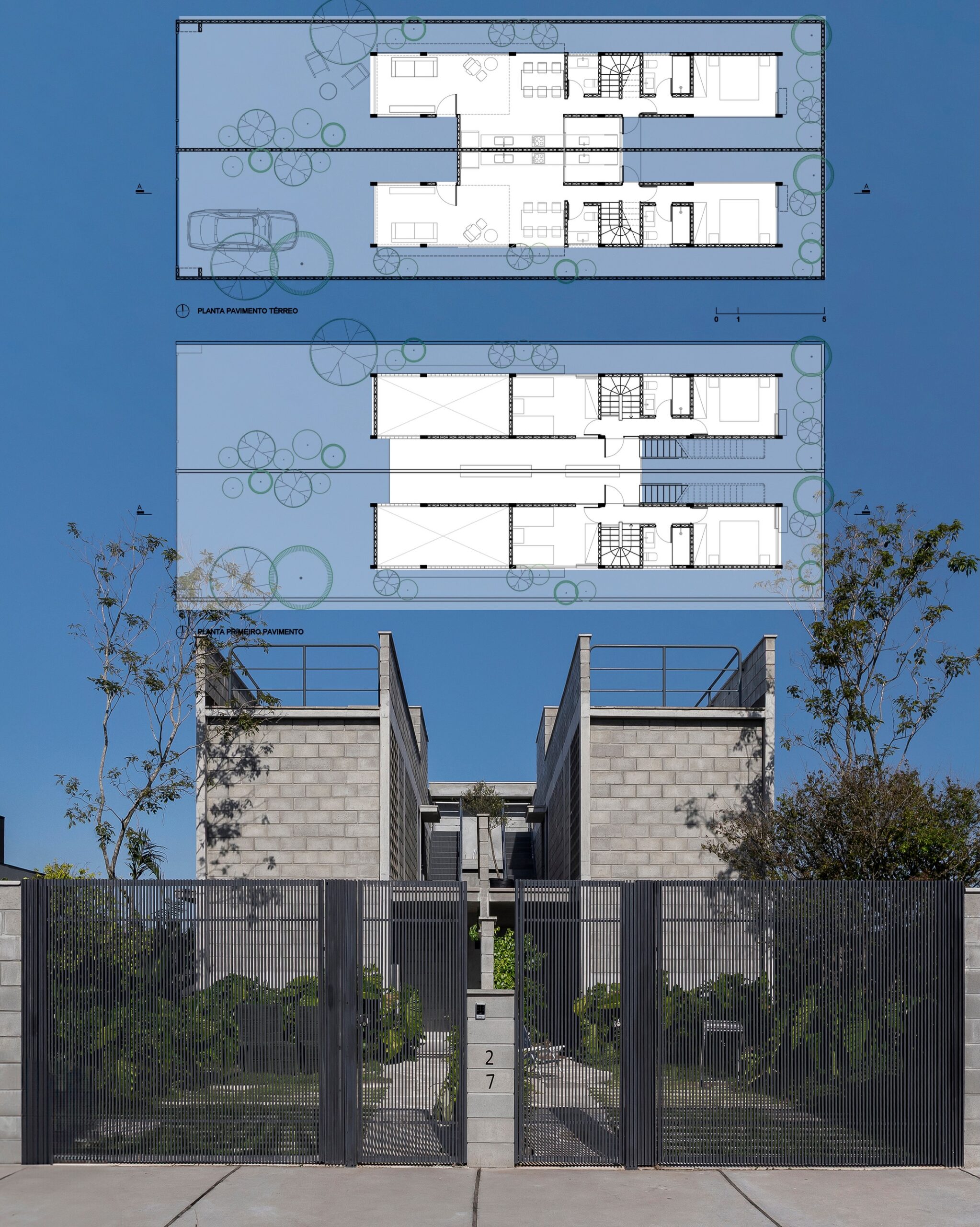
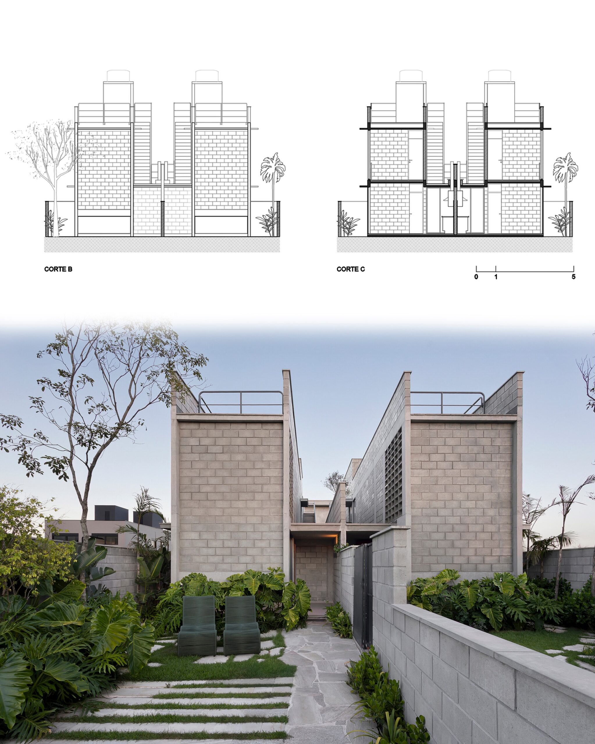
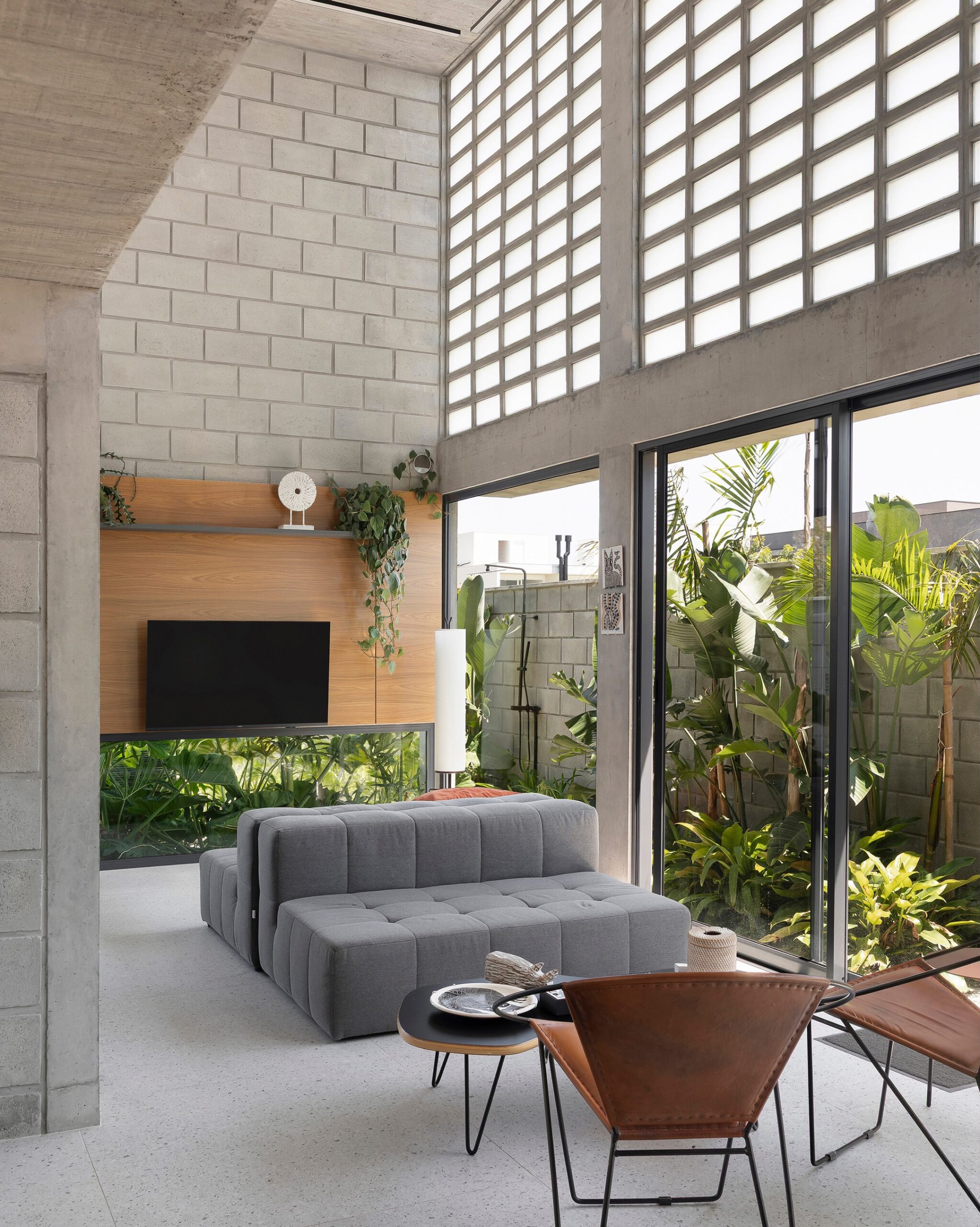
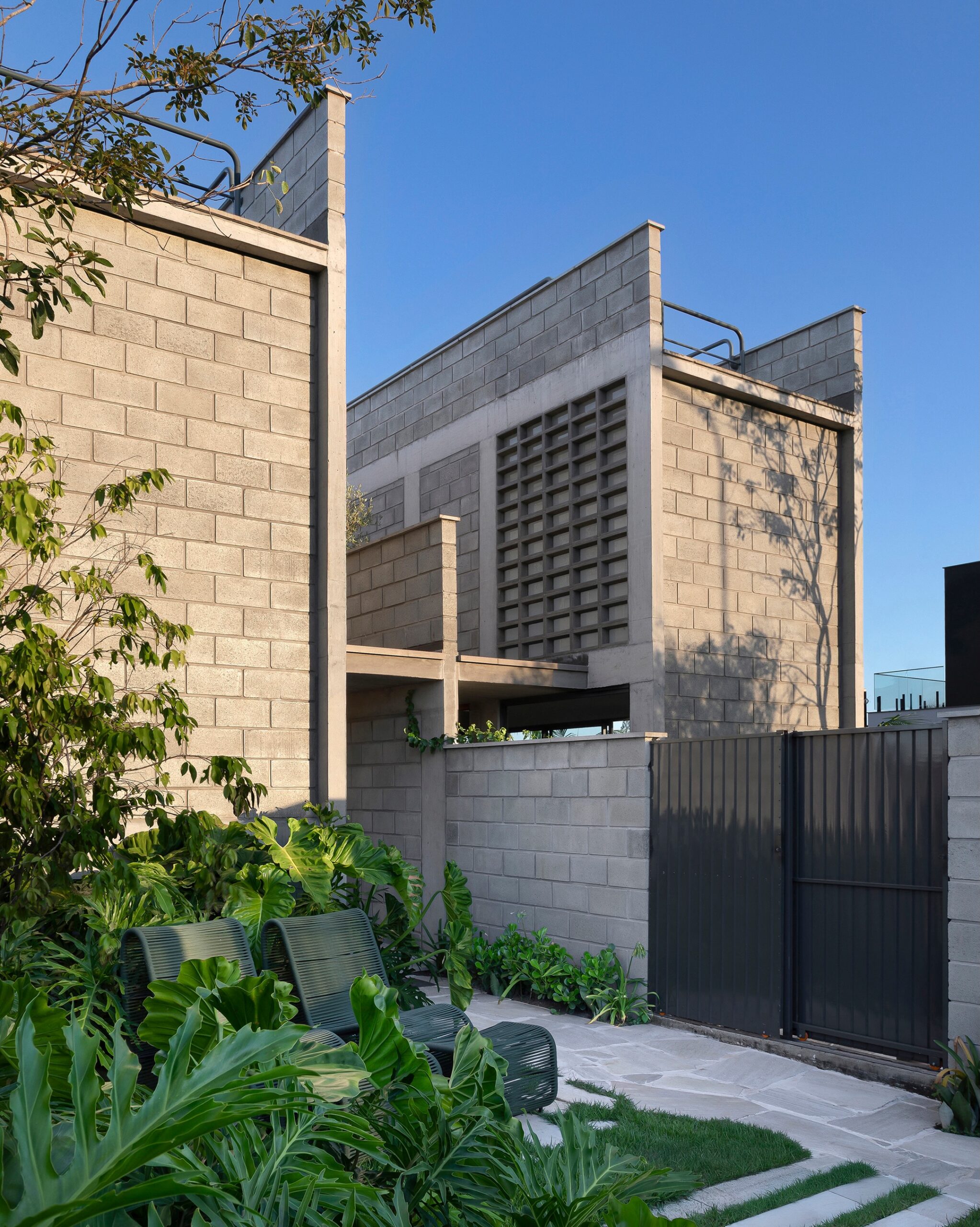
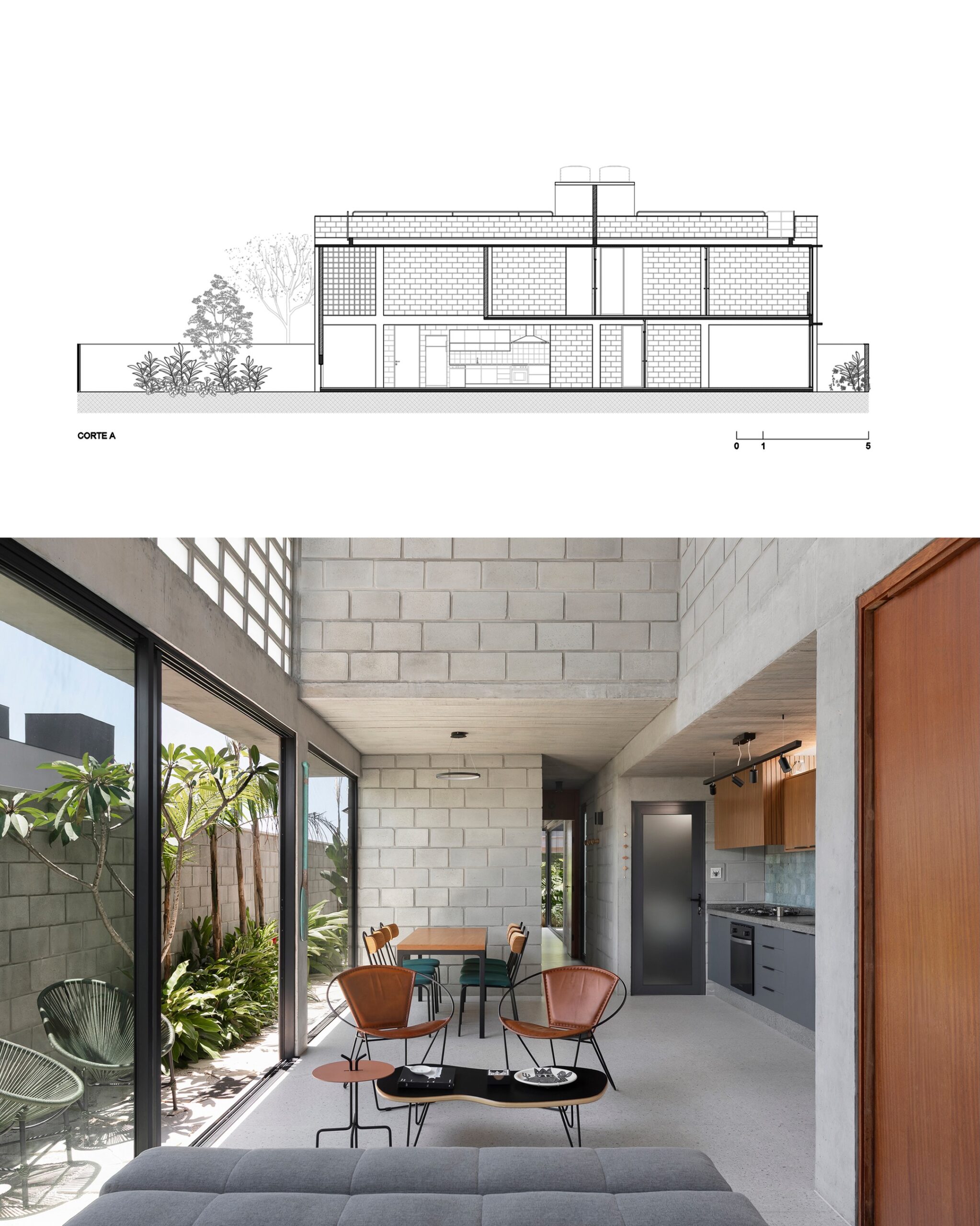
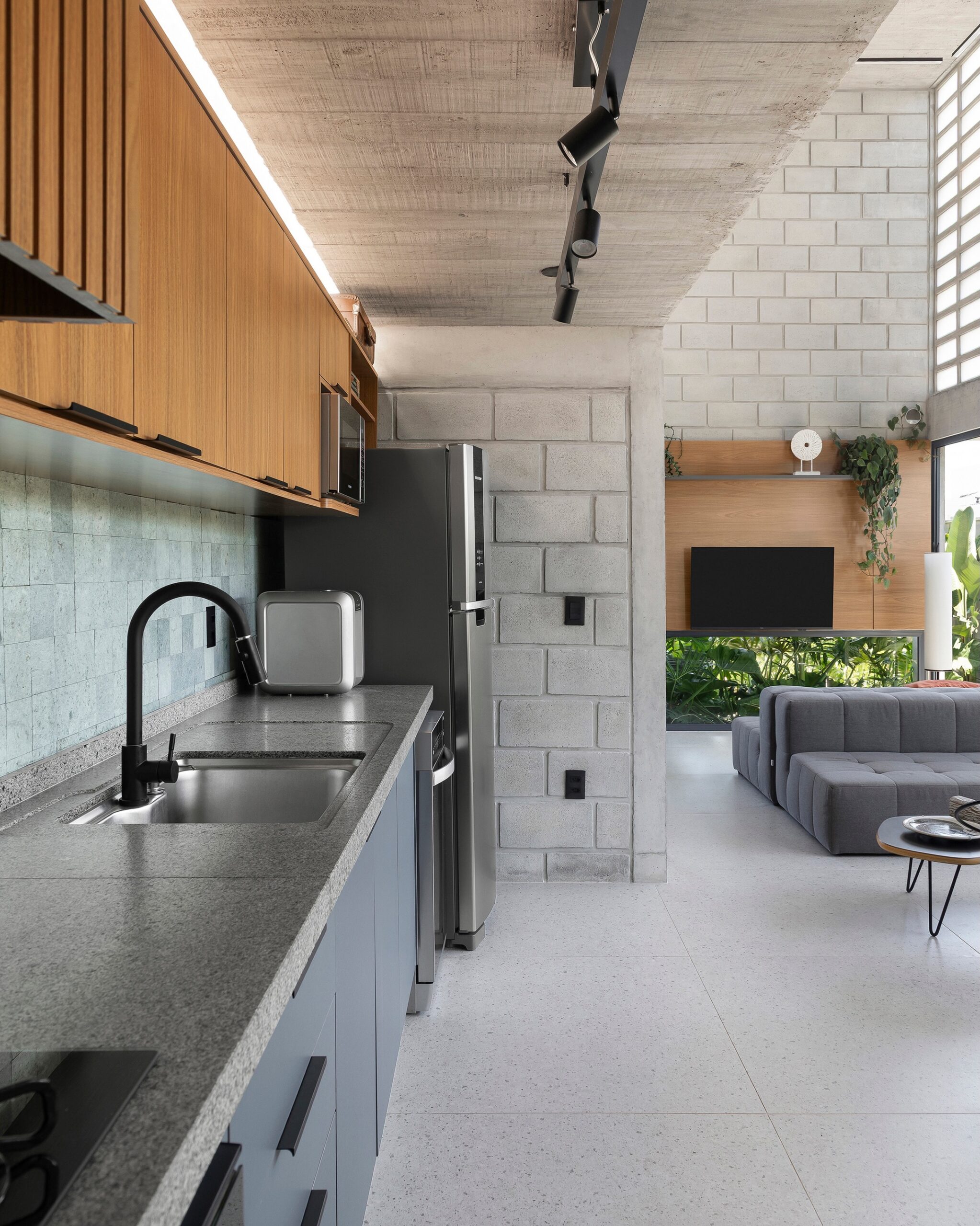
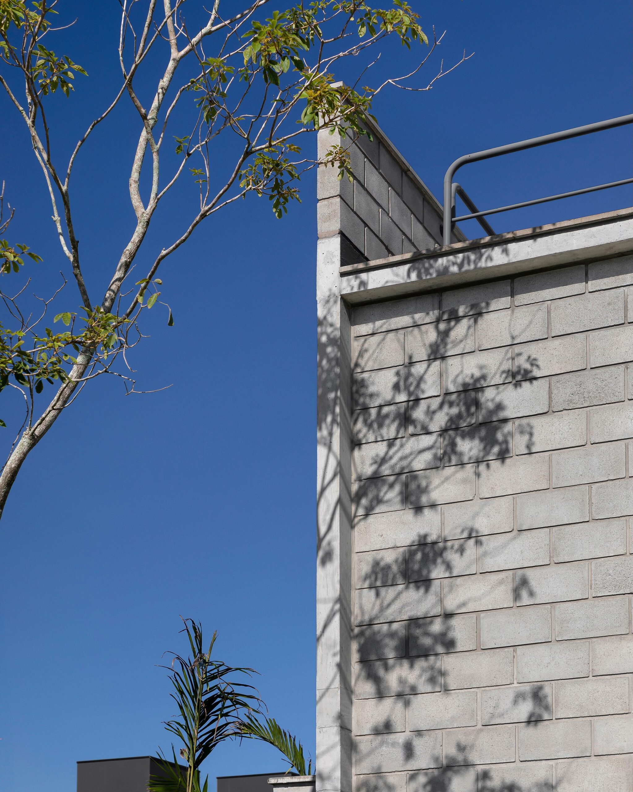
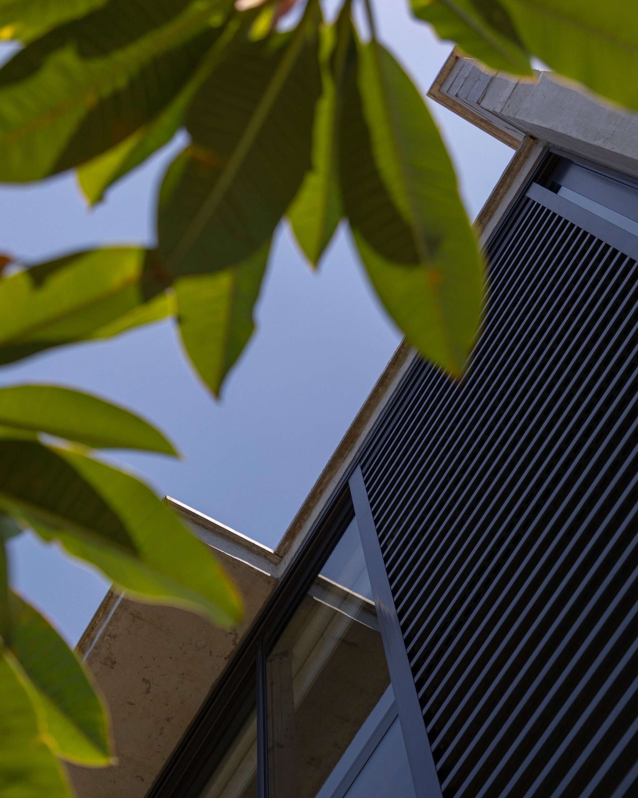
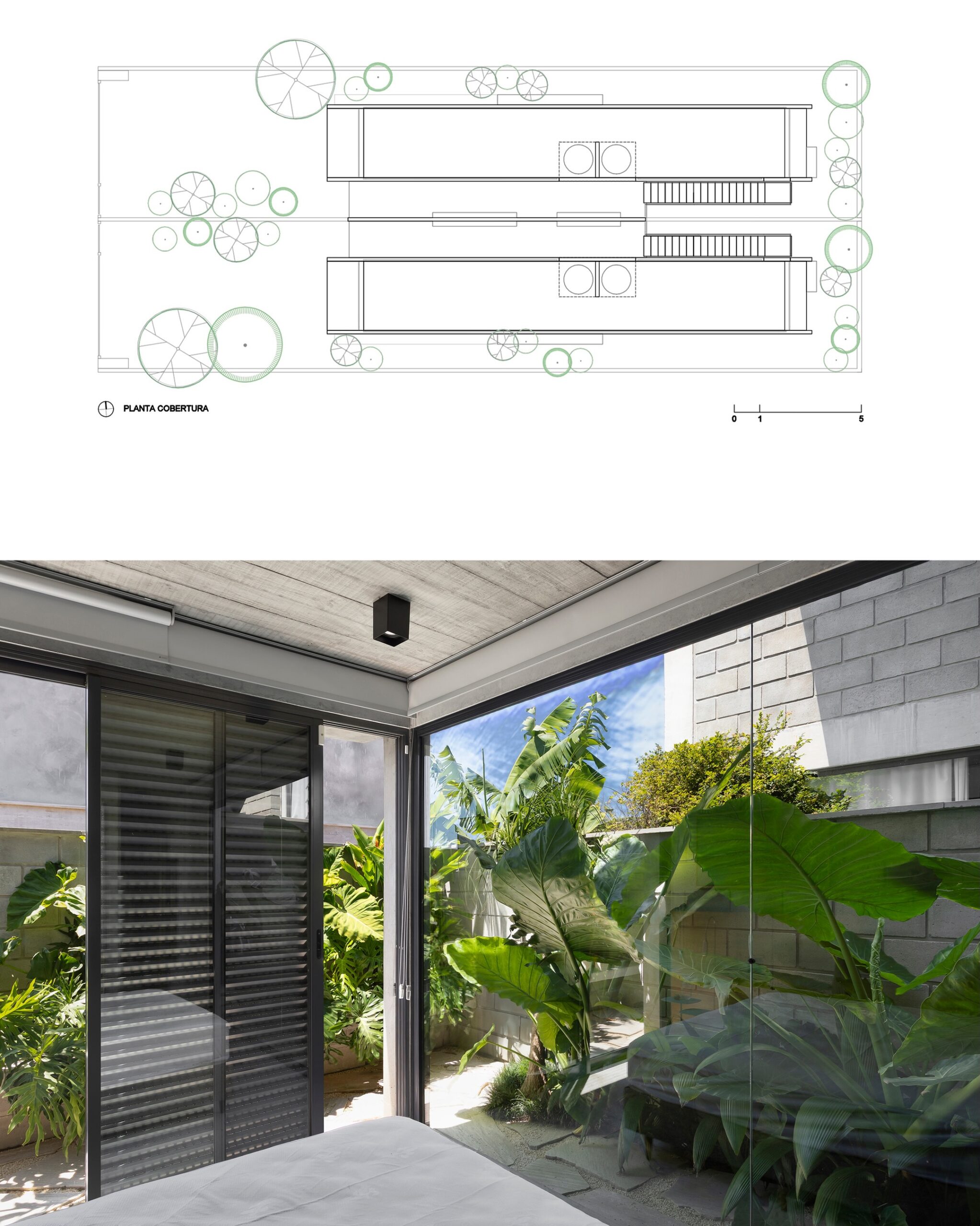
Campeche Houses / Terra e Tuma Associated Architects
Area: 230 m² (2475 ft² )
Photographs: Débora Jank
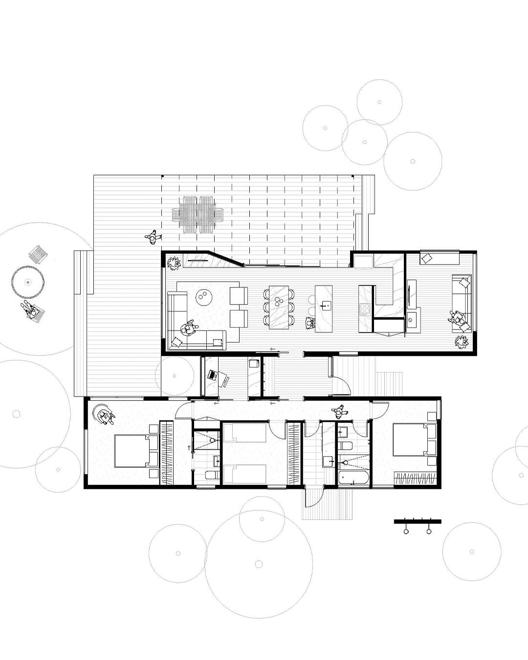
Two friends and a shared plan: to build their homes in Florianópolis. The choice of a shared plot of land in Praia do Campeche was not only pragmatic but also symbolic. The challenge then arose of designing two independent residences on the same lot , without losing sight of the autonomy of each—nor the possibility of a closer, almost communal, coexistence.The plot, measuring 12 meters wide by 30 meters deep, was divided in half and subjected to the regulations, resulting in a buildable area of only 4.5 meters by 19 meters for each house. This spatial constraint guided the project, influencing decisions regarding site placement, construction system, and internal organization. The house emerges from the boundary—and responds to it with intelligence and precision.The result is a vertical and permeable architecture. On the ground floor, the double-height living area and large openings ensure cross-ventilation and natural light, blurring the boundaries between interior and exterior. The master suite faces the rear, with direct access to the garden. Upstairs, two bedrooms complete the layout.The houses form an architectural ensemble that fosters respectful coexistence among neighbors who are also friends, without sacrificing privacy. There is a delicate balance between the common and the individual—an architectural gesture that, in the end, translates not only a way of living, but a way of relating to one another.
[source]
I don’t hate it, and I actually love the airy living/dining/kitchen space, but I definitely would plaster all that exposed concrete block. I’ve never been a fan of naked block, and in this house it seems excessive.
7 comments
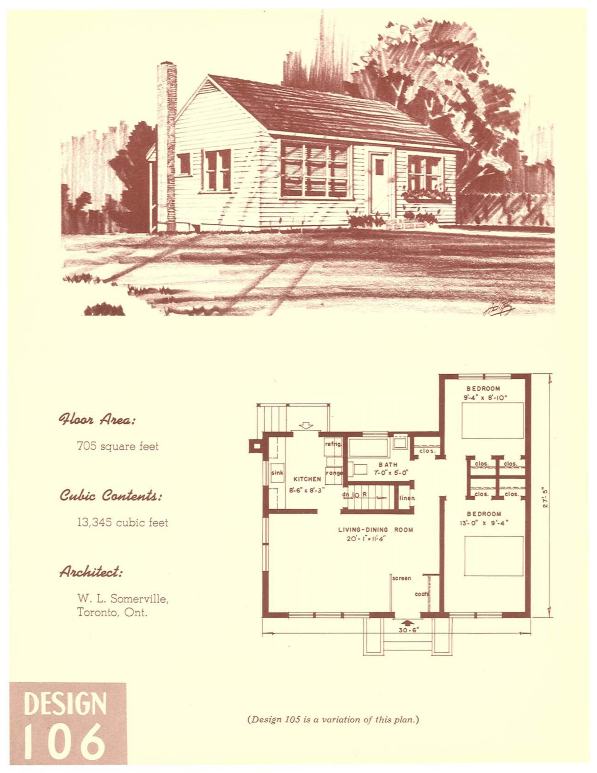
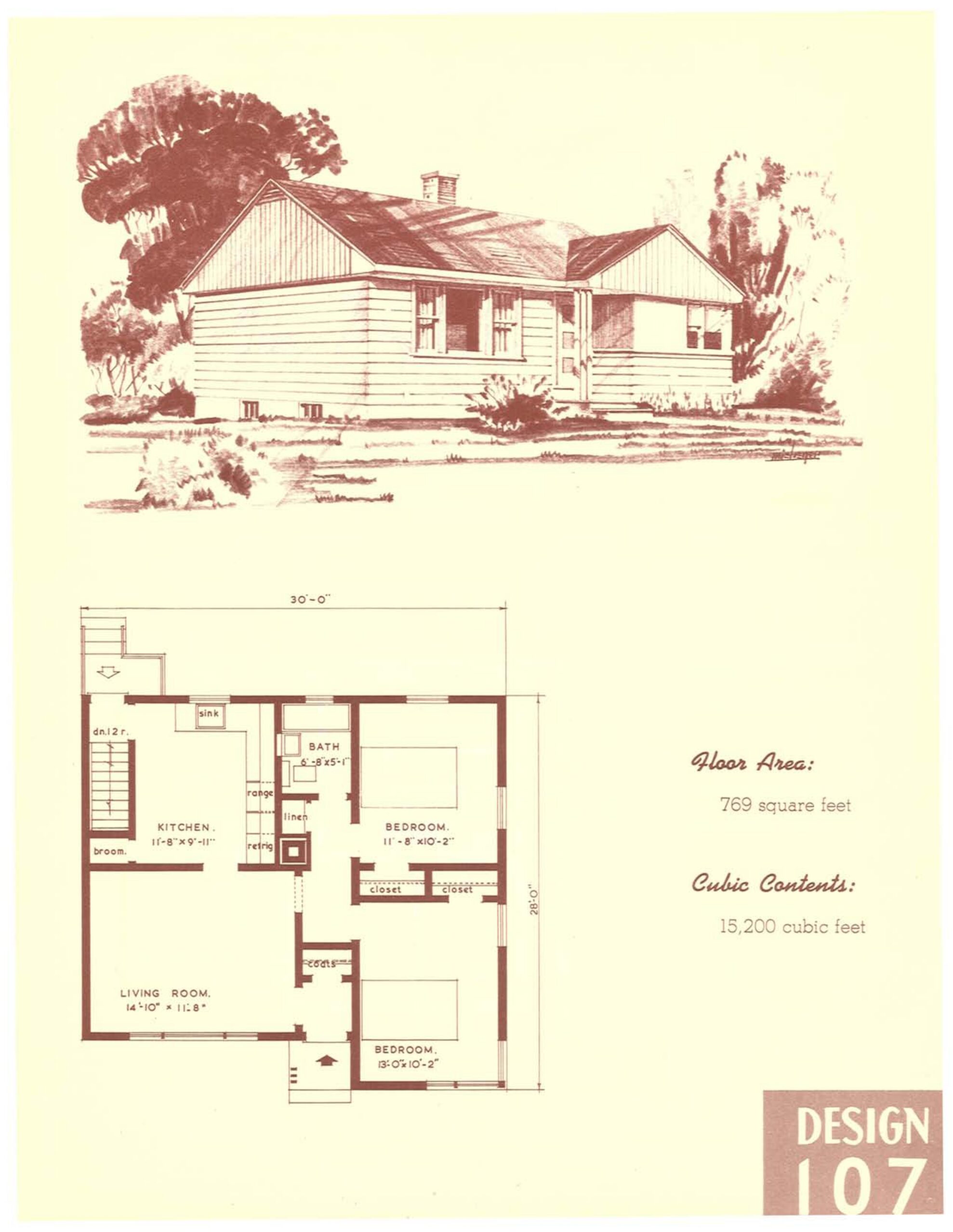
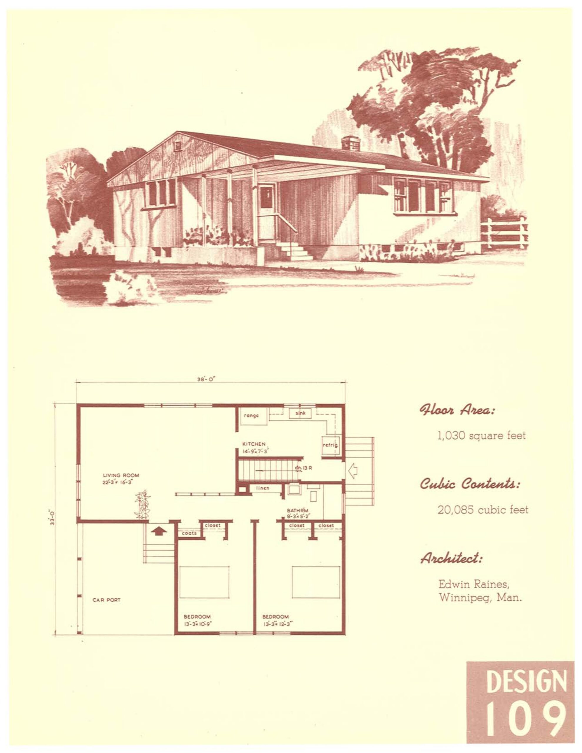
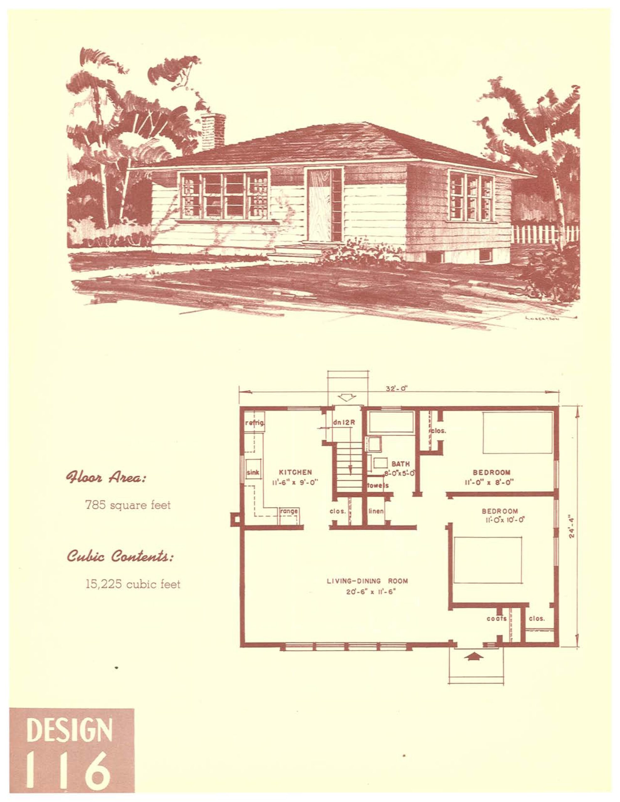
You know, living simply with less?
Why does all new construction have to be a McMansion with a three car garage?
3 comments
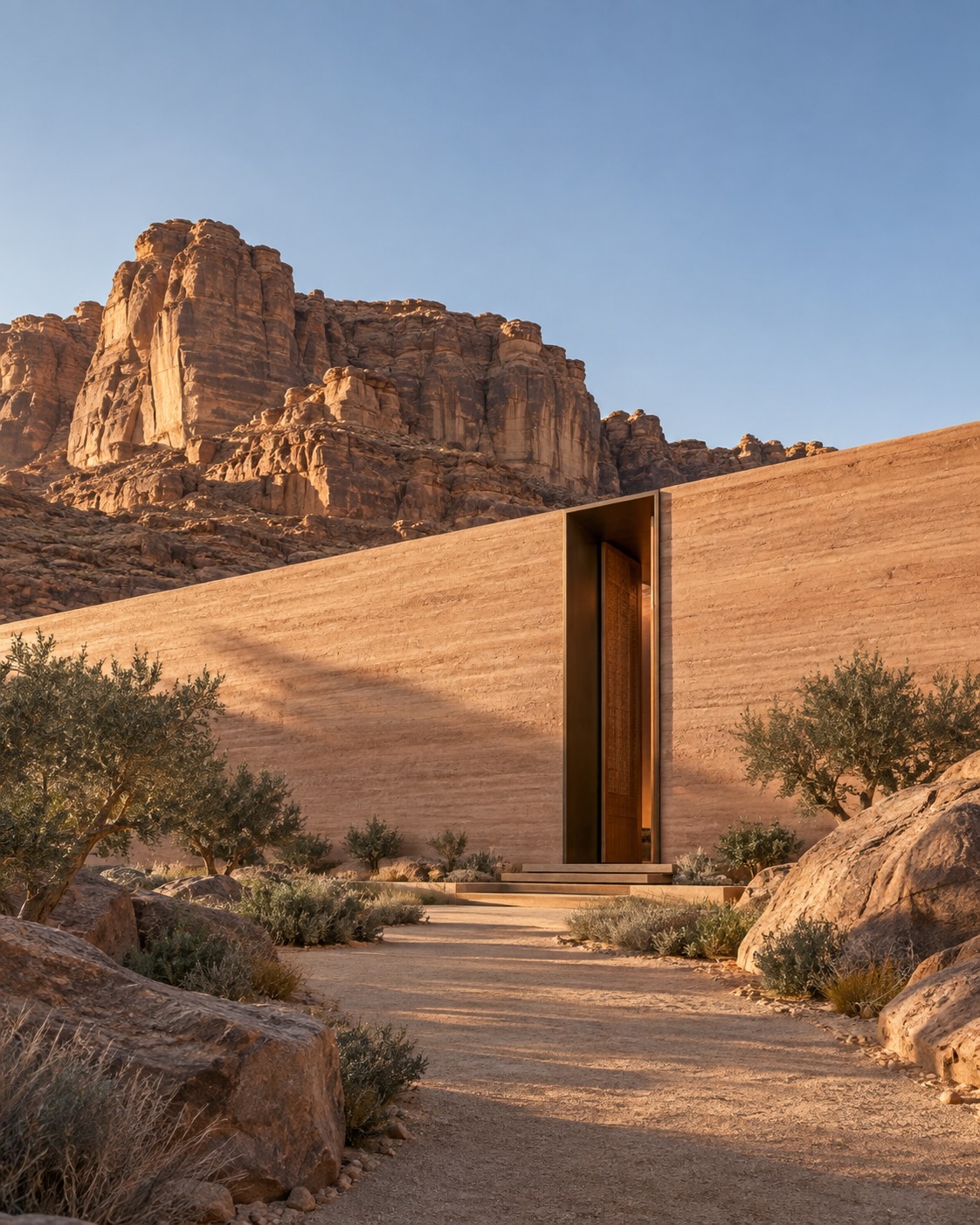
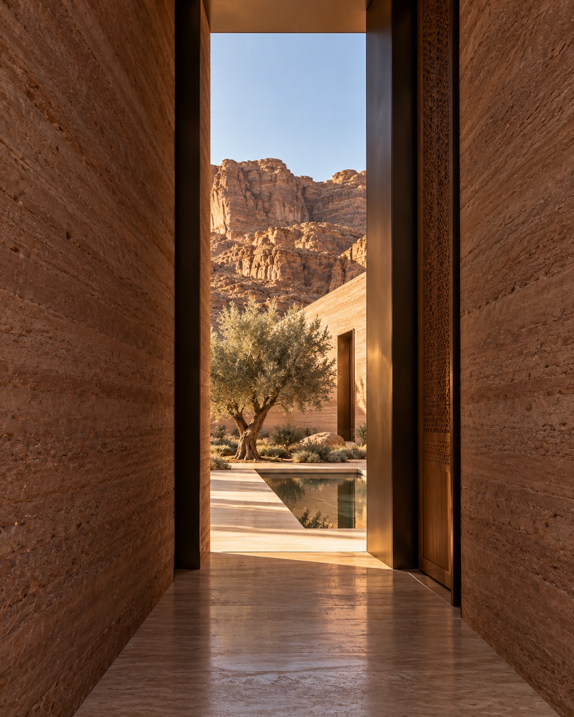
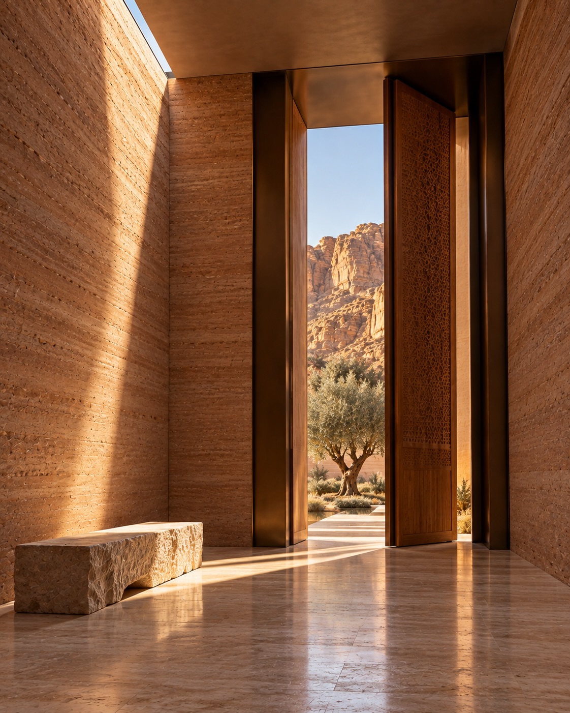
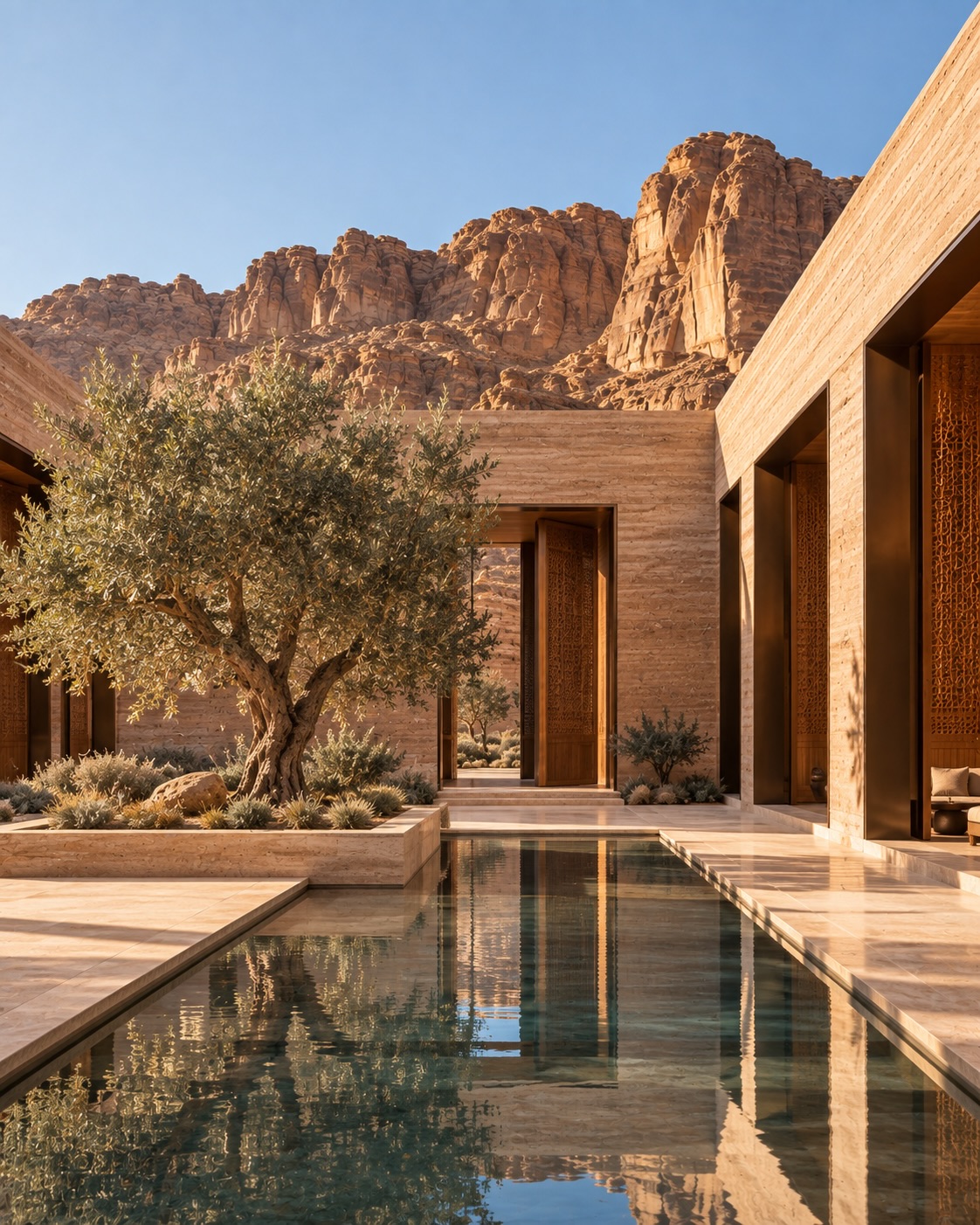
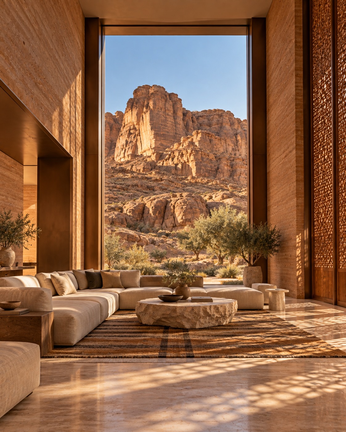
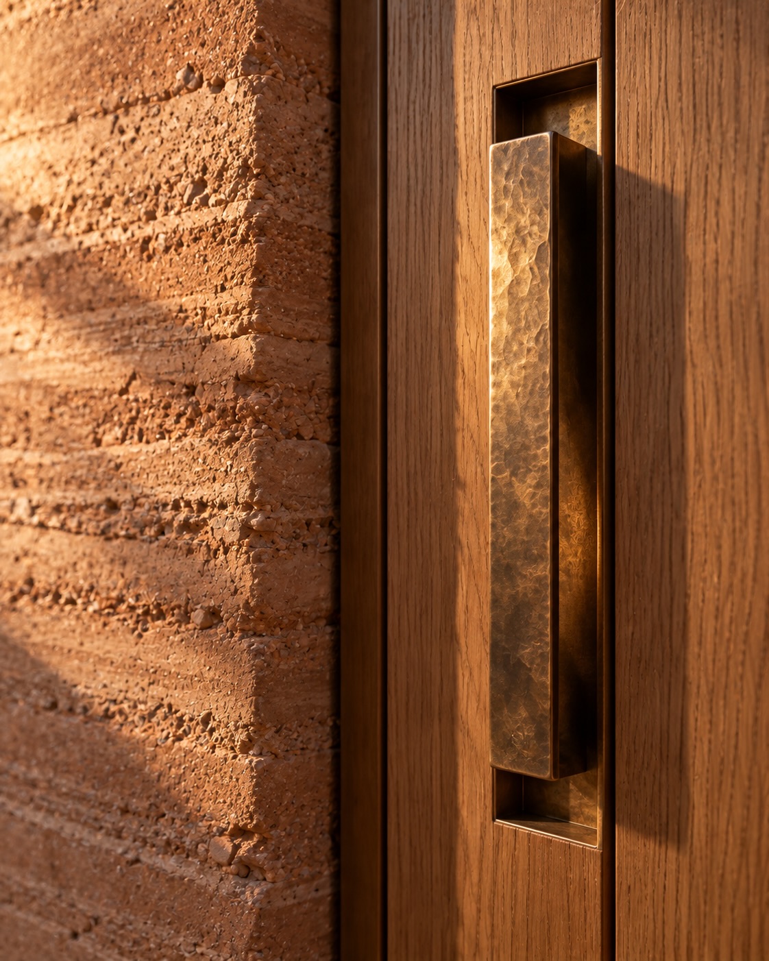
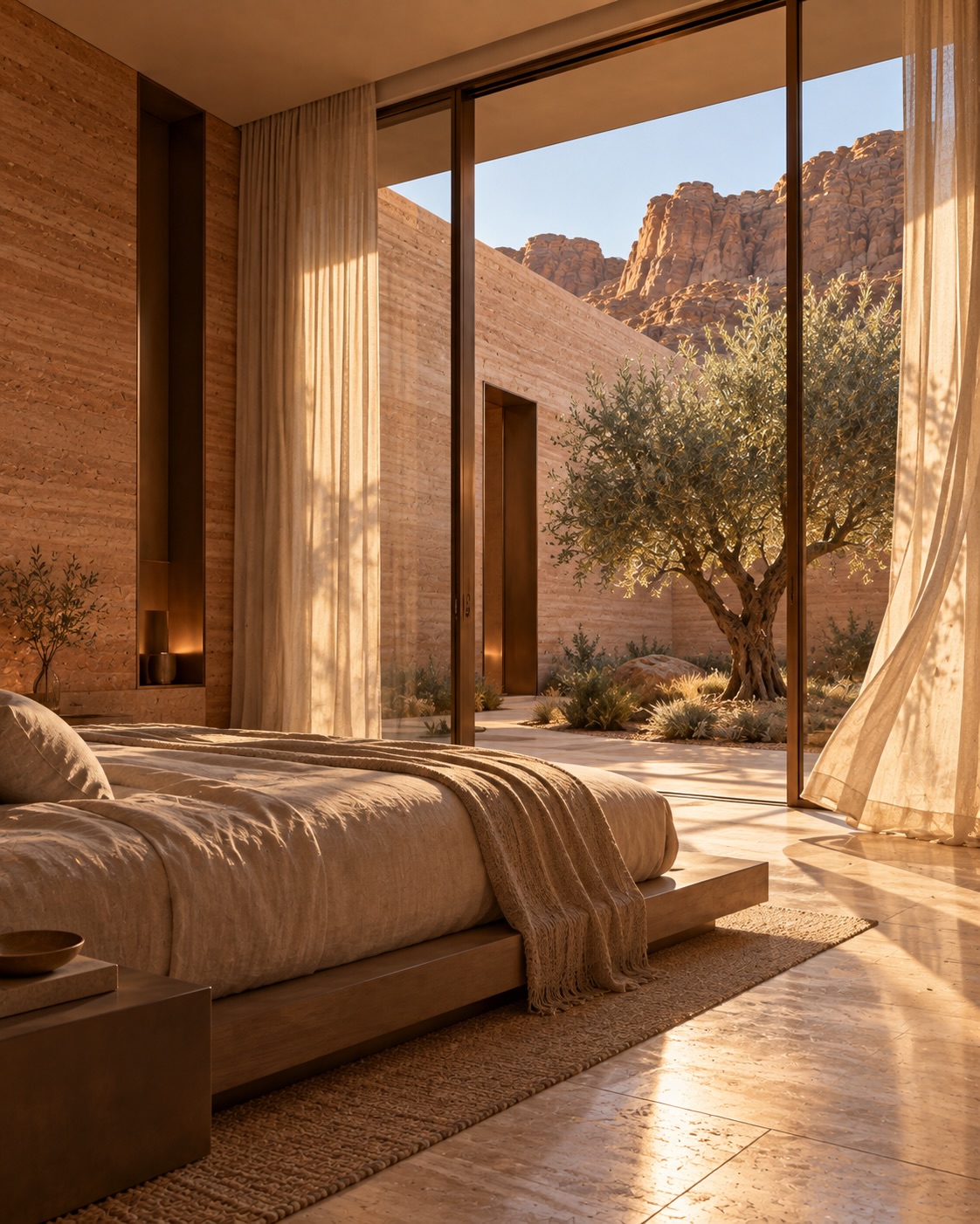
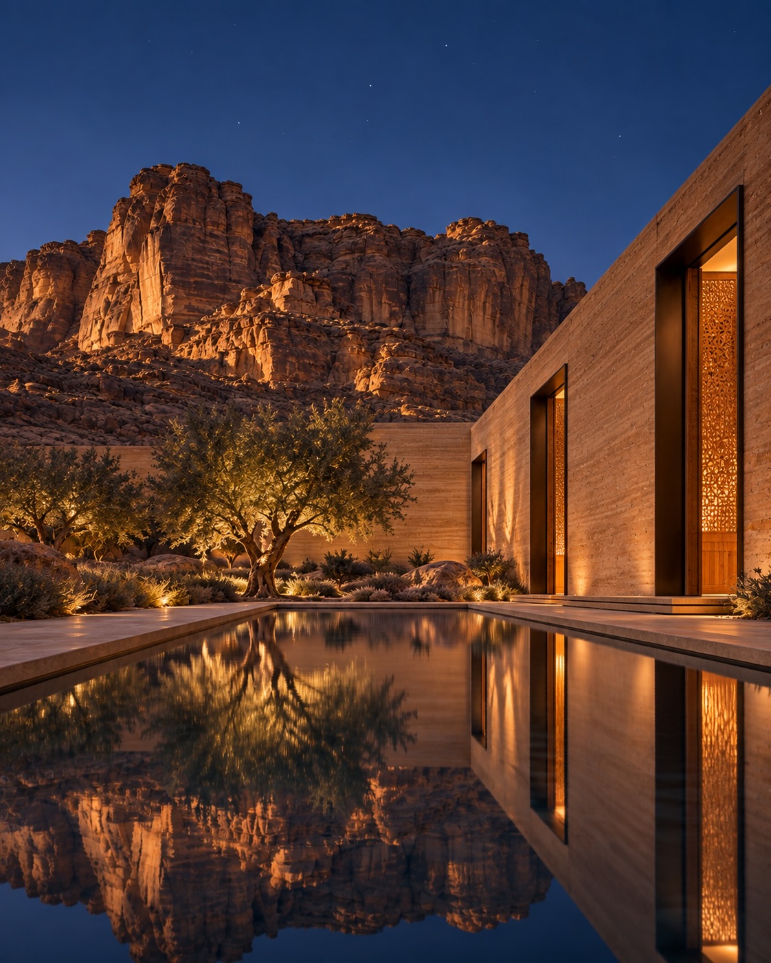
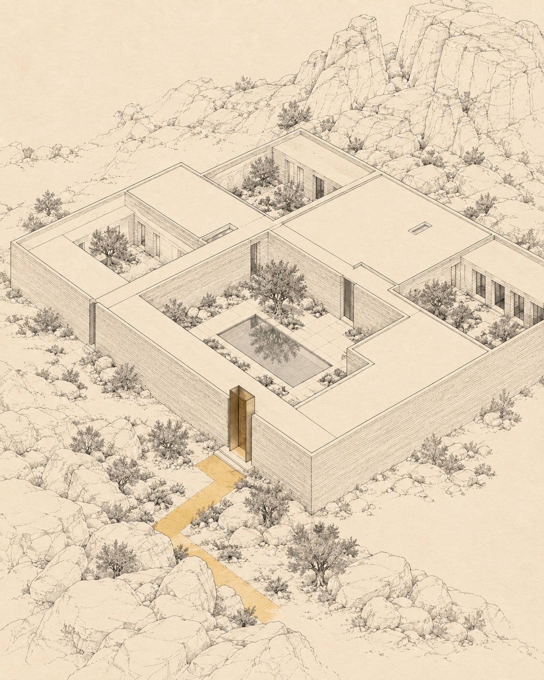
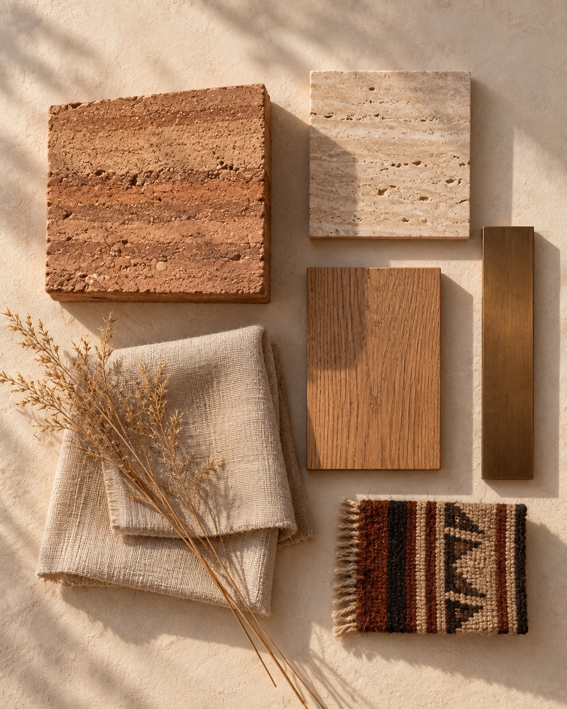
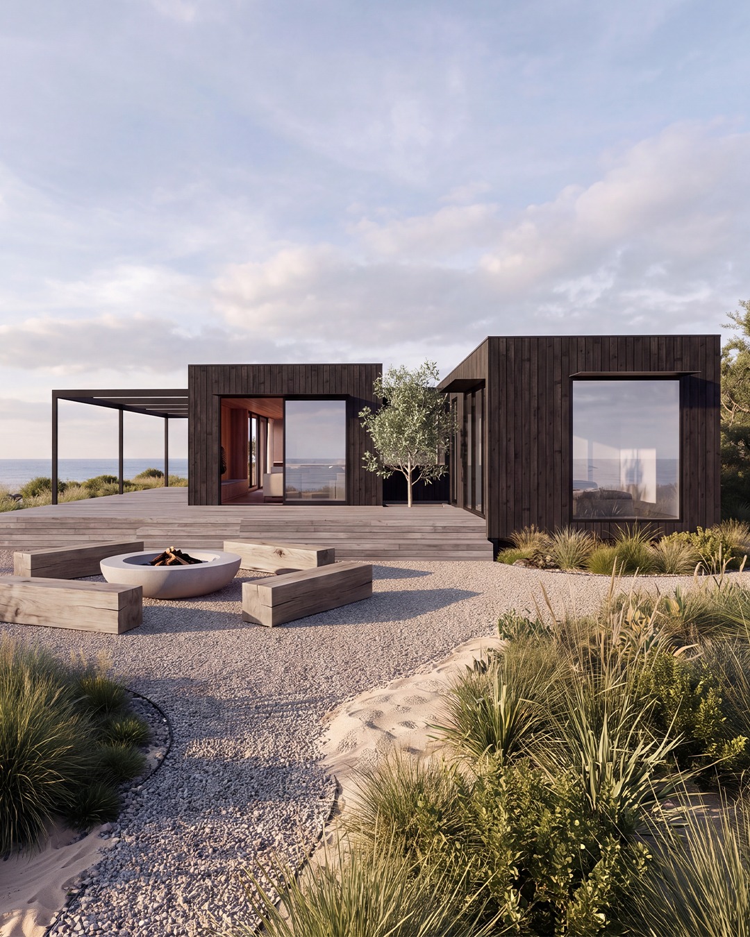
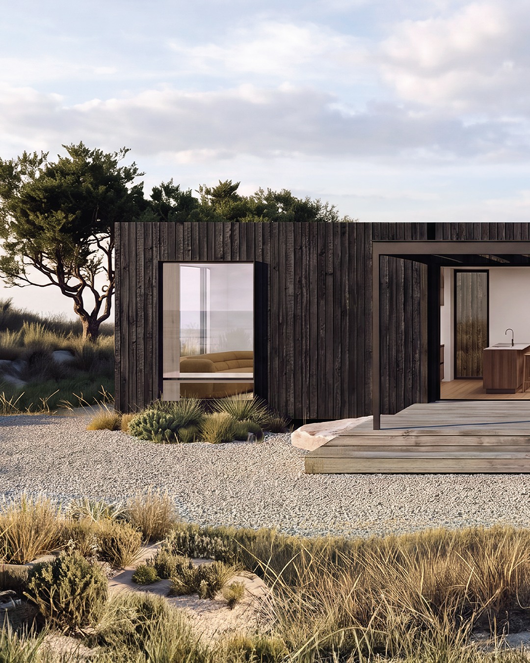
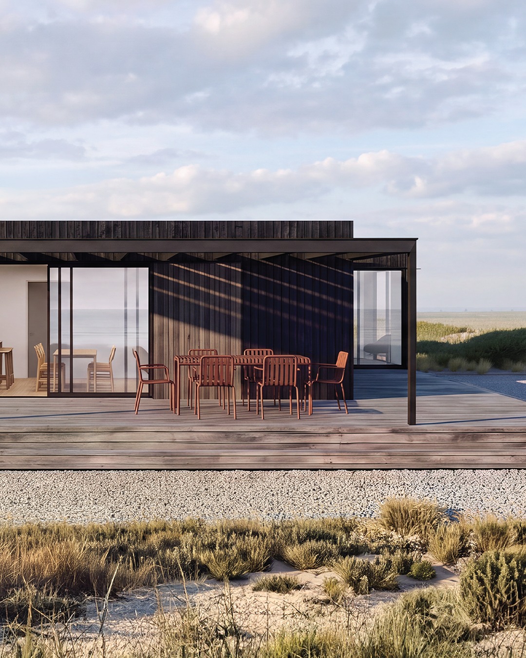
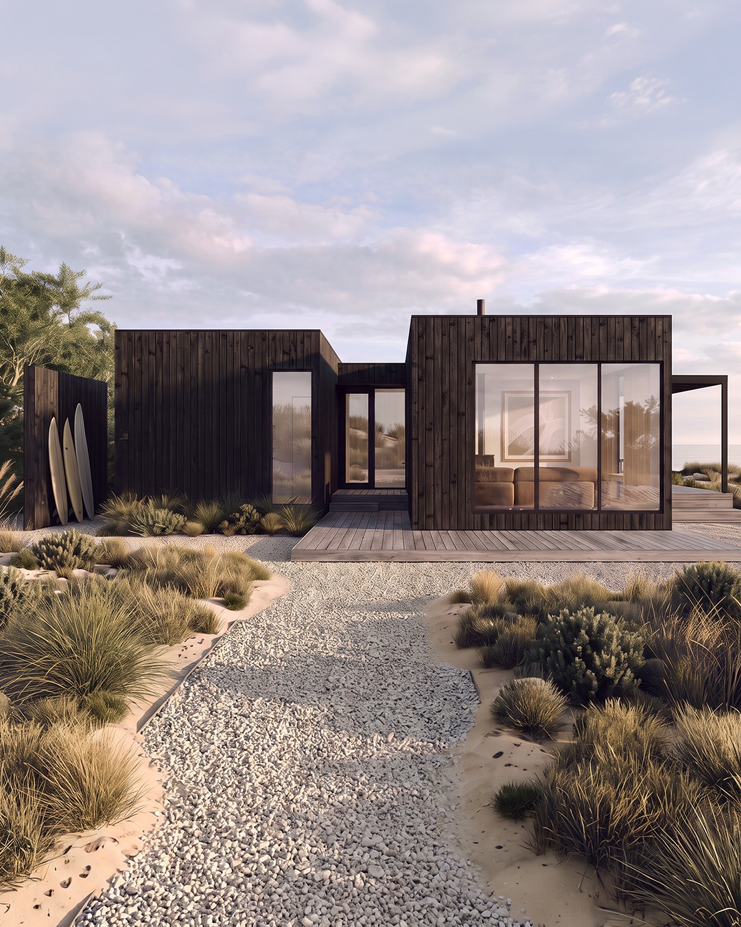
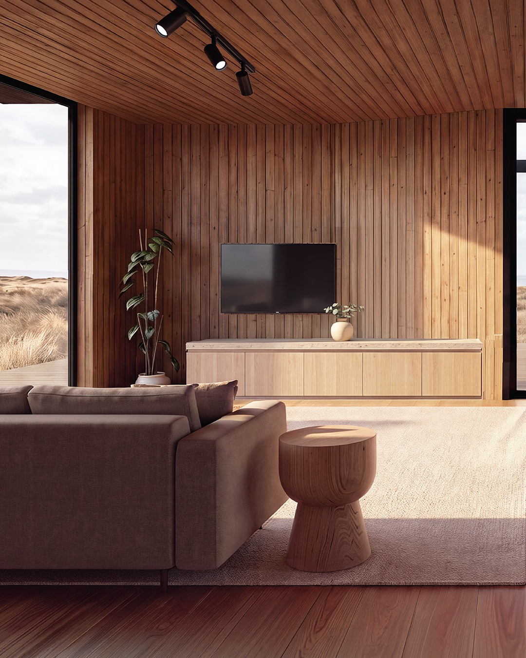
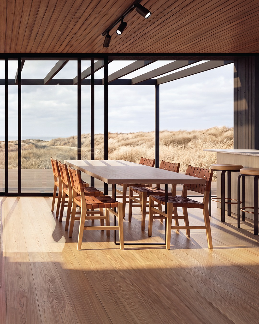
Yeah, it’s AI generated and the architects readily admit it’s not a real project yet. But I love setting and choice of materials. I could live there. I just wish they’d published a floor plan.
0 comments
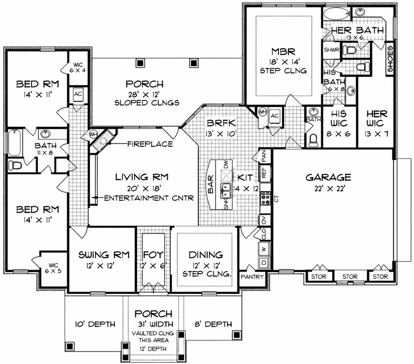
Not to mention a “Swing Room.”
I am assuming that’s Sewing Room and not…

But I could be wrong.
4 comments
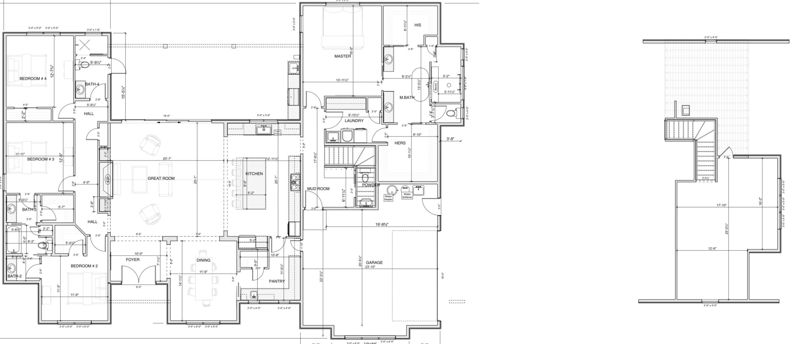
If you need not one, but two walk-in closets in the Master Suite (one of which being approximately 100 square feet) maybe—just maybe—you have too many clothes and should consider donating to those in need.
3 comments
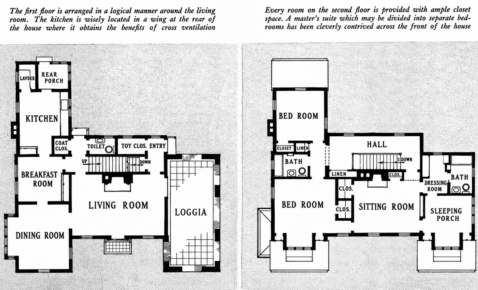
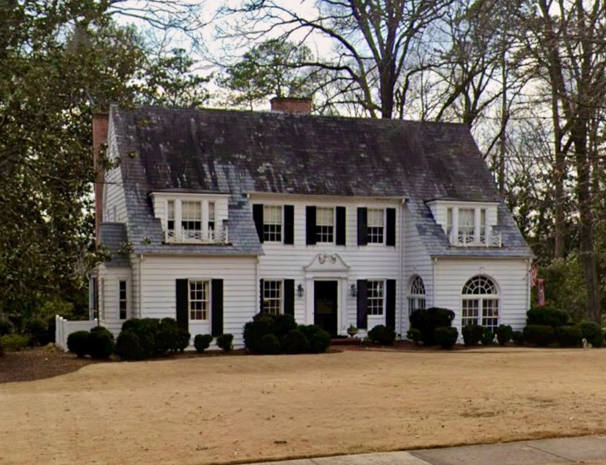
I’m assuming that since there’s no Laundry Room one could convert the rear porch.
I’d move the wall between the Breakfast Room and Dining Room further into the Dining Room and close off the doorway between the two spaces. I’d then make the Dining Room into a home office or Media Room. I’d put a wide doorway between the former Breakfast Room and Living Room and convert that space into the Dining Room.
Upstairs, I’d convert the Sitting Room into a proper bedroom, close it off from the bedroom on the left, and extend those closets to the outer wall. I realize you’d lose the perfectly symmetrical windows upstairs but I’m sure there would be some workaround to that. I don’t have an issue with the Sleeping Porch, although I’d convert that to a Master Suite Retreat
2 comments
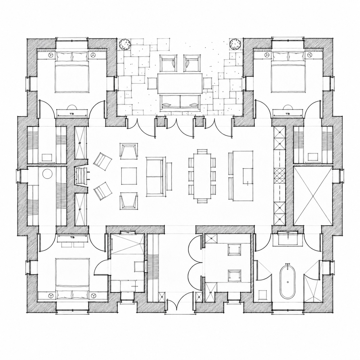
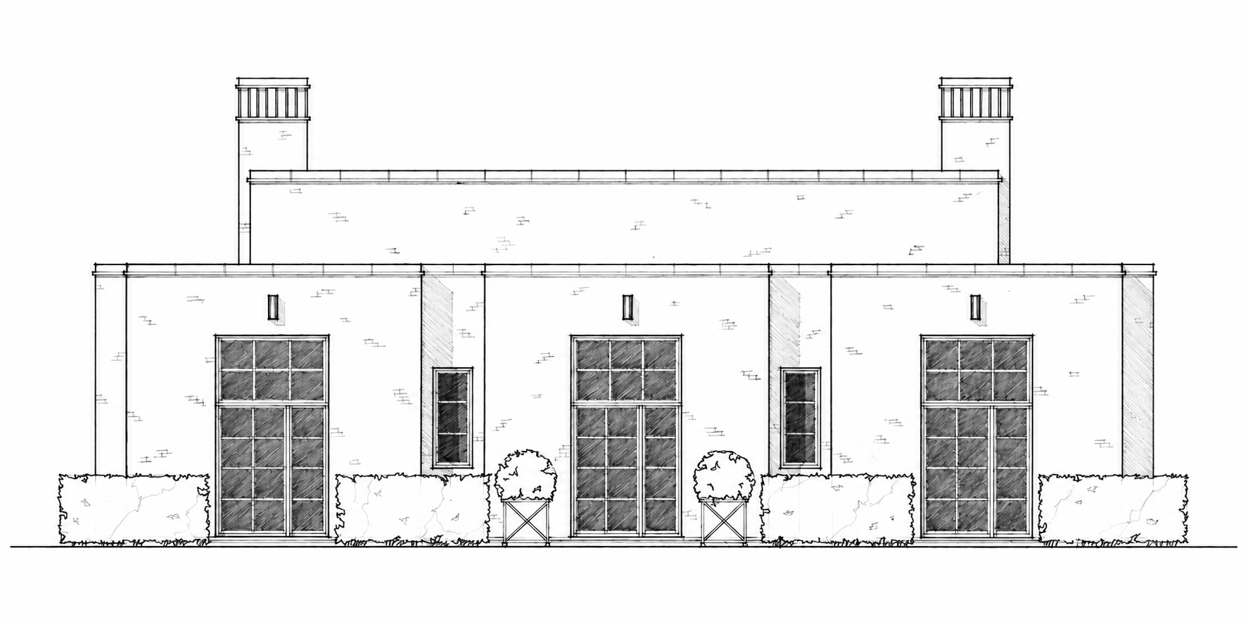
But I still like it!
But I don’t understand why there is such an opulent bathroom in the lower right corner that isn’t connected to a master suite. I also don’t understand the purpose of the empty room connected to said bathroom. Utility/Laundry Room?
4 comments
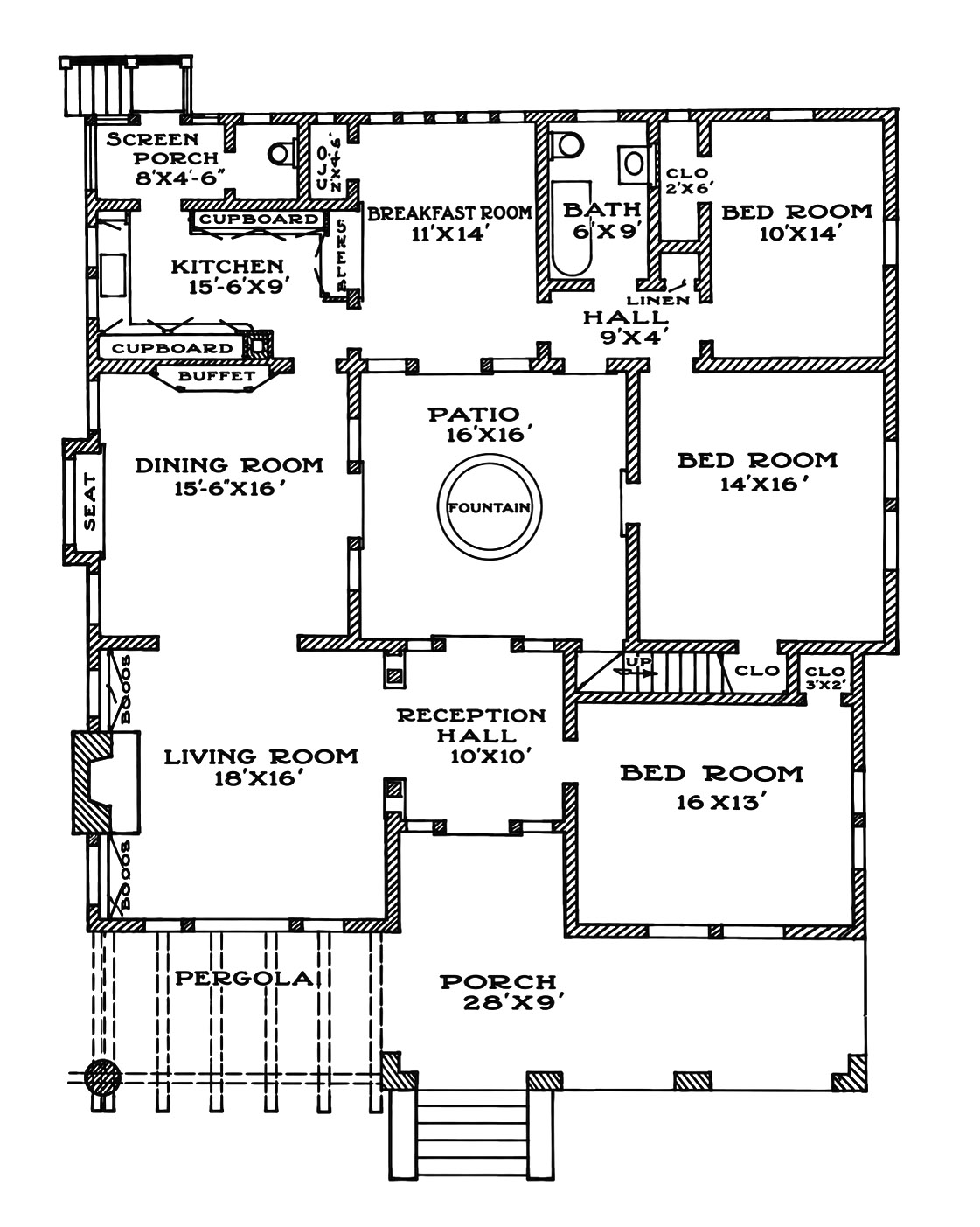
I’d open up the kitchen to the Dining Room. I’d either seal off the Breakfast Room completely to use as an office or leave it open and make it a media room. In the front, I’d get rid of the stair/closet (and make that second floor tower strictly a decorative feature) and push that wall further into the bedroom to make room for a bath and walk-in closet. I’d add a closet for the second bedroom between the it and the corner bedroom.
4 comments
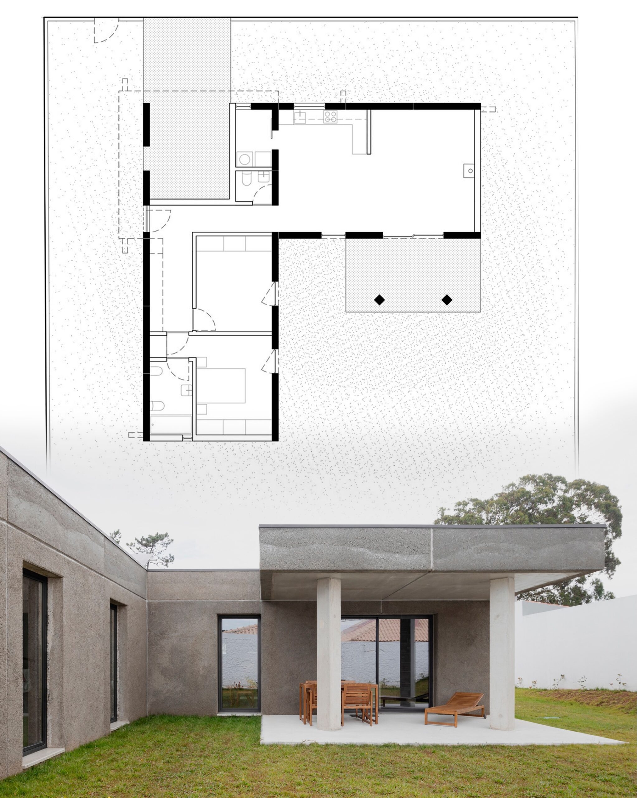
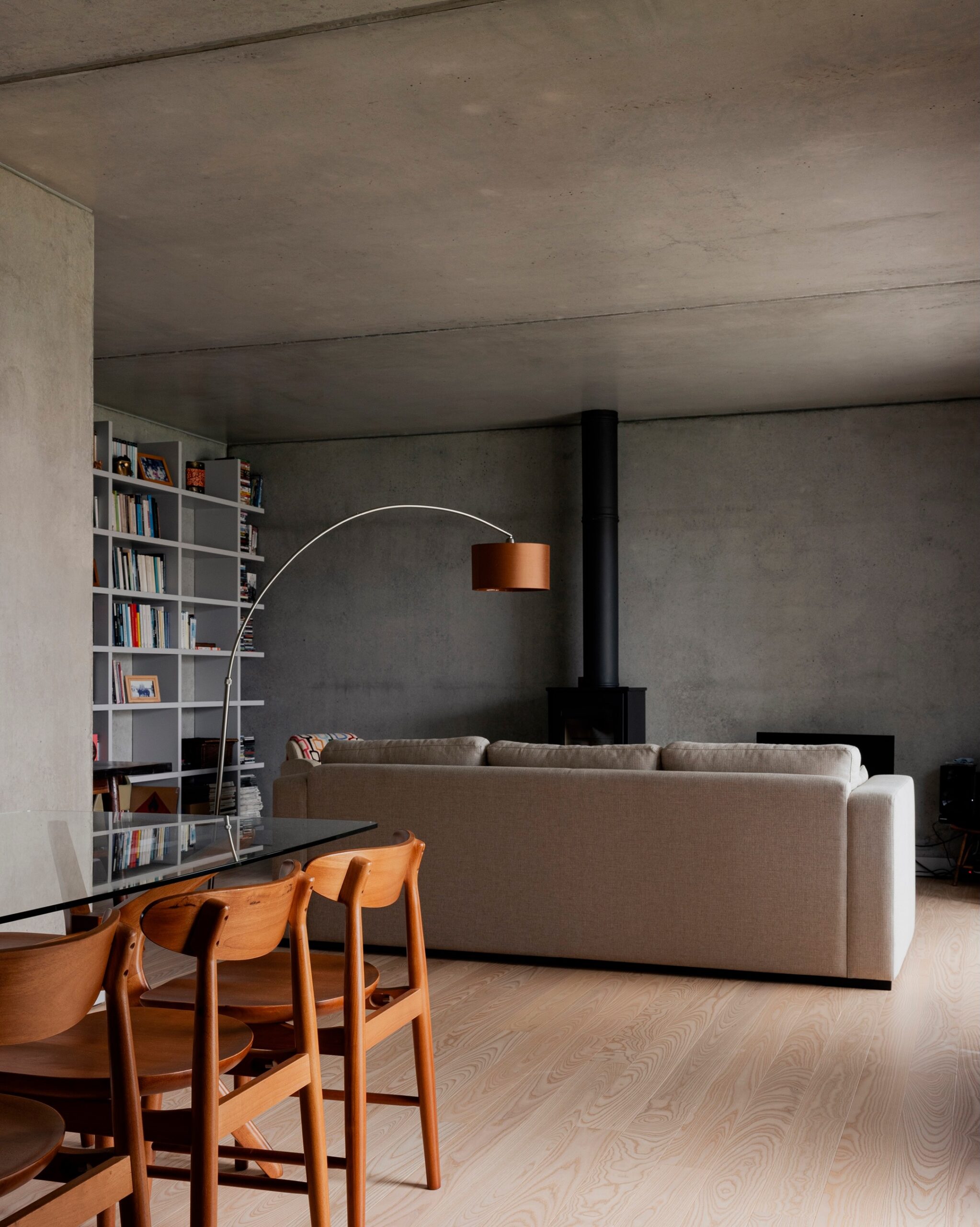
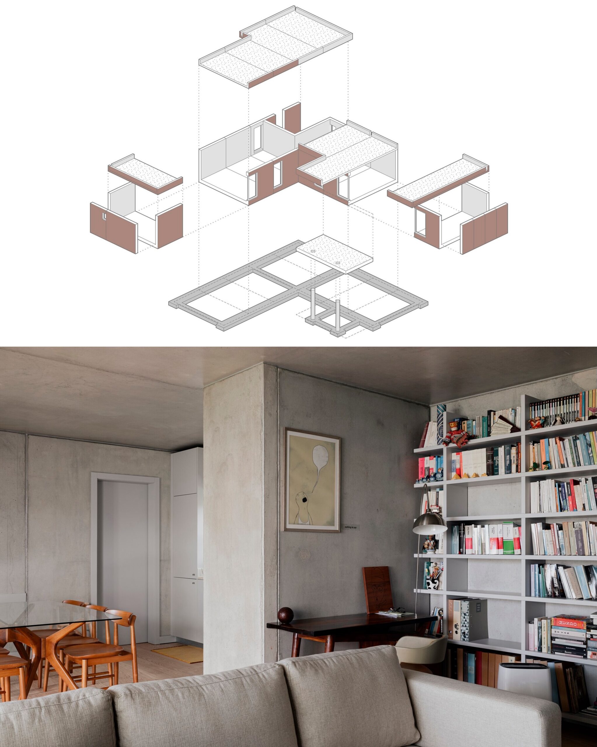
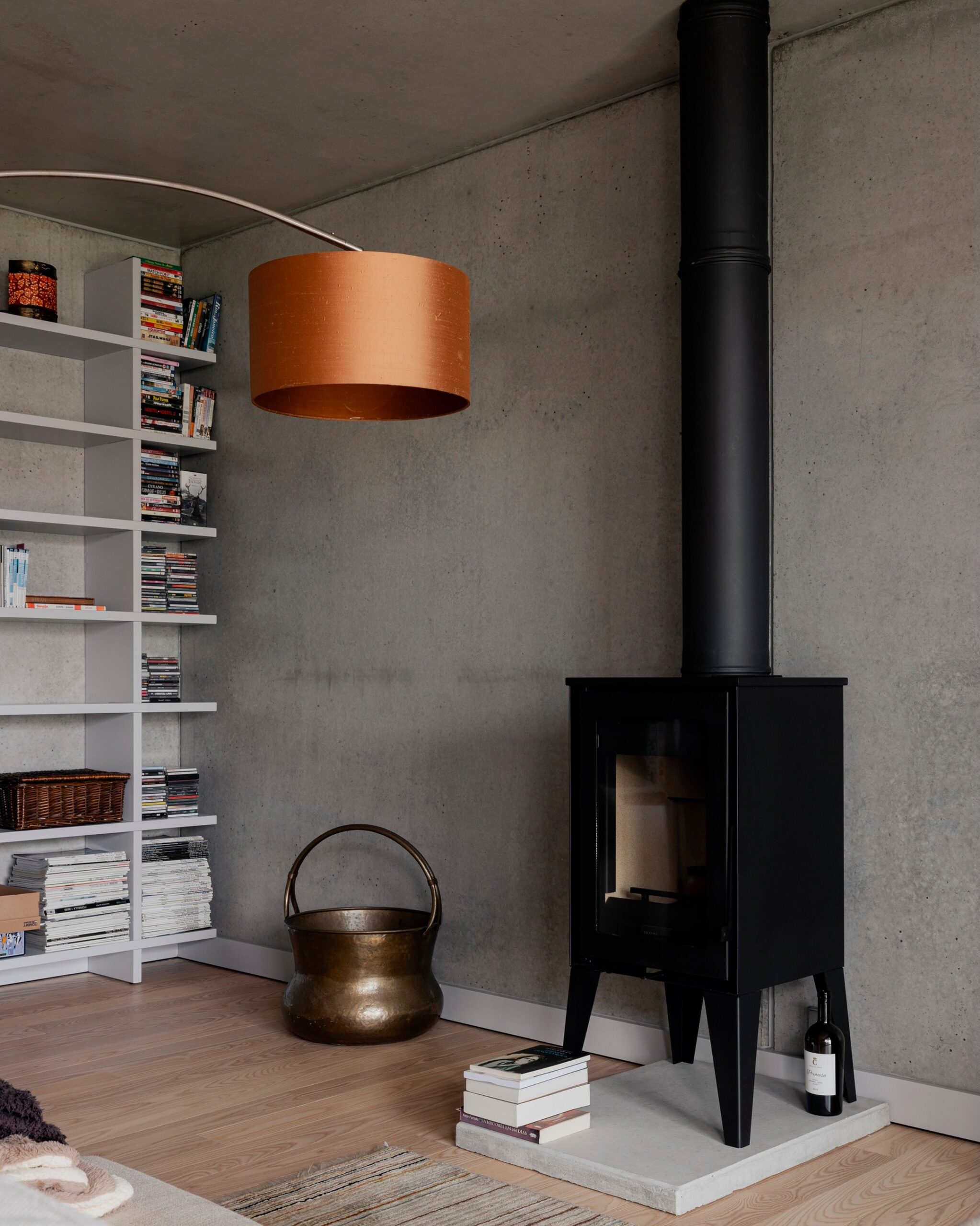
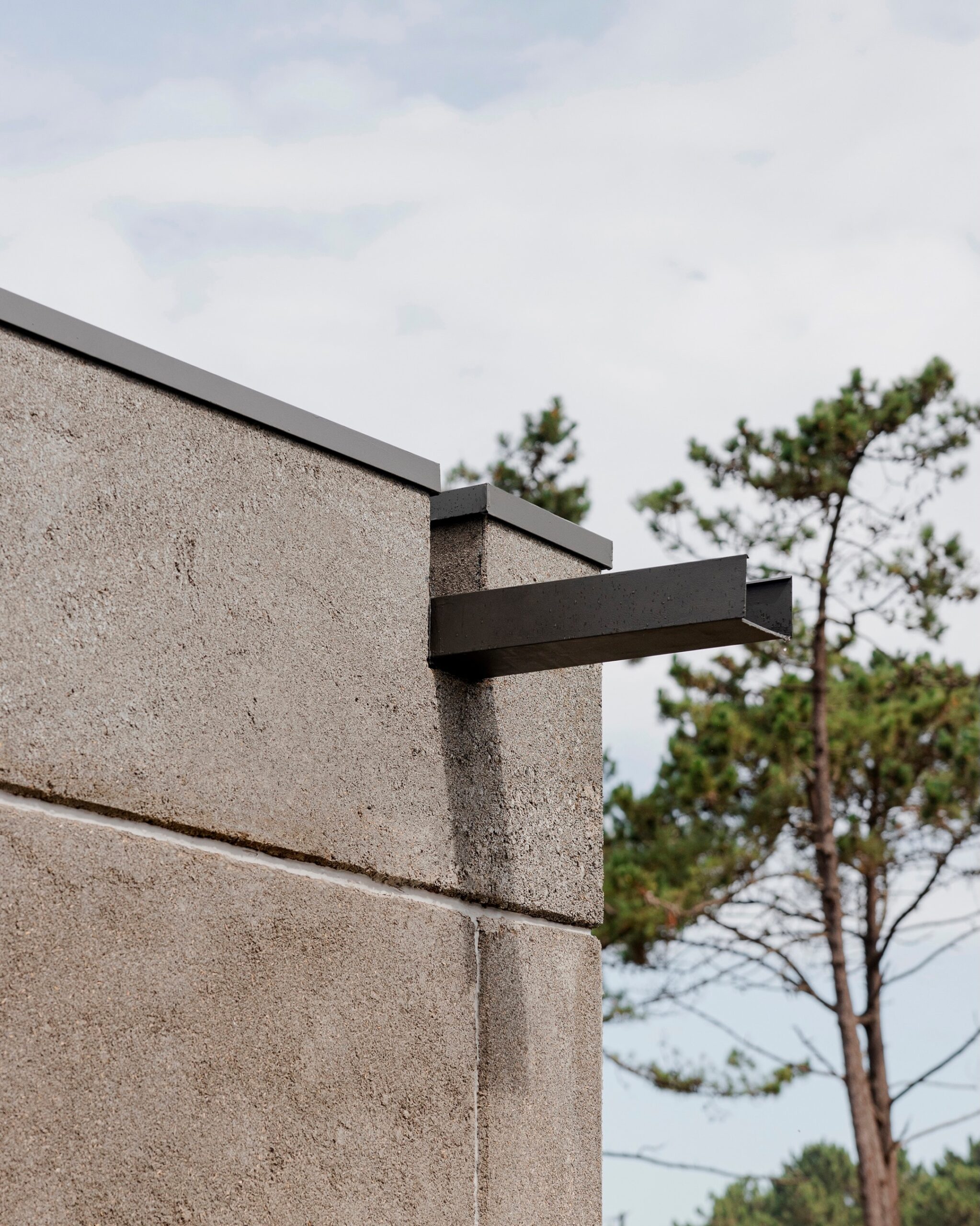
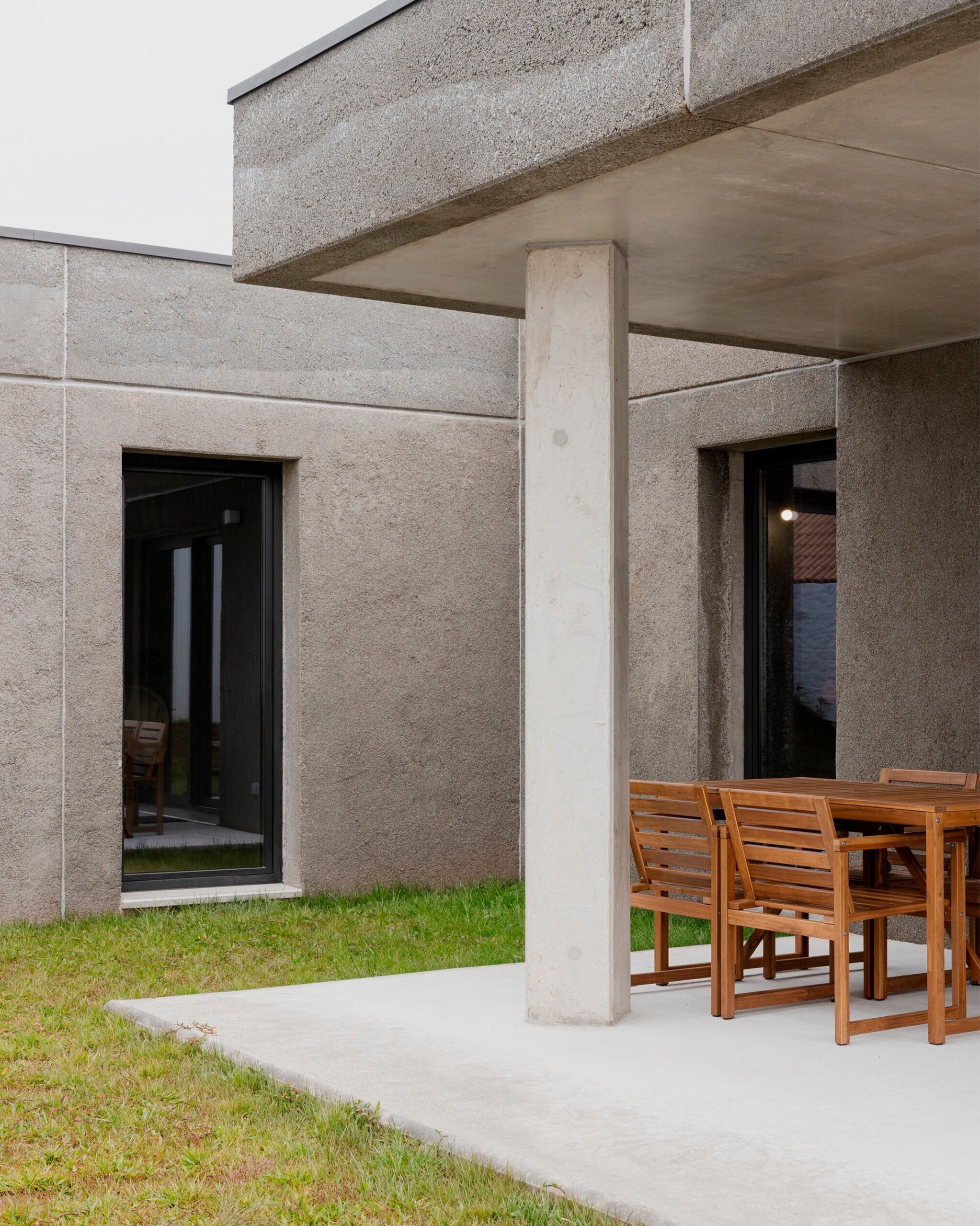
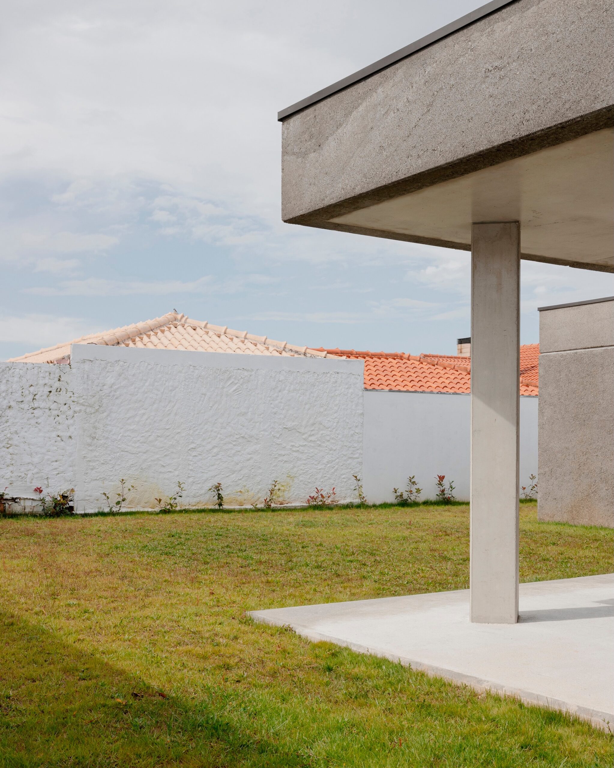
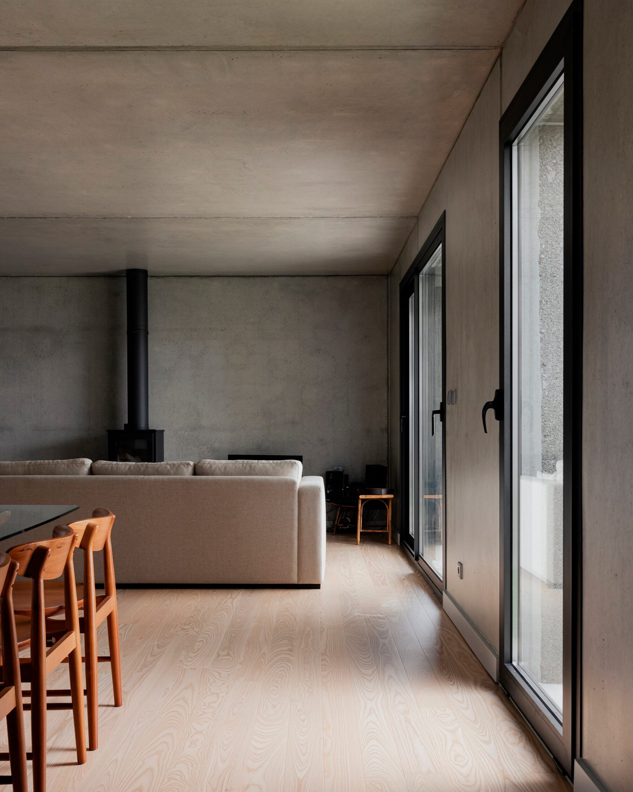
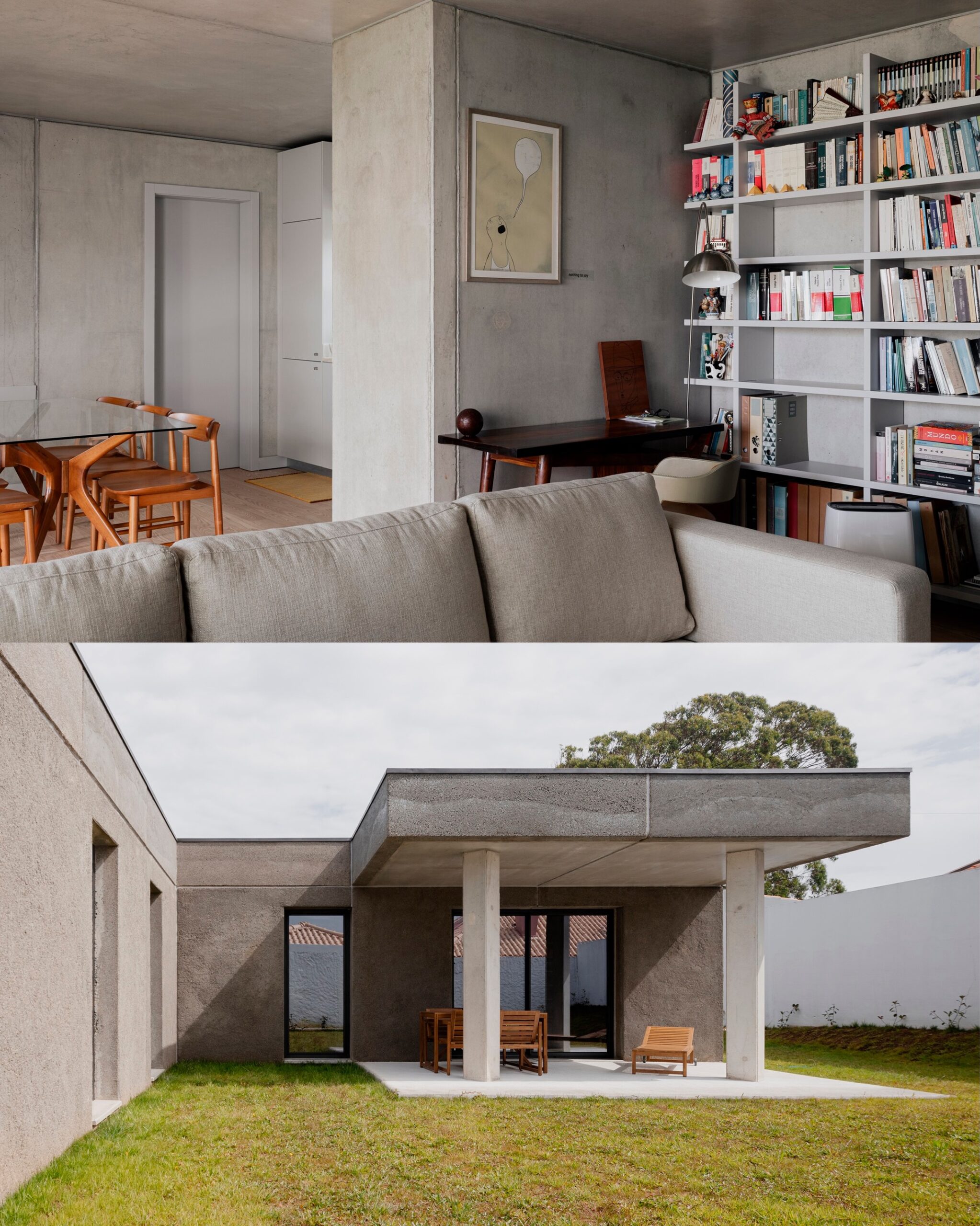
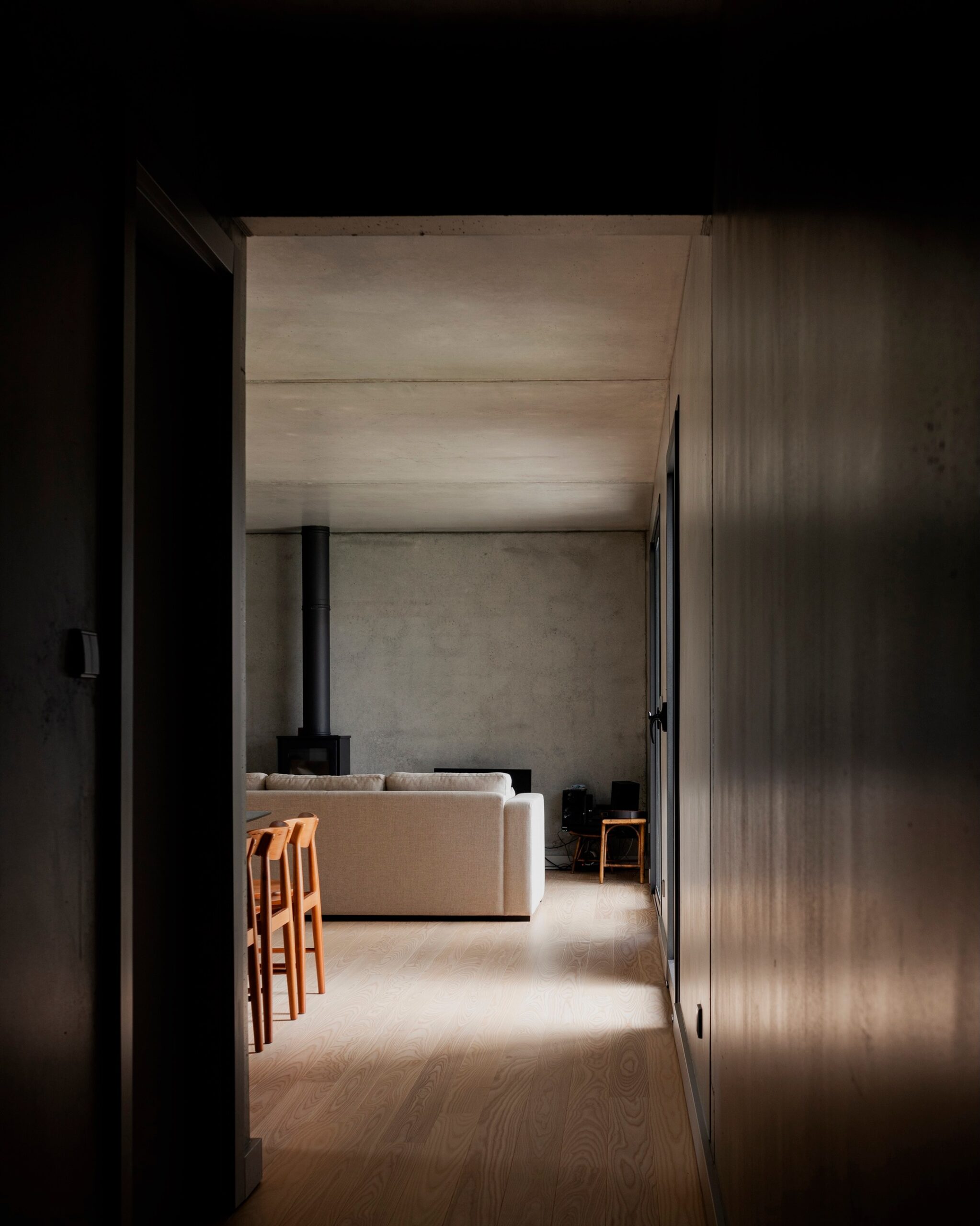
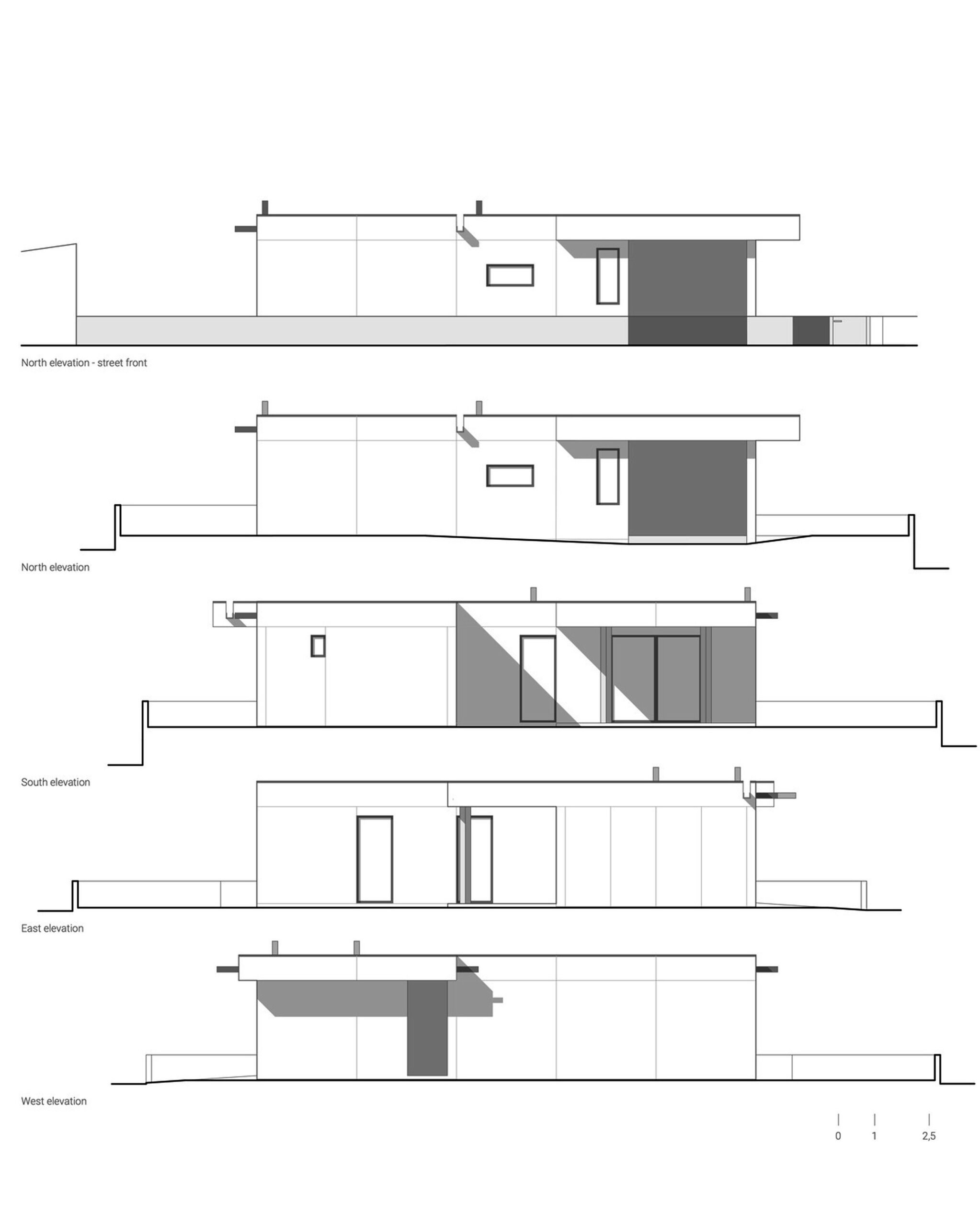
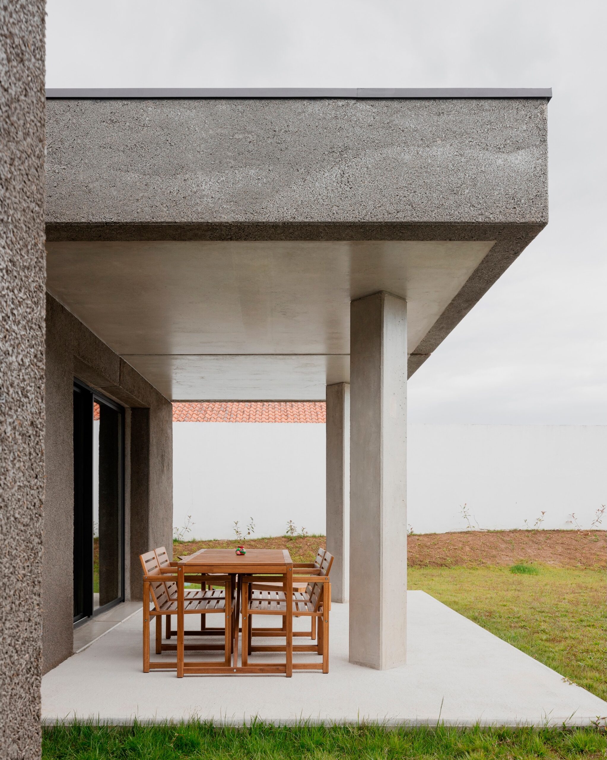
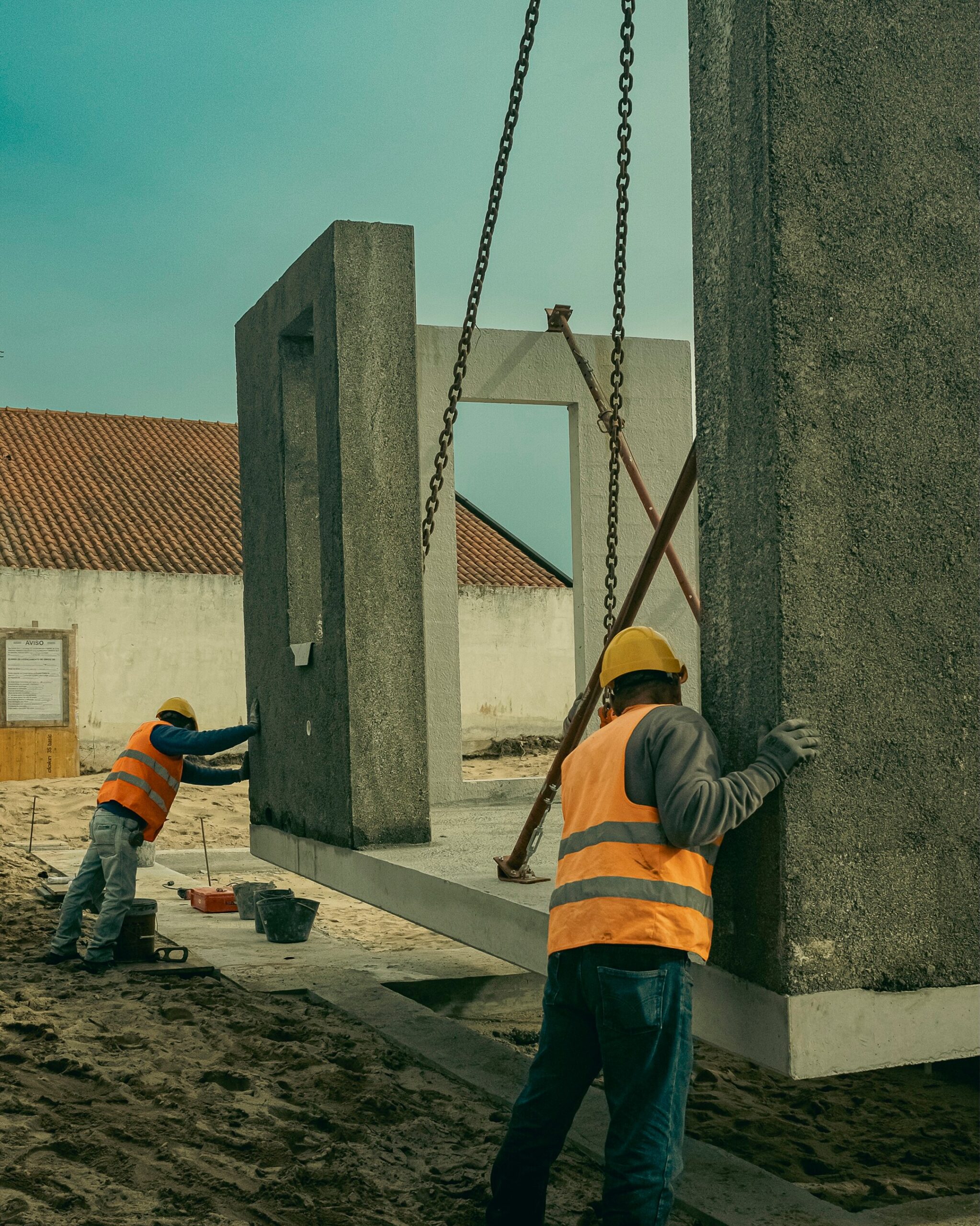
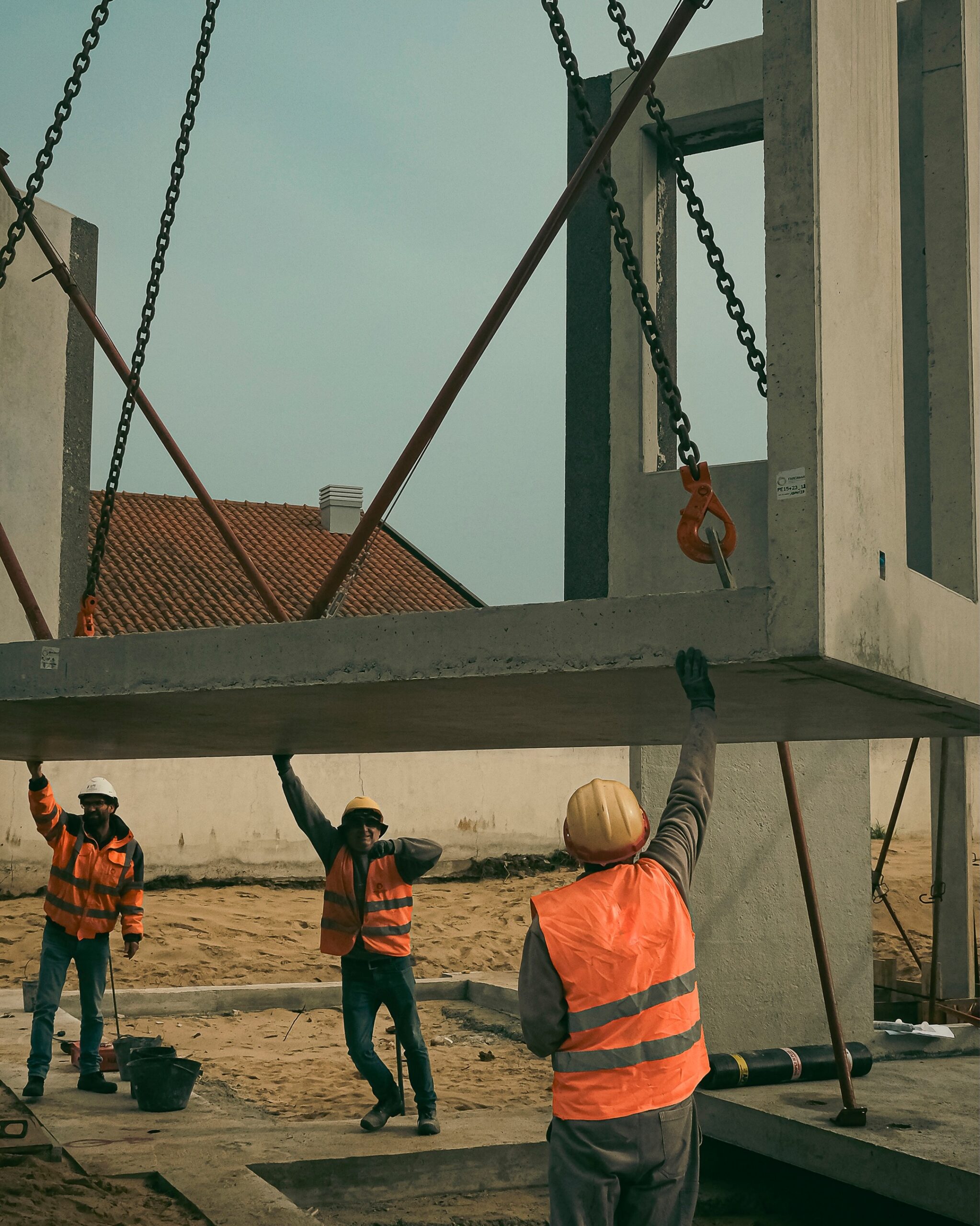
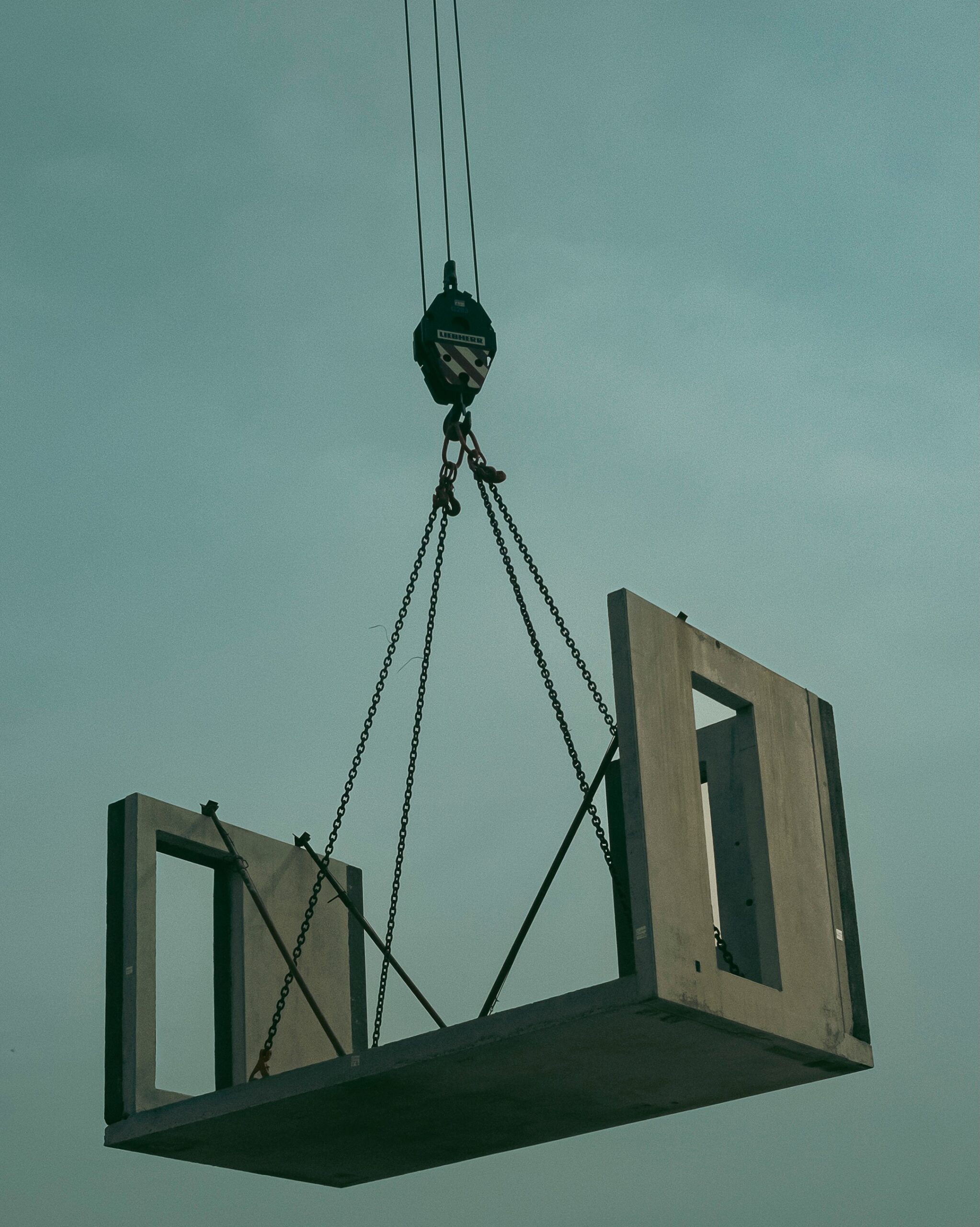
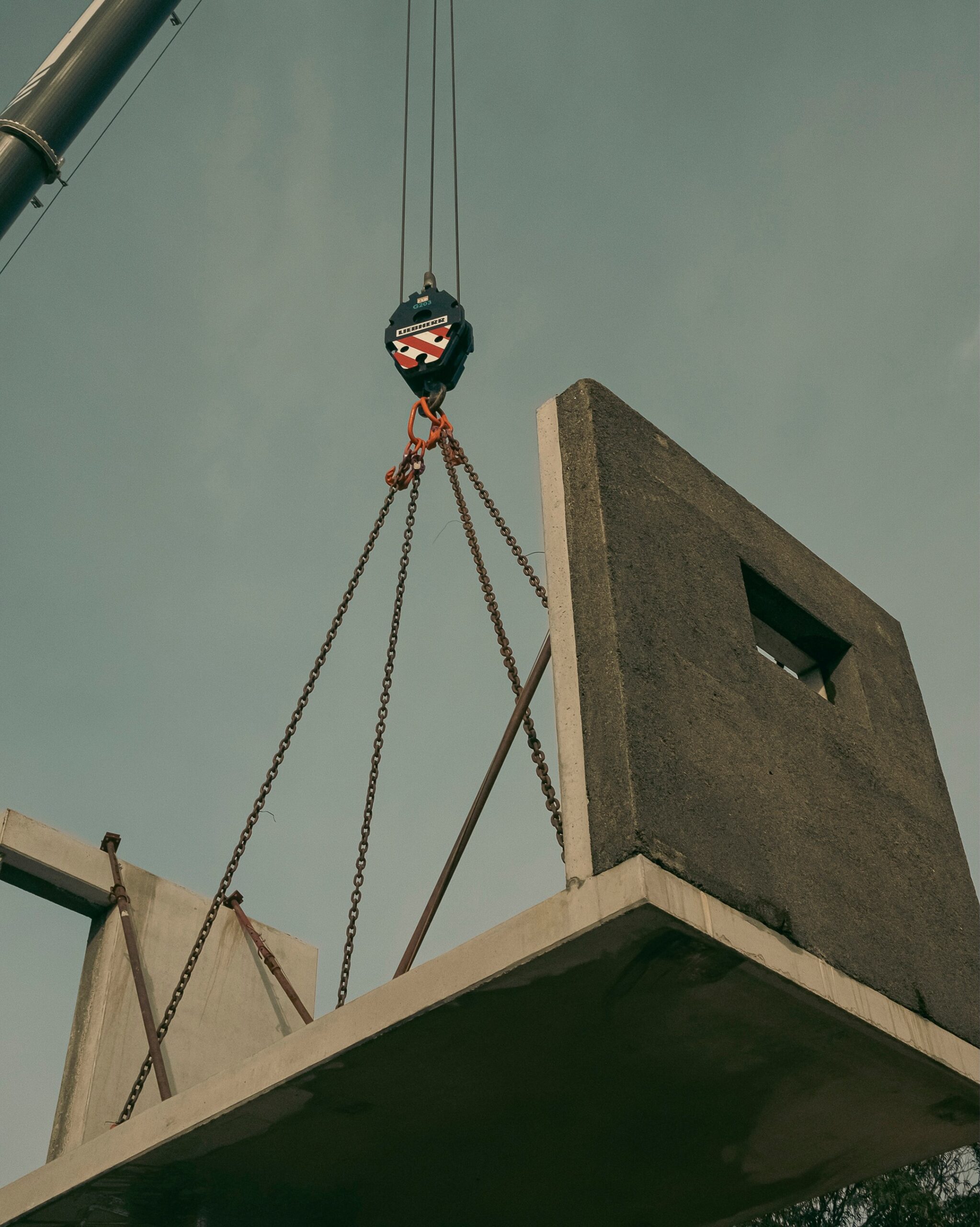
Esmoriz, Portugal
Area: 146 m² (1571 ft²)
The house is located on a flat, square-shaped plot oriented along a North-South axis, near a pine forest and the beach. The single-story structure fits within a context of similarly scaled, detached homes in a low-density setting.
The main entrance is situated on the northern side of the plot, and the house is laid out in an “L” shape, resulting from a clear separation between the social and private wings. This layout promotes natural cross ventilation and optimal solar exposure, eliminating the need for any air conditioning or mechanical ventilation systems. At the same time, the shape protects the private outdoor space from the prevailing northern and western winds.For this project, the studio explored the potential of a prefabricated, three-dimensional modular system based on U-shaped reinforced concrete components, which are grouped according to the needs of the housing program.To reduce construction time, site preparation, earthworks, excavation, and foundation work were carried out in parallel with the off-site production of the modular components. Additionally, the modules were delivered to the site with parts of the electrical and plumbing systems already pre-installed.Each module leaves the factory containing the structural reinforced concrete and an outer layer of cement-based composite incorporating rice husk. This material—an agro-industrial byproduct typically discarded or burned—is locally sourced from the rice fields of the Lower Mondego region and transformed here into a biobased construction material.
I would like to see a third bedroom (we need two offices in this house) and an additional full bath, but other than that, I could live there.
2 comments
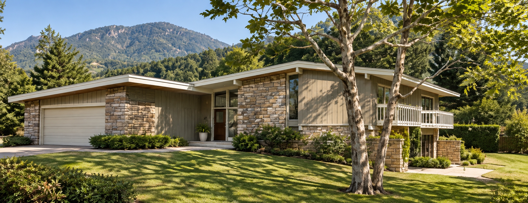
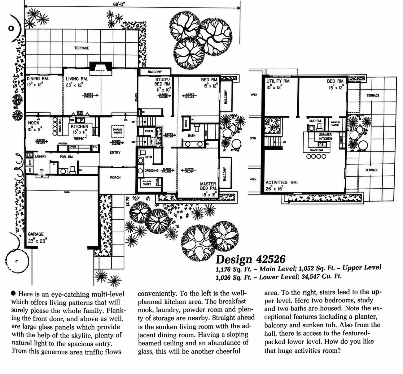
It kind of reminds me of the house I lived in during high school and college…on steroids.
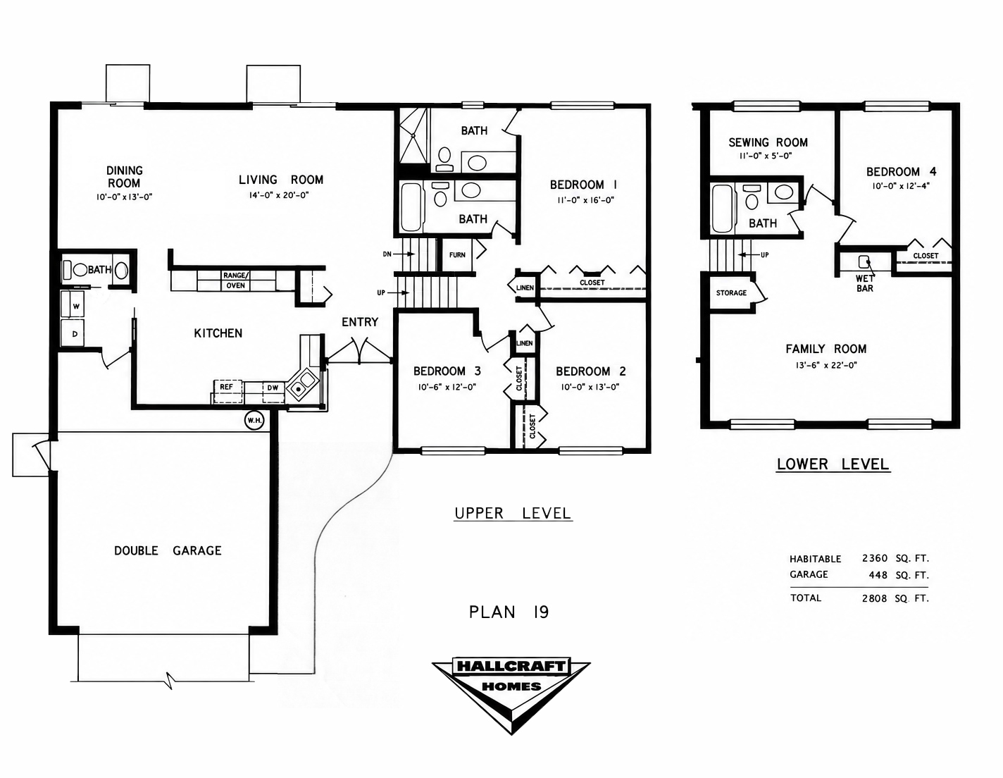
2 comments
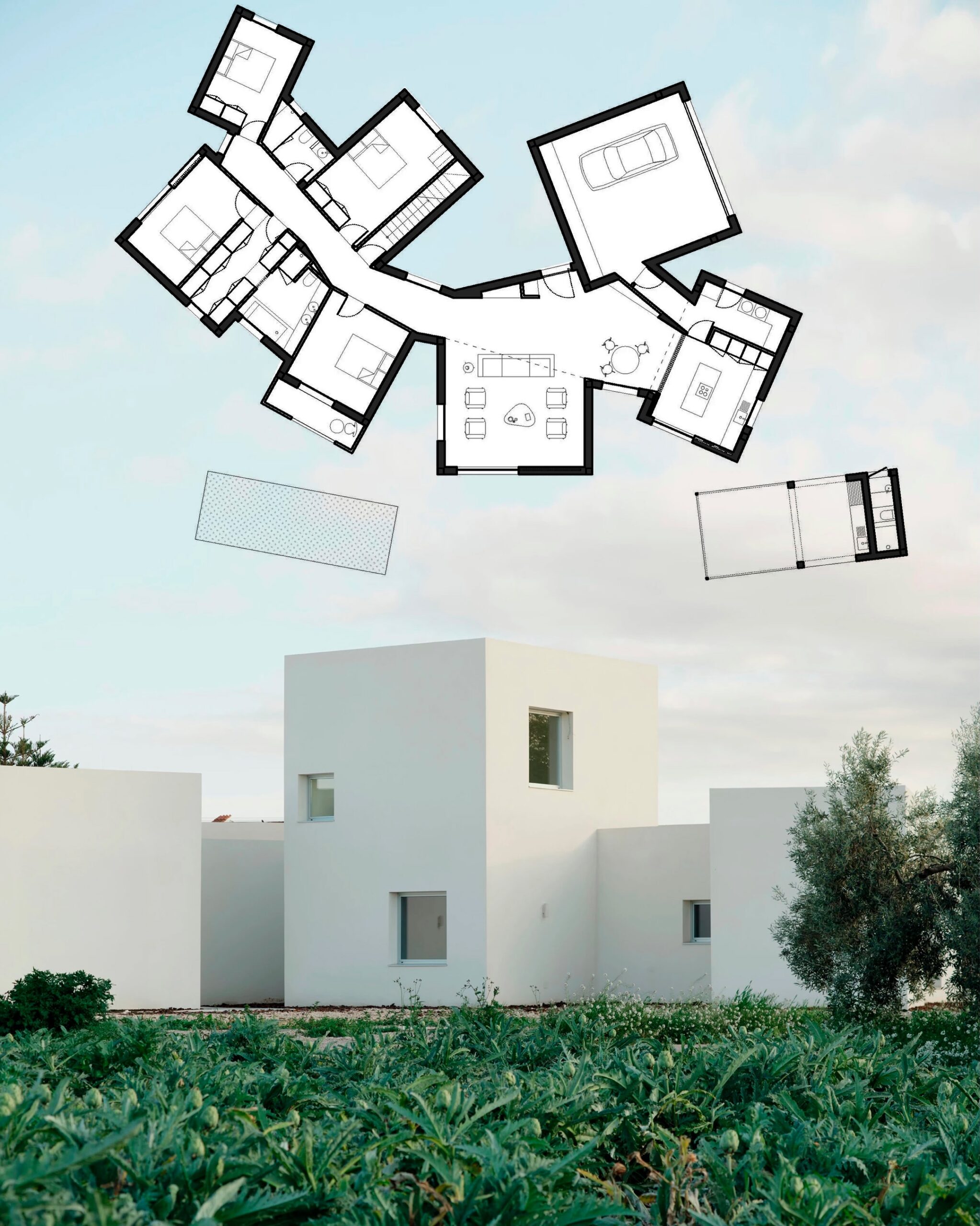
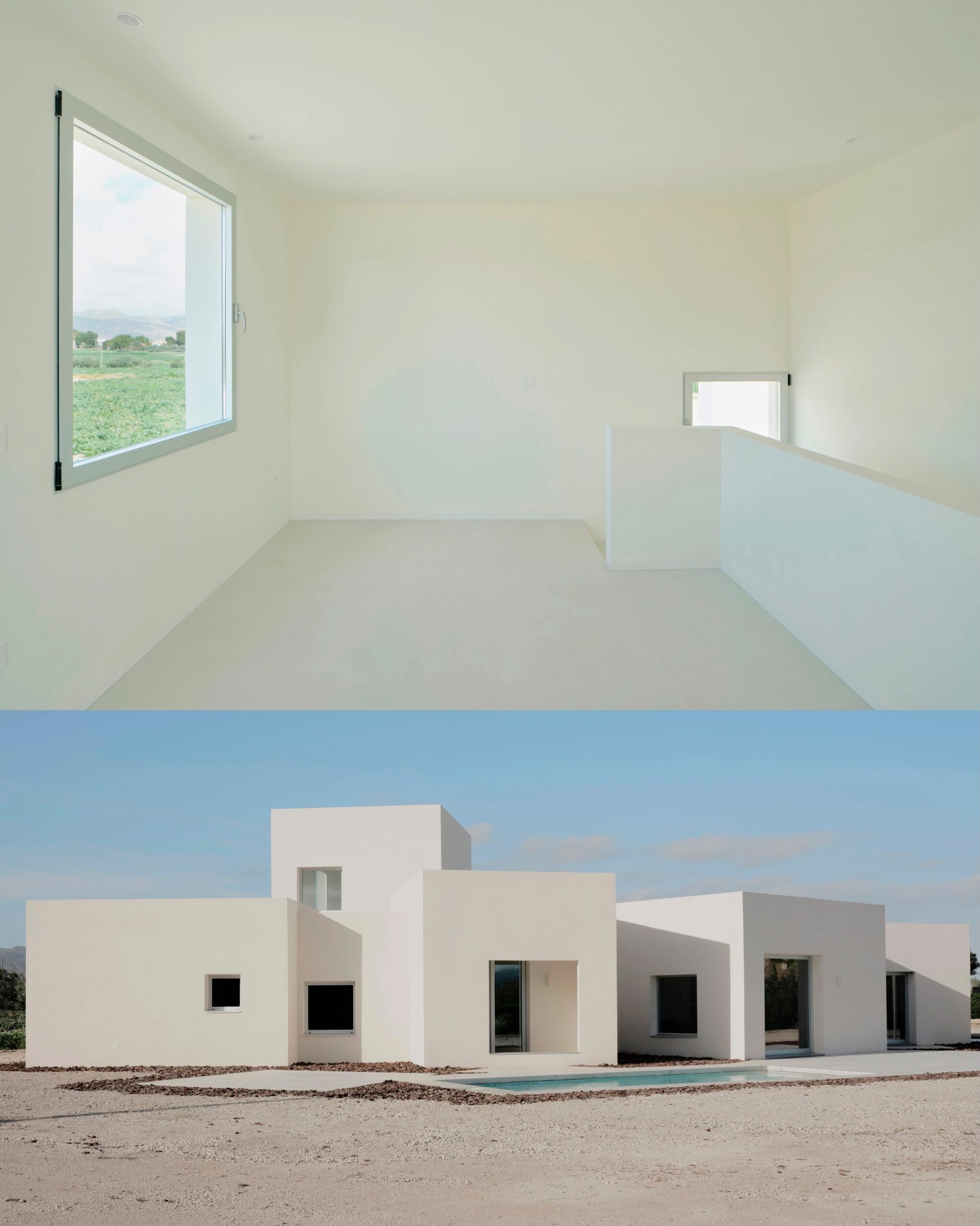
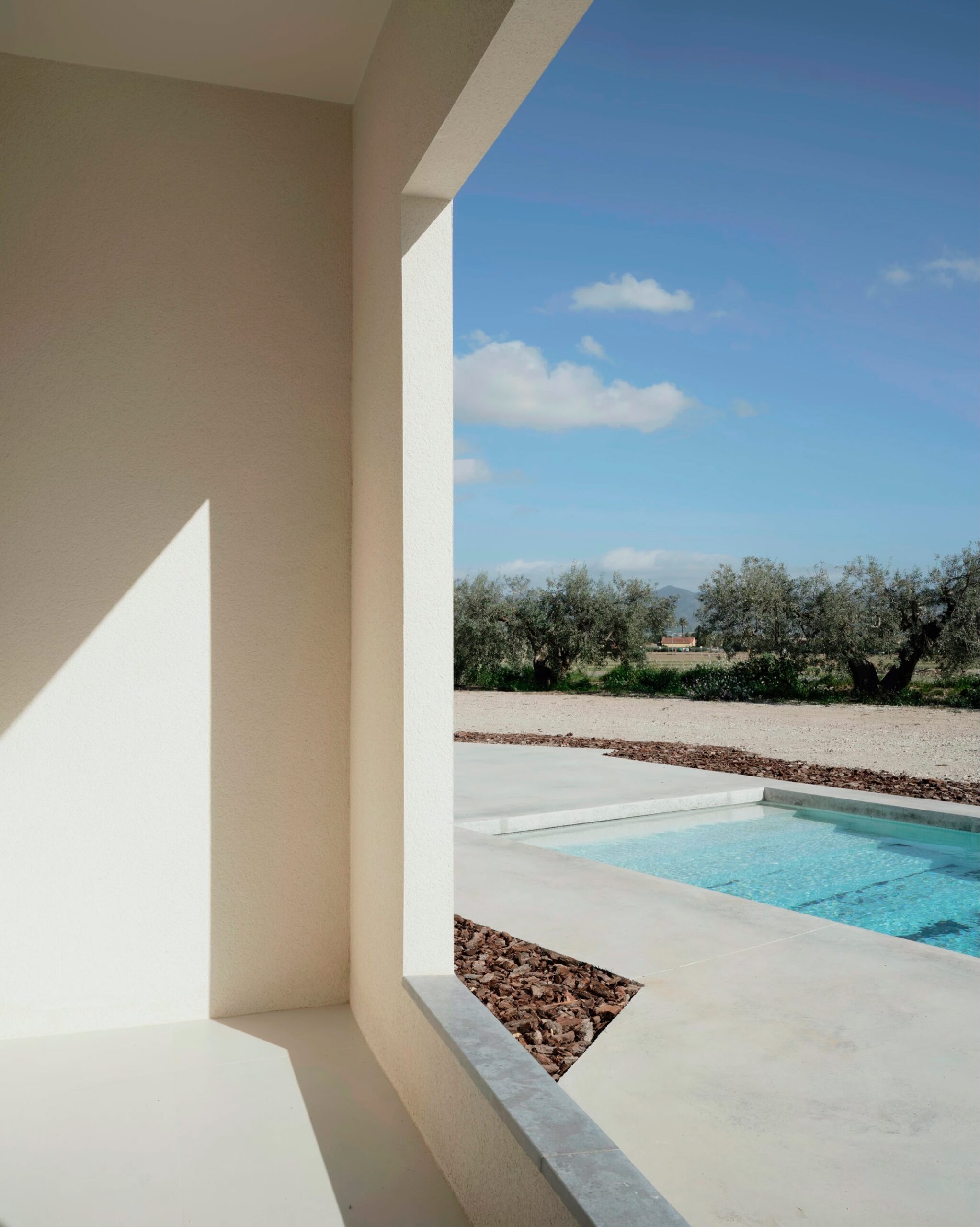
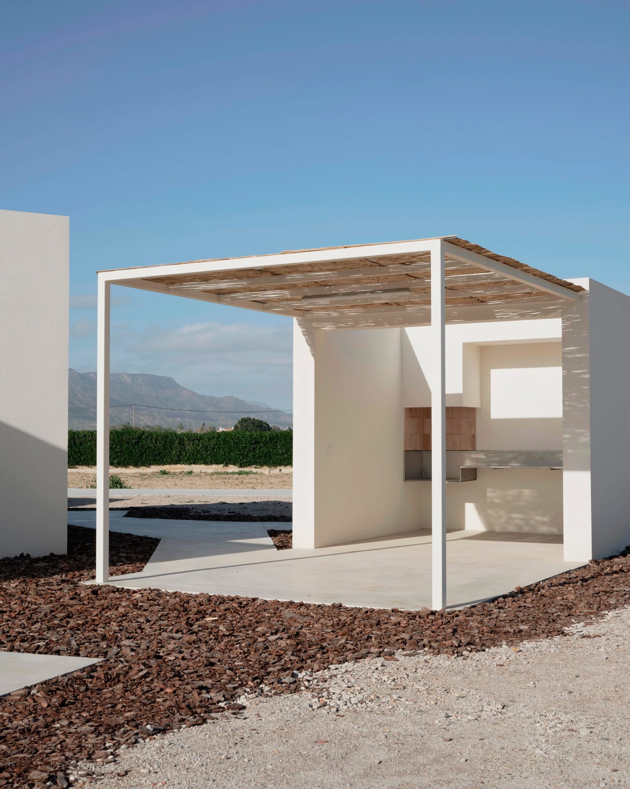
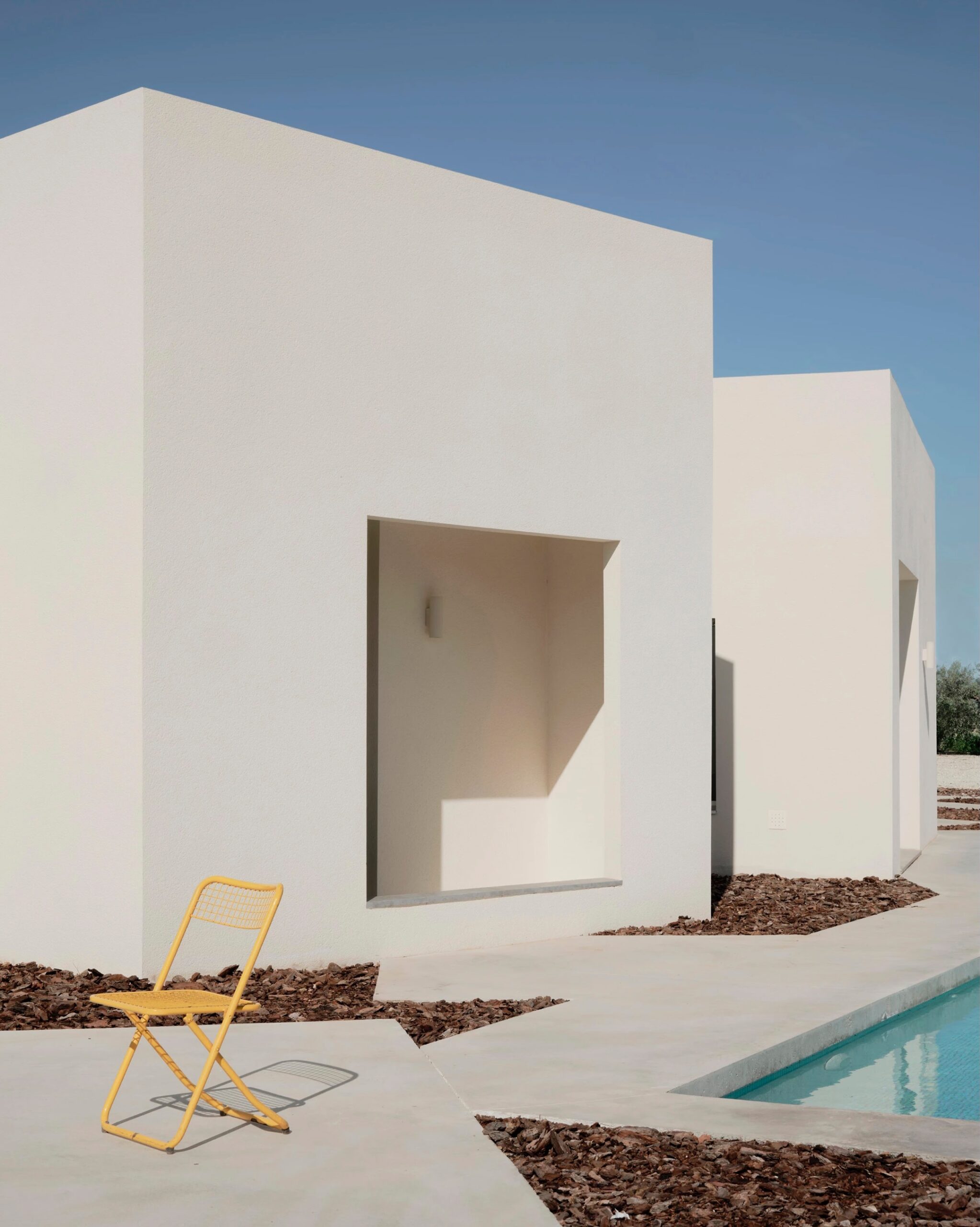
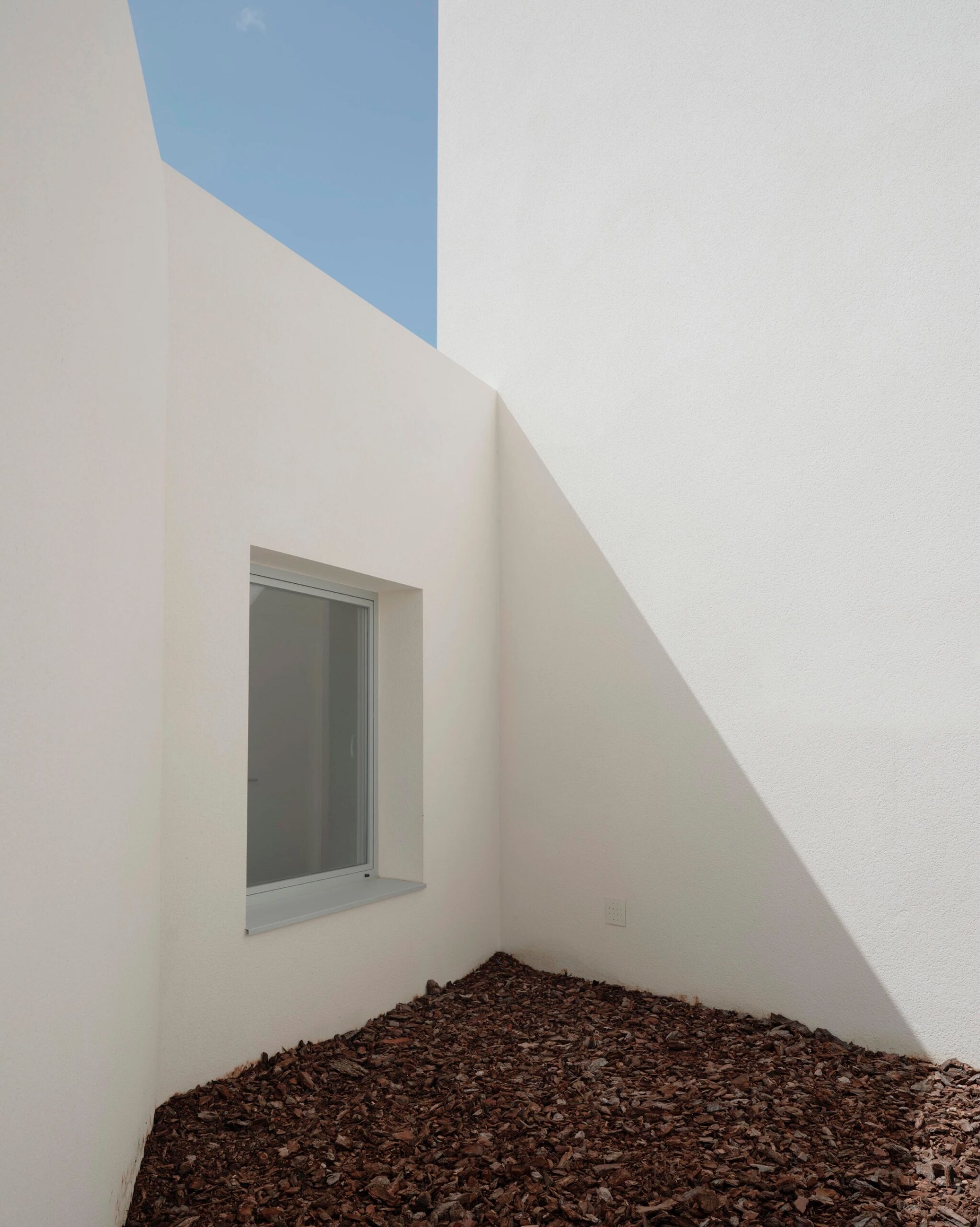
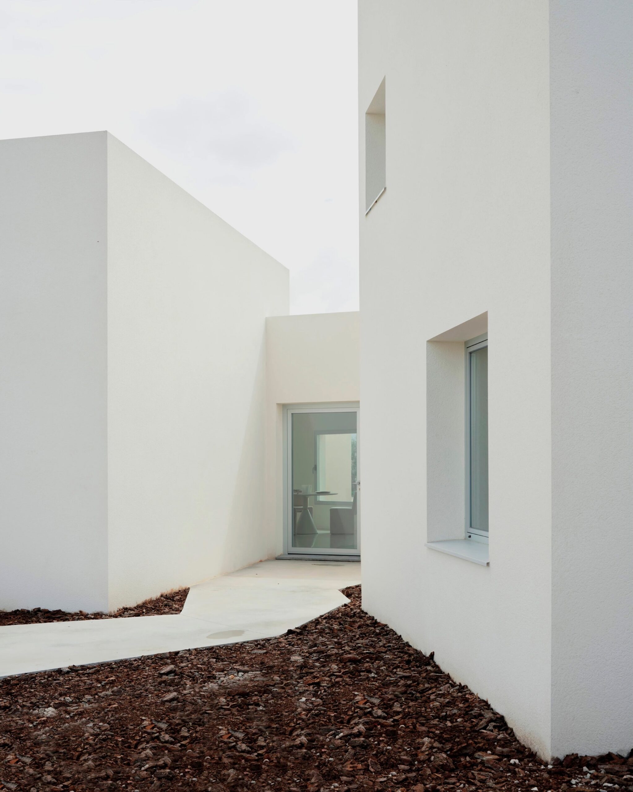

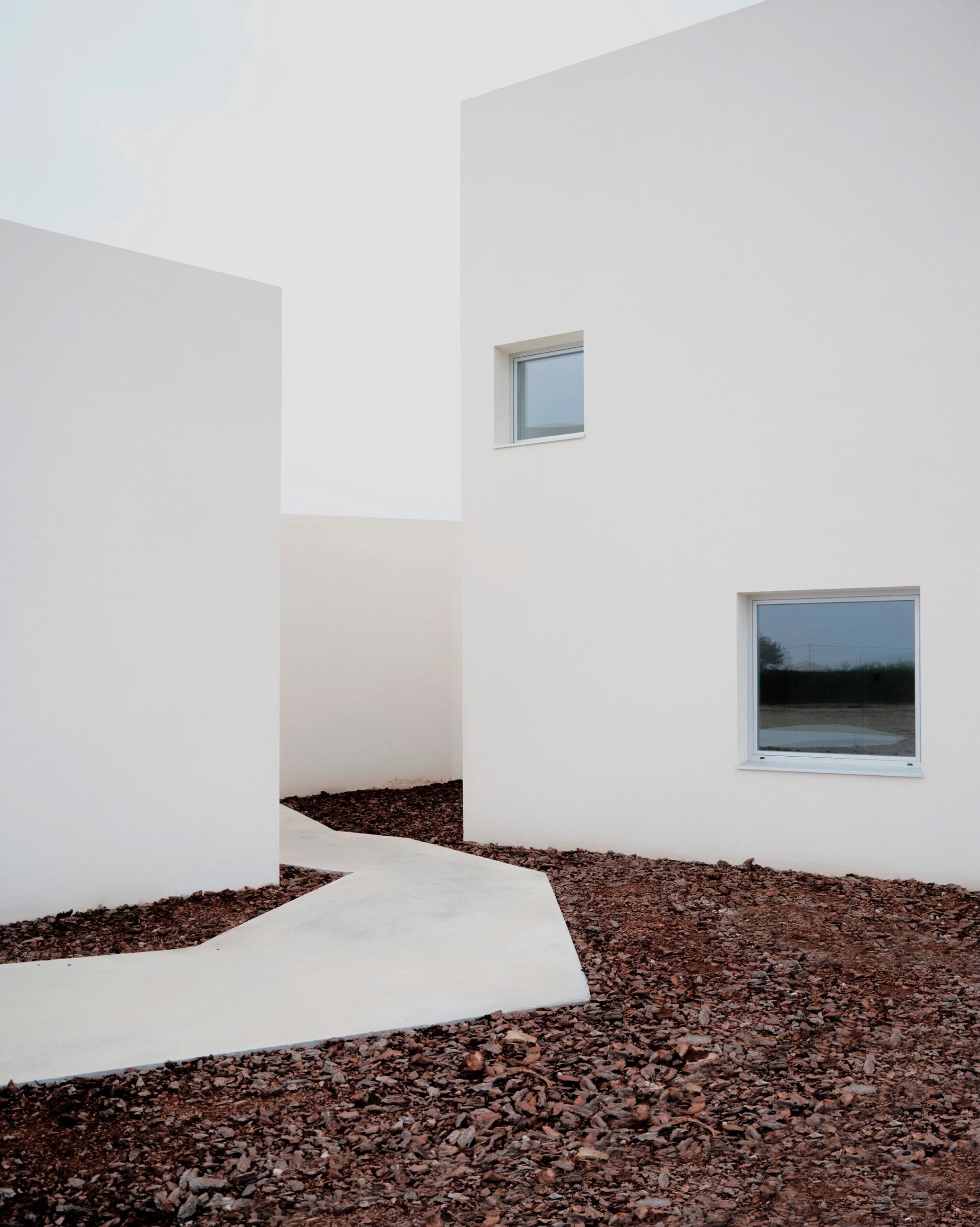
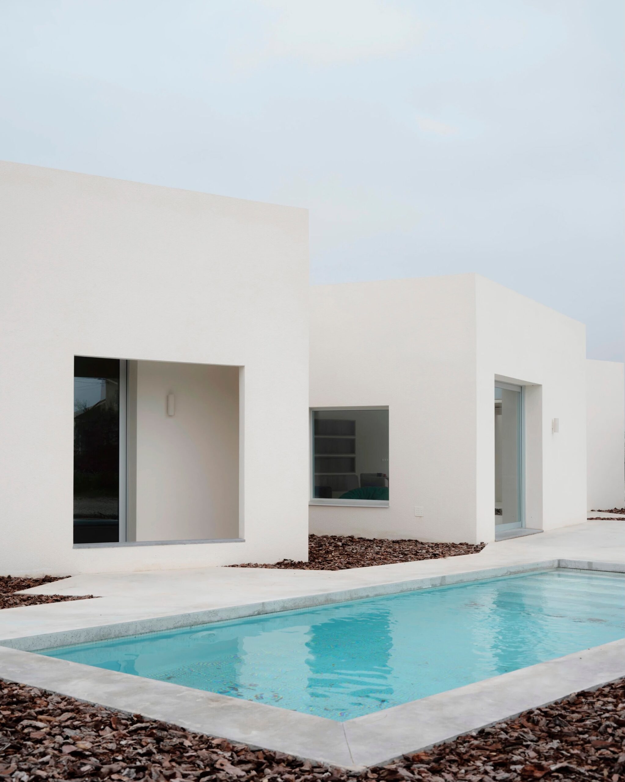
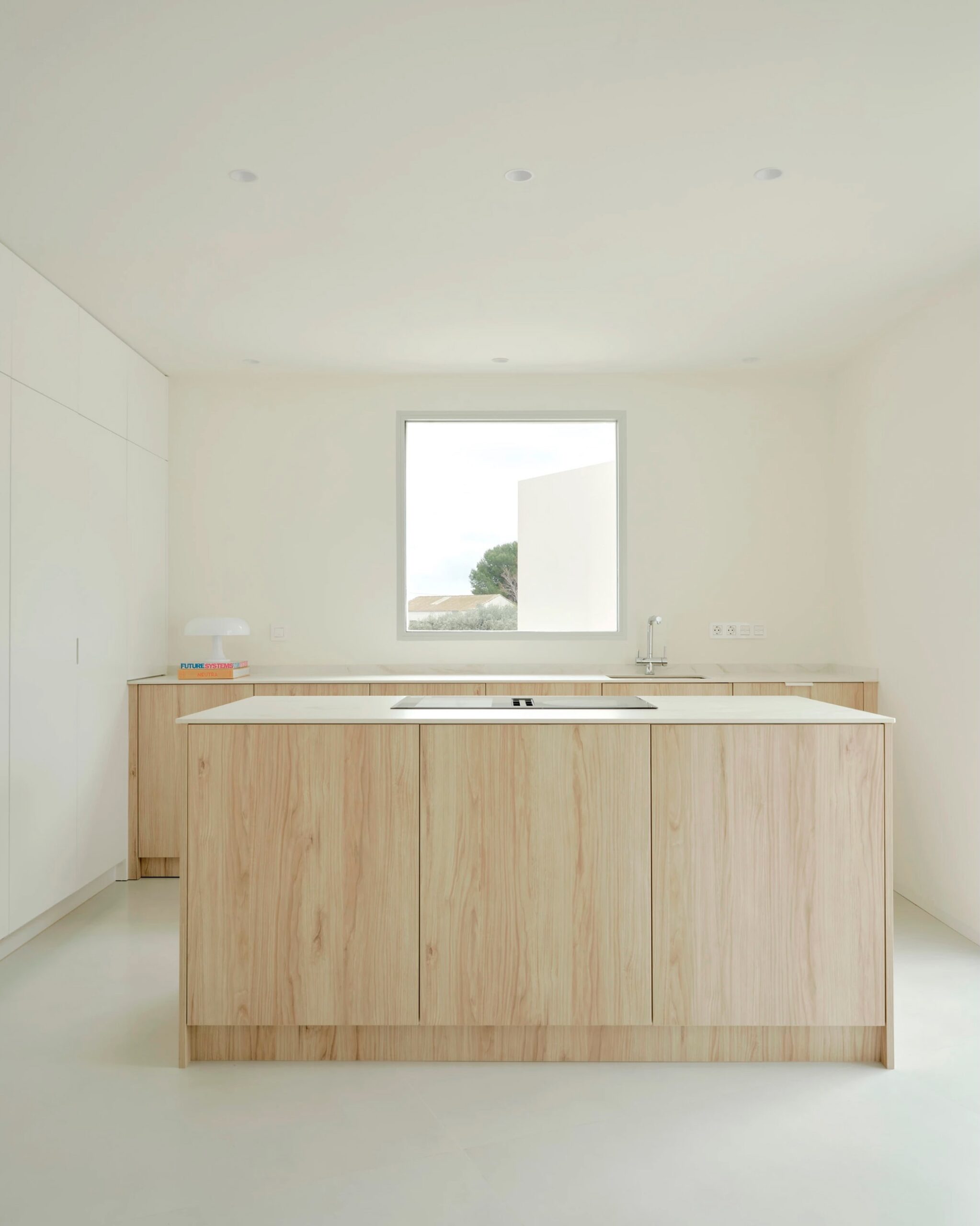
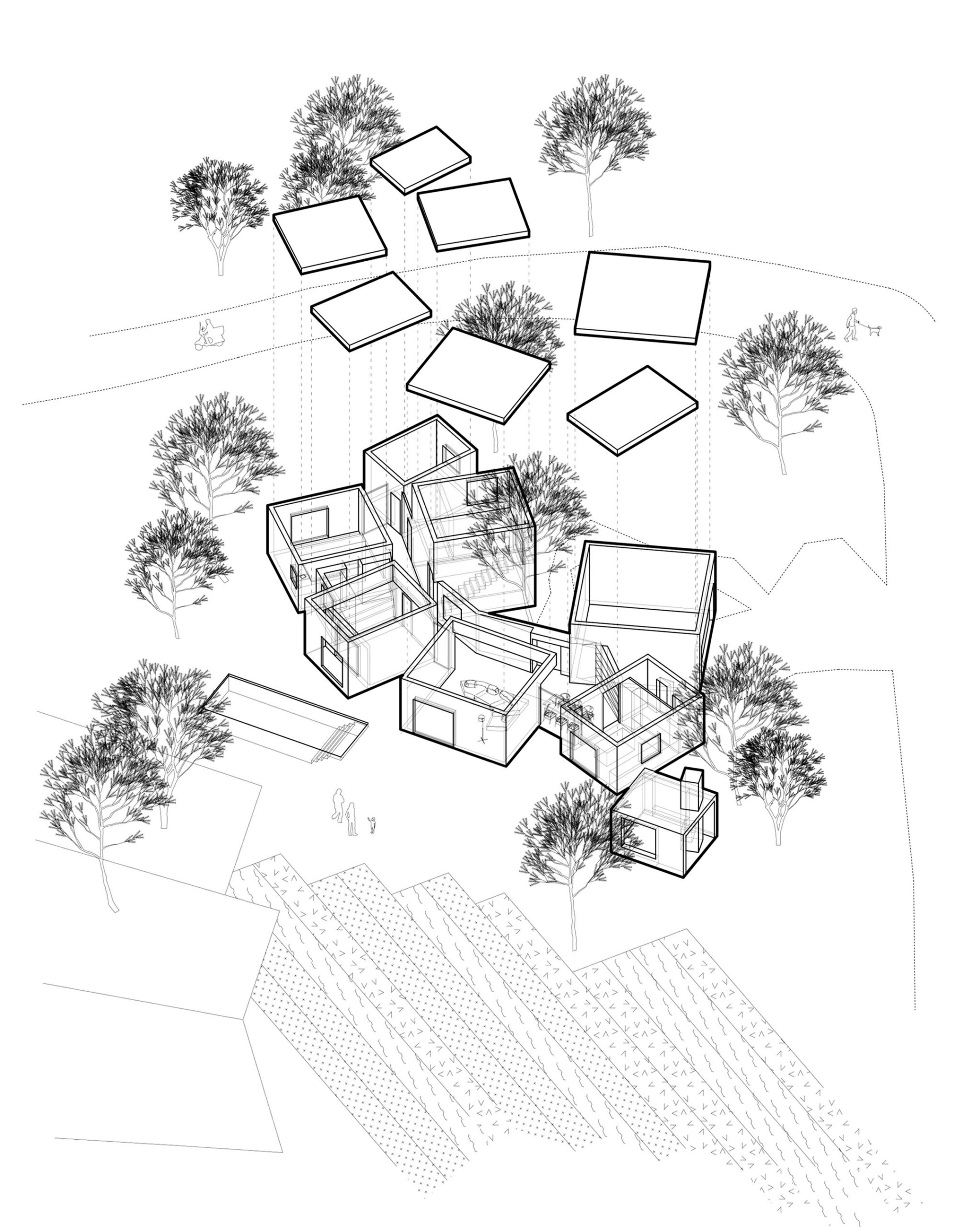
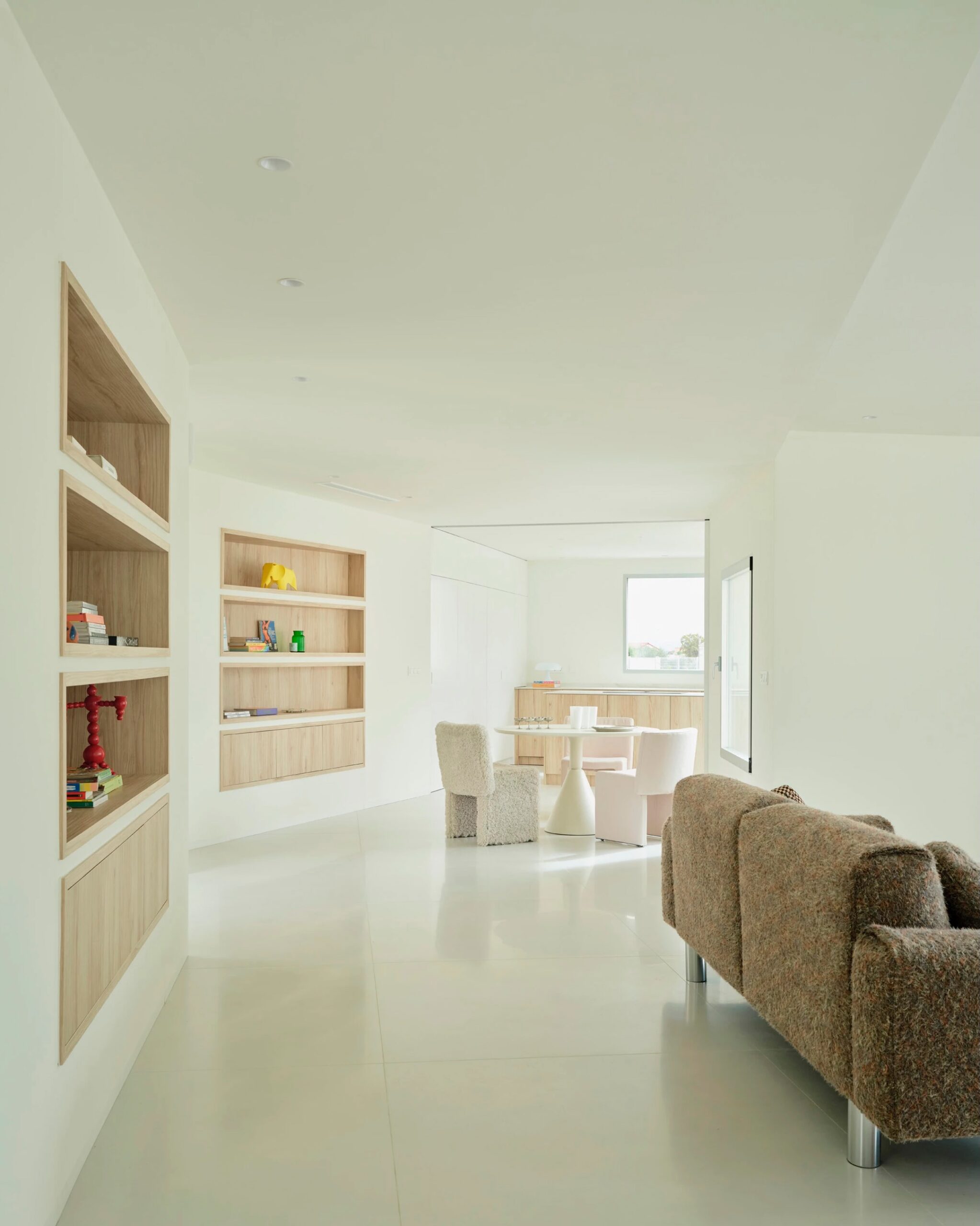
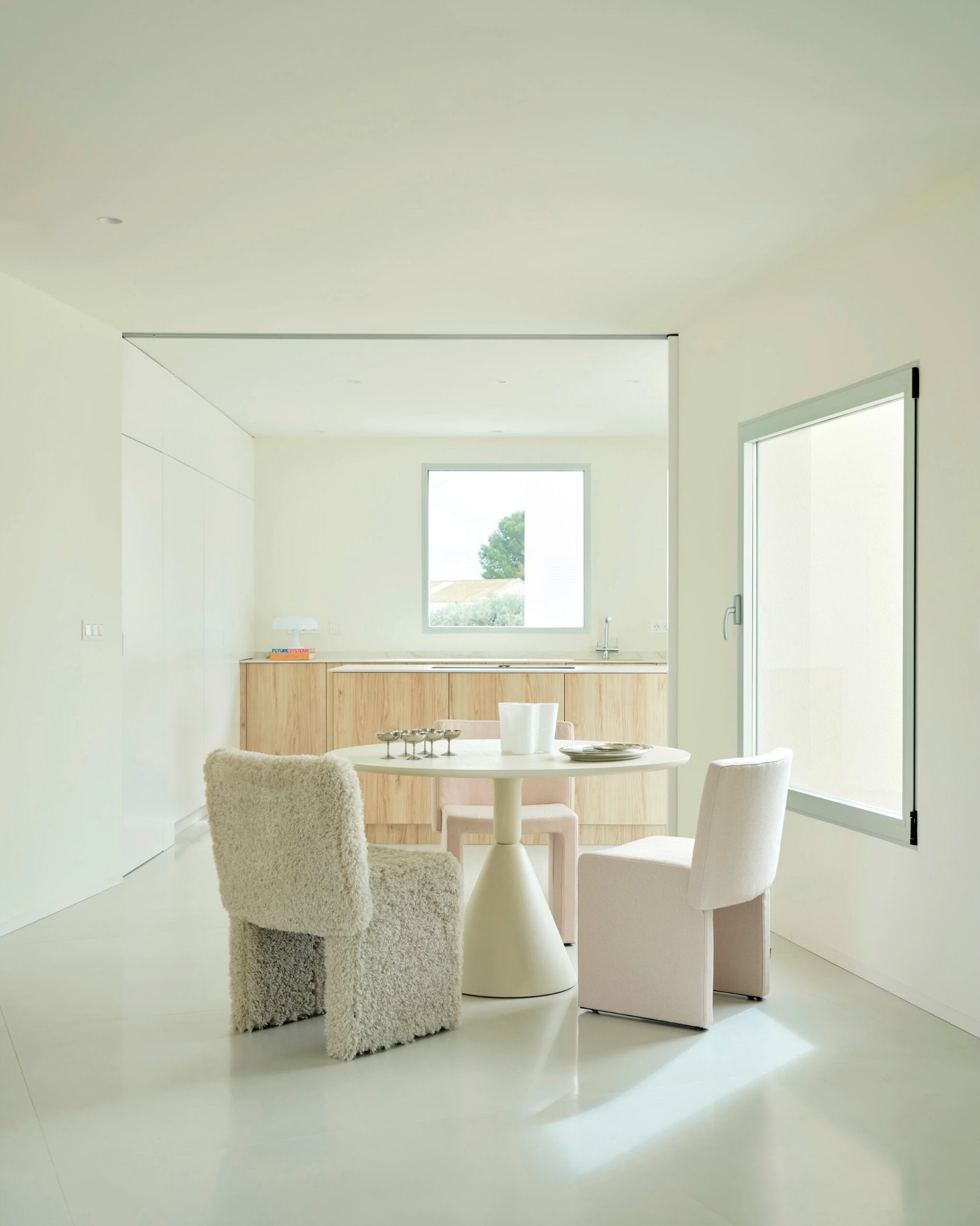
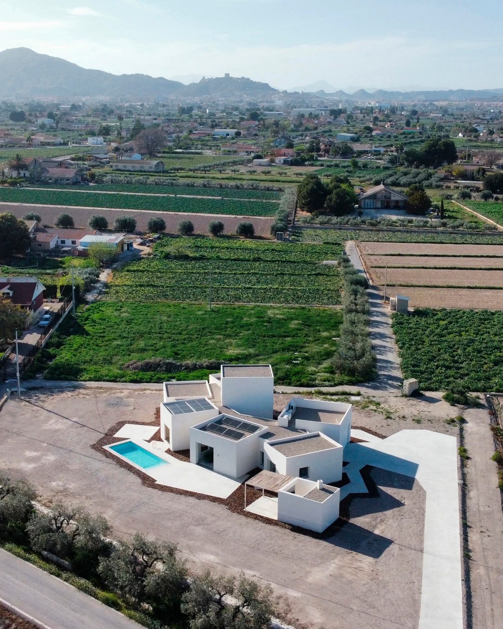
I rather like this. It’s not your typical rectangular suburban builder offering. It would probably cost a fortune to build due to the number of turns in the foundation footprint, but it might be worth it to live in something different.
2 comments
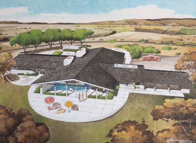
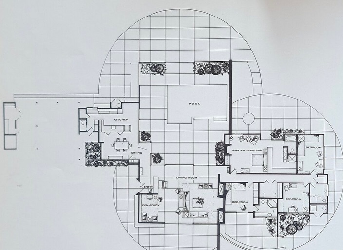
1963 Cliff May-designed Robert and Alice Power Residence in Camarillo
In the second half of the twentieth century, the Ranch style came to define Southern California living; with its rambling, low-slung profile, shallow-pitched roof, and open concept floor plan connecting it to its landscape, the ranch house embodied the effervescence of the buoyant post-war years. By the early 1960s, architectural designer Cliff May had been perfecting his take on the Ranch style for over thirty years, distilling the original adobe and Spanish Colonial forms into the sweeping ranch houses of the jet age.
The home is a classic May design, featuring an expansive roof line, indoor/outdoor floor plan built around a semi-sheltered pool, walls of glass, skylights, and adobe-inflected details such as viga and latilla style ceilings. The house is prominently planned around a central pool—a classic May design choice—and, with it’s walls of windows and sliding doors, invites the pool to become the central social space within the home, a true California original.
87 Vientos Road, a 4 bedroom, 4 bath, 3,569 square foot home located on a 1.09 acre lot, is currently listed for $2,360,000.
3 comments
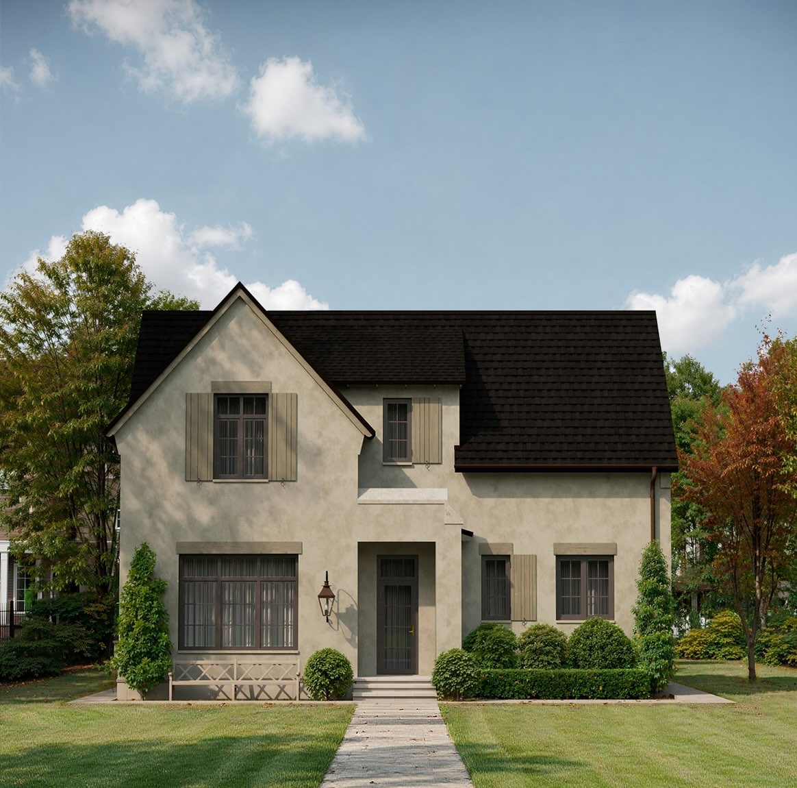
Exterior
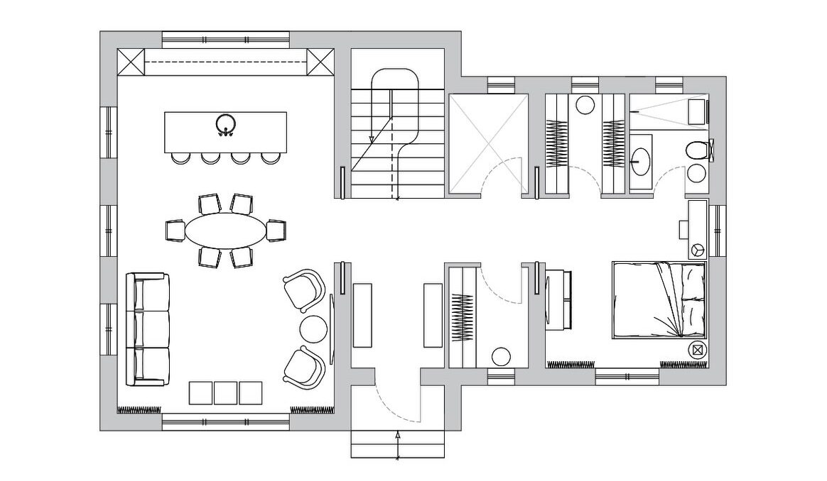
First Floor
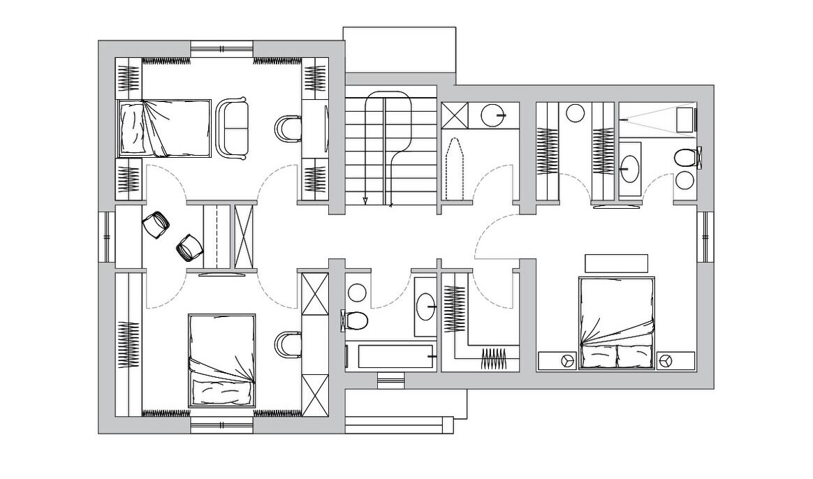
Second Floor
Not sure about the stairs. As a younger man it wouldn’t have been an issue for me, but these days…climbing stairs is probably exactly what I should be doing, y’know?
There also needs to be a guest bath on the first floor. Luckily it looks like there’s some unassigned space on the north side of the plan where you could easily put one in.
6 comments
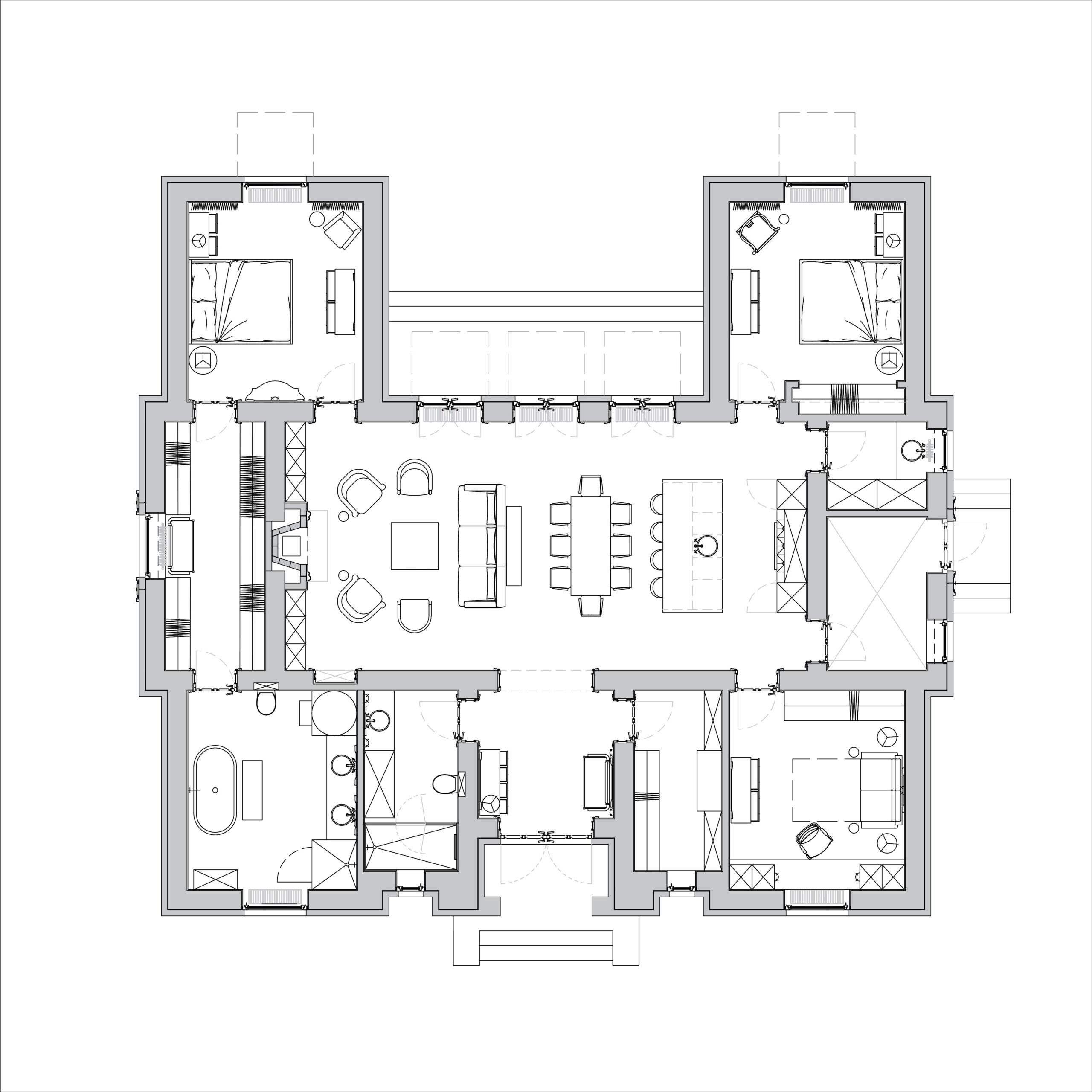
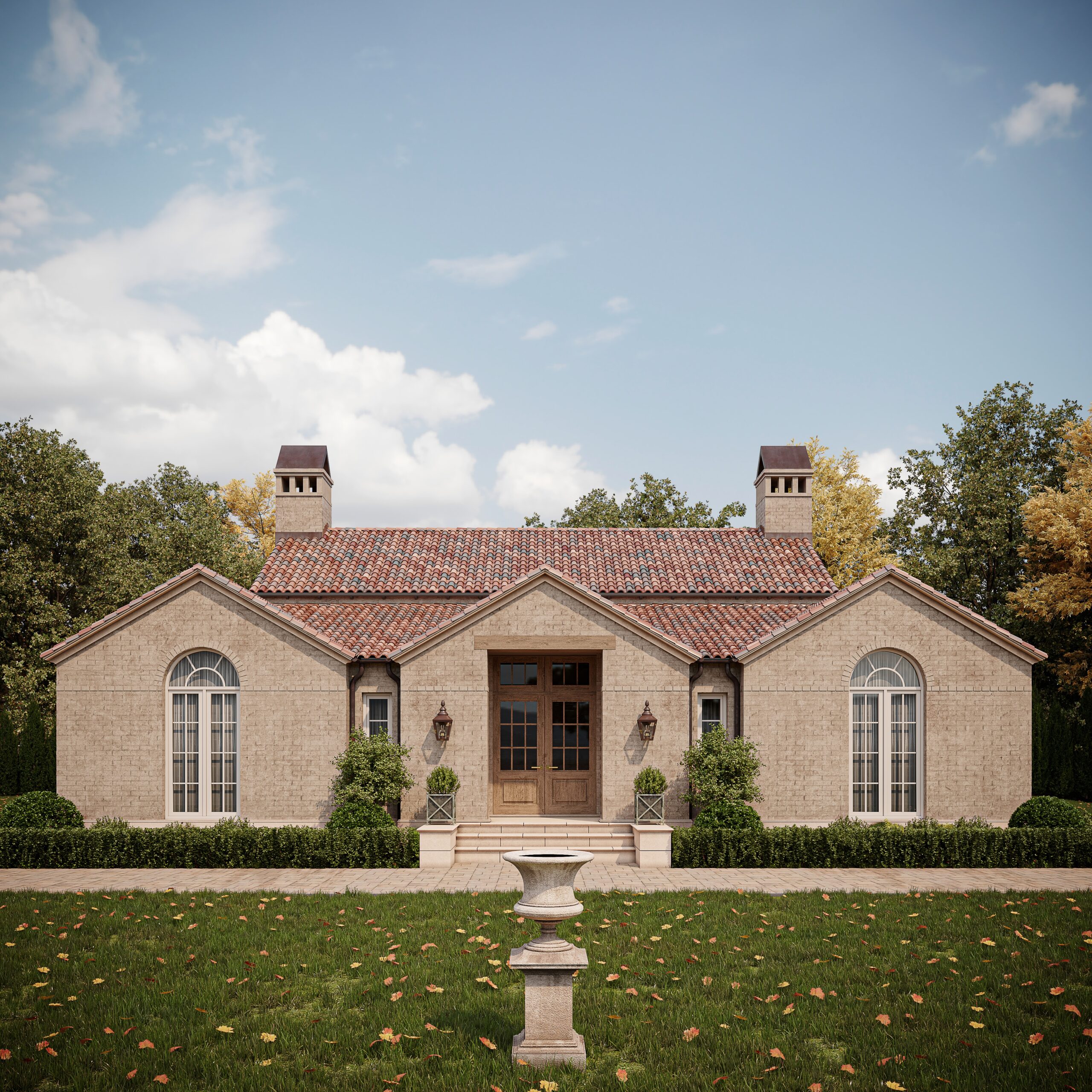
Another well thought-out thick-walled (I am assuming) Russian house.
I love how these plans don’t even feature garages. It’s refreshing to see residential architecture from a non-car-centric perspective.
I could definitely live here without making any changes.* Would you?
*The only thing I might change would be to flip the second bathroom and the closet/storage area on either side of the main entrance and open the bathroom to the main living area instead of the Foyer.
0 comments
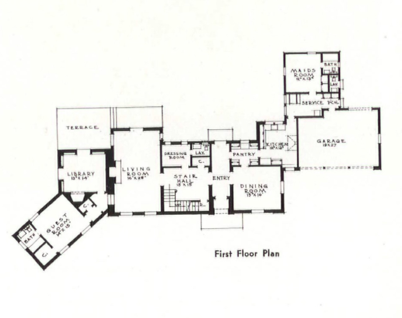
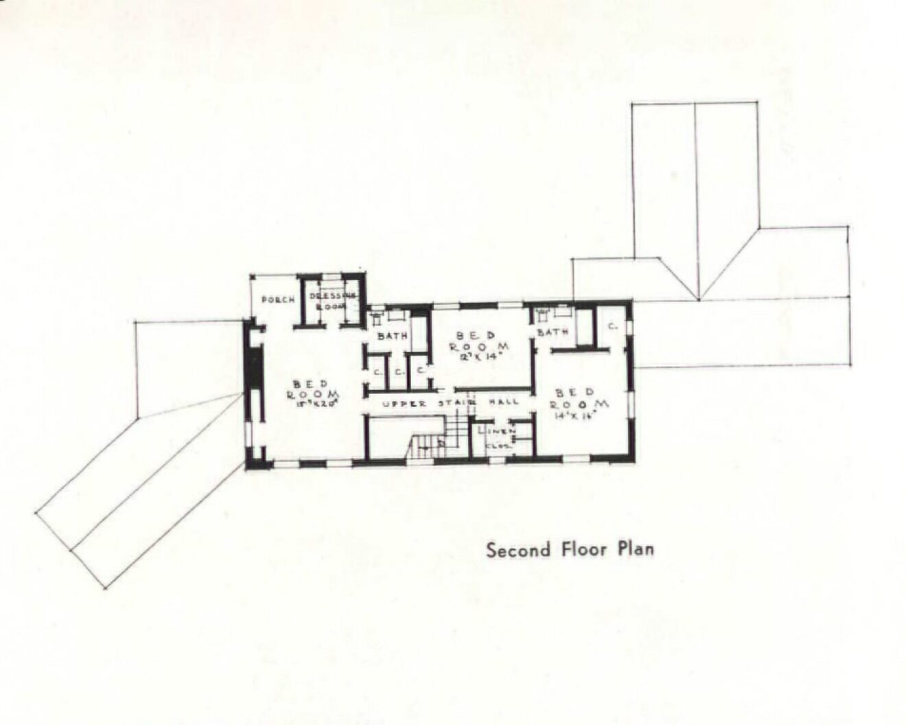
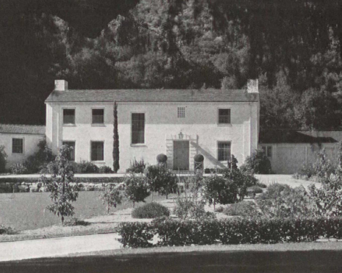
Kind of an unassuming exterior, but I like the floor plan. The livable layout makes sense. It’s on the larger side without being overly ostentatious.
1 comments
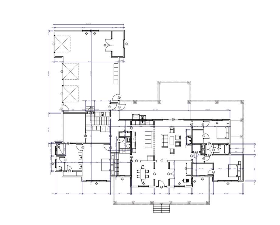
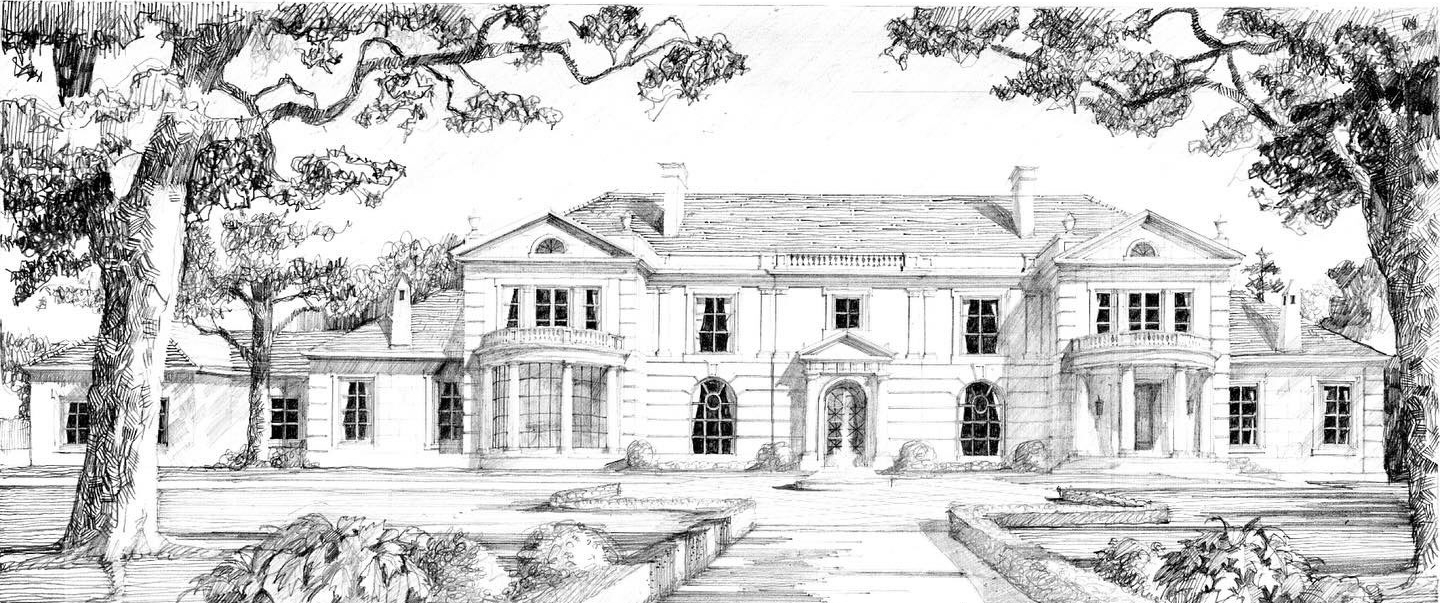
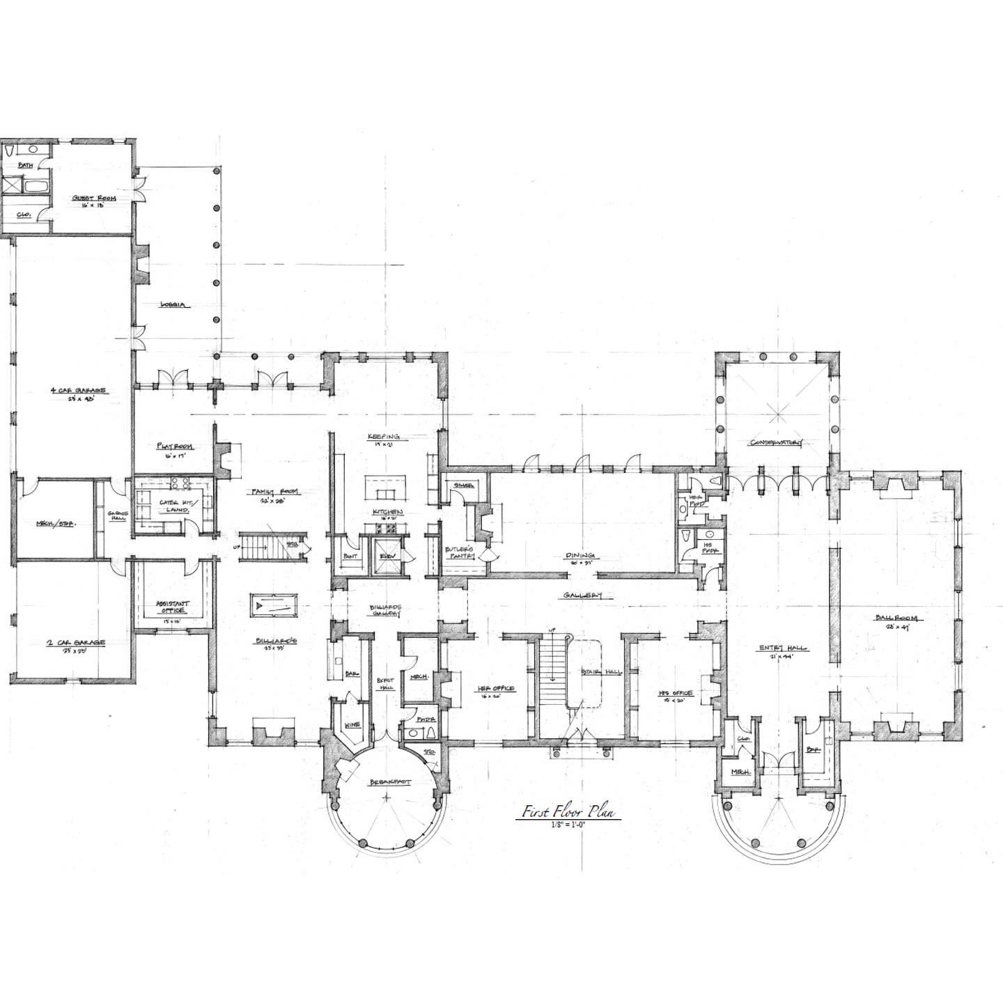
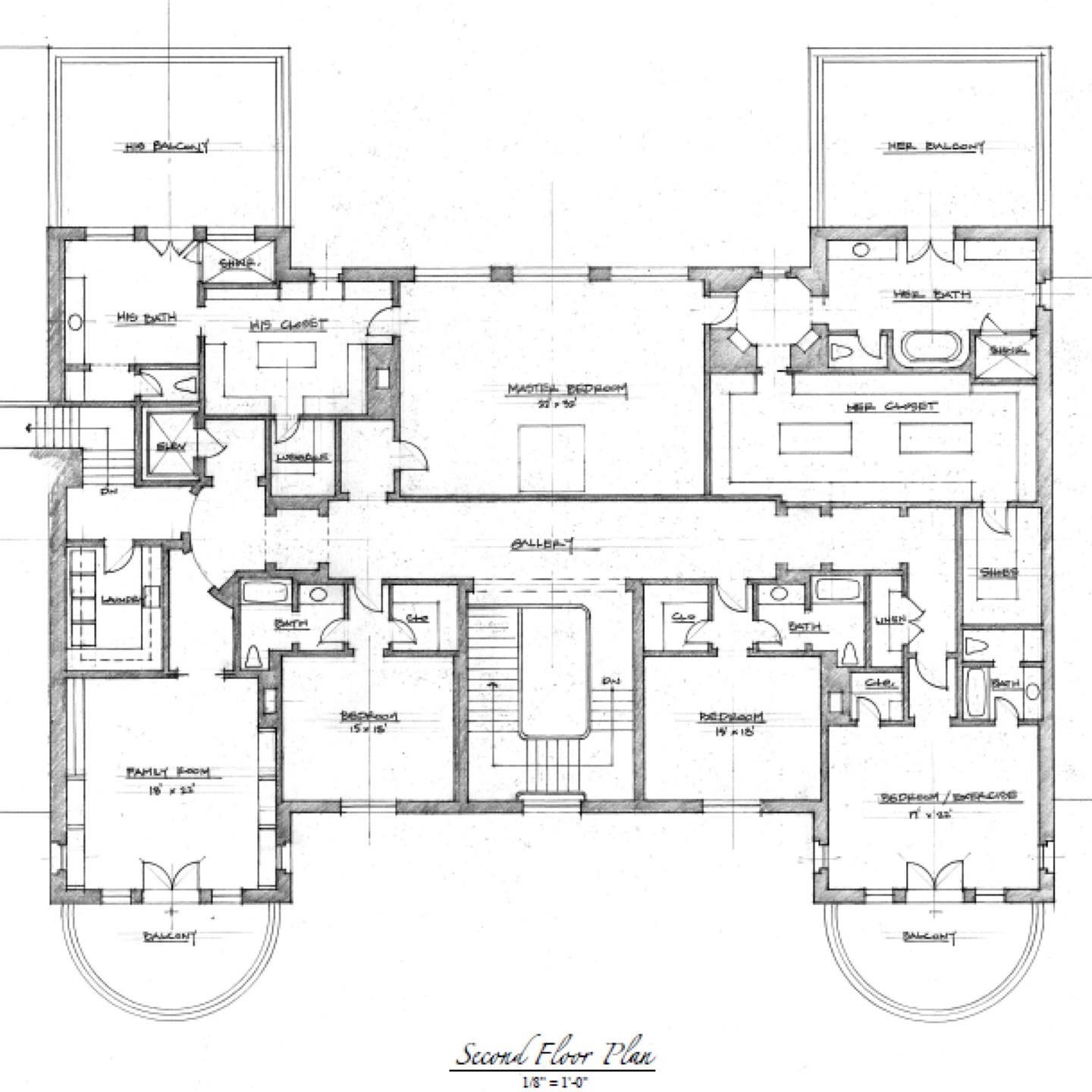
Let’s see…a 4 car garage plus an addition 2 car garage, a Billiards Room, a Billards Gallery, His ‘n Hers Offices, His ‘n Hers Bathrooms, His ‘n Hers Powder Rooms, Assistant’s Office, Conservatory, a BALL ROOM, a 21′ x 44′ Entry Hall with its own BAR, Butler’s Pantry, Elevator, a Hers Closet that’s bigger than our Living Room, and not one, but two Family Rooms…
It’s like those old illusion drawings where you’re supposed to locate all the things that are fucked up.
2 comments
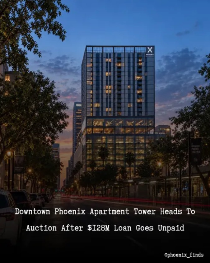
Downtown Phoenix Apartment Tower Heads To Auction After $128M Loan Goes Unpaid
X Phoenix, the 330 unit apartment community at 200 W. Monroe Street in Downtown Phoenix, is headed toward a trustee sale after its developer failed to repay a $128 million loan tied to the property.
According to Maricopa County documents, lender Mack Real Estate Group has scheduled the first phase of X Phoenix to be sold at auction on December 10 at Maricopa County Superior Court.
The property originally opened as a roughly $100 million development and marked Chicago based The X Company’s entry into the Phoenix market.
Ben and I were discussing this only a couple days ago; about how it seemed all progress had ground to a halt. To be honest, the entire concept and design of X Phoenix was odd from the beginning. Based on its description it sounded more like a high-tech dormitory for young adults (private bedrooms and baths, but shared living and kitchen facilities) than a traditional apartment building. Nevertheless it seemed to fill up quickly. Maybe I’m just old, but…no thanks!
The first phase of this building went up pretty quickly. It was directly north of City Hall so I saw it every day.
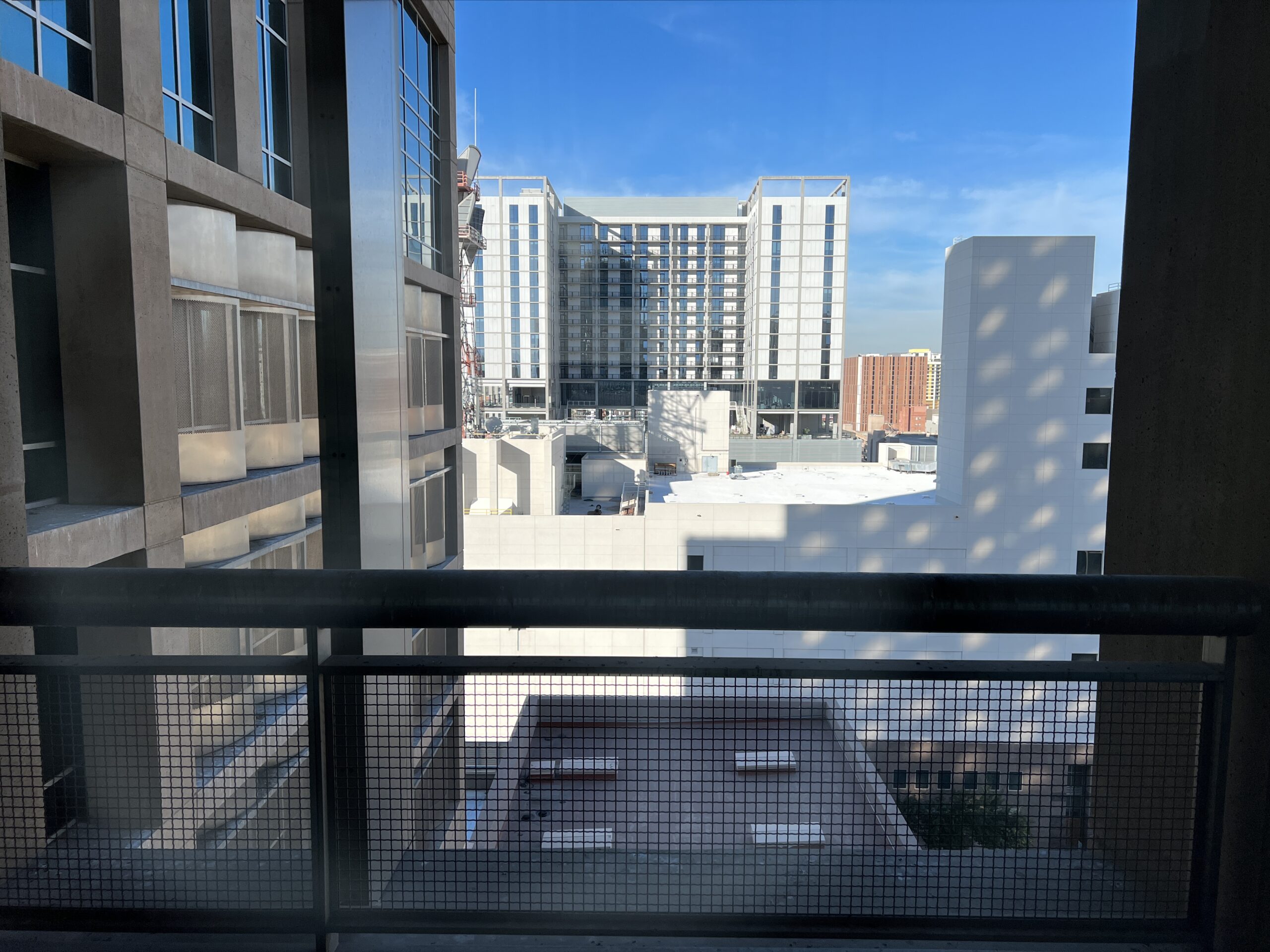
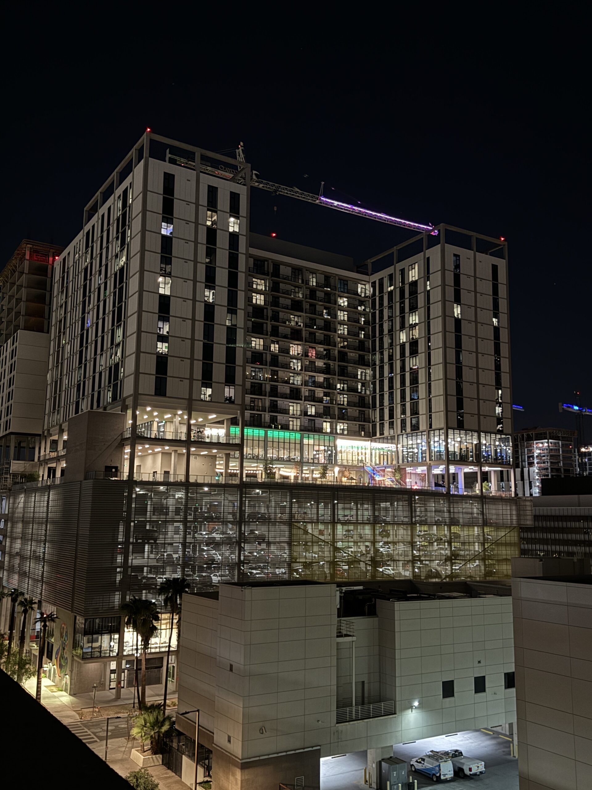
They started construction on Phase 2 in late 2023 or early 2024, and it seemed it was taking forever. When I retired from the City in January 2025, it still wasn’t finished, although it looked close enough that would probably be done by the end of the year.
Well, imagine my surprise when I was downtown a couple weeks ago and saw that it still wasn’t completed, and in fact, looked like precious little had been done since I last saw it 20 months ago. At least now I know why.
1 comments
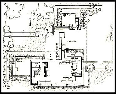
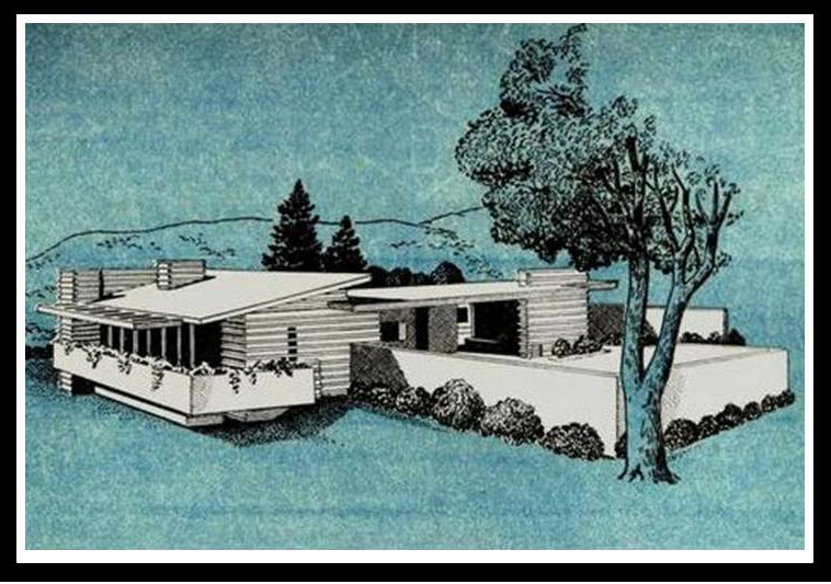
…because it’s such a funky layout with a bedroom physically separate from the rest of the house, but I looked and couldn’t find it.
2 comments
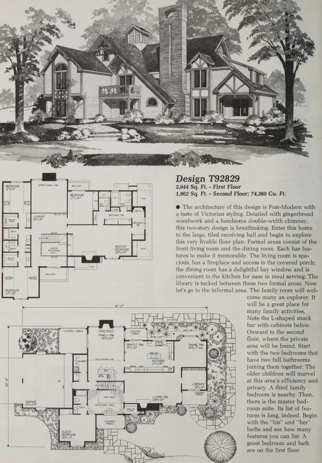
I don’t understand the bathroom arrangement on the second floor. Two of the bedrooms have their own, but also they’re also shared. And this his and hers bathrooms in the master suite?
At least there’s a guest bath on the first floor—even if it belongs to the Guest Bedroom…
1 comments